Presentation+Skills 演讲技巧
Presentationskill
处理提问
定好规则 复述问题 向所有听众做回答 把问题与你的演讲联系起来 你不知道答案,就明说 适时收场
在介绍和重复要点时,要提高语调 希望创造一个演讲高潮时,要提高语调 有时也可以用降低语调来引起注意 一般情况下,用中等语调 强调要点时,减慢语速 希望创造一个演讲高潮时,要加快语速 相对不重要的内容,可以加快语速 一般情况下,用中等语速
语速变化的提示:
避免照本宣科
停顿
停顿的目的
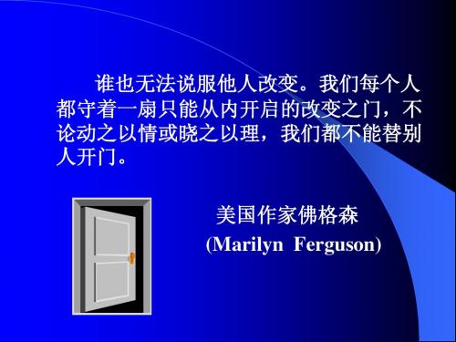
谁也无法说服他人改变。我们每个人 都守着一扇只能从内开启的改变之门,不 论动之以情或晓之以理,我们都不能替别 人开门。 美国作家佛格森 (Marilyn Ferguson)
你个人的成功往往并不取决于你的知识, 而取决于你如何与他人交流你的知识。 Your personal success is likely to be determined not by what you know, but by how well you communicate what you know. Lisbeth Weiss
预测提问和准备问题
预测提问
请同事针对内容提出问题 结合对听众的分析和演讲的内容 准备好证实材料
准备问题引发讨论用以
获取反馈 提高参与度
筹划环境
事先筹划环境的每一个环节,可以使你 和听众把注意力集中在演讲的内容上 选择一个医生最方便的时间和地点 预先布置好会场
预先布置会场,确保做到: 有足够的座位,安排座椅的时候考虑到讲台不 遮挡视线,并便于讨论。 室内适宜的温度,并可调节。 学会使用演讲设备,准备一些设备所需的灯泡 和电线等以备急需。 室内光线充分,并可调节。 房间独立并隔音。 准备好所有讲课中需要的东西(例如:录像带、 宣传资料、幻灯片、投影胶片等)以及白纸、 记号笔、名片等。 适当的饮料、食品及纪念品。
Presentation skills

Presentation Skills 演讲技巧
Nelson Xu
共同规则
手机铃声 ? 全心投入 勇敢上台
为什么需要演讲技巧训练
世上最可怕的事情是什么? 世上最可怕的事情是什么? What’s in it for me? ? 演讲技巧对我有什么好处? 演讲技巧对我有什么好处? 坚信: 坚信:任何人都可以通过学习与练习成 为出色的演讲者
有效表达的三要素
听者
内容
表达
形成你的风格
Be your self
课程目录
一、基本原则 克服“当众发言恐惧症” 二、克服“当众发言恐惧症” 三、发言前的准备 四、发言中的技巧 五、如何应对提问 六、小组演练
克服当众发言恐惧症
紧张是自然反应 你完全可以克服或掩饰紧张情绪
准备 练习 转移注意力 消除心理障碍
应用所学技巧 使用视听辅助工具 组织好内容
课程目录
一、基本原则 克服“ 当众发言恐惧症” 二、克服“ 当众发言恐惧症” 三、发言前的准备 四、发言中的技巧 五、如何应对提问 六、演练
演讲技巧分类
Verbal (语言的 语言的) 语言的
7% 38% 55%
Vocal (声音的 声音的) 声音的 Visual (视觉的 视觉的) 视觉的
:
入职以来的学习心得; 入职以来的学习心得; 入职至今的主要成绩和后期工作规划; 入职至今的主要成绩和后期工作规划; 您对ATL文化的理解(用一张 文化的理解( 陈述); 您对 文化的理解 用一张PPT陈述); 陈述 对公司和部门的建议。 对公司和部门的建议。 除以上内容外,您还可以挑选但不限于以下内容: 除以上内容外,您还可以挑选但不限于以下内容: 个人绩效状况和核心胜任力(结合ASK能力模型); 能力模型); 个人绩效状况和核心胜任力(结合 能力模型 个人职业发展规划及现状分析(可使用SWOT工具); 工具); 个人职业发展规划及现状分析(可使用 工具 其他有利于展现个人优势与价值的内容; 其他有利于展现个人优势与价值的内容; 学习工作中的困难,希望得到的帮助等。 学习工作中的困难,希望得到的帮助等
Presentationskill_PPT制作与演讲技巧

Presentationskill_PPT制作与演讲技巧PRSENTATION SKILLCoffee Liu 13 Dec,20121. How to make a structured and professional PPT?如何制作结构化和专业的PPT?2. How to make an influential presentation and convince your audience?如何进行有说服力的演讲和使听众信服?Definition定义Propose an idea 发表观点Convince your audience 使听众信服 For buy-in 使接受4Ps Model[ Prepare ]W–W–H–TWhat? – Identify objectives 确认目标 Objectives 目标Why should the presentation be done? 为什么? What can I get from it? 能得到什么? How long shall I prepare for it?要准备多久?形式如何?Example 例子Give open speech in a university 在大学公开演讲Present annual report to the shareholders 向股东做年度报告Show new product to the customers 向客户介绍新产品……What type of presentation will it be?W–W–H–T Who? – Know your audience 了解听众关心什么需要知道什么Needs to Know Cares whatExpectation期望值Who 是谁Audience profile 听众概况决策者Participant list 名单 Decision makerTaboo 禁忌 Questions问题Background 背景 Character 性格 Interest 兴趣W–W–H–T How? – By what means 采用什么形式Speech 演讲 Formal 正式 V.S. Informal 非正式 Style风格Briefing 简报 Daily reporting日常汇报Training 培训……W–W–H–T Tool 工具PPT Equipment(Multi-media, video, product model…)设备(多媒体,录像,产品模型)Environment(Light, Seat, projector, flip chart…)环境(灯光,座位,投影仪,活动挂图)[ Powerpoint ]Primary – Median Subject主题 Outline Structure Main part大纲结构主体内容AdvancedViewpoint 论点 Talking point 论据Fact 事实 Main Statistic 数据 Part Example 例子主体 Analogy 类比 Reference 引用……Primary – Median – AdvancedMain Front Agenda / Outline Structure Part page 架构首页议程/大纲 Change Visual Aid into / Chart转化为主体内容逻辑图/图表Subject 标题 Name 姓名 Date 日期…Fact Statistic Example Analogy Reference……Number / Percentage 数字/比例 Process 流程 Cause & effect 因果 Trend 趋势 Sequence 序列……Primary – Median – AdvancedVisual Aid逻辑图Primary – Median – AdvancedChart 图表6 4 2 0 类别类别类别类别 1 2 3 4 系列 1 系列 2 系列 3 Sales Region East South West North 2011 … … … … 2012 … … … …Primary – Median -AdvancedTemplate模板Polish 润色排版,图画,动画排版–风格统一格式一致字体颜色,大小标志,符号等Techniques 技巧 Subject and outline 先确立主题和大纲Logical structure 逻辑结构 Strong talking point 有力的论点论据3,6,12 PrincipleVisual aid – Chart – Words逻辑图–表–文字 Polish 润色Don’tSpelling error错别字Not aligned structure结构不统一Too much content一页显示过多内容Too small Font字体太小过长的标题Long Heading无用的页面Useless SlideJargon行话过多动画效果Too much effect[ Practice ]Don’t just recite 避免简单背诵 Practice before mirror 镜子前练习 Learn from the celebrity 模仿名人 Simulate presentation 仿真演示 Prepare cards & lecture准备小卡片和讲义Practice two hours before两小时前再练习一次Practice is the best way to overcome intensity![ Present ]。
演讲技巧 presentation tips

Presentation Tips:Preparation, Slides & Handouts, Delivery Preparation1. Start with the end in mindBefore you even open up PowerPoint, sit down and really think about the day of your presentation. What is the real purpose of your talk? Why is it that you were ask to speak? What does the audience expect? In your opinion, what are the most important parts of your topic for the audience to take away from your, say, 50-minute presentation? Remember, even if you've been asked to share information, rarely is the mere transfer of information a satisfactory objective from the point of view of the audience. After all, the audience could always just read your book (or article, handout, etc.) if information transfer were the only purpose of the meeting, seminar, or formal presentation.2. Know your audience as well as possibleBefore you begin to formulate the content of your presentation, you need to ask yourself many basic questions with an eye to becoming the best possible presenter for that particular audience. At the very least, you need to answer the basic "W questions."Who is the audience? What are their backgrounds? How much background informationabout your topic can you assume they bring to the presentation?What is the purpose of the event? Is it to inspire? Are they looking for concrete practicalinformation? Do they want more concepts and theory rather than advice?Why were you asked to speak? What are their expectations of you?Where is it? Find out everything you can about the location and logistics of the venue.When is it? Do you have enough time to prepare? What time of the day? If there are otherpresenters, what is the order (always volunteer to go first or last, by the way). What day of theweek? All of this matters.3. Content, content, contentNo matter how great your delivery, or how professional and beautiful your supporting visuals, if your presentation is not based on solid content, you can not succeed. Don't get me wrong, I am not saying that great content alone will carry the day. It almost never does. Great content is a necessary condition, but not a sufficient one. But your presentation preparation starts with solid content (appropriate for your audience) which you then build into a winning story that you'll use to connect with your audience.A word of caution: Though I am emphasizing how important content is, I also am begging you to spare your audience a "data dump." A data dump — all too common unfortunately — is when a presenter crams too much information into the talk without making the effort to make the information or data applicable to the members of the audience. A data dump also occurs when data and information do not seem to build on the information that came earlier in the presentation. Sometimes it almost seems that the presenter is either showing off, or more likely, is simply afraid that if he does not tell the "whole story" by giving reams of data, the audience will not understand his message.Do not fall into the trap of thinking that in order for your audience to understand anything, you must tell them everything. Which brings us to the idea of simplicity.4. Keep it simpleSimple does not mean stupid. Frankly, thinking that the notion of simplifying is stupid is just plain, well, "stupid." Simple can be hard for the presenter, but it will be appreciated by the audience. Simplicity takes more forethought and planning on your part because you have to think very hard about what to include and what can be left out. What is the essence of your message? This is the ultimate question you need to ask yourself during the preparation of your presentation. Here's a simple exercise:EXERCISE:If your audience could remember only three things about your presentation,what would you want it to be?(1)________________________________________________________________________(2)________________________________________________________________________(3)________________________________________________________________________5. Outlining your contentI suggest you start your planning in "analog mode." That is, rather than diving right into PowerPoint (or Keynote), the best presenters often scratch out their ideas and objectives with a pen and paper. Personally, I use a large whiteboard in my office to sketch out my ideas (when I was at Apple, I had one entire wall turned into a whiteboard!). The whiteboard works for me as I feel uninhibited and freer to be creative. I can also step back (literally) from what I have sketched out and imagine how it might flow logically when PowerPoint is added later. Also, as I write down key points and assemble an outline and structure, I can draw quick ideas for visuals such as charts or photos that will later appear in the PowerPoint. Though you may be using digital technology when you deliver your presentation, the act of speaking and connecting to an audience — to persuade, sell, or inform — is very much analog.Cliff Atkinson in his 2005 book, "Beyond Bullet Points," smartly states that starting to create your presentation in PowerPoint before you have your key points and logical flow first worked out (on paper or a white board in my case) is like a movie director hiring actors and starting to film before there is a script in hand.More on "planning analog"I usually use a legal pad and pen (or a whiteboard if there is enough space) to create a rough kind of storyboard.I find the analog approach stimulates my creativity a bit more as I said. No software to get in my way and I can easily see how the flow will go. I draw sample images that I can use to support a particular point, say, a pie chart here, a photo there, perhaps a line graph in this section and so on. You may be thinking that this is a waste of time: why not just go into PowerPoint and create your images there so you do not have to do it twice? Well, the fact is, if I tried to create a storyboard in PowerPoint, it would actually take longer as I would constantly have to go from normal view to slide sorter view to see the "whole picture." The analog approach (paper or whiteboard) to sketch out my ideas and create a rough storyboard really helps solidify and simplify my message in my own head. I then have a far easier time laying out those ideas in PowerPoint. I usually do not even have to look at the whiteboard or legal pad when I am in PowerPoint, because the analog process alone gave a clear visual image of how I want the content to flow. I glance at my notes to remind me of what visuals I thought of using at certain points and then go to or to my own extensive library of high-quality stock images to find the perfect image.6. Have a sound, clear structureTake a page out out the McKinsey presentation handbook: presentation structure is paramount. Without it, your wonderful style, delivery and great supporting visuals will fall flat. If you took the time in the first step to outline your ideas and set them up in a logical fashion, then your thinking should be very clear. You can visualize the logic of your content and the flow of the presentation. If your ideas are not clear first, it will be impossible todesign the proper structure later when you create visuals and/or supporting documents. Your audience needs to see where you are going. And it is not enough to simply have an "agenda" or "road map" slide in the beginning that illustrates the organization of your talk. If you do not actually have a solid road of logic and structure, then an outline slide will be of no use. In fact, the audience may become even more irritated since you made the promise of organization in the beginning, but then failed to deliver the promise with a presentation which is muddled and lacks focus.7. Dakara nani? (so what?)In Japanese I often say to myself, "dakara nani?" or "sore de...?" which translate roughly as "so what?!" or "your point being...?" I say this often while I am preparing my material. When building the content of your presentation always put yourself in the shoes of the audience and ask "so what?" Really ask yourself the tough questions throughout the planning process. For example, is your point relevant? It may be cool, but is it important or help your story in a very important way...or is it fluff? Surely you have been in an audience and wondered how what the presenter was talking about was relevant or supported his point. "So what?" you probably said to yourself. "So what?" — always be asking yourself this very important, simple question. If you can't really answer that question, then cut that bit of content out of your talk.8. Can you pass the "elevator test"?Check the clarity of your message with the elevator test. This exercise forces you to "sell" your message in 30-45 seconds. Imagine this is the situation: You have been scheduled to pitch a new idea to the head of product marketing at your company, one of the leading technology manufactures in the world. Both schedules and budgets are tight; this is an extremely important opportunity for you if you are to succeed at getting the OK from the executive team. When you arrive at the Admin desk outside the vice-president's office, suddenly she comes out with her coat and briefcase in hand and barks, "...sorry, something's come up, give me your pitch as we go down to the lobby..." Imagine such a scenario. Could you sell your idea in the elevator ride and a walk to the parking lot? Sure, the scenario is unlikely, but possible. What is very possible, however, is for you to be asked without notice to shorten your talk down, from, say, 20 minutes, to 10 minutes (or from a scheduled one hour to 30 minutes), could you do it? True, you may never have to, but practicing what you might do in such a case forces you to get your message down and make your overall content tighter and clearer.Author, Ron Hoff ("I Can See You Naked") reminds us that your presentation should be able to pass the David Belasco test while you're in the planning stages. David Belasco was a producer who insisted that the core idea for every successful play he produced could be written as a simple sentence on the back of a business card. Try it. Can you crystallize the essence of your presentation content and write it on the back of a business card? If the task is impossible for you, then you may want to think again and get your message down pat in your mind. This too is certainly something you do before you ever begin to open up PowerPoint (Keynote).9. The art of story tellingGood presentations include stories. The best presenters illustrate their points with the use of stories, most often personal ones. The easiest way to explain complicated ideas is through examples or by sharing a story that underscores the point. Stories are easy to remember for your audience. If you want your audience to remember your content, then find a way to make it relevant and memorable to them. You should try to come up with good, short, interesting stories or examples to support your major points.In addition, it is useful to think of your entire 30 minute presentation as an opportunity to "tell a story." Good stories have interesting, clear beginnings, provocative, engaging content in the middle, and a clear, logical conclusion. I have seen pretty good (though not great) presentations that had very average delivery and average graphics, but were relatively effective because the speaker told relevant stories in a clear, concise manner to support his points. Rambling streams of consciousness will not get it done; audiences need to hear (and see) your points illustrated.10. Confidence — How to get itThe more you are on top of your material the less nervous you will be. If you have taken the time to build the logical flow of your presentation, designed supporting materials that are professional and appropriate, there is much less to be nervous about. And, if you have then actually rehearsed with an actual computer and projector (assuming you are using slideware) several times, your nervousness will all but melt away. We fear what we do not know. If we know our material well and have rehearsed the flow, know what slide is next in the deck, and have anticipated questions, then we have eliminated much (but not all) of the unknown. When you remove the unknown and reduce anxiety and nervousness, then confidence is something that will naturally take the place of your anxiety.Slide and HandoutsPowerPoint uses slides with a horizontal or "Landscape" orientation. The software was designed as a convenient way to display graphical information that would support the speaker and supplement the presentation. The slides themselves were never meant to be the "star of the show" (the star, of course, is your audience). People came to hear you and be moved or informed (or both) by you and your message. Don't let your message and your ability to tell a story get derailed by slides that are unnecessarily complicated, busy, or full of what Edward Tufte calls "chart junk." Nothing in your slide should be superfluous, ever.Your slides should have plenty of "white space" or "negative space." Do not feel compelled to fill empty areas on your slide with your logo or other unnecessary graphics or text boxes that do not contribute to better understanding. The less clutter you have on your slide, the more powerful your visual message will become.Your presentation is for the benefit of the audience. But boring an audience with bullet point after bullet point is of little benefit to them. Which brings us to the issue of text. The best slides may have no text at all. This may sound insane given the dependency of text slides today, but the best PowerPoint slides will be virtually meaningless with out the narration (that is you). Remember, the slides are meant to support the narration of the speaker, not make the speaker superfluous.Many people often say something like this: "Sorry I missed your presentation. I hear it was great. Can you just send me your PowerPoint slides?" But if they are good slides, they will be of little use without you. Instead of a copy of your PowerPoint slides, it is far better to prepare a written document which highlights your content from the presentation and expands on that content. Audiences are much better served receiving a detailed, written handout as a takeaway from the presentation, rather than a mere copy of your PowerPoint slides. If you have a detailed handout or publication for the audience to be passed out after your talk, you need not feel compelled to fill your PowerPoint slides with a great deal of text.We’ll talk more about this in the delivery section below, but as long as we are talking about text, please remember to never, ever turn your back on the audience and read text from the slide word for word.This slide is not unusual, but it is nota visual aid, it is more like an "eye chart."Try to avoid text-heavy (and sleep inducing) slides like this one.Aim for something like this simple slide above.And this is even better...Use object builds and slide transitions judiciously. Object builds (also called animations), such as bullet points, should not be animated on every slide. Some animation is a good thing, but stick to the most subtle and professional (similar to what you might see on the evening TV news broadcast). A simple "Wipe Left-to-Right" (from the "Animations" menu) is good for a bullet point, but a "Move" or "Fly" for example is too tedious and slow (and yet, is used in many presentations today). Listeners will get bored very quickly if they are asked to endure slide after slide of animation. For transitions between slides, use no more than two-three different types of transition effects and do not place transition effects between all slides.Use high-quality graphics including photographs. You can take your own high-quality photographs with your digital camera, purchase professional stock photography, or use the plethora of high-quality images available on line (be cautious of copyright issues, however). Never simply stretch a small, low-resolution photo to make it fit your layout - doing so will degrade the resolution even further.Avoid using PowerPoint Clip Art or other cartoonish line art. Again, if it is included in the software, your audience has seen it a million times before. It may have been interesting in 1993, but today the inclusion of such clip art often undermines the professionalism of the presenter. There are exceptions, of course, and not all PowerPoint art is dreadful, but use carefully and judiciously.Try to avoid cheesy clip art like this.This edited stock photograph is moreeffective and professional.I often use images of people in my slides, as photography of people tends to help the audience connect with the slide on a more emotional level. If the photographic image is secondary in importance, then I decrease the opacity and add a Gaussian Blur or motion filter in Photoshop. If the photographic image is the primary area I want the audience to notice (such as a picture of a product), then the image can be more pronounced and little (or no) text is needed.In this title slide, the image is primary.In this slide of the same presentation, the image is secondary and "pushed" to the back by editing it first in Photoshop.You clearly need a consistent visual theme throughout your presentation, but most templates included in PowerPoint have been seen by your audience countless times (and besides, the templates are not all that great to begin with). Your audience expects a unique presentation with new (at least to them) content, otherwise why would they be attending your talk? No audience will be excited about a cookie-cutter presentation, and we must therefore shy away from any supporting visuals, such as the ubiquitous PowerPoint Design Template, that suggests your presentation is formulaic or prepackaged.You can make your own background templates which will be more tailored to your needs. You can then save the PowerPoint file as a Design Template (.pot) and the new template will appear among your standard Microsoft templates for your future use. You can also purchase professional templates on-line (for example:).Always be asking yourself, "How much detail do I need?" Presenters are usually guilty of including too much data in their on-screen charts. There are several ways to display your data in graphic form; here are a few things to keep in mind:Pie Charts. Used to show percentages. Limitthe slices to 4-6 and contrast the mostimportant slice either with color or by explodingthe slice.Vertical Bar ed to show changes inquantity over time. Best if you limit the bars to4-8.Horizontal Bar Charts. Used to comparequantities. For example, comparing salesfigures among the four regions of the company.Line ed to demonstrate trends. Forexample, here is a simple line chart showingthat our sales have gone up every year. Thetrend is good. The arrow comes in later tounderscore the point: Our future looks good!In general, tables are good for side-by-side comparisons of quantitative data. However, tables can lack impact on a visceral level. If you want to show how your contributions are significantly higher than two other parties, for example, it would be best to show that in the form of a bar chart (below, right). If you're trying to downplay the fact that your contributions are lower than others, however, a table will display that information in a less dramatic or emotional way.Color evokes feelings. Color is emotional. The right color can help persuade and motivate. Studies show that color usage can increase interest and improve learning comprehension and retention.You do not need to be an expert in color theory, but it's good for business professionals to know at least a bit on the subject. Colors can be divided into two general categories: Cool (such as blue and green) and Warm (such as orange and red). Cool colors work best for backgrounds as they appear to recede away from us into the background. Warm colors generally work best for objects in the foreground (such as text) because they appear to be coming at us. It is no surprise, then, that the most ubiquitous PowerPoint slide color scheme includes a blue background with yellow text. You do not need to feel compelled to use this color scheme, though you may choose to use a variation of those colors.If you will be presenting in a dark room (such as a large hall), then a dark background (dark blue, grey, etc.) with white or light text will work fine. But if you plan to keep most of the lights on (which is highly advisable) then a white background with black or dark text works much better. In rooms with a good deal of ambient light, a screen image with a dark background and light text tends to washout, but dark text on a light background will maintain its visual intensity a bit better.Learning to Use ColorAs we go through life, we learn that there are folks who are just natural at some things, while others of us have to work hard just to get by. For instance, some people can pick up a musical instrument in a few days, while it may take others a lifetime to learn. Some of us are barely able to speak English, while others can fluently speak several languages. And some of us are unable to do the Electric Slide without injuring those around them, while others can actually make it look like a line dance. The point is, while many things may seem unobtainable, they are things you can learn. We often think of a good eye for color as something innate rather than something learned. But in fact, given the proper tools, and possibly a few electrical shocks along the way, even a person who's colorblind can pick color schemes that are pleasing to the eye. So for all you colorblind readers out there, as well as those who quit Art 101 after learning there would be no nude models involved, we'd like to review how to select colors like a pro using the fundamentals of color.First let's deal with the basic terminology of color just to make sure we don't lose any of you along the way (we'd hate to have to come and pick you up later). We all know that primary colors are red, yellow, and blue. Then to get secondary colors, you add a primary color to another primary color. Yellow and red give you orange, red and blue give you purple, and blue and yellow give you green. But what then are tertiary colors? Why, simply a primary color added to one of the adjacent secondary colors. That means there are six tertiary colors (two colors for every primary color). Figure A shows a summary of these colors in all their basic splendor.Figure A: To pick the best color schemes, it's important to understand the three different types of colors.To fully understand the manner in which these colors relate, it's best to imagine these hues organized in a circle.This organization, shown in Figure B, is known in the design world as the color wheel. Sort of pretty, isn't it? But its real beauty is how it will help you pick colors to use in your Web site design.Figure B: Combining primary, secondary, and tertiary colors together, we get the color wheel. Choosing Colors Using the Color Wheel: The simplest approach to choosing colors using the color wheel is to simply imagine an equilateral triangle floating above the wheel. Each color at the vertices is a usable color. (For those of you who flunked math as well as art, the vertices are the places where the lines of the triangle meet.) This type of color selection is called a triad scheme. From our example in Figure C, you can see that we have four separate triad schemes that we can work with. The idea is that these hues work together to form a harmoniccombination of color.Figure C: There are four possible triads from the color wheel.But you certainly don't have to stop at triads. You could choose complementary colors, that is, hues that are directly across from each other on the color wheel--red and green for instance. These are called complementary colors because, when used together, they seem to make each other brighter and more vivid, as illustrated in Figure D.Figure D: Colors opposite from each other on the color wheel are said to be complementary. Variation on a Scheme: At this point we're ready to start mixing things up a bit, what with the triads and the complementary colors and all. For example, you could combine two complementary pairs together, called a double complement. Something like yellow and purple, blue and orange. Another iteration of glorious color wouldbe an alternate complement, where you combine a triad with the complement to one of the triadic hues. Green, reddish-purple, red, and orange for instance. You can also have a split complement that uses three colors, a hue and the two adjacent to its complement.Finally, in the combination category, you can have a tetrad, where you combine four colors that are directly across from each other. Here you would be using a primary, a secondary, and two tertiary colors. Figure E shows examples of each of these schemes.Figure E: Contrasting themes can liven up any Web site.All in the Family: Now that we've covered all the possible variations of contrasting colors, we need to take a look at the two types of schemes that use related colors--monochromatic and analogous. A monochromatic color set, as it sounds, uses a single hue but with varying tints and shades. Used correctly, this scheme can give a Web site a nice, clean look. An analogous color set, on the other hand, uses four contiguous colors along the wheel. Any four--you just spin the wheel. As you'll notice from the example shown in Figure F, the analogous scheme appears quite similar to a monochromatic scheme.Figure F: An analogous scheme looks almost monochromatic.Putting it all Together: Now that we've thoroughly inundated you with color choices, we need to give you a few final warnings. First and foremost, the color schemes we've highlighted may not work by themselves. You may still need to tweak the colors by varying the saturation and the value of each of the colors. The schemes that we illustrated are starting points, not ending points. Ultimately, the deciding factor will be the Web site's readability and the overall look and feel of the colors. To help you visualize how these colors will play off one another, design experts suggest you fire up any of the graphics applications that let you work in layers and compare the various themes to see which works best for your site. For example, as you can see in Figure G, some color combinations work without a bother while others require a little tweaking.Figure G: You can't expect every color combination to work for you.Conclusion: While the choice of color is one of the most subjective decisions in the world of design, it's still important to understand the theory behind why you should choose one set of colors over another. The theory may not let you instantly select a color scheme, but it will certainly lead you along the right path. Now, all you need to do is learn how to do the Electric Slide.Fonts communicate subtle messages in and of themselves, which is why you should choose fonts deliberately. Use the same font set throughout your entire slide presentation, and use no more than two complementary fonts (e.g., Arial and Arial Bold). Make sure you know the difference between a Serif font (e.g., Times New Roman) and a Sans-Serif font (Helvetica or Arial). Serif fonts were designed to be used in documents filled with lots of text. Serif fonts are said to be easier to read at small point sizes, but for on screen presentations the serifs tend to get lost due to the relatively low resolution of projectors. San-serif fonts are generally best for PowerPoint presentations, but try to avoid the ubiquitous Helvetica. I often choose to use Gill Sans as it is somewhere in between a serif and a sans-serif font and is professional yet friendly and "conversational." Regardless of what font you choose, make sure the text can be read from the back of the room.Times Arial Black and Arial。
成功演讲的技巧Presentation skills)

第二种结构,对比的架构,主要是强调前后的对比,强调差别感。例如减肥药等,尽管结果未必能够减肥,但是推销员总会告诉你减肥前后的样子对比来吸引客人。
3. 眼神接触(Eye Contact)
演讲,如何使听众真正感受到你的热情,就是通过眼神接触。就正如一次演唱会,为何明星总会说句:山顶的朋友你们好!就是因为这样做才可以使每个角落的人都感受到演讲人的热情,就像演讲者真的是在关注你,眼神如果能达到覆盖全场那就最好。
2. 结构(Structure)
常用的布局结构有:问题/解决(Problem/Solution)、之前/之后(Before/After)和总/分
ห้องสมุดไป่ตู้演讲也需要布局,就正如我们写文章,你总不能东边扯一下,西边说一下,最后主题都弄丢了。
第一种结构,一开始就抛出问题,并且提供解决方案,一般是会结合总分,侧重点是提供解决方案,方案一定要是可达的。例如:修建多条公路来分流车流量,修建后必然是可以缓解交通问题。
如何达成一个成功演讲,我们来分析一下演讲所需要的元素:内容(Content)、结构(Structure)、眼神接触(Eye Contact)和总结(Summary)
演讲技巧(Presentation skills)
1. 内容(Content)
一场演讲,最重要的必然是要传递的信息,注重信息内容的质量是首要的重点,如何将内容更好地传递出去,我们需要有额外的方法:比喻、以情动人、幽默感、大白话。
你的信息内容非常精彩,创新度更达到乔帮主再世水平,但是如果听众走神了,听众不能吸收你的信息,那你的演讲就是失败了。而幽默感则是能缓和演讲现场气氛的一种武器,幽默的语句可以引起听众的兴趣。
EffectiveCommunicationandPresentationSkills高效沟通与演讲技巧

Effective Communication and Presentation Skills 高效沟通与演讲技巧 You communicate with your boss, your subordinates, your clients, your competitors, etc. First, you will learn the methods to talk smart and always bring across your point. With the efficient communication skills you will learn, you will be a more effective team player, a better listener, and an efficient problem solver. Having presentation skills and being confident in public speaking will increase your career opportunities, as delivering professional presentations to clients and business partners is becoming an essential part of today's business world. The training will take you step-by-step through the process of developing an effective presentation from choice of a topic and organization of materials; you will become a successful speaker and get support from others. 您无时无刻都处在沟通之中:与上司,与下属,与客户,与竞争对手,提升人际关系影响力必须具备良好的沟通能力。
Presentation-Skills英文演讲-展示技巧介绍教学文案

❖ Organize the talk first, then put details in.
Prepare It
Preparing for the Talk (PPT)
❖ Use the standard company format ❖ Do not change format, it’s designed to for a
❖ Projected visuals have severe limits
Must be read from a distance Must be simple and bold Complex graphs and charts are suitable to
be put in a printed form
❖ The purpose of the talk is to move them to your point of view
❖ Organize the messages using Pyramid Principle
Plan It
Building the Case
❖ The pyramid has been formed ❖ Enrich it with
Lap Visual
❖ Each one get a copy. Good for complex data sheet and charts
white boards
❖ Good for increasing interactivity among 15 or fewer people
On-screen presentation
more general points to cut them down
关于做presentation的技巧(范文大全)

关于做presentation的技巧(范文大全)第一篇:关于做presentation的技巧关于做presentation 的技巧~~ 2008-05-27 12:47 今天上ARW课,主要内容是speech&oral presentation , 占期末评分的10%。
偶由于前段时间一直在忙IB和选修,PPT准备得很仓促,演讲稿即使写好了也没排练过几次,可是说是临阵磨枪,加上本人一直有怯场的毛病,结果可想而知---20分的满分只拿了14分;还被vickie 挑出一堆毛病,什么一些发音有问题啊,lack of eye-contact 阿,肢体语言不够啊。
郁闷半晌~~回来后痛定思痛,在网站上面搜了一些关于作presentation的小技巧,可能会对同学们有帮助。
1.不能紧张,周围最好有个什么可以依靠的东西。
2.可以将一些关键的词汇做好小的卡片,放在手中或者是前面的桌子上,但不要有太多的细节,否则会导致你总是不停的看手中的东西。
3.可以适当的应用一些道具,包括你要介绍或者解释的东西时,可以把这样东西相关的拿到讲演的地方,在讲解的过程中可以吸引听众的注意力。
4.条件允许的话,可以使用power point等,方便自己的讲解,也不会把讲解弄的很尴尬,但是主要的戏份是在讲演,而不是放映幻灯片。
5.可以准备一杯水,其实水的作用是来缓解压力或者当你一下子陷入茫然的时候给自己一个考虑的机会。
6.说话的时候勿求难词,关键是让大家能够听得懂,明白你究竟在说什么。
7.说话的语速控制在VOA Special English的速度上,可以使说话更加清晰表述清楚。
8.可以适当的穿插一些互动性的问题,这一点很重要,可以重申你的观点,并且让听众更加了解你要说的事情。
9.结束的时候千万不可以说that is all。
类的句型,这一点是外国人特别强调的,可以说thank you for coming等等一类的礼貌的话10.要尽量的放松,可以深呼吸或者是使两脚分开站立都是好的方法。
- 1、下载文档前请自行甄别文档内容的完整性,平台不提供额外的编辑、内容补充、找答案等附加服务。
- 2、"仅部分预览"的文档,不可在线预览部分如存在完整性等问题,可反馈申请退款(可完整预览的文档不适用该条件!)。
- 3、如文档侵犯您的权益,请联系客服反馈,我们会尽快为您处理(人工客服工作时间:9:00-18:30)。
2020/7/22
2. 选择需求
需求考虑
• 这是否是大部分的观众的共同需求? • 这些需求是否关键人物认为重要的呢? • 这些需求能否帮你达到既定目标?
2020/7/22
(一)分析阶段
1. 确定演讲目标 2. 分析观众 Nhomakorabea. 选择需求
2020/7/22
创作练习
(分析阶段) 时间:10分钟
2、需求排列
逻辑性(观众紧跟推理)
自己思路
复杂性(简单
复杂)
按主要性(大 小)
熟悉性(容易 不熟悉)
2020/7/22
(二)演讲的结构
1、组织演讲主体 2、对需求排序
3、转接语
4、结束语 5、开场白
2020/7/22
3、准备转接语
目的:
• 总结与每个需求相关的特点 • 连接下个需求,让观众能转移注意力
(一)分析阶段
1. 确定演讲目标 2. 分析观众 3. 选择需求
2020/7/22
1. 确定演讲目标
演讲的目标无非以下几类: • 确保每人都能明白新的政策、程序、规定 • 为取得管理层的承诺 • 让观众相信我们应该。。。
2020/7/22
(一)分析阶段
1. 确定演讲目标
2. 分析观众
3. 选择需求
2020/7/22
(二)演讲的结构
1、组织演讲主体 2、对需求排序 3、转接语 4、结束语 5、开场白
2020/7/22
1、组织演讲主体(笔记法)
需求描述:
特点:
详细解释 好处
转接语:
2020/7/22
(二)演讲的结构
1、组织演讲主体
2、对需求排序
3、转接语 4、结束语 5、开场白
2020/7/22
2020/7/22
1、制作视听材料
制作幻灯片的小技巧
• 背景 • 标题 • 文字 • 剪切画 • 图表
2020/7/22
1、制作视听材料
制作幻灯片的小技巧
• 对比 • 简洁
背景
2020/7/22
2020/7/22
2020/7/22
运动场上的汗水
2020/7/22
运动场上的汗水
2020/7/22
背景:
需要说明/确认: • • •
2020/7/22
练习:结束语
综述特点: 要求承诺:
2020/7/22
第一部分:创作(总结)
(一)分析阶段
1. 确定演讲目标 2. 分析观众 3. 选择需求
(二)演讲的结构
1、组织演讲主体 2、对需求排序 3、转接语 4、结束语 5、开场白
2020/7/22
专业演讲
演讲过程
2020/7/22
如何提高演讲技巧
1、制作视听材料 2 、建立形象 3、有效运用声音 4、有效运用语言 5、和观众交流
2020/7/22
如何提高演讲技巧
1、制作视听材料 2 、建立形象 3、有效运用声音 4、有效运用语言 5、和观众交流
2020/7/22
1、制作视听材料
观众吸收信息的特点
年度销售报告
• 东区销售:22333元 • 西区销售:225566元 • 北区销售:334567元 • 南区销售:336474元
2020/7/22
自我介绍
(1)姓名 (2)职务 (3)对这次培训的期望目标
2020/7/22
1分钟时间
共同承诺
关闭手机
2020/7/22
尊重他人
准时 思维开放
课程目标
• 了解以观众为中心的演讲方法 • 有策略性地进行专业演讲的创作 • 学会专业的演讲技巧
2020/7/22
专业演讲的两大要点
4、结束语
5、开场白
2020/7/22
4、准备结束语
• 综述有关的特点和评语 • 要求观众承诺去行动以达目标
一个富有鼓动性的结束语应再次提醒观众 他们应立即采取行动的原因,增强采取行 动的动力。
2020/7/22
(二)演讲的结构
1、组织演讲主体 2、对需求排序 3、转接语 4、结束语
5、开场白
2020/7/22
5、准备开场白
开场白的重要性 :
• 引起注意 • 让观众安定下来 • 建立和谐关系 • 个人风格 • 介绍讨论主题 • 介绍目的 • 说服观众你要讲的是值得一听的
2020/7/22
练习:开场白
介绍
问候:
目的:
基调/参与:
背景:
需要说明/确认: • • •
2020/7/22
开场白样本:
介绍
问候:自我介绍
专业演讲的创作
策略、计划、分析、组织、预估
专业演讲的演讲
个人形象、风格、演讲技巧
2020/7/22
专业演讲
创作
2020/7/22
第一部分:创作
(一)分析阶段
1. 确定演讲目标 2. 分析观众 3. 选择需求
(二)演讲的结构
1、组织演讲主体 2、对需求排序 3、转接语 4、结束语 5、开场白
2020/7/22
2020/7/22
2. 分析观众
• 分析有哪些类型的人参加会议 • 分析有哪些关键人物对你的目标有决定作用 • 分析观众对演讲产生的兴趣、顾虑和问题 • 分析演讲的时间长短、观众人数、会议室类型 • 分析对你是否有利的观众-支持者、反对者
2020/7/22
(一)分析阶段
1. 确定演讲目标 2. 分析观众
2020/7/22
简 明 扼 要!
转接语的例句:
• “另一个有趣/有关的领域是...” •“这让我谈到下一个论点...” • “很多同事很关心...我将会在下个论点谈到...”
如果找不到合适的转接语, 请重新选择顺序!
2020/7/22
(二)演讲的结构
1、组织演讲主体 2、对需求排序 3、转接语
目的:辅导系统 的介绍
基调/参与:20分钟
背景:销售队伍的日益庞大
需要说明/确认: • 人才培养
• 迅速上岗 • 标准流程
2020/7/22
创作练习
(演讲结构) 时间:10分钟
2020/7/22
组织演讲主体:
需求描述:
特点:
详细解释好处:
转接语:
2020/7/22
练习:开场白
介绍
问候:
目的:
基调/参与:
视觉 55%
说的内容 7%
声音 38%
2020/7/22
视听手段
• 揭纸板 • 幻灯片 • 幻灯胶片 • 图表 • 图片
•海报 •录像 •录音 •实物
1、制作视听材料
2020/7/22
制作视听的原则
1、制作视听材料
KISS MISS
Keep It Simple and Straightforward Make It Supportive and Slight
1、制作视听材料
制作幻灯片的小技巧
背景 • 对比 • 简洁
• 和谐
2020/7/22
2020/7/22
1、制作视听材料
制作幻灯片的小技巧
背景
• 对比 • 简洁 • 和谐
• 连续
2020/7/22
1、制作视听材料
制作幻灯片的小技巧
标题
• 最少占六分之一,预留足够空间 • 是幻灯片内容的总结
2020/7/22