雅思小作文折线图
折线图英语作文范文

折线图英语作文范文IntroductionIn today’s world, data visualization has become an essential tool for presenting information in a clear and concise manner. One of the most popular forms of data visualization is the line graph or the line chart. A line graph is a type of chart that displays information as a series of data points connected by straight lines. In this essay, we will be discussing a sample essay on a line graph and how to write an effective essay using a line graph.Sample EssayThe line graph below shows the percentage of people aged 65 and over in three countries over a period of 100 years.LineGraphLine GraphThe line graph illustrates the percentage of people aged 65 and over in three countries, namely the United States, Japan, and Sweden, from 1900 to 2000. Overall, it can be seen that the percentage of elderly people in all three countries increased over the 100-year period, with Japan having the highest percentage of elderly people in 2000.In 1900, the percentage of elderly people in the United States was the highest at around 4%, while Japan and Sweden had a lower percentage of elderly people at around 3%. Over the next 50 years, the percentage of elderly people in all three countries increased, with Japan having the highest percentage of elderly people in 1950 at around 7%, followed by Sweden at around 6% and the United States at around 5%.From 1950 to 2000, the percentage of elderly people in all three countries continued to increase. However, Japan had the highest percentage of elderly people throughout this period, with the percentage of elderly people in Japan reaching almost 20% in 2000. Sweden had the second-highest percentage of elderly people in 2000 at around 16%, while the United States had the lowest percentage of elderly people at around 12%.In conclusion, the line graph shows that the percentage of elderly people in all three countries increased over the 100-year period. Japan had the highest percentage of elderly people in 2000, followed by Sweden and the United States. This trend is likely to continue in the future, as the population continues to age.Writing TipsWhen writing an essay based on a line graph, it is important to follow a few key tips to ensure that your essay is effective and well-written. Here are some tips to keep in mind:1.Start with an introduction that provides an overview of the line graph andthe data it represents.e clear and concise language to describe the data in the line graph. Avoidusing overly technical terms or jargon that may be difficult for the reader tounderstand.e specific data points from the line graph to support your arguments andconclusions. Be sure to cite the data accurately and provide context for each data point.e transition words and phrases to connect your ideas and make your essayflow smoothly. Exam ples of transition words and phrases include “however,”“in addition,” “furthermore,” and “on the other hand.”5.Conclude your essay by summarizing the main points and drawing aconclusion based on the data presented in the line graph.By following these tips, you can write an effective essay based on a line graph and present information in a clear and concise manner.。
雅思写作小作文范文 雅思写作折线图(线状图) 公司垃圾数量.doc
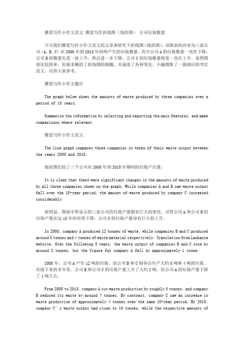
雅思写作小作文范文雅思写作折线图(线状图)公司垃圾数量今天我们雅思写作小作文范文的文章来研究下折线图(线状图)。
该图表的内容为三家公司(A, B, C)从2000年到2015年间所产生的垃圾数量。
其中公司A的垃圾数量一直在下降,公司B的数量先是一波上升,然后进一步下降。
公司C的垃圾数量则是一直在上升。
虽然图表比较简单,但基本概括了折线图的精髓,并涵盖了各种变化。
小编搜集了一篇相应的考官范文,以供大家参考。
雅思写作小作文题目The graph below shows the amounts of waste produced by three companies over a period of 15 years.Summarise the information by selecting and reporting the main features, and make comparisons where relevant.雅思写作小作文范文The line graph compares three companies in terms of their waste output between the years 2000 and 2015.线状图比较了三个公司从2000年到2015年期间的垃圾产出量。
It is clear that there were significant changes in the amounts of waste produced by all three companies shown on the graph. While companies A and B saw waste output fall over the 15-year period, the amount of waste produced by company C increased considerably.很明显,图表中所显示的三家公司的垃圾产量都有巨大的变化。
雅思小作文范文-线图

1. The proportion of male and female smokers in Someland from 1960 to 2000.1. 两条线,建议每条线一段;2. 每条线的描述请参考经典折线写法 (在数据库里有,详见《单线指导写法》 );3. 关键性数据不可少,如最大值,最小值等 ;4. 本文用到了线段之间的对比关系,如文中的 : 6 times of 和 smallest difference with ,这些都是加分项The chart compares the rate of smoking in men andwomen in Someland between 1960 and 2000.Overall,the proportion of smoking for both is currently declining and fewer women smoked throughout the period.Initially,the peak of male rate was reached in 1960, when it was 600 in every 1000, over 6 times of that of females.This number then decreased gradually to 500by 1975and continued to decrease but more steeply to 250 by 2000, which had the smallest difference with the level of women.Oppositely, the rate of smoking in women in 1960 was the lowest at only 90 in every 1, 000. By1965 this increased to 180, followed by a sharper rise to 320 by 1975. The rate of female smokers then remained stable at 320 until 1980 at which point the figure began to decline and ended up at 200 by 2000.In conclusion,the rate of smoking in men dropped straightly throughout the whole period while the figure of women smokers went through a fluctuation. ( 172 )2. Radio and television audiences throughout the day in 1992.以下是 6 分, 7 分和 9 分范文,可以看出,上 6 分的文章都有一个共性,就是没有大的语法错误,分段合适,表达清晰,且进行适当的词汇替换。
折线图作文-英语

折线图作文-英语I love using line graphs to present data because they are so clear and easy to understand. The way the lines move up and down really helps to show trends and patterns in the data.Line graphs are great for showing changes over time.You can see at a glance how things have changed, whetherit's the temperature over the course of a day, or the sales of a product over the course of a year.The thing I like most about line graphs is that they make it really easy to compare different sets of data. You can see how one thing has changed in relation to another, and it's all right there on the graph for you to see.I also find it really satisfying to create a line graph. It's like putting together a puzzle, trying to figure out the best way to represent the data so that it tells thestory clearly and effectively.Line graphs are just so versatile. You can use them to show all kinds of information, from the growth of a company to the changes in a person's weight over time. They're a really powerful tool for visualizing data.。
雅思写作小作文范文 雅思写作折线图(线状图) 老年人口比例.doc

雅思写作小作文范文雅思写作折线图(线状图)老年人口比例今天我们雅思写作小作文范文的文章来研究下折线图(线状图)。
该图表展示了美国、日本、瑞典这三个国家中65岁以上人口所占的比例,以及他们从1940年到2040年期间的变化。
小编搜集了一篇相应的考官范文,以供大家参考。
雅思写作小作文题目The graph below shows the proportion of the population aged 65 and over between 1940 and 2040 in three different countries.Summarise the information by selecting and reporting the main features, and make comparisons where relevant.雅思写作小作文范文The line graph compares the percentage of people aged 65 or more in three countries over a period of 100 years.线状图比较了一百年的十年里三个国家65岁以上人口的比例。
It is clear that the proportion of elderly people increases in each country between 1940 and 2040. Japan is expected to see the most dramatic changes in its elderly population.很明显,在1940年到2040年期间,每个国家老年人的比例都在上升。
其中,日本的老年人口上升最为迅速。
In 1940, around 9% of Americans were aged 65 or over, compared to about 7% of Swedish people and 5% of Japanese people. The proportions of elderly people in the USA and Sweden rose gradually over the next 50 years, reaching just under 15% in 1990. By contrast, the figures for Japan remained below 5% until the early 2000s.1940年,大约百分之九的美国人年龄在65岁以上,瑞典的数据为百分之七,日本的数据为百分之五。
雅思写作小作文范文 雅思写作折线图(线状图) 酸雨.doc

雅思写作小作文范文雅思写作折线图(线状图)酸雨今天我们雅思写作小作文范文的文章来研究下折线图(线状图)。
该图表展示了从1990年到2007年英国四个部门的酸雨排放量。
单位为百万吨。
四个部门分别为:交通与通勤部门,电力、燃气以及水利供应部门,家庭以及其他产业部门。
小编搜了一篇相应的考官范文,以供大家参考。
雅思写作小作文题目The graph below shows UK acid rain emissions, measured in millions of tonnes, from four different sectors between 1990 and 2007.Summarise the information by selecting and reporting the main features, and make comparisons where relevant.雅思写作小作文范文The line graph compares four sectors in terms of the amount of acid rain emissions that they produced over a period of 17 years in the UK.折线图比较了英国四个部门在17年间排放的酸雨数量。
It is clear that the total amount of acid rain emissions in the UK fell considerably between 1990 and 2007. The most dramatic decrease was seen in the electricity, gas and water supply sector.很明显,英国的整体酸雨排放量在1990年到2007年之间显著下降。
下降幅度最大的是电力、燃气以及水利供应部门。
描述折线图变化趋势的英语作文

描述折线图变化趋势的英语作文英文回答:The line graph illustrates the changes in the number of visitors to a theme park over a period of one year, from January to December. The vertical axis represents the number of visitors, while the horizontal axis represents the months.Looking at the graph, it is clear that there is a noticeable fluctuation in the number of visitors throughout the year. In January, the park had the fewest visitors, with only around 500 people. This number gradually increased in the following months, reaching a peak in July, when the park welcomed over 3000 visitors. After July, there was a gradual decline in the number of visitors, with a significant drop in December, when the park had around 800 visitors.One interesting trend to note is the sharp increase invisitors during the summer months. This can be attributed to the fact that many people go on vacation during this time and are therefore more likely to visit the theme park. On the other hand, the decrease in visitors towards the end of the year could be due to the colder weather and the holiday season, when people may prefer to stay at home or engage in other activities.Another noteworthy point is the overall upward trend in the number of visitors from January to July. This indicates that the park was able to attract more visitors during this period, possibly through the introduction of newattractions or marketing campaigns. However, the subsequent decline in visitors suggests that the park may need to implement strategies to maintain visitor numbers throughout the year.In conclusion, the line graph demonstrates the fluctuating trend in the number of visitors to a theme park over the course of one year. The graph shows a gradual increase from January to July, followed by a decline towards the end of the year. This trend can be attributedto factors such as vacation seasons and weather conditions. The park may need to consider implementing measures to sustain visitor numbers throughout the year.中文回答:这个折线图展示了一个主题公园一年内(从一月到十二月)游客数量的变化。
雅思写作小作文范文 雅思写作折线图(线状图) 美国肉类消耗量.doc

雅思写作小作文范文雅思写作折线图(线状图)美国肉类消耗量今天我们雅思写作小作文范文的文章来研究下折线图(线状图)。
该图表来自于华盛顿邮报的网站,数据相对于真正的雅思考试而言要更多一些。
因此如何挑选数据和进行对比就显得尤为重要。
小编搜集了一篇考官写的范文,以供大家参考。
雅思写作小作文题目雅思写作小作文范文The line graph shows changes in the per capita consumption of beef, pork, broilers, and turkey in the United States between 1955 and 2012.该折线图展示了1955年到2012年期间美国每人牛肉、猪肉、鸡肉和火鸡肉的消耗量。
It is noticeable that beef was by far the most popular of the four types of meat for the majority of the 57-year period. However, a considerable rise can be seen in the consumption of broilers, with figures eventually surpassing those for beef.很显然,牛肉在57年中的大多数时间都是四种肉类中最受欢迎的类型。
然而,鸡肉的消费量可以看到明显上升,并最终超过了牛肉的数量。
Between 1955 and 1976, US beef consumption rose from around 60 to a peak of 90 pounds per person per year. During the same period, consumption of broilers also rose, to nearly 30 pounds per person, while the figures for pork fluctuated between 50 and 40 pounds per person. Turkey was by far the least popular meat, with figures below 10 pounds per capita each year.在1955年到1976年期间,美国牛肉的消耗量从每人每年60磅,上涨到最高点每人每年90磅。
- 1、下载文档前请自行甄别文档内容的完整性,平台不提供额外的编辑、内容补充、找答案等附加服务。
- 2、"仅部分预览"的文档,不可在线预览部分如存在完整性等问题,可反馈申请退款(可完整预览的文档不适用该条件!)。
- 3、如文档侵犯您的权益,请联系客服反馈,我们会尽快为您处理(人工客服工作时间:9:00-18:30)。
Writing task one: single line graphYou will be given a graph with a single line. Your task is to write a 150 word report to describe the information given in the graph. You are not asked to give your opinion. You should spend around twenty minutes on the task. Task one is not worth as many marks as task two and so you should make sure that you keep within the recommended twenty minute time frame.What is being tested is your ability to:•objectively describe the information given to you•report on a topic without the use of opinion•use suitable language to describe the graphSample taskYou should spend about 20 minutes on this task.Write a report for a university lecturer describing the information in the graph below.Write at least 150 words.When you’ve f inished the taskHow good is your answer? Check the guidelines bellow and read the sample answer.Guidelines for a good answerDoes the report have a suitable structure?•Does it have an introduction, body and conclusion?•Does it include connective words to make the writing cohesive within sentences and paragraphs?Does the report use suitable grammar and vocabulary?•Does it include a variety of sentence structures?•Does it include a range of appropriate vocabulary?Does the report meet the requirements of the task?•Does it meet the word limit requirements?•Does it describe the whole graph adequately?•Does it focus on the important trends presented in the graphic information?Sample answerThe graph shows the number of cases of X disease in Someland between the years 1960 and 1995. As an overall trend, it is clear that the number of cases of the disease increased fairly rapidly until the mid seventies, remained constant for around a decade at 500 cases before dropping to zero in the late 80s.In 1960, the number of cases stood at approximately 100. That number rose steadily to 200 by 1969 and then more sharply to 500 in 1977. At this point the number of cases remained stable until 1984 before plummeting to zero by 1988. From 1988 to 1995 Someland was free of the disease.In conclusion, the graph shows that the disease was increasingly prevalent until the 1980s when it was eradicated from Someland.What do you think?What is your opinion of this sample answer? How well does it meet the requirements of the guidelines? Read the teacher's comments on this answer.Teacher's comments on the sample answer“The report structure is easy to follow and logical with a clear introduction, body and conclusion. The candidate uses cohesive words to connect pieces of informatio n and make the writing flow such as ‘until’ and ‘before’ in the second sentence. The candidate uses a variety of grammatical structures and vocabulary so that the writing is not repetitive.In terms of task requirements the report is a little short but this is because the simple graph used as an example does not have sufficient information for the candidate to describe. In the real IELTS test the graph will have more information and so the need to look for trends will be even greater than in this example.”Strategies for improving your IELTS scoreSelecting informationIt is important that you describe the whole graph fully. However, this does not mean that you should note every detail. In most cases there will be too much information for you to mention each figure. You will therefore need to summarise the graph by dividing it into its main parts. This is what we mean by describing the trends.For example, in a chronological line graph it might seem sensible to describe the information year by year or period by period. The graph above gives the information in five year sections so we could write our report like this:The number of cases of X disease started at 50 in 1965 and then went up gradually to 100 in 1965 and continued up to 200 in 1970 and then went up more sharply to 380 in 1975.While this way of describing the information may be accurate, it does not meaningfully sum up the information in the graph. In fact, the information in the graph would most meaningfully be described in four chronological sections following the shape of the graph.In the Sample Task, the graph shows four main trends:•first, a gradual increase from 1960 to 1968•second, a steeper increase from 1968 to 1977•third, a plateau from 1977 to 1983•fourth, a drop from 1983 to 1988The structure of the report must show these four main trends clearly.Report structureYour report should be structured simply with an introduction, body and conclusion. Tenses should be used appropriately.IntroductionUse two standard opening sentences to introduce your report. These opening sentences should make up the first paragraph. Sentence one should define what the graph is about; that is, the date, location, what is being described in the graph etc. For example:The graph shows the number of cases of X d isease in Someland between the years 1960 and 1995 …Notice the tense used. Even though it describes information from the past, the graph shows the information in the present time.Notice that the sample opening sentence does not simply copy the words used on the graphic material. Copied sentences will not be assessed by the examiner and so you waste your time including them.Describing the overall trendSentence two (and possibly three) might sum up the overall trend. For example:It can be clearly seen that X disease increased rapidly to 500 cases around the 1980s and then dropped to zero before 1999, while Y disease fell consistently from a high point of nearly 600 cases in 1960 to less than 100 cases in 1995.Notice the tense used. Here we are talking about the occurrence of the disease in the past.Describing the graph in detailThe body of the report will describe the graph or graphs in detail. You will need to decide on the most clear and logical order to present the material.Line graphs generally present information in chronological order and so the most logical order for you to write up the information would, most probably be from earliest to latest. Bar graphs, pie charts are organised in different ways and so you need to decide on the organisation of each one.Concluding sentencesYour report may end with one or two sentences which summarise your report to draw a relevant conclusion. Grammar and vocabularyAvoiding repetitionYou will receive a higher mark if your writing uses a range of structures and vocabulary correctly rather than a limited number. For example, the candidate who writes:The number of cases of X disease started at 50 in 1965 and then went up to 200 in 1970 and then went up to 500 in 1980 and then went down to zero in 1990.will lose marks for being repetitive. You should therefore practise writing reports using a wide variety of terms to describe the different movements in the graphs and different structures to vary your writing.Describing trendsTrends are changes or movements. These changes are normally expressed in numeric items, for example, population, production volumes or unemployment. There are three basic trends:Expressing movement: nouns and verbsFor each trend there are a number of verbs and nouns to express the movement. We can use a verb of change, for example:Unemployment levels fellOr we can use a related noun, for example:There was a fall in unemployment levelsDescribing the speed of changesteady steadilygradual graduallyslow slowlyExercise 1Use the following terms and any others necessary to describe the graph below.initially, stood at, dip/dipped, peak/peaked, level/levelled outWe can describe a trend by looking at:•the difference between two levels•the end point of the trendDescribing the difference between two levelsThis year unemployment has increased?by?20,000 cases (the difference between this year and last year is 20,000 cases).This year there has been an increase in unemployment?of?5%.Notice the prepositions. We use to increase?by?(with the verb) and an increase?of?(with the noun).Describing the end pointThis year unemployment has risen to 10% (the end result is that unemployment is up to 10%).This year there has been a rise in unemployment to 10%.Notice the prepositions. We use to rise?to?(with the verb) and a rise?to?(with the noun).Exercise 2Write 3 sentences describing the graph below using?by,?of?and?to.Expressing approximationWe use words to express approximation when the point we are trying to describe is between milestones on the graph.just under well under roughly approximatelyabout just over well over nearly。