雅思小作文_线图.
IELTS Line graph 雅思小作文 曲线图解析

at 数据 at 时间点.
第2页/共39页
重点句型
• 有波动但总体上升,之后下降 • From then on, it generally maintained
第17页/共39页
方法2
• 第一步: 时态----过去时 现在时 将来时 • 第二步: 观察规律 • 1. 都大幅上升 • 2. 美国和瑞典前50年基本完全相同 • 3. 90年后,美国和瑞典分道扬镳,应该分别来写 • 4. 日本的变化完全不同,应该单独占一段 • 第三步:首尾各一段,美国和瑞典一段,日本一段,共四段
an upward trend until the peak( about 数据) was reached at 时间点, in spite of some small fluctuations. • However, after that there was a slump in the percentage, and it continued until 时间点 when the number reached
重点句型
• 先下降再上升,之后下降并持平 • However, 对象 first experiences a gradual decline from 数据 at 时
间点 to 数据 at 时间点, which is the lowest in the day, and then a steady climb, back to its peak of 数据 at 时间点. In contrast to 比较 的对象, 对象 decrease slightly and almost level out for most of the evening, with a peak (nearly 数据) at 时间点.
雅思A类小作文范文 Aging Population 线图类
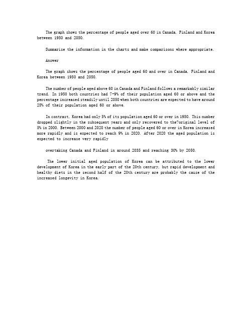
The graph shows the percentage of people aged over 60 in Canada, Finland and Korea between 1950 and 2050.Summarise the information in the charts and make comparisons where appropriate.AnswerThe graph shows the percentage of people aged 60 and over in Canada, Finland and Korea between 1950 and 2050.The number of people aged above 60 in Canada and Finland follows a remarkably similar trend. In 1950 both countries had 7-9% of their population aged 60 or above and the percentage increased steadily until 2050 when both countries are expected to have around 25% of their population aged 60 or above.In contrast, Korea had only 5% of its population aged 60 or over in 1950. This number dropped slightly in the subsequent years and only recovered to the?original level of 5% in 2000. Between 2000 and 2020 the number of people aged 60 or over in Korea increased more rapidly and is expected to reach 9% in 2020. After 2020 the aged population is expected to increase very rapidlyovertaking Canada and Finland in around 2035 and reaching 30% by 2050.The lower initial aged population of Korea can be attributed to the lower development of Korea in the early part of the 20th century, but rapid development and healthy diets in the second half of the 20th century are probably the cause of the increased longevity in Korea.。
雅思小作文范文-线图

1. The proportion of male and female smokers in Someland from 1960 to 2000.1. 两条线,建议每条线一段;2. 每条线的描述请参考经典折线写法 (在数据库里有,详见《单线指导写法》 );3. 关键性数据不可少,如最大值,最小值等 ;4. 本文用到了线段之间的对比关系,如文中的 : 6 times of 和 smallest difference with ,这些都是加分项The chart compares the rate of smoking in men andwomen in Someland between 1960 and 2000.Overall,the proportion of smoking for both is currently declining and fewer women smoked throughout the period.Initially,the peak of male rate was reached in 1960, when it was 600 in every 1000, over 6 times of that of females.This number then decreased gradually to 500by 1975and continued to decrease but more steeply to 250 by 2000, which had the smallest difference with the level of women.Oppositely, the rate of smoking in women in 1960 was the lowest at only 90 in every 1, 000. By1965 this increased to 180, followed by a sharper rise to 320 by 1975. The rate of female smokers then remained stable at 320 until 1980 at which point the figure began to decline and ended up at 200 by 2000.In conclusion,the rate of smoking in men dropped straightly throughout the whole period while the figure of women smokers went through a fluctuation. ( 172 )2. Radio and television audiences throughout the day in 1992.以下是 6 分, 7 分和 9 分范文,可以看出,上 6 分的文章都有一个共性,就是没有大的语法错误,分段合适,表达清晰,且进行适当的词汇替换。
雅思小作文线图满分范文汇总
雅思⼩作⽂线图满分范⽂汇总雅思⼩作⽂线图满分范⽂汇总雅思⼩作⽂中的线图,作为动态图的代表,在很⼤程度上来说是属于⽐较困难的考题类型。
但是⼀篇好的范⽂,从很⼤程度上就可以帮助雅思考⽣解决这些难题,但是整个⽹上关于雅思线图的范⽂很少,⽽图⽚的质量也乏善可陈。
针对这个问题,超级学长的⽼师精挑细选了5篇雅思⼩作⽂中的线图满分范⽂给雅思考⽣作为参考。
这5篇范⽂都属于过往的真题,从质量上,典型性上都⾮常具有研究,学习,模仿的价值。
线图范⽂⼀You should spend about 20 minutes on this task.Eating sweet foods produces acid in the mouth, which can cause tooth decay. (High acid levels are measured by low pH values)Summaries the information by selecting and reporting the main features, and make comparisons where relevant.Write at least 150 words.超级学长⽼师范⽂:The provided line graph illustrates the acid level in the mouth which is created by consuming sweet foods specifically sugar and honey and the possibility of tooth decay because of this acid level. As is presented in the line-graph, the higher the acid level the lower the pH value and a pH level less than 5.5 is detrimental to the tooth and causes the tooth decay.The given graph shows that the initial pH level of our mouth is 7 which begins to fall after consuming sweet foods. When we eat sweet item like cane sugar, the pH level drops to 3.5 after 5 minutes and remain in danger level (below pH level 5.5) for more than 30 minutes. Consuming fruit sugar drops the pH level nearly to 4 and remains at danger level for about 20 minutes. And finally, when we eat honey, the pH level falls below 5 and it remains under risk level for about 13 minutes. As the low pH level means higher acidity and causes tooth decay, cane sugar among the mentioned three food items is the most harmful to our tooth. (Approximately 186 words)线图范⽂⼆You should spend about 20 minutes on this task.The graph below compares the number of visits to two new music sites on the web. Summaries the information by selecting and reporting the main features, and make comparisons where relevant.Write at least 150 words.超级学长⽼师范⽂:The graph exhibits the public interest of using two new music websites named Music Choice and Pop Parade in the period of 15 days’ time. According to the graph, the trends were totally unstable and have swung extremely.The statistics of Pop Parade shows the starting point of 120000 visitors on the first day and decreased during the following 7days with the minimum number of visitors of 40000 on the 7th day. The fluctuation of Music Choice website wasn’t as extreme as the Pop Parade in the first week. The Music Choice started with 40000 visitors in the 1st day and the same number of visitors on the 7th day with small amount of changes during this week. In the 2nd week, both of the websites had the increasing interest of visitors i.e. Pop Parade reached to 140000 visitors on the 11th day and Music Choice reached to 120000 on the 12th day, and after some oscillations, the websites ended the 15 day period with 180000 and 80000 respectively. According to the chart, the rate of 180000 was the maximum of viewers that belongs to Pop Parade and Pop Parade has More public interest for the viewers altogether than the Music Choice within these two weeks.( Approximately 204 words )线图范⽂三You should spend about 20 minutes on this task.The line graph below gives information on cinema attendance in the UK.Summaries the information by selecting and reporting the main features, and make comparisons where relevant.Write at least 150 words.超级学长⽼师范⽂:The given line graph shows the number of cinema-going UK people and classifies theseviewers in four age groups. As is observed from the graph, people over 40 years old went to movies more than the younger people of the UK.As is observed from the line graph, the people of 44 to 54 years-old attended cinema more than the people of other age groups who are less than 44 years old. Only 15% of the UK citizens who were between 14 to 24 years old attended in cinema in 1990 while this percentage increased with the increase of age group. In this same year, more than 35% people over 40 years attended the cinema. It is clear from the data that, the people in UK trend to attend cinema more with the increase of their age. The cinema goer’s number increased gradually from 1990 to 2010 except for 1995 to 2000. In 2010, the number of cinema attendees was also dominated by the age group of 44 to 54 and the percentage of cinema attendees from all age groups increased by 5% on an average than the percentages were in 2005.线图范⽂四You should spend about 20 minutes on this task.The graph below shows the differences in wheat exports over three different areas. Summaries the information by selecting and reporting the main features, and make comparisons where relevant.Write at least 150 words.超级学长⽼师范⽂:The given line graph compares the wheat exports over three different parts of the world namely Australia, Canada and the European Community from 1985 to 1990. As is presented in the graph, the wheat export in Australia decreased over time while the export in Canada and European countries increased with some fluctuations.According to the graph, around 15 to 20 million tons of wheat was exported to Australia, Canada and the European community. This amount decreased slightly in 1986 reaching around 15 million tons and from that point, the export quantity in Australia kept on decreasing and reached just over 10 million tons in 1990. In the meantime, the amount increased sharply in Canada until 1988 and then there was a quick decline and finally, it reached around 19 million tons in 1990. Finally, the wheat export in the European Community increased gradually over the years and reached over 20 million tons in 1990.线图范⽂五You should spend about 20 minutes on this task.The chart below shows the changes that took place in three different areas of crime in New Port city center from 2003-2012.Summaries the information by selecting and reporting the main features, and make comparisons where relevant.Write at least 150 words.超级学长⽼师范⽂:The graph represents the variation in levels in the three main areas of crime in the centre of Newport city in the time period from 2003 to 2012.To start with, it was 3400 incidences of burglary in 2003 and 3750 in 2004. Fortunately, in the next 4 years it fell down dramatically and reached the absolute minimum in 2008 (1100 incidences), however, it then grew by 300 accidents and remained fairly constant by 2012.Car theft was a steady level of crime from 2003 to 2004 and got reduced in next 5 years from 2700 up to 2250. The number then increased to 2700 in 2012.Robbery reached its peak in 2005, which was 900 cases and decreased back to 500 in 2008. In the following two years, the number of incidences rose to 700 and continued to stay at this level in 2012.In conclusion, in the Newport city centre, the rate of burglary fell significantly, the level of robbery remained fairly constant, whereas car theft raised and had the biggest number of incidences in 2012.。
雅思写作小作文线图高分范文解析!

线图雅思小作文范文解析线图雅思小作文范文解析!动态线图,这已成为近两年来雅思考试的主流,下面三立在线小编就为大家分享一篇雅思写作小范文之线图九分范文。
希望同学们可以从中学习雅思线图写作技巧The line graph compares average yearly spending by Americans on mobile andlandline phone services from 2001 to 2010.概括线图内容It is clear that spending on landline phones fell steadily over the 10-yearperiod, while mobile phone expenditure rose quickly. The year 2006 marks thepoint at which expenditure on mobile services overtook that for residentialphone services.总述一条线总体趋势,和另一条行程对比In 2001, US consumers spent an average of nearly $700 on residential phoneservices, compared to only around $200 on cell phone services. Over thefollowing five years, average yearly spending on landlines dropped by nearly$200. By contrast, expenditure on mobiles rose by approximately $300.自2001年开始,描述cell phone每一段的变化趋势。
In the year 2006, the average American paid out the same amount of money onboth types of phone service, spending just over $500 on each. By 2010,expenditure on mobile phones had reached around $750, while the figure forspending on residential services had fallen to just over half this amount.对比手机服务,写出手机服务的特征。
图表作文攻略

图表作文攻略by 雅思伟哥(新浪微博@55老师)欢迎关注雅思写作公众平台(微信公众账号:英语伟哥)图表作文数据图单图1.线性图2.柱状图3.表格4.饼状图组合图5.同形可比6.同形不可比7.不同形8.复杂组合图非数据图9.流程图10.地图雅思写作小作文----线形图攻略线形图均为动态图(除非非常特殊的图形)。
图形特点1. 横坐标一般为时间单位2. 纵坐标一般为数据请注意:数据单位和数据出现形式(数值还是百分比)3. 不同的线分别代表不同事物请注意:雅思考试的线性图一般为多线图写作要点线图想要描述的是不同事物在经过一段时间后所发生的变化。
所以,在行文时需要交代:1:发生变化前各事物均为什么状态?(即:起点分别是什么?)2:这段时期发生了什么变化?(即:上升,下降,还是保持不变?变化快还是慢?)3:经历这些变化后成为什么状态?(即:终点分别是什么?)写作思路1. 起点--过程--终点2. 三根线以上的线图,需要把这些线按趋势分成两类3. 先描写过去的数据(已发生),再描写将来的数据(预测发生)剑5(TEST 1)The graph below shows the proportion of the population aged 65 and over between 1940 and 2040 in the tree different countries.The graph shows the increase in the ageing population in Japan, Sweden and the USA.(开头介绍句)It indicates that the percentage of elderly people in all three countriesis expected to increase to almost 25% of the respective populations by the year 2040.(OVERVIEW)In 1940 the proportion of people aged 65 or more stood at only 5% in Japan,approximately 7% in Sweden and 9% in the US. (起点描述)However, while thefigures for western countries grew to about 15% in around 1990, the figure for Japandipped to only 2.5% for much of this period, before rising to almost 5% again at thepresent time.(过程描述-过去数据)In spite of some fluctuation in the expected percentages, the proportion of olderpeople will probably continue to increase in the next two decades in the threecountries. A more dramatic rise is predicted between 2030 and 2040 in Japan,(过程描述-将来数据)by which time it is thought that the proportion of elderly people willbe similar in the three countries.(终点描述)剑7(TEST 2)The graph below shows the consumption of fish and some different kinds of meat in a European country between 1979 and 2004.The graph illustrates changes in the amounts of beef, lamb, chicken and fish consumed in a particular European country between 1979 and 2004.(开头句)In 1979, beef was by far the most popular of these foods, with about 225 grams consumed per person per week. Lamb and chicken were eaten in similar quantities (around 150 grams), while much less fish was consumed (just over 50 grams). (起点描述)However, during this 25-year period the consumption of beef and lamb fell dramatically to approximately 100 grams and 55 grams respectively. The consumption of fish also declined, but much less significantly to just below 50 grams, so although it remained the least popular food, consumption levels were the most stable.(过程描述--下降类)The consumption of chicken, on the other hand, showed an upward trend, overtaking that of lamb in 1980 and that of beef in 1989. By2004 it had soared to almost 250grams per person per week.(过程描述--上升类)Overall, the graph shows how the consumption of chicken increased dramatically while the popularity of these other foods decreased over the period. (OVERVIEW)。
雅思小作文例文3.0
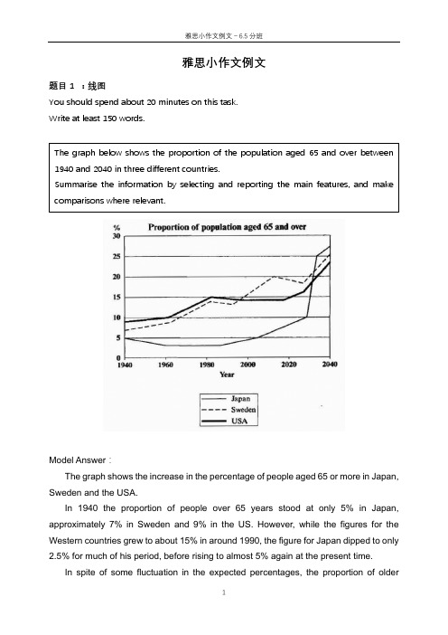
雅思小作文例文题目1 :线图You should spend about 20 minutes on this task.Write at least 150 words.Model Answer :The graph shows the increase in the percentage of people aged 65 or more in Japan, Sweden and the USA.In 1940 the proportion of people over 65 years stood at only 5% in Japan, approximately 7% in Sweden and 9% in the US. However, while the figures for the Western countries grew to about 15% in around 1990, the figure for Japan dipped to only2.5% for much of his period, before rising to almost 5% again at the present time.In spite of some fluctuation in the expected percentages, the proportion ofolder The graph below shows the proportion of the population aged 65 and over between 1940 and 2040 in three different countries.Summarise the information by selecting and reporting the main features, and make comparisons where relevant.people will probably continue to increase in the next two decades in the three countries.A more dramatic rise is predicted between 2030 and 2040 in Japan, by which time it is thought that the proportion of elderly people will besimilar in the three countries.Overall, it indicates that the percentage of elderly people in all three countries is expected to increase to almost 25% of the respective populations by the year 2040.题目2: 饼图The charts below give information about the ages of the populations of Yemen and Italy in 2000 and projections for 2050.Summarise the information by selecting and reporting the main features, and make comparisons where relevant.The pie charts below show the percentages of different age groups in Italy and Yemen in 2000 and its prediction for 2050. The age groups can be divided into 0-14 years, 15-59 years and 60+years.In 2000, the population aged under 14 accounted for the largest proportion of the overall population in Yemen, at 50.1%. This figure is expected to drop to 37% in 2050. Yemen is expected to see a slight increase in the proportion of people over 60 years from 3.6% to 5.7% in 2050, despite the fact that this age group will still represent the smallest section of the population. There will also be an increase in the percentage of the 15-59 age group from 46.3% to 57.3%.In contrast, most of the population in Italy was between 15-19 in 2000, at 61.6%. This figure is expected to drop to 46.2% in 2050. Those aged under 14 are projected to dip from 14.3% to 11.5%, representing the least proportion of the total population in both years. While the percentage of people aged over 60 will almost double to 42.3% in 2050.Overall, the projection is that the populations of both countries will become older. Italy had an older population than Yemen in the year 2000, and the same is predicted in 2050.题目3 柱状图The charts below give information about the ages of the populations of Yemen and Italy in 2000 and projections for 2050.Summarise the information by selecting and reporting the main features, and make comparisons where relevant.The bar charts given show the amount of marriages and divorces every ten yearsfrom 1970 to 2000 as well as the specific information about the percentages of different marital status in the U.S. in 1970 and 2000.The first chart gives statistic information on marriages and divorces each decade between 1970 and 2000. The number of marriages remained higher than that of divorces throughout this period. There were 2.5 million marriages in both 1970 and 1980, higher than the rest two years. The figure then continued to decrease to around 2.3 million in 1990 and 2 million in 2000. In contrast, there were 1 million divorces in 1970, representing the lowest point between 1970 and 2000. The number increased to almost 1.5 million in 1980 before it dropped all the way down to 1 million in 2000.The second chart compares the proportion of adult Americans in 4 different marital status: never married, married, widowed and divorced. In 1970, the most common marital status of adult Americans was married, which took up the largest proportion at 70%. In contrast, the percentage of people in the rest three marital status remained much lower. Despite a slight decrease occurred in the percentage of the widowed, both figures for the divorced and never married saw moderate increases of less than 10 percentage point.Overall, with years, the marriage rate of adult Americans decreased while the opposite trend was apparent in the divorce rate.题目4 表格1The table below shows the changes in the average distance measured in milestravelled by different modes of transport per person per year in 1985 and 2000 in England. Overall, the distance travelled in all modes of transportation significantly increased from 4740 miles in 1985 to 6475 miles in 2000. Car travelled the longest distance for everyone in both 1985 and 2000, increasing from 3199 miles to 4899 miles. Taxi, the least popular mode of transportation in 1985, only travelled for 13 miles and this figure slightly increased to 42 in 2000. The amount of the travelling distance of long distance bus doubled from 1985 (54 miles) to 2000 (124 miles). However, the figure for local bus in 2000 was almost half of the figure for 1985. The other ways of transport including bicycle, train and walking barely changed in these two years in terms of travelling distance.In summary, the modes of transport which allow the travelling for relatively long distance such as car, long distance bus and train remained popular in both these two years.The table below gives information about changes in modes of travel in England between 1985 and 2000.Average distance in milestravelled per person peryear, by mode of travel题目5 表格2The table below gives information about the underground railway system in six cities.Summarise the information by selecting and reporting the main features and make comparisons where relevant.The table presents statistic information about six countries’ underground systems regarding the time of opening, the length of route measured in kilometres and the yearly number of passengers measured in millions.London has the oldest underground railway system among the six cities, which was opened in 1863 while the railway system in Los Angeles is the newest, opened in the year 2001. For the rest four cities, that is, Paris, Tokyo, Washington DC and Kyoto, the opening dates were all in the 20th century.Next, in terms of the length of route measured in kilometres, the underground system in London is the longest at 394, almost double the size of the second largest one located in Paris, while the figure for Kyoto is the smallest at 11, followed by Los Angeles at 28.Lastly, when it comes to the yearly amount of passengers travelled by the underground system in these six cities, Tokyo has the largest number of passengers at 1927 million followed by Paris at 1191 million. On the contrary, the numbers for Kyoto and Los Angeles are the smallest at 45 million and 50 million respectively.Overall, the underground systems in different cities vary a lot regarding the opening date, the size and the number of passengers. Tokyo and Paris use it as the main mode of transport while in Kyoto and Los Angeles the metro system was less popular.雅思小作文例文-信息图表1.流程图The diagrams below show the life cycle of the silkworm and the stages in the production of silk cloth.Summarise the information by selecting and reporting the main features, and make comparisons where relevant.The flow chart illustrates the life cycle of the silkworm and the making process of silk cloth.In the first stage, a moth lays eggs and it takes 10 days for eggs to grow into larva which feeds on mulberry leaves. This stage lasts for 4-6 weeks until the larva produces silk thread. 3-8 days later, a number of cocoons are produced. 16 days later, the adult moths emerge from these cocoons, where a new cycle begins.The cocoons are the raw material used for the production of silk cloth. Once selected, they are boiled in water and the threads can be separated in the unwinding stage. Each thread is between 300 and 900 metres long, which means they can either be twisted together, dyed and then directly used to produce cloth in the weaving stage, or the threads can first go through the steps of twisting and weaving before the dyeing procedure.Overall, the diagrams show that the cocoon stage of the silkworm can be used to produce silk cloth through a very simple process.2.地图The two maps illustrate how the island has changed before and after the construction of some tourist equipment.Looking first at the map before construction, we can see a huge island with a beach in the west. The island was almost bare despite a few trees in the western and eastern area.Looking at the maps in more detail, we can see that small huts have been built to accommodate visitors to the island. The other physical structures that have been added are a reception building, in the middle of the island, and a restaurant to the north of the reception. As well as the buildings mentioned above, the new facilities on the island include a pier, where boats can dock. There has also been a vehicle track linking the pier with the reception and restaurant, and some footpaths connecting the huts. Finally, a swimming area has been designated for tourists on the western tip of the island.Overall, the island has become more tourism focused after the construction of some tourist facilities.。
2020雅思小作文考官范文(线形图题型)
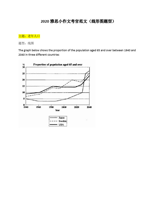
2020雅思小作文考官范文(线形图题型)主题:老年人口题型:线图The graph below shows the proportion of the population aged 65 and over between 1940 and 2040 in three different countries满分范文:The line graph compares the percentage of people aged 65 or more in three countries over a period of 100 years.It is clear that the proportion of elderly people increases in each country between 1940 and 2040. Japan is expected to see the most dramatic changes in its elderly population.In 1940, around 9% of Americans were aged 65 or over, compared to about 7% of Swedish people and 5% of Japanese people. The proportions of elderly people in the USA and Sweden rose gradually over the next 50 years, reaching just under 15% in 1990. By contrast, the figures for Japan remained below 5% until the early 2000s.Looking into the future, a sudden increase in the percentage of elderly people is predicted for Japan, with a jump of over 15% in just 10 years from 2030 to 2040. By 2040, it is thought that around 27% of the Japanese population will be 65 years old or more, while the figures for Sweden and the USA will be slightly lower, at about 25% and 23% respectively.主题:手机变迁题型:线图The line graph shows the average annual expenditures on cell phone and residential phone services between 2001 and 2010.范文:The line graph compares average yearly spending by Americans on mobile and landline phone services from 2001 to 2010.It is clear that spending on landline phones fell steadily over the 10-year period, while mobile phone expenditure rose quickly. The year 2006 marks the point at which expenditure on mobile services overtook that for residential phone services.In 2001, US consumers spent an average of nearly $700 on residential phone services, compared to only around $200 on cell phone services. Over the following five years, average yearly spending on landlines dropped by nearly $200. By contrast, expenditure on mobiles rose by approximately $300.In the year 2006, the average American paid out the same amount of money on both types of phone service, spending just over $500 on each. By 2010, expenditure on mobile phones had reached around $750, while the figure for spending on residential services had fallen to just over half this amount.主题:网络使用题型:线图The line graph below shows internet usage in different countries.范文:The line graph compares the percentage of people in three countries who used the Internet between 1999 and 2009.It is clear that the proportion of the population who used the Internet increased in each country over the period shown. Overall, a much larger percentage of Canadians and Americans had access to the Internet in comparison with Mexicans, and Canada experienced the fastest growth in Internet usage.In 1999, the proportion of people using the Internet in the USA was about 20%. The figures for Canada and Mexico were lower, at about 10% and 5% respectively. In 2005, Internet usage in both the USA and Canada rose to around 70% of the population, while the figure for Mexico reached just over 25%.By 2009, the percentage of Internet users was highest in Canada. Almost 100% of Canadians used the Internet, compared to about 80% of Americans and only 40% of Mexicans.。