图表式作文
英语四级图表类作文万能模板【优秀3篇】
英语四级图表类作文万能模板【优秀3篇】(经典版)编制人:__________________审核人:__________________审批人:__________________编制单位:__________________编制时间:____年____月____日序言下载提示:该文档是本店铺精心编制而成的,希望大家下载后,能够帮助大家解决实际问题。
文档下载后可定制修改,请根据实际需要进行调整和使用,谢谢!并且,本店铺为大家提供各种类型的经典范文,如总结报告、合同协议、规章制度、条据文书、策划方案、心得体会、演讲致辞、教学资料、作文大全、其他范文等等,想了解不同范文格式和写法,敬请关注!Download tips: This document is carefully compiled by this editor. I hope that after you download it, it can help you solve practical problems. The document can be customized and modified after downloading, please adjust and use it according to actual needs, thank you!Moreover, our store provides various types of classic sample essays, such as summary reports, contract agreements, rules and regulations, doctrinal documents, planning plans, insights, speeches, teaching materials, complete essays, and other sample essays. If you want to learn about different sample formats and writing methods, please pay attention!英语四级图表类作文万能模板【优秀3篇】英语四级考试中作文是拉分差距较大的题型,如何让自己的作文更出彩?除了考前多练笔,根据模板进行仿写也是非常实用的方法,下面是本店铺整理的英语四级图表类作文万能模板【优秀3篇】,在大家参照的同时,也可以分享一下本店铺给您最好的朋友。
图表型英语作文模板
图表型英语作文模板篇一:英语作文图表类提纲类作文写作模板第一部分、写作模板——图表式作文It is obvious in the graphic/table that the rate/number/amount of Y has undergone dramatic changes. It has gone up/grown/fallen/dropped considerably in recent years (as X varies). At the point of X1, Y reaches its peak of …(多少).What is the reason for this change? Mainly there are …(多少) reasons behind the situation reflected in the graphic/table. First of all, …(第一个原因). More importantly, …(第二个原因). Most important of all, …(第三个原因).From the above discussions, we have enough reason to predict what will happen in the near future. The trend described in the graphic/table will continue for quite a long time (if necessary measures are not taken括号里的使用于那些不太好的变化趋势).第二部分、写作模板——提纲式作文一、说明原因型模块(一)Nowadays , there are more and more XX in some big cities . It is estimated that ( 1 ). Why have there been so many XX ? Maybe thereasons can be listed as follows.The first one is that ( 2 ) .Besides, ( 3 ) . The third reason is ( 4 ). To sum up , the main cause of XX is due to ( 5 ) .It is high time that something were done upon it. For one thing , ( 6 ). On the other hand , ( 7 ). All these measures will certainly reduce the number of XX .注释:(1)用具体数据说明XX现象;(2)原因一;(3)原因二;(4)原因三(5)指出主要原因;(6)解决建议一;(7)解决建议二。
六级图表类作文范文
六级图表类作文范文
范文:
第一段,图表揭秘。
一看这图表,就知道近几年那城市居民出行方式可变了不少。
私家车越来越多,公共交通和走路的人越来越少。
第二段,私家车火爆。
说起私家车,那可真是火得一塌糊涂。
从2018年到2023年,
私家车的使用率从30%一路飙升到快50%了。
这背后啊,肯定是大家
生活好了,都想开车方便点。
第三段,公共交通遇冷。
可另一边呢,公共交通就没那么受欢迎了。
图表显示,用公共
交通的人越来越少,可能和私家车多了、公交服务没跟上都有关系。
第四段,步行渐少。
再来说说步行。
以前大家都爱走路,现在可不一样了。
城市的节奏越来越快,大家都想快点到达目的地,所以走路的人就少了。
第五段,环境与健康小忧。
这出行方式一变,环境和健康也跟着受影响。
私家车多了,空气和噪音污染都加重了;走路的人少了,大家运动也少了,健康自然就受影响了。
第六段,未来咋办。
那未来怎么办呢?城市管理者可得好好想想了。
高考备考写作专题:图表分析作文

高考备考写作专题:图表分析作文第一篇:全球二氧化碳排放量变化趋势随着工业化和现代化的发展,全球二氧化碳排放量不断增加,给地球的生态环境带来了巨大挑战。
下面是一幅描述全球二氧化碳排放量变化趋势的图表。
从图表中可以看出,自20世纪50年代开始,全球二氧化碳排放量呈现出逐年增加的趋势。
在20世纪70年代到80年代之间,排放量增速开始明显加快,到了90年代更是达到了高峰。
然而,在近几年,尽管二氧化碳排放量仍然在增加,但增速明显放缓。
造成全球二氧化碳排放量增加的原因有很多,但主要是工业生产、能源消耗和交通运输等活动所引起的。
这些活动大量使用化石燃料,例如煤炭、石油和天然气,导致了大量的二氧化碳释放到大气中。
全球二氧化碳排放量的增加给地球的生态环境带来了诸多问题。
首先,大量的二氧化碳排放导致大气中温室气体浓度升高,进而造成气候变化,例如全球气温上升、极端天气事件增多等。
其次,二氧化碳还会导致海洋酸化,对海洋生物造成威胁。
此外,由于空气污染加剧,人们的健康也受到了威胁。
为了应对全球二氧化碳排放量增加的问题,各国政府和国际组织已经采取了一系列的措施,例如限制工业排放、推广清洁能源和绿色交通等。
但要真正解决二氧化碳排放问题,还需要全球各方共同努力,包括改变生活方式、提高环保意识等。
第二篇:中国城市人口增长随着城市化进程的不断推进,中国城市人口呈现出快速增长的趋势。
下面是一幅描述中国城市人口增长的图表。
从图表中可以看出,1990年以前,中国城市人口增长较为缓慢,但之后迅速加快。
尤其是在2000年以后,城市人口增长速度急剧提升。
目前,中国的城市化率已经超过了50%。
城市人口增长的原因有很多,主要是农村人口向城市转移和城市自然增长导致的。
一方面,农村居民为了追求更好的生活条件和就业机会,纷纷涌向城市。
另一方面,由于医疗水平的提高和生活条件的改善,城市人口的自然增长也较快。
城市人口增长给中国带来了很多挑战。
首先,城市人口的快速增加导致了城市基础设施和公共服务压力的加大。
雅思英语图表作文范文(必备3篇)

雅思英语图表作文范文第1篇A类雅思各类图表作文要点及范文一.曲线图解题关键1曲线图和柱状图都是动态图,解题的切入点在于描述趋势。
2在第二段的开头部分对整个曲线进行一个阶段式的总分类,使写作层次清晰,同时也方便考官阅卷。
接下来再分类描述每个阶段的specifictrend,同时导入数据作为分类的依据。
3趋势说明。
即,对曲线的连续变化进行说明,如上升、下降、波动、持平。
以时间为比较基础的应抓住“变化”:上升、下降、或是波动。
题中对两个或两个以上的变量进行描述时应在此基础上进行比较,如变量多于两个应进行分类或有侧重的比较。
4极点说明。
即对图表中最高的、最低的点单独进行说明。
不以时间为比较基础的应注意对极点的描述。
5交点说明。
即对图表当中多根曲线的交点进行对比说明。
6不要不做任何说明就机械地导入数据,这不符合雅思的考试目的。
曲线图常用词汇动词—九大运动趋势一:表示向上:increase,rise,improve,grow,ascend,mount,aggrandize,goup,climb, take off, jump,shoot up暴涨,soar,rocket, skyrocket雅思英语图表作文范文第2篇It is said that countries are becoming similar to each other because of the global spread of the same products, which are now available for purchase almost anywhere. I strongly believe that this modern development is largely detrimental to culture and traditions worldwide.A country’s history, language and ethos are all inextricably bound up in its manufactured artefacts. If the relentless advance of international brands into every corner of the world continues, these bland packages might one day completely oust the traditional objects of a nation, which would be a loss of richness and diversity in the world, as well as the sad disappearance of t he manifestations of a place’s character. What would a Japanese tea ceremony be without its specially crafted teapot, or a Fijian kava ritual without its bowl made from a certain type of tree bark?Let us not forget either that traditional products, whether these be medicines, cosmetics, toy, clothes, utensils or food, provide employment for local people. The spread of multinational products can often bring in its wake a loss of jobs, as people urn to buying the new brand,perhaps thinking it more glamorous than the one they are used to. This eventually puts old-school craftspeople out of work.Finally, tourism numbers may also be affected, as travelers become disillusioned with finding every place just the same as the one they visited previously. To see the same products in shops the world over is boring, and does not impel visitors to open their wallets in the same way that trinkets or souvenirs unique to the particular area too.Some may argue that all people are entitled to have access to the same products, but I say that local objects suit local conditions best, and that faceless uniformity worldwide is an unwelcome and dreary prospect.Heres my full answer:The line graphs show the average monthly amount that parents in Britain spent on their children’s s porting activities and the number of British children who took part in three different sports from 2008 to is clear that parents spent more money each year on their children’s participation in sports over the six-year period. In terms of the number of children taking part, football was significantly more popular than athletics and 2008, British parents spent an average of around £20 per month on their children’s sporting activities. Parents’ spending on children’s sports increased gradually over the followi ng six years, and by 2014 the average monthly amount had risen to just over £ at participation numbers, in 2008 approximately 8 million British children played football, while only 2 million children were enrolled in swimming clubs and less than 1 million practised athletics. The figures for football participation remained relatively stable over the following 6 years. By contrast, participation in swimming almost doubled, to nearly 4 million children, and there was a near fivefold increase in the number of children doing athletics.剑桥雅思6test1大作文范文,剑桥雅思6test1大作文task2高分范文+真题答案实感。
英语图表作文模板及精选4篇

英语图表作文模板及精选4篇(经典版)编制人:__________________审核人:__________________审批人:__________________编制单位:__________________编制时间:____年____月____日序言下载提示:该文档是本店铺精心编制而成的,希望大家下载后,能够帮助大家解决实际问题。
文档下载后可定制修改,请根据实际需要进行调整和使用,谢谢!并且,本店铺为大家提供各种类型的经典范文,如总结报告、合同协议、规章制度、条据文书、策划方案、心得体会、演讲致辞、教学资料、作文大全、其他范文等等,想了解不同范文格式和写法,敬请关注!Download tips: This document is carefully compiled by this editor. I hope that after you download it, it can help you solve practical problems. The document can be customized and modified after downloading, please adjust and use it according to actual needs, thank you!Moreover, our store provides various types of classic sample essays, such as summary reports, contract agreements, rules and regulations, doctrinal documents, planning plans, insights, speeches, teaching materials, complete essays, and other sample essays. If you want to learn about different sample formats and writing methods, please pay attention!英语图表作文模板及精选4篇学而不思则罔,思而不学则殆,以下是本店铺给大伙儿收集整理的英语图表作文模板及精选4篇,欢迎参考。
雅思小作文之图表作文
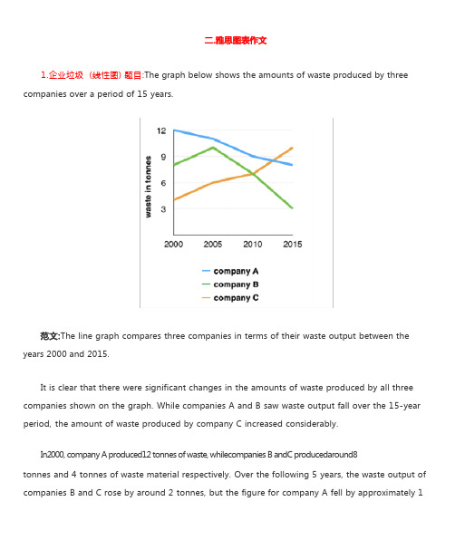
1.企业垃圾 (线性图) 题目:The graph below shows the amounts of waste produced by three companies over a period of 15 years.years 2000 and 2015.It is clear that there were significant changes in the amounts of waste produced by all three companies shown on the graph. While companies A and B saw waste output fall over the 15-year period, the amount of waste produced by company C increased considerably.In2000, company A produced12 tonnes of waste, whilecompanies B andC producedaround8tonnes and 4 tonnes of waste material respectively. Over the following 5 years, the waste output of companies B and C rose by around 2 tonnes, but the figure for company A fell by approximately 1tonne.From 2005 to 2015, company A cut waste production by roughly 3 tonnes, and company B reduced its waste by around 7 tonnes. By contrast, company C saw anincrease inwaste productionof approximately 4 tonnes over the same 10- year period. By 2015, company C’swaste output hadrisento10tonnes, while the respective amounts of waste fromcompanies A andB haddroppedto8 tonnes and only 3 tonnes.(192 words, band 9)这条线图对三家公司的废物产出从 2000 年到 2015 年进行了比较。
高考英语图表作文模板和范例
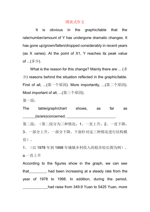
图表式作文It is obvious in the graphic/table that the rate/number/amount of Y has undergone dramatic changes. It has gone up/grown/fallen/dropped considerably in recent years (as X varies). At the point of X1, Y reaches its peak value of ...(多少).What is the reason for this change? Mainly there are ... (多少) reasons behind the situation reflected in the graphic/table. First of all, ...(第一个原因). More importantly, ...(第二个原因). Most important of all, ...(第三个原因).第一段:The table/graph/chart shows, as far as ______(is/are)concerned, _______________________.第二段:(第二段分为三种情况:1、一直上升;2、一直下降;3、一部分上升,一部分下降。
下面针对这三种情况进行结构模仿)。
1、(以1978年到1998年城镇乡村收入的稳步较长图为例)。
a.一直上升According to the figures show in the graph, we can see that________, had been increasing at a steady rate from the year of 1978 to 1998. In addition, during the period, ____________had raise from 349.9 Yuan to 5425 Yuan, morethan 5 times .Meanwhile, _______had also grown from 133.6 Yuan to 2100 Yuan.b. 一直下降According to the figures show in the graph, we can see that___________, had been decreasing at e steady rate from the year of 1978 to 1998. In addition, during the periond,____________had reduced from 349.9 Yuan to 5425 Yuan, more than 5 times .Meanwhile ,_______had also gone down 133.6 Yuan to 2100 Yuan.2、[以从1995年到1999年西安人的日常生活支出(食物、服装和娱乐)的变化为例]c. 一部分上升,一部分下降:According to the figures in the graph, we can see that__________had been increasing by 9% and 7%, respectively from the year of 1995 to1999. However,___________(the expenses on food)had been decline by30% ,during the same period. The statistics of rise and fall seem to exist in isolation but closely to one another. 第三段:There are several reasons for that phenomenon. On the hand, _____;On the other hand,_________,___________.注:横线部分为自己需填充的内容,这只是整篇文章的格式,红色横线部分视考题而定,可填充的内容经济类/发展类/旅游类/文化交流类:1. The policy of reformation and opening spreader widely in China should be taken into account firstly, when considering the reason for the steady increase of the citizen's income.2. The people of China has the spirit of working hard in order to improve their living.3. China's rapid economic development lays the base.4. In the past twenty five years, remarkable changes have taken place in China's tourism rank in the world.5. The economy of China has developed so fast in twenty years that China now becomes more and more important in the world.6. I'm confident that with the development of China the numbers of visitors and the foreign exchange earrings will certainly continues to increase in the future.7. With the rapid development of technology and the global economy ,the world is becoming international, cultural exchanges are becoming more and more frequent ,which is inevitably improving our mutual understanding and friendship with other countries.食品类:1、In order to live a healthy long life, we have to restrict our calorie intake eating the food with less fat.2、We should make our diet more nutritional and balance the calorie intake to enjoy a healthy life.3、To improve the bad situation, people should eat calcium-enriched food, such as fish,milk,beancurd and so on . 娱乐类/体育类:如看书/看电视1、We should make a balance between them to benefit themselves.2、The age in which we live now is an information one.3、People should go to the gym and take part in some sports, such as basketball, volleyball, swimming and so .All the exercise help people keep healthy.友谊类/文化交流类:1、People all over the world love and respect each other. The best way to show our love is to help others when they are in difficulties.2、Everyone should be encouraged required to try to be self-reliant.3、When one in trouble, others should help him.PS:经典句子:1、Scientists have warned that unless effective measures are taken, the problem of pollution will eventually get out of hand.2、For citizens ,they are supposed to conform to rules and regulations of the traffic.3、And the government should educate people in this respect ,which will draw people's attention of the serious problem.4、For drivers their speed should be restricted . Otherwise, they should be punished severely.5、It is time the anchorites concerned took proper steps the traffic problem.6、As long as each of us takes actions. I deeply believe the problem will be well resolved to an extend作文中可用的谚语或句子:As a saying goes:俗话说1、A good beginning is half done. 良好的开端是成功的一半。
- 1、下载文档前请自行甄别文档内容的完整性,平台不提供额外的编辑、内容补充、找答案等附加服务。
- 2、"仅部分预览"的文档,不可在线预览部分如存在完整性等问题,可反馈申请退款(可完整预览的文档不适用该条件!)。
- 3、如文档侵犯您的权益,请联系客服反馈,我们会尽快为您处理(人工客服工作时间:9:00-18:30)。
图表式作文图表式作文是四级考试中较难的一种作文类型。
它要求考生根据图表所给出的信息,写出所要表达主题的作文。
图表式作文最大的特点是所给的信息表达很集中,给人以一目了然之感。
四级的图表式作文提示部分包括图表和文字要点提示两部分。
图表的类型主要有:饼型图和直型图(graph)、曲线图(chart)和数据统计表(table)。
图表式作文的写作内容包括综合理解、客观详述和主观表达,一般可分为三部分来写:一,描述图表反映的总情况,用能充分说明主题的典型数据来描写。
二,对数字进行仔细的分析比较,归纳出增减速率并找出产生变化的原因。
三,读图表后的想法或评论,并得出自己的结论。
I. 具体的写作步骤如下:第一步,描述信息。
一,理解并描述整体信息首先,读懂图表标题,包括附标题所提供的信息。
准确了解主题内容,观察趋向和结果,找出变化的规律。
然后,用一两句话,就图表所反映的主题、事物发展的趋向和结果以及所反映出的深层问题等方面做出概括性的评论(一般不包括数字)。
二,描述具体信息为了证明已概括的整体信息,需要从不同角度,对图表列出的数据进行描述。
在说明数据变化时,既要说明结果,也要表明趋势。
对于趋势的描述,至少需引用一组数据变化的例子,有时还需要再举出一组数据与之作比较。
顺着这样的思路写下来,文章不仅内容丰富,而且脉络清晰。
注意:在分析图表时,不必对图表中出现的每个数字纠缠不清,应该关注的是图表中体现的总的情况,要删繁就简,抓住关键数据做文章。
比如,曲线的突然变化,百分比的增加或减少。
第二步,阐述原因用一句话把文章从信息的描述过渡到产生这些现象的原因,然后详细分析原因。
这一部分与同学们熟悉的议论文写法一致,在此不再过多叙述。
第三步,表达个人观点用一句话再次归纳图表内容,与第一段相互照应。
之后根据具体情况来表述观点:如果这篇文章讲的是一个令人担忧的问题,那么谈论一下可能的解决办法;如果这篇文章讲的是一个好的变化,那么这一段很可能是两种情况——可能写负面的影响或存在的问题(这就很象利弊类的文章了),或者写未来趋势或发展方向。
写未来趋势或发展方向时,不宜写得过多或过长,通常一两句话即可。
上述情况都是依提纲而定,提纲中如果没有第三点,那么是问题写办法,是好事写展望,均不宜长。
在表达个人观点时,同学们大可不必为了得出一个正确的观点煞费苦心地思考和描述。
要知道,此作文的目的是考察考生使用英语表达思想的流利程度和明晰程度,而不是市长问卷,让考生为解决某个问题出谋划策(当然解决问题的思路和能力是我们学习的重要目的)。
因此,在写作过程中,要有选择地进行表达。
避开艰涩的或有中国式英语嫌疑的词和词组。
图表式作文常用语:一,常用的引导性套语:As is shown in the above chart ...As can be seen from the graph above...From the graph,we can conclude...Taking a closer look at the figures ,we will find ...二,描述信息时,常用的词和短语:rise ,fall ;rate;vary with ;vary from ...to;increase by...%;drop by...%;the previous rate;steep rise of;steady decrease;decline;thelatest statistic show ;getting steadily smaller ;a shift away from ...to;figure indicate...II. 图表式作文模板:一,图表式带数字描述的作文。
It is obvious in the graph/table that the rate/number/amount Y has undergone dramatic changes.It has gone up/grown/fallen/dropped considerably in recent years ( as X varies ). At the point of X1,Y reaches its peak value of (多少).What is the reason for this change? Mainly there are (多少)reasons behind the situation reflected in the graph/table. First of all ,(原因一). More importantly ,(原因二). Most important of all ,(原因三).From the above discussions, we have enough reason to predict what will happen in the near future. The trend described in the graph/table will continue for quite a long time ( if necessary measures are not taken该句用于不太好的变化趋势)….二,图表式带数字比较的作文。
As is described in the chart,(图表的总述).The figures indicate that (趋势1), and (趋势2)。
There are at least three good reasons for(图表总述的另一种表达).In the first place, it is generally assumed that (理由一). Secondly, with the open and reform policy being carried out,(某个短语)has a great in flue nee on (原因).Last but not least, today an in creas ing number of people are realizing that(某个原因的重要性).Maybe there are some other reasons to show (图表总述的第三种表达),but it is gen erally believed that the above men ti oned reasons are commonly acceptable.From this point of view, it goes without saying that(措施). We are looking forward to a much better and brighter future.三,图表式作文带数字比较、并希望提出建议的作文。
As is depicted in the table,(图表的总述).For one thi ng,(趋势一).For ano ther,(趋势2). It is interesting to note that(趋势三).My suggestions to tackle the problem are as follows. First of all, with the rapid development of science and technology, an increasing number of people come to realize that(意见一),this is because (原因).Secondly,(意见二).Therefore, we should attach great significanee to solving the problem.As far as I'm concerned, it is high time that (某个组织或人)must make intensive efforts to (采取什么行动).Although we still have a long way to go, I am sure that tomorrow will be much better and brighter.III. 范文一. Chan ges in People's DietDirections: For this part, you are allowed 30 minutes to write a composition of no less than 100 words on Chan ges in People 'Diet. Study the followi ng table carefully and your compositi on must be based on the in formati on in the table. Write three paragraphs to:(1) state the cha nges in people's diet in the past five years;(2) give possible reas ons for the cha nges;(3) draw your own con clusi ons.You should quote as few figures as possible.Changes in People 'Diet1.From the chart we can see that duri ng the past five years there have bee n great cha nges in people ' diet. The greatest cha nge occurs in grain con sumpti on, which has dropped 4% from 49% in 1986 to 45% in 1990 in total food consumption. The second greatest change is in milk consumption, which in creased from 10% in 1986 to 13% in 1990. But on the other hand, two trends can be observed in the con sumpti on of meat and fruit and vegetables. From 1986 to 1989, meat con sumpti on in creased from 17% to 23% while that of fruit and vegetables dropped from 24% to 20%. From 1989 to 1990, meat con sumpti on dropped a little to 21%, while that of fruit and vegetables in creased a little to 21%.What has caused the great changes in people' diet? The main reason , I think, lies in the improvement in people 'sincome level. With the development of our society, people are becoming richer and richer, which enables them to purchase more nutritious food such as meat and milk. In the mean time, grain con sumptio n in people 'diet con seque ntly dropped.So from the analysis, we can draw a conclusion that our society is progressing and people are living a better life than ever before. We are now able to purchase more delicious and nutritious food, result ing in an improveme nt in our health.2.Studying the table of people' diet in the past five years, we can see that while the daily components of diet are the same, the proportion of each component is changing. Grain in 1986 made up almost half of people 'diet, but in 1989 and 1990 its percentage decrease to 45%. In contrast, the percentages of milk and meat were on the rise until 1990. as for fruit and vegetables, their percentage had been dropping until 1990, when its consumption saw a slight rise again.The possible reasons for the changes may go like this: with the development of the country ' economy, people" life is getting better and better. In the past, the main purpose of diet is to keep people from being hun gry. What concerned people most was the qua ntity of food, not its quality. So grain constituted a larger portion of their diet. Now people 'attention is not focused on the quantity, for food is abundant and most people can get all the food they want. So their in terest has switched to the quality. As milk and meat have higher prote in content and fruit and vegetables are vitam in rich, people begi n to con sume them more and more.What we can conclude from the figures is that people ' lives are improving every year. What ' more, we see a bala ncing out in their diet. Although people have more money now, they have chose n a healthier diet with less meat and more fruit and vegetables.二.Stude nt Use of ComputersDirections: For this part, you are allowed thirty minu tes to write a compositi on on the topic Stude nt Use of Computers. You should write at least 120 words, and base your compositi on on the chart and the outl ine give n below:hours/weekAverage nu mber of hours a stude nt spe nds on the computer per week1) .上图所示为1990年、1995年、2000年某校大学生使用计算机的情况,请描述其变化;2) .请说明发生这些变化的原因(可从计算机的用途、价格或社会发展等方面加以说明) ;3) .你认为目前大学生在计算机使用中有什么困难或问题。