雅思写作图表题
雅思作文图表题范文(热门3篇)

雅思作文图表题范文第1篇It is said that countries are becoming similar to each other because of the global spread of the same products, which are now available for purchase almost anywhere. I strongly believe that this modern development is largely detrimental to culture and traditions worldwide.A country’s history, language and ethos are all inextricably bound up in its manufactured artefacts. If the relentless advance of international brands into every corner of the world continues, these bland packages might one day completely oust the traditional objects of a nation, which would be a loss of richness and diversity in the world, as well as the sad disappearance of the manifestations of a place’s character. What would a Japanese tea ceremony be without its specially crafted teapot, or a Fijian kava ritual without its bowl made from a certain type of tree bark?Let us not forget either that traditional products, whether these be medicines, cosmetics, toy, clothes, utensils or food, provide employment for local people. The spread of multinational products can often bring in its wake a loss of jobs, as people urn to buying the new brand, perhaps thinking it more glamorous than the one they are used to. This eventually puts old-school craftspeople out of work.Finally, tourism numbers may also be affected, as travelers become disillusioned with finding every place just the same as the one they visited previously. To see the same products in shops the world over is boring, and does not impel visitors to open their wallets in the same way that trinkets or souvenirs unique to the particular area too.Some may argue that all people are entitled to have access to the same products, but I say that local objects suit local conditions best, and that faceless uniformity worldwide is an unwelcome and dreary prospect.Heres my full answer:The line graphs show the average monthly amount that parents in Britain spent on their children’s sporting activities and the number of British children who took part in three different sports from 2008 to is clear that parents spent more money each year on their children’s participation in sports over the six-year period. In terms of the number of children taking part, football was significantly more popular than athletics and 2008, British parents spent an average of around £20 per month on their children’s sporting activities. Parents’ spending on children’s sports increased gradually over the following six years, and by 2014 the average monthly amount had risen to just over £ at participation numbers, in 2008 approximately 8 million British children played football, while only 2 million children were enrolled in swimming clubs and less than 1 million practised athletics. The figures for football participation remained relatively stable over the following 6 years. By contrast, participation in swimming almost doubled, to nearly 4 million children, and there was a near fivefold increase in the number of children doing athletics.剑桥雅思6test1大作文范文,剑桥雅思6test1大作文task2高分范文+真题答案实感。
雅思图表题作文套用模板大全
雅思图表作文模板句Para1. This is a table / chart / (line线状bar柱状pie饼状)graph which demonstrate / illustrate / reveal /depict /privide information about............. Para2. (1)Obvious /Apparent from the graph is that ...rank the first/highest,while/whereas ....turn out to be the lowest(2)It is exhibited/shown in the table that.....(3)It can be seen from the table that.....Para3.(1)饼.柱图A,which accounts for...%,ranks the first;then next is B with...%;followed by C,constituting...%;finally it comes D.E.F at...%...%and...%respectively(2)特殊变化(不变,增长或下降多的)①It is worth mentioning that....②It must be pointed out that....③More striking/suprising is that....Para4.To conclude /In conclusion/overallPara5. this is a graph which illustrates...这个图表向我们展示了...Para6 .this table shows the changing proportion of a &b from...to...该表格描述了...年到...年间a与b的比例关系。
2023年 雅思 10月 写作题目

2023年10月雅思写作题目
一、Task 1(小作文)
1.图表题:柱状图,对比了四种不同的手机在不同年份的销量。
柱状图通常
用于表示数据,因此考生需要描述和比较不同手机在不同年份的销量。
2.地图题:地图题描述了一个城市在某个时间点的样子,包括商业区、住宅
区、公园等。
地图题要求考生描述城市布局,包括各种地标和功能区的位置。
3.流程图:流程图描述了一个产品的制造过程,从原材料到最终产品的每个
步骤。
流程图要求考生描述流程的顺序和每个步骤的内容。
4.表格题:表格题提供了一个国家在不同年份的旅游收入的数据。
表格题要
求考生提取和总结信息,分析趋势并提出原因。
二、Task 2(大作文)
1.社会类:人们花更多的时间在社交媒体上而不是与真实的人交往。
讨论社
交媒体对人际关系的积极和消极影响。
2.教育类:有人认为教育的目标是培养孩子们的兴趣和创造力,而有人认为
教育的目标是培养孩子们的职业技能。
讨论两种观点,并提出自己的看法。
3.科技类:随着科技的发展,人们可以在家里进行许多工作。
分析在家工作
的优点和缺点,并讨论它是否会成为未来的趋势。
4.环保类:政府应该采取措施鼓励人们减少肉类消费以减少环境污染。
讨论
这个建议的可行性,并给出其他减少环境的方法。
雅思写作之图表题答题技巧

雅思写作之图表题答题技巧
1.仔细审题
在开始写作之前,要认真阅读题目要求,明确图表的主题和要求,确保理解图表中的数据和信息。
2.确定图表类型
根据题目要求,确定图表类型,如柱状图、折线图、饼图等。
不同类型的图表有不同的写作要点和技巧,要熟悉每种类型的图表特点和写作方法。
3.概括图表主要特征
在描述图表之前,要概括图表的主要特征,如总体趋势、重要数据点等。
这有助于把握图表的整体情况,为后续的写作提供思路和方向。
4.描述图表细节
在描述图表时,要注意细节的描述,如数据的最大值、最小值、数据的波动情况等。
这些细节有助于让读者更好地理解图表中的数据和信息。
1
5.使用适当的图表语言
在描述图表时,要使用适当的图表语言,如“随着时间的推移”、“比例”、“增加”、“减少”等。
这些语言可以帮助读者更好地理解图表中的数据和趋势。
6.注意比较和对比
在描述图表时,要注意比较和对比不同数据点之间的关系和差异,这有助于突出数据的重点和特点。
7.总结和展望
在描述完图表后,可以总结图表中的信息和重点,并展望未来的趋势和发展。
这有助于让读者更好地理解图表的意义和价值。
以上是雅思写作图表题的答题技巧,考生可以在备考过程中多做练习,提高自己的图表分析和写作能力。
同时,也要注意积累词汇和表达方式,以便更好地应对不同类型的图表题目。
2。
雅思写作图表题共90页文档

雅思写作图表题
41、实际上,我们想要的不是针对犯 罪的法 律,而 是针对 疯狂的 法律。 ——马 克·吐温 42、法律的力量应当跟随着公民,就 像影子 跟随着 身体一 样。— —贝卡 利亚 43、法律和制度必须跟上律受制于情 理。— —托·富 勒
45、法律的制定是为了保证每一个人 自由发 挥自己 的才能 ,而不 是为了 束缚他 的才能 。—— 罗伯斯 庇尔
46、我们若已接受最坏的,就再没有什么损失。——卡耐基 47、书到用时方恨少、事非经过不知难。——陆游 48、书籍把我们引入最美好的社会,使我们认识各个时代的伟大智者。——史美尔斯 49、熟读唐诗三百首,不会作诗也会吟。——孙洙 50、谁和我一样用功,谁就会和我一样成功。——莫扎特
雅思图表作文真题范文
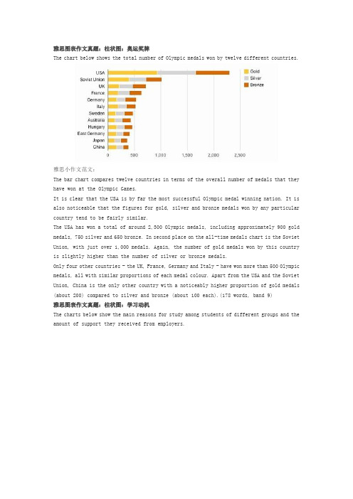
雅思图表作文真题:柱状图:奥运奖牌The chart below shows the total number of Olympic medals won by twelve different countries.雅思小作文范文:The bar chart compares twelve countries in terms of the overall number of medals that they have won at the Olympic Games.It is clear that the USA is by far the most successful Olympic medal winning nation. It is also noticeable that the figures for gold, silver and bronze medals won by any particular country tend to be fairly similar.The USA has won a total of around 2,300 Olympic medals, including approximately 900 gold medals, 750 silver and 650 bronze. In second place on the all-time medals chart is the Soviet Union, with just over 1,000 medals. Again, the number of gold medals won by this country is slightly higher than the number of silver or bronze medals.Only four other countries - the UK, France, Germany and Italy - have won more than 500 Olympic medals, all with similar proportions of each medal colour. Apart from the USA and the Soviet Union, China is the only other country with a noticeably higher proportion of gold medals (about 200) compared to silver and bronze (about 100 each).(178 words, band 9)雅思图表作文真题:柱状图:学习动机The charts below show the main reasons for study among students of different groups and the amount of support they received from employers.参考雅思小作文范文The bar charts compare students of different ages in terms of why they are studying and whether they are supported by an employer.It is clear that the proportion of students who study for career purposes is far higher among the younger age groups, while the oldest students are more likely to study for interest. Employer support is more commonly given to younger students.Around 80% of students aged under 26 study to further their careers, whereas only 10% study purely out of interest. The gap between these two proportions narrows as students get older, and the figures for those in their forties are the same, at about 40%. Students aged over 49 overwhelmingly study for interest (70%) rather than for professional reasons (less than 20%).Just over 60% of students aged under 26 are supported by their employers. By contrast, the 30-39 age group is the most self-sufficient, with only 30% being given time off and help with fees. The figures rise slightly for students in their forties and for those aged 50 or more.(178 words, band 9)雅思图表作文真题:柱状图:The chart below shows numbers of incidents and injuries per 100 million passenger miles travelled (PMT) by transportation type in 2002.雅思小作文范文The bar chart compares the number of incidents and injuries for every 100 million passenger miles travelled on five different types of public transport in 2002.It is clear that the most incidents and injuries took place on demand-response vehicles. By contrast, commuter rail services recorded by far the lowest figures.A total of 225 incidents and 173 injuries, per 100 million passenger miles travelled, took place on demand-response transport services. These figures were nearly three times as high as those for the second highest category, bus services. There were 76 incidents and 66 people were injured on buses.Rail services experienced fewer problems. The number of incidents on light rail trains equalled the figure recorded for buses, but there were significantly fewer injuries, at only 39. Heavy rail services saw lower numbers of such events than light rail services, but commuter rail passengers were even less likely to experience problems. In fact, only 20 incidents and 17 injuries occurred on commuter trains.(165 words, band 9)雅思图表作文真题:柱状图:各地房价The chart below shows information about changes in average house prices in five different cities between 1990 and 2002 compared with the average house prices in 1989.雅思小作文范文:The bar chart compares the cost of an average house in five major cities over a period of 13 years from 1989.We can see that house prices fell overall between 1990 and 1995, but most of the cities saw rising prices between 1996 and 2002. London experienced by far the greatest changes in house prices over the 13-year period.Over the 5 years after 1989, the cost of average homes in Tokyo and London dropped by around 7%, while New York house prices went down by 5%. By contrast, prices rose by approximately 2% in both Madrid and Frankfurt.Between 1996 and 2002, London house prices jumped to around 12% above the 1989 average. Homebuyers in New York also had to pay significantly more, with prices rising to 5% above the 1989 average, but homes in Tokyo remained cheaper than they were in 1989. The cost of an average home in Madrid rose by a further 2%, while prices in Frankfurt remained stable. (165 words)雅思图表作文真题:饼状图:垃圾处理The pie charts below show how dangerous waste products are dealt with in three countries.雅思小作文范文:The charts compare Korea, Sweden and the UK in terms of the methods used in each country to dispose of harmful waste.It is clear that in both the UK and Sweden, the majority of dangerous waste products are buried underground. By contrast, most hazardous materials in the Republic of Korea are recycled.Looking at the information in more detail, we can see that 82% of the UK’s dangerous waste is put into landfill sites. This disposal technique is used for 55% of the harmful waste in Sweden and only 22% of similar waste in Korea. The latter country recycles 69% of hazardous materials, which is far more than the other two nations.While 25% of Sweden's dangerous waste is recycled, the UK does not recycle at all. Instead, it dumps waste at sea or treats it chemically. These two methods are not employed in Korea or Sweden, which favour incineration for 9% and 20% of dangerous waste respectively.(159)。
雅思写作图表题通用课件
运用比较结构(如more than, less than, as much as等)来 比较不同对象或数据点。
使用图表中给出的单位,避免 造成误解。
逻辑连贯性技巧
在段落之间建立清晰的逻辑关系 ,使文章结构清晰、条理分明。
使用转折词(如however, but 等)来连接不同观点或数据点,
增强文章的连贯性。
和推断。
问题解答
总结词
良好的语言和结构是文章清晰易懂的关 键。
VS
详细描述
首先,使用简洁明了的语言,避免复杂的 句式和生僻词汇。其次,注意段落之间的 逻辑关系,使文章层次分明。最后,可以 适当地使用转折词和连接词,以增强文章 的连贯性和流畅性。
06 总结与建议
总结图表题要点
图表类型
熟悉各种图表类型,包括柱状 图、线图、饼图和表格,了解
布局技巧
开头段
简要介绍图表的主题和目 的,概括图表反映的趋势 或比较对象。
主体段
根据图表内容,分段描述 各个比较对象或数据变化 ,使用合适的比较和对比 结构。
结尾段
总结图表的主要信息,强 调趋势或比较结果,并给 出个人观点或建议。
语言运用技巧
使用准确、具体的词汇描述图 表中的数据和趋势,如上升、 下降、平稳等。
在写作过程中注意句子之间的衔 接,使用合适的过渡词(如in addition, furthermore等)来 连接句子和段落。
03 图表题常见类型 及解析
柱状图
总结词
柱状图是展示分类数据最常用的图表类型,通过不同高度的柱子来比较不同类 别的数据。
详细描述
柱状图主要用于展示不同类别之间的比较,如时间序列数据、不同地区或不同 产品之间的比较。通过柱子的高度可以直观地看出各个类别的数值大小和差异 。
雅思小作文---TASK1图表题
雅思小作文 T A S K 1 图表题规律注意事项:1 . Task1 是客观写作,要求客观真实。
2 . 客观性:不应该有任何图里没有而靠自己主观想象加入的成分。
结尾段针对图形做出的总结性结论也应该是根据图表的实际内容做出的符合逻辑的总结。
准确性:图表里面的数据介绍要力求精确,不能抄错数字。
但当一个特征点没有落在一个准确的坐标值上时,允许进行合理的目测或估计一个大概数值。
详尽性:要有层次感,并不需要把所有的数字都推到文章里。
3 . 类型Table 表格题Line Graph 线图Bar Chart 柱状图Pie Chart 饼状图Process Chart 流程图4 . 看图要注意单位,标题和图例。
5 . 对于多数小作文题,题中给出了几个图就对应的写出几个主体段。
题目里只给出一个图,根据图中包含几类图形元素写几个主体段。
图中只给了一个图,但图中所含图形元素很多,则分类。
题目中出现多线多柱多饼,用“对应提取法“,把每组里的对应元素提出来组织主体段。
6 . 时态和发生时间意义对应。
陈述永恒事实的句型,其主句的谓语动词必定用一般现在时。
若题目里没有出现时间,则全文都使用一般现在时。
7 . 结构开头段(1~2句)改写原题主体段1 总体概括具体介绍数字主体段N 总体概括具体介绍数字结尾段(1~2句)介绍总数(若图里并没有明确的给出总数,则省略)结论(根据图里的数据得出有一定合理性的结论)8 . 开头段的改写题目中ShowProportion InformationThe number/amount of FamilyMalesFemaleInfluence改写成illustrate /compare percentagedatathe figure for householdmenwomenaffect/effectCategories kinds/typesSubway system Storeunderground railway/train system shop9 . 介绍数据或描述变化趋势的常用词。
(完整版)雅思经典图表作文范文
#45.The charts below show the percentage of their food budget the average family spent on restaurant meals in different years.The graph shows the number of meals eaten in fast food restaurants and sit-down restaurants.You should write at least 150 words.Give reasons for your answer and include any relevant examples from your own knowledge or experience.Over the past30years,the average family has dramatically increased the number of meals that they eat at restaurants.The percentage of the family's food budget spent on restaurant meals steadily climbed.Just10percent of the food budget was spent on restaurant meals in1970,and15percent in1980.That percentage more than doubled in1990,to35percent,and rose again in2000to50percent. Where families eat their restaurant meals also changed during that30-year period. In1970,families ate the same number of meals at fast food and sit-down restaurants.In1980,fam¬ilies ate slightly more frequently at sit-down restaurants. However,since1990,fast food restaurants serve more meals to the families than do the sit-down restaurants.Most of the restaurant meals from2000were eaten at fast food restaurants.If this pattern continues,eventually the number of meals that families eat at fast food restaurants could double the number of meals they eat at sit-down restaurants.(164words)#44. You should spend about 20 minutes on this task.The map below is of the town of Garlsdon.A new supermarket(S)is planned for the town.The map shows two possible sites for the supermarket.Summarise the information by selecting and reporting the main features,and make comparisons where relevant.You should write at least 150 wordsmodel answer:The first potential location(S1)is outside the town itself,and is sited just off the main road to the town of Hindon,lying12kms to the north-west.This site is in the countryside and so would be able to accommodate a lot of car parking.This would make it accessable to shoppers from both Hindon and Garlsdon who could travel by car.As it is also close to the railway line linking the who towns to Cransdon(25km to the south-east),a potentially large number of shoppers would also be able to travel by train.In contrast,the suggested location,S2,is right in the town centre,which would begood for local residents.Theorically the store could be accessed by road or rail from the surrounding towns,including Bransdon,but as the central area is a no-traffic zone,cars would be unable to park and access would be difficult.Overall,neither site is appropriate for all the towns,but for customers in Cransdon,Hindon and Garlsdon,the out-of-town site(S1)would probably offer more advantages.(179words)#43. You should spend about 20 minutes on this task.The table below shows CO2emissions for different forms of transport in the European Union.The Pie Chart shows the percentage of European Union funds being spent on different forms of transport.You should write at least 150 words.model answer:The chart shows CO2emissions per passenger kilometre for variuos methods of transport in the European Union while the pie chart shows European Union spending on transport.Flying by air produces by far the greatest CO2emissions, approximately three times as much as passenger cars which are the next largest producers.Very little is spent by the EU on air travel while roads make up more than half of the EU transport budget.Trains produce about three times less CO2emissions per passenger kilometre than passenger cars and eight times less than air travel.Nearly a third of EU transport funds are spent on railways.Ships are a clean form of transport and produce about the same amount of CO2 per passenger kilometre as trains do.However,only2percent of EU funds are spent on ports.A further one percent is spent on inland waterways.Coaches are the cleanest form of transport.Emissions of CO2per passenger kilometre from coaches are half those of buses.Buses emit less than half as much CO2per passenger kilometre as cars.The European Union spends10 percent of its transport budget on public transport,such as buses and coaches. (197words)The table below shows the sales at a small restaurant in a downtown business district.Summarize the information by selecting and reporting the main features,and make comparisons where relevant.You should write at least 150 words.Give reasons for your answer and include any relevant examples from your own knowledge or experience.Sales:week of October7-13Mon.Tues.Wed.Thurs.Fri.Sat.Sun. Lunch $2,400 $2,450 $2,595 $2,375 $2,500 $1,950 $1,550 Dinner $3,623 $3,850 $3,445 $3,800 $4,350 $2,900 $2,450model answer:The sales at this small restaurant during the week of October7to13th followed a fairly set pattern from Monday to Friday,and then showed notable shift on the weekend.The lunch and dinner sales during the week peaked on Friday and then dipper down as the weekend set in.During the week of October7-14th,the lunch sales averaged at approximately $2,400.The highest lunch sales occurred on Friday,and the lowest occurred on Sunday.Sunday's lunch sales were approximately$1,000less than the average lunch sales during the rest of the week.Dinner sales,which generated at least$1,000to$1,500more a day than lunch sales,also remained steady during the week.Just like the lunch sales,the dinner sales peak on Friday and dipped down for the weekend.Excluding Wednesday and Thursday,the lunch and dinner sales from October7-11rose gradually until the end of the business week.Midweek,on Wednesday and Thursday,the sales were slightly lower than they were on Tuesday.According to the sales report,this restaurant has a steady lunch and dinner crowd. The most profitable day during the second week of October was Friday.Sunday, was the least prof¬itable day,with the full day's sales totaling/totalling less than the Friday dinner sales.These numbers are reflective of a restaurant that is located in a business/financial district where business hours are Monday through Friday.In June1996,an experimental flu vaccine was trialled in a large country town on females only.Summarise the information by selecting and reporting the main features,and make comparisons where relevant.You should write at least 150 words.Give reasons for your answer and include any relevant examples from your own knowledge or experience.model answer:The diagrams show data for a flu epidemic which hit a large country town in1996. Figure1gives the number of persons who died;Figure2shows the percentage breakdown of females who received a new flu vaccine;and Figure3gives the number of cases of flu before and during the epidemic.In Figure1it can be seen that the flu was responsible for the deaths of2females but no males in the period from March to May.However,from June to August, there were4female deaths and1male death.According to the pie chart in Figure2,only those females most at risk were given the new flu vaccine;28%did not take part in the trial.Of those females who took part,35%were aged(over65years old);24%were babies or children;and13% were either hospitalised or receiving other medical attention.From Figure3it is clear that the new vaccine had a positive effect on the number of new cases of flu reported in females.There were just over1000cases reported in March,climbing rapidly to a peak of3500in June.Thereafter,the number of cases dropped slowly to about2800in August,before levelling off at2500for the rest of the year.For males,the figures were lower but showed a similar trend throughout the epidemic.(232words)#39. You should spend about 20 minutes on this task.The chart below shows estimated world literacy rates by region and by gender for the year2000.Write a report for a university lecturer describing the information below.You should write at least 150 words.model answer:In this report I will describe a bar chart that shows the estimated world illiteracy rates by gender and region for the year2000.First I will look at male illiteracy for the6areas shown.The lowest rates were in Developed Countries,Latin America/Caribbean and East Asia/Oceania with rates of1%(approximately),10%and8%(approximately)respectively.The rates for the next three areas were much higher and quite similar to each other.Sub-Saharan Africa,the Arab States and South Asia had rates of approximately31%,29%and 34%.Female illiteracy was much higher relatively in each area except LatinAmerica/Caribbean where it was only slightly higher.The lowest rates for female illiteracy were again Developed Countries,Latin America/Caribbean and East Asia/Oceania with rates of approximately2%,12%and20%.Again the rates for the next three areas were much higher and quite similar to each other.Sub-Saharan Africa,the Arab States and South Asia had rates of approximately48%, 52%and56%.This ends my report.#38. You should spend about 20 minutes on this task.The chart shows the number of mobile phones and landlines per100people in selected countries.Write a report for a university lecturer describing the information given.You should write at least 150 words.model answer:The graph shows the number of mobile phones and landlines per100users,for selected countries.Overall,most of the countries included in the graph have more mobile phones subscribers than landlines.Most European countries have high mobile phone use.The biggest users of mobile phones are the Italians,with88cell phones per100people.For example, Italy has twice as many mobile phones as landlines,with88mobiles per hundred people compared to45for landlines.Mobile phone use is low in Canada,with fewer than40phones per100people.Denmark is also unusual because it has slightly more landlines than mobile phones.However,in some countries,the number of landlines is higher than the number of mobile phones.One example is the USA,where the number of mobiles,at50per 100people,is much lower than the number of landlines,at almost70per hundred.A similar pattern can be seen in Canada.The highest number of landlines in the graph is in Denmark,with about90per100people.In contrast,the lowest figures for fixed lines are in Italy and the UK.In conclusion, it seems that mobile phone use is higher in Europe than in North America.#37. You should spend about 20 minutes on this task.The graphs show enrolment in different colleges in the Higher Colleges of Technology in1999.Write a total of150-200words about the information in the three graphs. Write a report for a university lecturer describing the information given. You should write at least 150 wordsmodel answer:The charts shows student enrolment by gender and level in different colleges of the Higher Colleges of Technology colleges in the UAE.There are clear differences in male and female enrolment.Females outnumber men in all the colleges,with almost25%more students in Dubai Women's college than in Dubai Men's.Ras Al-Khaimah Women's College has almost180students, compared to only100in the Men's college.Females also outnumber males by level,with almost double the number of men at Higher Diploma level(330compared to181).Only at Diploma level does the number of men slightly exceed that of women.Over half the students are in Certificate level,with less than a quarter at Higher Diploma or Bachelor level.In conclusion,most students in the Higher Colleges are enrolled at Diploma level or below,and the majority of students are women.(143words)# 36. You should spend about 20 minutes on this task.The line graph below shows the number of annual visits to Australia by overseas residents.The table below gives information on the country of origin where the visitors came from.Write a report for a university lecturer describing the information given.You should write at least 150 words.NUMBER OF VISITORS (million)SOUTH KOREAJAPANCHINAUSABRITAINEUROPETotal20059.112.00.81.12.94.530.4 19752.93.20.30.40.91.18.8model answer:The given line graph illustrates information on the number of overseas visitors traveling to Australia in millions of people.Overall,one notable trend seems to be that Australia has steadily become more popular as a destination spot.For example,there were20million more visitors to Australia in2005than in1975. That's a jump from10million to30million in20years.The second table gives statistics showing the countries whose residents went to Australia between1975and2005.In both years,the largest number of visitors came from Japan,followed by South Korea and Europe.Britain,the United States and China also had many people traveling to Australia in these years.In fact,the number of people visiting Australia grew in every one of these countries.For example,in2005,12million people went there from Japan compared with only3.2 million in1975.(147words)#35. You should spend about 20 minutes on this task.The table below shows the consumer durables (telephone, refrigerator, etc.) owned in Britain from 1972 to 1983.Write a report for a university lecturer describing the information shown below. You should write at least 150 words.model answer:The chart shows that the percentage of British households with a range of consumer durables steadily increased between 1972 and 1983. The greatest increase was in telephone ownership, rising from 42% in 1972 to 77% in 1983. Next came centralheating ownership, rising from 37% of households in 1972 to 64% in 1983. The percentage of households with a refrigerator rose 2 1% over the same period and of those with a washing machine by 14%. Households with vacuum-cleaners. televisions and dishwashers increased by 8%, 5% and 2% respectively. In 1983. the year of their introduction, 18% of households had a video recorder.The significant social changes reflected in the statistics are that over the period the proportion of British houses with central heating rose from one to two thuds, and of those with a phone from under a half to over three-quarters. Together with the big increases in the ownership of washing machines and refrigerators, they are evidence of both rising living standards and the trend to lifestyles based on comfort and convenience.Consumer durables Percentage of households with: central heating television videovacuum cleaner refrigerator washing machine dishwasher telephone198260 9795 93 79 4 76197852 9692 91 75 3 60197239 9387 73 6642197443 9589 81 6850197648 9692 88 7154197955 9793 92 74 3 67198159 9794 93 78 4 75198364 98 1894 80 5 77#34. You should spend about 20 minutes on this task.The table below shows the figures for imprisonment in five countries between 1930and1980.Write a report for a university,lecturer describing the information shown below. You should write at least 150 wordsmodel answer:The table shows that the figures for imprisonment in the five countries mentioned indicate no overall pattern of increase or decrease.In fact there is considerable fluctuation from country to country.In Great Britain the numbers in prison have increased steadily from30000in1930 to80,000in1980.On the other hand in Australia,and particularly in New Zealand the numbers fell markedly from1930to1940.Since then they have increased gradually,apart from in1980when the numbers in prison in New Zealand fell by about30,000from the1970total.Canada is the only country in which the numbers in prison have decreased over the period1930to1980,although there have been fluctuations in this trend.The figures for the United States indicate the greatest number of prisoners compared to the other four countries but population size needs to be taken into account in this analysis.The prison population in the United States increased rapidly from1970to1980and this must be a worrying trend.。
最新雅思考试图表作文
•
11.As is shown in the table...如表格所示...
•
•Байду номын сангаас
12.As can be seen from the diagram, great changes have taken place in... 从图中可以看出,...发生了巨大变化。
13.From the table/chart/diagram/figure,we can see clearly that...or it is clear/apparent from the chart that... 从图表我们可以很清楚(明显)看 到... 14.This is a graph which illustrates...这个图表向我们展示了... 15.This table shows the changing proportion of a & b from..to... 该表格描述了...年到...年间a与b的比例关系。 16.The graph,presented in a pie chart, shows the general trend in... 该图以圆形图形式描述了...总的趋势。 17.This is a column chart showing...这是个柱型图,描述了...
•
1.The bar chart illustrates that... 该柱状图展示了...
•
• • • • • • • •
2.The graph provides some interesting data regarding... 该图为我们提供了有关...有趣数据。
3.The diagram shows (that)...该图向我们展示了... 4.The pie graph depicts (that)....该圆形图揭示了... 5.This is a cure graph which describes the trend of...这个曲线图描述 了...的趋势。 6.The figures/statistics show (that)...数据(字)表明... 7.The tree diagram reveals how...该树型图向我们揭示了如何... 8.The data/statistics show (that)...该数据(字)可以这样理解... 9.The data/statistics/figures lead us to the conclusion that... 这些数据资料令我们得出结论... 10.According to the chart/figures...根据这些表(数字)...
- 1、下载文档前请自行甄别文档内容的完整性,平台不提供额外的编辑、内容补充、找答案等附加服务。
- 2、"仅部分预览"的文档,不可在线预览部分如存在完整性等问题,可反馈申请退款(可完整预览的文档不适用该条件!)。
- 3、如文档侵犯您的权益,请联系客服反馈,我们会尽快为您处理(人工客服工作时间:9:00-18:30)。
曲线图Line Graph
The graph shows the unemployment rates in the US and Japan between March 1993 and March 1999. Write a report for a university lecturer.
number only after the year 1975, and before that time, there was a growing number of females who took up smoking. 总结:另一条线可用人做主语,利用时间状语从句进行转折点前后的比较
曲线图Line Graph
曲线图Line Graph
3. 98年中期,两国情况类似 From the middle of the year 1998, both America and Japan had the similar unemployment rate, about 5%. 总结:用时间介词短语开头
曲线图Line Graph
分析: 1. men: 平稳下降,降幅稍大 2. Women:1975前上升,1975后下降(找转折点分段) 3. 男女比较:最高点,最低点不同;1975前趋势相反,1975后类似 4. 时态:一般过去式
曲线图Line Graph
1. men: 平稳下降,降幅稍大 The number of British male smokers went through a continuous
3. 男女比较:最高点,最低点不同;1975前趋势相反,1975后类似 As time went on, the striking contrast between the proportions of male and female smokers (6:1 in the 1960’s) faded away to about the same, with men still slightly more. 总结:可用“随着…”状语开头,以表比较的表达做主语,比较后面用括号 写出图表的具体数据,以with结构表面其中的一方,以about等次表达不 确定的数据
曲线图Line Graph
The basis for bar chart, pie chart and table 分析重点: 1.单线条的趋势 2.高低点,转折点等特殊点 3.如果有多条线,需选出一条作为基准进行类
比和对比
曲线图Line Graph
The graph shows rates of smoking in men and women in the UK from 1960 to 2000.
1.美国总趋势下降,需包含最大最小值,期间有轻微反弹,在97后趋于平稳 2. 日本的总体趋势,96的明显好转,93和98的显著恶化3. 98年中期,两国情况类似
曲线图Line Graph
1.美国总趋势下降,需包含最大最小值,期间有轻微反弹,在97后趋于平稳 The general trend of US unemployment information was declining (from7% in 1993 to about 5% in 1999), with frequent slight rebounds from time to time, plus the comparatively leveling up period since1997, averaging at 5% more or less. 总结:表趋势词作主语,具体趋势的最大最小值可放其后的括号,with结构和非 谓语结构表示总趋势中的特殊点
曲线图Line Graph
2. 日本的总体趋势,96的明显好转,93和98的显著恶化 Whereas, the rather different case was reported in the Japanese job market, a gradual growth of the jobless people during the same time period despite the spring of 1996 when there was a significant rise of employment----about 1%. Among all the data, the beginning of 1993 and the latter half of 1998 were the two extremely difficult periods for the Japanese job hunters due to the rocketing number of those with no jobs. 总结:当需要表现2线强烈的反差时可将反差用different case表示放在单线描述中, 总体趋势中特殊点可为增幅和降幅的描述,在有数据的支持下可进行合理推测(用上 因果表达)
downward tendency from 600,000 in 1960 to about 250,000in 2000. 总结:数据做主语,图中动名词可改为发出动作的人,趋势后面加上起 止数据
曲线图Line Graph
2. Women:1975前上升,1975后下降(找转折点分段) But woman cigarette addicts witnessed a slower decline of 1/3
应用文写作图表分析
图表分析
Report the main feature and make analysis Notice: 1.运用总分,比较,归类,排序,联系等逻辑
方法进行分析,有选择的利用数据,而不是全 部选取。 2.注意单词和短语的同义转换----Lexical Resource 3.切忌过多的主观推测原因或者预测