雅思图表作文真题范文
雅思英语图表作文范文

雅思英语图表作文范文The bar chart illustrates the percentage of people in different age groups who use the Internet on a daily basis. It is clear that the younger age groups have a higher percentage of daily Internet users, with the 16-24 age group having the highest percentage at around 95%.Moving on to the pie chart, it shows the distribution of Internet usage by different purposes. It can be seenthat the majority of people use the Internet for social networking, accounting for 40% of the total usage. This is followed by entertainment and information seeking, each making up around 25% of the total usage.Looking at the line graph, it presents the trend of Internet usage over a period of time. There is a steady increase in the percentage of daily Internet users from 2005 to 2015, with a slight dip in 2010. This indicates the growing reliance on the Internet in people's daily lives.In conclusion, the data clearly indicates the significant role that the Internet plays in people's lives, especially among the younger age groups. Social networking is the most popular activity, and the trend of Internet usage is on the rise.。
模雅思作文模板:图表

According to the (first) line graph/ bar chart/pie chart/disgram, P 1 (the first sentence would be an opening statement of what the whole graph is about, followed by the main piece of information which you understand from the data):S1The bar chart gives information about the percentage of ……S2S2-1 In general, the number of tourist arrivals increased with the exception of arrivals in North America between 2000 and 2005 which decreased from 90 million to 88 million.(The main trend is an increase of 3 per year)P 2 (this paragraph is to describe the most and the least, and the different)S1 What is very obvious from the chart is that the number of ……S2 It also can be seen (from the graph) that ……S3 (In terms of …)In the case of South America and Sub-Saharan Africa, the rate of increase is fairly constant. (high, steep, low, dramatically, significantly, suddenly)P 3The second table indicates thatUseful sentence structures:In 2050 the percentage of ……. is predicted to be just over twice what it was in 1989.The main trend is an increase of 3 per yearThere is an upwards trendThere is the same pattern for each continentIn three different years between 1950 and 2050In three different years, 1950, 2000 and 2050In the years 1950, 2000 and 2050The number/rate/level/amount of …… is constantThere is an increase in the number/rate/level/amount of ……According to the line graph,It can be seen from the line graph thatAs shown in the line graph,The first table shows thatThe second table indicates thatThe bar chart compares the number of …./show the change in the percentage of The graph shows the percentage ofThis diagram showsUseful words or phrases:DecreaseDeclineShrinkFallDwindle (be careful of using this word)Go down (only for price)IncreaseGrowRiseSoarEscalateRocket (informal)Expand (be careful of using this word)Extend (be careful of using this word)Go up (only for price?)Remain constantIncrease steadily/ at a constant rateDoubleHalveSignificantlyMarkedlyDramaticallySharplyQuicklySuddenlyFairly constantSignificantDramaticSharpApproximatelySimilarlyIn contrast to the number of ……however / on the other hand / nevertheless / nonetheless/while/by contrast/whereasPhrases for DiagramWe use sequencing words and phrases to show the order of events in a process First …At the next state …Following this …Finally …SecondNextTo begin withThe last thingAs the wind movesThe generator then…We use phrases of purpose to give reasons for the events in a processIn order toSo thatSo as to。
雅思作文图表题范文(热门3篇)

雅思作文图表题范文第1篇It is said that countries are becoming similar to each other because of the global spread of the same products, which are now available for purchase almost anywhere. I strongly believe that this modern development is largely detrimental to culture and traditions worldwide.A country’s history, language and ethos are all inextricably bound up in its manufactured artefacts. If the relentless advance of international brands into every corner of the world continues, these bland packages might one day completely oust the traditional objects of a nation, which would be a loss of richness and diversity in the world, as well as the sad disappearance of the manifestations of a place’s character. What would a Japanese tea ceremony be without its specially crafted teapot, or a Fijian kava ritual without its bowl made from a certain type of tree bark?Let us not forget either that traditional products, whether these be medicines, cosmetics, toy, clothes, utensils or food, provide employment for local people. The spread of multinational products can often bring in its wake a loss of jobs, as people urn to buying the new brand, perhaps thinking it more glamorous than the one they are used to. This eventually puts old-school craftspeople out of work.Finally, tourism numbers may also be affected, as travelers become disillusioned with finding every place just the same as the one they visited previously. To see the same products in shops the world over is boring, and does not impel visitors to open their wallets in the same way that trinkets or souvenirs unique to the particular area too.Some may argue that all people are entitled to have access to the same products, but I say that local objects suit local conditions best, and that faceless uniformity worldwide is an unwelcome and dreary prospect.Heres my full answer:The line graphs show the average monthly amount that parents in Britain spent on their children’s sporting activities and the number of British children who took part in three different sports from 2008 to is clear that parents spent more money each year on their children’s participation in sports over the six-year period. In terms of the number of children taking part, football was significantly more popular than athletics and 2008, British parents spent an average of around £20 per month on their children’s sporting activities. Parents’ spending on children’s sports increased gradually over the following six years, and by 2014 the average monthly amount had risen to just over £ at participation numbers, in 2008 approximately 8 million British children played football, while only 2 million children were enrolled in swimming clubs and less than 1 million practised athletics. The figures for football participation remained relatively stable over the following 6 years. By contrast, participation in swimming almost doubled, to nearly 4 million children, and there was a near fivefold increase in the number of children doing athletics.剑桥雅思6test1大作文范文,剑桥雅思6test1大作文task2高分范文+真题答案实感。
雅思经典图表作文范文zlj

# 43. You should spend about 20 minutes on this task.The table below shows CO2 emissions for different forms of transport in the European Union. The Pie Chart shows the percentage of European Union funds being spent on different forms of tr ansport. You should write at least 150 words.model answer:The chart shows CO2 emissions per passenger kilometre for variuos methods of transport in the E uropean Union while the pie chart shows European Unionspending on transport. Flying by air produces by far the greatest CO2 emissions, approximately th ree times as much as passenger cars which are the next largest producers. Very little is spent by t he EU on air travel while roads make up more than half of the EU transport budget.Trains produce about three times less CO2 emissions per passenger kilometre than passenger car s and eight times less than air travel. Nearly a third of EU transport funds are spent on railways. Ships are a clean form of transport and produce about the same amount of CO2 per passenger kil ometre as trains do. However, only 2 percent of EU funds are spent on ports. A further one perce nt is spent on inland waterways.Coaches are the cleanest form of transport. Emissions of CO2 per passenger kilometre from coac hes are half those of buses. Buses emit less than half as much CO2 per passenger kilometre as car s. The European Union spends 10 percent of its transport budget on public transport, such as bus es and coaches. (197 words)# 40. You should spend about 20 minutes on this task.In June 1996, an experimental flu vaccine was trialled in a large country town on females only. Summarise the information by selecting and reporting the main features, and make comparisons where relevant. You should write at least 150 words.Give reasons for your answer and include any relevant examples from your own knowledgemodel answer:The diagrams show data for a flu epidemic which hit a large country town in 1996. Figure 1 gives t he number of persons who died; Figure 2 shows the percentage breakdown of females who recei ved a new flu vaccine; and Figure 3 gives the number of cases of flu before and during the epide mic.In Figure 1 it can be seen that the flu was responsible for the deaths of 2 females but no males in the period from March to May. However, from June to August, there were 4 female deaths and 1 male death.According to the pie chart in Figure 2, only those females most at risk were given the new flu vacc ine; 28% did not take part in the trial. Of those females who took part, 35% were aged (over 65 y ears old); 24% were babies or children; and 13% were either hospitalised or receiving other medi cal attention.From Figure 3 it is clear that the new vaccine had a positive effect on the number of new cases of flu reported in females. There were just over 1000 cases reported in March, climbing rapidly to a peak of 3500 in June. Thereafter, the number of cases dropped slowly to about 2800 in August, b efore levelling off at 2500 for the rest of the year. For males, the figures were lower but showed a similar trend throughout the epidemic. (232 words)#39. You should spend about 20 minutes on this task.The chart below shows estimated world literacy rates by region and by gender for the year 2000. Write a report for a university lecturer describing the information below. You should write at least 150 words.In this report I will describe a bar chart that shows the estimated world illiteracy rates by gender and region for the year 2000.First I will look at male illiteracy for the 6 areas shown. The lowest rates were in Developed Countries, Latin America/Caribbean and East Asia/Oceania with rates of 1% (approximately), 10% and 8 % (approximately) respectively. The rates for the next three areas were much higher and quite si milar to each other. Sub-Saharan Africa, the Arab States and South Asia had rates of approximatel y 31%, 29% and 34%.Female illiteracy was much higher relatively in each area except LatinAmerica/Caribbean where it was only slightly higher. The lowest rates for female illiteracy were a gain Developed Countries, Latin America/Caribbean and East Asia/Oceania with rates of approxi mately 2%, 12% and 20%. Again the rates for the next three areas were much higher and quite si milar to each other. Sub-Saharan Africa, the Arab States and South Asia had rates of approximatel y 48%, 52% and 56%.This ends my report.# 38. You should spend about 20 minutes on this task.The chart shows the number of mobile phones and landlines per 100 people in selected countries . Write a report for a university lecturer describing the information given. You should write at lea st 150 wordsThe graph shows the number of mobile phones and landlines per 100 users, for selected countrie s. Overall, most of the countries included in the graph have more mobile phones subscribers than landlines.Most European countries have high mobile phone use. The biggest users of mobile phones are th e Italians, with 88 cell phones per 100 people. For example, Italy has twice as many mobile phone s as landlines, with 88 mobiles per hundred people compared to 45 for landlines. Mobile phone u se is low in Canada, with fewer than 40 phones per 100 people. Denmark is also unusual because it has slightly more landlines than mobile phones.However, in some countries, the number of landlines is higher than the number of mobile phones . One example is the USA, where the number of mobiles, at 50 per 100 people, is much lower tha n the number of landlines, at almost 70 per hundred. A similar pattern can be seen in Canada. Th e highest number of landlines in the graph is in Denmark, with about 90 per 100 people. In contra st, the lowest figures for fixed lines are in Italy and the UK.# 37. You should spend about 20 minutes on this task.The graphs show enrolment in different colleges in the Higher Colleges of Technology in 1999. Write a total of 150 - 200 words about the information in the three graphs. Write a report for a u niversity lecturer describing the information given. You should write at least 150 wordsThe charts shows student enrolment by gender and level in different colleges of the Higher Colleg es of Technology colleges in the UAE.There are clear differences in male and female enrolment. Females outnumber men in all the coll eges, with almost 25% more students in Dubai Women's college than in Dubai Men's. Ras Al-Khai mah Women's College has almost 180 students, compared to only 100 in the Men's college. Females also outnumber males by level, with almost double the number of men at Higher Diplom a level (330 compared to 181). Only at Diploma level does the number of men slightly exceed tha t of women.Over half the students are in Certificate level, with less than a quarter at Higher Diploma or Bache lor level.In conclusion, most students in the Higher Colleges are enrolled at Diploma level or below, and th e majority of students are women.(143 words)36. You should spend about 20 minutes on this task.The line graph below shows the number of annual visits to Australia by overseas residents. The ta ble below gives information on the country of origin where the visitors came from. Write a report for a university lecturer describing the information given.You should write at least 150 words.he given line graph illustrates information on the number of overseas visitors traveling to Australi a in millions of people. Overall, one notable trend seems to be that Australia has steadily become more popular as a destination spot. For example, there were 20 million more visitors to Australia in 2005 than in 1975. That's a jump from 10 million to 30 million in 20 years.The second table gives statistics showing the countries whose residents went to Australia betwee n 1975 and 2005. In both years, the largest number of visitors came from Japan, followed by Sout h Korea and Europe. Britain, the United States and China also had many people traveling to Austr alia in these years. In fact, the number of people visiting Australia grew in every one of these cou ntries. For example, in 2005, 12 million people went there from Japan compared with only 3.2 mil lion in 1975.(147 words)#35. You should spend about 20 minutes on this task.The table below shows the consumer durables (telephone, refrigerator, etc.) owned in Britain fro m 1972 to 1983.Write a report for a university lecturer describing the information shown below. You should write at least 150 words.The chart shows that the percentage of British households with a range of consumer durables ste adily increased between 1972 and 1983. The greatest increase was in telephone ownership, risin g from 42% in 1972 to 77% in 1983. Next came centralheating ownership, rising from 37% of hou seholds in 1972 to 64% in 1983. The percentage of households with a refrigerator rose 2 1% over the same period and of those with a washing machine by 14%. Households with vacuum-cleaners . televisions and dishwashers increased by 8%, 5% and 2% respectively. In 1983. the year of their i ntroduction, 18% of households had a video recorder.The significant social changes reflected in the statistics are that over the period the proportion of British houses with central heating rose from one to two thuds, and of those with a phone from u nder a half to over three-quarters. Together with the big increases in the ownership of washing m achines and refrigerators, they are evidence of both rising living standards and the trend to lifesty les based on comfort and convenience.。
剑桥雅思18写作范文
剑桥雅思18写作范文本文为您提供剑桥雅思18写作范文,旨在帮助您更好地了解考试要求和提高写作水平。
第一部分:图表描述范文一:Pie ChartsThe given pie charts illustrate the reasons why people in a particular country chose to travel abroad in the year2017. The information is divided into two categories:personal and business travel.According to the charts,personal travel accounted for the majority,with73%of respondents citing this as their reason for going abroad.Within this category,the main motivation for traveling was to'relax and take a break'at 39%.Visiting family and friends,as well as exploring new cultures,were also popular reasons at22%and12% respectively.On the other hand,only27%of the respondents traveled for business purposes.In terms of business travel,'attending conferences and meetings'was the most common reason at15%,closely followed by'visiting clients and partners'at12%.'Training and professional development'and'international assignments' accounted for8%and7%respectively.Overall,the pie charts demonstrate that the majority of people traveled abroad for personal reasons,mainly to relax and explore new cultures.However,a significant portion also traveled for business purposes,attending conferences and visiting clients.第二部分:图表分析范文二:Line GraphsThe given line graphs compare the average monthly household spending on three different categories in the United Kingdom from2010to2015.The first graph shows the trends in spending on food and drink,with a slight increase from around£200in2010to approximately£250in2015.Despite minor fluctuations,the overall trend shows a steady rise during the period.The second graph displays the changes in spending on clothing and footwear.It demonstrates a more significant increase,starting at around£100in2010and rising to nearly£150in2015.Like the previous graph,it shows some fluctuations,but the overall trend is upward.Finally,the third graph presents the variations in household spending on recreation and culture.It exhibits a similar pattern to the previous graphs,with an initialfigure of approximately£100in2010,which steadily increases to reach nearly£125in2015.In conclusion,the line graphs show that household spending on food and drink,clothing and footwear,as well as recreation and culture,all experienced an upward trend from 2010to2015.This reflects an overall increase in the average monthly expenditure in these areas.第三部分:图表讨论范文三:Bar ChartsThe provided bar charts compare the age distribution of the population in two countries:Country A and Country B.The data is categorized into five different age groups:0-14,15-24,25-64,65-79,and80+.In Country A,the age group with the highest percentageis25-64,representing over50%of the population.The0-14age group comprises around25%of the population,while the remaining three age groups each account for less than10%.On the other hand,in Country B,the age groupdistribution is more evenly spread.The25-64age group still holds the majority,but it is followed closely by the0-14 age group,both at around30%.The15-24and65-79age groups both make up approximately15%of the population,while the 80+age group has the smallest percentage at around10%.Overall,the bar charts reveal that the population age distribution in Country A is more concentrated in theworking-age group(25-64),while Country B has a more balanced distribution across all age groups,particularly with a larger portion of young people(0-14).第四部分:图表总结范文四:TableThe provided table presents the percentage of households in a particular country who own different types of electronic devices in the year2018.According to the table,the highest ownership percentage is for mobile phones,with a staggering98%of households having this device.It is followed by televisions,which are present in92%of puters,both desktops and laptops,have relatively lower ownership rates at75%and68% respectively.Other devices included in the table are tablets,with55% ownership,while gaming consoles and smart speakers have the lowest ownership percentages,both at32%.In conclusion,the table demonstrates that mobile phones and televisions are the most commonly owned electronic devices in households,with computers,tablets,gamingconsoles,and smart speakers following behind in terms of ownership rates.本文为您提供的剑桥雅思18写作范文履行了任务要求,采用准确、生动、简洁的语言表达,并且没有出现与主题无关的内容。
雅思小作文之图表作文
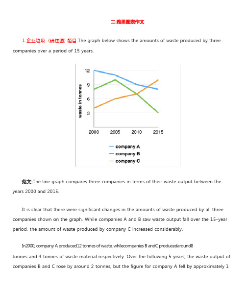
1.企业垃圾 (线性图) 题目:The graph below shows the amounts of waste produced by three companies over a period of 15 years.years 2000 and 2015.It is clear that there were significant changes in the amounts of waste produced by all three companies shown on the graph. While companies A and B saw waste output fall over the 15-year period, the amount of waste produced by company C increased considerably.In2000, company A produced12 tonnes of waste, whilecompanies B andC producedaround8tonnes and 4 tonnes of waste material respectively. Over the following 5 years, the waste output of companies B and C rose by around 2 tonnes, but the figure for company A fell by approximately 1tonne.From 2005 to 2015, company A cut waste production by roughly 3 tonnes, and company B reduced its waste by around 7 tonnes. By contrast, company C saw anincrease inwaste productionof approximately 4 tonnes over the same 10- year period. By 2015, company C’swaste output hadrisento10tonnes, while the respective amounts of waste fromcompanies A andB haddroppedto8 tonnes and only 3 tonnes.(192 words, band 9)这条线图对三家公司的废物产出从 2000 年到 2015 年进行了比较。
雅思图表作文万能模板
雅思图表作文万能模板英文回答:Introduction。
The bar chart illustrates the percentage of people in three age groups who engage in three different activities: reading books, watching TV, and using the internet. The data was collected from a survey conducted in a particular region, and the results provide insights into the leisure activities of different age groups.Overall Observation。
In general, the chart reveals that the youngest age group (aged 18-24) has the highest engagement in all three activities compared to the middle-aged (aged 35-44) and elderly (aged 65+) groups.Reading Books。
The youngest age group (aged 18-24) exhibits the highest percentage of readers, with 75% engaging in this activity. In contrast, the middle-aged group has a significantly lower percentage of readers (50%), and the elderly group has the lowest percentage (30%).Watching TV。
雅思4类图表作文范文

雅思4类图表作文范文下载温馨提示:该文档是我店铺精心编制而成,希望大家下载以后,能够帮助大家解决实际的问题。
文档下载后可定制随意修改,请根据实际需要进行相应的调整和使用,谢谢!并且,本店铺为大家提供各种各样类型的实用资料,如教育随笔、日记赏析、句子摘抄、古诗大全、经典美文、话题作文、工作总结、词语解析、文案摘录、其他资料等等,如想了解不同资料格式和写法,敬请关注!Download tips: This document is carefully compiled by theeditor. I hope that after you download them,they can help yousolve practical problems. The document can be customized andmodified after downloading,please adjust and use it according toactual needs, thank you!In addition, our shop provides you with various types ofpractical materials,such as educational essays, diaryappreciation,sentence excerpts,ancient poems,classic articles,topic composition,work summary,word parsing,copy excerpts,other materials and so on,want to know different data formats andwriting methods,please pay attention!好的,以下是一篇更加口语化的文章:《各国学生每周学习时间大揭秘》。
- 1、下载文档前请自行甄别文档内容的完整性,平台不提供额外的编辑、内容补充、找答案等附加服务。
- 2、"仅部分预览"的文档,不可在线预览部分如存在完整性等问题,可反馈申请退款(可完整预览的文档不适用该条件!)。
- 3、如文档侵犯您的权益,请联系客服反馈,我们会尽快为您处理(人工客服工作时间:9:00-18:30)。
雅思图表作文真题:柱状图:奥运奖牌The chart below shows the total number of Olympic medals won by twelve different countries.雅思小作文范文:The bar chart compares twelve countries in terms of the overall number of medals that they have won at the Olympic Games.It is clear that the USA is by far the most successful Olympic medal winning nation. It is also noticeable that the figures for gold, silver and bronze medals won by any particular country tend to be fairly similar.The USA has won a total of around 2,300 Olympic medals, including approximately 900 gold medals, 750 silver and 650 bronze. In second place on the all-time medals chart is the Soviet Union, with just over 1,000 medals. Again, the number of gold medals won by this country is slightly higher than the number of silver or bronze medals.Only four other countries - the UK, France, Germany and Italy - have won more than 500 Olympic medals, all with similar proportions of each medal colour. Apart from the USA and the Soviet Union, China is the only other country with a noticeably higher proportion of gold medals (about 200) compared to silver and bronze (about 100 each).(178 words, band 9)雅思图表作文真题:柱状图:学习动机The charts below show the main reasons for study among students of different groups and the amount of support they received from employers.参考雅思小作文范文The bar charts compare students of different ages in terms of why they are studying and whether they are supported by an employer.It is clear that the proportion of students who study for career purposes is far higher among the younger age groups, while the oldest students are more likely to study for interest. Employer support is more commonly given to younger students.Around 80% of students aged under 26 study to further their careers, whereas only 10% study purely out of interest. The gap between these two proportions narrows as students get older, and the figures for those in their forties are the same, at about 40%. Students aged over 49 overwhelmingly study for interest (70%) rather than for professional reasons (less than 20%).Just over 60% of students aged under 26 are supported by their employers. By contrast, the 30-39 age group is the most self-sufficient, with only 30% being given time off and help with fees. The figures rise slightly for students in their forties and for those aged 50 or more.(178 words, band 9)雅思图表作文真题:柱状图:The chart below shows numbers of incidents and injuries per 100 million passenger miles travelled (PMT) by transportation type in 2002.雅思小作文范文The bar chart compares the number of incidents and injuries for every 100 million passenger miles travelled on five different types of public transport in 2002.It is clear that the most incidents and injuries took place on demand-response vehicles. By contrast, commuter rail services recorded by far the lowest figures.A total of 225 incidents and 173 injuries, per 100 million passenger miles travelled, took place on demand-response transport services. These figures were nearly three times as high as those for the second highest category, bus services. There were 76 incidents and 66 people were injured on buses.Rail services experienced fewer problems. The number of incidents on light rail trains equalled the figure recorded for buses, but there were significantly fewer injuries, at only 39. Heavy rail services saw lower numbers of such events than light rail services, but commuter rail passengers were even less likely to experience problems. In fact, only 20 incidents and 17 injuries occurred on commuter trains.(165 words, band 9)雅思图表作文真题:柱状图:各地房价The chart below shows information about changes in average house prices in five different cities between 1990 and 2002 compared with the average house prices in 1989.雅思小作文范文:The bar chart compares the cost of an average house in five major cities over a period of 13 years from 1989.We can see that house prices fell overall between 1990 and 1995, but most of the cities saw rising prices between 1996 and 2002. London experienced by far the greatest changes in house prices over the 13-year period.Over the 5 years after 1989, the cost of average homes in Tokyo and London dropped by around 7%, while New York house prices went down by 5%. By contrast, prices rose by approximately 2% in both Madrid and Frankfurt.Between 1996 and 2002, London house prices jumped to around 12% above the 1989 average. Homebuyers in New York also had to pay significantly more, with prices rising to 5% above the 1989 average, but homes in Tokyo remained cheaper than they were in 1989. The cost of an average home in Madrid rose by a further 2%, while prices in Frankfurt remained stable. (165 words)雅思图表作文真题:饼状图:垃圾处理The pie charts below show how dangerous waste products are dealt with in three countries.雅思小作文范文:The charts compare Korea, Sweden and the UK in terms of the methods used in each country to dispose of harmful waste.It is clear that in both the UK and Sweden, the majority of dangerous waste products are buried underground. By contrast, most hazardous materials in the Republic of Korea are recycled.Looking at the information in more detail, we can see that 82% of the UK’s dangerous waste is put into landfill sites. This disposal technique is used for 55% of the harmful waste in Sweden and only 22% of similar waste in Korea. The latter country recycles 69% of hazardous materials, which is far more than the other two nations.While 25% of Sweden's dangerous waste is recycled, the UK does not recycle at all. Instead, it dumps waste at sea or treats it chemically. These two methods are not employed in Korea or Sweden, which favour incineration for 9% and 20% of dangerous waste respectively.(159)。