BEC图表作文模版和范文
bec 商务英语中关于图表的作文
bec 商务英语中关于图表的作文篇1Oh my goodness! Charts in business English are simply indispensable! They play a crucial role in presenting complex data in a clear and understandable manner. For instance, in market research, charts can vividly display the changing preferences of consumers. Just imagine how difficult it would be to grasp these changes without the visual aid of a chart! It would be like finding a needle in a haystack.Another significant example is in financial reports. Charts are powerful tools to show the trends of a company's income and expenditure. They allow stakeholders to quickly identify patterns and make informed decisions. How amazing is it that a simple chart can convey so much vital information at a glance?In conclusion, charts are not just visual aids in business English; they are essential for effective communication and decision-making. So, let's make the most of them and drive our businesses forward with the help of these wonderful tools!篇2Oh my goodness! In the realm of business English, charts play an incredibly vital role! Let's delve into the various types and their distinctive features and applicable scenarios. Take the bar chart, for instance. It'ssimply perfect for comparing data of different items. With clear bars, it presents a straightforward visual contrast. How amazing is that? Then there's the line graph. Oh, it's a wonder when it comes to showing the changing trends of data. You can easily spot the ups and downs. Isn't it fascinating? These charts have profound applications in business decisions. When analyzing market share, a bar chart can offer a quick comparison among competitors. And when predicting sales growth, a line graph helps us envision the future trajectory. So, next time you encounter charts in business, you'll know exactly how to make the most of them. Don't you agree?篇3Oh, dear friends! Let's explore the wonderful world of charts in business English. To accurately interpret these charts, we need to pay close attention to several key elements. Firstly, the axes are of great significance. They define the range and scale of the data presented. For instance, the x-axis might represent time, while the y-axis could show sales figures. The title gives us a clear understanding of the main content. It's like a guiding light! Then, the legend helps us distinguish different data series. And don't forget to analyze the abnormal data. They could be indicators of potential business problems. For example, a sudden drop in sales might suggest issues with the product or marketing strategy. So, by carefully observing these elements, we can truly grasp the valuable information hidden withinthe charts and make informed business decisions. Isn't that amazing?篇4Oh my goodness! In the realm of business English writing, creating charts is of paramount importance! But, hold on, there are several crucial points to keep in mind. Firstly, simplicity is key! A cluttered chart can be a total disaster, confusing the readers. So, keep it neat and straightforward. Secondly, the accuracy of data is non-negotiable! One tiny mistake can lead to serious consequences. Imagine if the figures are wrong - what a mess that would be! And don't forget the consistency between the chart and the text. They must complement each other perfectly. If they don't, it's like having two pieces of a puzzle that just don't fit. So, always double-check and ensure everything is in harmony. Remember, a well-crafted chart can make your business communication shine, while a poorly done one can be a major setback. Isn't that something we all want to avoid?篇5In the realm of business English, charts play a crucial role in communicating information effectively. However, when it comes to cross-cultural communication, challenges arise! For instance, in some cultures, red might symbolize prosperity and good fortune, while in others, it could be associated with danger or warning. The same applies to various symbols! Take the arrow for example. In one country, an upward arrow might implygrowth and success, but in another, it could have a completely different connotation.So, how can we address these challenges? Firstly, it's essential to conduct thorough research on the cultural background of the target audience before presenting the charts. Secondly, providing clear explanations and legends can minimize misunderstandings. And last but not least, seeking feedback from representatives of different cultures can offer valuable insights for improvement.In conclusion, being aware of and effectively handling the differences in the interpretation of chart elements across cultures is of paramount importance in successful business communication. Isn't it?。
英语应用文图表类作文模版

英语应用文图表类作文模版Here's a template for a chart-based English application essay that meets the given requirements:Alright, let's dive into this chart. Look at the numbers! They're pretty telling, huh? See that sharp risein sales over the last quarter? That's pretty impressive, right? Well, let's not get ahead of ourselves.Now, check out this section. The decline in customer satisfaction? Yeah, that's a bit of a concern. But let's not panic, maybe there's a reason behind it. Maybe it'sjust a temporary dip. After all, we know how volatile these things can be.Okay, moving on. Let's focus on the profits for a bit. They've been pretty stable, haven't they? Well, that's a good sign. Steady as she goes, you know? But we can't just rest on our laurels. We need to keep pushing forward, always looking for ways to improve.And what about our marketing efforts? They seem to be paying off, don't they? Look at that increase in brand awareness. That's what we're all about, getting our name out there, making a splash in the market. But let's not forget, it's not just about the numbers. It's about connecting with our customers, understanding their needs, and delivering on our promises.Lastly, let's take a moment to appreciate our team. They've been working hard, putting in the hours.。
剑桥雅思18写作范文
剑桥雅思18写作范文本文为您提供剑桥雅思18写作范文,旨在帮助您更好地了解考试要求和提高写作水平。
第一部分:图表描述范文一:Pie ChartsThe given pie charts illustrate the reasons why people in a particular country chose to travel abroad in the year2017. The information is divided into two categories:personal and business travel.According to the charts,personal travel accounted for the majority,with73%of respondents citing this as their reason for going abroad.Within this category,the main motivation for traveling was to'relax and take a break'at 39%.Visiting family and friends,as well as exploring new cultures,were also popular reasons at22%and12% respectively.On the other hand,only27%of the respondents traveled for business purposes.In terms of business travel,'attending conferences and meetings'was the most common reason at15%,closely followed by'visiting clients and partners'at12%.'Training and professional development'and'international assignments' accounted for8%and7%respectively.Overall,the pie charts demonstrate that the majority of people traveled abroad for personal reasons,mainly to relax and explore new cultures.However,a significant portion also traveled for business purposes,attending conferences and visiting clients.第二部分:图表分析范文二:Line GraphsThe given line graphs compare the average monthly household spending on three different categories in the United Kingdom from2010to2015.The first graph shows the trends in spending on food and drink,with a slight increase from around£200in2010to approximately£250in2015.Despite minor fluctuations,the overall trend shows a steady rise during the period.The second graph displays the changes in spending on clothing and footwear.It demonstrates a more significant increase,starting at around£100in2010and rising to nearly£150in2015.Like the previous graph,it shows some fluctuations,but the overall trend is upward.Finally,the third graph presents the variations in household spending on recreation and culture.It exhibits a similar pattern to the previous graphs,with an initialfigure of approximately£100in2010,which steadily increases to reach nearly£125in2015.In conclusion,the line graphs show that household spending on food and drink,clothing and footwear,as well as recreation and culture,all experienced an upward trend from 2010to2015.This reflects an overall increase in the average monthly expenditure in these areas.第三部分:图表讨论范文三:Bar ChartsThe provided bar charts compare the age distribution of the population in two countries:Country A and Country B.The data is categorized into five different age groups:0-14,15-24,25-64,65-79,and80+.In Country A,the age group with the highest percentageis25-64,representing over50%of the population.The0-14age group comprises around25%of the population,while the remaining three age groups each account for less than10%.On the other hand,in Country B,the age groupdistribution is more evenly spread.The25-64age group still holds the majority,but it is followed closely by the0-14 age group,both at around30%.The15-24and65-79age groups both make up approximately15%of the population,while the 80+age group has the smallest percentage at around10%.Overall,the bar charts reveal that the population age distribution in Country A is more concentrated in theworking-age group(25-64),while Country B has a more balanced distribution across all age groups,particularly with a larger portion of young people(0-14).第四部分:图表总结范文四:TableThe provided table presents the percentage of households in a particular country who own different types of electronic devices in the year2018.According to the table,the highest ownership percentage is for mobile phones,with a staggering98%of households having this device.It is followed by televisions,which are present in92%of puters,both desktops and laptops,have relatively lower ownership rates at75%and68% respectively.Other devices included in the table are tablets,with55% ownership,while gaming consoles and smart speakers have the lowest ownership percentages,both at32%.In conclusion,the table demonstrates that mobile phones and televisions are the most commonly owned electronic devices in households,with computers,tablets,gamingconsoles,and smart speakers following behind in terms of ownership rates.本文为您提供的剑桥雅思18写作范文履行了任务要求,采用准确、生动、简洁的语言表达,并且没有出现与主题无关的内容。
商务英语bec图表描述作文范文
商务英语bec图表描述作文范文全文共3篇示例,供读者参考篇1Title: A Comprehensive Guide to Writing BEC Chart Description Essays in Business EnglishIntroductionBusiness English is an essential part of any profession, and being able to effectively describe data in charts, graphs, and tables is crucial in the business world. In this guide, we will provide you with tips and examples on how to write BEC chart description essays effectively.Understanding the BasicsBefore you start writing your chart description essay, it is important to understand the basics. Make sure you are familiar with the types of charts commonly used in business settings, such as bar charts, line graphs, pie charts, and tables. Also, be sure to recognize the key components of a chart, including titles, labels, and legends.Structuring Your EssayWhen writing a BEC chart description essay, it is important to follow a clear and logical structure. Start by introducing the chart and providing some context. Next, describe the main trends or key findings in the data. Finally, conclude by summarizing the key points and implications of the chart.Language and PresentationWhen writing your essay, use clear and concise language. Avoid using jargon or technical terms that may be unfamiliar to your audience. Be sure to use appropriate grammar and punctuation. Additionally, consider using visuals such as bullet points or numbered lists to make your essay easier to read.Example BEC Chart Description EssayNow, let's look at an example of a BEC chart description essay:Title: Sales Performance in Q1 2021IntroductionThe chart below displays the sales performance of our company in the first quarter of 2021. The data represents the total sales revenue generated by each department over athree-month period.Main TrendsOverall, the chart shows a positive trend in sales performance across all departments. The sales revenue increased steadily throughout the quarter, with a significant peak in March. The Marketing department had the highest sales revenue, followed by Sales and Finance.ImplicationsThe strong sales performance in Q1 2021 is a clear indication of the effectiveness of our marketing strategies and the dedication of our sales team. Moving forward, we should continue to focus on these areas to drive further growth and success for our company.ConclusionIn conclusion, the sales performance in Q1 2021 demonstrates the resilience and dedication of our team in driving revenue growth. By leveraging our strengths in marketing and sales, we can continue to achieve success in the future.ConclusionIn conclusion, writing BEC chart description essays is an important skill for professionals in the business world. Byfollowing these tips and examples, you can effectively describe data in charts and graphs, and communicate key findings to your audience. Practice writing chart description essays regularly to improve your skills and enhance your business English communication abilities.篇2Business English BEC Chart Description EssayIntroductionIn today's globalized business world, effective communication is crucial for success. With the rise of international trade and multinational companies, the ability to present and interpret data using charts and graphs is a valuable skill in the workplace. In this essay, we will examine the importance of chart description in business English, specifically focusing on the Business English Certificate (BEC) exam.The BEC exam is designed to assess candidates' ability to communicate in English in a business context. One of the key components of the exam is the Writing section, where candidates are required to interpret and describe data presented in charts, graphs, and tables. By mastering the skill of chartdescription, candidates can demonstrate their proficiency in both English language and business communication.Types of Charts in BECIn the BEC exam, candidates may encounter a variety of charts, including bar charts, line graphs, pie charts, and tables. Each type of chart serves a different purpose and requires a different approach to description.- Bar Charts: Bar charts are used to compare data across categories or time periods. When describing a bar chart, it is important to highlight the key trends, similarities, and differences in the data.- Line Graphs: Line graphs are used to show trends over time. When describing a line graph, candidates should focus on the overall trend, peaks, and troughs, and any significant changes in the data.- Pie Charts: Pie charts are used to show the distribution of a whole into its parts. When describing a pie chart, candidates should focus on the percentages of each category and any patterns or trends in the data.- Tables: Tables are used to present data in a structured format. When describing a table, candidates should summarizethe key information and identify any relationships or patterns in the data.Tips for Describing Charts in BECTo excel in the chart description task in the BEC exam, candidates should follow these tips:- Analyze the data: Before describing a chart, candidates should take a few moments to analyze the data and identify the key trends, similarities, and differences.- Use appropriate language: When describing a chart, candidates should use a mix of descriptive language (e.g., increase, decrease, rise, fall) and numerical data (e.g., percentages, figures) to convey the information accurately.- Structure your description: A well-structured description should include an introduction of the chart, a summary of the key trends, and a conclusion highlighting the main points.- Practice regularly: To improve their chart description skills, candidates should practice regularly by describing different types of charts and graphs.Sample BEC Chart DescriptionTo illustrate the importance of chart description in business English, let's consider a sample bar chart presenting the sales performance of a company over the past year:The bar chart above shows the monthly sales performance of XYZ Company from January to December 2021. Overall, sales steadily increased from January to July, with a peak in March, before declining in the second half of the year.In January, sales were at $100,000, and they gradually increased to $150,000 in March, marking the highest point in the year. However, sales saw a slight dip in April, before picking up again in May and June.From July onwards, sales began to decline, reaching a low point of $80,000 in December. The biggest drop in sales was observed in November, followed by a slight recovery in December.In conclusion, the bar chart highlights the seasonal variation in sales performance, with peaks in the first half of the year and dips in the second half. This analysis can help XYZ Company identify trends and make strategic decisions to improve their sales performance in the future.ConclusionIn conclusion, chart description is a valuable skill in business English that can help candidates communicate effectively in a business context. By mastering the art of interpreting and describing data in charts and graphs, candidates can demonstrate their proficiency in both English language and business communication. Through regular practice and following the tips outlined in this essay, candidates can improve their chart description skills and excel in the BEC exam.篇3Title: Analysis of BEC ChartIntroductionBusiness English Certificate (BEC) exams require candidates to interpret and analyze business-related charts, graphs, and other data. In this essay, we will examine a sample BEC chart and provide a detailed description of its content.Description of the ChartThe chart below represents the annual revenue growth of a company over a five-year period.Year Revenue Growth (%) 2016 8% 2017 10% 2018 12% 2019 15% 2020 20%Analysis of the DataFrom the chart, we can observe a consistent increase in the company's revenue growth each year. In 2016, the revenue growth was at 8%, which then increased to 10% in 2017, 12% in 2018, 15% in 2019, and finally peaked at 20% in 2020. This indicates a positive trend of growth and success for the company.The significant jump in revenue growth from 2019 to 2020, from 15% to 20%, suggests that the company implemented successful strategies or introduced new products/services that led to a boost in revenue. This could have involved expanding into new markets, improving customer retention, or streamlining business processes.Implications for the CompanyThe chart's data highlights the company's strong performance and potential for further growth. With a consistent increase in revenue growth over the years, the company is likely to attract investors, expand its market reach, and enhance its competitive position in the industry.The company's success in achieving a 20% revenue growth in 2020 could lead to opportunities for further expansion andinnovation. It could consider investing in research and development, launching new products, or entering new markets to capitalize on its growth momentum.ConclusionIn conclusion, the BEC chart provides valuable insights into a company's revenue growth over a five-year period. By analyzing the data, we can identify trends, patterns, and opportunities for the company to capitalize on its success and achieve continued growth in the future. This exercise demonstrates the importance of data analysis and interpretation in making informed business decisions.。
雅思英语图表作文范文(必备3篇)

雅思英语图表作文范文第1篇A类雅思各类图表作文要点及范文一.曲线图解题关键1曲线图和柱状图都是动态图,解题的切入点在于描述趋势。
2在第二段的开头部分对整个曲线进行一个阶段式的总分类,使写作层次清晰,同时也方便考官阅卷。
接下来再分类描述每个阶段的specifictrend,同时导入数据作为分类的依据。
3趋势说明。
即,对曲线的连续变化进行说明,如上升、下降、波动、持平。
以时间为比较基础的应抓住“变化”:上升、下降、或是波动。
题中对两个或两个以上的变量进行描述时应在此基础上进行比较,如变量多于两个应进行分类或有侧重的比较。
4极点说明。
即对图表中最高的、最低的点单独进行说明。
不以时间为比较基础的应注意对极点的描述。
5交点说明。
即对图表当中多根曲线的交点进行对比说明。
6不要不做任何说明就机械地导入数据,这不符合雅思的考试目的。
曲线图常用词汇动词—九大运动趋势一:表示向上:increase,rise,improve,grow,ascend,mount,aggrandize,goup,climb, take off, jump,shoot up暴涨,soar,rocket, skyrocket雅思英语图表作文范文第2篇It is said that countries are becoming similar to each other because of the global spread of the same products, which are now available for purchase almost anywhere. I strongly believe that this modern development is largely detrimental to culture and traditions worldwide.A country’s history, language and ethos are all inextricably bound up in its manufactured artefacts. If the relentless advance of international brands into every corner of the world continues, these bland packages might one day completely oust the traditional objects of a nation, which would be a loss of richness and diversity in the world, as well as the sad disappearance of t he manifestations of a place’s character. What would a Japanese tea ceremony be without its specially crafted teapot, or a Fijian kava ritual without its bowl made from a certain type of tree bark?Let us not forget either that traditional products, whether these be medicines, cosmetics, toy, clothes, utensils or food, provide employment for local people. The spread of multinational products can often bring in its wake a loss of jobs, as people urn to buying the new brand,perhaps thinking it more glamorous than the one they are used to. This eventually puts old-school craftspeople out of work.Finally, tourism numbers may also be affected, as travelers become disillusioned with finding every place just the same as the one they visited previously. To see the same products in shops the world over is boring, and does not impel visitors to open their wallets in the same way that trinkets or souvenirs unique to the particular area too.Some may argue that all people are entitled to have access to the same products, but I say that local objects suit local conditions best, and that faceless uniformity worldwide is an unwelcome and dreary prospect.Heres my full answer:The line graphs show the average monthly amount that parents in Britain spent on their children’s s porting activities and the number of British children who took part in three different sports from 2008 to is clear that parents spent more money each year on their children’s participation in sports over the six-year period. In terms of the number of children taking part, football was significantly more popular than athletics and 2008, British parents spent an average of around £20 per month on their children’s sporting activities. Parents’ spending on children’s sports increased gradually over the followi ng six years, and by 2014 the average monthly amount had risen to just over £ at participation numbers, in 2008 approximately 8 million British children played football, while only 2 million children were enrolled in swimming clubs and less than 1 million practised athletics. The figures for football participation remained relatively stable over the following 6 years. By contrast, participation in swimming almost doubled, to nearly 4 million children, and there was a near fivefold increase in the number of children doing athletics.剑桥雅思6test1大作文范文,剑桥雅思6test1大作文task2高分范文+真题答案实感。
英语图表作文模板及精选4篇

英语图表作文模板及精选4篇(经典版)编制人:__________________审核人:__________________审批人:__________________编制单位:__________________编制时间:____年____月____日序言下载提示:该文档是本店铺精心编制而成的,希望大家下载后,能够帮助大家解决实际问题。
文档下载后可定制修改,请根据实际需要进行调整和使用,谢谢!并且,本店铺为大家提供各种类型的经典范文,如总结报告、合同协议、规章制度、条据文书、策划方案、心得体会、演讲致辞、教学资料、作文大全、其他范文等等,想了解不同范文格式和写法,敬请关注!Download tips: This document is carefully compiled by this editor. I hope that after you download it, it can help you solve practical problems. The document can be customized and modified after downloading, please adjust and use it according to actual needs, thank you!Moreover, our store provides various types of classic sample essays, such as summary reports, contract agreements, rules and regulations, doctrinal documents, planning plans, insights, speeches, teaching materials, complete essays, and other sample essays. If you want to learn about different sample formats and writing methods, please pay attention!英语图表作文模板及精选4篇学而不思则罔,思而不学则殆,以下是本店铺给大伙儿收集整理的英语图表作文模板及精选4篇,欢迎参考。
BEC图表类作文

图表类商务报告及建议书补充练习1⏹You work for a communication apparatus company. You have been asked to write aproposal to the Board of Directors on the performance of your three main products (in thousand sets) over the last years.⏹Look at the graphs below, on which you have already made some handwritten notes.⏹Then, using all these handwritten notes, write your proposal.⏹Write 120-140 words.2.•You work for Super Sonic Industries Group Corp. you have been asked to write a report to the Board of Directors.•Study the graph below, on which you have made some handwritten notes.•Then, using all these handwritten notes, write your report.Sample 2.Date: March 1, 2006From: Susan Lee, Market Development DepartmentTo : Board of DirectorsSubject: Analytical Report on Profit & Expenditure of 2005As requested, I have submitted this report about the profit and expenditure of our corporation in 2005.Graph 1 reveals that our total profit of 2005 is US$200,000, which is US$50,000 higher than that of 2004. To expand business, our investment in establishing new enterprises was raised from US$80,000 in 2004 to US$14,000 in 2005. And the new circulating fund also increased from US$70,000 in 2004 to US$150.000 in 2005.Graph 2 indicates a 20% increase in the profit by absorbing foreign investment because of greater efforts in this area and a 5% decrease in the profit of domestic trade enterprises due to the nationwide depression.There are marked changes in the expenditure of 2005. the profit retained was 10% lower than that of the previous year because more money went to establishing new enterprises and new circulating fund sectors.。
BEC商务英语高级写作 图表Chart

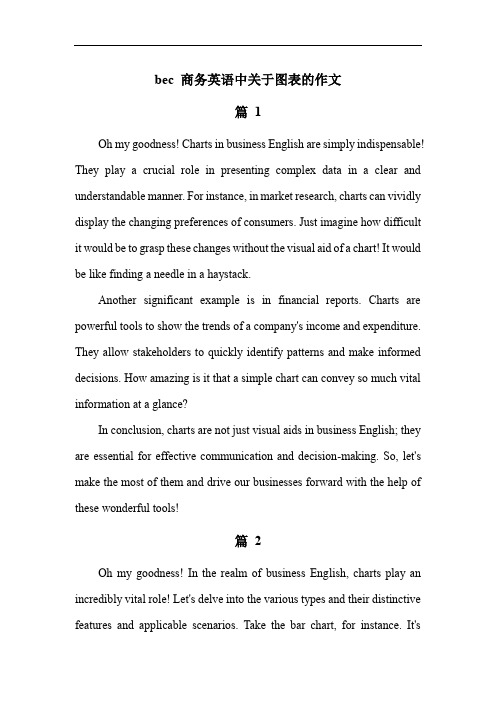
The effect of the GE treatment is reasonably sound. As the purity degree of water without treatment falls to 35% after three months, the one with GE biocides is shown to be as pure as 70% at that time. After five months, the purity degree of the treated water still maintains 40%.
100.00%
80.00%
60.00%
40.00%
20.00%
0.00%
1
2
3
4
month
5
water with treatment
water without treatment
A
8
The two graphs compare the effect of two biocides: GE and HI. Without the treatment, the purity degrees of the polluted water drop to less than 20% after five months.
A
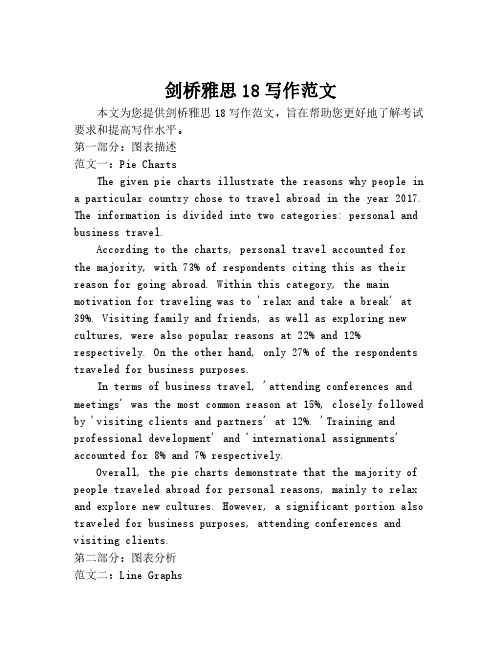
Sales to South Asia
4
• The graph shows the fluctuation in a company’s sales to South Asia over a period of twelve months. According to the graph, sales to South Asia increased steadily from 7 million dollars in January to 10 million dollars in May. After this, sales fell dramatically, hitting the lowest point in June at 6 million dollars. There was then a slight increase in July. Between July and September sales stayed constant at a little over 6 million dollars. There was then a sharp rise between September and November with a peak of 11 million dollars in November. After November sales declined significantly to 8 million dollars.
- 1、下载文档前请自行甄别文档内容的完整性,平台不提供额外的编辑、内容补充、找答案等附加服务。
- 2、"仅部分预览"的文档,不可在线预览部分如存在完整性等问题,可反馈申请退款(可完整预览的文档不适用该条件!)。
- 3、如文档侵犯您的权益,请联系客服反馈,我们会尽快为您处理(人工客服工作时间:9:00-18:30)。
图表作文写作
一注意事项
1 时态
2 多样性
3 避免个人观点
二模板
Introduction
This is a pie chart which shows the proportion of …….. This chart is divided into six types as follows…..
Findings
Basically, chicken has the largest proportion.While others has the smallest percentage.
According to the pie chart, chicken ….. Then port is with 20%......
It should note that…… And it is also interesting to note that….
Conclusion
It can be concluded from the pie chart that……句型
一,首段。
陈述图标,要借用说明中的词语,但是避免照搬。
通常要先指名这是哪种图标。
关键词:graph, pie chart, bar chart, column chart, table
Show, illustrate, describe, demonstrate
Be made up of…, consists of…, be designed to…,
句型:
This pie chart shows how an IELTS speaking test is organized.
This diagram illustrates the internal structure of…
The graph describes the changes in the number of male teachers over the period from 1998 to 1999.
This is a curve chart which demonstrates the trend of oil supply and demand.
二,第二段,大体描述的图标的情况,一般来说,描述两个极端的内容。
关键词:As can be seen, basically, generally speaking,
Largest proportion, highest speed of increasing, most, the least percentage goes to…
Exceed, account for, have,
While, whereas, on the other hand
句型:
As can be seen, the immigration of both West and Indians increased rapidly over the last twenty years. A decreased phenomenally after 1960’s whereas B continued to grow.
Basically, chicken has the largest proportion, which accounts for 40%;while others has smallest percentage, which is 2%.
According to the table, generally speaking, the most commonly misplaced items were hats and books, whilst cards and watches were misplaced the least.
三,第三段,结合时间,详细描述图标变化。
注意数值之间对比的词语:
相同:Similarly, both….,neither, Like A, B is….
不同:Unlike A, B is…, in contrast, despite/ in spite of…
提示性词语:It is worth mentioning that It must be pointed out that More surprising is that…
主体要表述数值变化和所占份额。
(配合时间)
线形图:根据时间段,来描述数值的变化
饼形图:各部分占据的份额
柱形图:和饼图相似,有数值的比较和变化
图标:描述数值所占比例份额
数值变化词语:
上升:Increase/grow/rise/ascend/take off/pick up/climb/hike/shoot up/ soar/skyrocket/in general upward trend/hit record/reach record high or low
下降: Fall/drop/decrease/descend/depress/collapse/decline/downward trend/slump
其他词语:Level off/remain,keep steady
Recover/ bottom out/ fluctuate/peak
副词,形容词:Sharply/dramatically/phenomenally/marginally/slightly/volatile
数值占据份额词语:
Account for, occupy, make up for, be Percentage,
四,最后一段总结, 综述一下情况
词语:in summary, Therefore we can conclude that, in conclusion, Finally, what we can know is that, All in all, we know that…时间连词:
开始
In the start of…At the beginning The price/number stood at/ began at…
Then,…Later After that…Next Before falling again, it rose to…The 1999 saw a slight recovery of…,
Finally At last At the end of …。