ppt经典图表表达
合集下载
经典PPT图表应用

单击此处添加文字 单击此处添加文字 单击此处添加文字 单击此处添加文字
单击此处添加文字 单击此处添加文字 单击此处添加文字 单击此处添加文字
单击此处添加文字 单击此处添加文字 单击此处添加文字 单击此处添加文字
添加文字
添加文字
添加文字
添加文字
添加文字
2 13-联动关系
强调关联关系中对象的同步变化性。
4
点击添加文本
5
点击添加文本
2 5-冲突关系
强调两个或几个对象之间的矛盾关系
对立的、互不相容的力量或性质(如观念、利益、意志)的互相干扰
点击添加文本
点击添加文本
2 6-包含关系
强调一个对象包括另外一个对象或几个对象
包含是集合与集合之间的关系,也叫子集关系
添加标题
点击添 加文本
点击添 加文本 点击添 加文本 点击添 加文本 点击添 加文本 点击添 加文本 点击添 加文本
高手
以图形表示各类数理关系、逻辑关系的一种演示形式,用意在于让这些关系可视化、 清晰化、形象化。 文字、图表、图片被称为PPT的三大元素一点也不过分。 图表则是PPT最具特色、最具优势的元素。
1 图表的定义和分类
图表(Chart)是一种很好的将对象属性 数据直观、形象地“可视化”的手段。
表达数据关系的图表:
五、采取的措施
1
概述
费用构成&预算内容
2
整体分析
整体费用分析及与FY10同期对比
3
单项费用分析
房租、办公用品、电话费等单项预算分析
4
体系费用分析
各体系行政费用预算分析
Content
整体分析
整体费用分析及与FY10同期对比
15.最经典PPT图表表达
If resizing graphs in the main PowerPoint application, make sure to use only the corner object boxes (see diagram) Make sure that the graph is resized with the same aspect ratio (vertical/horizontal proportions) If the text becomes distorted, undo immediately!
If a legend is needed, place it to the right of the graph or within the plot area. Do not add a border and set the font to roughly the same size as the data labels
Category D
Category E
Axis title
Source: Text is Arial, 8-point, plain; a semicolon should separate each item; the line should end in a period.
Bar graph, 12 categories
32
1999E
The safest way to change the size or position of graph elements is to do so within the native graph application itself
Try to use colors from the main color palette as much as possible
经典图表表达.ppt
Yale Harvard
42 1900
78 1920
16 20
50 25
1940
1960
99 32 1980
If a legend is needed, place it to the right of the graph or within the plot area. Do not add a border and set the font to roughly the same size as the data labels
Remember to adjust the document title tracker when you create a new document. It should match the name of the PowerPoint file
When the data refers to projected or estimated figures, add “E” to the year label
Make sure that the graph is resized with the same aspect ratio (vertical/horizontal proportions)
If the text becomes distorted, undo immediately!
Use the corner object boxes only when resizing graphs! It is also advisable to hold down the <shift> key when doing so
Create graphs using the native PowerPoint chart software, rather than pasting graphs from Excel
如何用图表说话PPT课件

1993年-1998年销售额
1994年
1995年
1996年
1997年
销售额 1998年
主题信息确定
同样的数据, 得出不同的主 题,是强调排 名还是强调所 占份额,由你 来决定,你决 定的就是你的 主题。
小结
1、了解了数据类、非数据类各种图表类型; 2、使用图表的目的:关键在于简洁、越简洁越好。 3、成功的图表必须具备以下几个关键要素: 每张图表都传达一个明确的信息、清晰易读、格式简单明了并 且前后连贯、图表与标题相辅相成; 4、好图表的标准的格式:信息标题、图表标题、脚注、标签、 图例、资料来源; 5、什么时侯不适合用图表表达: 图表太简单,完成可以用文字描述; 或者用图表来表示某种精确的内容可能产生误导。 习惯了一种固定的表达方式,用图表表达则容易造成混乱。
练习一:项目的五个阶段
I.初次接触
IV.提出 III. 制定解 建议 II. 项目 决方案 启动
V. 实施改革
5. 实施 改革
1. 初次 接触
I. 初次 接触
II. 项目 启动
III. 制定解 决方案
IV. 提出 建议
4. 提出 建议
3. 制定解 决方案
2. 项目 启动
V. 实施改革
练习二:图表运用
非临沂市非山东籍
41%
7%
2%
婚姻状况
50%
66%
34%
未婚管理人员 男
已婚管理人员 女
己婚员工
ThemeGallery is a Design Digital Content & Contents mall developed by Guild Design Inc.
•2006 statistics title
利用PPT图表解读数据

04 PPT图表实战案 例
销售数据分析案例
总结词
通过销售数据图表,可以清晰地展示销售业绩、销售渠道、客户群体以及销售趋势等信 息,帮助企业更好地了解销售情况,制定相应的销售策略。
详细描述
在PPT中,可以使用柱状图、折线图和饼图等图表形式,分别展示不同时间段、不同销 售渠道的销售数据,以及各销售渠道的占比情况。通过对比不同数据,可以发现销售业 绩的变化趋势,以及各销售渠道的优劣势。同时,还可以结合客户群体的特点,分析不
饼图制作
总结词
饼图用于展示各部分在整体中所占的比例,通过不同大小的扇形来比较各部分的 比例关系。
详细描述
在PPT中制作饼图,选择“插入”菜单中的“图表”选项,然后选择“饼图”, 并选择所需的样式。接着,将数据输入到Excel工作表中,并确保数据区域与图 表相匹配。最后,根据需要调整图表的颜色、字体、标签等格式。
利用PPT图表解读数据
汇报人:可编辑 2024-01-08
目 录
• PPT图表基础知识 • 常见PPT图表制作 • PPT图表进阶技巧 • PPT图表实战案例 • PPT图表常见问题解答
01 PPT图表基础知 识
PPT图表基础知识
• 请输入您的内容
02 常见PPT图表制 作
柱状图制作
总结词
05 PPT图表常见问 题解答
如何选择合适的图表类型?
总结词Байду номын сангаас
选择合适的图表类型是解读数据的关键。
详细描述
根据数据的特点和需求,选择最能反映数据关系的图表类型。例如,柱状图适 用于比较不同类别的数据,折线图适用于展示趋势,饼图适用于表示占比关系 。
如何提高图表的可读性?
总结词
用图表直观表达数据ppt课件

图表型
柱形图
折线图 饼图
使用特点
能较好地表示出每个项目的具体数目和对 比情况 能较好地反映事物的变化情况
能较好地表示出各部分在总体中所占的百 分比
5
• 从以上我们可知是表格易于表达数据信息 还是图表呢?下面我们再来比较下:
与表格相比,用图表来描述数据更加直观 清楚,可方便看出数据的差异大小:还能帮 助反映数据所代表的事物间相互联系,变化 趋势,下面我们一起来学创 建图表: 6
60%
50%
40%
满意
30%
基本满意
20%
不满意
10%
0%
第1题
第2题
第3题
第4题
第5题
柱形图
3
销售额
12000 10000
8000 6000 4000
2000 0
销售额
折线图
销售额
2001
2002
2003
2004
2005
年度
饼图 20%
34%
46%
满意
基本满意
不满意
4
通过对三种图表的观察,我们能找出它们 的一些特点吗?
信息技术
1
第六节 用图表直观表达数据
在我们日常生活中经常要对一些数据进行统计,然 后得到一张结果的统计表,可是表格里的数字外形 差别不明显,而且还会看错,那么哪种类型的数据 处理方式能更有利于表达数据中包含的信息呢?
下面我们一起来学习图表:
2
一、选择图表类型 (柱形图,折线图,饼图)
1 了解各种类型图表的优势
如图2-37
9
最后一步是图表位置的设置:单击“下一步” 按 钮设置插入位置(如图2-38),单击完成就可以生 成图表了(如图2-39)
经典PPT-并列关系PPT图表模板
Catch The feel of Design in contemporary colors and styles.
Clarity & Impact
Premium Design
Visual Appealing
Subtle Touch
Stylish Design
Each work is featured with simplicity but supreme beauty.
OPPORTUNITIES
• Your text goes here • Your text goes here • Your text goes here • Your text goes here • Your text goes here • Your text goes here
Positive
This is an example text.
This is an example text.
This is an example text.
Sample Text
This is an example text.
This is an example text.
Sample Text
Sample Text
Opportunities
• Your text goes here • Your text goes here • Your text goes here
• Your text goes here • Your text goes here • Your text goes here • Your text goes here • Your text goes here • Your text goes here
经典图表表达模板
Dataset 1 Dataset 2
24 24
25
30
Bar graph, 12 categories
Axis title
Category A Category B Category C Category D Category E Category F Category G Category H Category I Category J Category K Category L
100% stacked bar graph
Category A
6
Category B
10
Category C
10
Category D
Do not add unit
120
symbols (e.g., $
or M) to the axis
100
labels (except for
%).
80
Set the intervals
60
to the largest
reasonable value
40
possible
20
0
All numbers in the graph (data and axis labels) should be the same size. Text labels may be smaller if necessary
Presenter/timing Presenter/timing Presenter/timing Presenter/timing Presenter/timing Presenter/timing
Create graphs using the native PowerPoint chart software, rather than pasting graphs from Excel
PPT设计教程-经典数据图表
度
及大小
彩
宽度(与线条相同)
第四步、折线图格式设置
140
118
120
108
108
99
100
84 79
80 62 67
87
72
78
59
60
40
20
0 一月 二月 三月 四月 五月 六月 七月 八月 九月 十月 十一月 十二月
接着再单击折线,选择【效果】,给折线添加阴影,可根据需要微调参数。
第五步、添加数据标签
布衣公子作品
经典数据图表六例
布衣公子系列PPT新教程之十三
经典数据图表六例
布衣公子系列PPT新教程之十三
菠萝 80% 樱桃 30% 葡萄 85% 草莓 50%
目录页
经典铅笔图表 经典仪表盘
经典滑珠图表 半圆参差图表
娃娃头图表 面积折线图
经典铅笔图表
铅笔柱形图就非常不错,可以匹配校园、文案或文字类使用场景
第一步、绘制组合图表
图表标题
系列 1 系列 2 系列 3
【插入】→【图表】→【组合】→选择系列1和系列2为圆环图,系列3为饼图,系列3勾选【次坐标轴】
第二步、表盘的数据设置
预留三行 刻度显示 指针预留 表盘颜色 刻度分布
图表标题
颜色值
表盘值
指针值(系列3)
(系列 2) (系列1)
第三步、指针的数据及公式设置
118
108
108
99
84 79 62 67
87
72
78
59
一月 二月 三月 四月 五月 六月 七月 八月 九月 十月 十一月 十二月
右击折线,单击【添加数据标签】,即为图表添加了数据标签。同时, 设置【标签位置】为靠上,并适当设置字体的字体、大小和色彩。
PPT图表图示表现形式(一)
▪5 XXXX ▪6 XXXX
▪7 XXXX
▪12 XXXX
▪10 XXXX
▪11 XXXX
▪8 XXXX ▪9 XXXX
流程图
XX
XX
XXXX
XXXX XXXX
XXXX
XXXX
XXXX XXXX XXXX XXXX
XXXXXX XXXXXX
XXXX
XXXXXX XXXXXX
XX
XXXX XXXX
XXXX
结构图
XXXXXXXX
XXXX
XXXX
XXXXXXX
XXXXX
XXXXXXXX
XXXX
结构图
XXXXX
XXXXXXXX✓ XXXXXXXX ✓ XXXXXXXX ✓ XXXXXXXX
XXXXX XXXXX
XXXXXX
XX
X X X X
矩阵图
XXXX XXXX
XXXX
XXXX XXXX XXXX
XX
XXXX
• XXX • XXX
XX
分析图
XX
XX
XX
XX
XX
XX
XXXX
XXX XXX
分析图
XXX XXX
2006s
2007s XXXX
XXXX
XXX XXX
2008s
分析图
XXXXXXX
• XXX • XXX • XXX • XXX
XXX XXX
XXXXXX
XXX XXXX
XXXXX
流程图
XXXXX
XXXX
XXXXX
XXXX
XX
XXXXX
XXXX
流程图
- 1、下载文档前请自行甄别文档内容的完整性,平台不提供额外的编辑、内容补充、找答案等附加服务。
- 2、"仅部分预览"的文档,不可在线预览部分如存在完整性等问题,可反馈申请退款(可完整预览的文档不适用该条件!)。
- 3、如文档侵犯您的权益,请联系客服反馈,我们会尽快为您处理(人工客服工作时间:9:00-18:30)。
32
CAGR
25
1998-2002
68%
The CAGR block should be placed to the right of the graph. Font size should be close to that the graph’s data labels
16
7 4
In general, use whole numbers unless you have a specific reason for including decimals
Title, time period
Subtitle
Category A Category B Category C Category D 7 24 15 13 7 8 10 4 22 28 0 5 10 15 20 25 30 6 10
Axis title
Category E Category F Category G Category H Category I Category J Category K Category L
If a legend is needed, place it to the right of the graph or within the plot area. Do not add a border and set the font to roughly the same size as the data labels
Participation in Harley Davidson conventions, 1998-2002
Thousands of people
35 30 25 20 15 10 5 0 1998 1999 2000 2001 2002E
When used, axis tick marks should be placed on the outside of the axis
Axis title
Source: Text is Arial, 8-point, plain; a semicolon should separate each item; the line should end in a period.
Stacked bar graph
Title, time period
When the data refers to projected or estimated figures, add “E” to the year label
In general, include all relevant information while keeping the graph as simple as possible
Dataset 4 Dataset 5
Category C
10
10
7
9
4
40
Category D
24
24
12
14ቤተ መጻሕፍቲ ባይዱ
10
84
Category E 0
15 10
15 20 30
8 40
10
6 50 60
54
70
80
90
Axis title
Source: Text is Arial, 8-point, plain; a semicolon should separate each item; the line should end in a period.
Use the corner object boxes only when resizing graphs! It is also advisable to hold down the <shift> key when doing so
35 30 25 25 20 15 10 5 0 1995 1996 1997 1998E 4 7 16
Create graphs using the native PowerPoint chart software, rather than pasting graphs from Excel
Title is bold, with the time period appearing after a comma. Always write out the year in full. The optional subtitle provides additional info on the data and is not bold, italics, 2 points smaller than the title. Line spacing is 1
Bar graph, 1 data series
Title, time period
Subtitle
Category A 6
Category B
10
Axis title
Category C
7
Category D
24
Category E
15
0
5
10
15
20
25
30
Axis title
Source: Text is Arial, 8-point, plain; a semicolon should separate each item; the line should end in a period.
Category D
Category E
Axis title
Source: Text is Arial, 8-point, plain; a semicolon should separate each item; the line should end in a period.
Bar graph, 12 categories
In general, do not use borders on bars, columns, pie pieces, et cetera
All numbers in the graph (data and axis labels) should be the same size. Text labels may be smaller if necessary
Axis titles are optional and should not be used if the information is given elsewhere or is self-evident Remember to adjust the document title tracker when you create a new document. It should match the name of the PowerPoint file
Bar graph, 2 data series
Title, time period
Subtitle
Category A 6 6 10 10 7 7 24 24 15 15 0 5 10 15 20 25 30
Dataset 1 Dataset 2
Category B
Axis title
Category C
1
5 3 6 6
5 10
7 10
10
10
If you want to insert a callout, use this type of text box, not the yellow ones used in this document for editorial comments
Select from the palette shown below for box fills, graphs, shadows, and other color elements
Fill
R-0 G-52 B-102
Accent
R-239 G-196 B-089
Accent 2
R-040 G-108 B-026
Accent 3
R-255 G-245 B-200
Title Text
R-222 G-029 B-014
Shadow
R-153 G-153 B-153
Additional colors, if needed
Cumulative number of Rhodes Scholars, 1900-1980
Harvard vs. Yale
120 100 80 60 40 20 4 0 1900 1920 1940 1960 1980 2 16 7 8 20 25 50 32 Yale Harvard 99
Do not add unit symbols (e.g., $ or M) to the axis labels (except for %). Set the intervals to the largest reasonable value possible
Subtitle
Category A 6 6 3 5 1
21 When necessary, give the total for the column in a separate box
Dataset 1 Dataset 2 Dataset 3
Category B
10
10
5
7
3
35
Axis title
Templates – Graphs
US Business Group
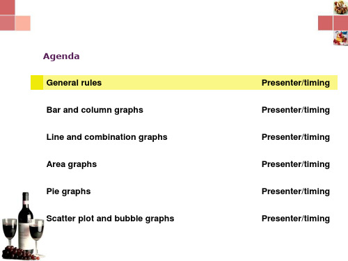
Agenda
General rules Bar and column graphs Line and combination graphs Area graphs Pie graphs Scatter plot and bubble graphs Presenter/timing Presenter/timing Presenter/timing Presenter/timing Presenter/timing Presenter/timing