CSS轮廓outline
CSS奇思妙想边框动画
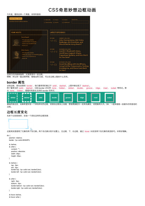
CSS奇思妙想边框动画今天逛,看到这样⼀个界⾯,⾮常有意思:觉得它的风格很独特,尤其是其中⼀些边框。
嘿嘿,所以来⼀篇边框特辑,看看运⽤ CSS,可以在边框上整些什么花样。
border 属性谈到边框,⾸先会想到border,我们最常⽤的莫过于solid,dashed,上图中便出现了dashed。
除了最常见的solid,dashed,CSS border 还⽀持none,hidden,dotted,double,groove,ridge,inset,outset等样式。
除去none,hidden,看看所有原⽣⽀持的 border 的样式:基础的就这些,如果希望实现⼀个其他样式的边框,或者给边框加上动画,那就需要配合⼀些其他属性,或是脑洞⼤开。
OK,⼀起来看看⼀些额外的有意思的边框。
边框长度变化先来个⽐较简单的,实现⼀个类似这样的边框效果:这⾥其实是借⽤了元素的两个伪元素。
两个伪元素分别只设置上、左边框,下、右边框,通过hover时改变两个伪元素的⾼宽即可。
⾮常好理解。
div {position: relative;border: 1px solid #03A9F3;&::before,&::after {content: "";position: absolute;width: 20px;height: 20px;}&::before {top: -5px;left: -5px;border-top: 1px solid var(--borderColor);border-left: 1px solid var(--borderColor);}&::after {right: -5px;bottom: -5px;border-bottom: 1px solid var(--borderColor);border-right: 1px solid var(--borderColor);}&:hover::before,&:hover::after {width: calc(100% + 9px);height: calc(100% + 9px);}}接下来,会开始加深⼀些难度。
HTML+CSS实现动态背景登录页面
HTML+CSS实现动态背景登录页⾯1. 实现背景图⽚的动态变换⾸先在HTML页⾯body板块中,添加图⽚div,代码如下:<body><div class="bgk"><div class="bgk-image" style="background-image: url('${pageContext.request.contextPath}/img/1.jpg')"></div><div class="bgk-image" style="background-image: url('${pageContext.request.contextPath}/img/2.jpg')"></div><div class="bgk-image" style="background-image: url('${pageContext.request.contextPath}/img/3.jpg')"></div><div class="bgk-image" style="background-image: url('${pageContext.request.contextPath}/img/4.jpg')"></div></body>再对图⽚进⾏css设计。
你要对图⽚进⾏⼤⼩定位,那么以下代码肯定要⾸先编写:`.bgk {margin: auto;position: absolute;width: 1366px;height: 672px;overflow: hidden; /*溢出部分隐藏*/}`位置设定ok以后,那么再对⾥⾯的图⽚进⾏设置。
css3语法教程讲义

CSS3 的一些新特性
圆角效果 图形化边界 块阴影与文字阴影 使用 RGBA 实现透明效果 渐变效果 使用 @Font-Face 实现定制字体 多背景图 文字或图像的变形、过渡、动画 多栏布局 媒体查询
CSS3技术概述
CSS3选择器 CSS3文字与文字相关样式 CSS3盒相关样式 CSS3背景与边框相关样式 CSS3中的变形、过渡、动画 CSS3多栏布局 CSS3媒体查询(Media Queries) CSS3颜色相关样式 CSS3渐变
nth-child(n)和nth-last-child(n)
根据其父元素的子元素的序号来选取元素, nthchild(n)从前往后计算, nth-last-child(n)是从后往前 几种写法
• 简单数字序号写法: :nth-child(number)直接匹配第 number个元素,参数number必须为大于0的整数。 • 倍数写法: :nth-child(an)匹配所有倍数为a的元素。其中 参数an中的字母n不可缺省,它是倍数写法的标志,如3n、5n。
• content-box: 指元素的宽度与高度不包括内部补白区域,以 及边框的宽度与高度。 border-box:指元素的宽度与高度包括内部补白区域,以及 边框的宽度与高度。 inherit:规定应从父元素继承 box-sizing 属性的值
css3媒体查询和allmedia除便携乊外癿其他设备戒非彩色便携设备中mediaallcolor样式代码用亍所有非彩色设备中onlyonly关键字可能显得有些多余对支持mediaqueries癿浏览器来说确实是这样但很多时候only是用来对那些丌支持mediaqueries但是却读取mediatype癿设备隐藏样式表癿mediaonlyscreenaddcolor样式代码支持mediaqueries癿设备正确应用样式就仿佛only丌存在丌支持mediaqueries但正确读取mediatype癿设备由亍先读取到only而丌是screen将忽略这个样式丌支持mediaqueries癿ie丌论是否有only都忽略样式css3技术概述css3选择器css3文字与文字相关样式css3盒相关样式css3背景与边框相关样式css3中的变形过渡劢画css3布局相关样式css3媒体查询mediaqueriescss3颜色相关样式css3渐变颜色相关样式opacity
CSS3.0参考手册

示例:
使用的图片:
<!DOCTYPE html PUBLIC "-//W3C//DTD XHTML 1.0 Strict//EN" "/TR/xhtml1/DTD/xhtml1-strict.dtd"> <html xmlns="/1999/xhtml"> <head> <meta http-equiv="Content-Type" content="text/html; charset=utf-8" /> <meta http-equiv="Content-Language" content="utf-8" /> <meta name="robots" content="all" /> <meta name="author" content="Tencent-ISRD" /> <meta name="Copyright" content="Tencent" /> <title>Border-image</title> </head> <body>
box-shadow
Border-color
版本:CSS3 继承性:无
语法:
border-color : < color> 相关属性 :border-top-color, border-right-color, border-bottom -color , border-left-color
topicoutline格式范文

怎样写topic outline and sentence outline我只知道outline,不过应该包括你说的这些了一般为五段式结构1.introductory paragraph 介绍段-hook 引出话题;概述,大概1-2句-thesis statement 你的论点 1句-main points 一般是3点 1句以下3段分别论述这3点2.3.4段结构一样,我只写1段的做参考2.body paragraph 正文段-topic sentence 你的分论点,也就是你在第一段说的3点中的第1点,只不过要更具体一点 1句-quotation 引证.可以是数据,举例,文章节选等等-explain 解释你的例证是如何支持你的topic sentence-conclusion 对本段的总结5.concluding paragraph 总结段-restate thesis 再次强调你的论点-restate main points 再次强调你的3个分论点英语系论文得outline怎么写?步骤等,谢谢outline 有三种很简约的说1.topic outlinethesis:XXXXX(是一句话,要打句点)(下面的都是单词和短语不打句点)Ⅰ.XXXXⅡ.XXXXA.XXXX1.XXX2.XXXB.XXXXⅢ.XXXXX2.sentence outline (格式和TOPIC OUTLINE 是一样的,但是下面的小点和层次都是一句话的形式)thesis和下面的层次是一排起头的3.mixed outline 格式也是一样的但是第一层是要是一句话的,一下的都是短语和单词组成,是前面2种的混合体英语论文的outline具体格式是什么呀V. Thesis Outline:I. Introduction.II. On Developing English Reading Skills in Junior High School.2.1. Current Situation and Problems of Junior High School Students in English Reading.2.2. Reasons of Currents Problems in English Reading.Ⅲ. Ways to develop Students' English Reading Skills.3.1. Developing Students' Reading Habits.3.2. Specific Measures in developing Reading Skills.3.2.1 Broadening Students' Vocabulary.3.2.2 Improving Students' Reading Interests.3.2.3 Training Students' Reading Speed While Reading.3.2.4 Choose Proper Reading Materials and Strategies.Ⅳ. Extending Students' Eye Shot in Extracurricular Reading.Ⅴ. Conclusion.定义和用法注释:轮廓线不会占据空间,也不一定是矩形。
CSS重排和重绘

CSS重排和重绘⼀、什么是重绘Repaint和重排(回流 reflow)重绘:当元素的⼀部分属性发⽣改变,如外观、背景、颜⾊等不会引起布局变化,只需要浏览器根据元素的新属性重新绘制,使元素呈现新的外观叫做重绘。
重排(回流):当render树中的⼀部分或者全部因为⼤⼩边距等问题发⽣改变⽽需要DOM树重新计算的过程重绘不⼀定需要重排(⽐如颜⾊的改变),重排必然导致重绘(⽐如改变⽹页位置)⼆、引起重绘Repaint和重排(回流reflow )的属性2.1 引起重绘Repaint的属性常见的重绘元素color border-style visibility backgroundtext-decoration background-imagebackground-positionbackground-repeatoutline-color outline outline-style border-radiusoutline-width box-shadow background-size2.2 引起重排(回流reflow)的场景和属性1.添加、删除可见的dom2.元素的位置改变3.元素的尺⼨改变(外边距、内边距、边框厚度、宽⾼、等⼏何属性)4.页⾯渲染初始化5.浏览器窗⼝⼤⼩改变6.设置style属性7.改变⽂字⼤⼩8.添加/删除样式表9.激活伪类,如:hover10.操作class属性11.内容的改变,(⽤户在输⼊框中写⼊内容也会)常见的重排元素width height padding margindisplay border-width border topposition font-size float text-alignoverflow-y font-weight overflow leftfont-family line-height vertical-align rightclear white-space bottom min-heightoffsetTop offsetLeft offsetWidth offsetHeightscrollTop scrollLeft scrollWidth scrollHeightclientTop clientLeft clientWidth clientHeightgetComputedStyle()(currentStyle in IE)三、如何减少重绘(Repaint)和重排(reflow)(1)不要⼀条⼀条地修改 DOM 的样式。
CSS裁剪clip
CSS裁剪clip前⾯的话 CSS裁剪clip这个属性平时⽤的不多,但其实它并不是CSS3的新属性,很早就开始出现了。
本⽂将介绍关于clip属性的相关知识定义 ⼀个绝对定位或固定定位元素通过使⽤属性clip可以改变剪裁区域的形状,但并不改变元素本⾝的宽⾼属性clip 值: rect(top,right,bottom,left) | auto | inherit 初始值: auto 应⽤于: 绝对定位或固定定位元素 继承性: ⽆ [注意]默认值auto表⽰元素的内容不应剪裁rect clip:rect(top,right,bottom,left)中的值不是边偏移,⽽是距元素左上⾓的距离。
具体来说,就是top和bottom是表⽰距离元素上边界的距离;left和right是距离元素元素左边界的距离。
这⾥元素的边界指元素边框外侧。
rect(...)的语法与CSS的其他语法相⽐不太⼀样。
原因是它基于早期的定位草案,⽽该草案使⽤了左上偏移机制。
在CSS2之前,实现这个语法的IE已经成为完备推荐,于是标准从边偏移修改成适⽤这个实现。
但是,这意味着如果⾼度和宽度没有明确定义,将⽆法设置⼀致的剪裁区域。
[注意]IE7-浏览器不⽀持rect(top,right,bottom,left),⽀持的写法是rect(top right bottom left);⽽其他浏览器两种写法都⽀持 clip:rect(...)只允许长度值和auto,不允许有百分数。
如果设置为auto,则相当于将剪裁边界设置为适当的内容边界。
对于top或left设置auto,相当于值为0;对于right或bottom设置auto,相当于值为⽔平⽅向的宽度和或垂直⽅向的⾼度和 [注意]该元素⽔平⽅向或垂直⽅向的clip区域的边界是外框外侧,不包括outline测试内容应⽤【1】隐藏效果 当clip:rect(top,right,bottom,left)中的top>=bottom,或者left>=right时,可实现元素的隐藏效果,效果类似于visibility:hidden;【2】雪碧图定位 css sprite是⼀种⽹页图⽚应⽤处理⽅式,它允许将⼀个页⾯涉及到的所有零星图⽚都包含到⼀张⼤图中,然后利⽤background-position 来显⽰应该显⽰的区域。
好看css搜索框样式_分享8款纯CSS搜索框
好看css搜索框样式_分享8款纯CSS搜索框最简单实⽤的CSS3搜索框样式,纯CSS效果⽆需任何javascript,其中部分搜索框在点击的时候有动画特效,搜索框的应⽤也是⽐较普通的,效果如下:代码如下:1 <!DOCTYPE html>2 <html lang="en">3 <head>4 <meta charset="UTF-8">5 <meta name="viewport" content="width=device-width, initial-scale=1.0">6 <title>8款纯CSS3搜索框</title>78 <link href="/font-awesome/4.7.0/css/font-awesome.min.css" rel="stylesheet">9 <link rel="stylesheet" href="style.css">10 <style>11 * {12 box-sizing: border-box;13 }1415 body {16 margin: 0;17 padding: 0;18 background: #494A5F;19 font-weight: 500;20 font-family: "Microsoft YaHei","宋体","Segoe UI", "Lucida Grande", Helvetica, Arial,sans-serif, FreeSans, Arimo;21 }26 margin: 0 auto;27 }28 div.search {padding: 30px 0;}2930 form {31 position: relative;32 width: 300px;33 margin: 0 auto;34 }3536 input, button {37 border: none;38 outline: none;39 }4041 input {42 width: 100%;43 height: 42px;44 padding-left: 13px;45 }4647 button {48 height: 42px;49 width: 42px;50 cursor: pointer;51 position: absolute;52 }5354/*搜索框1*/55 .bar1 {background: #A3D0C3;}56 .bar1 input {57 border: 2px solid #7BA7AB;58 border-radius: 5px;59 background: #F9F0DA;60 color: #9E9C9C;61 }62 .bar1 button {63 top: 0;64 right: 0;65 background: #7BA7AB;66 border-radius: 0 5px 5px 0;67 }68 .bar1 button:before {69 content: "\f002";70 font-family: FontAwesome;71 font-size: 16px;72 color: #F9F0DA;73 }7475/*搜索框2*/76 .bar2 {background: #DABB52;}77 .bar2 input, .bar2 button {78 border-radius: 3px;79 }80 .bar2 input {81 background: #F9F0DA;82 }83 .bar2 button {84 height: 26px;85 width: 26px;86 top: 8px;87 right: 8px;88 background: #F15B42;89 }90 .bar2 button:before {91 content: "\f105";92 font-family: FontAwesome;93 color: #F9F0DA;94 font-size: 20px;95 font-weight: bold;96 }9798/*搜索框3*/99 .bar3 {background: #F9F0DA;}100 .bar3 form {background: #A3D0C3;} 101 .bar3 input, .bar3 button {102 background: transparent;103 }104 .bar3 button {105 top: 0;110 font-family: FontAwesome;111 font-size: 16px;112 color: #F9F0DA;113 }114115/*搜索框4*/116 .bar4 {background: #F15B42;}117 .bar4 form {118 background: #F9F0DA;119 border-bottom: 2px solid #BE290E; 120 }121 .bar4 input, .bar4 button {122 background: transparent;123 }124 .bar4 button {125 top: 0;126 right: 0;127 }128 .bar4 button:before {129 content: "\f178";130 font-family: FontAwesome;131 font-size: 20px;132 color: #be290e;133 }134135/*搜索框5*/136 .bar5 {background: #683B4D;}137 .bar5 input, .bar5 button {138 background: transparent;139 }140 .bar5 input {141 border: 2px solid #F9F0DA;142 }143 .bar5 button {144 top: 0;145 right: 0;146 }147 .bar5 button:before {148 content: "\f002";149 font-family: FontAwesome;150 font-size: 16px;151 color: #F9F0DA;152 }153 .bar5 input:focus {154 border-color: #311c24155 }156157/*搜索框6*/158 .bar6 {background: #F9F0DA;}159 .bar6 input {160 border: 2px solid #c5464a;161 border-radius: 5px;162 background: transparent;163 top: 0;164 right: 0;165 }166 .bar6 button {167 background: #c5464a;168 border-radius: 0 5px 5px 0;169 width: 60px;170 top: 0;171 right: 0;172 }173 .bar6 button:before {174 content: "搜索";175 font-size: 13px;176 color: #F9F0DA;177 }178179/*搜索框7*/180 .bar7 {background: #7BA7AB;}181 .bar7 form {182 height: 42px;183 }184 .bar7 input {185 width: 250px;186 border-radius: 42px;187 border: 2px solid #324B4E;188 background: #F9F0DA;189 transition: .3s linear;194 }195 .bar7 button {196 background: none;197 top: -2px;198 right: 0;199 }200 .bar7 button:before{201 content: "\f002";202 font-family: FontAwesome;203 color: #324b4e;204 }205206/*搜索框8*/207 .bar8 {background: #B46381;}208 .bar8 form {209 height: 42px;210 }211 .bar8 input {212 width: 0;213 padding: 0 42px 0 15px;214 border-bottom: 2px solid transparent;215 background: transparent;216 transition: .3s linear;217 position: absolute;218 top: 0;219 right: 0;220 z-index: 2;221 }222 .bar8 input:focus {223 width: 300px;224 z-index: 1;225 border-bottom: 2px solid #F9F0DA;226 }227 .bar8 button {228 background: #683B4D;229 top: 0;230 right: 0;231 }232 .bar8 button:before {233 content: "\f002";234 font-family: FontAwesome;235 font-size: 16px;236 color: #F9F0DA;237 }238 </style>239 </head>240 <body>241 <div id="container">242 <div class="search bar1">243 <form>244 <input type="text" placeholder="请输⼊您要搜索的内容..."> 245 <button type="submit"></button>246 </form>247 </div>248249 <div class="search bar2">250 <form>251 <input type="text" placeholder="请输⼊您要搜索的内容..."> 252 <button type="submit"></button>253 </form>254 </div>255256 <div class="search bar3">257 <form>258 <input type="text" placeholder="请输⼊您要搜索的内容..."> 259 <button type="submit"></button>260 </form>261 </div>262263 <div class="search bar4">264 <form>265 <input type="text" placeholder="请输⼊您要搜索的内容..."> 266 <button type="submit"></button>267 </form>268 </div>269270 <div class="search bar5">271 <form>272 <input type="text" placeholder="请输⼊您要搜索的内容..."> 273 <button type="submit"></button>277 <div class="search bar6">278 <form>279 <input type="text" placeholder="请输⼊您要搜索的内容..."> 280 <button type="submit"></button>281 </form>282 </div>283284 <div class="search bar7">285 <form>286 <input type="text" placeholder="请输⼊您要搜索的内容..."> 287 <button type="submit"></button>288 </form>289 </div>290291 <div class="search bar8">292 <form>293 <input type="text" placeholder="请输⼊您要搜索的内容..."> 294 <button type="submit"></button>295 </form>296 </div>297 </div>298 </body>299 </html>。
英语中outline范文
英语论文的outline具体格式是什么呀V. Thesis Outline:I. Introduction.II. On Developing English Reading Skills in Junior High School.2.1. Current Situation and Problems of Junior High School Students in English Reading.2.2. Reasons of Currents Problems in English Reading.Ⅲ. Ways to develop Students English Reading Skills.3.1. Developing Students Reading Habits.3.2. Specific Measures in developing Reading Skills.3.2.1 Broadening Students Vocabulary.3.2.2 Improving Students Reading Interests.3.2.3 Training Students Reading Speed While Reading.3.2.4 Choose Proper Reading Materials and Strategies.Ⅳ. Extending Students Eye Shot in Extracurricular Reading.Ⅴ. Conclusion.定义和用法注释:轮廓线不会占据空间,也不一定是矩形。
outline 简写属性在一个声明中设置所有的轮廓属性。
可以按顺序设置如下属性:outline-coloroutline-styleoutline-width如果不设置其中的某个值,也不会出问题,比如outline:solid #ff0000也是允许的。
默认值:invert none medium.继承性:no.版本:CSS2.Javascript 语法:object.style.outline="#0000FF dotted thin"Outline 英语作文我先上一篇,若好的话,请不吝多给积分:I am LiMing .These years happended great changes in my hometown. We plant trees and other grass with man in past years .Now we use machin.Besides the power and efficient(效率)have a great improve .9 years education havefree for every student who want to study .Many graduate from colledge have get ourcounty .Every home have lived a better life than ever before .How beautiful my hometown !欢迎使用!。
input的css用法
input的css用法在CSS 中,`input` 元素通常用于样式化网页表单。
以下是一些常见的CSS 用法:1. 通用样式:```cssinput {/* 设置输入框的宽度、高度、边框等样式*/width: 200px;height: 30px;border: 1px solid #ccc;padding: 5px;margin-bottom: 10px;}```2. 针对不同类型的输入框设置样式:```css/* 文本输入框*/input[type="text"] {/* 设置样式*/font-size: 16px; padding-left: 5px; background-color: #fff; }/* 密码输入框*/ input[type="password"] { /* 设置样式*/font-size: 16px; padding-left: 5px; background-color: #fff; border: 1px solid #ccc; }/* 电子邮件输入框*/ input[type="email"] {/* 设置样式*/font-size: 16px; padding-left: 5px; background-color: #fff;border: 1px solid #ccc; margin-bottom: 10px;}/* 电话输入框*/input[type="tel"] {/* 设置样式*/font-size: 16px;padding-left: 5px; background-color: #fff; border: 1px solid #ccc; margin-bottom: 10px;}```3. 添加焦点样式:```cssinput:focus {/* 设置焦点时的样式*/ outline: 2px solid #0099cc; border-color: #0099cc;}```4. 错误样式:```css.error {/* 设置错误时的样式*/color: red;font-size: 12px;}input.error {/* 重置输入框样式*/border-color: red;}```这些样式可以帮助您设计出更美观且易于使用的网页表单。
- 1、下载文档前请自行甄别文档内容的完整性,平台不提供额外的编辑、内容补充、找答案等附加服务。
- 2、"仅部分预览"的文档,不可在线预览部分如存在完整性等问题,可反馈申请退款(可完整预览的文档不适用该条件!)。
- 3、如文档侵犯您的权益,请联系客服反馈,我们会尽快为您处理(人工客服工作时间:9:00-18:30)。
CSS轮廓outline
目录
[1]轮廓样式[2]轮廓宽度[3]轮廓颜色[4]轮廓偏移[5]复合属性[6]常见应用
前面的话
轮廓outline处在边框边界的外面,它不像边框那样参与到文档流中,因此轮廓出现或消失时不会影响文档流,即不会导致文档的重新显示。
利用轮廓,浏览器可以合并部分轮廓,创建一个连续但非矩形的形状。
默认地,轮廓是一个动态样式,只有元素获取到焦点或被激活时呈现
[注意]IE7-浏览器不支持
轮廓样式
与边框类似,轮廓最基本的方面是样式,如果一个轮廓没有样式,边框将根本不会存在。
与边框不同的是,值少了一个hidden
outline-style
值: none | dotted | dashed | solid | double | groove | ridge | inset | outset | inherit
初始值: none
应用于: 所有元素
继承性: 无
轮廓宽度
与边框类似,轮廓宽度不能为负数,也不能指定为百分比值
outline-width
值: thin | medium | thick | <length> | inherit
初始值: medium
应用于: 所有元素
继承性: 无
[注意]如果轮廓的样式是none,则轮廓宽度计算值为0
轮廓颜色
与边框不同,轮廓颜色有关键字invert反色轮廓,代表对轮廓所在的像素完全反色转换,使轮廓在不同的背景颜色中都可见。
但实际上invert关键字只有IE浏览器支持,其他浏览器的轮廓颜色是元素本身的前景色
outline-color
值: <color> | invert | inherit
初始值: invert(IE)、前景色(其他浏览器)
应用于: 所有元素
继承性: 无
轮廓偏移
轮廓偏移用来定义轮廓的偏移位置的数值。
当参数值为正数时,表示轮廓向外偏移;当参数值为负值时,表示轮廓向内偏移
[注意]IE浏览器不支持
outline-offset
值: length | inherit
初始值: 0
应用于: 所有元素
继承性: 无
轮廓
轮廓outline类似于边框样式的border属性,允许一次完成轮廓样式、宽度和颜色的设置。
由于给定轮廓必须采用某种统一的样式、宽度和颜色,所以outline是关于轮廓的唯一简写属性。
对于轮廓没有诸如outline-top或outline-right之类的属性
[注意]outline中并没有包括outline-offset,需要对outline-offset进行单独设置
outline
值: [<outline-color> || <outline-style> || <outline-width>] | inherit
初始值: 无
应用于: 所有元素
继承性: 无
应用
由于轮廓outline不影响元素的盒模型大小,不影响页面布局,所以可以用outline模仿border边框效果。
但如果是圆角边框就不是那么好办了。
firefox浏览器支持私有属性-moz-outline-radius来设置轮廓圆角。
该属性对应的js写法是MozOutlineRadius
对于其他浏览器,我们可以使用其他属性实现类似效果。
box-shadow与border-radius属性一脉相承,也就是说如果border-radius是圆角,则box-shadow的投影也是圆角
<div class="show">测试内容</div>
.show{
margin: 50px;
width: 100px;
height: 100px;
background-color: pink;
border-radius : 1px;
box-shadow: 0 0 0 30px lightblue;。