雅思写作图表题-精编版
雅思小作文流程图类题目范文及解析

雅思小作文流程图类题目范文及解析雅思小作文流程图类题目范文及解析,一起来学习一下吧,下面我就和大家共享,来观赏一下吧。
雅思小作文流程图类题目范文及解析雅思小作文流程图类题目范文及解析为大家带来雅思小作文当中一类较有难度的图表——流程图类的小作文的范文以及解析。
流程图顾名思义就是对某一有时间和步骤先后挨次的行为进行步骤的拆解,并配上相应的文字和解说而生成的图表。
我们在处理流程图类图表作文是应当怎么写,请看下文。
上图来自网络主题:家居设计题型:流程图The diagrams below show some principles of house design for cool and for warm climates.满分范文:The diagrams show how house designs differ according to climate.这些图表显示房子的设计因气候而不同。
The most noticeable difference between houses designed for cool and warm climates is in the shape of the roof. The designs also differ with regard to the windows and the use of insulation.为凉快和暖和气候设计的房子之间最明显的区分是屋顶的外形。
在窗户和保温材料的使用方面,设计也有所不同。
We can see that the cool climate house has a high-angled roof, which allows sunlight to enter through the window. By contrast, the roof of the warm climate house has a peak in the middle and roof overhangs to shade the windows. Insulation and thermal building materials are used in cool climates to reduce heat loss, whereas insulation and reflective materials are used to keep the heat out in warm climates.我们可以看到凉快的气候房子有一个高角度的屋顶,它允许阳光通过窗户进入。
雅思图表作文TASK1精讲精练
雅思图表作文TASK1精讲精练A理论部分:雅思小作文概论1、文章结构:主要分三部分:i。
introductory sentence;ii。
body paragraph;iii.Concluding sentence具体讲:第一段introductory sentence只要写一句话,交待图形(如the line graph, pie chart等等),描述对象(如图表描述的是the number of tourists visiting England),地点(如the US, the UK等)以及时间(如between 1988 and 1997等等);另外要注意的就是第一段不能和图表上方已给的句子太过相似!否则,会失分的!第二部分一般写1~3段,这要视情况而定。
这部分主要就是对比不同的数据,如相似或相同的数据;某个数据是另一个数据的2倍;某个数据所占比例最大或最小等等。
最后一段concluding sentence也只要写一句话,主要是总结图表的整个趋势。
2。
文章的效果。
很多学生会发现小作文的例文特别简单(尤其是剑桥书里提供的)。
原因很简单,这个report 的目的就是要让university lecturer了解某个事物的发展趋势,所以写出来的文章必须结构清晰、易懂,绝对不能太复杂,也不要把每个数据都描写出来,只要描写有代表性的,重要的数据即可.以下为雅思小作文的四个基本步骤第一步:改写题目通过同义词转换在短短的1分钟内就写好作文的第一段。
举例:The graph below shows the percentage of people unable to find work in three major countries from 1983 to 1992.题目中划线的单词都可以进行同义转换:graph—figure, show—illustrate, percentage-proportion, major-key, from…to…—between…and…,第二步:分析时态1. 图表小作文大部分时候使用过去时态,因为出现的数据一般都是以往的统计数据,过去的情形和现在的情形很有可能完全不一样,因此用过去时态比较恰当。
最总结-雅思图表作文
图表作文主要:表格题table,线图line graph,柱状图(竖)或条形图(横)bar chart,饼状图pie chart非主流:流程图process diagram, 地图特征信息:起点,拐点,终点,交点,变化趋势PS.忽略细节;尽可能按顺序介绍第一段:有时间变化的图,线图和柱状图等,概括总体趋势(上升下降或波动)没有时间变化的图,饼图和表格,概括几部分组成有时间推移,无明显趋势变化的第一段:The table shows that figures for imprisonment in the five countries mentioned indicate no overall pattern of increase or decrease. In fact there is considerable fluctuation from country to country.无时间推移,表格题等第一段:We can see from the table that the non-book club member figures are made up of sales to college staff, college students and members of the public.(概括组成部分)题目改写:可以将名词性短语改成句子:例1:The charts below show the levels of participation in education and science in developing and industrialized countries in 1980 and 1990.改写:These data shows the the difference between .. & .. countries' participation in edu & sci These data shows how the ..&.. countries participated in ....例2:The pie charts below show units of electricity production by fuel source in Australia and France in 1980 and 2000.改写:The charts compare the sources of electricity in Australia and France in the years …The charts indicate how many units of electricity were produced by different fuel sources in .. between ….线图line graph或柱状图bar chart范文:第一段:改写题目:The graph shows the increase in the aging population in ~~~概括总趋势:It indicates that the percentage of elderly people in all three countries is expected/predicted to (未来时间,预测)increase to almost 25% of the respective populations by the year 2040.第二段:起点数值:In 1940 the proportion of people aged 65 or more stood at only 5% in Japan, approximately 7% in Sweden and 9% in the US.起点到中点:However, while the figures for the Western countries grew to about~~ in around 1990, the figure for Japan dipped to only 2.5% for much of this period, before rising to (描述先升后降或者先降后升,让句式变复杂) almost 5% again at the present time.第三段:中后段趋势:In spite of some fluctuation in the expected percentages, the proportion of older people will probably continue to increase in the next two decades in the three countries. A more dramatic rise is predicted/seen (将来或现在) in Japan between 2030 and 2040, by which time it is thought that the proportion of elderly people will be similar in the three countries.有时间推移的线图or柱状图的描述:(划线部分表示时间推移;大量词汇形容上升下降极值等)✓As we can see from the line graph, the number of people using this station fluctuates 波动over these 16 hours.✓More specifically, at first/initially at 6am the number of people at that station stands at最初值only 100.✓Then, the number shoots up 上升over the next two hours, peaking at/reaching the highest point最大值400 at 8am.✓After that/from that moment on, the number declines rapidly for two hours, bottoming out at/reaching the lowest point 最小值180 at 10am.✓The period between 10 and 12 o’clock experiences/witnesses/sees(经历变化的三个词) a slight growth/ a downward trend 上升/下降趋势in the number of people, with thenumber reaching 280 at midday.✓Numbers in the following two hours level off at/remain stable at/stabilize at/reach a plateau at/hover at数值稳定at just under 300 people.✓From this point onwards, the number plunges to猛降only 100 from 2pm to 4pm.✓The next two hours experiences a sharp rise again, with 6 am arriving at 380 people.✓After 6pm, the number falls again, reaching the low point of 130 at 8pm.✓The period from 8am to 10pm sees a slight rise, but finally/eventually the number of people declines again from 180 at 9pm to 135 at 10pm.According to the graph, ~~ have rocketed over the 15-year period. Indeed, a staggering 65% increase in the total number of ~~ has been recorded between the year ~ and ~.There was a slow and steady increase in ~, ranging from~ to just over 10%This figure doubled in the next two years to reach ~From that moment on, significant jumps in the number of ~ averaged at 10% between the years 1996 to 1998 and to 2000 respectivelyThe most noteworthy increase was recorded in the period between the years 2000 and 2002 where numbers in ~~ rose dramatically from ~ to ~.This appears to have started to level off in the last two years with only a slight increase几个东西对比型的柱状图:▲先找到最多的:The chart shows that Britain, among the four European countries listed, has spent most heavily on the range of (一系列的,常用小作文中多个物品或人群的比较) consumer goods included. In every case, British spending is considerably higher than that of other countries; only in the case of tennis racquets does another countries, Italy, come close.▲相反,再找到最少的:In contrast, Germany is generally the lowest spender. This is most evident in photographic film, where Germany spends much less than Britain. Germany only spends more than another country, France, in two cases: tennis racquets and perfumes.▲再找到中间的:Meanwhile, France and Italy generally maintain middle positions, averaging approximately similar spending overall. Specifically, F spends more on CDs but less on tennis racquets than I does.▲总结:It is clear from the data that there are some significant differences (老套总结) in spending habits within Europe.表格题table范文:The table gives a breakdown of the different types of family who were living in poverty in~~ On average, 11% of all households, comprising almost two million people, were in this position. However, those consisting of only one parent or a single adult had almost double this proportion of poor people, with 21% and 19% respectively.Couples generally tended to better off, with lower poverty levels for couples without children than those with children. It is noticeable that for both types of household with children, ahigher than average proportion were living in poverty at this time(better off/worse off情况更好/更糟)Older people were generally less likely to be poor, though once again the trend favored elderly couples (only 4%) rather than singe elderly people(6%). (好句型the trend favoredA rather than B)Overall the table suggest s that~~~按增长多少排列:✓The greatest increase is in ~, rising from.. to..✓Next came~, rising from.. to..✓The percentage of households with a refrigerator rose 21% over the same period and of those with a washing machine by 14% (省略句)✓Households with ~,~ and~ increased by ~,~ and ~ respectively.✓The significant social changes reflected in the statistics are that over the period the proportion of British houses with central heating rose from one to two thirds and of those with a phone from under a half to over three-quarters. Together with the big increase in the ownership of washing machines and refrigerators, they are evidence of both rising standards and the trend of lifestyles based on comfort and convenience.饼状图pie chart范文:The chats compare the sources of electricity in Australia and France in the years 1980 and 2000. between these years electricity production almost doubled, rising from 100 units to 170 units in Australia, and from 90 to 180 units in France.In 1980 Australia used coal as the main electricity source (50 units) and the remainder was produced from natural gas, hydro power (each producing 20 units) and oil (which produced only 10 units). By 2000, coal had become the fuel for more than 75% of electricity produced and only hydro continued to be another significant source supplying approximately 20%.In contrast, France used coal as a source for only 25 units of electricity in 1980, which was matched by natural gas. The remaining 40 units were produced largely from oil and unclear power, with hydro contributing only 5 units. But by 2000 unclear power, which was not used at all in Australia, had developed into the main resource, producing almost 75% of electricity, at 126 units, while coal and oil together produced only 50 units. Other sources were on longer significant.Overall, it is clear that by 2000 these two countries relied on different principal fuel sources: A relied on coal and F on nuclear power.同义转换句子:Australia used coal as the main electricity sourceCoal was the main source for electricity in AustraliaThe main proportion of electricity was produced from coal in AustraliaCoal became the main fuel to produce electricity in Australia饼图常用的词汇句子:占多少:Account for/make upEg. A accounts for the greatest/largest proportion (52%)of the electricity use, while B makes upthe17% of the total need of electricity 括号内介绍数字Represent, occupy, constituteEg. C represents the same proportion (15%) as do D and E.包括:consist of, comprise, include组成:make up, compose, constituteAt the higher levels of education, men with postgraduate diplomas clearly outnumbered their female counterparts (70% and 30%, respectively), and also constituted 60% of Master’s graduates.Spend vt. Spent过去分词做定语spender消费者spending消耗量流程图process diagram✓The diagram shows that there are four main stages in the life of the silkworm.✓First of all, ~①~~~ it takes ten years for each egg to become~~✓This step lasts for up to six weeks until ~~~②✓After a period of about 3 weeks, ~~ eventually emerge from~~③and the life cycle begins againThe process begins with the raw material, limestone and clay, being crushed into powderThe second stage shows that the powder is blended in a mixer and then transported to aAfter having been hire-heated, in the following step the compound is fed to a grinder and ground into cement, which is subsequently packed into bags.杨涛预测大作文方面:1. Some college students cannot find jobs after graduation, so some local government encourage them to go the rural place to service the local residents. However, others believe it violates the right-to-choose for those university students. Discuss both sides and give your own opinion.2. Some people think the global warming is caused by all kinds of development worldwide, so that the whole world rather an individual or a single nation should take the responsibility of this solution. To what extent do you agree or disagree?3. Some people think we should all take primary education when we are young. However, other think we should take secondary education as well. Discuss both sides and give your own opinion.4. Travelers visit different places with the purpose of seeing something different from their own countries. However, the views around the world become increasingly similar. What are the causes of this issue? What measures should be taken to deal with it?5. People believe that we should give criminals community education rather than longer imprisonment for their rehabilitation. To what extent do you agree or disagree?6. Famous artists should get supports from the local government such as financial aid and tax-free. However, others believe people who love art should find their own way to live up. Discuss both sides and give your own opinion.7. Some people believe that there is only one standard of success: being rich and wealthy. To what extent do you agree or disagree? What other factors will also measure one’s success?8. The extinction of lesser-known language is because the widespread of English language as an international language around the globe. What are the effects of the extinction of some less-used languages? What measures should we take to deal with it?9. Some people believe that female cannot afford the some kinds of jobs such as military and police force. So these jobs should only employ male for the own good. To what extent do you agree or disagree?10. A saying goes “a friend in need is a friend indeed.” In modern society, people treat people as friends or enemies. Some people may think competition is good for the foundation of friendship. To what extent do you agree or disagree?Adv & Disadv 001Y ou should spend about 40 minutes on this task.Write about the following topic:It is becoming more and more difficult to escape the influence of the media on our lives.Discuss the advantages and disadvantages of living in a media rich society.Give reasons for your answer and include any relevant examples from your own knowledge or experience.Write at least 250 words.model answer:The media is about communication and I suppose most of us would agree that, as human beings we need to communicate. W e need to know what is going on in the world generally; we want to be entertained and tokeep in touch with people. Older media, such as newspapers, radio and TV help us do this, but the newer media, particularly the internet and mobile phones go further. W e have more choice in terms of what we watch or who we talk to.I have an I-Phone which allows me - just by using one device - to make phone calls, use the internet, listen to music, play games and watch videos. And it's all immediate, and portable. It makes you feel in control, but there arc disadvantages too.People are always texting and emailing each other and if they don't have their phone or laptop around, they feel cut off. Also, have you seen a group of teenagers in a cafe where they're not talking to each other, but using their phones? It's a very common sight these days, which many people feel is worrying, as we seem to prefer using technology to face-to-face communication.We are also spoilt for choice - perhaps too much choice. There are so many TV channels, but so many of the programmes are poor quality. There's also so much advertising all around us, trying to persuade us to buy things we don't really need. T o survive in such a society, you have to be very aware of the power the media can have over you, your actions and your opinions, and try not to let it control your life.T o my mind, there's no doubt we live in a media-rich society, and there's nothing we can do about that. What we can do is use the media responsibly and not let it use us.Children should never be educated at home by their parents. Do you agree or disagree?Discuss the advantages and disadvantages for young people who decide to do this.Y ou should write at least 250 words.model answer:Nobody can say with confidence that children should be taught at home or at any children's institutions. There are many different children and every one demand of education suitable only for him.But for most of children the best way of learning the life is being in the children's institutions. Nobody would argue that contacts between children of the same age are very important for bringing your child up. Such a contact is very important for playing, entertaining and learning living with other people. The harmonious living with other people, to my mind, is the first task for any man. Lack of this harmony sets problems and troubles.The children need space to run and make noise, to jump and cry. Do you or your neighbours allow these actions for your child? If you live in town, it is difficult to find a safe place to play. Kindergartens give such a possibility. They give space, a lot of toys and constructions for physical exercises. So, if you have bad living conditions, the kindergarten is the best way for you. But if you have a large family with many children and enough space, you may keep your child at home. Y ou should be sure that the child feels, dressed and comfortable. His brothers and sisters give him necessary contacts. It's noticed long ago that children in big families are much more easy-tempered and calm. They are located in more harmonic world than others.Sometimes differences in age put troubles in contacts between children in large families. Then it is better for child to be sent to the kindergarten (school). But if quarrels don't last for a long time, everything is all right. In general, quarrels develop ability to cooperate with people. They develop a personal initiative andforce setting the balance. In such a way the child gets lessons of life. Addly, the quarrels often take place in kindergartens and schools and we shouldn't fear it.Side by side with quarrels parents often are afraid of colds which happen in kindergartens more frequently. Parents prefer keeping the child at home. But for a healthy child odd cold (if illness occurs, it goes its normal course) can't make big harm to the child. And if the child is adaptable to the conditions of public places earlier it would be better for him in future.In general, I am a follower of the theory of keeping children in adapted places such as good kindergartens. But keeping children in such a place can't replace family and home. Only together they make harmonic and beautiful union.Agree or Disagree 001Y ou should spend about 40 minutes on this task.Write about the following topic:Computers and modems have made it possible for office workers to do much of their work from home instead of working in offices every day. Working from home should be encouraged as it is good for workers and employers.Do you agree or disagree?sample answer:In recent years the vast expansion of information and communications technology has made teleworking much more practical. Although in many cases office workers could be made geographically independent by using modems, faxes and cell phones, few companies or employees take full advantage of this possibility. There are a number of strong arguments in favor of allowing workers to work from home. Firstly costs for employers would be reduced because businesses would require less office space, which is often situated in the center of large cities. Secondly, worker's lives would be improved in a variety of ways. For example, they would not need to travel to get to work, which would give them more free time.Also, they could combine their work with their family life, which is a major advantage if they are parents of young children or they have old people to look after. On the other hand, traveling to a centralized workplace also has a number of points in its favor. The first is that many employees would miss the social aspect of work such as seeing colleagues and meeting customers. A further point is that employers would need to be able to trust their workers to work at a high standard and finish their work on time, since supervising teleworkers is even more complicated than supervising workers in the same office.Finally, working from home might inhibit teamwork and creative work and so perhaps so only really suitable for people doing routine office work.In conclusion, I believe that while many workers welcome the opportunity to go out to work, others would find the chance to work from home very convenient. Where possible, I think workers should be offered the choice, but not forced to work from home unless they wish to.Nowadays many students have the opportunity to study for part or all of their courses in foreign countries. While studying abroad brings many benefits to individual students, it also has a number of disadvantages. Do you agree or disagree?Write at least 250 words.sample answer:In recent years there has been a vast increase in the number of students choosing to study abroad. This is partly because people are more affluent and partly due to the variety of grants and scholarships which are available for overseas students nowadays. Although foreign study is not something which every studentwould choose, it is an attractive option for many people.Studying overseas has a number of advantages. Firstly/For example, it may give students access to knowledge and facilities such as laboratories and libraries which are not available in their home country. Furthermore/Moreover/What is more/Secondly, by looking abroad students may find a wider range of courses than those offered in their country's universities, and therefore one which fits more closely to their particular requirements.on the other hand, studying abroad has a number of drawbacks. These may be divided into personal and professional. Firstly students have to leave their family and friends for a long period. Furthermore/Moreover/What is more/Secondly studying abroad is almost always more expensive that studying in one's local university. Finally/Furthermore/Moreover/What is more, students often have to study in a foreign language, which may limit their performance and mean they do not attain their true level. In my opinion/On the other hand, however, the disadvantages of studying abroad are usually temporary in nature. Students who study abroad generally become proficient in the language quite soon and they are only away from their family and friends for a year or two. Furthermore/What is more, many of the benefits last students all their lives and make them highly desirable to prospective employers.Cause & Effect 001Y ou should spend about 40 minutes on this task.Write about the following topic:Illiteracy has traditionally been viewed as largely a third world problem.However it is becoming apparent that in countries such as the USA and Australia, illiteracy is on the increase.Discuss possible causes for this and its effect on society.Write at least 250 words.model answer:It is true that illiteracy is becoming a serious problem in industrialised nations. This is surprising as most people think that this is a problem only in under-developed nations such as in parts of Africa and India. Illiteracy is related to many other problems such as poverty, over-population and governmental corruption. Let us take a more detailed look at the causes of this growing problem in many Western nations.One of the most obvious reasons for the increase in illiteracy is the advent of television. Children no longer have to read to obtain information. Neither do they have to read to relax. T oday children get home from school and go straight to "the box" to watch their favorite program. Watching television is much easier and more exciting than reading.Another reason for the increase in illiteracy is the fact that so many women work. This means that children are often alone at home and so they are unsupervised. When parents get home they are often too tired to spend quality time whit their children.It is also true that many people blame schools for the decline in illiteracy. In many countries there has been a move away from teaching basic skills such as reading and writing.There are many effects of this growing illiteracy rate. The most obvious is unemployment. This may in turn lead to alcohol and drug abuse. Ultimately the economy of the country begins to suffer and there is a drop in living standards.T o address this problem, parents need to become more aware of their responsibilities and schools need to consider a change in their teaching methods. If this worsening trend is not reversed, the problem of illiteracy will become very serious.Discuss & Give Opinion 001Y ou should spend about 40 minutes on this task.Write about the following topic:In today's competitive world, many families find it necessary for both parents to go out to work. While some say the children in these families benefit from the additional income, others feel they lack support because of their parents' absence.Give reasons for your answer and include any relevant examples from your own knowledge or experience. Write at least 250 words.model answer:In the past a typical family consisted of a father who went out to work and a mother who stayed at home and looked after the children. Nowadays, it is the norm for both parents to work. This situation can affect children both positively and negatively.Some people think that the children of working parents are in an advantageous position where their parents are able to afford mere luxuries such as new clothes, video games or mobile phones. Proponents of this view argue that children are able to enjoy and experience more from life due to their parents' extra wealth, for example, by going on foreign holidays.On the other hand, however, there are those who claim that when both parents work, their children do not get enough support and attention, meaning that the children might not do as well at school because there is no one at house to provide support with such things as homework or exam revision. The absence of a parent at home could make it easier for children to get involved in such things as drugs or undertake drinking. When I was growing up, both my parents worked and I was always well provided for. On the other hand, I think that it would sometimes have been better if I could have seen more of my parents.In conclusion, I believe that we cannot change the fact that both parents have to work nowadays. It is not an ideal situation, but if parents make time for their children in the evenings and at the weekends, then the children will not suffer in any way. It must be stated that the extra income generated by both parents working, makes for a much higher standard of living which benefits the whole family.Discuss & Give Opinion 002Y ou should spend about 40 minutes on this task.Write about the following topic:Successful sports professionals can earn a great deal more money than people in other important professions.Some people think this is fully justified while others think it is unfair.Discuss both these views and give your own opinion.Give reasons for your answer and include any relevant examples from your own knowledge or experience. Write at least 250 words.model answer:As a result of constant media attention, sports professionals in my country have become stars and celebrities, and those at the top are paid huge salaries. Just like movie stars, they live extravagant lifestyles with huge houses and cars.Many people find their rewards unfair, especially when comparing these super salaries with those of top surgeons or research scientists, or even leading politicians who have the responsibility of governing the country. However, sports salaries are not determined by considering the contribution to society a person makes, or the level of responsibility he or she holds. Instead, they reflect the public popularity of sport in general and the level of public support that successful stars can generate. So the notion of 'fairness' is not the issue.Those who feel that sports stars' salaries are justified might argue that the number of professionals with real talent are very few, and the money is a recognition of the skills and dedication a person needs to be successful. Competition is constant and a player is tested every time they perform in their relatively short career. The pressure from the media is intense and there is little privacy out of the spotlight. So all of thesefactors may justify the huge earnings.Personally, I think that the amount of money such sports stars make is more justified than the huge earnings of movie stars, but at the same time, it indicates that our society places more value on sport than on more essential professions and achievements.(251 words)Reasons & Solutions 001Y ou should spend about 40 minutes on this task.Write about the following topic:In some countries young people have little leisure time and are under a lot of pressure to work hard in their studies.What do you think are the causes of this?What solutions can you suggest?Give reasons for your answer and include any relevant examples from your own knowledge or experience. Write at least 250 words.model answer:Some young people find themselves with very little leisure time. I believe there are two main causes of this situation. The first is parental pressure and the second is competition for university places.Every parent wants to see his or her child do well in school and go on to have a successful career. This means that they exert pressure on their children to spend hours each day studying at home. Some even arrange extra tuition for their children. In my own country, it is not uncommon for young people to spend another three hours at small private schools after their usual day at stale school is over. As a consequence, their leisure time is extremely limited and the pressure on them is considerable.The second cause is related to the higher education system. Each year, there are many times more applicants to university than there are university places. The result of this is that only those students with very high grades manage to obtain a place. This contributes to the pressure on teenagers since they must work long hours to have any chance of success.One solution to the problem is for parents to be made aware of the effects of the pressure they put on their children. Schools should inform parents that too much pressure can lead to anxiety, stress and depression. They should be shown ways in which they can help their children lead more balanced lives with a reasonable amount of leisure time.Another effective measure would be for the government to invest in the creation of more university places. This could be done by expanding existing universities or by building new ones. This would have the effect of easing competition for places giving teenagers some of their precious free lime back.Reasons & Solutions 002Y ou should spend about 40 minutes on this task.Write about the following topic:Counties such as China, India and Japan have unsustainable population growths. In fact many experts are of the opinion that the population 'explosion' which is now a very worrying concern, is the most serious threat to life on this planet.Give some suggestions to address this problem.Write at least 250 words.model answer:It is true that the population 'explosion' which has taken place over the last century, is a very serious problem. One of the main reasons for this unacceptable population growth is a lack of understanding about。
雅思英语图表作文范文(必备3篇)

雅思英语图表作文范文第1篇A类雅思各类图表作文要点及范文一.曲线图解题关键1曲线图和柱状图都是动态图,解题的切入点在于描述趋势。
2在第二段的开头部分对整个曲线进行一个阶段式的总分类,使写作层次清晰,同时也方便考官阅卷。
接下来再分类描述每个阶段的specifictrend,同时导入数据作为分类的依据。
3趋势说明。
即,对曲线的连续变化进行说明,如上升、下降、波动、持平。
以时间为比较基础的应抓住“变化”:上升、下降、或是波动。
题中对两个或两个以上的变量进行描述时应在此基础上进行比较,如变量多于两个应进行分类或有侧重的比较。
4极点说明。
即对图表中最高的、最低的点单独进行说明。
不以时间为比较基础的应注意对极点的描述。
5交点说明。
即对图表当中多根曲线的交点进行对比说明。
6不要不做任何说明就机械地导入数据,这不符合雅思的考试目的。
曲线图常用词汇动词—九大运动趋势一:表示向上:increase,rise,improve,grow,ascend,mount,aggrandize,goup,climb, take off, jump,shoot up暴涨,soar,rocket, skyrocket雅思英语图表作文范文第2篇It is said that countries are becoming similar to each other because of the global spread of the same products, which are now available for purchase almost anywhere. I strongly believe that this modern development is largely detrimental to culture and traditions worldwide.A country’s history, language and ethos are all inextricably bound up in its manufactured artefacts. If the relentless advance of international brands into every corner of the world continues, these bland packages might one day completely oust the traditional objects of a nation, which would be a loss of richness and diversity in the world, as well as the sad disappearance of t he manifestations of a place’s character. What would a Japanese tea ceremony be without its specially crafted teapot, or a Fijian kava ritual without its bowl made from a certain type of tree bark?Let us not forget either that traditional products, whether these be medicines, cosmetics, toy, clothes, utensils or food, provide employment for local people. The spread of multinational products can often bring in its wake a loss of jobs, as people urn to buying the new brand,perhaps thinking it more glamorous than the one they are used to. This eventually puts old-school craftspeople out of work.Finally, tourism numbers may also be affected, as travelers become disillusioned with finding every place just the same as the one they visited previously. To see the same products in shops the world over is boring, and does not impel visitors to open their wallets in the same way that trinkets or souvenirs unique to the particular area too.Some may argue that all people are entitled to have access to the same products, but I say that local objects suit local conditions best, and that faceless uniformity worldwide is an unwelcome and dreary prospect.Heres my full answer:The line graphs show the average monthly amount that parents in Britain spent on their children’s s porting activities and the number of British children who took part in three different sports from 2008 to is clear that parents spent more money each year on their children’s participation in sports over the six-year period. In terms of the number of children taking part, football was significantly more popular than athletics and 2008, British parents spent an average of around £20 per month on their children’s sporting activities. Parents’ spending on children’s sports increased gradually over the followi ng six years, and by 2014 the average monthly amount had risen to just over £ at participation numbers, in 2008 approximately 8 million British children played football, while only 2 million children were enrolled in swimming clubs and less than 1 million practised athletics. The figures for football participation remained relatively stable over the following 6 years. By contrast, participation in swimming almost doubled, to nearly 4 million children, and there was a near fivefold increase in the number of children doing athletics.剑桥雅思6test1大作文范文,剑桥雅思6test1大作文task2高分范文+真题答案实感。
雅思写作八分经典范文背诵:图表作文
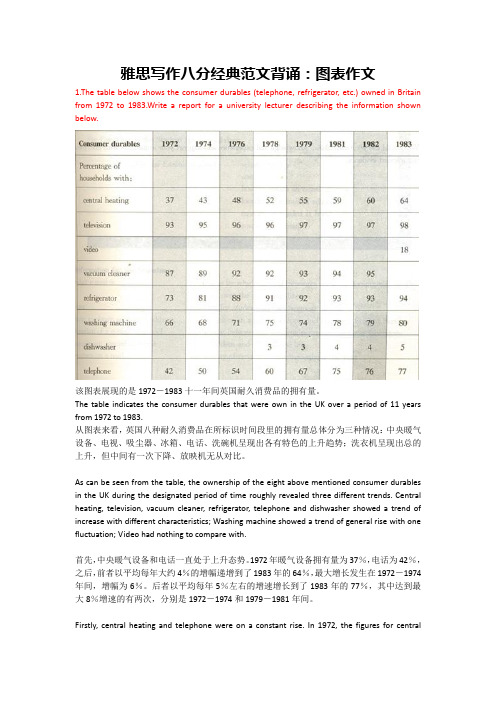
雅思写作八分经典范文背诵:图表作文1.The table below shows the consumer durables (telephone, refrigerator, etc.) owned in Britain from 1972 to 1983.Write a report for a university lecturer describing the information shown below.该图表展现的是1972-1983十一年间英国耐久消费品的拥有量。
The table indicates the consumer durables that were own in the UK over a period of 11 years from 1972 to 1983.从图表来看,英国八种耐久消费品在所标识时间段里的拥有量总体分为三种情况:中央暖气设备、电视、吸尘器、冰箱、电话、洗碗机呈现出各有特色的上升趋势;洗衣机呈现出总的上升,但中间有一次下降、放映机无从对比。
As can be seen from the table, the ownership of the eight above mentioned consumer durables in the UK during the designated period of time roughly revealed three different trends. Central heating, television, vacuum cleaner, refrigerator, telephone and dishwasher showed a trend of increase with different characteristics; Washing machine showed a trend of general rise with one fluctuation; Video had nothing to compare with.首先,中央暖气设备和电话一直处于上升态势。
雅思A类写作-图表写作模板

雅思A类写作-图表写作模板⼀.图表写作常⽤模板Para1. This is a table / chart / (line线状bar柱状pie饼状)graph which demonstrate / illustrate / reveal /depict /privide information about.............Para2. (1)Obvious /Apparent from the graph is that ...rank thefirst/highest,while/whereas ....turn out to be the lowest(2)It is exhibited/shown in the table that.....(3)It can be seen from the table that.....Para3.(1)饼.柱图A,which accounts for...%,ranks the first;then next is B with...%;followed by C,constituting...%;finally it comes D.E.F at...%...%and...%respectively(2)特殊变化(不变,增长或下降多的)①It is worth mentioning that....②It must be pointed out that....③More striking/surprising is that....Para4.To conclude /In conclusion/overall雅思写作图表作⽂标准化结构样本仅供参考Para 1, 两句话:第⼀句:This is a _____chart, which demonstrates the number of_____ from ____ to ____. 如果两个图,则:There are two charts below. The _____ chart describes the number of _____, and the _____ chart illustrates the figure of ____. 第⼆句:(所有题⽬适⽤),From the chart we can see that the number of ______ varies constantly/greatly in _____.Para 2, As we can see from the chart,/or It is clear from the chart that ____.如果有两个图:则:The _____ chart shows that ______./or As we can see from the first chart, _______Para 3, (如果两个图的话,) It is clear from the second chart that …Para 4 结尾:From the figures/statistics above, we can see/conclude/draw a conclusion that …⼆.应注意事项DON'T copy any part of the question in your answer. This is not your own work and therefore will be disregarded by the examiner and deducted from the word count. You can use individual words but be careful of using long "chunks" of the question text.Don't repeat yourself or the same ideas. This gives a bad impression and the examiner realises that it isn't adding to the content of your report.If you are weak at English grammar, try to use short sentences. This allows you to control the grammar and the meaning of your writing much more easily and contributes to a better cohesion and coherence mark. It's much easier to make things clear in a foreign language if you keep your sentences short!Think about the tenses of your verbs. If you're writing about something that happened in the past, your verbs will need to be in the past tenses. If you're describing the future, you will need to use the future tenses. If it's a habitual action, you'll need the present simple tense and so on. If you have time, a quick check of your verbs at the end of the exam can help you find errors. For describing graphs you will probably need past tenses whereas, for describing a process, you will probably need the present simple. Think about the verbs while practising and then it will become easier when you do the exam.As I just said, if you have finished the exam with time to spare, DON'T just sit there!! Check what you have done. If you have time after the check, check again. And so on……Don't be irrelevant. Although you can use your imagination to expand on your answer, if any part of your report is totally unrelated to the question and put in to just put up the word count, then the examiner will not take it into account and deduct it from the word count.If you want to improve, there's no secret. Practice. Practice. Practice. You won't get better sitting and doing nothing. Even good English users need practice for the IELTS exam. It could make all the difference between your getting the band that you need, and getting half a band less than you need and having to wait 3 months to do the exam again.三.写作范⽂雅思TASK1图表写作套句精选50句1.the table shows the changes in the number of...over the period from...to...该表格描述了在...年之...年间...数量的变化。
(完整版)雅思经典图表作文范文
#45. The charts below show the percentage of their food budget the average family spent on restaurant meals in different years. The graph shows the number of meals eaten in fast food restaurants and sit-down restaurants.You should write at least 150 words.Give reasons for your answer and include any relevant examples from your own knowledge or experience.Over the past 30 years, the average family has dramatically increased the number of meals that they eat at restaurants. The percentage of the family's food budget spent on restaurant meals steadily climbed. Just 10 percent of the food budget was spent on restaurant meals in 1970, and 15 percent in 1980. That percentage more than doubled in 1990, to 35 percent, and rose again in 2000 to 50 percent. Where families eat their restaurant meals also changed during that 30-year period. In 1970, families ate the same number of meals at fast food and sit-down restaurants. In 1980, fam¬ilies ate slightly more frequently at sit-down restaurants. However, since 1990, fast food restaurants serve more meals to the families than do the sit-down restaurants. Most of the restaurant meals from 2000 were eaten at fast food restaurants. If this pattern continues, eventually the number of meals that families eat at fast food restaurants could double the number of meals they eat at sit-down restaurants.(164 words)#44. You should spend about 20 minutes on this task.The map below is of the town of Garlsdon. A new supermarket (S) is planned for the town. The map shows two possible sites for the supermarket.Summarise the information by selecting and reporting the main features, and make comparisons where relevant.You should write at least 150 wordsmodel answer:The first potential location (S1) is outside the town itself, and is sited just off the main road to the town of Hindon, lying 12 kms to the north-west. This site is in the countryside and so would be able to accommodate a lot of car parking. This would make it accessable to shoppers from both Hindon and Garlsdon who could travel by car. As it is also close to the railway line linking the who towns to Cransdon (25 km to the south-east), a potentially large number of shoppers would also be able to travel by train.In contrast, the suggested location, S2, is right in the town centre, which would begood for local residents. Theorically the store could be accessed by road or rail from the surrounding towns, including Bransdon, but as the central area is a no-traffic zone, cars would be unable to park and access would be difficult. Overall, neither site is appropriate for all the towns, but for customers in Cransdon, Hindon and Garlsdon, the out-of-town site (S1) would probably offer more advantages.(179 words)# 43. You should spend about 20 minutes on this task.The table below shows CO2 emissions for different forms of transport in the European Union.The Pie Chart shows the percentage of European Union funds being spent on different forms of transport.You should write at least 150 words.model answer:The chart shows CO2 emissions per passenger kilometre for variuos methods of transport in the European Union while the pie chart shows European Union spending on transport. Flying by air produces by far the greatest CO2 emissions, approximately three times as much as passenger cars which are the next largest producers. Very little is spent by the EU on air travel while roads make up more than half of the EU transport budget.Trains produce about three times less CO2 emissions per passenger kilometre than passenger cars and eight times less than air travel. Nearly a third of EU transport funds are spent on railways.Ships are a clean form of transport and produce about the same amount of CO2 per passenger kilometre as trains do. However, only 2 percent of EU funds are spent on ports. A further one percent is spent on inland waterways.Coaches are the cleanest form of transport. Emissions of CO2 per passenger kilometre from coaches are half those of buses. Buses emit less than half as much CO2 per passenger kilometre as cars. The European Union spends 10 percent of its transport budget on public transport, such as buses and coaches. (197 words)The table below shows the sales at a small restaurant in a downtown business district.Summarize the information by selecting and reporting the main features, and make comparisons where relevant.You should write at least 150 words.Give reasons for your answer and include any relevant examples from your own knowledge or experience.model answer:The sales at this small restaurant during the week of October 7 to 13th followed a fairly set pattern from Monday to Friday, and then showed notable shift on the weekend. The lunch and dinner sales during the week peaked on Friday and then dipper down as the weekend set in.During the week of October 7-14th, the lunch sales averaged at approximately $2,400. The highest lunch sales occurred on Friday, and the lowest occurred on Sunday. Sunday's lunch sales were approximately $1,000 less than the average lunch sales during the rest of the week.Dinner sales, which generated at least $1,000 to $1,500 more a day than lunch sales, also remained steady during the week. Just like the lunch sales, the dinner sales peak on Friday and dipped down for the weekend.Excluding Wednesday and Thursday, the lunch and dinner sales from October 7-11 rose gradually until the end of the business week. Midweek, on Wednesday and Thursday, the sales were slightly lower than they were on Tuesday.According to the sales report, this restaurant has a steady lunch and dinner crowd. The most profitable day during the second week of October was Friday. Sunday, was the least prof¬itable day, with the full day's sales totaling/totalling less than the Friday dinner sales. These numbers are reflective of a restaurant that is located in a business/financial district where business hours are Monday through Friday.In June 1996, an experimental flu vaccine was trialled in a large country town on females only.Summarise the information by selecting and reporting the main features, and make comparisons where relevant.You should write at least 150 words.Give reasons for your answer and include any relevant examples from your own knowledge or experience.model answer:The diagrams show data for a flu epidemic which hit a large country town in 1996. Figure 1 gives the number of persons who died; Figure 2 shows the percentage breakdown of females who received a new flu vaccine; and Figure 3 gives the number of cases of flu before and during the epidemic.In Figure 1 it can be seen that the flu was responsible for the deaths of 2 females but no males in the period from March to May. However, from June to August, there were 4 female deaths and 1 male death.According to the pie chart in Figure 2, only those females most at risk were given the new flu vaccine; 28% did not take part in the trial. Of those females who took part, 35% were aged (over 65 years old); 24% were babies or children; and 13% were either hospitalised or receiving other medical attention.From Figure 3 it is clear that the new vaccine had a positive effect on the number of new cases of flu reported in females. There were just over 1000 cases reported in March, climbing rapidly to a peak of 3500 in June. Thereafter, the number of cases dropped slowly to about 2800 in August, before levelling off at 2500 for the rest of the year. For males, the figures were lower but showed a similar trend throughout the epidemic.(232 words)#39. You should spend about 20 minutes on this task.The chart below shows estimated world literacy rates by region and by gender for the year 2000.Write a report for a university lecturer describing the information below.You should write at least 150 words.model answer:In this report I will describe a bar chart that shows the estimated world illiteracy rates by gender and region for the year 2000.First I will look at male illiteracy for the 6 areas shown. The lowest rates were in Developed Countries, Latin America/Caribbean and East Asia/Oceania with rates of 1% (approximately), 10% and 8% (approximately) respectively. The rates for the next three areas were much higher and quite similar to each other. Sub-Saharan Africa, the Arab States and South Asia had rates of approximately 31%, 29% and 34%.Female illiteracy was much higher relatively in each area except LatinAmerica/Caribbean where it was only slightly higher. The lowest rates for female illiteracy were again Developed Countries, Latin America/Caribbean and East Asia/Oceania with rates of approximately 2%, 12% and 20%. Again the rates for the next three areas were much higher and quite similar to each other. Sub-Saharan Africa, the Arab States and South Asia had rates of approximately 48%, 52% and 56%.This ends my report.# 38. You should spend about 20 minutes on this task.The chart shows the number of mobile phones and landlines per 100 people in selected countries.Write a report for a university lecturer describing the information given.You should write at least 150 words.model answer:The graph shows the number of mobile phones and landlines per 100 users, for selected countries. Overall, most of the countries included in the graph have more mobile phones subscribers than landlines.Most European countries have high mobile phone use. The biggest users of mobile phones are the Italians, with 88 cell phones per 100 people. For example, Italy has twice as many mobile phones as landlines, with 88 mobiles per hundred people compared to 45 for landlines. Mobile phone use is low in Canada, with fewer than 40 phones per 100 people. Denmark is also unusual because it has slightly more landlines than mobile phones.However, in some countries, the number of landlines is higher than the number of mobile phones. One example is the USA, where the number of mobiles, at 50 per 100 people, is much lower than the number of landlines, at almost 70 per hundred.A similar pattern can be seen in Canada. The highest number of landlines in the graph is in Denmark, with about 90 per 100 people. In contrast, the lowest figures for fixed lines are in Italy and the UK.In conclusion, it seems that mobile phone use is higher in Europe than in North America.# 37. You should spend about 20 minutes on this task.The graphs show enrolment in different colleges in the Higher Colleges of Technology in 1999.Write a total of 150 - 200 words about the information in the three graphs. Write a report for a university lecturer describing the information given. You should write at least 150 wordsmodel answer:The charts shows student enrolment by gender and level in different colleges of the Higher Colleges of Technology colleges in the UAE.There are clear differences in male and female enrolment. Females outnumber men in all the colleges, with almost 25% more students in Dubai Women's college than in Dubai Men's. Ras Al-Khaimah Women's College has almost 180 students, compared to only 100 in the Men's college.Females also outnumber males by level, with almost double the number of men at Higher Diploma level (330 compared to 181). Only at Diploma level does the number of men slightly exceed that of women.Over half the students are in Certificate level, with less than a quarter at Higher Diploma or Bachelor level.In conclusion, most students in the Higher Colleges are enrolled at Diploma level or below, and the majority of students are women.(143 words)# 36. You should spend about 20 minutes on this task.The line graph below shows the number of annual visits to Australia by overseas residents. The table below gives information on the country of origin where the visitors came from. Write a report for a university lecturer describing the information given.You should write at least 150 words.NUMBER OF VISITORS (million)1975 2005SOUTH KOREAJAPANCHINAUSABRITAINEUROPE 2.93.20.30.40.91.19.112.00.81.12.94.5Total 8.8 30.4model answer:The given line graph illustrates information on the number of overseas visitors traveling to Australia in millions of people. Overall, one notable trend seems to be that Australia has steadily become more popular as a destination spot. For example, there were 20 million more visitors to Australia in 2005 than in 1975. That's a jump from 10 million to 30 million in 20 years.The second table gives statistics showing the countries whose residents went to Australia between 1975 and 2005. In both years, the largest number of visitors came from Japan, followed by South Korea and Europe. Britain, the United States and China also had many people traveling to Australia in these years. In fact, the number of people visiting Australia grew in every one of these countries. For example, in 2005, 12 million people went there from Japan compared with only 3.2 million in 1975.(147 words)#35. You should spend about 20 minutes on this task.The table below shows the consumer durables (telephone, refrigerator, etc.) owned in Britain from 1972 to 1983.Write a report for a university lecturer describing the information shown below. You should write at least 150 words.Consumer1972 1974 1976 1978 1979 1981 1982 1983 durablesPercentage ofhouseholds with:central heating 39 43 48 52 55 59 60 64television 93 95 96 96 97 97 97 98video 18vacuum cleaner 87 89 92 92 93 94 95refrigerator 73 81 88 91 92 93 93 94washing66 68 71 75 74 78 79 80 machinedishwasher 3 3 4 4 5telephone 42 50 54 60 67 75 76 77 model answer:The chart shows that the percentage of British households with a range of consumer durables steadily increased between 1972 and 1983. The greatest increase was in telephone ownership, rising from 42% in 1972 to 77% in 1983. Next came centralheating ownership, rising from 37% of households in 1972 to 64% in 1983. The percentage of households with a refrigerator rose 2 1% over the same period and of those with a washing machine by 14%. Households with vacuum-cleaners. televisions and dishwashers increased by 8%, 5% and 2% respectively. In 1983. the year of their introduction, 18% of households had a video recorder.The significant social changes reflected in the statistics are that over the period the proportion of British houses with central heating rose from one to two thuds, and of those with a phone from under a half to over three-quarters. Together with the big increases in the ownership of washing machines and refrigerators, they are evidence of both rising living standards and the trend to lifestyles based on comfort and convenience.#34. You should spend about 20 minutes on this task.The table below shows the figures for imprisonment in five countries between 1930 and 1980.Write a report for a university, lecturer describing the information shown below. You should write at least 150 wordsmodel answer:The table shows that the figures for imprisonment in the five countries mentioned indicate no overall pattern of increase or decrease. In fact there is considerable fluctuation from country to country.In Great Britain the numbers in prison have increased steadily from 30 000 in 1930 to 80,000 in 1980. On the other hand in Australia, and particularly in New Zealand the numbers fell markedly from 1930 to 1940. Since then they have increased gradually, apart from in 1980 when the numbers in prison in New Zealand fell by about 30,000 from the 1970 total. Canada is the only country in which the numbers in prison have decreased over the period 1930 to 1980, although there have been fluctuations in this trend. The figures for the United States indicate the greatest number of prisoners compared to the other four countries but population size needs to be taken into account in this analysis. The prison population in the United States increased rapidly from 1970 to 1980 and this must be a worrying trend.。
雅思图表作文模板「经典篇」
雅思图表作文模板「经典篇」雅思图表作文模板「经典篇」静态图表可以为所呈现的信息,只有不同数据之间的对比,无时间变化的图表。
主要常见的静态图可以分为:柱状图,饼状图,表格以及对比式的地图题。
不同于比如折线图的雅思小动态图,静态图的写作技巧有所不同。
首先分类,其次按比例进行描写。
对于比例的描述中常用的词:(大比例:Dominate/occupy the majority of/ stand at the largest of proportion ofwhich is…注意词性的'替换。
)模板句型:1.B rank/position second followed immediately/closely by C and D.B is in the second place.B is the second most/least popular…2. 占据(占据多少百分比)Be/consist/compose/take up…/comprise/constitute/make up/account for/occupies a majority of sth.E.g. Voluntary workers take up nearly half of the work force in house care sector (医护产业).Hispanics (a speaking person living into the US. Especially one of Latin American)综合句型:1.A be 倍数 as many/much as B(利用句型,雅思想要达到高分要求的话,要尽量在主语上下功夫,脑袋里首先想到的主语一定是大家都能想到的,再想想看是否可以用别的主语进行造句)E.g. Women working as/employed as child minder in the under-35 age group in 1995 were twice as many as in 1990.Television was twice as popular as washing machine in 1999,with close to 10% of household owning one TV set at home.(sale volume of television销售量;新高/新低 new high/new low) 主体段落开头必备:副词clearly, .../ obviously, .../ apparently, .../ evidently, ...短语:According to the table/data, .......In accordance with the table/data, .....That从句:It can be seen from the + 图表+that ......We can see from the + 图表+that ......It appears from the data that ......It indicates from the table that.......As从句:As we can see from the data/table, ......As we can see from the data/ table, .......As is reflected in the table, ......。
最新雅思考试图表作文
•
11.As is shown in the table...如表格所示...
•
•Байду номын сангаас
12.As can be seen from the diagram, great changes have taken place in... 从图中可以看出,...发生了巨大变化。
13.From the table/chart/diagram/figure,we can see clearly that...or it is clear/apparent from the chart that... 从图表我们可以很清楚(明显)看 到... 14.This is a graph which illustrates...这个图表向我们展示了... 15.This table shows the changing proportion of a & b from..to... 该表格描述了...年到...年间a与b的比例关系。 16.The graph,presented in a pie chart, shows the general trend in... 该图以圆形图形式描述了...总的趋势。 17.This is a column chart showing...这是个柱型图,描述了...
•
1.The bar chart illustrates that... 该柱状图展示了...
•
• • • • • • • •
2.The graph provides some interesting data regarding... 该图为我们提供了有关...有趣数据。
3.The diagram shows (that)...该图向我们展示了... 4.The pie graph depicts (that)....该圆形图揭示了... 5.This is a cure graph which describes the trend of...这个曲线图描述 了...的趋势。 6.The figures/statistics show (that)...数据(字)表明... 7.The tree diagram reveals how...该树型图向我们揭示了如何... 8.The data/statistics show (that)...该数据(字)可以这样理解... 9.The data/statistics/figures lead us to the conclusion that... 这些数据资料令我们得出结论... 10.According to the chart/figures...根据这些表(数字)...
雅思作文模板:图表作文模板12个
雅思作文模板:图表作文模板12个雅思图表作文离不开数据的描述,所以大家如果想要在雅思图表作文当中取得好成绩,就一定要掌握一些数据描述的模板。
下面就为大家总结了12个关于数据描述的雅思图表作文模板,大家可以在备考的时候进行参考。
1.the table shows the changes in the number of...over the period from...to... 该表格描述了在...年之...年间...数量的变化。
2.the bar chart illustrates that... 该柱状图展示了...3.the graph provides some interesting data regarding... 该图为我们提供了有关...有趣数据。
4.the diagram shows (that)... 该图向我们展示了...5.the pie graph depicts (that).... 该圆形图揭示了...6.this is a cure graph which describes the trend of... 这个曲线图描述了...的趋势。
7.the figures/statistics show (that)... 数据(字)表明...8.the tree diagram reveals how... 该树型图向我们揭示了如何...9.the data/statistics show (that)... 该数据(字)可以这样理解...10.the data/statistics/figures lead us to the conclusion that... 这些数据资料令我们得出结论...11.as is shown/demonstrated/exhibited in the diagram/graph/chart/table... 如图所示...12.according to the chart/figures... 根据这些表(数字)...以上就是关于雅思图表作文数据描述的模板,大家可以看到这些雅思图表作文的模板是根据雅思图表的种类的不同而有不同的描述方法。