雅思写作Task1曲线图考官范文(5)
雅思英语图表作文范文(必备3篇)

雅思英语图表作文范文第1篇A类雅思各类图表作文要点及范文一.曲线图解题关键1曲线图和柱状图都是动态图,解题的切入点在于描述趋势。
2在第二段的开头部分对整个曲线进行一个阶段式的总分类,使写作层次清晰,同时也方便考官阅卷。
接下来再分类描述每个阶段的specifictrend,同时导入数据作为分类的依据。
3趋势说明。
即,对曲线的连续变化进行说明,如上升、下降、波动、持平。
以时间为比较基础的应抓住“变化”:上升、下降、或是波动。
题中对两个或两个以上的变量进行描述时应在此基础上进行比较,如变量多于两个应进行分类或有侧重的比较。
4极点说明。
即对图表中最高的、最低的点单独进行说明。
不以时间为比较基础的应注意对极点的描述。
5交点说明。
即对图表当中多根曲线的交点进行对比说明。
6不要不做任何说明就机械地导入数据,这不符合雅思的考试目的。
曲线图常用词汇动词—九大运动趋势一:表示向上:increase,rise,improve,grow,ascend,mount,aggrandize,goup,climb, take off, jump,shoot up暴涨,soar,rocket, skyrocket雅思英语图表作文范文第2篇It is said that countries are becoming similar to each other because of the global spread of the same products, which are now available for purchase almost anywhere. I strongly believe that this modern development is largely detrimental to culture and traditions worldwide.A country’s history, language and ethos are all inextricably bound up in its manufactured artefacts. If the relentless advance of international brands into every corner of the world continues, these bland packages might one day completely oust the traditional objects of a nation, which would be a loss of richness and diversity in the world, as well as the sad disappearance of t he manifestations of a place’s character. What would a Japanese tea ceremony be without its specially crafted teapot, or a Fijian kava ritual without its bowl made from a certain type of tree bark?Let us not forget either that traditional products, whether these be medicines, cosmetics, toy, clothes, utensils or food, provide employment for local people. The spread of multinational products can often bring in its wake a loss of jobs, as people urn to buying the new brand,perhaps thinking it more glamorous than the one they are used to. This eventually puts old-school craftspeople out of work.Finally, tourism numbers may also be affected, as travelers become disillusioned with finding every place just the same as the one they visited previously. To see the same products in shops the world over is boring, and does not impel visitors to open their wallets in the same way that trinkets or souvenirs unique to the particular area too.Some may argue that all people are entitled to have access to the same products, but I say that local objects suit local conditions best, and that faceless uniformity worldwide is an unwelcome and dreary prospect.Heres my full answer:The line graphs show the average monthly amount that parents in Britain spent on their children’s s porting activities and the number of British children who took part in three different sports from 2008 to is clear that parents spent more money each year on their children’s participation in sports over the six-year period. In terms of the number of children taking part, football was significantly more popular than athletics and 2008, British parents spent an average of around £20 per month on their children’s sporting activities. Parents’ spending on children’s sports increased gradually over the followi ng six years, and by 2014 the average monthly amount had risen to just over £ at participation numbers, in 2008 approximately 8 million British children played football, while only 2 million children were enrolled in swimming clubs and less than 1 million practised athletics. The figures for football participation remained relatively stable over the following 6 years. By contrast, participation in swimming almost doubled, to nearly 4 million children, and there was a near fivefold increase in the number of children doing athletics.剑桥雅思6test1大作文范文,剑桥雅思6test1大作文task2高分范文+真题答案实感。
雅思写作Task1流程图考官范文(5)
雅思写作Task1流程图考官范文(5)(最新版)编制人:__________________审核人:__________________审批人:__________________编制学校:__________________编制时间:____年____月____日序言作文(composition)是经过人的思想考虑和语言组织,通过文字来表达一个主题意义的记叙方法。
作文分为小学作文,中学作文,大学作文(论文)。
作文体裁包括:记叙文、说明文、应用文、议论文。
作文并不神秘,要想写好一篇文章,首先要多看,多想,勤于观察,积累素材。
只有细致的观察生活,积累素材才是写好作文的基础。
首先要明确你要写的主题,认真的审题,列出大纲,不要只注意题目中要求的字有多少,要多注意题目的本身,要多读多想,准确的用好词语和修饰语。
这是审题的关键,要确立好主题的依据,要精心的选材,布局列题,有的材料,还要分析整理。
这就要对材料进行分类,比较,概括,筛选。
我们不要象盖房子那样的把所有的材料都堆砌起来,要合理恰当的组合,具体的说开头和结尾要略写,那么经过就要仔细的推敲,修辞,润色,写好以后不要急于交稿,反复检查认真的修改。
古人说:书读百遍,其义自见。
熟读唐诗三百首,不会作诗也会吟。
这些都说明一个道理,只要你多看书,多读书对你的写作文有一定的好处。
只要你明白这样的一个道理,作文就是要你把生活中喜,怒,哀,乐用文字经过加工,修饰。
整理,也就是我们说的作文。
作文内容英语作文啦雅思频道特为大家收集整理了雅思写作Task1流程图考官范文。
认真研读一定的雅思范文及作文模板可以帮助我们检验自己的写作水平,并能很好地吸收和应用优秀范文里的优秀内容~更多雅思报名官网的最新消息,最新、最专业的雅思备考资料,英语作文啦将第一时间为大家发布。
The diagram below shows how a central heating system in a house works.Summarise the information by selecting and reporting the main features, and make comparisons where relevant.Sample Answer:The given diagram shows how a central heating system of a house works. As is observed from the illustration, the central heating machine comprises several mechanical aspects and forms a complex system.According to the given illustration, for the central heating machine to work the cold water supply is required and this water flows to the storage tank and the overflow pipe is there to store the excess water in storage. Thewater is passed through a boiler which is either gas or oil driven and a pump is connected with it. The radiators are connected with the boiler and these radiators are made of small tubes. When the cold water passes through the pump and boiler, it gains temperatures and become hot water and from the water taps the house members get hot water. Thus the whole system that covers the house keeps it warm.In summary, the central heating symtem mainly works by flowing water through the house and increasing the temperature of it.。
【2019最新】雅思小作文攻略+范文:曲线图-word范文模板 (1页)

【2019最新】雅思小作文攻略+范文:曲线图-word范文模板本文部分内容来自网络整理,本司不为其真实性负责,如有异议或侵权请及时联系,本司将立即删除!== 本文为word格式,下载后可方便编辑和修改! ==雅思小作文攻略+范文:曲线图下面雅思为大家整理了雅思小作文攻略+范文:曲线图,供考生们参考,以下是详细内容。
曲线图范文 1:【第一句】 The curve illustrates the number of cases of A - type crimes committed in the UK between the years 1990 and 201X.【第二句】It can be seen that A - type crimes decreased dramatically to 200 cases around the middle of the 1990 s and then increased to 201X before the year 201X.范文 2:From the graph , we can see clearly that in the early morning ,at 6 a . m ., few people watch TV . However , from this time onwards , the number of TV audience is on the rise . At noon , the people watching TV account for about 8% of the total population . In the period between 12:00 and 2:00 p . m ., the TV audience experiences a sharp increase from 8% to approximately 18%.From 2:00 p . m . to 4:00 p . m ., the figure remains constantat about 18%, then balloons to the peak of the day , reaching approximately 50%. The number of TV audiences drops dramatically from 10 p . m . till it reaches its bottom at 3 p . m .On the other hand , there is a sharp increase in radio audience from 6. a . m to 9 a . m ., peaking at about 28% at 8:30 a . m . However , from this point onwards , it declines gradually for therest of the day , bottoming out at 4:00 a . m . the next day .In brief , the number of TV and radio audiences varies according to different phases of time probably due to the different features of these two media .。
(完整word版)雅思作文写作Task 1第一课时—曲线图、表格图

IELTS图表作文讲解:曲线图表格图范文分析:开头段(首段改写)The graph ①illustrates changes in the amounts of② beef, lamb, chicken and fish③consumed in a particular European country④ between 1979 and 2004。
①改写题目中的shows⑧下降表达,类似的有decrease, go down , decline, fall down ,drop ,sink。
这句话描写相反的趋势。
⑨交叉点⑩时间+上升表达⑪⑩最大值结尾段Overall,the graph shows how the consumption of ①chicken increased dramatically while the popularity of ②these other foods decreased over the period.①上升②下降,结尾段一般总结图中最主要的信息或最终要的趋势.❖TABLE③ 低于平均值的家庭类型情况④ 高于平均值的情况⑤ 倍数表达,清晰的对比⑥ 尾段对表中的主要类型的总趋势进行了重述Besides,此文章中作者用括号表达数据,很有新意,清晰三、结构及句型总结首段常用句型:1。
The table /graph shows (that)...2. The figures/statistics show (that)。
3. The diagram shows/ describes/ illustrates how。
.4。
According to/As (is) shown in the/As can be seen from the table/chart, diagram, graph, figures5. It can be seen/obse rved from the/ we can see from the…6. It is clear/ apparent from the table/chart/diagram/graph/figures (that)。
(扬州沃的)雅思写作之曲线图写作攻略

雅思写作之曲线图写作攻略雅思写作包含图表作文以及议论文,也就是我们常说的小作文和大作文。
评分上前者占1/3,后者占2/3。
很多考生根据评分上的比重,错误地认为小作文没有议论文重要,殊不知,虽然只占1/3,但图表作文的技巧性比较强,短期内强化训练更能有较大提高。
若考生的写作总分要求达到6分,那图表作文至少要达到7分,这样才更为保险。
以下是扬州沃的雅思托福培训中心的老师通过总结,对数据类图表中的曲线图做出的分类写作攻略。
曲线图是所有数据类动态图表的基础,掌握了曲线图的写法,其他图表就很容易下手了。
曲线图一般分为三种情况,单曲线,双曲线和多根曲线。
单曲线单曲线最简单,没有纵向的对比,只需要横向比较,从起点至终点按照时间段把趋势提出来即可。
需要注意的是不仅要列趋势,还要作对比。
双曲线双曲线即图表里出现了两根曲线,而且大部分情况下这两根曲线的趋势是不同的。
也就是说,当Line 1的趋势是上升的,Line 2基本是下降的,这种情况一般推荐一根一根分段描写,具体的描写方法按照上文所提到的单曲线写法进行。
需要注意的是,两段之间必须加上表示转折关系的连接词,如On the contrary, In contrast, Conversely, whereas, whilst 等。
另外,在整篇文章的结尾段,需要进行时间段上两根曲线纵向的对比,如从整体上来看,前半年看电视的人数大大超过听收音机的,然而后半年情况完全相反。
第二种双曲线的情况是图中的两根曲线前面一阶段时间内趋势相同,然后从某个时间点开始两根线开始走不同的趋势。
这种也没有什么难度,老师推荐的写法是按照时间段描写。
Body 1写相同趋势的部分,Body 2写趋势不同的部分。
具体来讲,Body 1也有两种写法,可以把两根曲线放在一起写,如A and B both experienced agentle growth from… and … to … and … respectively;或者可以分开写,如A declined substantially during the initial decade from … to … . Similarly/ Likewise/ Also, B ... . 至于Body 2,开始部分需要告知读者从哪个时间点开始两者不一样了,如However, from 1970 onwards, two different trends can be witnessed. 接下来,一根一根按照单曲线写法分开描述。
雅思写作task 1 曲线图

• 引言: • 1.直接开门见山,给曲线下定义,即日期,地点,曲 线讲述了什么内容。(第一句,注意时态用一般现 在时) • The graph shows....... • (chart,table,diagram)(indicates,illustrates,describes,gi ves,presents,reveals) • eg:The graph shows the number of cases of X disease in Someland between the years 1960 and 1995 • 2.第二句,第三句要总结出曲线的总体趋势(要注 意使用的时态) • eg:It can be clearly seen that X disease increased rapidly to 500 cases around the 1980s and then dropped to zero before 1999,while Y disease fell consistently from a high point of nearly 600 case in1960 to less that 100 cases in 1996
• 避免重复: • 如果是准确使用了各种结构和大量的词 汇,得分就会很高。
两条曲线
•
You should spend about 20 minutes on this task.Write a report for a university lecturer describing the information in the graph below.You should write at least 150 words.
• • •
考生答卷一: The graph shows the rate of smoking in Someland. In1960,600 men in every 1000 was smoking.This number decreased gradually to 500 by 1974 and continued to decrease but more steeply to 300 in 1996.In contrast the rate of women smokers in1960 was very low at onlt 80 in every1000.This number incresed to 170 by 1968 and increased again but more steeply to 320 in 1977.The rate of female smokers then remained stable at 320 until 1984 at which point the figures began to decline and had dropped to 250 by 1995. 考生答卷二 The graph compares the rate of smoking in men and women in Someland between the years1960 and 2000.It can be clearly seen that the rate of smoking for both men and women iacurrently declining and that fewer women have smoked throughout the period. In 1960,600men in ever 1000 was smoking.This number decreased gradually to 500 by 1974 and continued to decrese but more steeply to 250 in 2000.In contract,the rate of smoking in women in1960 was very low at only 80 in ever 1000.By 1968 this increased to 170,and increased again but more steeply to 320 in 1977.The rate of female smokers then remained stable at 320 until 1984 at which point the figures began to decline and had dropped to 200 by 2000. In conclusion ,we can see that the rate of smoking in men dropped throughout the whole period but was always at a higher level than the female figures, The rate of smoking inwomen increased until 1977 but then decreased for the rest the period.
雅思写作八分经典范文背诵:图表作文(5)
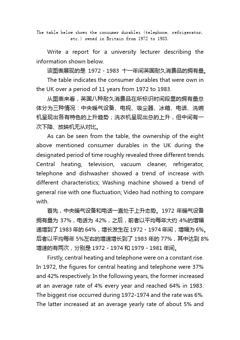
The table below shows the consumer durables (telephone, refrigerator, etc.) owned in Britain from 1972 to 1983.Write a report for a university lecturer describing the information shown below.该图表展现的是1972-1983十一年间英国耐久消费品的拥有量。
The table indicates the consumer durables that were own in the UK over a period of 11 years from 1972 to 1983.从图表来看,英国八种耐久消费品在所标识时间段里的拥有量总体分为三种情况:中央暖气设备、电视、吸尘器、冰箱、电话、洗碗机呈现出各有特色的上升趋势;洗衣机呈现出总的上升,但中间有一次下降、放映机无从对比。
As can be seen from the table, the ownership of the eight above mentioned consumer durables in the UK during the designated period of time roughly revealed three different trends. Central heating, television, vacuum cleaner, refrigerator, telephone and dishwasher showed a trend of increase with different characteristics; Washing machine showed a trend of general rise with one fluctuation; Video had nothing to compare with.首先,中央暖气设备和电话一直处于上升态势。
雅思英语折线图作文模板
雅思英语折线图作文模板Line Graphs are commonly used in IELTS Academic Writing Task 1 to illustrate changes or trends over a period of time. In this article, we will discuss the structure and key points to include in an IELTS Line Graph essay. By following a proper template and using accurate and concise language, you can effectively convey the information presented in the graph.Introduction:The introduction should provide a general overview of the graph and its main features. It is important to paraphrase the task statement and mention the time frame of the data.Sample Introduction:The line graph illustrates the changes in [subject] over a period of [time frame]. The graph displays [X-axis] on the horizontal axis and [Y-axis] on the vertical axis. Overall, the graph shows fluctuations in [subject] with some notable trends.Body Paragraphs:The body paragraphs should present the key details and trends shown in the graph. It is crucial to provide accurate data and describe the main features of the graph in a logical order.Paragraph 1:Begin by describing the highest and lowest points on the graph, as well as any significant changes or trends. Use comparative language to show the differences between the data points.Sample Paragraph 1:The graph starts with [lowest point] in [year], followed by a steady increase to [highest point] in [year]. From [year] to [year], there was a gradual decline to [lowestpoint] in [year]. It is worth noting that the highest point was approximately [X units] higher than the lowest point.Paragraph 2:Focus on the overall trend by describing the general pattern of the graph. Mention any peaks, dips, or plateaus that occur throughout the given time frame.Sample Paragraph 2:Throughout the period shown, there was a fluctuating trend in [subject]. There were noticeable peaks in [year] and [year], followed by a sharp decline in [year]. After that, there was a gradual increase until [year], where the trend plateaued. This pattern suggests a cyclical nature in the data.Paragraph 3:Analyze any specific details or changes that are evident in the graph. Use comparative language to highlight the differences between the data points.Sample Paragraph 3:In terms of [specific detail], there was a significant increase from [year] to [year], with a peak of [highest point] in [year]. However, there was a sharp decrease in [year], resulting in a drop of approximately [X units]. This decline was followed by a gradual recovery until [year], where the data stabilized.Conclusion:The conclusion should summarize the main points discussed in the body paragraphs and provide a final observation or prediction based on the graph.Sample Conclusion:In conclusion, the line graph demonstrates the fluctuations in [subject] over [time frame]. The data shows a cyclical pattern with peaks in [year] and [year], as well as asharp decline in [year]. Based on the information provided, it can be predicted that [subject] will continue to fluctuate in the future.Overall, by following this template and using accurate and concise language, you can effectively write an IELTS Line Graph essay. Remember to analyze the main features of the graph, describe the trends and changes, and provide a logical conclusion based on the given information. Practice writing essays using different line graphs to improve your skills and familiarity with this task type.。
- 1、下载文档前请自行甄别文档内容的完整性,平台不提供额外的编辑、内容补充、找答案等附加服务。
- 2、"仅部分预览"的文档,不可在线预览部分如存在完整性等问题,可反馈申请退款(可完整预览的文档不适用该条件!)。
- 3、如文档侵犯您的权益,请联系客服反馈,我们会尽快为您处理(人工客服工作时间:9:00-18:30)。
雅思写作Task1曲线图考官范文(5)
本文为大家收集整理了雅思写作Task1曲线图考官范文(5)。
认真研读一定的雅思范文及作文模板可以帮助我们检验自己的写作水平,并能很好地吸收和应用优秀范文里的优秀内容。
The chart and graph below give information about sales and share prices for
Coca-Cola.
Write a report for a university lecturer describing the information shown below.
Sample Answer:
The given pie chart and line graphs show the data on sales volume and share price of Coca-Cola. As is given in the illustration, in the year 2000, Coca-Cola was sold most in America where it had more than 55% sales volume. The share price of Coca-Cola was highest in 1998 and reached to around 55 in 2001 with some fluctuation.
As is presented in the pie chart, in 2000, Coca-Cola had more than 55% sales in Latin and North America. In Europe it had more than 20% sales volume, in Asia 16.45% and in Africa it had 7% sales volume. This indicates that American continent has the largest market for Coca-Cola while this market is least in African Continent.
Again, the share price of Coca-Cola was only $ 33 in 1996 and this price increased to $ 68 in 1997. The price reached to the highest in 1998 when it was $ 80 per share. The price then started dropping and with some fluctuations it reached it around $ 60 in 2001.
In summary, the American Continent was the largest market for Coca-Cola in 2000 and the average share price of it is $60 though this price varies year to year.
(Approximately 202 words)。