雅思线图范文
雅思剑桥官方范文之线图
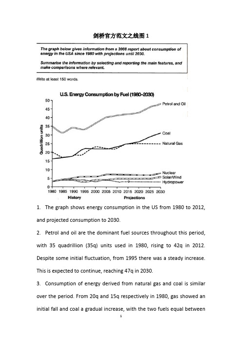
剑桥官方范文之线图11.The graph shows energy consumption in the US from 1980 to 2012, and projected consumption to 2030.2.Petrol and oil are the dominant fuel sources throughout this period, with 35 quadrillion (35q) units used in 1980, rising to 42q in 2012. Despite some initial fluctuation, from 1995 there was a steady increase. This is expected to continue, reaching 47q in 2030.3.Consumption of energy derived from natural gas and coal is similar over the period. From 20q and 15q respectively in 1980, gas showed an initial fall and coal a gradual increase, with the two fuels equal between1985 and 1990. Consumption has fluctuated since 1990 but both now provide 24q. Coal is predicted to increase steadily to 31q in 2030, whereas after 2014, gas will remain stable at 25q.4.In 1980, energy from nuclear, hydro-and solar/wind power was equal at only 4q. nuclear has risen by 3q, and solar/wind by 2. After slight increases, hydropower has fallen back to the 1980 figure. It is expected to maintain this level until 2030, while the others should rise slightly after 2025.5.Overall, the US will continue to rely on fossil fuels, with sustainable and nuclear energy sources remaining relatively insignificant.剑桥官方范文之线图21.The graph illustrates changes in the amounts of beef, lamb, chicken and fish consumed in a particular European country between 1979 and 2004.2.In 1979 beef was by far the most popular of these foods, with about 225 grams consumed per person per week. Lamb and chicken were eaten in similar quantities ( around 150 grams), while much less fish was consumed (just over 50 grams).3.However, during this 25-year period the consumption of beef andlamb fell dramatically to approximately 100 grams and 55 grams respectively. The consumption of fish also declined,but much less significantly to just below 50 grams, so although it remained the least popular food, consumption levels were the most stable.4.The consumption of chicken, on the other hand, showed an upward trend, overtaking that of lamb in 1980 and that of beef in 1989. By 2004 it had soared to almost 250 grams per person per week.5.Overall, the graph shows how the consumption of chicken increased dramatically while the popularity of these other foods decreased over the period.。
雅思图表题范例
雅思TASK11、曲线图(剑7 Test2 W1)The graph below show the consumption of fish and some different kinds of meat in a European country between 1979and 2004.Summaries the information by selecting and reporting the main features, and make comparisons where relevant.The graph illustrates changes in the amounts of beef, lamb, chicken and fish consumed in a particular European country between 1979 and 2004.In 1979 beef was by far the most popular of these foods, with about 225 grams consumed per person per week. Lamb and chicken were eaten in similar quantities (around 150 grams), while much less fish was consumed (just over 50 grams).However, during this 25-year period the consumption of beef and lamb fell dramatically to approximately 100 grams and 55 grams respectively. The consumption of fish also declined, but much less significantly to just below 50 grams, so although it remained the least popular food, consumption levels were the most stable.The consumption of chicken, on the other hand, showed an upward trend, overtaking that of lamb in 1980 and that of beef in 1989. By 2004 it had soared to almost 250 grams per person per week.Overall, the graph shows how the consumption of chicken increased dramatically while the popularity of these other foods decreased over the period.2、柱状图(C3T3W1)You should spend about 20 minutes on thistask.Thecharts below show the levels of participation in education and science indeveloping and industrialized countries in 1980 and 1990.Write a report a university lecturer describing the information shownbelow.You should write at least 150 words.The data shows the differences between developing and industrialized countries’ participation in education and science.In terms of the number of years of schooling received, we see that the length of time people spend at school in industrialized countries was much greater at 8.5 years in 1980, compared to 2.5 years in developing countries. The gap was increased further in 1900 when the figures rose to 10.5 years and 3.5 years respectively.We can see a similar pattern in the second graph, which shows that the number of people working as scientists and technicians in industrialized countries increased from 55 to 85 per 1,000 people between 1980 and 1990, while the number in developing countries went from 12 to 20.Finally, the figures for spending on research and development show that industrialized countries more than doubled their spending, from $200bn to$420bn, while developing countries decreased theirs , from$75bn down to $25bn.Overall we can see that not only are there very large differences between the two economies but that there gaps are widening.3、饼状图(C7T4W1)The charts compare the sources of electricity in Australia and France in the years 1980 and 2000. Between these years, electricity production almost doubled, rising from 100 units to 170 in Australia, and from 90 to 180 units in France.In 1980 Australia used coal as the main electricity source (50 units) and the remainder was produced from natural gas, hydro power (each producing 20 units) and oil (which produced only 10 units). By 2000, coal had become the fuel for more than 75% of electricity produced and only hydro continued to be another significant source supplying approximately 20%.In contrast, France used coal as a source for only 25 units of electricity in 1980, which was matched by natural gas. The remaining 40 units were produced largely from oil and nuclear power, with hydro contributing only 5 units. But by 2000, nuclear power, which was not used at all in Australia, had developed into the main source, producing almost 75% of electricity, at 126 units, while coal and oil together produced only 50 units. Other sources were no longer significant.Overall, it is clear that by 2000 these two countries relied on different principal fuel sources: Australia relied on coal and France on nuclear power.4、表格类(C5T4W1)The take below gives information about the underground railway systems in six cities.Summarise the information by selecting and reporting the main features, and make comparisons where relevant. You should write at least 150 words.The table shows the detailed information regarding the underground railway systems in six cities, namely, London, Paris, Tokyo ,Washington DC, Kyoto and Los Angeles.London has the oldest underground railway system among the six cities which was opened in 1863. AndParis is the second oldest, and it was opened in 1900. This was then followed by other four cities, namely,Tokyo,WashingtonDC andKyoto with the opening date of 1927, 1976, and 1981 respectively. As forLos Angeles, it is the last one in this table to have its own underground railway system (opened in 2001).In terms of the size of the railway system, Londonenjoys the largest underground railway systems, with 394 kilometres of route in total, which is nearly twice as large as that in Paris(199 kilometres). Kyoto, in contrast, has the smallest system, for it only has 11kilometres of route, which is nearly 1/36 of the route of London. The other threecities(Tokyo, Washington DC, and Los Angeles) have 155, 126 and 28 kilometres respectivelyInterestingly, Tokyo, which only has 155 kilometres of route, enjoys the greatest number of passengers per year, at 1927 million passengers. The system inParis has the second greatest number of passengers, at 1191 millions passengers per year. The smallest underground railway system,Kyoto, serves the smallest number (only 45 people).In conclusion, the underground railway systems in different cities vary a lot in the opening date, the size as well as the number of passengers served per year.5、地图题(真题)The following two maps show the development of a coastal city from 1950 to 2007.Summarize the information by selecting and reporting the main features, and make comparisons where relevant.The two maps illustrate the changes of a coastal city between 1950 and 2007. We can see clearly that the city became more and more modern.1n 1950, the city was like a small village, with vast grassland areas all over the city. There was a sea in the north of this city, with a park to the west. In front of the park, there was a big building area where things were under construction. By that time, three large areas were all grasslands, with a cross road dividing them.However, when it comes to 2007, things experienced significant changes. A new apartment had been built where the park was, and the original building areas were converted into industry buildings such as parks, parking lots and swimming pools. The most obvious changes were that the former grasslands disappeared, becoming cinemas in the southwest, shops in the southeast, and houses in the northeast. On the north side, although the sea was still there, a wharf was built in it so people could travel more easily by sea.Finally, although there was still a cross road in the city, the horizontal road was moved to the south. By doing so, industry buildings and houses could be left more places to develop. Anyway, the city had experienced tremendous changes throughout the 57-year period.6、流程图(C6T3W1)The first diagram shows that there are four main stages in the life of the silk worm.First of all, eggs are produced by the moth and it takes ten days for each egg to become a silkworm larva that feeds on mulberry leaves. This stage lasts for up to six weeks until the larva produces a cocoon of silk thread around itself. After a period of about three weeks, the adult moths eventually emerge from these cocoons and the life cycle begins again.The cocoons are the raw material used for the production of silk cloth. Once selected, they are boiled in water and the threads can be separated in the unwinding stage. Each thread is between 300 and 900 metres long, which means they can be twisted together, dyed and then used to produce cloth in the weaving stage.Overall, the diagrams show that the cocoon stage of the silkworm can be used to produce silk cloth through a very simple process.。
作文范文之雅思作文线状图
雅思作文线状图【篇一:雅思小作文——线形图(line graphs)】智课网ielts备考资料雅思小作文——线形图(line graphs)摘要:线形图是雅思写作task 1 里常考的图形之一,其写作非常值得我们深入研究。
现专供以下学习材料,希望能对各位“雅友”的线形图写作带去一些启发和帮助。
线形图是雅思写作task 1 里常考的图形之一,其写作非常值得我们深入研究。
现专供以下学习材料,希望能对各位“雅友”的线形图写作带去一些启发和帮助。
line graphsline graphs are more popular than all other graphs combined because their visual characteristics reveal data trends clearly and these graphs are easy to create. line graphs, especially useful in the fields of statistics and science, are one of the most common tools used to present data.a line graph is a visual comparison of how two variables—shown on the x- and y-axes—are related or vary with each other. it shows related information by drawing a continuous line between all the points on a grid. for information on the shapes of line graphs, see the organizing data chapter.line graphs compare two variables: one is plotted along the x-axis (horizontal) and the other along the y-axis(vertical). the y-axis in a line graph usually indicates quantity (e.g., dollars, litres) or percentage, while the horizontal x-axis often measures units of time. as a result, the line graph is often viewed as a time series graph. for example, if you wanted to graph the height of a baseball pitch over time, you could measure the time variable along the x-axis, and the height along the y-axis.although they do not present specific data as well as tables do, line graphs are able to show relationships more clearly than tables do. line graphs can also depict multiple series which are usually the best candidate for time series data and frequency distribution.e graphs share a similar purpose. the column graph, however, reveals a change in magnitude, whereas the line graph is used to show a change in direction.in summary, line graphsshow specific values of data wellreveal trends and relationships between datacompare trends in different groups of a variablegraphs can give a distorted image of the data. if inconsistent scales on the axes of a line graph force data to appear in a certain way, then a graph can even reveal a trend that is entirely different from the one intended. this means that the intervals between adjacent points along the axis may be dissimilar, or that the same data charted in two graphs using different scales will appear different.example 1 – plotting a trend over timefigure 1 shows one obvious trend, the fluctuation in the labour force from january to july. the number of students at andrews high school who are members of the labour force is scaled using intervals on the y-axis, while the time variable is plotted on the x-axis.the number of students participating in the labour force was 252 in january, 252 in february, 255 in march, 256 in april, 282 in may, 290 in june and 319 in july. when examined further, the graph indicates that the labour forceparticipation of these students was at a plateau for the first four months covered by the graph (january to april), and for the next three months (may to july) the number increased steadily. figure 1. labour force participation in andrews high schoolexample 2 – comparing two related variablesfigure 2 is a single line graph comparing two items; in this instance, time is not a factor. the graph compares thenumber of dollars donated by the age of the donors. according to the trend in the graph, the older the donor, the more money he or she donates. the 17-year-old donors donate, on average, $84. for the 19-year-olds, the average donation increased by $26 to make the average donation of that age group $110.figure 2. average number of dollars donated at evergreen high school, by age of donorexample 3 – using correct scalewhen drawing a line, it is important that you use the correct scale. otherwise, the lines shape can give readers the wrong impression about the data. compare figure 3 with figure 4:figure 3. number of guilty crime offenders, grishamvillefigure 4. number of guilty crime offenders, grishamvilleusing a scale of 350 to 430 (figure 3) focuses on a small range of values. it does not accurately depict the trend in guilty crime offenders between january and may since it exaggerates that trend and does not relate it to the bigger picture. however, choosing a scale of 0 to 450 (figure 4) better displays how small the decline in the number of guilty crime offenders really was.example 4 – multiple line graphsa multiple line graph can effectively compare similar items over the same period of time (figure 5).figure 5. cell phone use in anytowne, 1996 to 2002figure 5 is an example of a very good graph. the message is clearly stated in the title, and each of the line graphs is properly labelled. it is easy to see from this graph that the total cell phone use has been rising steadily since 1996,except for a two-year period (1999 and 2000) where the numbers drop slightly. the pattern of use for women and men seems to be quite similar with very small discrepancies between them.相关字搜索:雅思【篇二:线状图】如何写好开头段1表示展示,显示的单词归纳1. show. to make sth. clear; to prove sth.证明,表明v. to say what sb./sth. is like 描写,描绘;叙述揭示;揭露;暴露;泄露4. display v. /displei/ to show signs of sth., especially a quality or feeling 显示;表现;显露5. illustrate v. to use pictures, photographs, diagrams, etc. ina book, etc. (用图、实例等)说明,阐明6.demonstrate v. to show sth. clearly by giving proof or evidence 显示,表露to show sb./sth., especially in a picture 展示;描述8. indicatev. to show that sth. is true or exists 表明;象征;暗示9.unfold v. to be gradually made known; to gradually make sth. known to other people显露,表露;呈现10. exhibit v. to show signs of sth?especially a quality or feeling 表尔,显出11. depict v. to show or represent sth. in a work of art such asa drawing or painting描绘,描画;描述12. outline 描绘以上动词在语义都接近,但需注意:它们后面所跟的宾语不同总结起来就是而担其它的一般只接名词宾语!对...进行分析the table gives a breakdown of different types of family who were living in poverty in australia in 2009.提供关于...的信息the chart gives information about post-school qualifications in terms of different levels of further education reached by men and women in australia in 2009.比较the charts compare the sources of electricity in australia and france in the years 1980....a glance at the graph provided reveals some striking similarities between chinese and us birth rates during the period 1920-2000.....5.given are two graphs concerning criminality in britain.其它替换词★number 丨nambs/数字★figure 丨figa/数字★percentage百分率,百分比the percentage of aged couples who lived in poverty in australia in 1999 was 4%. ★proportion 比例,比率this bar chart indicates the proportion of medical complaints of patients visiting therapists in australia in 2012.★rate 比例,比率;率the bar chart reveals different rates of post-school qualifications in australia in 2010. ★amount. /smaunt/数量,数额(一般与不可数名词连用)theres been a great amount of research into the subject.强化练习到尼泊尔的游客来自何处)in march 2010.有多少降雨)over a year,.(3) the chart gives 混合型汽车在全球的销售)between 2006 and 2009.不同交通方式)used by overseas visitors to travel in new zealand.少图书馆的书.) over this four-year period.售) in japan, the us and the rest of the world from 2006 to 2009.2.时间的连接词练习(二选一)1.the number of students who took spanish was 150 in/on 2010.2.according to the data, mandarin decreased during/at that period.3.since/from 2000, the trends have changed greatly.4.the chart shows the number of people going abroadfrom/between 2000 and 2010.5.in general, all the figures steadily increased over/from 1911 to 2011 .6.during the period 1980 and/to 1990, there was a gradual decrease.7.i have been learning japanese for/in two years now.8.the chart shows changes in irish school eollment figures over/at a 20-year period.9.on/in may 4,2012,in plain sight concluded its fifth and final season.10.the 12th china beijing international high-tech expo will be held in/on may.11.the number started a long decline from 1930onwards/afterwards.12.the period 1250 to/and 1350 is a period of religious and secular literature in english.13.the charts indicate how much a uk school spent on different costs in/for four separate years: 1981,1991,2001 and 2011.表示连续的时间段2. during the same period3. in the no. years spanning from 19xx through 19xx4. from then on= from this time onwards= in the subsequent years.句子翻译练习1.以上的线状图表明了在英国冬季和夏季的一天中用电的需求量。
雅思英语图表作文范文(必备3篇)

雅思英语图表作文范文第1篇A类雅思各类图表作文要点及范文一.曲线图解题关键1曲线图和柱状图都是动态图,解题的切入点在于描述趋势。
2在第二段的开头部分对整个曲线进行一个阶段式的总分类,使写作层次清晰,同时也方便考官阅卷。
接下来再分类描述每个阶段的specifictrend,同时导入数据作为分类的依据。
3趋势说明。
即,对曲线的连续变化进行说明,如上升、下降、波动、持平。
以时间为比较基础的应抓住“变化”:上升、下降、或是波动。
题中对两个或两个以上的变量进行描述时应在此基础上进行比较,如变量多于两个应进行分类或有侧重的比较。
4极点说明。
即对图表中最高的、最低的点单独进行说明。
不以时间为比较基础的应注意对极点的描述。
5交点说明。
即对图表当中多根曲线的交点进行对比说明。
6不要不做任何说明就机械地导入数据,这不符合雅思的考试目的。
曲线图常用词汇动词—九大运动趋势一:表示向上:increase,rise,improve,grow,ascend,mount,aggrandize,goup,climb, take off, jump,shoot up暴涨,soar,rocket, skyrocket雅思英语图表作文范文第2篇It is said that countries are becoming similar to each other because of the global spread of the same products, which are now available for purchase almost anywhere. I strongly believe that this modern development is largely detrimental to culture and traditions worldwide.A country’s history, language and ethos are all inextricably bound up in its manufactured artefacts. If the relentless advance of international brands into every corner of the world continues, these bland packages might one day completely oust the traditional objects of a nation, which would be a loss of richness and diversity in the world, as well as the sad disappearance of t he manifestations of a place’s character. What would a Japanese tea ceremony be without its specially crafted teapot, or a Fijian kava ritual without its bowl made from a certain type of tree bark?Let us not forget either that traditional products, whether these be medicines, cosmetics, toy, clothes, utensils or food, provide employment for local people. The spread of multinational products can often bring in its wake a loss of jobs, as people urn to buying the new brand,perhaps thinking it more glamorous than the one they are used to. This eventually puts old-school craftspeople out of work.Finally, tourism numbers may also be affected, as travelers become disillusioned with finding every place just the same as the one they visited previously. To see the same products in shops the world over is boring, and does not impel visitors to open their wallets in the same way that trinkets or souvenirs unique to the particular area too.Some may argue that all people are entitled to have access to the same products, but I say that local objects suit local conditions best, and that faceless uniformity worldwide is an unwelcome and dreary prospect.Heres my full answer:The line graphs show the average monthly amount that parents in Britain spent on their children’s s porting activities and the number of British children who took part in three different sports from 2008 to is clear that parents spent more money each year on their children’s participation in sports over the six-year period. In terms of the number of children taking part, football was significantly more popular than athletics and 2008, British parents spent an average of around £20 per month on their children’s sporting activities. Parents’ spending on children’s sports increased gradually over the followi ng six years, and by 2014 the average monthly amount had risen to just over £ at participation numbers, in 2008 approximately 8 million British children played football, while only 2 million children were enrolled in swimming clubs and less than 1 million practised athletics. The figures for football participation remained relatively stable over the following 6 years. By contrast, participation in swimming almost doubled, to nearly 4 million children, and there was a near fivefold increase in the number of children doing athletics.剑桥雅思6test1大作文范文,剑桥雅思6test1大作文task2高分范文+真题答案实感。
雅思小作文线图满分范文汇总
雅思⼩作⽂线图满分范⽂汇总雅思⼩作⽂线图满分范⽂汇总雅思⼩作⽂中的线图,作为动态图的代表,在很⼤程度上来说是属于⽐较困难的考题类型。
但是⼀篇好的范⽂,从很⼤程度上就可以帮助雅思考⽣解决这些难题,但是整个⽹上关于雅思线图的范⽂很少,⽽图⽚的质量也乏善可陈。
针对这个问题,超级学长的⽼师精挑细选了5篇雅思⼩作⽂中的线图满分范⽂给雅思考⽣作为参考。
这5篇范⽂都属于过往的真题,从质量上,典型性上都⾮常具有研究,学习,模仿的价值。
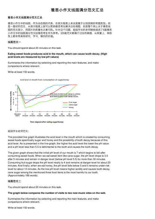
线图范⽂⼀You should spend about 20 minutes on this task.Eating sweet foods produces acid in the mouth, which can cause tooth decay. (High acid levels are measured by low pH values)Summaries the information by selecting and reporting the main features, and make comparisons where relevant.Write at least 150 words.超级学长⽼师范⽂:The provided line graph illustrates the acid level in the mouth which is created by consuming sweet foods specifically sugar and honey and the possibility of tooth decay because of this acid level. As is presented in the line-graph, the higher the acid level the lower the pH value and a pH level less than 5.5 is detrimental to the tooth and causes the tooth decay.The given graph shows that the initial pH level of our mouth is 7 which begins to fall after consuming sweet foods. When we eat sweet item like cane sugar, the pH level drops to 3.5 after 5 minutes and remain in danger level (below pH level 5.5) for more than 30 minutes. Consuming fruit sugar drops the pH level nearly to 4 and remains at danger level for about 20 minutes. And finally, when we eat honey, the pH level falls below 5 and it remains under risk level for about 13 minutes. As the low pH level means higher acidity and causes tooth decay, cane sugar among the mentioned three food items is the most harmful to our tooth. (Approximately 186 words)线图范⽂⼆You should spend about 20 minutes on this task.The graph below compares the number of visits to two new music sites on the web. Summaries the information by selecting and reporting the main features, and make comparisons where relevant.Write at least 150 words.超级学长⽼师范⽂:The graph exhibits the public interest of using two new music websites named Music Choice and Pop Parade in the period of 15 days’ time. According to the graph, the trends were totally unstable and have swung extremely.The statistics of Pop Parade shows the starting point of 120000 visitors on the first day and decreased during the following 7days with the minimum number of visitors of 40000 on the 7th day. The fluctuation of Music Choice website wasn’t as extreme as the Pop Parade in the first week. The Music Choice started with 40000 visitors in the 1st day and the same number of visitors on the 7th day with small amount of changes during this week. In the 2nd week, both of the websites had the increasing interest of visitors i.e. Pop Parade reached to 140000 visitors on the 11th day and Music Choice reached to 120000 on the 12th day, and after some oscillations, the websites ended the 15 day period with 180000 and 80000 respectively. According to the chart, the rate of 180000 was the maximum of viewers that belongs to Pop Parade and Pop Parade has More public interest for the viewers altogether than the Music Choice within these two weeks.( Approximately 204 words )线图范⽂三You should spend about 20 minutes on this task.The line graph below gives information on cinema attendance in the UK.Summaries the information by selecting and reporting the main features, and make comparisons where relevant.Write at least 150 words.超级学长⽼师范⽂:The given line graph shows the number of cinema-going UK people and classifies theseviewers in four age groups. As is observed from the graph, people over 40 years old went to movies more than the younger people of the UK.As is observed from the line graph, the people of 44 to 54 years-old attended cinema more than the people of other age groups who are less than 44 years old. Only 15% of the UK citizens who were between 14 to 24 years old attended in cinema in 1990 while this percentage increased with the increase of age group. In this same year, more than 35% people over 40 years attended the cinema. It is clear from the data that, the people in UK trend to attend cinema more with the increase of their age. The cinema goer’s number increased gradually from 1990 to 2010 except for 1995 to 2000. In 2010, the number of cinema attendees was also dominated by the age group of 44 to 54 and the percentage of cinema attendees from all age groups increased by 5% on an average than the percentages were in 2005.线图范⽂四You should spend about 20 minutes on this task.The graph below shows the differences in wheat exports over three different areas. Summaries the information by selecting and reporting the main features, and make comparisons where relevant.Write at least 150 words.超级学长⽼师范⽂:The given line graph compares the wheat exports over three different parts of the world namely Australia, Canada and the European Community from 1985 to 1990. As is presented in the graph, the wheat export in Australia decreased over time while the export in Canada and European countries increased with some fluctuations.According to the graph, around 15 to 20 million tons of wheat was exported to Australia, Canada and the European community. This amount decreased slightly in 1986 reaching around 15 million tons and from that point, the export quantity in Australia kept on decreasing and reached just over 10 million tons in 1990. In the meantime, the amount increased sharply in Canada until 1988 and then there was a quick decline and finally, it reached around 19 million tons in 1990. Finally, the wheat export in the European Community increased gradually over the years and reached over 20 million tons in 1990.线图范⽂五You should spend about 20 minutes on this task.The chart below shows the changes that took place in three different areas of crime in New Port city center from 2003-2012.Summaries the information by selecting and reporting the main features, and make comparisons where relevant.Write at least 150 words.超级学长⽼师范⽂:The graph represents the variation in levels in the three main areas of crime in the centre of Newport city in the time period from 2003 to 2012.To start with, it was 3400 incidences of burglary in 2003 and 3750 in 2004. Fortunately, in the next 4 years it fell down dramatically and reached the absolute minimum in 2008 (1100 incidences), however, it then grew by 300 accidents and remained fairly constant by 2012.Car theft was a steady level of crime from 2003 to 2004 and got reduced in next 5 years from 2700 up to 2250. The number then increased to 2700 in 2012.Robbery reached its peak in 2005, which was 900 cases and decreased back to 500 in 2008. In the following two years, the number of incidences rose to 700 and continued to stay at this level in 2012.In conclusion, in the Newport city centre, the rate of burglary fell significantly, the level of robbery remained fairly constant, whereas car theft raised and had the biggest number of incidences in 2012.。
雅思写作小作文线图高分范文解析!

线图雅思小作文范文解析线图雅思小作文范文解析!动态线图,这已成为近两年来雅思考试的主流,下面三立在线小编就为大家分享一篇雅思写作小范文之线图九分范文。
希望同学们可以从中学习雅思线图写作技巧The line graph compares average yearly spending by Americans on mobile andlandline phone services from 2001 to 2010.概括线图内容It is clear that spending on landline phones fell steadily over the 10-yearperiod, while mobile phone expenditure rose quickly. The year 2006 marks thepoint at which expenditure on mobile services overtook that for residentialphone services.总述一条线总体趋势,和另一条行程对比In 2001, US consumers spent an average of nearly $700 on residential phoneservices, compared to only around $200 on cell phone services. Over thefollowing five years, average yearly spending on landlines dropped by nearly$200. By contrast, expenditure on mobiles rose by approximately $300.自2001年开始,描述cell phone每一段的变化趋势。
In the year 2006, the average American paid out the same amount of money onboth types of phone service, spending just over $500 on each. By 2010,expenditure on mobile phones had reached around $750, while the figure forspending on residential services had fallen to just over half this amount.对比手机服务,写出手机服务的特征。
雅思线图范文

雅思线图范文以下是一个可能的雅思线图作文范文,字数超过700字。
如果你对于字数有特殊要求,请告诉我。
The line graph depicts the changes in the population of three different types of turtles over a 20-year period, from 1990 to 2010. The data is presented in the units of thousands.Overall, it is clear that the population of turtle types A and B fluctuated over the period shown, while the population of type C experienced a steady upward trend. Furthermore, type A experienced the greatest change in population over the 20-year period.In 1990, the population of type A turtles stood at around 50,000, while the population of type B turtles was slightly higher, at about 60,000. The population of type C turtles was the lowest, at around 40,000.Over the next five years, the population of type A turtles rapidly increased to almost 80,000, making it the most populous type by 1995. The population of type B turtles also increased, but at a slower rate, reaching around 70,000. The population of type C turtles remained relatively stable at around 40,000.Between 1995 and 2000, the population of type A turtles continued to rise, reaching its peak at approximately 90,000. In contrast, the population of type B turtles decreased slightly to around 65,000. Type C experienced a significant increase in population, reachingover 110,000 by 2000.From 2000 to 2005, the population of type A turtles declined gradually to approximately 75,000. Type B turtles experienced a sharp decrease to below 50,000. The population of type C turtles continued to increase, surpassing 130,000 by 2005.Finally, in the last five years of the period, the population of type A turtles fluctuated around 85,000, while the population of type B turtles remained relatively stable at around 45,000. Type C turtles continued to dominate, with their population peaking at around 140,000 by 2010.In conclusion, the line graph demonstrates the varying population trends of three types of turtles over a 20-year period. While type A and B turtles experienced fluctuations in population, type C turtles witnessed a continuous increase. Overall, type C turtles had the highest population by the end of the period shown.。
雅思写作-小作文范文-线图
线图C5T1原题The graph below shows the proportion of the population aged 65 and over between 1940 and 2040 in three different countries.Summarize the information by selecting and reporting the main features, and make comparisons where relevant.The graph shows the increase in the ageing population in Japan, Sweden and the USA. It indicates that the percentage of elderly people in all three countries is expected to increase to almost 25% of the respective populations by the year 2040. In 1940 the proportion of people aged 65 or more stood at only 5% in Japan, approximately 7% in Sweden and 9% in the US. However, while the figures for the Western countries grew to about 15% in around 1990, the figure for Japan dipped to only 2.5% for much of this period, before rising to almost 5% again at the present time.In spite of some fluctuation in the expected percentages, the proportion of older people will probably continue to increase in the next two decades in the three countries. A more dramatic rise is predicted between 2030 and 2040 in Japan, by which time it is thought that the proportion of elderly people will be similar in the three countries.分析:题目The graph below shows the proportion of the population aged 65 and over between 1940 and 2040 in three different countries.第一段The graph shows the increase in the ageing population in Japan, Sweden and the USA.•作者没有一上来提示图表内容,而是直接奔向中心思想,也就是文章的主旨句。
- 1、下载文档前请自行甄别文档内容的完整性,平台不提供额外的编辑、内容补充、找答案等附加服务。
- 2、"仅部分预览"的文档,不可在线预览部分如存在完整性等问题,可反馈申请退款(可完整预览的文档不适用该条件!)。
- 3、如文档侵犯您的权益,请联系客服反馈,我们会尽快为您处理(人工客服工作时间:9:00-18:30)。
line graphC11P77 Carbon dioxide emissionsC9P101 U.S. Energy consumptionC8p101 Goods transported in UKC7p53 Fish and meat consumptionC6P30 Global water useC5P29 proportion of population aged 65 and overC11P77 Carbon dioxide emissionsKaren’s WritingThe graph compares changes in the amounts of average carbon dioxide emissions per person in four European countries from 1967 to 2007.In 1967 carbon dioxide emissions in the UK was the largest, with about 10.8 metric tonnes per person. In Sweden, Italy and Portugal, the emissions stood at 8.8,4.2 and 1.7 metric tonnes respectively.It is clear from the line graph that over the 40-year period, the emissions of carbon dioxide in the UK fell sharply to 9 metric tonnes while those in Sweden saw a small increase from 1967 to 1977, peaking at 10.2 metric tonnes. During the next 30-year period, the amounts decreased significantly to just below 6.By contrast, carbon dioxide emissions in Italy showed an upward trend, overtaking those of Sweden in 1990 at 7 metric tonnes. By 2007, it had reached just under 8 metric tonnes. Similarly, the emissions in Portugal kept growing to 5.5 metric tonne in 2007, at the same amounts with those in Sweden.Overall, the graph shows that the carbon dioxide emissions declined in the UK and Sweden whereas grew in Italy and Portugal over the 40-year period.C9P101 U.S. Energy consumptionExaminer’s WritingThe graph shows energy consumption in the US from 1980 to 2012, and projected consumption to 2030.Petrol and oil are the dominant fuel sources throughout this period, with 35 quadrillion (35q) units used in 1980,rising to 42q in 2012. Despite some initial fluctuation, from 1995 there was a steady increase. This is expected to continue, reaching 47q in 2030.Consumption of energy derived from natural gas and coal is similar over the period. From 20q and 15q respectively in 1980, gas showed an initial fall and coal a gradual increase, with the two fuels equal between 1985 and 1990. Consumption has fluctuated since 1990 but both nowprovide 24q. Coal is predicted to increase steadily to 31q in 2030, whereas after 2014, gas will remain stable at 25q.In 1980, energy from nuclear, hydro- and solar/wind power was equal at only 4q. Nuclear has risen by 3q, and solar/wind by 2. After slight increases, hydropower has fallen back to the 1980 figure. It is expected to maintain this level until 2030, while the others should rise slightly after 2025.Overall, the US will continue to rely on fossil fuels, with sustainable and nuclear energy sources remaining relatively insignificant.C8p101 Goods transported in UKThe graph below shows the quantities of goods transported in the UK between 1974 and 2002 by four different modes of transport.Summarise the information by selecting and reporting the main features, and make comparisons where relevant.It is clear that in 1974, goods transported by road were largest, with 70 million tonnes.Band 8The graph illustrates the quantities of goods transported in the United kingdom by four different modes of transport between the time period of 1974 and 2002. Over this span of 28 years, the quantities of goods transported by road, water and pipeline have all increased while the quantities transported by rail has remained almost constant at about 40 million tonnes.The largest quantities of goods transported both in 1974 and 2002 were by road(70 million tonnes and 98 million tonnes respectively) while the lowest both in 1974 and 2002 was by pipeline(about 5 million tonnes and 22 million tonnes respectively). The amount of goods transported by water was constant from 1974 to 1978, where it plateaued for about 20 years before starting to rise gradually again.The amount of goods transported by rail is almost constant at 40 million tonnes in 1974 and 2002, with decreases in quantity in between the years. It is also interesting to note that almost allshowed a decrease in 1994 in amount of goods transported except for the pipeline, which actually peaked in that year.In conclusion the road remains the most popular method of transporting goods in the UK while water and pipelines are becoming increasingly used, have not become more popular as a method of transport.C7p53 Fish and meat consumptionThe graph below shows the consumption of fish and some different kinds of meat in European country between 1979 and 2004.Summarise the information by selecting and reporting the main features,and make comparison where relevant.Examiner’s WritingThe graph illustrates changes in the amounts of beef, lamp, chicken, and, fish consumed in a particular European country between 1979 and 2004.In 1979 beef was by far the most popular of these foods, with about 225 grams consumed per person per week. Lamp and chicken were eaten in similar quantities(around 150 grams), while much less fish was consumed(just over 50 grams)However,during this 25-year period the consumption of beef and lamp fell dramatically to approximately 100 grams and 55 grams respectively.The consumption of fish also declined, but much less significantly to just below 50 grams, so although it remained the least popular food, consumption levels were the most stable.The consumption of chicken, on the other hand, showed an upward trend, overtaking that of lamb in 1980 and that of beef in 1989. By 2004 it had soared to almost 250 grams per person perweek.Overall, the graph shows how the consumption of chicken increased dramatically while the popularity of these other foods decreased over the period.C6P30 Global water useThe graph and table below give information about water use worldwide and water consumption in two different countries.Examiner’s WritingThe graph shows how the amount of water used worldwide changed between 1900 and 2000.Throughout the century, the largest quantity of water was used for agricultural purposes, and this increased dramatically from about 500 km3 to around 3,000 km3 in the year 2000. Water used in the industrial and domestic sectors also increased, but consumption was minimal until mid-century. From 1950 onwards, industrial use grew steadily to just over 1,000 km3, while domestic use rose more slowly to only 300 km3, both far below the levels of consumption by agriculture.The table illustrates the differences in agricultural consumption in some areas of the world by contrasting the amount of irrigated land in Brazil (26,500 km2) with that in the D.R.C. (100 km2). This means that a huge amount of water is used in agriculture in Brazil, and this is reflected in thefigures for water consumption per person: 359 m3 compared with only 8 m3 in the Congo. With a population of 176 million, the figures for Brazil indicate how high agricultural water consumption can be in some countries.C5P29 proportion of population aged 65 and overThe graph blew shows the proportion of the population aged 65 and over between 1940 and 2040 in three different countries.Summarise the information by selecting and reporting the main features,and make comparison where relevant.Examiner’s WritingThe graph shows the increase in the ageing population in Japan, Sweden and the USA. It indicates that the percentage of elderly people in all three countries is expected to increase to almost 25% of the respective populations by the year 2040.In 1940 the proportion of people aged 65 or more stood at only 5% in Japan, approximately 7% in Sweden and 9% in the US. However, while the figures for the Western countries grew to about 15% in around 1990,the figure for Japan dippped to only 2.5% for much of this period, before rising to almost 5% again at the present time.In spite of some fluctuation in the expected percentages, the proportion of older people will probably continue to increase in the next two decades in the three countries. A more dramatic rise is predicted between 2030 and 2040 in Japan, by which time it is thought that the proportion of elderly people will be similar in the three countries.。