雅思图表写作
作文范文之雅思图表类英语作文模板
雅思图表类英语作文模板【篇一:雅思图表作文模板】1 according to the chart```2 the date lead us to the conclusion that```3 the date show```4 the tree diagram reveals how```5 the figures show```6 this is a cure graph which describes the trend of```7 the pie graph depicts```8 the graph provides some interesting date regrarding```9 the table shows the changes in the number of ``` over the period from ```to ```10 as is shown in the table ```11 from the table ,we can clearly see that ```12 this table shows the changing proportion of x and y from ``` to ````13 the graph,presented in a pie chart, shows the general trend in```14 as can be seen from the grape ,the two curves show the flutuation of ```15 over the period from ```to ```the```remained level.16 in the year between ```and ```.17 in the 3 years spanning from 2005 through 2008.18 the number of ``` remained steady from ```to ````.19 the number sharply went up to ```20 the percentage of ``` stayed the same between ``` and ```21 the percentage remainede steady at```22 the percentage of ```is sightly large than that of.23 there is not a great deal of differece between ```and ```24 the graphs show a three fold increase in the number of ```25 ```decreased year by year while ```increased steadily.26 there is an upward trend in the number of ```27 a considerable increase occurred from ```to ```28 from ```to ```the rate of decrease slow down.29 from this year on,there was a gradual declinel reduction in the ```reaching a figure of.30 be similar to ```be the same as31 there are a lot similarities between ```and ```32 the difference between x and y lies in ``para 1,两句话:第一句:this is a _____chart, which demonstrates the number of_____ from ____ to____. 如果两个图,则:there are two charts below. the _____ chart describes the number of_____, and the _____ chart illustrates the figure of ____. 第二句:(所有题目适用),from thechart we can see that the number of ______ variesconstantly/greatly in _____. )para 2, as we can see from the chart,/or it is clear from thechart that ____. 如果有两个图:则:the _____ chart shows that ______./or as we can see from the first chart, _______para 3, (如果两个图的话,) it is clear from the second chartthat ?para 4 结尾:from the figures/statistics above, we cansee/conclude/draw a conclusion that ?the bar chart indicates the current situation of the amount of money spent on fastfoods according to different income classes in britain.for those who belong to the high-income class, hamburgerhas been shown to beperson per week. by contrast fish and chips remain at a rather low level of about 16pence per person per week, and pizza, though attracts more expenses, accounts for 19pence per person per week, merely 3 pence more than that of fish and chips.as expected, low-income class spend much less in all 3 categories than high-incomeclass, with fish and chips at the top of the list at 15 pence per capital per week, andpizza at the bottom at a weekly expense of 8 pence per capital. the average income group resembles high-income class in hamburger consumptionat the largest amount of 33 per person every week, and low-income class in pizzaconsumption at the smallest amount of 11 per person every week, but amazingly, fishand chips consumed by this group leads all classes at a weekly expense of 25 penceper person.in conclusion, hamburgers, in general gain more welcome than other types of fastfood.para1. this is a table / chart / (line线状 bar柱状 pie饼状)graph which demonstrate / illustrate /reveal /depict /privide information about.............para2.(1)obvious /apparent from the graph is that ...rank thefirst/highest,while/whereas ....turn out tobe the lowest(2)it is exhibited/shown in the table that.....(3)it can be seen from the table that.....para3.(1)饼.柱图 a,which accounts for...%,ranks the first;then next is b with...%;followed byc,constituting...%;finally it comes d.e.fat...%...%and...%respectively(2)特殊变化(不变,增长或下降多的)(3)①it is worth mentioning that.... ②it must be pointed out that.... ③morestriking/suprising is that.... para4.to conclude /inconclusion/overall1. 最明显的原因__,因此___the most obvious reason for this phenomenon is that_____consequently, ____.2. 无论你喜欢与否,_____已经变得越来越流行,这是有原因的no matter you like it or not, aaa has become more and more popular and there are many reasonfor it.3. 对我们来说,改变这个不利的环境____是非常紧急的it’s an urgent task for us to change this unfavorable situation: ____.4. 这个图片会让你想起一些奇怪的东西,这种现象还是会继续存在这个社会the picture can reminds you of some strange, yet familiar phenomena existing in our society.5. 提供了大量的解决方案,一些人建议___,另一些人建议___a great number of solutions are being offered. some people suggest that ____. others argue that .6. 对于____,我们应该____confronted with aaa, we should take a serious of effective measures to cope with thesituation.7. 然而,___引起了许多为问题,however____ may cause some problems. first, it is__second, __. finally, ____. so, it is clear that__has its advantages and disadvantages.8. 虽然_____有一个__的非常大的好处,但是它不能完全__在__方面although _____ has a great advantage of _____, it cant compete with ____ in ____.9. _____也许更喜欢_____,但是_____忍受_____的不利之出_____may be preferable to ____, but it suffers from the disadvantages that___.10. _____的有利之处比____的有利之处要多,举例说明,_____the advantages of ______are much greater that thoseof____.for instance, ___.11.but i don’t think it is a very good way to solve ___. for instance, _____.worst of all,______.12.there are many ways to ______. first, _____. second, _____. third, ___.13.on the contrary, there are some people in favor of _____.14.they believe___. moreover, they think____. there are several measures for us to adopt. first,we can____, there are a number of advantages of ____. another solution is to _____.15.it is high time that something was done about it. for example,_____. in addition,_____. all these measures will certainly _.16. there are some other people, who______. their reasons are different, something for _____,sometimes for____, and sometimes simply for _____.17._____ is necessary and important to our country’s development and construction. first, ____.what’s more, ___. most important of all,___.18.however, if not managed properly, ____ can create many problems.sometimes ____.furthermore,_. therefore, ___ has been gaining public concern.19.有很多原因____,①there are probably many reasons for ____. first, ____.②second, ____. finally, ___.there are, i think, two main reasons for __. in the first place, ___. in the second place, __. therefore,③well, why is there ____? i think there might be two reasons. one is ___, and the other is _____.④why___? for one thing, ____. for another,____. perhaps the main reason is ___.⑤why_____? the first reason is that___. the second reason is ___. the third is__. for all this,the main cause of_____ is due to ____.20.it is no easy job to find the reasons for this tendency which involves several complicated factors. for some ___. for others ____.21. “why do _____?” many people often ask questions like this.22. in recent years, there is a general tendency to ___. according to a study, there is__. comparedwith __ last year. why _____?23.according to a survey, there is a growing number of ___. what brings this result? the mainreason rests with.24.①some people prefer to ___. in their opinion, ____. in addition, ____. nevertheless,nowadays, __ has become more and more common.②many people are inclined to____. in their opinion, ___.they believe that ___.25. today, there __, which have brought a lot of harms in our daily life. first, __ second, ____. what makes things worse is that ___.26.nowadays, ___ has become a problem we have to face. though it’s easier said than done, with the help of modern technology, we now have many means to solve it.27. 对于这个图,说明了_①the graph shows the general trend in _______.②according to the figures/numbers/statistics/percentages in the table/chart/bar graph/line graph, it can be seen that ___. obviously, ____, but why?③the figure indicates/shows/suggests/proves that___. there isa steady/rapid development/trend of _.④from the graph/chart, we know the statistics of __ and _. it can be seen easily that ___.⑤according to the two graphs presented, it can be observed that ___ in the left graph, __. at the same time, _ as the right graph shows.28. 现在我们经常听到_____,但是真的如此吗?①these days we are often told that ____. but is it true?②these days we often hear about ___. but is this really the case?29. 一位著名的作家曾经说过_____one of the great writers once said that _. now it still has a realistic significance.30. 回看历史,______的想法从来都没流行过,一方面_____另一方面______in our history, the idea that ____ never has been so popular. on one hand, ___, on the other hand,31. 人们中有许多像____不同的意见,一些人认为_______there are different opinions among people as to ____. some people suggest that __.32. 一些人认为__对_______来说在许多方面都是好的,然而,其他人不同意some people hold the opinion that _ is superior to __ in many ways: others, however, disagree with it.33. 现在虽然越来越多的人___,但仍有一些__的人,他们也许认为_____nowadays although more and more people __, still there are some who think __, they may think【篇二:雅思图表作文模板20篇下载】智课网ielts备考资料雅思图表作文模板20篇下载摘要:雅思图表作文模板20篇下载。
雅思小作文之图表作文
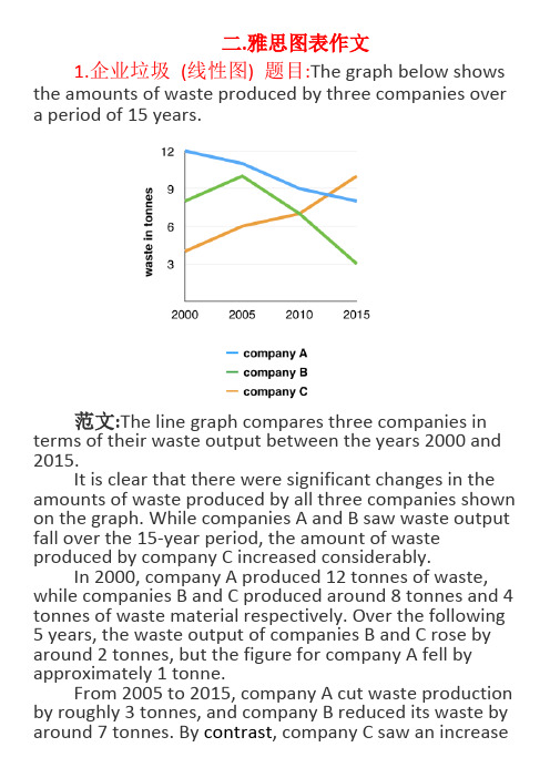
二.雅思图表作文1.企业垃圾(线性图) 题目:The graph below shows the amounts of waste produced by three companies over a period of 15 years.范文:The line graph compares three companies in terms of their waste output between the years 2000 and 2015.It is clear that there were significant changes in the amounts of waste produced by all three companies shown on the graph. While companies A and B saw waste output fall over the 15-year period, the amount of waste produced by company C increased considerably.In 2000, company A produced 12 tonnes of waste, while companies B and C produced around 8 tonnes and 4 tonnes of waste material respectively. Over the following 5 years, the waste output of companies B and C rose by around 2 tonnes, but the figure for company A fell by approximately 1 tonne.From 2005 to 2015, company A cut waste production by roughly 3 tonnes, and company B reduced its waste by around 7 tonnes. By contrast, company C saw an increasein waste production of approximately 4 tonnes over the same 10-year period. By 2015, company C’s waste output had risen to 10 tonnes, while the respective amounts of waste from companies A and B had dropped to 8 tonnes and only 3 tonnes.(192 words, band 9)这条线图对三家公司的废物产出从2000年到2015年进行了比较。
雅思英语图表作文范文(必备3篇)

雅思英语图表作文范文第1篇A类雅思各类图表作文要点及范文一.曲线图解题关键1曲线图和柱状图都是动态图,解题的切入点在于描述趋势。
2在第二段的开头部分对整个曲线进行一个阶段式的总分类,使写作层次清晰,同时也方便考官阅卷。
接下来再分类描述每个阶段的specifictrend,同时导入数据作为分类的依据。
3趋势说明。
即,对曲线的连续变化进行说明,如上升、下降、波动、持平。
以时间为比较基础的应抓住“变化”:上升、下降、或是波动。
题中对两个或两个以上的变量进行描述时应在此基础上进行比较,如变量多于两个应进行分类或有侧重的比较。
4极点说明。
即对图表中最高的、最低的点单独进行说明。
不以时间为比较基础的应注意对极点的描述。
5交点说明。
即对图表当中多根曲线的交点进行对比说明。
6不要不做任何说明就机械地导入数据,这不符合雅思的考试目的。
曲线图常用词汇动词—九大运动趋势一:表示向上:increase,rise,improve,grow,ascend,mount,aggrandize,goup,climb, take off, jump,shoot up暴涨,soar,rocket, skyrocket雅思英语图表作文范文第2篇It is said that countries are becoming similar to each other because of the global spread of the same products, which are now available for purchase almost anywhere. I strongly believe that this modern development is largely detrimental to culture and traditions worldwide.A country’s history, language and ethos are all inextricably bound up in its manufactured artefacts. If the relentless advance of international brands into every corner of the world continues, these bland packages might one day completely oust the traditional objects of a nation, which would be a loss of richness and diversity in the world, as well as the sad disappearance of t he manifestations of a place’s character. What would a Japanese tea ceremony be without its specially crafted teapot, or a Fijian kava ritual without its bowl made from a certain type of tree bark?Let us not forget either that traditional products, whether these be medicines, cosmetics, toy, clothes, utensils or food, provide employment for local people. The spread of multinational products can often bring in its wake a loss of jobs, as people urn to buying the new brand,perhaps thinking it more glamorous than the one they are used to. This eventually puts old-school craftspeople out of work.Finally, tourism numbers may also be affected, as travelers become disillusioned with finding every place just the same as the one they visited previously. To see the same products in shops the world over is boring, and does not impel visitors to open their wallets in the same way that trinkets or souvenirs unique to the particular area too.Some may argue that all people are entitled to have access to the same products, but I say that local objects suit local conditions best, and that faceless uniformity worldwide is an unwelcome and dreary prospect.Heres my full answer:The line graphs show the average monthly amount that parents in Britain spent on their children’s s porting activities and the number of British children who took part in three different sports from 2008 to is clear that parents spent more money each year on their children’s participation in sports over the six-year period. In terms of the number of children taking part, football was significantly more popular than athletics and 2008, British parents spent an average of around £20 per month on their children’s sporting activities. Parents’ spending on children’s sports increased gradually over the followi ng six years, and by 2014 the average monthly amount had risen to just over £ at participation numbers, in 2008 approximately 8 million British children played football, while only 2 million children were enrolled in swimming clubs and less than 1 million practised athletics. The figures for football participation remained relatively stable over the following 6 years. By contrast, participation in swimming almost doubled, to nearly 4 million children, and there was a near fivefold increase in the number of children doing athletics.剑桥雅思6test1大作文范文,剑桥雅思6test1大作文task2高分范文+真题答案实感。
雅思图表作文万能模板
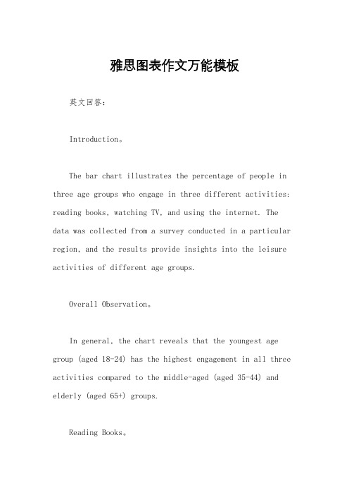
雅思图表作文万能模板英文回答:Introduction。
The bar chart illustrates the percentage of people in three age groups who engage in three different activities: reading books, watching TV, and using the internet. The data was collected from a survey conducted in a particular region, and the results provide insights into the leisure activities of different age groups.Overall Observation。
In general, the chart reveals that the youngest age group (aged 18-24) has the highest engagement in all three activities compared to the middle-aged (aged 35-44) and elderly (aged 65+) groups.Reading Books。
The youngest age group (aged 18-24) exhibits the highest percentage of readers, with 75% engaging in this activity. In contrast, the middle-aged group has a significantly lower percentage of readers (50%), and the elderly group has the lowest percentage (30%).Watching TV。
雅思4类图表作文范文

雅思4类图表作文范文下载温馨提示:该文档是我店铺精心编制而成,希望大家下载以后,能够帮助大家解决实际的问题。
文档下载后可定制随意修改,请根据实际需要进行相应的调整和使用,谢谢!并且,本店铺为大家提供各种各样类型的实用资料,如教育随笔、日记赏析、句子摘抄、古诗大全、经典美文、话题作文、工作总结、词语解析、文案摘录、其他资料等等,如想了解不同资料格式和写法,敬请关注!Download tips: This document is carefully compiled by theeditor. I hope that after you download them,they can help yousolve practical problems. The document can be customized andmodified after downloading,please adjust and use it according toactual needs, thank you!In addition, our shop provides you with various types ofpractical materials,such as educational essays, diaryappreciation,sentence excerpts,ancient poems,classic articles,topic composition,work summary,word parsing,copy excerpts,other materials and so on,want to know different data formats andwriting methods,please pay attention!好的,以下是一篇更加口语化的文章:《各国学生每周学习时间大揭秘》。
完整版)雅思经典图表作文范文
完整版)雅思经典图表作文范文XXX in fast food and sit-down restaurants.As can be seen from the charts。
XXX over the years。
In 1970.only 25% of a family's food budget was spent on eating out。
but this figure rose to almost 50% in 2000.This trend is likely dueto the XXX.The graph shows that the number of meals eaten in fast food restaurants has increased significantly compared to sit-down restaurants。
In 1980.the average person ate 20 meals in fast food restaurants and 60 meals in sit-XXX。
by 2000.the average person ate 60 meals in fast food restaurants and only 20 meals in sit-XXX fast-XXX society。
XXX.XXX。
XXX a negative one。
as it allows XXX。
it is XXX.Over the past three decades。
XXX。
In 1970.only 10% of the food budget was XXX。
but by 1980.this had increased to 15%。
In 1990.the pXXX 35%。
and in 2000.it rose again to 50%。
The n of family restaurant meals has also changed over the years。
雅思图表类英语作文模板
雅思图表类英语作文模板英文回答:1. Introduce the chart/graph: Briefly describe the type of chart/graph, the data it presents, and the time period or geographical location it covers.2. Overall trend: State the general trend or pattern observed in the data. Use specific numbers or percentages to support your statement.3. Key features: Highlight the most important or noticeable features of the chart/graph, such as peaks, valleys, or changes over time.4. Possible reasons: Speculate on the reasons behind the trends or features you have identified. Consider external factors or events that may have influenced the data.5. Predictions or recommendations: Based on the data presented, make predictions about future trends or provide recommendations for action.中文回答:雅思图表类英语作文模板。
1. 图表介绍,简要描述图表类型、数据内容以及时间跨度或地理范围。
2. 总体趋势,陈述数据中观察到的总体趋势或模式。
雅思图表作文模板 比较
雅思图表作文模板比较雅思图表作文是雅思写作考试中的一个重要部分,要求考生对给定的图表数据进行准确的描述、分析和比较。
为了帮助考生更好地应对这一题型,以下将为大家提供一个较为通用的雅思图表作文模板,并通过实例进行详细讲解。
一、开头段开头段的主要目的是对图表进行简要介绍,包括图表的类型(如柱状图、折线图、饼图等)、主题以及数据所涵盖的时间段。
例如:The given chart is a 图表类型 presenting information about 图表主题over the period of 时间段 It is clear at a glance that some significant trends and comparisons can be observed二、概述段在概述段中,考生需要对图表的主要特征和总体趋势进行概括性描述。
这有助于为后续的详细分析打下基础,同时也能让读者快速了解图表的核心内容。
比如:Overall, the data reveals a clear pattern 主要趋势或特点 1、Additionally, 主要趋势或特点 2、 However, there are also some exceptions or fluctuations, such as 特殊情况或波动三、主体段 1主体段是对图表数据进行详细分析和比较的部分。
在第一个主体段中,可以先聚焦于图表中的一个主要方面或数据组,并进行具体的描述和比较。
例如,如果是柱状图,可以描述某一组柱子的高度差异以及所代表的含义;如果是折线图,可以描述某一条折线的上升或下降趋势以及原因。
Looking at 数据组或方面 1, it is evident that 具体描述和比较 For instance, 举例说明 This indicates that 分析得出的结论四、主体段 2在第二个主体段,可以继续对另一个重要的数据组或方面进行类似的分析和比较,以确保涵盖图表中的关键信息。
雅思图表小作文范文(合集23篇)
雅思图表小作文范文(合集23篇)Most senior citizens retire or no longer work full-time. They usually live in their own houses not far from their children's, while the children of a few senior citizens have gone abroad and work or study far beyond the oceans. For certain senior citizens, tile years after retirement are not very enjoyable. First, they feel that their lives lose meaning for being at home all day. In addition, they may feel lonely, especially those without children around. Moreover, they become more concerned with their health, as they grow older, and worry a lot about their safety. At the same time, many senior citizens enjoy their lives. They feel free to do things they were not able to do when they were working and raising their families. They spend their time travelling, doing exercises or watching TV. They get together with their fellow members who have the common interests and equal free time.大多数的老人退休或不再做全职工作。
雅思写作图表题通用课件
运用比较结构(如more than, less than, as much as等)来 比较不同对象或数据点。
使用图表中给出的单位,避免 造成误解。
逻辑连贯性技巧
在段落之间建立清晰的逻辑关系 ,使文章结构清晰、条理分明。
使用转折词(如however, but 等)来连接不同观点或数据点,
增强文章的连贯性。
和推断。
问题解答
总结词
良好的语言和结构是文章清晰易懂的关 键。
VS
详细描述
首先,使用简洁明了的语言,避免复杂的 句式和生僻词汇。其次,注意段落之间的 逻辑关系,使文章层次分明。最后,可以 适当地使用转折词和连接词,以增强文章 的连贯性和流畅性。
06 总结与建议
总结图表题要点
图表类型
熟悉各种图表类型,包括柱状 图、线图、饼图和表格,了解
布局技巧
开头段
简要介绍图表的主题和目 的,概括图表反映的趋势 或比较对象。
主体段
根据图表内容,分段描述 各个比较对象或数据变化 ,使用合适的比较和对比 结构。
结尾段
总结图表的主要信息,强 调趋势或比较结果,并给 出个人观点或建议。
语言运用技巧
使用准确、具体的词汇描述图 表中的数据和趋势,如上升、 下降、平稳等。
在写作过程中注意句子之间的衔 接,使用合适的过渡词(如in addition, furthermore等)来 连接句子和段落。
03 图表题常见类型 及解析
柱状图
总结词
柱状图是展示分类数据最常用的图表类型,通过不同高度的柱子来比较不同类 别的数据。
详细描述
柱状图主要用于展示不同类别之间的比较,如时间序列数据、不同地区或不同 产品之间的比较。通过柱子的高度可以直观地看出各个类别的数值大小和差异 。
- 1、下载文档前请自行甄别文档内容的完整性,平台不提供额外的编辑、内容补充、找答案等附加服务。
- 2、"仅部分预览"的文档,不可在线预览部分如存在完整性等问题,可反馈申请退款(可完整预览的文档不适用该条件!)。
- 3、如文档侵犯您的权益,请联系客服反馈,我们会尽快为您处理(人工客服工作时间:9:00-18:30)。
线型图:model answer
On the other hand, between 1900 and 1918 the death rate stayed constant at 41 per thousand. In 1918, however, it rose sharply and reached the peak of 60 per thousand in 1920. From 1920 to 1930 the death rate fell. It reached the same point of 30 per thousand as the birth rate in 1930. There was a rapid increase in 1930 and also in 1940. Since 1945 it had fallen steadily and arrived at 10 per thousand in 1980. This is very similar to the case of the birth rate.
Asia is the largest continent in the world, over four times as big as Europe. Occupying one-fifth of the world’s surface area. Africa ranks the second. Other continents ranging below 20% of the world’s area are North America, South America, Antarctic, Europe and Oceania.
Before 1920 the birth rate remained level at around 40 per thousand. Then from 1920 it fell until it reached 30 per thousand in 1930. From 1930to 1945 it rose slowly (increased steadily) to 50 per thousand. Since 1945 it had decreased/fallen steadily. It got to 20 per thousand in 1980. The birth control measures were becoming effective and the birth rate was falling/decreasing at the moment and would continue to fall.
10
柱型图:
11
柱型图:model answer
According to the bar chart, students from four Asian countries (PRC, Taiwan, Japan and Korea) and one European country (Germany) are taking Graphic Design at the college. Some students are enrolled in the Computer-Aided Design (CAD) core option; the others are taking Photography.
雅思学术类TASK 1范例:
You should spend 20 minutes on this task.
The line graph below shows the birth and death rates per thousand population. Write a report describing the information shown below.
7
饼型图:model answer
Asia also has the largest population with a half of the world’s people living there. In contrast, Antarctica has no permanent inhabitants. Europe has a population next to that of Asia in size, and an area slightly bigger than that of Oceania, becoming the most densely populated region on the earth. Here the striking fact about the distribution of the world’s
The two pie charts below show the percentage of the Earth’s surface area and the percentage of the two world’s population for the seven continents.
Write a report describing the information shown below.
13
柱型图:model answer
As for the photography option, more females than males are enrolled from every country except Germany. In fact, no female German students are taking Photographic Design. Only 1 male from each country is enrolled in Photography, except for 2 males from Taiwan.
பைடு நூலகம்
Overall, the PRC has the largest number of enrolled
students (17) and Germany the smallest (5).Japan
and Taiwan both have 12 students; Korea has 11. It
population is its unevenness.
8
饼型图:model answer
The total number of the people of Asia, Africa and South America comprises almost three-fourths of the world’s population and the majority of the countries on these continents are poorer and less developed. On the other hand ,the richer countries in North America and Europe control 80% of the global economy. Although a lot of the world’s natural resources like oil come from the poorer counties, the richer countries are using far more resources.
You should write at least 150 words.
5
饼型图:
6
饼型图:model answer
These two pie charts show the percentage of the Earth’s surface area and the percentage of the world’s population for the seven continents.
16
谋篇:
3 Write a fourth sentence about France. In France, for example, the number of (mobile phone) owners has increased sevenfold from one million in 1995 to seven million in 2000. 4 Write a fifth sentence about the UK. In 1995,the UK had the greatest number of owners at just under five million and this figure increased to 12 million to 2000.
about the graph. Overall, the number of (mobile phone) owners has risen considerably since 1995. In some countries the figure has more than doubled over the five years.
14
柱型图例2:
15
谋篇:
1 Write one sentence which says what the graph shows.
The graph shows the increase in the number of mobile phone owners in Europe between 1995 and 2000. 2 Write two sentences which give overall information
is noticeable that Japan and Korea have similar
12
profiles.
柱型图:model answer
Students from all five counties are enrolled in CAD, but more males are taking this option than females (21 and 9 respectively ). For each nationality the males taking CAD outnumber the females, except in the case of the Germans with 3 females to only 1 male. The PRC has the most students studying CAD (9); Taiwan is next with 7, while Japan has 6. Korea and Germany have 4 CAD students each.