英语作文 图标数据类基础写作
图表类英语作文模板
图表类英语作文模板Introduction:The given chart depicts the data on [topic] over a specific period of time. In this essay, I will analyze the information presented in the chart and provide a comprehensive overview of the trends and patterns observed.Overview of the Chart:The chart illustrates [describe the main features of the chart]. It is evident that [provide a general observation of the chart].Body Paragraphs:1. Key Trends:The chart reveals several significant trends. Firstly, [describe the most prominent trend]. This trend can beattributed to [provide a reason or explanation]. Secondly, [describe the second most important trend]. This trend indicates [provide an interpretation]. Lastly, [describeany other noticeable trends]. These trends highlight [provide the significance of these trends].2. Comparisons and Contrasts:When comparing the different elements in the chart, itis apparent that [describe the similarities or differences]. For instance, [provide an example of a comparison or contrast]. This comparison/contrast suggests [provide an interpretation].3. Highlighting the Highest/Lowest:The chart showcases the highest/lowest [specify the category] in [specific time period]. [Provide thehighest/lowest value] was recorded during this time. This indicates [provide an interpretation].4. Fluctuations:Throughout the given time period, there weresignificant fluctuations in [specific category]. For instance, [describe the fluctuations]. These fluctuations can be attributed to [provide a reason or explanation]. It is worth noting that [provide the impact or significance of these fluctuations].5. Summarizing the Data:In conclusion, the chart provides a comprehensive overview of [topic]. The key trends identified include [mention the trends]. Comparisons and contrasts between [elements] highlight [provide the significance]. The highest/lowest [category] was recorded at [value]. Fluctuations in [specific category] were observed, which can be attributed to [reasons]. Overall, the data presented in the chart emphasizes [provide the main message or takeaway].Conclusion:In conclusion, the analysis of the given chart reveals important insights into [topic]. By examining the key trends, comparisons, fluctuations, and summarizing the data, we can gain a deeper understanding of the information presented. It is hoped that this essay has effectively conveyed the information depicted in the chart and provided a comprehensive analysis of the trends and patterns observed.。
英语作文图表作文(五篇范文)
英语作文图表作文(五篇范文)第一篇:英语作文图表作文图表分析作文1As is clearly shown in the table/ figure/ graph / chart, 图表总体描述 between 年代 and 年代.Especially, 突出的数据变化.There are three reasons for 具体表示急剧上升、下降或特殊现象的词.To begin with, 原因一.In addition / Moreover, 原因二.For example, 具体例证.Last but no least, 原因三.In short,总结上文.As far as I am concerned, / For my part, / As for me,作者自己的观点.On the one hand, 理由一.On the other hand, 理由二.In brief,总结上文.图表分析作文2The table / figure / graph / chart shows that 图表总述from 年代to年代.It is self-evident that突出的数据变化.Three possible reasons contribute to 具体表示急剧上升、下降或特殊现象的词或代词代替上文内容.One reason is that原因一.Another reason is that 原因二.For instance,举例证.What’s more原因三.As a result, 重述上文之趋势.However, in my opinion 作者观点.For one thing,理由一.For another, 理由二.T o sum up,总结上文.图表分析作文3It can be seen from the table / figure / graph / chart that图表总述between年代and年代.Especially,突出的数据变化.Why are there such great changes during 图表涉及的年头数years? There are mainly two reasons explaining具体表示急剧上升、下降或特殊现象的词或代词代替上文内容.First,原因一.In the old days,比较法说明过去的情况.But now,说明现在的情况.Second,原因二.As a result,总结上文.In my viewpoint,作者自己的观点.On the one hand,论点一.On the other hand,论点二.图表分析作文4As the table / figure / graph / chart shows,图表总述in the past years年代.Obviously,突出的数据变化.Why are there suchsharp contrasts during 图表涉及的年头 years?Two main factors contribute to具体表示急剧上升、下降或特殊现象的词或代词代替上文内容.First of all,原因一.In the past,比较法说明过去的情况.But now 说明现在的情况.Moreover,原因二.Therefore,总结上文.As I see it,作者自己的观点.For one thing,论点一.For another,论点二.图表作文补充句型• As is shown in the graph…如图所示…•The graph shows that…图表显示…•As can be seen from the table,…从表格中可以看出…•From the chart, we know that…从这张表中,我们可知…• All these data clearly prove the fact that… 所有这些数据明显证明这一事实,即…• The increase of ….In the ci ty has reached to 20%.….在这个城市的增长已达到20%.• In 1985, the number remained the same.1985年,这个数字保持不变.• There was a gradual decline in 1989.1989年,出现了逐渐下降的情况.第二篇:英语图表作文图表描述专题训练(一)这类作文时,注意以下几点:第一,审题时,除了要把握好图表的表层信息外,还要分析图标的深层含义,如原因、根源、可能的发展趋势等。
英语图表类作文写作方法
英语图表类作文写作方法英文回答:When it comes to writing an essay on a chart or graph, there are several key points to consider. First and foremost, it is important to analyze the data presented in the chart and understand its main trends or patterns. This will help you form a clear and concise thesis statement for your essay.For example, if the chart shows the population growthin a certain country over the past decade, you can identify the main trends, such as a steady increase or a sudden decline. This will serve as the basis for your thesis statement, which can be something like "The population of XYZ country has experienced a significant growth over the past decade."Once you have established your thesis statement, it is important to provide supporting evidence for your argument.This can be done by referring to specific data points or trends shown in the chart. For instance, you can mentionthat the population increased by a certain percentage each year or that there was a spike in population growth duringa specific period.Furthermore, it is crucial to provide analysis and interpretation of the data. This can involve explaining the reasons behind the trends shown in the chart or making predictions about future developments. For instance, youcan discuss the factors that contributed to the population growth, such as improved healthcare or immigration, and speculate on whether this trend will continue in the future.In addition to analyzing the data, it is important to structure your essay in a logical and coherent manner. This can be achieved by organizing your ideas into paragraphsand using appropriate transition words and phrases. For example, you can start a new paragraph by saying "Another important aspect to consider is..." or "On the other hand,it is worth noting that..."Lastly, it is important to conclude your essay by summarizing your main points and restating your thesis statement. This will provide a sense of closure and ensure that your essay is well-rounded. For example, you can conclude by saying "In conclusion, the chart clearly illustrates the significant population growth in XYZ country over the past decade, and it is likely that this trend will continue in the future."中文回答:写一篇关于图表或图形的文章时,有几个关键点需要考虑。
描述图表类英语作文怎么写
描述图表类英语作文怎么写看看别人是怎么从一张图表得出信息,来写出英语作文的。
下面是店铺给大家整理的图表类英语范文,供大家参阅!描述图表类英语作文篇1Directions:For this part you are required to study the following chart carefully and write a report of more than 350 words.Your composition should meet the requirements below: 1.Describe the information shown in the following chart.2.Predict the trend and give the reasons.This bar chart below compares the number ofstudents studying abroad and returning to home country in 1993 and 2003.Firstit shows that in 1993 there were approximately 9000 students studying abroad.However only one in five students returned back to their home country after thecompletion of their study.Notably,in 2003 the number of students studyingabroad has jumped to almost 60,000 and two thirds of them (close to 40,000)returned back to their homeland.Thischart clearly shows the significant increase in the number of students goingabroad as well as the boomed returning rate.There are many reasons for this trendand we could possibly expect the continuous growth the future.Oneof the major reasons would due to greatly enlarged size of middle classfamilies.Statistics have shown the percentage of this class has increased from8% to 32% in the whole population in the last 10 years.These families focusemore on the education for their children and they can afford other ways ofeducation,for example sending their children to overseas.Thereare other reasons for this trend as well.For instance theglobalization hasmade studying abroad much easier,especially for the communication andtransportation.Also the improved education on foreign langue contributed tothis as well.Many students have learnt English well and they can start theiracademic study immediately without lengthy language courses.Thiscountry has also paid a significant attention to attract overseas scholar tocome back.More and more modern research centers are built and advancedequipment is provided to facilitate their study.There have been wellstructured incentive plans for them as well.Most of people returned felt they have a better statue in homeland than overseas.In consideration of all these factors,we canexpect more and more students will go abroad to study and return.描述图表类英语作文篇2The graph blew shows the unemployment rates in the US and Japan between March 1993 and March 1999.Write a report for a university lecturer describing the information shown blow.范文:According to the results of the labor-force research published recently, the following conclusions can be drawn from it.In March , 1993.United Stats had seven percent of their workforce which might not seen disastrous until compared with Japan, where 2.5% were unemployed. However, the unemployment rate in United States began declining slowly since March 1993,and reached 5% mark in the middle of 1996. Japan turned out to be less lucky, as their unemployment rate doubled in three years. From then on, the percentage of unemployedworkforce in United States remained roughly the same-about 5% until March 99, although there were minor falls and rises in the unemployment rate.As for Japan, the percentage of unemployment fell rapidly by 0.5-0.6% after March 1996, but from summer 1996 and onwards it grew steadily and without any falls tot reach 5.0% boundary in March 1999.The major conclusion that I’ve drawn using the graph, is that number of unemployed in USA decreased by about 2.0% in the course of six years, while in Japan it actually increased by 2.5%. As a result, in March 99, both Japan and US had about 5% of their work force unemployed.描述图表类英语作文篇3The graph blew shows the proportion of the population aged 65 and over between 1940 and 2040 in three different countries.Summarise the information by selecting and reporting the main features,and make comparison where relevant.范文:The graph shows the increase in the ageing population in Japan, Sweden and the USA. It indicates that the porcentage of elderly people in all three countries is expected to increase to almost 25% of the respective populations by the year 2040.In 1940 the proportion of people aged 65 or more atood at only 5% in Japan, approximately 7% in Sweden and 9% in the US. However, while the figures for the Western countries grew to about 15% in around 1990,the figure for Japan dippped to only 2.5% for much of this period, before rising to almost 5% again at the present time.In spite of some fluctuation in the expected percentages, the proportion of older people will probably continue to increase inthe next two decades in the three countries. A more dramatic rise is predicted between 2030 and 2040 in Japan, by which time it is thought that the proportion of elderly people will be simliar in the three countries.。
英语图表作文模板及范文(通用12篇)

英语图表作文模板及范文(通用12篇)(经典版)编制人:__________________审核人:__________________审批人:__________________编制单位:__________________编制时间:____年____月____日序言下载提示:该文档是本店铺精心编制而成的,希望大家下载后,能够帮助大家解决实际问题。
文档下载后可定制修改,请根据实际需要进行调整和使用,谢谢!并且,本店铺为大家提供各种类型的经典范文,如工作总结、工作计划、合同协议、条据文书、策划方案、句子大全、作文大全、诗词歌赋、教案资料、其他范文等等,想了解不同范文格式和写法,敬请关注!Download tips: This document is carefully compiled by this editor. I hope that after you download it, it can help you solve practical problems. The document can be customized and modified after downloading, please adjust and use it according to actual needs, thank you!Moreover, our store provides various types of classic sample essays for everyone, such as work summaries, work plans, contract agreements, doctrinal documents, planning plans, complete sentences, complete compositions, poems, songs, teaching materials, and other sample essays. If you want to learn about different sample formats and writing methods, please stay tuned!英语图表作文模板及范文(通用12篇)英语图表作文模板及范文第1篇The table/chart diagram/graph shows (that)According to the table/chart diagram/graphAs (is)shown in the table/chart diagram/graphAs can be seen from the table/chart/diagram/graph/figures,figures/statistics shows (that)……It can be seen from the figures/statisticsWe can see from the figures/statisticsIt is clear from the figures/statisticsIt is apparent from the figures/statisticstable/chart/diagram/graph figures (that)……table/chart/diagram/graph shows/describes/illustrates图表类英语作文范文The past years have witnessed a mounting number of Chinese scholars returning from overseas.As is lively illustrated by the column chart, the number of returnees climbed from a mere thousand in 20XX to over thousand in 20XX, at an annual increase rate of around 50%.A multitude of factors may have led to the tendency revealed by the chart, but the following are the critical ones from my perspective.First and foremost, along with the development ofChinese economy and society, the number of Chinese studying abroad has been soaring in the past years, which has provided an eXpanding base for the number of returnees.In the second place, the government has enacted a series of preferential policies to attract overseas Chinese scholars back st but not least, the booming economy, science and technology in this country have generated more attative job opportunites for scholars returning from overseas.The waves of returnees will definitely contribute to this nation’s development, since they have brought back not only advanced science and technology but also pioneering concepts of education and management.With more scholars coming back from overseas, and with the concerted efforts of the whole nation,we have reasons to eXpect a faster rejuvenation of this country.更多培训课程:苏州个人提升英语更多学校信息:苏州虎丘区朗阁教育机构咨询电话:英语图表作文模板及范文第2篇Students tend to use computers more and more frequently nowadays.Reading this chart, we can find that the average number of hours a student spends on the computer per week has increased sharply.In 1990, it was less than 2 hours; and in 1995, it increased to almost 4 hours, and in 2000, the numbersoared to 20 hours.Obviously computers are becoming increasingly popular.There are several reasons for this change.First,computers facilitate us in more aspects of life.Also, the fast development of the Internet enlarges our demands for using computers.We can easily contact with friends in remote places through the Internet.Besides, the prices of computers are getting lower and lower,which enables more students to purchase them.However, there still eXist some problems, such as poor quality, out-of-date designs and so on.And how to balance the time between using computers and studying is also a serious problem.Anyhow, we will benefit a lot from computers as long as we use them properly.英语图表作文模板及范文第3篇As can be clearly seen from the graph/table/chart (As is shown in the table/figure), great changed have taken place in_______,The_________have/has skyrocketed/jumped from _____to _____.When it comes to the reasons for the changes,different people give different eXplanations.Here I shall just give a begin with, ______What’s more,___________, Last but not least, ________.While it is desirable that ___________,there are still some problems and difficulties for __________Firstly, __________,In addition, __________,In a word, __________.以上就是为大家整理的英语专四图表作文范文模板,希望能够对大家有所帮助。
图表类英语作文范文

图表类英语作文范文As we all know, English writing is an important part of English learning. In English writing, using charts and graphs can make the content more intuitive and vivid, and also help readers understand the information more easily. Therefore, mastering the skills of writing chart-based English compositions is of great significance. In this article, we will take a look at some sample chart-based English compositions and analyze their writing techniques.Sample 1: The chart above shows the changes in the number of tourists visiting a certain city from 2015 to 2020. As can be seen from the chart, the number of tourists has been steadily increasing over the past six years. In 2015, the city welcomed around 2 million tourists, and this number has risen to 3.5 million in 2020. The main reason for this growth is the improvement of the city's tourism infrastructure, as well as the increase in publicity and promotion efforts. In addition, the city's unique culture and beautiful scenery have also contributed to its popularity among tourists.Sample 2: The pie chart above illustrates the distribution of students' after-school activities. It can be observed that the majority of students, accounting for 40%, choose to participate in sports activities after school. This is followed by 30% of students who prefer to engage in artistic activities such as painting and music. 20% of students spend their time on academic enrichment, while the remaining 10% of students choose to relax at home. This chart reflects the diverse interests and hobbies of students, and also indicates the importance of providing a variety of after-school activity options for students.Sample 3: The bar graph above presents the survey results of students' favorite subjects. According to the graph, English is the most favored subject among students, with 35% of the surveyed students choosing it as their favorite. This is followed by Mathematics, which is favored by 25% of students. Science and History are equally popular, each favored by 20% of students. The least favored subject is Geography, with only 10% of students showing interest in it. This chart not only reflects students'preferences for different subjects, but also provides valuable information for educators to better understand students' learning interests and needs.In conclusion, using charts and graphs in English writing can effectively enhance the expression of information and make the content more vivid and intuitive. Through the analysis of the above sample chart-based English compositions, we can learn various writing techniques and skills, such as accurately describing the data, making comparisons, and drawing conclusions. Therefore, it is essential for English learners to practice writing chart-based compositions in order to improve their English writing abilities.。
英语图表作文范例50篇

⼀、图表作⽂写作常识 1、图形种类及概述法: 泛指⼀份数据图表:a data graph/chart/diagram/illustration/table 饼图:pie chart 直⽅图或柱形图:bar chart / histogram 趋势曲线图:line chart / curve diagram 表格图:table 流程图或过程图:flow chart / sequence diagram 程序图:processing/procedures diagram 2、常⽤的描述⽤法 The table/chart diagram/graph shows (that) According to the table/chart diagram/graph As (is) shown in the table/chart diagram/graph As can be seen from the table/chart/diagram/graph/figures, figures/statistics shows (that)…… It can be seen from the figures/statistics We can see from the figures/statistics It is clear from the figures/statistics It is apparent from the figures/statistics table/chart/diagram/graph figures (that) …… table/chart/diagram/graph shows/describes/illustrates how…… 3、图表中的数据(Data)具体表达法 数据(Data)在某⼀个时间段固定不变:fixed in time 在⼀系列的时间段中转变:changes over time 持续变化的data在不同情况下: 增加:increase / raise / rise / go up …… 减少:decrease / grow down / drop / fall …… 波动:fluctuate / rebound / undulate / wave …… 稳定:remain stable / stabilize / level off …… 最常⽤的两种表达法: 动词+副词形式(Verb+Adverb form) 形容词+名词形式(Adjective+Noun form) ⼆、相关常⽤词组 1、主章开头 图表类型:table、chart、diagramgraph、column chart、pie graph 描述:show、describe、illustrate、can be seen from、clear、apparent、reveal、represent 内容:figure、statistic、number、percentage、proportion 2、表⽰数据变化的单词或者词组 rapid/rapidly 迅速的,飞快的,险峻的 dramatic/dramatically 戏剧性的,⽣动的 significant/significantly 有意义的,重⼤的,重要的 sharp/sharply 锐利的,明显的,急剧的 steep/steeply 急剧升降的 steady/steadily 稳固的,坚定不移的 gradual/gradually 渐进的,逐渐的 slow/slowly 缓慢的,不活跃的 slight/slightly 轻微的、略微地 stable/stably 稳定的 3、其它在描述中的常⽤到的词 significant changes 图中⼀些较⼤变化 noticeable trend 明显趋势 during the same period 在同⼀时期 grow/grew 增长 distribute 分布,区别 unequally 不相等地 in the case of adv. 在……的情况下 in terms of / in respect of / regarding 在……⽅⾯ in contrast 相反,⼤不相同 government policy 政府政策 market forces 市场规率 measure n.尺⼨,⽅法,措施v.估量,调节 forecast n.先见,预见v.预测 三、考研英语图表写作套句精选 1.the table shows the changes in the number of……over the period from……to…… 该表格描述了在……年之……年间……数量的变化。
干货英语作文图表类范例
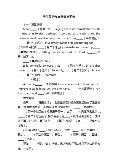
干货英语作文图表类范例(一)饼图模板Since______(背景介绍), Beijing has made remarkable results in attracting foreign business. According to the pie chart, the investors in different enterprises come from______(来源地区). _____(第一个地区的)investment ranks first, accounting for______(具体所占比例. _____(第二个地区的)investment makes up______(具体所占比例), putting it in second spot. The third is______(第三个地区)at_____(具体所占比例).It is generally believed that______(观点立场). In the first place, ____(第一个原因). Secondly, _____(第二个原因). Finally, _____(第三个原因). Therefore,______(结论).As far as______(讨论内容)are concerned, I think we can improve it as follows. On the one hand,_____(一方面建议). On the other hand,_____(另一方面建议).中文翻译自从______(背景介绍),北京在吸引外资方面已经做出了显著成果。
根据饼图来看,不同企业的投资者来自于_____(来源地区)。
______(第一个地区的)投资居于第一,占了_____(具体所占比例)。
______(第二个地区的)投资占总比的_____(具体所占比例),使其处于第二的位置。
第三名是_____(第三个地区),有_____(具体所占比例)。
- 1、下载文档前请自行甄别文档内容的完整性,平台不提供额外的编辑、内容补充、找答案等附加服务。
- 2、"仅部分预览"的文档,不可在线预览部分如存在完整性等问题,可反馈申请退款(可完整预览的文档不适用该条件!)。
- 3、如文档侵犯您的权益,请联系客服反馈,我们会尽快为您处理(人工客服工作时间:9:00-18:30)。
几种现象或观点对比 (一)相同对比 1. 男女生喜欢喜欢新潮衣服的数量都在增加/减少。 The number of the boys liking fashion clothes enjoys/suffers the same increase as it does for girls./ which holds true with regard to girls. 2. 喜欢周董的男生比例和喜欢周董的女生比例相同。 The percentage of the boys admiring Mr Zhou is the same as that of the girls. 3.调查显示 50% 的美国人在学习汉语,仅有10%的英 国人也在学习汉语。 According to the survey, 50% of Americans are leaning Chinese, compared with only 10% of the British.
重点注意: 1. 并不是图表中所有的数字都有用; 上周,我们以“谁是你的偶像”为题,在2600名学生 中 进行了一次调查(survey)。以下是调查数据: 偶像(idol) 女生 男生 伟人 18% 18% 父母 25% 11% 影视明星 50% 14% 体育明星 6% 48% 没有偶像 1% 9%
(二)不同对比 1. 大约百分之三十的人反对,同时百分之三十的赞同。 About 30% of the people are against it, which is the opposite to the people who are for it. 2. 80%中国人认为应该养成存钱的习惯,而超过90% 的美国人认为应该学会花钱。 80% of Chinese hold the belief that we should from the habit of paying money away, while more than 90% of Americans are against it./ disapprove of it.
倍数对比 1. 数据表明喜欢看电影和喜欢看电视的人数一样多。 As the figure shows, people who like going to movies are as many as those who like watching TV. 2. 相当于3倍(材料一,20) three times as…as two times +-er+ than three times the +n+ of….. 体现地位 1. 从重要性方面考虑,事业对男士来说是第一位。 In terms of importance, the career ranks the first for a man. 2. 仅次于 be next to/ be second to
百分比/比率 1.那个国家的失业率正在急速上升 The rate of unemployment of the country is sharply rising. 2. 49.9%的同学赞成,25%的同学反对,25.1%的同 学没有发表意见。 About half of the students are for it, while a quarter are against it and about 25% have no opinion. 3. 98%的人很乐观,只有2%的悲观。 The majority of them are optimistic, compared with only 2% who are pessimistic. 4. ….只占有百分之十。 …..only accounts for 10%.
1.调查时间、调查问题以及调查对象; 2.男女生在以明星为偶像方面的差异; 3.“父母”在男女生偶像中的排序差异; 4.男女生在以伟人为偶像方面的异同; 5.你的偶像及理
2.使用适当的名词代替一些百分数; 3.描述完数字后还要注意是否要求发表个人观点(案
例分析一)
4.对核心信息适当展开(案例分析二)
图表作文的种类: 表格; 曲线; 柱状图; 饼状图; 扇形图 图表类作文的时态: 1. 对一般性事件的调查,通常使用一般现在时 2. 对某个事件从过去到现在的变化趋势的调 查, 通常是过去时和现在时混合使用
图表作文的常用短语和句型: 描述或引入话题 1. 上个星期/最近我在同学中就….作了一次调查 Last week I made a survey on…. among students. Recently I have surveyed students on……. 2. 调查结果显示…. The survey shows that…… According to the survey, ………… The results are as follows. 3. 正如图表/数据所描述/显示 As is shown/illustrated/ described in the chart/table/ diagram/ figure It can be seen from the……. According to the date/ figure of the table/ graph…… From the chart /table…., we can see th/暗示/显示了….. The results of the survey/ table/ data witnesses/ indicates/ reveals/ shows/ reflects…….. 一种现象的变化: (一) 上升/下降变化 1. slight/small/minor/insignificant increase/decrease 2. large/huge/sudden/sharp/ obvious increase/decrease 3. gradual/steady increase/decrease 4. reach a peak/ the top of/ a high point reach the bottom/ floor of… 5. the biggest change occurred in the period when….. (材料第二点) (二)出现波动 1. vary/range between A and B 2. vary/ range from A to B 3. vary with……
80% of Chinese hold the belief that we should from the habit of paying money away. On the contrary more than 90% of Americans advocate that we should learn to spend the money we have earned. .