英文图表表达句型
英语写作句型-从图表中得出结论句型
1) As is shown in the graph … 如图所⽰…2) The graph shows that … 图表显⽰…3) As can be seen from the table … 从表格中可以看出…4) The statistics presented in the chart are rather convincing. 图表中所显⽰的数据相当具有说服⽰。
5) All these data clearly prove the fact that… 所有这些数据明显证明这⽰事实,即…6) The figures lead us to the conclusion that … 这些数据导致这样的结论…7) The above data can be interpreted as follows: 上⽰的数据可以解释如下:8) This chart provides several important points of comparison between the two trends. 这张表格揭⽰了这两种趋势的许多很重要的⽰⽰。
9) The increase of … in the city has reached to 20%. 在这个城市的增加以达到20%…10) In 1985, the number remained the same. 年,这个数字保持不变。
198511) There was a gradual decline in 1989. 1989年,出现了逐渐下降的情况。
12) There was no drop in 1986, and then came a sharp rise in the following years. 1986 年,没有出现下降,接着在接下来的⽰年中出现了迅速的上升。
13) From the chart, we know that … 从这张表中,我们可知…14) If the increase of … is compared to …, it will be observed that … 如果把的增加与… 的对⽰,就会看出…。
大学英语写作“图表描写”常用句型

大学英语写作“图表描写”常用句型第一篇:大学英语写作“图表描写”常用句型大学英语写作“图表描写”常用句型大学英语写作“图表描写”常用句型描写图表不是要考生把图表中的数据全部写出来。
由于数据只起说明问题的材料作用,因此要对其有所挑选。
一个不漏地描述数据,不仅会让读者感到你的表达冗长、枯燥,而且会感觉你的表述不得要领,偏离重点。
因此,只要把最能说明问题的数据描述出来就可以了。
要做到对数据的描写有针对性,就必须用一句话把图表中所反映的问题或现象或趋势归纳出来,尽量放在文章开头表达清楚,这样做有一针见血之功能,也便于下面引用数据来阐述。
1.According to(As can be seen from / As shown in / It is clear / apparent from)the chart(graph / table / diagram / figure / statistics), ……2.The chart(graph / table / diagram)reveals(shows / suggests)that ……3.From the statistics(information)given in the table(graph / chart), we can estimate(see / conclude)t hat ……4.The number(percentage / figure)of …… nearly(almost)doubled, as compared withthat of last year.5.The figure(number / percentage)increased(dropped / decreased)more than(almost / about)six times(twice)compared with…6.The percentage(number)is twice(4 times / half)as much as that(those)of 1990.7.The rate(number)was X percent, less(more)than a half(third / quarter)of the 1998total.8.By comparison with 1990, it shot up(jumped / increased / rose / decreased / dropped /fell)by X percent(from X to Y percent / to X percent).9.By 1998, less than(more than / almost / about / over / as many as / nearly)three-quarters of(X percent of / one out of five / one in four / one half of)housewives(graduates / young couples / the number of students).10.A has almost(nearly / about / over)a quarter / half / twice / one third)as manystudents as(as much money as)B.11.During the period 1970—1999(From 1910 to 1974 / Since 1980 / Since the early 1980s)there was(has been)sudden jump(sharp rise / dramatic increase / a marked fluctuation / steady decrease / slight decline / gradual reduction / fall)in the number of people who… / personal income / college population.第二篇:考研英语写作漫画图表常用句型九.考研英语写作漫画图表常用句型列举几个常用于描述漫画的句式:1.The cartoon/picture briefs/depicts/shows...例句:The cartoon briefs the history of commercial fishing in the 20th century.2. In the picture,...例句:In the picture, an American girl looks so pleased in the richly decorated Chinese national costumes.3.Looking at the picture,...例句:Looking at the picture, many people cannot help laughing....4....。
英文图表表达句型
图表表达句型(1)1. At a slower rate... 以较低的速度……2. It reflects the great differences that exist between...在……之间反应了巨大的差异3. These figures were overwhelmingly greater than the corresponding figure of...这些数据远远大于XXX的相关数据4. It can be seen from the chart that significantly...-er (比较级)...than...由图可以看出,XXX明显更……5. In all locations, A outnumbered B... 在所有方面,A都比B……6. These two pie charts (饼状图) show the differences between two groups of...这两个饼状图显示了两组XXX之间的不同之处7. The first point to note is the huge increase (in the number of)...首先要注意的就是(数据方面的)巨幅增加8. A is more than... times (bigger) than B . A比B多(大)XXX倍。
9. The biggest loss was to A, which decreased from... to... of the whole.损失最大的是A,整体上,它从XXX降至XXX10. The biggest gains (in graduate numbers) were made by A which, as a group, haveincreased by over...A获得了最大的效益,整体上,它增长了…11. To sum up, ... 总之,……12. This bar chart displays the numbers of... 该柱状图显示了XXX的数据13. The chart reflects several trends. 该图显示了如下几种趋势……14. But... we see a different trend emerging. 但是……我们发现了另一种趋势慢慢浮现15. When we compare..., we see... 当比较……我们会发现……16. This suggests increased educational opportunities for women in higher education.这一点表明女性接受高等教育的机会得到增加。
商务英语图表作文常用句型
商务英语图表作文常用句型引导语:图表作文是BEC考试中常出的题型。
对于如何描述图表,很多学生都感到困难。
那么下面,为大家了一些常用的描述图表的句型,供大家参考,希望能帮助到大家1. To sum up, ...2. This bar chart displays the numbers of...3. The chart reflects several trends.4. But... we see a different trend emerging.5. When we pare..., we see...6. This suggests increased educational opportunities for women in higher education.7. Aording to the graph, ...8. The proportion of...9. There was a slight recovery...10. ... has dropped dramatically.11. At a slower rate...12. It reflects the great differences that exist between...13. These figures were overwhelmingly greater than the corresponding figure of...14. It can be seen from the chart that significantly...~er(比较级)...than...15. In all locations, A out numbered B...16. These two pie charts (饼状图) show the differences between two groups of...17. The first point to note is the huge increase (in the number of)...18. A is more than... times (bigger) than B19. The biggest loss was to A, which decreased from... to... of the whole.20. The biggest gains (in graduate numbers) were made by A which, as a group, have increased by over...21. The general trend appears to be increases.22. There were approximately...23. ... had jumped four fold to...24. ... rose sharply from... to...25. Remained constant at...26. The overall trend for...27. The graph shows the percentage of...28. We can see that... swell during the... hours, peaking at... am.29. Although the raw data does not provide an explanation for these trends30. When coupled with the graphic information, leads to some possible conclusions...?31. This may serve to explain, at least in part, the mirror image of the two lines.32. Perhaps the most telling feature of the chart is the dominance of...33. The graph relates the percentage of...34. Rise gradually to about 10%.35. After a slight drop around lunch time, audiences begin a fairly steady climb towards the peak viewer ship in the hours from 6pm to 10pm at some 40-45%.36. A sharp decline follows to...37. Listenership drops steadily from this peak, crossing the line for television views at around 2pm.38. It continues to decline throughout the eveninguntil reaching a low point at 2am.39. The graph proves the dominance of...40. During the peak period of...41. The diagram unfolds a clear parison between...42. The United States as a whole in four aspects, namely, ...43. Obviously, in every aspect...44. ... had a much higher growth rate than... as a whole during that period.45. The number of... increased by %.46. The most rapid increase of all the four aspects... As to the other three, though the growth rates were not so high, they were indeed remarkable and impressive.47. The number of... dropped by %.48. This increased again...49. From the diagram it can be safely concluded that (in the years)...50. There were many significant changes (in modes of transport)...51. The following paragraphs will identify and discuss the trends in the aompanying graph.52. A very noticeable trend was the steady decrease in...53. During the same period, there was a large increase...。
表达图表增减的短语和句型

1.the table shows the changes in the number of...over the period from...to...该表格描述了在...年之...年间...数量的变化。
2.the bar chart illustrates that...该柱状图展示了...3.the graph provides some interesting data regarding...该图为我们提供了有关...有趣数据。
4.the diagram shows (that)...该图向我们展示了...5.the pie graph depicts (that)....该圆形图揭示了...6.this is a cure graph which describes the trend of...这个曲线图描述了...的趋势。
7.the figures/statistics show (that)...数据(字)表明...8.the tree diagram reveals how...该树型图向我们揭示了如何...9.the data/statistics show (that)...该数据(字)可以这样理解...10.the data/statistics/figures lead us to the conclusion that...这些数据资料令我们得出结论...11.as is shown/demonstrated/exhibited in the diagram/graph/chart/table...如图所示...12.according to the chart/figures...根据这些表(数字)...13.as is shown in the table...如表格所示...14.as can be seen from the diagram, great changes have taken place in...从图中可以看出,...发生了巨大变化。
图表类作文常用句型
图表类作文常用句型1.the table shows the changes in the number of...over the period from...to... 该表格描述了在...年之...年间...数量的变化。
2.the bar chart illustrates that...该柱状图展示了...3.the graph provides some interesting data regarding...该图为我们提供了有关...有趣数据。
4.the diagram shows (that)...该图向我们展示了...5.the pie graph depicts (that)....该圆形图揭示了...6.this is a cure graph which describes the trend of...这个曲线图描述了...的趋势。
7.the figures/statistics show (that)...数据(字)表明...8.the tree diagram reveals how...该树型图向我们揭示了如何...9.the data/statistics show (that)...该数据(字)可以这样理解...10.the data/statistics/figures lead us to the conclusion that...这些数据资料令我们得出结论...11.as is shown/demonstrated/exhibited in the diagram/graph/chart/table... 如图所示...12.according to the chart/figures...根据这些表(数字)...13.as is shown in the table...如表格所示...14.as can be seen from the diagram,great changes have taken place in...从图中可以看出,...发生了巨大变化。
【英语高考】图表模板句型
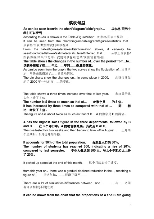
模板句型As can be seen from/in the chart/diagram/table/graph...从表格/图形中我们可以看到……According to /As is shown in the T able /Figure/Chart...如表格/图表中显示……It can be seen from the chart/diagram/table/graph/figures/statistics that...从表格/图表/数据中我们可以看到……From the table/figures/data/results/information above, it can/may be seen/concluded/shown/estimated/calculated/inferred that...从以上的表格/图表/数据/结果/信息中,我们可以看到/总结/预测/计算/得出……The table shows the changes in the number of...over the period from...to...该表格描述了在……年之……年间……数量的变化。
As can be seen from the graph, the two curves show the fluctuation of...如图所示,两条曲线描述了……的波动情况。
The pie charts show the changes on... in some place in 2000.此饼形图显示了2000年一些地方……的变化。
The table shows a three times increase over that of last year.表格显示比去年上升了3倍。
The number is 5 times as much as that of...此数字是……的5倍。
It has increased by three times as compared with that of ...同……相比,增长了3倍。
英语常用图表描述句型

15.5常用图表阐释语:(1)表示“图表所示”句型:As is shown in the chart…如图所示As can be seen in the table…从表中可知As the graph shows…该曲线图表明The above table illustrates…该表格显示The first column represents…第一栏代表The second row demonstrates that…第二行表示See Figure (Table) 2 请看图(表)2(2)表示上升的动词:.increase, rise, go up, grow, climb, rocket, soar, rebound, ascend. Leapupwards, jump, speed up, surge, shoot up(3)表示下降的动词:.go down, fall, drop, decline, abate,decrease, slump, diminish, descend,plummet (fall quickly), shrink, slip, slide, take a plunge, dive,sink, slow down, (4)表示快速的副词:rapidly, quickly, sharply, dramatically, surprisingly, fast.(5)表示程度的副词、短语:considerably, a great deal, very much, a lot, rather, somewhat, quite a lot,a bit, a little, slightlysignificantly, markedly, noticeably, exactly, precisely, almost, nearly, roughly,approximately.(6)表示缓慢、逐步的副词、短语:steadily, gradually, small increase, slightly, moderately, slowly.(7)表示达到顶峰、平行向前等短语:to peak a high point at…, reach a peak at…, reach a plateau;reach the bottomat…, to bottom a low point at…,drop to the bottom at…, to level off;keep constant,stay the same, remain steady, remain the same/constant, stabilize.(8) 表示状况的单词、短语:erratic movements (unstable trend), fluctuations, trough (the lowest point),to the bottom, upward trend, downward trend.15.6 图表描述例句:Sales stood at the lowest level in March.三月份的销售额呈最底水平。
- 1、下载文档前请自行甄别文档内容的完整性,平台不提供额外的编辑、内容补充、找答案等附加服务。
- 2、"仅部分预览"的文档,不可在线预览部分如存在完整性等问题,可反馈申请退款(可完整预览的文档不适用该条件!)。
- 3、如文档侵犯您的权益,请联系客服反馈,我们会尽快为您处理(人工客服工作时间:9:00-18:30)。
图表表达句型(1)1. At a slower rate... 以较低的速度……2. It reflects the great differences that exist between...在……之间反应了巨大的差异3. These figures were overwhelmingly greater than the corresponding figure of...这些数据远远大于XXX的相关数据4. It can be seen from the chart that significantly...-er (比较级)...than...由图可以看出,XXX明显更……5. In all locations, A outnumbered B... 在所有方面,A都比B……6. These two pie charts (饼状图) show the differences between two groups of...这两个饼状图显示了两组XXX之间的不同之处7. The first point to note is the huge increase (in the number of)...首先要注意的就是(数据方面的)巨幅增加8. A is more than... times (bigger) than B . A比B多(大)XXX倍。
9. The biggest loss was to A, which decreased from... to... of the whole.损失最大的是A,整体上,它从XXX降至XXX10. The biggest gains (in graduate numbers) were made by A which, as a group, have increased byover...A获得了最大的效益,整体上,它增长了…11. To sum up, ... 总之,……12. This bar chart displays the numbers of... 该柱状图显示了XXX的数据13. The chart reflects several trends. 该图显示了如下几种趋势……14. But... we see a different trend emerging. 但是……我们发现了另一种趋势慢慢浮现15. When we compare..., we see... 当比较……我们会发现……16. This suggests increased educational opportunities for women in higher education.这一点表明女性接受高等教育的机会得到增加。
17. According to the graph, ... 根据曲线图……18. The proportion of... 所占比例……19. There was a slight recovery... ……有轻微的恢复20. ... has dropped dramatically ……已大幅下降21. The general trend appears to be increases. 总体趋势似乎是在增长。
22. There were approximately... 大约有……23. ... had jumped four fold to... ……已跃升四倍24. ... rose sharply from... to...从……到……急剧上涨25. Remained constant at... 保持在…26. The overall trend for... 总体趋势……27. The graph shows the percentage of... 该图所示……所占百分比……28. We can see that... swell during the... hours, peaking at... am.我们可以看到,……在XXX时间一路增长,在XXX时刻到达峰值29. Although the raw data does not provide an explanation for these trends.尽管原始数据没有为这些趋势提供解释30. When coupled with the graphic information, leads to some possible conclusions...结合图表信息,就可能得到一些结论……31. This may serve to explain, at least in part, the mirror image of the two lines.这可能有助于解释,至少部分解释了这两条线的镜像关系。
32. Perhaps the most telling feature of the chart is the dominance of...也许该图表最生动的特征就是……的优势33. The graph relates the percentage of... 该图的比例关系……34. Rise gradually to about 10%. 逐渐上升至百分之十左右。
35. After a slight drop around lunch time, audiences begin a fairly steady climb towards the peak viewer ship in the hours from 6pm to 10pm at some 40-45%.在午餐时间有轻微的下降,然后观众开始稳定增长,在下午六点至10点,观众增加至峰值,百分之四五十左右。
36. A sharp decline follows to... 跟随着……急剧下降37. Listenership drops steadily from this peak, crossing the line for television views at around2pm.听众人数自峰值稳定下降,在下午两点左右横越电视观众数。
38. It continues to decline throughout the evening until reaching a low point at 2am.整个晚上它继续下降,直到凌晨02点达到最低点。
39. The graph proves the dominance of... 该图显示了XXX的优势40. During the peak period of... 在XXX的高峰时期,…41. The diagram unfolds a clear comparison between...该图没有展现XX与XX之间的清晰比较42. The United States as a whole in four aspects, namely, ...美国,作为一个整体在四个方面,即…43. Obviously, in every aspect... 很显然,在各个方面……44. ... had a much higher growth rate than... as a whole during that period.整体看来,在那期间,XXX增长速度远远高于XXX45. The number of... increased by %. XXX的数据增长了……46. The most rapid increase of all the four aspects... As to the other three, though the growth rates were not so high, they were indeed remarkable and impressive.四个方面中增长最快的是……至于其他三个方面,尽管增加速率没那么高,它们的增长也是很显著的。
47. The number of... dropped by %. XXX的数据下降了……48. From the diagram it can be safely concluded that (in the years)...由图可知(几年时间里)……49. There were many significant changes (in modes of transport)...有很多明显的改变(在运输方式方面)……50. The following paragraphs will identify and discuss the trends in the accompanying graph.下列各段将确定并讨论附图所示趋势。
51. A very noticeable trend was the steady decrease in...一个明显的趋势是在XXX方面的稳定下降。
52. During the same period, there was a large increase... 同时,XXX增幅很大。
53. This increased again... 它再次增长了……54. As is shown in the graph … 如图所示…55. The graph shows that … 图表显示…56. As can be seen from the table … 从表格中可以看出…57. The statistics presented in the chart are rather convincing.图表中所显示的数据相当具有说服力。
58. All these data clearly prove the fact that… 所有这些数据明显证明这一事实,即…59. The figures lead us to the conclusion that … 这些数据导致这样的结论…60. The above data can be interpreted as follows: 上面的数据可以解释如下:61. This chart provides several important points of comparison between the two trends.这张表格揭示了这两种趋势的许多很重要的方面。
62. The increase of … in the city has reached to 20%. …在这个城市的增加以达到20%63. In 1985, the number remained the same. 1985年,这个数字保持不变。
