Simon雅思小作文真题范文 Task 1: 'waste graph' answer
考官Simon雅思大作文范文(28篇)
目录1. 政府是否该支持本土电影 (2)2. 外国游客应该比本地游客花更多钱 (3)3. 现代社会的人变得更独立还是更不独立 (4)4. 选择工作最重要的考虑因素是薪水 (5)5. 动物实验是否应该禁止 (6)6. 政府是否应该支持艺术工作者 (7)7. 青少年是否应该无偿为社区工作 (8)8. 我们为什么需要音乐 (9)9. 电脑游戏是好还是坏呢 (10)10. 平均寿命变长的原因和应对方法 (11)11. 我们应该只关心自己的国家吗 (12)12. 科技是如何影响人们的日常交流的 (13)13. 兴趣爱好应该是很困难的 (14)14. 平等社会和个人成就之间的关系 (15)15. 大学每个科目的男生女生数量应该相等 (16)16. 博物馆的目的应该是娱乐还是教育 (17)17. 应该上大学还是应该直接找工作 (18)18. 政府是否应该出钱保护濒危语言 (19)19. 环境污染的方式以及政府和个人能够做什么 (20)20. 为何幸福很难定义以及如何获得幸福 (21)21. 你是否同意保护野生动物是浪费资源 (22)22. 严厉惩罚交通肇事能提高行驶安全吗 (23)23. 企业除了赚钱以外要承担社会责任 (24)24. 政府如何让城市生活更美好 (25)25. 现在人们更喜欢独居了是好还是坏呢 (26)26. 大学生应该学习自己喜欢的还是对社会有用的 (27)27. 让罪犯用亲身经历告诉青少年不要犯罪 (28)28. 传统思想在当代是否还有用武之地 (29)1.政府是否该支持本土电影Many people prefer to watch foreign films rather than locally produced films. Why could this be? Should governments give more financial support to local film industries?范文:It is true that foreign films are more popular in many countries than domestically produced films. There could be several reasons why this is the case, and I believe that governments should promote local film-making by subsidising the industry.There are various reasons why many people find foreign films more enjoyable than the films produced in their own countries. Firstly, the established film industries in certain countries have huge budgets for action, special effects and to shoot scenes in spectacular locations. Hollywood blockbusters like ‘Avatar’ or the James Bond films are examples of such productions and the global appeal that they have. Another reason why these big-budget films are so successful is that they often star the most famous actors and actresses, and they are made by the most accomplished producers and directors. The poor quality, low-budget filmmaking in many countries suffers in comparison.In my view, governments should support local film industries financially. In every country, there may be talented amateur film-makers who just need to be given the opportunity to prove themselves. To compete with big-budget productions from overseas, these people need money to pay for film crews, actors and a host of other costs related to producing high-quality films. If governments did help with these costs, they would see an increase in employment in the film industry, income from film sales, and perhaps even a rise in tourist numbers. New Zealand, for example, has seen an increase in tourism related to the 'Lord of the Rings' films, which were partly funded by government subsidies.In conclusion, I believe that increased financial support could help to raise the quality of locally made films and allow them to compete with the foreign productions that currently dominate the market.(295 words, band 9)2.外国游客应该比本地游客花更多钱Foreign visitors should pay more than local visitors for cultural and historical attractions. To what extent do you agree or disagree with this opinion?It is sometimes argued that tourists from overseas should be charged more than local residents to visit important sites and monuments. I completely disagree with this idea.The argument in favour of higher prices for foreign tourists would be that cultural or historical attractions often depend on state subsidies to keep them going, which means that the resident population already pays money to these sites through the tax system. However, I believe this to be a very shortsighted view. Foreign tourists contribute to the economy of the host country with the money they spend on a wide range of goods and services, including food, souvenirs, accommodation and travel. The governments and inhabitants of every country should be happy to subsidise important tourist sites and encourage people from the rest of the world to visit them.If travellers realised that they would have to pay more to visit historical and cultural attractions in a particular nation, they would perhaps decide not to go to that country on holiday. To take the UK as an example, the tourism industry and many related jobs rely on visitors coming to the country to see places like Windsor Castle or Saint Paul’s Cathedral. These two sites charge the same price regardless of nationality, and this helps to promote the n ation’s cultural heritage. If overseas tourists stopped coming due to higher prices, there would be a risk of insufficient funding for the maintenance of these important buildings.In conclusion, I believe that every effort should be made to attract tourists from overseas, and it would be counterproductive to make them pay more than local residents.(269 words, band 9)3.现代社会的人变得更独立还是更不独立Some people think that in the modern world we are more dependent on each other, while others think that people have become more independent. Discuss both views and give your own opinion.People have different views about whether we are more or less dependent on others nowadays. In my view, modern life forces us to be more independent than people were in the past.There are two main reasons why it could be argued that we are more dependent on each other now. Firstly, life is more complex and difficult, especially because the cost of living has increased so dramatically. For example, young adults tend to rely on their parents for help when buying a house. Property prices are higher than ever, and without help it would be impossible for many people to pay a deposit and a mortgage. Secondly, people seem to be more ambitious nowadays, and they want a better quality of life for their families. This means that both parents usually need to work full-time, and they depend on support from grandparents and babysitters for child care. However, I would agree with those who believe that people are more independent these days. In most countries, families are becoming smaller and more dispersed, which means that people cannot count on relatives as much as they used to. We also have more freedom to travel and live far away from our home towns. For example, many students choose to study abroad instead of going to their local university, and this experience makes them more independent as they learn to live alone. Another factor in this growing independence is technology, which allows us to work alone and from any part of the world.In conclusion, while there are some reasons to believe that people now depend on each other more, my own view is that we are more independent than ever.4.选择工作最重要的考虑因素是薪水When choosing a job, the salary is the most important consideration. To what extent do you agree or disagree?Many people choose their jobs based on the size of the salary offered. Personally, I disagree with the idea that money is the key consideration when deciding on a career, because I believe that other factors are equally important. On the one hand, I agree that money is necessary in order for people to meet their basic needs. For example, we all need money to pay for housing, food, bills, health care, and education. Most people consider it a priority to at least earn a salary that allows them to cover these needs and have a reasonable quality of life. If people chose their jobs based on enjoyment or other non-financial factors, they might find it difficult to support themselves. Artists and musicians, for instance, are known for choosing a career path that they love, but that does not always provide them with enough money to live comfortably and raise a family.Nevertheless, I believe that other considerations are just as important as what we earn in our jobs. Firstly, personal relationships and the atmosphere in a workplace are extremely important when choosing a job. Having a good manager or friendly colleagues, for example, can make a huge difference to workers’ levels of happiness and general quality of life. Secondly, many people’s f eelings of job satisfaction come from their professional achievements, the skills they learn, and the position they reach, rather than the money they earn. Finally, some people choose a career because they want to help others and contribute something positive to society.In conclusion, while salaries certainly affect people’s choice of profession, I do not believe that money outweighs all other motivators.5.动物实验是否应该禁止Nowadays animal experiments are widely used to develop new medicines and to test the safety of other products. Some people argue that these experiments should be banned because it is morally wrong to cause animals to suffer, while others are in favour of them because of their benefits to humanity. Discuss both views and give your own opinion.It is true that medicines and other products are routinely tested on animals before they are cleared for human use. While I tend towards the viewpoint that animal testing is morally wrong, I would have to support a limited amount of animal experimentation for the development of medicines.On the one hand, there are clear ethical arguments against animal experimentation. To use a common example of this practice, laboratory mice may be given an illness so that the effectiveness of a new drug can be measured. Opponents of such research argue that humans have no right to subject animals to this kind of trauma, and that the lives of all creatures should be respected. They believe that the benefits to humans do not justify the suffering caused, and that scientists should use alternative methods of research. On the other hand, reliable alternatives to animal experimentation may not always be available. Supporters of the use of animals in medical research believe that a certain amount of suffering on the part of mice or rats can be justified if human lives are saved. They argue that opponents of such research might feel differently if a member of their own families needed a medical treatment that had been developed through the use of animal experimentation. Personally, I agree with the banning of animal testing for non-medical products, but I feel that it may be a necessary evil where new drugs and medical procedures are concerned.In conclusion, it seems to me that it would be wrong to ban testing on animals for vital medical research until equally effective alternatives have been developed.(270 words, band 9)6.政府是否应该支持艺术工作者Some people think that governments should give financial support to creative artists such as painters and musicians. Others believe that creative artists should be funded by alternative sources. Discuss both views and give your own opinion.People have different views about the funding of creative artists. While some people disagree with the idea of government support for artists, I believe that money for art projects should come from both governments and other sources. Some art projects definitely require help from the state. In the UK, there are many works of art in public spaces, such as streets or squares in city centres. In Liverpool, for example, there are several new statues and sculptures in the docks area of the city, which has been redeveloped recently. These artworks represent culture, heritage and history. They serve to educate people about the city, and act as landmarks or talking points for visitors and tourists. Governments and local councils should pay creative artists to produce this kind of art, because without their funding our cities would be much less interesting and attractive.On the other hand, I can understand the arguments against government funding for art. The main reason for this view is that governments have more important concerns. For example, state budgets need to be spent on education, healthcare, infrastructure and security, among other areas. These public services are vital for a country to function properly, whereas the work of creative artists, even in public places, is a luxury. Another reason for this opinion is that artists do a job like any other professional, and they should therefore earn their own money by selling their work.In conclusion, there are good reasons why artists should rely on alternative sources of financial support, but in my opinion government help is sometimes necessary.7.青少年是否应该无偿为社区工作Some people think that all teenagers should be required to do unpaid work in their free time to help the local community. They believe this would benefit both the individual teenager and society as a whole. Do you agree or disagree? Many young people work on a volunteer basis, and this can only be beneficial for both the individual and society as a whole. However, I do not agree that we should therefore force all teenagers to do unpaid work.Most young people are already under enough pressure with their studies, without being given the added responsibility of working in their spare time. School is just as demanding as a full-time job, and teachers expect their students to do homework and exam revision on top of attending lessons every day. When young people do have some free time, we should encourage them to enjoy it with their friends or to spend it doing sports and other leisure activities. They have many years of work ahead of them when they finish their studies.At the same time, I do not believe that society has anything to gain from obliging young people to do unpaid work. In fact, I would argue that it goes against the values of a free and fair society to force a group of people to do something against their will. Doing this can only lead to resentment amongst young people, who would feel that they were being used, and parents, who would not want to be told how to raise their children. Currently, nobody is forced to volunteer, and this is surely the best system.In conclusion, teenagers may choose to work for free and help others, but in my opinion we should not make this compulsory.(250 words, band 9)8.我们为什么需要音乐There are many different types of music in the world today. Why do we need music? Is the traditional music of a country more important than the international music that is heard everywhere nowadays?It is true that a rich variety of musical styles can be found around the world. Music is a vital part of all human cultures for a range of reasons, and I would argue that traditional music is more important than modern, international music.Music is something that accompanies all of us throughout our lives. As children, we are taught songs by our parents and teachers as a means of learning language, or simply as a form of enjoyment. Children delight in singing with others, and it would appear that the act of singing in a group creates a connection between participants, regardless of their age. Later in life, people’s musical preferences develop, and we come to see our favourite songs as part of our life stories. Music both expresses and arouses emotions in a way that words alone cannot. In short, it is difficult to imagine life without it.In my opinion, traditional music should be valued over the international music that has become so popular. International pop music is often catchy and fun, but it is essentially a commercial product that is marketed and sold by business people. Traditional music, by contrast, expresses the culture, customs and history of a country. Traditional styles, such as ...(example)..., connect us to the past and form part of our cultural identity. It would be a real pity if pop music became so predominant that these national styles disappeared.In conclusion, music is a necessary part of human existence, and I believe that traditional music should be given more importance than international music. (261 words, band 9)9.电脑游戏是好还是坏呢Some people regard video games as harmless fun, or even as a useful educational tool. Others, however, believe that videos games are having an adverse effect on the people who play them. In your opinion, do the drawbacks of video games outweigh the benefits?Many people, and children in particular, enjoy playing computer games. While I accept that these games can sometimes have a positive effect on the user, I believe that they are more likely to have a harmful impact.On the one hand, video games can be both entertaining and educational. Users, or gamers, are transported into virtual worlds which are often more exciting and engaging than real-life pastimes. From an educational perspective, these games encourage imagination and creativity, as well as concentration, logical thinking and problem solving, all of which are useful skills outside the gaming context. Furthermore, it has been shown that computer simulation games can improve users’ motor skills and help to prepare them for re al-world tasks, such as flying a plane.However, I would argue that these benefits are outweighed by the drawbacks. Gaming can be highly addictive because users are constantly given scores, new targets and frequent rewards to keep them playing. Many children now spend hours each day trying to progress through the levels of a game or to get a higher score than their friends. This type of addiction can have effects ranging from lack of sleep to problems at school, when homework is sacrificed for a few more hours on the computer or console. The rise in obesity in recent years has also been linked in part to the sedentary lifestyle and lack of exercise that often accompany gaming addiction.In conclusion, it seems to me that the potential dangers of video games are more significant than the possible benefits.(258 words, band 9)10.平均寿命变长的原因和应对方法In the developed world, average life expectancy is increasing. What problems will this cause for individuals and society? Suggest some measures that could be taken to reduce the impact of ageing populations.It is true that people in industrialised nations can expect to live longer than ever before. Although there will undoubtedly be some negative consequences of this trend, societies can take steps to mitigate these potential problems. As people live longer and the populations of developed countries grow older, several related problems can be anticipated. The main issue is that there will obviously be more people of retirement age who will be eligible to receive a pension. The proportion of younger, working adults will be smaller, and governments will therefore receive less money in taxes in relation to the size of the population. In other words, an ageing population will mean a greater tax burden for working adults. Further pressures will include a rise in the demand for healthcare, and the fact young adults will increasingly have to look after their elderly relatives.There are several actions that governments could take to solve the problems described above. Firstly, a simple solution would be to increase the retirement age for working adults, perhaps from 65 to 70. Nowadays, people of this age tend to be healthy enough to continue a productive working life. A second measure would be for governments to encourage immigration in order to increase the number of working adults who pay taxes. Finally, money from national budgets will need to be taken from other areas and spent on vital healthcare, accommodation and transport facilities for the rising numbers of older citizens.In conclusion, various measures can be taken to tackle the problems that are certain to arise as the populations of countries grow older.(265 words, band 9)11.我们应该只关心自己的国家吗We cannot help everyone in the world that needs help, so we should only be concerned with our own communities and countries. To what extent do you agree or disagree with this statement?Some people believe that we should not help people in other countries as long as there are problems in our own society. I disagree with this view because I believe that we should try to help as many people as possible.On the one hand, I accept that it is important to help our neighbours and fellow citizens. In most communities there are people who are impoverished or disadvantaged in some way. It is possible to find homeless people, for example, in even the wealthiest of cities, and for those who are concerned about this problem, there are usually opportunities to volunteer time or give money to support these people. In the UK, people can help in a variety of ways, from donating clothing to serving free food in a soup kitchen. As the problems are on our doorstep, and there are obvious ways to help, I can understand why some people feel that we should prioritise local charity.At the same time, I believe that we have an obligation to help those who live beyond our national borders. In some countries the problems that people face are much more serious than those in our own communities, and it is often even easier to help. For example, when children are dying from curable diseases in African countries, governments and individuals in richer countries can save lives simply by paying for vaccines that already exist. A small donation to an international charity might have a much greater impact than helping in our local area.In conclusion, it is true that we cannot help everyone, but in my opinion national boundaries should not stop us from helping those who are in need. (280 words, band 9)12.科技是如何影响人们的日常交流的Nowadays the way many people interact with each other has changed because of technology. In what ways has technology affected the types of relationships that people make? Has this been a positive or negative development?It is true that new technologies have had an influence on communication between people. Technology has affected relationships in various ways, and in my opinion there are both positive and negative effects.Technology has had an impact on relationships in business, education and social life. Firstly, telephones and the Internet allow business people in different countries to interact without ever meeting each other. Secondly, services like Skype create new possibilities for relationships between students and teachers. For example, a student can now take video lessons with a teacher in a different city or country. Finally, many people use social networks, like Facebook, to make new friends and find people who share common interests, and they interact through their computers rather than face to face.On the one hand, these developments can be extremely positive. Cooperation between people in different countries was much more difficult when communication was limited to written letters or telegrams. Nowadays, interactions by email, phone or video are almost as good as face-to-face meetings, and many of us benefit from these interactions, either in work or social contexts. On the other hand, the availability of new communication technologies can also have the result of isolating people and discouraging real interaction. For example, many young people choose to make friends online rather than mixing with their peers in the real world, and these ‘virtual’ relationships are a poor substitute for real friendships.In conclusion, technology has certainly revolutionised communication between people, but not all of the outcomes of this revolution have been positive.13.兴趣爱好应该是很困难的Some people believe that hobbies need to be difficult to be enjoyable. To what extent do you agree or disagree?Some hobbies are relatively easy, while others present more of a challenge. Personally, I believe that both types of hobby can be fun, and I therefore disagree with the statement that hobbies need to be difficult in order to be enjoyable.On the one hand, many people enjoy easy hobbies. One example of an activity that is easy for most people is swimming. This hobby requires very little equipment, it is simple to learn, and it is inexpensive. I remember learning to swim at my local swimming pool when I was a child, and it never felt like a demanding or challenging experience. Another hobby that I find easy and fun is photography. In my opinion, anyone can take interesting pictures without knowing too much about the technicalities of operating a camera. Despite being straightforward, taking photos is a satisfying activity.On the other hand, difficult hobbies can sometimes be more exciting. If an activity is more challenging, we might feel a greater sense of satisfaction when we manage to do it successfully. For example, film editing is a hobby that requires a high level of knowledge and expertise. In my case, it took me around two years before I became competent at this activity, but now I enjoy it much more than I did when I started. I believe that many hobbies give us more pleasure when we reach a higher level of performance because the results are better and the feeling of achievement is greater.In conclusion, simple hobbies can be fun and relaxing, but difficult hobbies can be equally pleasurable for different reasons.14.平等社会和个人成就之间的关系In recent years, there has been growing interest in the relationship between equality and personal achievement. Some people believe that individuals can achieve more in egalitarian societies. Others believe that high levels of personal achievement are possible only if individuals are free to succeed or fail according to their individual merits. What is your view of the relationship between equality and personal success?In my opinion, an egalitarian society is one in which everyone has the same rights and the same opportunities. I completely agree that people can achieve more in this kind of society.Education is an important factor with regard to personal success in life. I believe that all children should have access to free schooling, and higher education should be either free or affordable for all those who chose to pursue a university degree. In a society without free schooling or affordable higher education, only children and young adults from wealthier families would have access to the best learning opportunities, and they would therefore be better prepared for the job market. This kind of inequality would ensure the success of some but harm the prospects of others.I would argue that equal rights and opportunities are not in conflict with people’s freedom to succeed or fail. In other words, equality does not mean that people lose their motivation to succeed, or that they are not allowed to fail. On the contrary, I believe that most people would feel more motivated to work hard and reach their potential if they thought that they lived in a fair society. Those who did not make the same effort would know that they had wasted their opportunity. Inequality, on the other hand, would be more likely to demotivate people because they would know that the odds of success were stacked in favour of those from privileged backgrounds.In conclusion, it seems to me that there is a positive relationship between equality and personal success.(260 words)15.大学每个科目的男生女生数量应该相等Universities should accept equal numbers of male and female students in every subject. To what extent do you agree or disagree?In my opinion, men and women should have the same educational opportunities. However, I do not agree with the idea of accepting equal proportions of each gender in every university subject.Having the same number of men and women on all degree courses is simply unrealistic. Student numbers on any course depend on the applications that the institution receives. If a university decided to fill courses with equal numbers of males and females, it would need enough applicants of each gender. In reality, many courses are more popular with one gender than the other, and it would not be practical to aim for equal proportions. For example, nursing courses tend to attract more female applicants, and it would be difficult to fill these courses if fifty per cent of the places needed to go to males.Apart from the practical concerns expressed above, I also believe that it would be unfair to base admission to university courses on gender. Universities should continue to select the best candidates for each course according to their qualifications. In this way, both men and women have the same opportunities, and applicants know that they will be successful if they work hard to achieve good grades at school. If a female student is the best candidate for a place on a course, it is surely wrong to reject her in favour of a male student with lower grades or fewer qualifications.In conclusion, the selection of university students should be based on merit, and it would be both impractical and unfair to change to a selection procedure based on gender.(265 words, band 9)。
雅思写作小作文范文 雅思写作折线图(线状图) 公司垃圾数量.doc
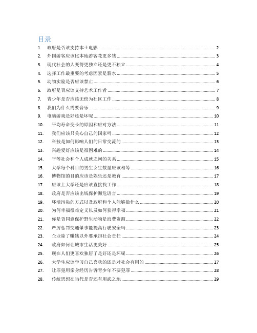
雅思写作小作文范文雅思写作折线图(线状图)公司垃圾数量今天我们雅思写作小作文范文的文章来研究下折线图(线状图)。
该图表的内容为三家公司(A, B, C)从2000年到2015年间所产生的垃圾数量。
其中公司A的垃圾数量一直在下降,公司B的数量先是一波上升,然后进一步下降。
公司C的垃圾数量则是一直在上升。
虽然图表比较简单,但基本概括了折线图的精髓,并涵盖了各种变化。
小编搜集了一篇相应的考官范文,以供大家参考。
雅思写作小作文题目The graph below shows the amounts of waste produced by three companies over a period of 15 years.Summarise the information by selecting and reporting the main features, and make comparisons where relevant.雅思写作小作文范文The line graph compares three companies in terms of their waste output between the years 2000 and 2015.线状图比较了三个公司从2000年到2015年期间的垃圾产出量。
It is clear that there were significant changes in the amounts of waste produced by all three companies shown on the graph. While companies A and B saw waste output fall over the 15-year period, the amount of waste produced by company C increased considerably.很明显,图表中所显示的三家公司的垃圾产量都有巨大的变化。
task1 graph 小作文
雅思写作考试分为两部分:task1图表题和task2论述文。
小作文task1图表题,要求客观,准确和详尽的写作,需要完成的任务是必须如实而且详尽的用英文记录图表中的信息,其最高境界是让考官即使不看图表,只看考生作文也能准确的想象出图标的内容。
相比之下,大作文task2明显带有主观性,需要完成的任务是可以用英文准确的表达自己的观点并提供支持此观点的强有力的论据。
从评分标准来看,前者要求:task achievement(要求按照题目完成写作任务),coherence and cohesion, lexical resources, grammatical range and accuracy;后者要求task response(这是最重要的差别,即要求给你出自己的观点并进行强有力的论证), coherence and cohesion, lexical resources, grammatical range and accuracy.因此,这就要求广大烤鸭们在作文的准备过程中避免以下误区。
task 1图表题切忌牵强的比较。
Write a report for a university lecturer describing the information shown below. (剑3)Summarize the information by selecting and reporting the main features, and make comparisons where relevant.(剑7)对比以上两个雅思小作文的题目要求我们可以看出,小作文已经不再是要求简单的描述图表,而是开始要求考生具有一定的数字分析,总结归纳和对比计算的能力了。
为了成功拿下小作文,我们要注意:1.常用单词和词组的用法2.提高分析图表信息的能力和速度3.减少语法错误4.不要为了比较而比较前三点在于平时的大量积累。
Simon考官A类雅思写作小作文范文-汇总

A类雅思写作小作文共计41篇,篇篇9分,完整覆盖了雅思a类小作文的pie,bar,line,table, diagram, map, combination7大题型,范文皆雅思前考官英国曼城人simon的手笔,此人行文风格推崇简洁明快,适合烤鸭研读模仿。
他的雅思小作文几乎都是4段式,字数一般在160左右。
一、柱状图(10)_________________________________________ 31. 柱状图:年龄分布 ___________________________________ 32. 柱状图:电子游戏 ___________________________________ 43. 柱状图:奥运奖牌 ___________________________________ 54. 柱状图:学习动机 ___________________________________ 55. 柱状图:交通事故 ___________________________________ 76. 柱状图:各地房价 ___________________________________ 77. 柱状图:日常消费 ___________________________________ 99. 柱状图:网聊耗时 __________________________________ 1110. 柱状图:电话耗时 _________________________________ 12二、饼图(4)___________________________________________ 131. 饼图-垃圾处理 _____________________________________ 132. 饼图:三地用水 ____________________________________ 153. 饼图:服务问卷 ____________________________________ 154. 饼图:游客分析 ____________________________________ 16三、流程图(8)_________________________________________ 171. 流程图:房屋保护 __________________________________ 172. 流程图:太阳能发电 ________________________________ 185. 流程图:房屋设计 __________________________________ 216. 流程图:水循环 ____________________________________ 237. 流程图:天气预报 __________________________________ 238. 流程图:三文鱼一生 ________________________________ 25四、表格(7)___________________________________________ 261. 表格:垃圾制造 ____________________________________ 262. 表格:骑车上班 ____________________________________ 273. 表格:消费开支 ____________________________________ 274. 表格:贫困家庭 ____________________________________ 285. 表格:地下铁 ______________________________________ 296. 表格:手机用途 ____________________________________ 30五、地图(3)___________________________________________ 331. 地图:村庄变迁 ____________________________________ 332. 地图:超市变迁 ____________________________________ 343. 地图:学校变迁 ____________________________________ 35六、线图(5)___________________________________________ 361. 线图:手机变迁 ____________________________________ 362. 线图:老龄人口 ____________________________________ 373. 线图:价格变动 ____________________________________ 384. 线图:企业垃圾 ____________________________________ 395. 线图:网络人口 ____________________________________ 40七、混合图(5)_________________________________________ 411. 混合图:温度与降水 ________________________________ 412. 混合图:英国移民 __________________________________ 423. 混合图:水消耗 ____________________________________ 434. 混合图:运动开支 __________________________________ 445. 混合图:独居人口 __________________________________ 45一、柱状图(10)1. 柱状图:年龄分布The charts below compare the age structure of the populations of France and India in 1984.The two charts compare the populations of France and India in terms of age distribution by gender in the year 1984.It is clear that the population of India was younger than that of France in 1984, with a noticeably larger proportion of people aged under 20. France, on the other hand, had a significantly larger percentage of elderly inhabitants.In India, close to 14% of people were aged 5 or under, and each five-year age bracket above this contained an increasingly smaller proportion of the population. France’s population, by contrast, was more evenly distributed across the age ranges, with similar figures (around 7% to 8% of all people) for each five-year cohort between the ages of 0 and 40. Somewhere between 10% and 15% of all French people were aged 70 or older, but the equivalent figure for India was only 2%.Looking more closely at gender, there was a noticeably higher proportion of French women than men in every cohort from age 50 upwards. For example, almost 3% of French 70- to 75-year-olds were women, while just under 2% were men. No significant gender differences can be seen on the Indian population chart.(199 words, band 9)2. 柱状图:电子游戏The bar graph shows the global sales (in billions of dollars) of different types of digital games between 2000 and 2006.The bar chart compares the turnover in dollars from sales of video games for four different platforms, namely mobile phones, online, consoles and handheld devices, from 2000 to 2006.It is clear that sales of games for three out of the four platforms rose each year, leading to a significant rise in total global turnover over the 7-year period. Sales figures for handheld games were at least twice as high as those for any other platform in almost every year.In 2000, worldwide sales of handheld games stood at around $11 billion, while console games earned just under $6 billion. No figures are given for mobile or online games in that year. Over the next 3 years, sales of handheld video games rose by about $4 billion, but the figure for consoles decreased by $2 billion. Mobile phone and online games started to become popular, with sales reaching around $3 billion in 2003.In 2006, sales of handheld, online and mobile games reached peaks of 17, 9 and 7 billion dollars respectively. By contrast, turnover from console games dropped to its lowest point, at around $2.5 billion.(187)3. 柱状图:奥运奖牌The chart below shows the total number of Olympic medals won by twelve different countries.范文:The bar chart compares twelve countries in terms of the overall number of medals that they have won at the Olympic Games.It is clear that the USA is by far the most successful Olympic medal winning nation. It is also noticeable that the figures for gold, silver and bronze medals won by any particular country tend to be fairly similar.The USA has won a total of around 2,300 Olympic medals, including approximately 900 gold medals, 750 silver and 650 bronze. In second place on the all-time medals chart is the Soviet Union, with just over 1,000 medals. Again, the number of gold medals won by this country is slightly higher than the number of silver or bronze medals.Only four other countries - the UK, France, Germany and Italy - have won more than 500 Olympic medals, all with similar proportions of each medal colour. Apart from the USA and the Soviet Union, China is the only other country with a noticeably higher proportion of gold medals (about 200) compared to silver and bronze (about 100 each).(178 words, band 9)4. 柱状图:学习动机The charts below show the main reasons for study among students of different groups and the amount of support they received from employers.参考范文The bar charts compare students of different ages in terms of why they are studying and whether they are supported by an employer.It is clear that the proportion of students who study for career purposes is far higher among the younger age groups, while the oldest students are more likely to study for interest. Employer support is more commonly given to younger students.Around 80% of students aged under 26 study to further their careers, whereas only 10% study purely out of interest. The gap between these two proportions narrows as students get older, and the figures for those in their forties are the same, at about 40%. Students aged over 49 overwhelmingly study for interest (70%) rather than for professional reasons (less than 20%).Just over 60% of students aged under 26 are supported by their employers. By contrast, the 30-39 age group is the most self-sufficient, with only 30% being given time off and help with fees. The figures rise slightly for students in their forties and for those aged 50 or more.(178 words, band 9)5. 柱状图:交通事故The chart below shows numbers of incidents and injuries per 100 million passenger miles travelled (PMT) by transportation type in 2002.范文The bar chart compares the number of incidents and injuries for every 100 million passenger miles travelled on five different types of public transport in 2002.It is clear that the most incidents and injuries took place on demand-response vehicles. By contrast, commuter rail services recorded by far the lowest figures.A total of 225 incidents and 173 injuries, per 100 million passenger miles travelled, took place on demand-response transport services. These figures were nearly three times as high as those for the second highest category, bus services. There were 76 incidents and 66 people were injured on buses.Rail services experienced fewer problems. The number of incidents on light rail trains equalled the figure recorded for buses, but there were significantly fewer injuries, at only 39. Heavy rail services saw lower numbers of such events than light rail services, but commuter rail passengers were even less likely to experience problems. In fact, only 20 incidents and 17 injuries occurred on commuter trains.(165 words, band 9)6. 柱状图:各地房价The chart below shows information about changes in average house prices in five different cities between 1990 and 2002 compared with the average house prices in 1989.范文:The bar chart compares the cost of an average house in five major cities over a period of 13 years from 1989.We can see that house prices fell overall between 1990 and 1995, but most of the cities saw rising prices between 1996 and 2002. London experienced by far the greatest changes in house prices over the 13-year period.Over the 5 years after 1989, the cost of average homes in Tokyo and London dropped by around 7%, while New York house prices went down by 5%. By contrast, prices rose by approximately 2% in both Madrid and Frankfurt.Between 1996 and 2002, London house prices jumped to around 12% above the 1989 average. Homebuyers in New York also had to pay significantly more, with prices rising to 5% above the 1989 average, but homes in Tokyo remained cheaper than they were in 1989. The cost of an average home in Madrid rose by a further 2%, while prices in Frankfurt remainedstable.(165 words)7. 柱状图:日常消费The bar chart below shows money spent on consumer goods in different countries.范文:The bar chart compares consumer spending on six different items in Germany, Italy, France and Britain.It is clear that British people spent significantly more money than people in the other three countries on all six goods. Of the six items, consumers spent the most money on photographic film.People in Britain spent just over £170,000 on photographic film, which is the highest figureshown on the chart. By contrast, Germans were the lowest overall spenders, with roughly the same figures (just under £150,000) for each of the six products.The figures for spending on toys were the same in both France and Italy, at nearly £160,000. However, while French people spent more than Italians on photographic film and CDs, Italians paid out more for personal stereos, tennis racquets and perfumes. The amount spent by French people on tennis racquets, around £145,000, is the lowest figure shown on the chart.(150)8. 柱状图:教育水平The charts below show the levels of participation in education and science in developing and industrialised countries in 1980 and 1990.The three bar charts show average years of schooling, numbers of scientists and technicians, and research and development spending in developing and developed countries. Figures are given for 1980 and 1990.It is clear from the charts that the figures for developed countries are much higher than those for developing nations. Also, the charts show an overall increase in participation in education and science from 1980 to 1990.People in developing nations attended school for an average of around 3 years, with only a slight increase in years of schooling from 1980 to 1990. On the other hand, the figure for industrialised countries rose from nearly 9 years of schooling in 1980 to nearly 11 years in 1990.From 1980 to 1990, the number of scientists and technicians in industrialised countries almost doubled to about 70 per 1000 people. Spending on research and development also saw rapid growth in these countries, reaching $350 billion in 1990. By contrast, the number of science workers in developing countries remained below 20 per 1000 people, and research spending fell from about $50 billion to only $25 billion.(184 words)9. 柱状图:网聊耗时The chart below shows the amount of time that 10 to 15-year-olds spend chatting on the Internet and playing on games consoles on an average school day in the UK.IntroductionThe bar chart compares the time spent by 10 to 15-year-olds in the UK on two activities, namely chatting online and playing computer games.OverviewOverall, we can see that playing computer games is marginally more popular than chatting on the Internet. However, completely different trends can be seen if we look at the specific figures for boys and girls.Boys aged between 10 and 15 clearly favour playing on games consoles over chatting online. According to the chart, while 85% of boys play computer games every day, only 55% chat online daily. Furthermore, the majority of boys play on their consoles for more than one hour each day, and 10% do this activity for four hours or more.By contrast, girls prefer chatting online. Close to 70% of 10 to 15-year-old girls engage in online conversation each day, compared to about 50% of this cohort who play computer games. Of the girls who do play on consoles, most of them play for less than an hour, whereas most girls who chat online do so for more than one hour, and nearly 10% chat for four hours or more.(188)10. 柱状图:电话耗时The chart below shows the total number of minutes (in billions) of telephone calls in the UK, divided into three categories, from 1995-2002.提纲:Introduction: rewrite the question statement in your own words.Overview: point out which category was highest in each year, which was lowest, and which saw the biggest changes.Details: compare the 3 categories in 1995, then say what happened up until 1999.Details: notice what happened to local calls from 1999 onwards, and contrast this with the other 2 categories. Finish with a comparison of the figures in 2002.范文:The bar chart compares the amount of time spent by people in the UK on three different types of phone call between 1995 and 2002.It is clear that calls made via local, fixed lines were the most popular type, in terms of overall usage, throughout the period shown. The lowest figures on the chart are for mobile calls, but this category also saw the most dramatic increase in user minutes.In 1995, people in the UK used fixed lines for a total of just over 70 billion minutes for local calls, and about half of that amount of time for national or international calls. By contrast, mobile phones were only used for around 4 billion minutes. Over the following four years, the figures for all three types of phone call increased steadily.By 1999, the amount of time spent on local calls using landlines had reached a peak at 90 billion minutes. Subsequently, the figure for this category fell, but the rise in the other two types of phone call continued. In 2002, the number of minutes of national / international landline calls passed 60 billion, while the figure for mobiles rose to around 45 billion minutes.(197 words, band 9)二、饼图(4)1. 饼图-垃圾处理The pie charts below show how dangerous waste products are dealt with in three countries.范文:The charts compare Korea, Sweden and the UK in terms of the methods used in each country to dispose of harmful waste.It is clear that in both the UK and Sweden, the majority of dangerous waste products are buried underground. By contrast, most hazardous materials in the Republic of Korea are recycled.Looking at the information in more detail, we can see that 82% of the UK’s dangerous waste is put into landfill sites. This disposal technique is used for 55% of the harmful waste in Sweden and only 22% of similar waste in Korea. The latter country recycles 69% of hazardous materials, which is far more than the other two nations.While 25% of Sweden's dangerous waste is recycled, the UK does not recycle at all. Instead, it dumps waste at sea or treats it chemically. These two methods are not employed in Korea or Sweden, which favour incineration for 9% and 20% of dangerous waste respectively.(159)2. 饼图:三地用水The pie charts below compare water usage in San Diego, California and the rest of the world.范文The pie charts give information about the water used for residential, industrial and agricultural purposes in San Diego County, California, and the world as a whole.It is noticeable that more water is consumed by homes than by industry or agriculture in the two American regions. By contrast, agriculture accounts for the vast majority of water used worldwide.In San Diego County and California State, residential water consumption accounts for 60% and 39% of total water usage. By contrast, a mere 8% of the water used globally goes to homes. The opposite trend can be seen when we look at water consumption for agriculture. This accounts for a massive 69% of global water use, but only 17% and 28% of water usage in San Diego and California respectively.Such dramatic differences are not seen when we compare the figures for industrial water use. The same proportion of water (23%) is used by industry in San Diego and worldwide, while the figure for California is 10% higher, at 33%.(168 words, band 9)3. 饼图:服务问卷The charts below show the results of a questionnaire that asked visitors to the Parkway Hotel how they rated the hotel's customer service. The same questionnaire was given to 100 guests in the years 2005 and 2010.范文The pie charts compare visitors’ responses to a survey about customer service at the Parkway Hotel in 2005 and in 2010.It is clear that overall customer satisfaction increased considerably from 2005 to 2010. While most hotel guests rated customer service as satisfactory or poor in 2005, a clear majority described the hotel’s service as good or excellent in 2010.Looking at the positive responses first, in 2005 only 5% of the hotel’s visitors rated its customer service as excellent, but this figure rose to 28% in 2010. Furthermore, while only 14% of guests described customer service in the hotel as good in 2005, almost three times as many people gave this rating five years later.With regard to negative feedback, the proportion of guests who considered the hotel’s customer service to be poor fell from 21% in 2005 to only 12% in 2010. Similarly, the proportion of people who thought customer service was very poor dropped from 15% to only 4% over the 5-year period. Finally, a fall in the number of ‘satisfactory’ ratings in 2010 reflects the fact that more people gave positive responses to the survey in that year.(193 words, band 9)4. 饼图:游客分析The chart below shows the results of a survey of people who visited four types of tourist attraction in Britain in the year 1999.范文The pie chart compares figures for visitors to four categories of tourist attraction and to five different theme parks in Britain in 1999.It is clear that theme parks and museums / galleries were the two most popular types of tourist attraction in that year. Blackpool Pleasure Beach received by far the highest proportion of visitors in the theme park sector.Looking at the information in more detail, we can see that 38% of the surveyed visitors went to a theme park, and 37% of them went to a museum or gallery. By contrast, historic houses and monuments were visited by only 16% of the sample, while wildlife parks and zoos were the least popular of the four types of tourist attraction, with only 9% of visitors.In the theme park sector, almost half of the people surveyed (47%) had been to Blackpool Pleasure Beach. Alton Towers was the second most popular amusement park, with 17% of the sample, followed by Pleasureland in Southport, with 16%. Finally, Chessington World of Adventures and Legoland Windsor had each welcomed 10% of the surveyed visitors.(181 words, band 9)三、流程图(8)1. 流程图:房屋保护The diagrams below show how houses can be protected in areas which are prone to flooding.范文The diagrams compare two different methods of defence for homes which are at risk of being flooded.The key difference between the diagrams is that they show flood protection with and without a stopbank. In either case, the at-risk home is raised on stilts above ground level.The first diagram shows how a stopbank acts as a flood barrier to stop river water from flooding homes. The stopbank is a small mound of land next to the river that is higher than the 100-year flood level, and prevents the river from bursting its banks. Nearby houses can be built on stilts to prevent flooding from rainwater, and a floodgate beneath the stopbank can be opened to allow this ‘ponding’ to drain off into the river.When there is no stopbank, as shown in the second diagram, there will be nothing to stop the river from flooding. In this case, the solution is to put buildings on stilts. The height of the stilts is measured so that the floor of the house is 300mm above the 100-year flood level. This measurement is called the ‘freeboard’.(184)2. 流程图:太阳能发电The diagram below shows how solar panels can be used to provide electricity for domestic use.范文The picture illustrates the process of producing electricity in a home using solar panels.It is clear that there are five distinct stages in this process, beginning with the capture of energy from sunlight. The final two steps show how domestic electricity is connected to the external power supply.At the first stage in the process, solar panels on the roof of a normal house take energy from the sun and convert it into DC current. Next, this current is passed to an inverter, which changes it to AC current and regulates the supply of electricity. At stage three, electricity is supplied to the home from an electrical panel.At the fourth step shown on the diagram, a utility meter in the home is responsible for sending any extra electric power outside the house into the grid. Finally, if the solar panels do not provide enough energy for the household, electricity will flow from the utility grid into the home through the meter.(163)3. 流程图:废纸回收9. The chart below shows the process of waste paper recycling.The flow chart shows how waste paper is recycled. It is clear that there are six distinct stages in this process, from the initial collection of waste paper to the eventual production of usable paper.At the first stage in the paper recycling process, waste paper is collected either from paper banks, where members of the public leave their used paper, or directly from businesses. This paper is then sorted by hand and separated according to its grade, with any paper that is not suitable for recycling being removed. Next, the graded paper is transported to a paper mill.Stages four and five of the process both involve cleaning. The paper is cleaned and pulped, and foreign objects such as staples are taken out. Following this, all remnants of ink and glue are removed from the paper at the de-inking stage. Finally, the pulp can be processed in a paper making machine, which makes the end product: usable paper.(160 words, band 9)4. 流程图:蜜蜂一生The diagram shows the life cycle of the honey bee. Two things to consider are:范文The diagram illustrates the various stages in the life of a honey bee. We can see that the complete life cycle lasts between 34 and 36 days. It is also noticeable that there are five main stages in the development of the honey bee, from egg to mature adult insect.The life cycle of the honey bee begins when the female adult lays an egg; the female typically lays one or two eggs every 3 days. Between 9 and 10 days later, each egg hatches and the immature insect, or nymph, appears.During the third stage of the life cycle, the nymph grows in size and sheds its skin three times. This moulting first takes place 5 days after the egg hatches, then 7 days later, and again another 9 days later. After a total of 30 to 31 days from the start of the cycle, the young adult honey bee emerges from its final moulting stage, and in the space of only 4 days it reaches full maturity.(169 words, band 9)5. 流程图:房屋设计The diagrams below show some principles of house design for cool and for warm climates.范文:The diagrams show how house designs differ according to climate.The most noticeable difference between houses designed for cool and warm climates is in the shape of the roof. The designs also differ with regard to the windows and the use of insulation.We can see that the cool climate house has a high-angled roof, which allows sunlight to enter through the window. By contrast, the roof of the warm climate house has a peak in the middle and roof overhangs to shade the windows. Insulation and thermal building materials are used in cool climates to reduce heat loss, whereas insulation and reflective materials are used to keep the heat out in warm climates.Finally, the cool climate house has one window which faces the direction of the sun, while the warm climate house has windows on two sides which are shaded from the sun. By opening the two windows at night, the house designed for warm climates can be ventilated.(162 words, band 9)6. 流程图:水循环The diagram below shows the water cycle, which is the continuous movement of water on, above and below the surface of the Earth.范文The picture illustrates the way in which water passes from ocean to air to land during the natural process known as the water cycle.Three main stages are shown on the diagram. Ocean water evaporates, falls as rain, and eventually runs back into the oceans again.Beginning at the evaporation stage, we can see that 80% of water vapour in the air comes from the oceans. Heat from the sun causes water to evaporate, and water vapour condenses to form clouds. At the second stage, labelled ‘precipitation’ on the diagram, water falls as rain or snow.At the third stage in the cycle, rainwater may take various paths. Some of it may fall into lakes or return to the oceans via ‘surface runoff’. Otherwise, rainwater may filter through the ground, reaching the impervious layer of the earth. Salt water intrusion is shown to take place just before groundwater passes into the oceans to complete the cycle.(156 words, band 9)7. 流程图:天气预报The diagram shows the process of weather forecast by Australian Bureau of Meteorology范文The figure illustrates the process used by the Australian Bureau of Meteorology to forecast the weather.There are four stages in the process, beginning with the collection of information about the weather. This information is then analysed, prepared for presentation, and finally broadcast to the public.Looking at the first and second stages of the process, there are three ways of collecting weather data and three ways of analysing it. Firstly, incoming information can be received by satellite and presented for analysis as a satellite photo. The same data can also be passed to a radar station and presented on a radar screen or synoptic chart. Secondly, incoming information may be collected directly by radar and analysed on a radar screen or synoptic chart. Finally, drifting buoys also receive data which can be shown on a synoptic chart.At the third stage of the process, the weather broadcast is prepared on computers. Finally, itis delivered to the public on television, on the radio, or as a recorded telephone announcement.(170)8. 流程图:三文鱼一生The diagram below shows the life cycle of a salmon, from egg to adult fish.范文The diagram illustrates the stages in the life of the salmon, from birth to maturity.It is clear that there are six* main stages as the salmon develops from egg to mature adult. We can also see that salmon spend time in three distinct locations during the cycle, moving from river to estuary to ocean and then back upstream.Salmon begin their lives in rivers where the adult fish lay and incubate their eggs. After emerging from eggs, the young salmon spend the next stage of their lives being reared in freshwater areas. Then, at some point in their development, the fish swim downstream to river estuaries where rearing continues.。
simon雅思写作小作文模板

simon雅思写作小作文模板英文回答:Part 1。
The pie chart shows the proportion of different types of waste produced by a household in one week.Introduction:This pie chart illustrates the various categories of waste generated by a household over a seven-day period.Body:Food waste: The largest segment (40%) is attributed to food scraps, leftovers, and spoiled food.Paper products: The second largest category (25%) consists of paper items such as newspapers, magazines, andcardboard.Plastic and metal: Plastic packaging, bottles, andmetal cans account for 15% of the waste.Yard waste: Grass clippings, leaves, and other organic materials from gardening contribute 12% to the total.Other: The remaining 8% comprises a diverse range of items, including textiles, electronics, and hazardous waste.Conclusion:In conclusion, this pie chart underscores thesignificant contribution of food waste and paper productsto a household's weekly waste output. It emphasizes theneed for effective waste management strategies, including recycling, composting, and waste reduction initiatives.Part 2。
Simon雅思小作文真题范文 Task 1: 'living alone' charts
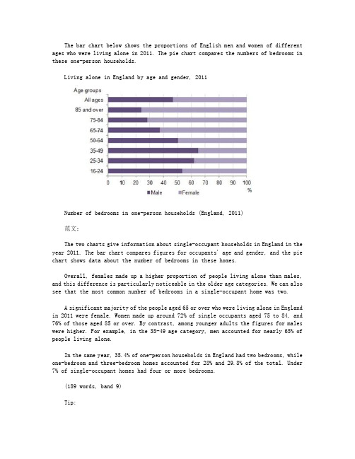
The bar chart below shows the proportions of English men and women of different ages who were living alone in 2011. The pie chart compares the numbers of bedrooms in these one-person households.Living alone in England by age and gender, 2011Number of bedrooms in one-person households (England, 2011)范文:The two charts give information about single-occupant households in England in the year 2011. The bar chart compares figures for occupants' age and gender, and the pie chart shows data about the number of bedrooms in these homes.Overall, females made up a higher proportion of people living alone than males, and this difference is particularly noticeable in the older age categories. We can also see that the most common number of bedrooms in a single-occupant home was two.A significant majority of the people aged 65 or over who were living alone in England in 2011 were female. Women made up around 72% of single occupants aged 75 to 84, and 76% of those aged 85 or over. By contrast, among younger adults the figures for males were higher. For example, in the 35-49 age category, men accounted for nearly 65% of people living alone.In the same year, 35.4% of one-person households in England had two bedrooms, while one-bedroom and three-bedroom homes accounted for 28% and 29.8% of the total. Under 7% of single-occupant homes had four or more bedrooms.(189 words, band 9)Tip:Notice that I was forced to leave out some of the information from the bar chart. This is normal when you only have 20 minutes; examiners expect you to select some key figures, not to try to include everything.。
Simon雅思小作文真题范文Task1:wastetableessay
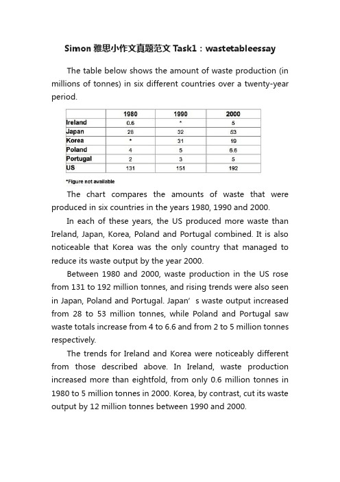
The trends for Ireland and Korea were noticeably different from those described above. In Ireland, waste production increased more than eightfold, from only 0.6 million tonnes in 1980 to 5 million tonnes in 2000. Korea, by contrast, cut its waste output by 12 million tonnes between 1990 and 2000.
The chart compares the amounts of waste that were produced in six countries in the years 1980, 1990 and 2000.
In each of these years, the US produced more waste than Ireland, Japan, Korea, Poland and Portugal combined. It is also noticeable that Korea was the only country that managed to reduce its waste output by the year 2000.
前考官Simon:34篇雅思小作文范文

前考官simon:34篇雅思小作文范文IELTS Writing Task 1: bar chart sample answer题目:The chart below shows the total number of minutes (in billions) of telephone calls in the UK, divided into three categories, from 1995-2002.Here's my suggested outline for a 4-paragraph report:Introduction: rewrite the question statement in your own words.Overview: point out which category was highest in each year, which was lowest, and which saw the biggest changes.Details: compare the 3 categories in 1995, then say what happened up until 1999.Details: notice what happened to local calls from 1999 onwards, and contrast this with the other 2 categories. Finish with a comparison of the figures in 2002.范文:The bar chart compares the amount of time spent by people in the UK on three different types of phone call between 1995 and 2002.It is clear that calls made via local, fixed lines were the most popular type, in terms of overall usage, throughout the period shown. The lowest figures on the chart are for mobile calls, but this category also saw the most dramatic increase in user minutes.In 1995, people in the UK used fixed lines for a total of just over 70 billion minutes for local calls, and about half of that amount of time for national or international calls. By contrast, mobile phones were only used for around 4 billion minutes. Over the following four years, the figures for all three types of phone call increased steadily.By 1999, the amount of time spent on local calls using landlines had reached a peak at 90 billion minutes. Subsequently, the figure for this category fell, but the rise in the other two types of phone call continued. In 2002, the number of minutes of national / international landline calls passed 60 billion, while the figure for mobiles rose to around 45 billion minutes.(197 words, band 9)IELTS Writing Task 1: 'living alone' chartsThe bar chart below shows the proportions of English men and women of different ages who were living alone in 2011. The pie chart compares the numbers of bedrooms in these one-person households.Living alone in England by age and gender, 2011Number of bedrooms in one-person households (England, 2011)范文:The two charts give information about single-occupant households in England in the year 2011. The bar chart compares figures for occupants' age and gender, and the pie chart shows data about the number of bedrooms in these homes.Overall, females made up a higher proportion of people living alone than males, and this difference is particularly noticeable in the older age categories. We can also see that the most common number of bedrooms in a single-occupant home was two.A significant majority of the people aged 65 or over who were living alone in England in 2011 were female. Women made up around 72% of single occupants aged 75 to 84, and 76% of those aged 85 or over. By contrast, among younger adults the figures for males were higher. For example, in the 35-49 age category, men accounted for nearly 65% of people living alone.In the same year, 35.4% of one-person households in England had two bedrooms, whileone-bedroom and three-bedroom homes accounted for 28% and 29.8% of the total. Under 7% of single-occupant homes had four or more bedrooms.(189 words, band 9)Tip:Notice that I was forced to leave out some of the information from the bar chart. This is normal when you only have 20 minutes; examiners expect you to select some key figures, not to try to include everything.IELTS Writing Task 1: 'coffee and bananas' table题目:The tables below give information about sales of Fairtrade*-labelled coffee and bananas in 1999 and 2004 in five European countries.*Fairtrade: a category of products for which farmers from developing countries have been paidan officially agreed fair price.范文:The tables show the amount of money spent on Fairtrade coffee and bananas in two separate years in the UK, Switzerland, Denmark, Belgium and Sweden.It is clear that sales of Fairtrade coffee rose in all five European countries from 1999 to 2004, but sales of Fairtrade bananas only went up in three out of the five countries. Overall, the UK saw by far the highest levels of spending on the two products.In 1999, Switzerland had the highest sales of Fairtrade coffee, at ?3 million, while revenue from Fairtrade bananas was highest in the UK, at ?15 million. By 2004, however, sales of Fairtrade coffee in the UK had risen to ?20 million, and this was over three times higher than Switzerland sales figure for Fairtrade coffee in that year. The year 2004 also saw dramatic increases in the money spent on Fairtrade bananas in the UK and Switzerland, with revenues rising by ?32 million and ?4.5 million respectively.Sales of the two Fairtrade products were far lower in Denmark, Belgium and Sweden. Small increases in sales of Fairtrade coffee can be seen, but revenue remained at ?2 million or below in all three countries in both years. Finally, it is noticeable that the money spent on Fairtrade bananas actually fell in Belgium and Sweden.。