雅思小作文课堂练习
雅思小作文练习

雅思小作文练习篇一:雅思小作文练习题目雅思写作Task-1练习题1.writeareportdescribingtheinformationinthegraphbelow. Youshouldwriteatleast150words.Youshouldspendabout20minutesonthistask.2.Thegraphbelowcomparesthenumberofvisitstotwonewmusicsitesontheweb.writeareportforauniversitylecturerdescribingtheinformationshownbelow. Youshouldspendabout20minutesonthistask.Youshouldwriteatleast150wor ds.3.Youshouldspendabout20minutesonthistask. Eatingsweetfoodsproducesacidinthemouth,whichcancausetoothdecay. (HighacidlevelsaremeasuredbylowpHvalues) describetheinformationbelowanddiscusstheimplicationsfordentalhealth.Yo ushouldwriteatleast150words.4.Youshouldspendabout20minutesonthistask. Thediagrambelowshowstheaveragehoursofunpaidworkperweekdonebype opleindifferentcategories.(Unpaidworkreferstosuchactivitiesaschildcareint hehome,houseworkandgardening.)descr(来自:爱作文网)ibetheinformationpresentedbelow,comparingresultsformenandwomeni nthecategoriesshown.Suggestreasonsforwhatyousee. Youshouldwriteatleast150words.5.Youshouldspendabout20minutesonthistask. Thechartbelowshowsestimatedworldliteracyratesbyregionandbygenderfor theyear2000.writeareportforauniversitylecturerdescribingtheinformationb elow.Youshouldwriteatleast150words.6.Youshouldspendabout20minutesonthistask. ThegraphshowsinternetUsageinTaiwanbyageGroup,1998-2000. Summarisetheinformationbyselectingandreportingthemainfeatures,andma kecomparisonswhererelevant.Youshouldwriteatleast150words.7.Youshouldspendabout20minutesonthistask. writeareportforauniversitylecturerdescribingtheinformationinthetwograph sbelow.Youshouldwriteatleast150words.8.Youshouldspendabout20minutesonthistask. Thetablebelowprovideinformationonrentalchargesandsalariesinthreeareas ofLondon. writeareportforauniversitylecturerdescribingtheinformationshownbelow.Youshouldwriteatleast150words.areaweeklyrentsperproperty(£/w)Salariesneeded(£/year)9.Youshouldspendabout20minutesonthistask. Thetakebelowgivesinformationabouttheundergroundrailwaysystemsinsixc ities. Summarisetheinformationbyselectingandreportingthemainfeatures,andma kecomparisonswhererelevant.Youshouldwriteatleast150words. UndergroundRailwaysSystems篇二:雅思小作文7句式&实战练习一.趋势描写表上升:grow,increase,goup,rise,jumpup,surgeup,shootup,,keepanupwardtendency 表下降:drop,decrease,godown,dip,sink,decline,falldown,keepandownwardtenden cy表波动:fluctuate,rangefrom```to````,riseandfalls表顶点和最低点:reachthetop;arriveatthepeak;reachthebottom;表示程度变化1.激烈的/地,大幅度的/地:sharp,surprising,dramatic,significant,remarkable2.适度的/地,中等的/地:modest,moderate3.逐渐的/地,稳步的/地:gradual,steady,stable,continual4.轻微的/地:slight二.精选句型句式一:主语(描述对象)+谓语动词(趋势变化)+副词+数据+时间(位置在前或者后皆可)+Eg:Theamountofelectricityconsumedincreasedsharplyto150from8pmto12 pm.句式二:therebea+adj+n(趋势变化)+in+描述对象+数+时间Eg:therewasaslightfall/declineintheconsumptionofelectricityto100betwee n1970and1980.句式三:a/an+adj+n(趋势)+in+方面+数据canbeseen/found+时间aobviousdeclineintheelectricityconsumptioncanbeseenintheyear1900.句式四:时间段(名词短语)+see/witness+a/an+adj+n(趋势变化)+in方面+数Eg:thefirstyearseeaslightgo-upintheexpenditureonleisureactivitiesfrom13t o15.句式五:主语+谓语动词(保持平稳)+at+数据+时间段Eg:theexpenseoneleisureactivitiesmaintainedconstantatapproximately20th ousandbetween````to`````.三.实战练习:1.这个流程图展示了雅思口语考试时如何组织进行的。
雅思小作文句型操练

data的具体表达法
data在某一个时间段固定不变:fixed in time 在一系列的时间段中转变: changes over time
持续变化的data在不同情况下: 增加:increase / raise / rise / go up ... 减少:decrease / grow down / drop / fall ... 波动:fluctuate / rebound / undulate / wave ... 稳定:remain stable / stabilize / level off ...
从图表我们可以很清楚(明显)看到... from the table/chart/diagram/figure,we can see clearly
that...or it is clear/apparent from the chart that...
这个图表向我们展示了... this is a graph which illustrates... 该表格描述了...年到...年间a与b的比例关系。 this table shows the changing proportion of a & b from...to... 该图以圆形图形式描述了...总的趋势。 The graph, presented in a pie chart, shows the general trend
a于b有共同之处。 a has something in common with b
a与b之间的差别在于... the difference between a and b lies in...
...年...急剧上升。 (year)witnessed/saw a sharp rise in...
雅思普通培训类小作文(书信类)(上)

1.You are going to London for a visit, and you would like to spend two days in visiting a library as you are doing a research project. Write a letter to the library assistant, asking him/her for help andspecifying your requirements.2.When you were painting your rented apartment, you accidentally damaged something in one of the rooms. Write to your landlord, explaining the reason for writing the letter and how the whole thing happened. Finally, you should suggest how you can compensate for the damages.3.You are an international student who studies in a college without sports facilities. Write to the manager of a sports club nearby, inquiring about what procedures are needed before you can join the club.4.During your travel overseas, you left a handbag on the passenger plane. Write a letter to the airline company, explaining the situation and describing the handbag. Also, indicate the way they can possibly solve the problem.5.You bought a CD player from a local store a few days ago, but now it doesn’t work. Write a letter to the manufacturer, asking them what the problems are and complaining about the attitude of the shop assistant. Also tell them how they can handle the situation.6.You are a local student who has moved to a new neighborhood where there is an extremely large tree just in front of your doorway. Write a letter to the local authority, complaining about the problems the big tree has brought to your life.7.Write a letter to invite one of your friends to attend a large celebration at your home. State the reasons why the celebration is held and all the details about the celebration. Also, ask your friend to do a favor for you.8.One of the pen friends overseas is going to visit you. However, for some reason, you cannot meet him/her as previously arranged. Write about your reason, the place where you want him to wait for you, and how he/she can recognize you.9.You are a college student taking part in a research project. Write a letter to a local museum, asking them to provide essential materials. Give the details of your project and specify the required materials.10. During your business trip to another city, you met an attendant on the train who treated you with very impolite manners. Write a letter to the railway authority, complaining about the bad attitude and poor service of that attendant.11. You have just received good news related with your family. Write a letter to one of your friends, explain the reason for writing. Also, tell him/her the details of the good news and why you are so excited about it.12. You are in international student who has been arranged by your university to live with a local family. However, for some reason, you are not satisfied with the accommodation. Write a letter to your university, explaining about the situation and asking for a rearrangement.13. One of the pen friends overseas is going to visit you. However, for some reason, you cannot meet him/her as previously arranged. Write about your reason, the place where you want him to wait for you, and how he/she can recognize you.14. You are organizing a business meeting, and you should write to people from other companies and tell them the changes of the meeting (time, location, etc.). You can (1) explain why you have to make changes, (2) tell them the changes, and (3) apologize for the changes.15. You are going to London for a visit, and you would like to spend two days in visiting a library as you are doing a research project. Write a letter to the library assistant, asking him/her for help and specifying your requirements.。
雅思小作文练习练习

The graph shows the demand for energy and the energy available from fossil fuels in Freedonia from 1985 to 2005. Write a report for a university lecturer describing the information shown below.
ቤተ መጻሕፍቲ ባይዱ
The two pie charts, combined with the line chart, give an overview of three aspects of the energy market.
According to the first pie chart, the consumption of oil was the highest in 2005, accounting for 37%of the energy consumed worldwide, followed by coal and natural gas, taking up 28%and 23% separately. Nuclear power and hydro-electricity evenly contributed to the remaining 12%.Saudi Arabia and Canada are the two countries with the largest oil reserves-20%versus 14%. Four Mid-east countries, Iran, Iraq, Kuwait and United Arab follow behind, each having 8 to 10%of the global reserves. Venezuela,Russia and the United States are on the list as well, but account for a smaller share, 6%, 5% and 2% respectively.
雅思小作文题库练习集锦
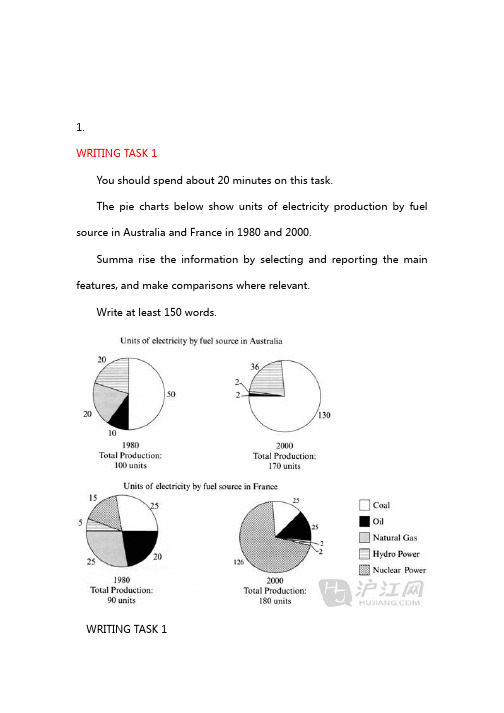
1.WRITING TASK 1You should spend about 20 minutes on this task.The pie charts below show units of electricity production by fuel source in Australia and France in 1980 and 2000.Summa rise the information by selecting and reporting the main features, and make comparisons where relevant.Write at least 150 words.WRITING TASK 1You should spend about 20 minutes on this task.The pie charts below show units of electricity production by fuel source in Australia and France in 1980 and 2000.Summa rise the information by selecting and reporting the main features, and make comparisons where relevant.Write at least 150 words.he charts compare the sources of electricity in Australia and France in the years 1980 and 2000. Between these years electricity production almost doubled, rising from 100 units to 1970 in Australia, and from 90 to 180 units in France.In 1980 Australia used coal as the main electricity source (50 units) and the remainder was produced from natural gas, hydro power (each producing 20 units) and oil (which produced only 10 units). By 2000, coal had become the fuel for more than 75% of electricity produced and only hydro continued to be another significant source supplying approximately 20%.In contrast, France used coal as a source for only 25 units of electricity in 1980, which was matched by natural gas. The remaining 40 units were produced largely from oil and nuclear power, with hydro contributing only 5 units. But by 2000 nuclear power, which was not used at all in Australia, had developed into the main source, producing almost 75% of electricity, at 126 units, while coal and oil together produced only50 units. Other sources were no longer significant.Overall, it is clear that by 20000 these two countries relied on different principal fuel sources: Australia relied on coal and France on nuclear power.这些图比较了1980年和2000年澳大利亚和法国的电的来源。
最近的雅思作文练习题

2.As technology develops, more shopping and business is done through the internet while communication face to face becomes less frequent. Is this a positive or a negative development?
19.Some people think that examinations have some bad effects on both students and teachers. Some people say they do a good job in the evaluation of the students’ performance. What is your opinion?
23. Although it is a freedom to use tobacco while some people think it should be made illegal as the same way as other drugs. To what extent do you agree or disagree? What’s your opinion?
1. Some children in rural places cannot have good schools and medical facilities. To improve this situation, some people suggest that new teachers and doctors should be sent to rural places for several years. Others, however, believe every one has the free right to choose where to work. Discuss both views and give your own opinion.
雅思小作文经典表达及相关练习

1.2005 年见证了。
的大幅上涨The year 2005 witnessed/ saw a sharp increase in 2.该数据再2008年经历了大幅上涨The number experienced a sharp rise in 2006 3.。
出现了上升的趋势There is an upward/ rising trend in4.。
出现了上涨An increase can be found in…5.然后,该数据经历了小幅下降This was followed by a slight increase to 5% in 2005The graph below shows the number of books read by men and women at Burnaby Public Library from 2011 to 2014.Summarise the information by selecting and reporting the main features, and make comparisons where relevant.Write at least 150 words.The graph gives information about Burnaby Public Library between 2011 and 2014. It shows how many library books people read over this four-year period.As can be seen from the graph, there were different trends for men and women. The number of books read by men _______________(缓慢增长) between 2011 and 2012, from about 3000 to 4000. After that, the number _______________(大幅增长)to 14000 books in 2014. This was the ___________(最高的)figure in the period.Women started off reading __________(更多的)books than men, but their numbers followed a different_____________(方式). Between 2011 and 2012, there was ___________(一个增长)3000 _________(从)5000 books _________(到)8000 books, and then__________(一个缓慢的上升)to 10000 books in 2013. However, in 2014, their numbers fell back to 8000 again.Overall, there was ___________(一个上升的)trend in the number of books read by men. Although women read more books than men in 2011, their reading fell to below the level of men in 2014.The three pie charts below show the changes in annual spending by local authorities in Someland in 1980, 1990 and 2000.The charts show how much local authorities spent on a range of services in Someland in three separate years: 1980, 1990 and 2000.In all three years, the greatest expenditure was on education. But while K-12 education _______(见证了一个下降)from 25% in 1980 to only 18% of spending in 2000, higher education remained the largest proportion, _________(达到了)45% of total spending in 1990 and ________(结束在)at 40% in 2000.Expenditure on health and human resources had _________(上升)to 20% by 1990 before____________(下降)to only 10% by the end of the period.___________(相比较), the share of transportation saw an opposite trend. This cost __________(下降)to only 6% of total expenditure in 1990 but __________(大幅上升)in 2000 when it __________(占据)22% of the total budget.__________(相似的是), the cost of environmental services_________________(见证了一个上升的趋势), ___________(上升) from only 4% to 9% by 2000.Overall, higher education ___________(占据了)the largest cost to local authorities, and while spending increased for transportation and environmental services, there were corresponding drops in expenditure on health and human resources and K-12 education.。
雅思小作文训练

13.as is shown in the table... 如表格所示...14.as can be seen from the diagram, great changes have taken place in... 从图中可以看出,...发生了巨大变化。
15.from the table/chart/diagram/figure, we can see clearly that...or it is clear/apparent from the chart that... 从图表我们可以很清楚(明显)看到...16.this is a graph which illustrates... 这个图表向我们展示了...17.this table shows the changing proportion of a & b from...to... 该表格描述了...年到...年间a与b的比例关系。
18.the graph, presented in a pie chart, shows the general trend in... 该图以圆形图形式描述了...总的趋势。
19.this is a column chart showing... 这是个柱型图,描述了...20.as can be seen from the graph, the two curves show the fluctuation of... 如图所示,两条曲线描述了...的波动情况。
21.over the period from...to...the...remained level. 在...至...期间,...基本不变。
22.in the year between...and... 在...年到...期间...23.in the 3 years spanning from 1995 through 1998... 1995年至1998三年里...24.from then on/from this time onwards... 从那时起...25.the number of...remained steady/stable from (month/year) to (month/year). ...月(年)至...月(年)...的数量基本不变。
- 1、下载文档前请自行甄别文档内容的完整性,平台不提供额外的编辑、内容补充、找答案等附加服务。
- 2、"仅部分预览"的文档,不可在线预览部分如存在完整性等问题,可反馈申请退款(可完整预览的文档不适用该条件!)。
- 3、如文档侵犯您的权益,请联系客服反馈,我们会尽快为您处理(人工客服工作时间:9:00-18:30)。
流程图:剑六The process diagrams illustrate the life cycle of the silkworm(in5stages)and5key steps how to produce silk cloth.In the first diagram,at first,several eggs are laid on the leaves.After10days,the eggs become silkworm larvas,which feed on the mulberry leaves.4-6weeks later,these larvas produce silk thread to wrap themselves.It will take them3-8days to totally wrap themselves to form the cocoons.Then after16days, the original larvas become moths,which will continue a new life cycle by laying eggs on leaves.In the second diagram,initially,cocoons are selected carefully and then are boiled in hot water for some time. Then the cocoons are unwound to produce thread about300-900meters.In the next stage,the thread is twisted and can be weaved into silk cloth.During this process,the thread or the cloth can be dyed in various colors.The diagrams clearly show the life cycle of the silkworm and how to produce silk cloth in five key stages.剑四Test1P31The table illustrates the proportion from different household types living in poverty in Australia in1999.Overall/In general,11%of all households,which were1,837,000people,lived in poverty at that time.Sole parent accounted for/took up/represented the largest proportion,at21%(which were232,000people). The proportion of people who were single with no children is larger than that of those couples with no children,at19%(which were359,000people)and7%(which were211,000people)respectively.The couples with children represented a much higher proportion than couples without children,at12%(which were 933,000people).The aged people took up a smaller proportion than the young people,with single aged person accounting for6%(which were54,000people)and aged couple representing4%(which were48,000 people).According to the table,it is clear that the proportion of young people living in poverty in Australia in1999was larger than that of aged people.剑四Test2P54The line chart/graph,together with the pie chart/graph,illustrates/shows the typical daily demand for electricity in England in winter and summer and what the electricity is used for in an average English home.In the line chart,overall,the daily demand for electricity in winter is almost/nearly twice as much as that in summer.In winter,the demand for electricity was at the lowest point during6:00-9:00,at30,000units.Then it increased steadily to40,000units at12:00,and stayed mostly unchanged during12:00-19:00.After that, the demand for electricity rosed to a peak of approximately47,000units in22:00and then dropped sharply to35,000at24:00.Then it increased slightly to about40,000units at3:00.The demand for electricity thendecreased to the bottom at7:00,at30,000units.,However,in winter,...(略)In the pie chart.more than half of the electricity is used for heating rooms and heating water,which account for52.5%.About17.5%of the electricity is used for ovens,kettle and washing machines.Equal percent of electricity(at15%)is used for lighting,TV,radio and vacuum cleaners,food mixers,electric tools respectively.According to the graphs,it is clear that...(略)剑四TEST3P78The bar chart/graph shows/illustrates the different levels of post-school qualifications in Australia according to gender in1999.Overall/In general,the proportion of post-school qualifications held by men is much higher.The post-school qualification of skilled vocational diploma held by men accounted for the largest proportion,at90%,about nine times higher than that of women,at around12%....剑四TEST4P100The line graph,together with the bar chart,illustrates visitors traveling to and from the UK,measured in millions,from1979to1999,in five-yearly intervals and the most popular countries visited by UK residents in 1999.In the line chart,overall,the number of visiting abroad by UK residents is larger than the number of visiting to the UK by oversea residents and both increased over time.From1979to1986,the number of UK residents visiting abroad increased slightly while the number of overseas residents visiting to the UK stayed mostly unchanged.After1986,both rose significantly,with the number of UK residents visiting abroad reaching51 million people in1999and the number of overseas residents visiting to the UK reaching28million people in 1999.In the bar chart,overall,France and Spain are the two most popular countries traveled by UK residents.In 1999,approximately11million UK visitors visited France and around9million visited Spain.Fewer people visited the USA and Greece,at about4million people and3million people respectively.The fewest UK visitors visited Turkey in1999,at around2.5million.剑五TEST1The line graph/chart shows/illustrates from1940with forecasts to2040in twenty-yearly intervals in three countries--the USA,Sweden and Japan.Overall/In general,the proportion in the three countries increase steadily over the100years.In1940,the proportion in the USA was around9percent.Then it rose slightly to10percent in1960.During the next twenty years,it increased steadily to15percent and then stayed mostly unchanged from the years1980to2020,at around15percent.It is predicted that the proportion will rise significantly from2020to a peak at approximately24percent in2040.The proportion in Sweden increased from around7percent in1940to 14percent in1980and then level off for some time and increased steadily to20percent in2010.It is forecast that the proportion will fluctuate a bit then will continue to increase to25percent in2040.The proportion in Japan in1940was half of that in the USA,at5percent,and it remained mostly unchanged from the years1940to2008,at around5percent.Then it rose steadily from2008and will surpass the USA and Sweden in2030.According to the line chart,it is clear that the three countries have an increase in the proportion of population aged65and over.剑五Test2P52The bar charts/graphs illustrategroups and the amount of support they received from employers.In general/Overall,most younger people study for career while older people mainly study for interest and most employers would support young people to study.In the first chart,people(who are)under26study mainly for career,at80percent,which is eight times as much as those young people who study for interest, at10percent.The proportion for people who are between26-29and30-39is around70percent for career and20percent for interest respectively.The people between40-49have an equal proportion for career and for interest,at40percent.But the proportion of people over49for interest is more than three times larger than that for career,at70percent and20percent respectively.In the second chart,more supports are given to people who are under26,at approximately60percent.The proportion for people between26-29is less than that of the first group,at about50percent.The the proportion dropped to around30percent for people who are30-39and40-49.Then it increased slightly for people over49.According to the bar graphs,it is clear that...剑五Test4P98The table illustrates/shows the relevant information of underground railway systems in six countries --Overall,longer route carries more passengers per year.London has system,opened in1863,the route of which is394kilometres,carrying775million passengers per year.The railway system in Paris opened in1900.The route is about half of that in London,at199kilometres,but it carries more passengers than London railway system,at1191million people per year.Tokyo opened its railway system in 1927.Though the route is shorter than those of London and Paris,it carries the most passengers among the six countries,at1927passengers per year.The railway system in Washington DC opened in1976,and it has a route of126kilometres but only carries144million passengers per year.The railway systems in Kyoto (opened in1981)and Los Angeles(opened in2001)have much shorter routes,at11kilometres and28 kilometres respectively and thus carry fewer passengers,at45million and50million each per year.According to the table,it is clear that every country has its special feature of its own railway system.剑六Test1P30The line chart,together with the table,illustrates the global water use,measured in km3in three sectors from the years1900to2000and the water consumption in Brazil and Congo in2000.In the first chart,the use of water in three sectors increased steadily over100years.The water used for agriculture rose steadily from500km3in1900to3000km3in2000.The water used for industrial use and domestic use stayed mostly unchanged from1900to1950,then increased steadily from1950to2000, reaching at1000km3and400km3respectively.However,the increase of domestic use was far slower than that of agriculture use and industrial use.In the table/second chart,the water consumption in Brazil was much more than that in DRC in2000.With an irrigated land of26,500km2,the water consumption per person in Brazil(population of176million)was359 m3,much more than that in DRC,with a land of100km2and a population of5.2million,at8m3.剑六TEST2P52The table illustrates the average distance traveled by different modes per person per year in England between1985and2000.In general/Overall,the average distance traveled by all modes increased during the15years,and indistance traveled by local bus.In1985,the longest distance traveled per person per year is by car,at3,199 miles.The distance traveled by local bus was much shorter than that traveled by car,at429miles.People traveled255miles and289miles by walking and train respectively.Shorter distance were traveled by bicycle and long distance bus,at51miles and54miles each.The shortest distance was traveled by taxi, which was only13miles.And there exist other modes covered450miles per person per year.In2000,The longest distance was still traveled by car,increasing to4806miles....According to the table,it is clear that the average distance traveled by all modes increased from4740in 1985to6475in2000.剑六TEST4P98The bar charts/graphs show/illustrate the number of marriages and divorces in the USA,measured in millions,from the years1970to2000and the marital status of adult Americans in1970and2000.Overall/In general,the number of marriages decreased while the number of divorces stayed mostly unchanged.In the first chart,the number of marriage was2.5million in1970and in1980.It decreased to 2.3million in1990and continued to drop to2million in2000.In contrast,the number of divorces was just 1million in1970and it rose to about1.4million in1980then decreased to approximately1.1million in1990and continued to drop to the previous level at1million in2000.In the second chart,married adults account for the largest proportion,at70percent in1970and59 percent in2000,although the percentage decreased during the30years.The adults who never married increased from about14percent in1970to20percent in2000.The percentage of divorced adults had a fourfold increase from2percent in1970to8percent in2000.However,the percentage of widowed adults remained relatively stable,at approximately5percent.According to the bar charts,it is clear that during the30years the number of marriages decreased while the number of divorces stayed mostly unchanged.剑七Test1P30The table illustrates the percentage of national consumer expenditure on different/various items/categories in five countries in2002.Overall/In general,the consumers in the five countries spent the most money on food/drinks/tobacco,and Turkey accounted for the largest percentage,at32.4%.The percentage of Ireland was just second to that of Turkey,at28.91%.The percent in Spain,Italy and Sweden was much smaller,at18.80%,16.36%and 15.77%respectively.Less money was spent on clothing/footwear,with Italy representing the highest percentage,at9.00%,while Turkey,Spain and Ireland accounted for only6.63%,6.51%and6.43% respectively.The smallest percentage was in Sweden,at5.40%.All the consumers in five countries spent the least money on leisure/education.The percentage in Turkey was the highest,at4.35%,and the percentages in Sweden and Italy were almost the same,at3.22%and3.20%each.Smaller percentages were in Ireland and Spain,at2.21%and1.98%respectively.According to the table,it is clear that the consumers in five countries spent much more money on food/drinks/tobacco than any other categories.剑七Test4P101The pie charts/graphs illustrate/show the units of electricity produced by fuel source in Australia and France in the years1980and2000.Overall/In general,the electricity production almost doubled,rising from100units to170units in Australia, and from90to180units in France.In1980Australia coal is used as the main electricity source,representing half of the total production,at50units,followed by natural gas,hydro power(each producing20units)and oil(which produced only10units).By2000,coal had accounts for the majority units,producing130units electricity.Less electricity was produced by Hydro power,which produced36units.Oil and natural gas only produced2units each.In contrast,France...。