android 画虚线、实线,画圆角矩形,一半圆角
android 绘制图形(线段,圆,矩形等)

android 绘制图形(线段,圆,矩形等)1. 创建一个你自己的MyView 让他继承 View类实现onDraw 方法 这是主要的。
Java代码1.packagecom.wljie;2.3.importandroid.content.Context;4.5.importandroid.graphics.Canvas;6.7.importandroid.graphics.Color;8.9.importandroid.graphics.Paint;10.11.importandroid.view.View;12.13.publicclassMyViewextendsView{14.15.publicMyView(Contextcontext){16.17.super(context);18.19.//TODOAuto-generatedconstructorstub20.21.}22.23.@Override24.25.protectedvoidonDraw(Canvascanvas){26.27.super.onDraw(canvas);28.29.canvas.drawColor(Color.WHITE);30.31.Paintpaint=newPaint();//实例化paint类32.33.paint.setAntiAlias(true);//设置去锯齿34.35.paint.setColor(Color.RED);//设置paint的颜色是红色的36.37.paint.setStyle(Paint.Style.STROKE);//设置为空心的38.39.canvas.drawLine(0,0,100,100,paint);//划一条线段40.41.canvas.drawCircle(200,200,50,paint);//划一个空心圆42.43.}44.45.}2. 在activity 实例华这个类Java代码1.packagecom.wljie;2.3.importandroid.app.Activity;4.5.importandroid.graphics.Paint;6.7.importandroid.os.Bundle;8.9.importandroid.widget.Button;10.11.importandroid.widget.LinearLayout;12.13.publicclassMainextendsActivity{14.15./**Calledwhentheactivityisfirstcreated.*/16.17.18.@Override19.20.publicvoidonCreate(BundlesavedInstanceState){21.22.super.onCreate(savedInstanceState);23.24.//setContentView(yout.main);25.26.MyViewmyView=newMyView(this);27.28.setContentView(myView);29.30.}31.32.}图形的绘制在Android 中象图标的制作如:并行图,直方图用的比较多。
Android绘制图形(转)学习

Android绘制图形(转)学习以前的⽂章⾥边画⼀般都是⼀些矩形,今天就看看怎么在android⼿机屏幕上绘制⼀些⼏何图形,如三⾓形、多边形、椭圆、圆形、正⽅形等等。
并且设置空⼼、实⼼。
下⾯我们先来看看在android中可以绘制出那些⼏何图形[color=#008000] ⽅法说明drawRect 绘制矩形drawCircle 绘制圆形drawOval 绘制椭圆drawPath 绘制任意多边形drawLine 绘制直线drawPoin 绘制点[/color]我们先来看看效果图吧:[align=center][/align][align=left] 下⾯我们就来看看代码是怎么做的:[/align][align=left][b]Java代码:[/b][/align][code]<?xml version="1.0" encoding="utf-8"?><LinearLayout xmlns:android="/apk/res/android"android:orientation="vertical"android:layout_width="fill_parent"android:layout_height="fill_parent"><TextViewandroid:layout_width="fill_parent"android:layout_height="wrap_content"android:text="@string/hello"android:textColor="#00FF00"/><xiaohang.zhimeng.GameViewandroid:layout_width="wrap_content"android:layout_height="wrap_content"/></LinearLayout>[/code][b]Java代码:[/b][code]package eoe.demo;import android.app.Activity;import android.os.Bundle;public class Activity01 extends Activity {@Overrideprotected void onCreate(Bundle savedInstanceState) {super.onCreate(savedInstanceState);setContentView(yout.main);}}[/code]GameView[b]Java代码:[/b][code]package eoe.demo;import android.content.Context;import android.graphics.Canvas;import android.graphics.Color;import android.graphics.Paint;import android.graphics.Path;import android.graphics.Rect;import android.graphics.RectF;import android.util.AttributeSet;import android.view.View;public class GameView extends View implements Runnable {// 声明Paint对象private Paint mPaint = null;private GameView2 mGameView2 = null;public GameView(Context context, AttributeSet attr){super(context,attr);System.out.println(1);// 构建画笔对象mPaint = new Paint();mGameView2 = new GameView2(context);// 开启线程new Thread(this).start();}@Overrideprotected void onDraw(Canvas canvas) {super.onDraw(canvas);// 设置画布为⿊⾊背景canvas.drawColor(Color.BLACK);// 取消锯齿mPaint.setAntiAlias(true);// 设置画笔风格为空⼼mPaint.setStyle(Paint.Style.STROKE);{// 定义矩形对象Rect rect1 = new Rect();// 设置矩形⼤⼩rect1.left = 5;rect1.top = 5;rect1.bottom = 25;rect1.right = 45;mPaint.setColor(Color.BLUE);// 绘制矩形canvas.drawRect(rect1, mPaint);mPaint.setColor(Color.RED);// 绘制矩形canvas.drawRect(50, 5, 90, 25, mPaint);mPaint.setColor(Color.YELLOW);// 绘制圆形// 40 70 分别是圆⼼的X 和 Y坐标 30为半径 mPaint为画笔对象canvas.drawCircle(40, 70, 30, mPaint);// 定义椭圆RectF rectf1 = new RectF();rectf1.left = 80;rectf1.top = 30;rectf1.right = 120;rectf1.bottom = 70;mPaint.setColor(Color.LTGRAY);// 绘制椭圆canvas.drawOval(rectf1, mPaint);// 绘制多边形Path path1 = new Path();/*** 这个多变形我也没试验它到底是怎么画应该就是从起点找点⼀个点⼀个点的连线*/path1.moveTo(150 + 5, 80 - 50); // 此点为多边形的起点path1.lineTo(150 + 45, 80 - 50);path1.lineTo(150 + 30, 120 - 50);path1.lineTo(150 + 20, 120 - 50);// 使这些点构成封闭的多边形path1.close();mPaint.setColor(Color.GRAY);// 绘制这个多边形canvas.drawPath(path1, mPaint);mPaint.setColor(Color.RED);// 设置画笔空⼼边框的宽度mPaint.setStrokeWidth(3);// 绘制直线// 这个绘制直线的⽅法前2个参数是前点坐标后 2个参数是终点坐标我们可看出两个点的Y坐标都⼀样的canvas.drawLine(5, 110, 315, 110, mPaint);}// 绘制实⼼⼏何体// 将画笔设置为实⼼mPaint.setStyle(Paint.Style.FILL);{// 定义矩形Rect rect1 = new Rect();rect1.left = 5;rect1.top = 130 + 5;rect1.bottom = 130 + 25;rect1.right = 45;mPaint.setColor(Color.BLUE);// 绘制矩形canvas.drawRect(rect1, mPaint);mPaint.setColor(Color.RED);// 绘制矩形canvas.drawRect(50, 130 + 5, 90, 130 + 25, mPaint);mPaint.setColor(Color.YELLOW);// 绘制圆形这⾥参数就不说明了上边已经说了canvas.drawCircle(40, 130 + 70, 30, mPaint);// 定义椭圆对象RectF rectf1 = new RectF();// 设置椭圆⼤⼩rectf1.left = 80;rectf1.top = 130+30;rectf1.right = 120;rectf1.bottom = 130 + 70;mPaint.setColor(Color.LTGRAY);// 绘制椭圆canvas.drawOval(rectf1, mPaint);// 绘制多边形Path path1 = new Path();// 设置多边形的点path1.moveTo(150+5, 130+80-50);path1.lineTo(150+45, 130+80-50);path1.lineTo(150+30, 130+120-50);path1.lineTo(150+20, 130+120-50);// 使这些点构成封闭的多边形path1.close();mPaint.setColor(Color.GRAY);// 绘制这个多边形canvas.drawPath(path1, mPaint);mPaint.setColor(Color.RED);mPaint.setStrokeWidth(3);// 绘制直线canvas.drawLine(5, 130 + 110, 315, 130 + 110, mPaint);}// 通过ShapDrawable来绘制⼏何图形mGameView2.DrawShape(canvas);}@Overridepublic void run() {while (!Thread.currentThread().isInterrupted()) {try {Thread.sleep(100);} catch (InterruptedException e) {Thread.currentThread().interrupt();}// 使⽤postInvalidate可以直接在线程中更新界⾯postInvalidate();}}}[/code]在android中还可以通过ShapDrawable来绘制图像,ShapDrawable可以设置画笔的形状。
Android实现代码画虚线边框背景效果

Android实现代码画虚线边框背景效果实现如下边框效果:虚线画效果,可以使⽤Android中的xml来做。
下⾯话不多说,直接上代码:<RelativeLayoutandroid:id="@+id/coupon_popup"android:layout_width="320dp"android:layout_height="200dp"android:layout_margin="20dp"android:gravity="center_vertical"android:background="@drawable/bg_border_stroke">写⼀个 bg_border_stroke的xml做背景。
bg_border_stroke.xml<?xml version="1.0" encoding="utf-8"?><layer-list xmlns:android="/apk/res/android" ><item><shape><strokeandroid:width="1dp"android:color="#E8A227" /><solid android:color="#FFFFFF" /><corners android:radius="5dp" /></shape></item><itemandroid:bottom="1dp"android:left="1dp"android:right="1dp"android:top="1dp"><shape><strokeandroid:dashGap="15dp"android:dashWidth="15dp"android:width="2.5dp"android:color="#E8A227" /><solid android:color="#FFFFFF" /><corners android:radius="5dp" /></shape></item></layer-list>总结以上就是这篇⽂章的全部内容了,希望本⽂的内容对各位Android开发者能有⼀定的帮助,如果有疑问⼤家可以留⾔交流。
Android中Shape的用法详解

Android中Shape的⽤法详解ShapeDrawable是⼀种很常见的Drawable,可以理解为通过颜⾊来构造的图形,它既可以是纯⾊的图形,也可以是具有渐变效果的图形,ShapeDrawabled语法稍显复杂,如下所⽰:<shapexmlns:android="/apk/res/android"android:shape=["rectangle" | "oval" | "line" | "ring"] ><cornersandroid:radius="integer"android:topLeftRadius="integer"android:topRightRadius="integer"android:bottomLeftRadius="integer"android:bottomRightRadius="integer" /><gradientandroid:angle="integer"android:centerX="integer"android:centerY="integer"android:centerColor="integer"android:endColor="color"android:gradientRadius="integer"android:startColor="color"android:type=["linear" | "radial" | "sweep"]android:useLevel=["true" | "false"] /><paddingandroid:left="integer"android:top="integer"android:right="integer"android:bottom="integer" /><sizeandroid:width="integer"android:height="integer" /><solidandroid:color="color" /><strokeandroid:width="integer"android:color="color"android:dashWidth="integer"android:dashGap="integer" /></shape>•Android: shape•有4个选项,rectangle(矩形)oval(椭圆)line(横线)ring(圆环),默认为rectangle,需要注意line和ring需要通过标签来指定线的宽度和颜⾊等信息,否则⽆法达到预期效果•⾸先来说⼀下最常⽤的rectangle(矩形),⼀般都是在按钮或者字体上⾯设置⼀个background的Drawable。
Android布局实现圆角边框

Android布局实现圆⾓边框⾸先,在res下⾯新建⼀个⽂件夹drawable,在drawable下⾯新建三个xml⽂件:shape_corner_down.xml、shape_corner_up.xml和shape_corner.xml,分别是下⾯两个⾓是圆⾓边框,上⾯两个⾓是圆⾓边框,四个⾓全部是圆⾓边框。
shape_corner_down.xml:1 2 3 4 5 6 7<?xml version="1.0"encoding="utf-8"?><shape xmlns:android=""><solid android:color="#0099CC"/><corners android:bottomRightRadius="20dp"android:bottomLeftRadius="20dp"/><stroke android:width="1dp"android:color="#000000"/> </shape>shape_corner_up.xml:1 2 3 4 5 6 7<?xml version="1.0"encoding="utf-8"?><shape xmlns:android=""><solid android:color="#CCCC99"/><corners android:topLeftRadius="20dp"android:topRightRadius="20dp"/><stroke android:width="1dp"android:color="#000000"/> </shape>shape_corner.xml:1 2 3 4 5 6 7 8 9<?xml version="1.0"encoding="utf-8"?><shape xmlns:android=""><solid android:color="#99CCFF"/><corners android:topLeftRadius="20dp"android:topRightRadius="20dp"android:bottomRightRadius="20dp"android:bottomLeftRadius="20dp"/><stroke android:width="1dp"android:color="#000000"/> </shape><solid android:color>设置了背景颜⾊。
Android对控件设置边框样式(边框颜色,圆角)和图片样式(圆角)

Android对控件设置边框样式(边框颜⾊,圆⾓)和图⽚样式(圆⾓)1、设置边框、圆⾓、背景⾊案例在drawable中新建⼀个edge.xml⽂件<?xml version="1.0" encoding="utf-8"?><shape xmlns:android="/apk/res/android"><!-- 这⾥是设置背景⾊--><solid android:color="@color/colorGrey"/><!-- 这⾥是设置为四周也可以单独设置某个位置为圆⾓--><corners android:topLeftRadius="5dp"android:topRightRadius="5dp"android:bottomRightRadius="5dp"android:bottomLeftRadius="5dp"/><!-- 这⾥设置边框 --><stroke android:width="1dp" android:color="#000000"/></shape>Activity页⾯引⽤:android:background="@drawable/edge"如下案例所⽰:<ScrollViewandroid:id="@+id/scrollView2"android:layout_width="0dp"android:layout_height="0dp"android:layout_marginStart="8dp"android:layout_marginTop="8dp"android:layout_marginEnd="8dp"android:layout_marginBottom="8dp"app:layout_constraintBottom_toTopOf="@+id/guideline"app:layout_constraintEnd_toEndOf="parent"app:layout_constraintHorizontal_bias="0.0"app:layout_constraintStart_toStartOf="parent"app:layout_constraintTop_toTopOf="parent"app:layout_constraintVertical_bias="0.0"android:background="@drawable/edge"><LinearLayoutandroid:layout_width="match_parent"android:layout_height="wrap_content"android:orientation="vertical"><TextViewandroid:id="@+id/et"android:layout_width="match_parent"android:layout_height="wrap_content"android:minLines="8"android:text="123456789"/></LinearLayout></ScrollView>说明: solid为填充⾊即内部的背景填充⾊,stroke 为边框可以设置颜⾊和宽度效果如下:2、设置边框颜⾊案例:在drawable中新建⼀个button_edge.xml⽂件<?xml version="1.0" encoding="utf-8"?><layer-list xmlns:android="/apk/res/android"><!-- 边框颜⾊值 --><item><shape><solid android:color="#3bbaff"/></shape></item><!--这个是按钮边框设置为四周并且宽度为1--><itemandroid:right="1dp"android:left="1dp"android:top="1dp"android:bottom="1dp"><shape><!--这个是背景颜⾊--><solid android:color="#ffffff"/><!--这个是按钮中的字体与按钮内的四周边距--><padding android:bottom="5dp"android:left="5dp"android:right="5dp"android:top="5dp"/></shape></item></layer-list>使⽤:android:background="@drawable/button_edge"3、设置圆⾓按钮案例:(其实按钮还是⽅形的,只是将外围部分隐藏了⽽已)在drawable中:新建⼀个 button_circle_shape.xml⽂件<?xml version="1.0" encoding="UTF-8"?><shapexmlns:android="/apk/res/android"android:shape="rectangle"><!-- 填充的颜⾊ --><solid android:color="#FFFFFF"/><!-- android:radius 弧形的半径 --><!-- 设置按钮的四个⾓为弧形 --><cornersandroid:radius="5dip"/><!--也可单独设置--><!-- <corners --><!-- android:topLeftRadius="10dp"--><!-- android:topRightRadius="10dp"--><!-- android:bottomRightRadius="10dp"--><!-- android:bottomLeftRadius="10dp"--><!-- /> -->**设置⽂字padding**<!-- padding:Button⾥⾯的⽂字与Button边界的间隔 --><paddingandroid:left="10dp"android:top="10dp"android:right="10dp"android:bottom="10dp"/></shape>使⽤:android:background="@drawable/shape"4、设置圆⾓图⽚案例1 简单的设置:(不能添加⾃定义图⽚只能设置颜⾊和字体)在drawable中创建⼀个image_circle.xml图⽚<?xml version="1.0" encoding="utf-8"?><shape xmlns:android="/apk/res/android"><solid android:color="#FFFFFF"/><corners android:topLeftRadius="10dp"android:topRightRadius="10dp"android:bottomRightRadius="10dp"android:bottomLeftRadius="10dp"/></shape>使⽤:android:background="@drawable/image_circle"5、真实案例:edge.xml<?xml version="1.0" encoding="utf-8"?><layer-list xmlns:android="/apk/res/android"><!-- 边框颜⾊值 --><item><shape><solid android:color="#3bbaff"/></shape></item><!--这个是按钮边框设置为四周并且宽度为1--><itemandroid:right="1dp"android:left="1dp"android:top="1dp"android:bottom="1dp"><shape><!--这个是背景颜⾊--><solid android:color="#ffffff"/><!--这个是按钮中的字体与按钮内的四周边距--><padding android:bottom="5dp"android:left="5dp"android:right="5dp"android:top="5dp"/></shape></item></layer-list>布局⽂件 LeftFragment.xml:<?xml version="1.0" encoding="utf-8"?><FrameLayout xmlns:android="/apk/res/android" xmlns:tools="/tools"android:layout_width="match_parent"android:layout_height="match_parent"tools:context=".LeftFragment"><LinearLayoutandroid:layout_width="match_parent"android:layout_height="match_parent"android:layout_gravity="center"android:orientation="vertical"><LinearLayoutandroid:layout_width="wrap_content"android:layout_height="wrap_content"android:layout_gravity="center_horizontal"android:orientation="horizontal"android:padding="10dp"><ImageViewandroid:layout_width="wrap_content"android:layout_height="wrap_content"android:layout_gravity="center_horizontal"android:src="@mipmap/user"/><TextViewandroid:layout_width="wrap_content"android:layout_height="wrap_content"android:layout_gravity="center_horizontal"android:text="⼿⼯登录"android:textSize="20sp"/></LinearLayout><LinearLayoutandroid:layout_width="match_parent"android:layout_height="wrap_content"android:padding="10dp"android:background="@drawable/edge"android:layout_marginLeft="5dp"android:layout_marginRight="5dp"><TextViewandroid:layout_width="wrap_content"android:layout_height="wrap_content"android:paddingLeft="20dp"android:text="账号"android:textSize="15sp"/><EditTextandroid:layout_width="match_parent"android:layout_height="wrap_content"android:hint="请输⼊⼯⼚管理系统账号"android:background="@null"android:paddingLeft="10dp"android:textSize="15sp"/></LinearLayout><LinearLayoutandroid:layout_width="match_parent"android:layout_height="wrap_content"android:padding="10dp"android:background="@drawable/edge"android:layout_marginLeft="5dp"android:layout_marginRight="5dp"><TextViewandroid:layout_width="wrap_content"android:layout_height="wrap_content"android:paddingLeft="20dp"android:textSize="15sp"android:text="密码"/><EditTextandroid:layout_width="match_parent"android:layout_height="wrap_content"android:hint="请输⼊⼯⼚管理系统登录密码" android:background="@null"android:paddingLeft="10dp"android:textSize="15sp"/></LinearLayout><CheckBoxandroid:layout_width="match_parent"android:layout_height="wrap_content"android:padding="10dp"android:text="记住密码"/><Buttonandroid:layout_width="match_parent"android:layout_height="wrap_content"android:padding="10dp"android:text="登录"/><TextViewandroid:layout_width="wrap_content"android:layout_height="wrap_content"android:layout_gravity="center"android:text="登录出现问题?"/></LinearLayout></FrameLayout>。
Android使用XML的方式为背景添加渐变,描边,圆角的效果
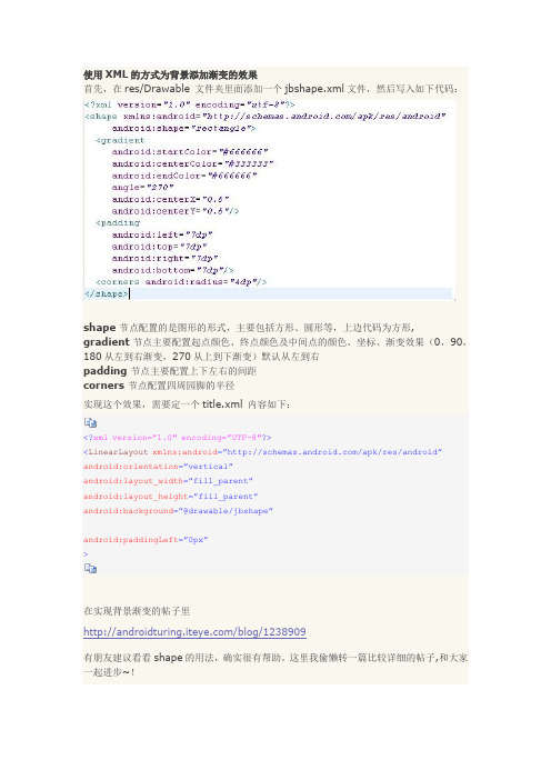
使用XML的方式为背景添加渐变的效果首先,在res/Drawable 文件夹里面添加一个jbshape.xml文件,然后写入如下代码:shape 节点配置的是图形的形式,主要包括方形、圆形等,上边代码为方形,gradient节点主要配置起点颜色、终点颜色及中间点的颜色、坐标、渐变效果(0,90,180从左到右渐变,270从上到下渐变)默认从左到右padding 节点主要配置上下左右的间距corners 节点配置四周园脚的半径实现这个效果,需要定一个title.xml 内容如下:<?xml version=”1.0″ encoding=”UTF-8″?><LinearLayout xmlns:android=”/apk/res/android”android:orientation=”vertical”android:layout_width=”fill_parent”android:layout_height=”fill_parent”android:background=”@drawable/jbshape”android:paddingLeft=”0px”>在实现背景渐变的帖子里/blog/1238909有朋友建议看看shape的用法,确实很有帮助。
这里我偷懒转一篇比较详细的帖子,和大家一起进步~!Android中常常使用shape来定义控件的一些显示属性,今天看了一些shape的使用,对shape有了大体的了解,稍作总结:先看下面的代码:复制到剪贴板XML/HTML代码1.<shape>2.<!-- 实心-->3. <solidandroid:color="#ff9d77"/>4.<!-- 渐变-->5. <gradient6. android:startColor="#ff8c00"7. android:endColor="#FFFFFF"8. android:angle="270"/>9.<!-- 描边-->10. <stroke11. android:width="2dp"12. android:color="#dcdcdc"/>13.<!-- 圆角-->14. <corners15. android:radius="2dp"/>16. <padding17. android:left="10dp"18. android:top="10dp"19. android:right="10dp"20. android:bottom="10dp"/>21.</shape>solid:实心,就是填充的意思android:color指定填充的颜色gradient:渐变android:startColor和android:endColor分别为起始和结束颜色,ndroid:angle是渐变角度,必须为45的整数倍。
Android自定义Drawable实现圆角效果

Android⾃定义Drawable实现圆⾓效果Drawable是⼀种可绘制资源的载体,如图形、图像等。
在实际开发中可以作为view的背景。
主要有静态和动态两种⽅式,静态通过xml描述使⽤,动态即⾃定义Drawable。
本⽂实现⼀个圆形和圆⾓的背景图⽚效果。
效果图:实现⽅式:1.初始化⼀个BitmapShader着⾊器对象;2.将着⾊器对象set给画笔;3.在画布上绘制圆或圆⾓即可;4.使⽤,view.setBackgroundDrawable或者 ImageView.setImageDrawablepackage com.mydrawable.musk;import android.graphics.Bitmap;import android.graphics.BitmapShader;import android.graphics.Canvas;import android.graphics.ColorFilter;import android.graphics.Paint;import android.graphics.PixelFormat;import android.graphics.Shader;import android.graphics.drawable.Drawable;/*** Created by musk.*/public class CircleDrawable extends Drawable {private Paint mPaint;private int mWidth;private Bitmap mBitmap;public CircleDrawable(Bitmap bitmap) {mBitmap = bitmap;//着⾊器,设置横向和纵向的着⾊模式为平铺BitmapShader bitmapShader = new BitmapShader(mBitmap,Shader.TileMode.CLAMP, Shader.TileMode.CLAMP);mPaint = new Paint();mPaint.setAntiAlias(true);mPaint.setDither(true);mPaint.setShader(bitmapShader);mWidth = Math.min(mBitmap.getWidth(), mBitmap.getHeight());}//绘制@Overridepublic void draw(Canvas canvas) {canvas.drawCircle(mWidth / 2, mWidth / 2, mWidth / 2, mPaint);}//设置透明度值@Overridepublic void setAlpha(int alpha) {mPaint.setAlpha(alpha);}//设置颜⾊过滤器@Overridepublic void setColorFilter(ColorFilter colorFilter) {mPaint.setColorFilter(colorFilter);}//返回不透明度@Overridepublic int getOpacity() {return PixelFormat.TRANSLUCENT;}//返回图⽚实际的宽⾼@Overridepublic int getIntrinsicWidth() {return mWidth;}@Overridepublic int getIntrinsicHeight() {return mWidth;}}⾃定义Drawable有五个⽅法必须覆写,draw()、setAlpha()、setColorFilter()、getOpacity(),另外的getIntrinsicWidth()和getIntrinsicHeight()是在view设置wrap_content时设置drawable的宽度和⾼度。
- 1、下载文档前请自行甄别文档内容的完整性,平台不提供额外的编辑、内容补充、找答案等附加服务。
- 2、"仅部分预览"的文档,不可在线预览部分如存在完整性等问题,可反馈申请退款(可完整预览的文档不适用该条件!)。
- 3、如文档侵犯您的权益,请联系客服反馈,我们会尽快为您处理(人工客服工作时间:9:00-18:30)。
android 画虚线、实线,画圆角矩形,一半圆角
建立dotted_line_gray.xml文件放在drawable文件夹下面。
android:shape="line" 可以修改你想要的形状
<?xml version="1.0" encoding="utf-8"?>
<shape xmlns:android="/apk/res/android"
android:shape="line">
<!-- 显示一条虚线,破折线的宽度为dashWith,破折线之间的空隙的宽度为dashGap,当dashGap=0dp时,为实线 -->
<stroke android:width="1dp" android:color="#D5D5D5"
android:dashWidth="2dp" android:dashGap="3dp" />
<!-- 虚线的高度-->
<size android:height="2dp" />
</shape>
然后在布局的xml里面:
作为ImageView或者Linearlayout等作为背景源就可以了。
<LinearLayout
android:id="@+id/activity_line"
android:layout_width="fill_parent"
android:layout_height="wrap_content"
android:layout_marginLeft="5dip"
android:layout_marginRight="5dip"
android:background="@drawable/dotted_line_gray" />
---------
2、画圆角矩形
建立rect_gray.xml文件放在drawable文件夹下面。
<?xml version="1.0" encoding="utf-8"?>
<shape
xmlns:android="/apk/res/android"
android:shape="rectangle">
<!-- 填充颜色-->
<solid android:color="#FFFFFF"></solid>
<!-- 线的宽度,颜色灰色-->
<stroke android:width="1dp" android:color="#D5D5D5"></stroke>
<!-- 矩形的圆角半径-->
<corners android:radius="0dp" />
</shape>
然后在布局的xml里面:
作为ImageView或者Linearlayout等作为背景源就可以了。
<LinearLayout
android:id="@+id/activity_myhezu_wantchu zu"
android:layout_width="wrap_content"
android:layout_height="wrap_content"
android:background="@drawable/myhezu_d ottedline_rect_green"
android:orientation="horizontal" >
3、一半圆角:
<shape xmlns:android="/apk/res/android"
android:shape="rectangle">
<corners android:topLeftRadius="16dp" <!--上面左圆角的半径--> android:topRightRadius="16dp" <!--上面右圆角的半径-->
android:bottomLeftRadius="0dp" <!--下面左圆角的半径-->
android:bottomRightRadius="0dp"/> <!--下面右圆角的半径-->
<gradient android:startColor="#ffffff"
android:endColor="#ffffff"
android:angle="270"/>
<stroke android:width="1dp"
android:color="#80000000" />
</shape>。