饼图和图表写作
图表类作文
图表类作文图表作文在1991年6月,1996年6月,2002年6月,2012年12月四级考试中出现。
图表作文分为表作文和图作文两类。
表作文是指以表格(Table)形式命题的作文。
表格可以使大量数据系统化,便于阅读和比较。
阅读表格时要注意找出表格中各个项目的相互关系和变化规律。
图作文可分为三种:饼状图作文,曲线图作文,和条状图作文。
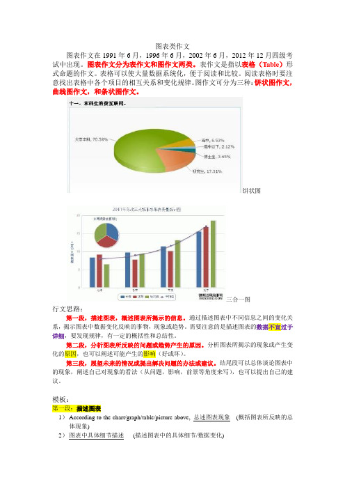
饼状图三合一图行文思路:第一段,描述图表,概述图表所揭示的信息。
通过描述图表中不同信息之间的变化关系,揭示图表中数据变化反映的事物,现象或趋势。
需要注意的是描述图表的数据不宜过于详细,要发现规律,有一定的概括性和总结性。
第二段,分析图表所反映的问题或趋势产生的原因。
分析图表所揭示的现象或产生变化的原因,也可以阐述可能产生的影响(好或坏)。
第三段,展望未来的情况或提出解决问题的办法或建议。
结尾段可以总体谈论图表中的现象,阐述自己对现象的看法(从问题,影响,前景等角度来写),也可以提出自己的建议。
模板:第一段:描述图表1)According to the chart/graph/table/picture above, 总述图表现象(概括图表所反映的总体现象)2)图表中具体细节描述(描述图表中的具体细节/数据变化)3)Obviously/Consequently, this chart/graph//table/picture has forcefully proved that 图表呈/现象趋势)4)Many reasons account for 图表反映的问题(过渡句,过渡到分析问题产生的原因) Consequently, many problems related to 图表涉及的主体emerge. /图表涉及的主体或呈现的结果can do lots of harm/benefits. (过渡到分析问题所造成的好/坏影响)5)Firstly/First of all, 原因一/影响一(分析第一个原因或影响)6)进一步说明原因/影响一(第一个原因或影响的进一步阐述)7)Furthermore/Secondly, 原因二/影响二8)Thirdly/Besides, 原因三/影响三(As a result, 以上原因导致的结果)第三段:阐述观点段/说明影响段/说明问题段9)As for me/As far as I am concerned, 我的态度/相关情况或是现象将来的趋势、可能带来的(好或坏的)影响或存在的问题10)For one thing, 理由一/影响一/问题一11)For another/In addition/Besides, 理由二/影响二/问题二12)In brief/To conclude, 总结全文(总结全文,重申观点,提出建议或作出展望)实用句型一、描述图表二、原因三、收尾———补充:●表示增长、上升的词汇●动词:increase, rise, climb, go up, soar, skyrocket,副词:sharply, remarkably, obviously,significantly, gradually, slowly●表示下降、减少的词汇decrease, drop, fall, go down, decline●表示持续不变的词汇level off; remain steady/unchanged●表示倍数的词汇double; triple the number of/the percentage of; four/five times四、模板示例例:2012.12月真题●全文3段为:1. 描述图表2. 分析原因3. 结论或建议从文章内容上,第1段总体描述1句,加细节描述1-2句;第2段分析原因,解释为什么教育程度越高,失业率越低?内容仁者见仁,只要没跑题就行。
各种饼图的英文作文
各种饼图的英文作文英文:As I sit down to delve into the various types of pie charts, I find myself excited by the prospect of exploring their diverse applications and implications. Pie charts, with their circular form and segmented slices, offer a visually engaging way to represent data. They are widely used across different fields such as business, statistics, and academia for presenting proportions and percentages.One of the most common uses of pie charts is in business presentations. Imagine you're in a meeting discussing sales performance for different product categories. Using a pie chart, you can easily illustrate the percentage of total sales contributed by each category. For instance, if you're in the electronics industry, you might showcase that 40% of sales come from smartphones, 30% from laptops, and 30% from other accessories. This not only provides a quick snapshot of the sales distribution butalso makes it easier for stakeholders to grasp the relative importance of each category.In academia, pie charts are frequently employed in research papers to showcase demographic distributions or survey results. Let's say you conducted a survey onfavorite ice cream flavors among different age groups. You could represent the data with a pie chart, where each slice corresponds to a different age group and its proportion reflects the percentage of respondents favoring aparticular flavor. This not only makes the findings more digestible but also adds visual appeal to your research presentation.Moreover, pie charts find utility in statistics to represent parts of a whole. When discussing market share, for example, you might use a pie chart to depict the percentage of market controlled by each competitor. This allows for a quick comparison and understanding of the competitive landscape. 。
饼图作文模板原因分析

饼图作文模板原因分析英文回答:Introduction:Pie charts are a popular form of data visualizationthat represent data in a circular format, with each section of the chart representing a different category or variable. They are widely used in various fields, such as business, finance, and research, to present data in a visually appealing and easy-to-understand manner. In this essay, I will analyze the reasons behind the popularity of pie charts.Reason 1: Visual Appeal.One of the main reasons why pie charts are widely used is their visual appeal. The circular shape and vibrant colors make them visually appealing and attractive to the viewers. This visual appeal helps in grabbing the attentionof the audience and making the data more memorable. For example, when presenting sales data for different product categories, a pie chart can effectively highlight the proportions and make it easier for the audience to remember the information.Reason 2: Easy Comprehension.Another reason for the popularity of pie charts istheir ease of comprehension. Pie charts provide a simpleand intuitive way to represent data, allowing viewers to quickly understand the distribution or proportion ofdifferent categories. The use of percentages or angles can further enhance the understanding of the data. For instance, when analyzing the market share of different smartphone brands, a pie chart can clearly show the dominance of a particular brand without requiring the audience tointerpret complex numerical data.Reason 3: Comparison and Contrast.Pie charts also excel in comparing and contrastingdifferent categories or variables. By placing multiple pie charts side by side or using multiple concentric circles,it becomes easier to compare the proportions or changesover time. This comparative analysis is particularly useful in identifying trends, patterns, or outliers in the data. For example, when comparing the revenue distribution of different regions over the years, a series of pie chartscan effectively demonstrate the changes and highlight the regions with significant growth or decline.Reason 4: Universal Understanding.Pie charts have a universal understanding acrossdifferent cultures and languages. The visual nature of pie charts eliminates the language barrier and makes it easier for people from diverse backgrounds to understand the data. This universality is especially beneficial in international business or research, where stakeholders or collaborators may have different native languages. For instance, when presenting market research findings to a multinational team, a pie chart can facilitate effective communication and ensure that everyone interprets the data accurately.Conclusion:In conclusion, the popularity of pie charts can be attributed to their visual appeal, easy comprehension, ability to compare and contrast, and universal understanding. These factors make pie charts an effective tool for presenting data in a visually appealing and easily understandable manner. Whether it is for business presentations, academic research, or data analysis, pie charts continue to be widely used and appreciated.中文回答:介绍:饼图是一种常见的数据可视化形式,以圆形的格式表示数据,图表的每个部分代表不同的类别或变量。
雅思图表写作饼图(复习)通用课件

练习三:分析并比较不同饼图的数据
总结词
培养数据分析能力
VS
详细描述
提供两张不同的饼图,要求学生对两张饼 图的数据进行分析和比较。学生需要识别 出两张图中各部分的比例差异,分析这些 差异产生的原因,并得出结论。此练习有 助于提高学生的数据分析能力和逻辑思维 能力。
THANKS
感谢观看
如何保证数据的准确性和客观性?
准确客观的数据来源
数据的准确性和客观性是图表写作的基础。要保证数据的准确性,需要从可靠的来源获取数据,并核 实数据的准确性。在引用数据时,需要注明数据的来源,以增加数据的可信度。同时,需要注意数据 的时效性,使用最新的数据能够更好地反映当前的情况。
如何让饼图更加直观易懂?
主题应具有实际意义 ,有助于读者了解该 领域源应具有权威性和可信 度,以确保数据的准确性和可 靠性。
数据来源应具有广泛性和多样 性,以涵盖不同方面的数据, 使饼图更加全面和客观。
数据来源应具有时效性,以确 保数据的最新性和有效性。
数据整理与分类
对数据进行清洗和整理,去除异 常值和重复值,确保数据的准确
合理使用图表元素
饼图是一种常见的图表形式,用于展示数 据的比例关系。要让饼图更加直观易懂,需 要合理使用图表元素。首先,需要选择合适 的颜色和标签,以便于区分不同的数据项。 其次,需要按照数据的大小合理安排扇区的 顺序,以便于读者比较大小关系。最后,需 要在图表中添加必要的说明和标注,帮助读
者理解图表的意义和重点。
雅思图表写作饼图(复习)通用 课件
目录
• 饼图的基本概念 • 饼图的写作技巧 • 饼图写作实例分析 • 常见问题与解答 • 练习与巩固
01
饼图的基本概念
图表类作文模板

满分技巧:
• 图表作文的结构通常是三段: • 第一段:用分类法或对比法来分析图表中的数据变化所反 映出的问题或数据变化的总趋势或特征,注意对图表中的 数据内容不必全部描述,只需重点引用能够支持观点的一 些数据即可。
• 第二段:分析造成的现象变化或问题及其原因
• 第三段:表达自己的想法、评论或ecently I have done a survey on the hobbies of the students in our school. The results show as follows:
• Considering it a good way to cultivate their taste and build their figure, about 30% of the students, the majority of whom are girls, are fond of music and dancing. Surfing the Internet, playing computer games and chatting online are what most students prefer to do,accounting for about 40% of the students surveyed. In their opinions, it is a good way to learn the latest news and make friends. 20%,mostly boys, enjoy doing sports, thinking it helps to keep fit. What disappoints me is that only 10% of the students choose to read in their spare time in order to acquire knowledge and improve writing ability. • As far as I am concerned, middle school students should spend more time reading, because students can benefit from books in their lifetime.
报告写作中的图表解读与数据展示
报告写作中的图表解读与数据展示一、图表的基本类型及其应用场景图表在报告写作中起着展示数据和信息的重要作用,不仅能够清晰地传递信息,还能增加可读性和易懂性。
在报告写作中,常见的图表类型包括折线图、柱状图、饼图、雷达图、散点图等。
每种图表类型都适用于不同的数据和信息展示场景,选择合适的图表类型有助于增强报告的说服力和可信度。
1.1 折线图:用于展示随时间变化的趋势数据,可以清晰地呈现数据的变化规律和趋势走向。
1.2 柱状图:适用于展示数据的对比情况,可以清晰地比较不同分类或组别之间的差异。
1.3 饼图:主要用于展示不同部分组成整体的比例关系,可以直观地展示各部分之间的相对大小。
1.4 雷达图:适合用于展示多个变量之间的关系,可以一目了然地看出各个变量的相对优势和劣势。
1.5 散点图:适用于展示两个变量之间的相关性或者分布情况,可以明显地看出变量之间的相互影响。
1.6 柱线混合图:将柱状图和折线图结合在一起,适用于展示两种不同类型数据的变化规律和对比情况。
二、图表的设计原则与技巧在报告写作中,图表的设计需要遵循一定的原则和技巧,以保证图表的准确性、清晰度和美观度。
2.1 简洁明了:图表应尽量简洁明了,突出核心信息,不要包含过多无用的细节,以免影响读者对数据的理解。
2.2 标题和标注:每个图表都应有标题和标注,标题要简明扼要地概括图表的主要内容,标注要清晰地解释各个数据点或者颜色的含义。
2.3 坐标轴和刻度:坐标轴和刻度应该清晰明了,刻度要合理选择,避免出现刻度不连续、刻度过小或过大的情况。
2.4 颜色和图例:颜色要选择明亮鲜艳且易于区分的色彩,图例要清晰地解释图表中不同元素的含义。
2.5 排版和布局:图表的排版和布局要与报告整体风格相协调,要注意在图表附近空出足够的空间,避免过于拥挤和混乱。
2.6 数据标签与趋势线:数据标签可以直接显示数据的具体值,趋势线可以更加明显地显示变量之间的关系和趋势。
三、图表解读的技巧与要点在报告写作中,不仅要设计好图表,还要能够准确地解读图表,向读者传递正确的数据和信息。
饼状图图表作文

• The amount of oil production in Africa is about three times that of consumption ( 7.8 MB/D compared to 2.5 MB/D) • Africa produces 7.8 MB/D, about three times what it consumes (2.5 MB/D).
the introduction can be written like this: • Even just after having a child, a large number women return to work. As the child grows older, the percentage of mothers who choose or need to continue working rises. At least until the child is ten, the larger number of working mothers take part-time occupations. When the child is ten years or older, the number of the full-timers more than doubles while that of the part-timers decrease.
作文写作要点
• 介绍各扇面及总体的关系。 • 各个扇面之间的比较,同类扇面在不同 时间、不同地点的比较。 重点突出特点最明显的扇面:最大的、 最小的、互相成倍的。
The basic trends of the four charts:
Just after bearing children, back to work. The older child…the more… Most part-time during child 5~9 Child 10+, full time double, part-time less
图表作文(经典范文)
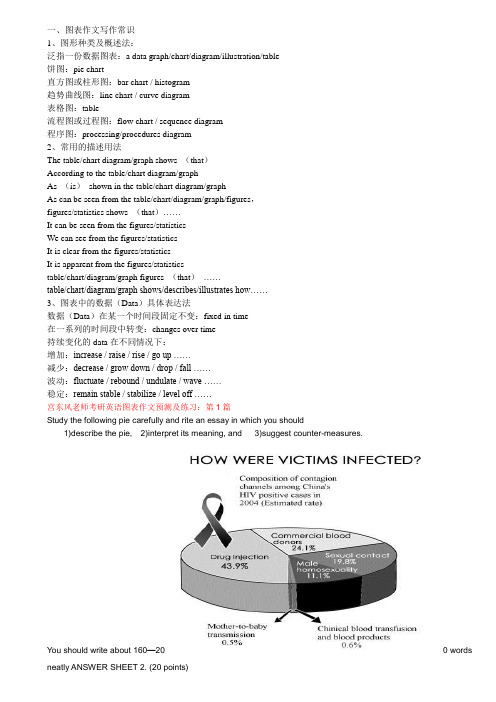
一、图表作文写作常识1、图形种类及概述法:泛指一份数据图表:a data graph/chart/diagram/illustration/table饼图:pie chart直方图或柱形图:bar chart / histogram趋势曲线图:line chart / curve diagram表格图:table流程图或过程图:flow chart / sequence diagram程序图:processing/procedures diagram2、常用的描述用法The table/chart diagram/graph shows (that)According to the table/chart diagram/graphAs (is)shown in the table/chart diagram/graphAs can be seen from the table/chart/diagram/graph/figures,figures/statistics shows (that)……It can be seen from the figures/statisticsWe can see from the figures/statisticsIt is clear from the figures/statisticsIt is apparent from the figures/statisticstable/chart/diagram/graph figures (that)……table/chart/diagram/graph shows/describes/illustrates how……3、图表中的数据(Data)具体表达法数据(Data)在某一个时间段固定不变:fixed in time在一系列的时间段中转变:changes over time持续变化的data在不同情况下:增加:increase / raise / rise / go up ……减少:decrease / grow down / drop / fall ……波动:fluctuate / rebound / undulate / wave ……稳定:remain stable / stabilize / level off ……宫东风老师考研英语图表作文预测及练习:第1篇Study the following pie carefully and rite an essay in which you should1)describe the pie,2)interpret its meaning, and 3)suggest counter-measures.You should write about 160—200 words neatly ANSWER SHEET 2. (20 points)[参考范文](291 words) 爱滋病的感染途径As is obviously betrayed in the pie above, the main contagion (接触传染) channels among China’s HIV positive cases are drug injection (43.9%), commercial blood donors (24.1%), and sexual contact (19.8%). The statistics have indicated the reality that we are facing and have profound implication for us in terms of AIDS control and prevention.The implied meaning of the pie above which demonstrates how victims were usually infected in the year of 2004 is far-reaching. In the first place, the contagion channel of drug injection should be the top on our agenda. The channel of infection ranks first in the pie above currently in our society the availability of drugs are getting easier. If enough attention is not attached to the control of drug injection, China’s HIV positive cases will rocket to an alarming figure, which is bound to threaten the stability of our society.What’s more, the contagion channels — commercial blood donors and sexual contact — should not be ignored by us. The two channels of infection rank second and third respectively. In fact, blood and sex are part of people’s life so that it is more difficult for us to always watch out. However, constant watching-out has become a must due to the cruel reality which is revealed in the pie above. Otherwise, everybody in our society will be in danger of being infected with HIV positive.Counter measures must be taken in order contain the current situation. In the first place, we must offer medical treatment to those who are already infected. In the second place, we must popularize the knowledge of AIDS in our society, especially among young people. Most importantly, the idea of prevention should be the uppermost in our work and life.宫东风老师考研英语图表作文预测及练习:第2篇Study the following chart carefully and write an essay in which you should1)describe the chart,2)deduce the purpose of the painter of the chart.You should write about 160—200 words neatly ANSWER SHEET 2. (20 points)[参考范文]2004年不同疾病的死亡率(248 words)As is apparently betrayed in the chart above, among the leading causes of death among 15 — 59-year-olds worldwide in the year of 2004 are HIV/AIDS, heart failure, tuberculosis and so forth, which cover both external and internal factors. What the chart reveals mirrors a social reality, which is in effect thought-provoking.The aim of the painter of the chart is to make us have a clear understanding of the leading causes of death so as to improve our life span and the quality of life. In the first place, some diseases such as HIV/AIDS and cancer arestill No. 1 enemies since we still have no better way to deal with them. Consequently, we must work hard in this aspect and try our best to find the cure as early as possible. In the second place, psychological stress on us should not be neglected in terms of leading causes of death. Causes such as heart failure and suicide are closely related with psychological stress.Therefore, to protect our life, we must first of all attach importance to our state of mind. Last but not least important, some leading causes such as respiratory illness is associated with our environment pollution. Therefore, the improvement of our environment can contribute to the protection of our life. In sum, the chart above reminds us that the leading causes of death result from diseases, psychological stress, and environmental pollution. In order to have a better life, something must be done in the relevant aspects mentioned above.宫东风老师考研英语图表作文预测及练习:第3篇Study the following chart carefully and write an essay in which you should1)describe the chart,2)account for the status revealed, and3)make a relevant prediction.You should write about 160—200 words neatly ANSWER SHEET 2. (20 points)The number of Scientific breakthroughs over the past years in P.R. China (Estimated)[参考范文](228 words) 从2001-2004年4年当中中国在科学成就上突破表As is apparently betrayed in the chart above, the number of scientific breakthroughs over the past years in P.R. China has been climbing and rocketed to 120 cases in the year of 2004, which is a shocking news to people both at home and abroad. People may wonder what is behind the great achievement.The foremost reasons for the tremendous feat which is revealed in the chart above can be illustrated as follows. To begin with, idea that science and technology are also productivity has contributed to the increase of scientific breakthrough. Over the years, more and more people realize that we are living in an era of knowledge explosion. If we want to survive and develop in the current world, we must keep pace with the development of science and technology. Thus, scientific breakthrough crop up by each passing day. What’s more, the Opening-up and Reform has also brought about the increase of scientific breakthroughs. The Opening-up and Reform has improved the d evelopment of China’s economy, which has laid a solid foundation for the increase of scientific breakthroughs. In sum, our new idea and Opening-up and Reform are the preconditions of the tremendous increase of scientific breakthroughs.As our country develops at a high speed, more scientific breakthroughs will come into our life since we have more solid economic foundation, advanced equipment and facilities, and super talents.宫东风老师考研英语图表作文预测及练习:第4篇Study the following chart carefully and write an essay to1) describe the chart,2) state your attitude toward the event, and3) suggest counter-measures.You should write about 160—200 words neatly ANSWER SHEET 2. (20 points)[参考范文](172 words) 世界恐怖案件调查表As is apparently betrayed in the chart above, the number of terror attacks over the past four years has been climbing and rocketed to 204 cases in the year of 2004. This is a shocking figure to everyone and every nation in the world, which has aroused the deep concern of the international community.In my view, terrorist offences against civilians cannot be justified in any way. Action of the kind is no doubt criminal regardless of their motivation, be it political or personal. The terror attack on children and women like the case in Russia not long ago is never forgivable. In fact, terror attack is a threat to the world peace and stability.Counter-measures should be taken to fight against terrorism. To begin with, there is a greater and more urgent need for the international community to collaborate now. What’s more, the legislative framework of international co-operation against terrorism should be perfected. Most importantly, the world community should carefully explore terrorism’s breading grounds while probing effective means to counter it.宫东风老师考研英语图表作文预测及练习:第5篇Study the following drawing carefully and write an essay to1)describe the picture2)deduce the reasons for the predictions revealed, and3)put forward your suggestions.You should write about 160—200 words neatly ANSWER SHEET 2. (20 points)[参考范文](256 words) 预测中国人口寿命As is a pparently betrayed in the drawing above, the average life spans of the world population and China’s population will reach fifty years and one hundred years respectively by the year of 2300. And by then the number of people above the age of sixty will account for thirty-eight percent of the total world population. This is a great change in human history, which has made us think deeply.The foremost reasons for the predictions which are indicated in the drawing above can be illustrated as follows. To begin with, the rapid development of the world economy has contributed to the predictions. Over these years, the world economy is developing at a surprising speed, which has supplied people all over the world with adequate daily necessities. What’s more, the de velopment of medical science has brought about the predictions. Over the past years, a number of medical breakthroughs have been made in the field of medical science, which has greatly protected people and improved the quality of people’s life. With the fu rther growth of the world economy and medical science, the UN predictions will be more persuasive.By the way, here are suggestions of mine for the predictions revealed in the drawing above. The international community including China must now make preparations for the coming of the day. Much knowledge concerning senior citizens should be popularized. More public facilities for senior citizens should be set up. More professionals on senior citizens should be strictly trained. Only in this way can we live in a peaceful and harmonious environment. 宫东风老师考研英语图表作文预测及练习:第6篇Study the following chart carefully and write an essay in which you should1)describe the chart,2)deduce the purpose of the painter of the chart, and3)suggest counter-measures.You should write about 160—200 words neatly ANSWER SHEET 2. (20 points)[参考范文](280 words) 关于南京大屠杀知道情况的问卷调查As is apparently betrayed in the chart above, the number of people who know the date of the Nanjing Massacre (大屠杀) is only one out of fifteen, which is really surprising to every Chinese. The social phenomenon is not a trivial matter and should arouse the great concern of our society.The aim of the painter of the chart is to remind us that we are forgetting what we should always keep in mind as a Chinese. Everyone in the world has his/her motherland. As a Chinese, we should have a good understanding of the history of our motherland. Without a good understanding of the history, we can not be a qualified Chinese. In the history of our nation, many significant events have ever taken place. The Nanjing Massacre is just one of them, which have left us an unforgettable memory. To forget events of the kind means that we betray our nation, that we are losing our national spirit, that we lack patriotism (爱国精神), and that we are destroying our future. The phenomenon which is revealed in the chart above is pervasive and must be curbed. Otherwise, it will impair the development of our motherland.Counter-measures must be taken to rectify the trend of the kind revealed in the chart above. Mostly importantly, laws and regulations must be established to popularize the knowledge of the history of our motherland. Besides, activities at national level should be organized to mark the significant events in our history. In sum, we must attach more importance to our history in order to make our country become a strong and powerful nation in the world.宫东风老师考研英语图表作文预测及练习:第7篇Study the following chart carefully and write an essay to1)depict the chart, and2)deduce the reasons behind the fact.You should write about 160—200 words neatly on NSWER SHEET 2. (20 points)[参考范文](235 words) 考研人数从2003-2005年持续上升As is vividly betrayed in the chart above, the number of MS/MA candidates has been climbing over the past years and rocketed to 1.3 million in the year of 2005. People at different walks of life may wonder what is behind the figure.The foremost reasons for the great increase of MA/MS candidates over the past years can be illustrated as follows. In the first place, the idea that knowledge is power has contributed to the enormous increase of MA/MS candidates. At present, we are living in an era of knowledge explosion. If we want to survive in the current society, we must have good command of knowledge. To be exact, knowledge learning has become a life-long work.Therefore, more and more people are content with their four-year college education and apply for MA/MSdegree. In the second place, the current unsatisfactory job-hunting has resulted in the great increase of MS/MA candidates over the past years. At the moment, the supply of the college graduates overtakes the demand for the college graduates.As a result, many college graduates can not find jobs that they really enjoy and want. Some of their jobs are even irrelevant to their majors. Therefore, they would like to conduct further study instead of doing the work that they dislike. As a consequence, more and more people apply for MA/MS degree, which has led to the great increase of MA/MS candidates.宫东风老师考研英语图表作文预测及练习:第8篇Study the following chart carefully and write an essay to1)describe the chart,2)deduce the possible reasons of the increase of the gold medals.You should write about 160—200 words neatly on ANSWER SHEET 2. (20 points)[参考范文]中国在奥运会上金牌逐渐上升(197 words)As is vividly portrayed in the chart above, the number of gold medals which are snatched by P.R. China has been climbing and rocketed to 32 at the 2004 Athens Olympic Games. This is a great achievement in Chinese sports. People both at home and abroad may wonder what has brought about the great success.The foremost reasons for the great achievement which is revealed in the chart above can be illustrated as follows. To begin with, the Opening-up and Reform has contributed to the growth of Chinese sports. The Opening-up and Reform since 1978 has improved the development of economy in China, which has laid a solid foundation for the development of sports in China.Thus, without the Opening-up and Reform, the 32 gold medals would be a pie in the sky. What’s more, the international exchanges have brought about the growth of Chinese sports. On one hand, we sent Yao Ming to NBA and Liu Xiang to participate in international events of various kinds. On the other hand, we have invited foreign professionals to come to China and coach our national teams.Therefore, without the international exchanges, the 32 gold medals would be an empty talk.宫东风老师考研英语图表作文预测及练习:第9篇Study the following chart carefully and write an essay in which you should1)describe the chart,2)account for the fact revealed in the chart.You should write about 160-200 words neatly on ANSWER SHEET 2. (20 points)[参考范文](238 words)As is vividly betrayed in the chart above, the number of scholars returning from the overseas has been climbing over the past years and rocketed to over 50 thousand in the year of 2004. People may wonder what is behind the amazing figure.The foremost reasons for the tremendous increase which is clearly revealed in the chart above can be illustrated as follows. To begin with, a set of preferential policies has contributed to the increase of the number. To attract the students studying overseas to return, our government has set up a suite of preferential policies in terms of salaries, residing place, housing, choice of jobs, and children’s education. Without the preferential policies, the increase of the number is out of the question.What’s more, the rapid development of our motherland has led to the in crease of the number of scholars returning from overseas. Since 1978, China has carried out Opening-up and Reform, which has greatly improved the growth of China’s economy. The robust economy has laid a solid foundation for the rapid development of scientific field, which makes P.R.China a most inviting country to both Chinese at home and abroad and foreigners. Therefore, without the great leap of our motherland over the past years, the increase of the scholars returning from overseas would be impossible.In one word, our preferential policy and rapid development of our motherland are the foundation of the increase revealed in the chart above.图表作文10:1997年考研英语真题作文Directions:A. Study the following set of pictures carefully and write an essay in no less than 120 words.B. Your essay must be written clearly on the ANSWER SHEET.C. Your essay should cover all the information provided and meet the requirements below:OUTLINE:1. Interpret the following picture.2. Predict the tendency of tobacco consumption and give your reasons.【参考范文】The problem of smoking has received more and more concern from all over the world. As is indicated by the pictures, smokers for nearly 20% of the world population. And tobacco has caused a loss of 200 billion U.S. dollars and claimed 3 million lives annually.However, it is billion that the world tobacco production witnessed a decrease from 14.364 billion pounds in 1994 to 14.2 in 1995. according to this change. I confidently believe that there will be less and less tobacco consumption in the future, generally for two reasons. On the one hand, being aware of the harm of smoking, more and more people join in the fight against it. They either try their best to give up smoking or advise others not to smoke any longer.On the other hand, many governments have attached more attention to this social hazard and take various measures to put an end to it. Therefore, I have every reason to believe that the fight against smoking will be won by us human beings at last.考研英语二图表作文预测:全国出境游Topic 3: The boom of overseas traveling industryFrom the bar chart given above, we can observe that the number of people traveling abroad experienced some changes during the past several years. From 1999 to 2000, the number of Chinese people traveling abroad increased rapidly from 7.5 million to 10 million, and then to 12.1 million in 2001.The bar chart reveals that people in mounting numbers are going to travel abroad. What exactly contribute to this phenomenon? Reasons can be listed as follows: for one thing, the authorities have issued some preferential policies to promote the development of the overseas tourism industry, which encourages a sudden emergence of travel agencies that can provide customers with convenient overseas tourism services. Additionally, with the improvement of financial status and purchasing power, a considerable number of Chinese people can afford the once-deemed-expensive traveling expenses. Last but not least, as there exists huge difference in cultures, customs and landscapes between China and overseas countries, quite a few people hold that overseas traveling is not only a perfect way to relax oneself, but also enrich their knowledge and expand their horizons.By observing the past trends, we may forecast that the growth tendency will continue. However,it is also a highly variable industry which is vulnerable to seasons and climates,international political situation,fluctuations in exchange.考研英语二图表作文预测:电子商务成交额Global E-commerce turnoverFrom the curve chart given above, we can observe that the turnover of global E-commerce experienced some change during the past several years. From 1997 to 2005, it rose dramatically from 20 billion to 900 billion.The curve chart reveals that the global E-commerce industry enjoys an explosive growth. Quite a few reasons can be listed to account for this phenomenon, and the followings might be the most critical ones: for one thing, the authorities of different countries have issued some preferential policies to protect and encourage the development of E-commerce, thus quite a few online-transaction websites emerge overnight. Moreover, the one-click-payment consumption mode has been widely accepted by the public thanks to the widespread availability of the Internet. Last but not least, people’s decision to purchase on-line can also be put down to the power of so-called “group-dynamics”: when our friends are shopping at net work, we will be influenced by them and imitate their behaviors unconsciously.The rapid development of E-commerce signals that new business models contribute largely to the sustainable development of the global economy. However, when enjoying the fruits offered by modern technology, we should also keep an eye on the underlying threat of it. In a world features open boundary, deception and fraud sometime abound. (209 words )考研英语二图表作文预测:职业选择Different job inclination between boys and girlsFrom the bar chart given above, we can find that it reflects the statistics of profession inclination between girls and boys. Most obviously, 40% of boys intend to be a manager, with only 15% of girls choosing this job. When it comes to the profession of teacher, we can observe that 45% of girls prefer to take this job, while the proportion of boys only account for 5%, 40% lower than that of girls.The bar chart informs us of the phenomenon that there exists some difference in profession inclination between boys and girls. What exactly contribute to this phenomenon ? reasons can be listed as follow: for one thing, quite a few boys regard being a manager as a symbol of success. As this profession stands for promising futures, fat pay and competence. Moreover, boys’ de cision to be a manager can also be attributed to the power of so-called “group dynamics”: when members of their social network prefer to be a manager after graduation, they are easily influenced and imitate others’ behavior unconsciously or consciously. Wh en it comes to girls, the are more inclined to be a teacher. As this profession features stability and respect. Take social and biological factors into account, we know that it is reasonable for girl to choose teacher as their ideal profession goals.Both girls and boys have rights to choose their profession. However, one thing we should bear in mind is that there exists no better or worse, superior or inferior jobs, but suitable and satisfactory ones. (254words)考研英语二作文范文:中国职业的变化The changes of Chinese professionsFrom the pie chart given above, we can observe that the professions structure of Chinese people experienced some changes during the past several years. From 1980 to 1999, the percentage of agricultural professions decreased by 30% from 68% to 38%. During the same period, however, service sectors increased rapidly from 5% to 22%. When it comes to the manufacturing professions, its percentage rose markedly from 27% in 1980 to 40% in 1999.The pie chart reveals the phenomenon that there exists some difference in the development tendency among different professions in China. What exactly contribute to this phenomenon ? reasons can be listed as follows: for one thing, with the rapid process of urbanization, people in mounting numbers, especially youngster, have left their village homes ,moved into big cities and thus been out of agricultural industries. Moreover, quite a few people, especially college graduates hold that it is comparatively easy for them to make more money in the service industry. When it comes to the manufacturing industry, its transformation might be attributed to the adjustment of industrial structure: the authorities have issued some preferential policies to promote the rapid extension of manufacturing industry, thus, more workforces are required.By observing the change over the past several years, we may forecast that the proportion of professions of service and manufacture will continue to rise. However, a high value should be placed on the development of agricultural industry by the public and the authorities. Otherwise, with the number of people who are engaged in agriculture diminishing, we will one day have nothing to eat! (262words)考研英语二作文范文:快餐和坐下来餐厅发展趋势The development tendency of fast food and sit down restaurantFrom the curve chart given above, we can observe that the number meals of fast food and sitdown restaurant experienced some changes during the past several years. The number of meals of fast food increased slowly from 20 in 1970 to nearly 30 in 1980. From 1980 to 2000, it ascended rapidly from 30 to approximately 90. On the contrary, when observing the statistics of sitdown restaurant meals, we can find that it increased slowly from 20 in 1970 to roughly 50 in 2000.The curve chart informs us of the phenomenon that there exists some difference in the development tendency between fast food and sitdown restaurants. What exactly contribute to this phenomenon? Reasons can be listed as follows: for one thing, with the pace of modern life quickening, people barely have much time to waste in lining up for restaurant meals, on thecontrary, fast food meals can do help busy people save a great deal of time. Additionally, the authorities have issued some preferential policies to protect and encourage the rapid extension of fast food industry , thus the public can buy fast food at shops scattering around the city. On the contrary , people in diminishing numbers are willing to eat at sitdown restaurant. They think that eating at restaurant is always time-consuming and inconvenient. Besides, food at restaurant is comparatively expensive than fast food.by observing the trend of the past, we may forecast that the number of fast food meals will continue to rise in the years to come. However, we should also take the detrimental impact of fast food into consideration. Do remember that fast food is one of the main causing factors of diseases such as heart attack, obesity and diabetes.英语二。
- 1、下载文档前请自行甄别文档内容的完整性,平台不提供额外的编辑、内容补充、找答案等附加服务。
- 2、"仅部分预览"的文档,不可在线预览部分如存在完整性等问题,可反馈申请退款(可完整预览的文档不适用该条件!)。
- 3、如文档侵犯您的权益,请联系客服反馈,我们会尽快为您处理(人工客服工作时间:9:00-18:30)。
15
16
17
TASK I
表格题审题顺序:
确定写作顺序(横?纵?) 表格审题编号——先趋势,后数据
在表格左边空白区域标上trend 写出all trends那句话(总分句)2 min 在表格右边空白区域进行数据方法的编号 2-3 min 进行数据的描写 10 min
18
TASK I
5
TASK I
“占据”的讲法:A占了数据的百分比
occupy constitute make up the rest the remainder
6
TASK I
1. A占了数据的百分比 2. THERE BE 3. 数据做主语 4. The percentage of… is …%.
7
饼图的三句万能句型:
Once in a day Twice in a day
0
10 20 30 40 50
Women Men
23
TASK I
We can see the proportion of young men and young women went to Gym from the two pie charts and the bar chart shows how many times they went there last year. In general, females went to Gym less frequently than males and exercised mostly twice in a week. The pie chart shows that about two third of the male population went to Gym last year, while only less than half of the female population went there. The highest percentage of women who went to Gym was approximately 33%, was for twice in a week. However, this percentage was less than the percentage of males went to Gym, which was approximately 42%. Males worked out themselves more commonly for once a day, which constituted just over 23%, 3 times in a week (about 12%), once in week (approximately 10%) and twice in a day (6%). Females went to Gym more commonly than males were for 3 times in a week (21%)and once in week (18%). Seven per cent of men and about 14% of women seldom went to Gym.
years 1960, 1980 and 2000.
The number of people using trains at first rose from just under 20% in 1960 to about 28% in 1980, but then fell back to about 23% in 2000.
反比的三种句型:
1. This was the opposite with… 2. This was converse with … 3. This was contrary to …
20
TASK I:混合图
WRITING TASK 1 You should spend about 20 minutes on this task. The two pie charts show the proportion young men and young women went to Gym and the bar chart below shows how often they did in London last year. Write a report for a university lecturer describing the information shown below. You should write at least 150 words.
2. 若横坐标是数 字轴或时间轴, 按曲线图写, 否则按饼状图 写法写
P63
13Байду номын сангаас
TASK I: 柱状图
The graph shows the changing patterns in commuting by train, car, tube or bus for commuters in London in the
IELTS WRITING
Lesson Nine: 小作文2
1
饼状图
2
Men
Went to Gym Didn't go to Gym
Women
Went to Gym Didn't go to Gym
3
TASK I
Pie Chart的审题过程:
1. 看文字信息 2. 标题审题 标1\2\3 3. 极端数据及其周围(与之接近)数据 4. 一般数据 5. 落单数据
TABLE
1. 表格的描述顺序是以时间(趋势)作为主线,非时 间作为辅线
2. 极端数字举例法 3. 范围法 4. 平均值举例法 5. 类比法 6. 反比法
19
TASK I
类比的四种句型:
1. This was the similar case with… 2. This was true of … 3. So did… 4. This can be paralleled with …
21
Men
Went to Gym Didn't go to Gym
Women
Went to Gym Didn't go to Gym
22
Once in a year Once in a month
Once in a week 2 times in a week 3 times in a week
1. 数据+抄题+导入宾语 Band 5
2. 主语+“占据”(先特征,后数据) Band 6
3. 剩余数据 Band 7
8
9
解决方案: 1. 把相同的属性的柱状用线条勾画出来。以线
状图或者是饼状图的方法来写。 2. 完成两维分析。
10
11
12
TASK I:柱状图
1. 将相同属性的 柱子顶端连接 起来
Use of the tube has been relatively stable, falling from around 27% of commuters in 1960 to 22% in 1980, but climbing back to reach 25% by 2000.
On the other hand, the use of cars increased steadily from just over 5% in 1960 to 23% in 1980, reaching almost 40% by 2000, whereas the popularity of buses has declined since 1960, falling from just under 35% in 1960 to 27% in 1980 and only 15% in 2000.
4
TASK I:两个饼
1. 每个饼块在两个饼中排名第?占?% 2. 分类说:左饼到右饼
上升/下降/保持不变 3. 每段中具体描写每个饼块,突出特点 4. 写完要素后将两个饼的数量比较一下
*若两个饼的总量有不同,需要交代一下 5. 学会丰富百分比的表达和“占”的表达。不要一直用数字加
百分比的格式,如25%。特定的数字可以采取多样性的表 达,如25%=a quarter of, 50%=half of, >50%=a, or the majority of