
雅思写作小作文线形图表题附范文
雅思写作小作文线形图表题附范文
资料仅供参考
雅思写作 – LINE GRAPH
WRITING TASK 1 (Test 2, Cambridge IELTS 7)
You should spend about 20 minutes on this task.
This graph below shows the consumption of fish
and some different kinds of meat in a European
country between 1979 and .
Summarise the information by selecting and
reporting the main features, and make
comparisons where relevant.
Write at least 150 words.
资料仅供参考
范文
The graph illustrates changes in the amount of beef, lamb, chicken and fish
consumed in a particular European country between 1979 and .
In 1979, beef was by far the most popular of these foods, with about 225 grams
consumed per person per week. Lamb and chicken were eaten in similar quantities
(around 150 grams), while much less fish was consumed (just over 50 grams).
However, during this 25-year period the consumption of beef
and lamb fell
dramatically to approximately 100 grams and 55 grams
respectively. The
consumption of fish also declined, but much less significantly to just below 50
grams, so although it remained the least popular food, consumption levels were
the most stable.
The consumption of chicken, on the other hand, showed an upward trend,
overtaking that of lamb in 1980 and that of beef in 1989. By it had soared to
almost 250 grams per person per week.
Overall, the graph shows how the consumption
of chicken increased
dramatically while the popularity of these other foods decreased over the period.
(173 words)
资料仅供参考
WRITING TASK 1 (Test 4, Cambridge IELTS 8)
资料仅供参考
雅思小作文线图满分范文汇总
雅思⼩作⽂线图满分范⽂汇总
雅思⼩作⽂线图满分范⽂汇总
雅思⼩作⽂中的线图,作为动态图的代表,在很⼤程度上来说是属于⽐较困难的考题类型。但
是⼀篇好的范⽂,从很⼤程度上就可以帮助雅思考⽣解决这些难题,但是整个⽹上关于雅思线
图的范⽂很少,⽽图⽚的质量也乏善可陈。针对这个问题,超级学长的⽼师精挑细选了5篇雅思
⼩作⽂中的线图满分范⽂给雅思考⽣作为参考。这5篇范⽂都属于过往的真题,从质量上,典型
性上都⾮常具有研究,学习,模仿的价值。
线图范⽂⼀
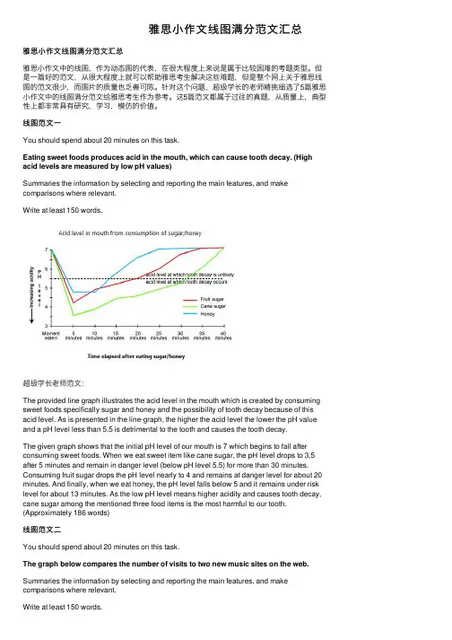
You should spend about 20 minutes on this task.
Eating sweet foods produces acid in the mouth, which can cause tooth decay. (High
acid levels are measured by low pH values)
Summaries the information by selecting and reporting the main features, and make
comparisons where relevant.Write at least 150 words.
超级学长⽼师范⽂:
The provided line graph illustrates the acid level in the mouth which is created by consuming
sweet foods specifically sugar and honey and the possibility of tooth decay because of this
acid level. As is presented in the line-graph, the higher the acid level the lower the pH value
and a pH level less than 5.5 is detrimental to the tooth and causes the tooth decay.
雅思写作八分经典范文背诵:图表作文
雅思写作八分经典范文背诵:图表作文
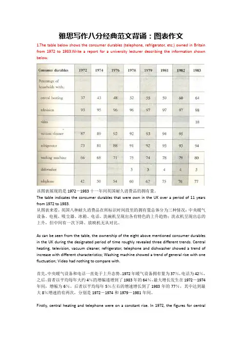
1.The table below shows the consumer durables (telephone, refrigerator, etc.) owned in Britain
from 1972 to 1983.Write a report for a university lecturer describing the information shown
below.
该图表展现的是1972-1983十一年间英国耐久消费品的拥有量。
The table indicates the consumer durables that were own in the UK over a period of 11 years
from 1972 to 1983.
从图表来看,英国八种耐久消费品在所标识时间段里的拥有量总体分为三种情况:中央暖气设备、电视、吸尘器、冰箱、电话、洗碗机呈现出各有特色的上升趋势;洗衣机呈现出总的上升,但中间有一次下降、放映机无从对比。
As can be seen from the table, the ownership of the eight above mentioned consumer durables
in the UK during the designated period of time roughly revealed three different trends. Central
heating, television, vacuum cleaner, refrigerator, telephone and dishwasher showed a trend of
increase with different characteristics; Washing machine showed a trend of general rise with one
雅思写作小作文范文 雅思写作流程图flow chart 咖啡制作过程.doc

雅思写作小作文范文 雅思写作流程图flow chart 咖啡制作过程
今天我们雅思写作小作文范文的文章来研究下流程图flow chart。该图表展示了从咖啡豆到罐装咖啡的制作过程,共分为11个阶段,包括咖啡豆的收获,晒干,烘烤,冷却,碾磨,加水,过滤,冷冻,再次碾磨,烘干,以及装罐等。小编搜集了一篇相应的考官范文,以供大家参考。
雅思写作小作文题目
The diagram below shows how coffee is produced and prepared for sale in
supermarkets and shops.
Summarise the information by selecting and reporting the main features, and make
comparisons where relevant.
雅思写作小作文范文
The picture illustrates the process of coffee manufacture and preparation for
sale on the market.
图片说明了咖啡制作以及为在市场上销售做准备的过程。
It is clear that there are 11 stages in the production of coffee. The process
begins with the picking of coffee beans and ends at the packing stage.
显然,咖啡的生产过程一共有11个阶段。它们以采集咖啡豆为起点,以包装为终点。
Looking at the coffee production process in detail, coffee beans must first be
picked in the fields. These beans are then dried, roasted, and cooled before being
雅思小作文范文表题(必备14篇)

第 1 页 共 32 页 雅思小作文范文表题(必备14篇)
(经典版)
编制人:__________________
审核人:__________________
审批人:__________________
编制单位:__________________
编制时间:____年____月____日
序言
下载提示:该文档是本店铺精心编制而成的,希望大家下载后,能够帮助大家解决实际问题。文档下载后可定制修改,请根据实际需要进行调整和使用,谢谢!
并且,本店铺为大家提供各种类型的经典范文,如工作总结、工作计划、合同协议、条据文书、策划方案、句子大全、作文大全、诗词歌赋、教案资料、其他范文等等,想了解不同范文格式和写法,敬请关注!
Download tips: This document is carefully compiled by this editor. I
hope that after you download it, it can help you solve practical problems.
The document can be customized and modified after downloading, please adjust
and use it according to actual needs, thank you!
Moreover, our store provides various types of classic sample essays for
everyone, such as work summaries, work plans, contract agreements, doctrinal
documents, planning plans, complete sentences, complete compositions,
雅思写作-小作文范文-条图
条图
C3T2
原题
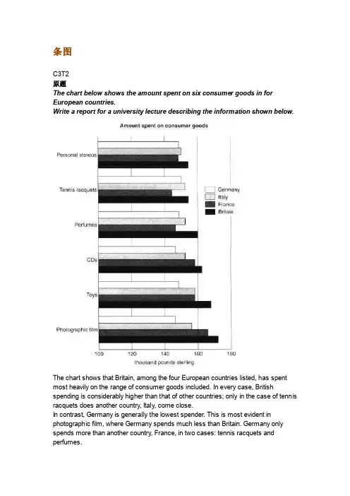
The chart below shows the amount spent on six consumer goods in for
European countries.
Write a report for a university lecture describing the information shown below.
The chart shows that Britain, among the four European countries listed, has spent
most heavily on the range of consumer goods included. In every case, British spending is considerably higher than that of other countries; only in the case of tennis
racquets does another country, Italy, come close.
In contrast, Germany is generally the lowest spender. This is most evident in
photographic film, where Germany spends much less than Britain. Germany only
spends more than another country, France, in two cases: tennis racquets and perfumes. Meanwhile, France and Italy generally maintain middle positions, averaging
approximately similar spending overall. Specifically, France spends more on CDs and
雅思图表小作文混合图范文

雅思图表小作文混合图范文
雅思图表小作文混合图范文分享 独居人口比例
关于混合图题型(柱状图+饼状图):The bar chart below shows
the proportions of English men and women of different ages who
were living alone in 2011. The pie chart compares the numbers
of bedrooms in these one-person households(在英国2011年,不同年龄段独居人口的男女比例,以及独居家庭的房间数统计)。
雅思图表小作文混合图9分范文:
The two charts give information about single-occupant
households in England in the year 2011. The bar chart compares
figures for occupants' age and gender, and the pie chart shows
data about the number of bedrooms in these homes.
Overall, females made up a higher proportion of people
living alone than males, and this difference is particularly
noticeable in the older age categories. We can also see that the
most common number of bedrooms in a single-occupant home
was two.
A significant majority of the people aged 65 or over who
剑桥雅思6-test1-小作文-折线图学习笔记
剑桥雅思6-test1-小作文
题目:
The graph below shows the proportion of the population aged 65 and over between 1940
and 2040 in three different countries.
Summarise the information by selecting and reporting the main features, and make
comparisons where relevant.
Write at least 150 words.
我写的
The line graph compares the proportion of population in three different countries which is 65
and older over a 100year periodover a period of 100 years.
It is easy to see in the graph the figures people aged 65 and over in three different countries
tend to increase from 1940 to 2040(整个句子:It is easy to see in the graph the figures
people aged 65 and over in three different countries tend to increase from 1940 to 2040),
While Japan is expected to show the most drastic fluctuation.(未来的数字,用预测的被动)
In 1940, Japan had the lowest rates of population aged 65 and over at 5%, while the figure for
作文范文之雅思图表类英语作文模板
雅思图表类英语作文模板
【篇一:雅思图表作文模板】
1 according to the chart'''
2 the date lead us to the conclusion that'''
3 the date show'''
4 the tree diagram reveals how'''
5 the figures show'''
6 this is a cure graph which describes the trend of'''
7 the pie graph depicts'''
8 the graph provides some interesting date regrarding'''
9 the table shows the changes in the number of ''' over the period from
'''to '''
10 as is shown in the table '''
11 from the table ,we can clearly see that '''
12 this table shows the changing proportion of x and y from ''' to ''''
13 the graph,presented in a pie chart, shows the general trend '''
14 as can be seen from the grape ,the two curves show the flutuation of
'''
15 over the period from '''to '''the'''remained level.
16 in the year between '''and '''.
17 in the 3 years spanning from 2005 through 2008.
【雅思写作真题】剑桥8 Test4小作文实例批改丨附考官范文
作文题目:剑桥8 Test4小作文
The graph below shows the quantities of goods transported in the UK between
1974 and 2002 by four different modes of transport.Summarise the information by
selecting and reporting the main features, and make comparisons where relevant.
考生原文
The line diagram which indicates the goods transported in UK between (1974) and
(2002), according to different ways of transport and the tonnes they carried.
Among these lines, water and rail both start with the similar value 40 million
tonnes at 1974. After 4 years, the amounts of goods that carried by ship had an increase. However, the amounts that transported by trains went down. Though
water line had a decrease from 1982 to 1998, the overall value of it always above
the rail line.
The most obvious line which can find on the top of chart is the quantity of goods
雅思小作文例文3.0
雅思小作文例文-6.5分班
1 雅思小作文例文
题目1 :线图
You should spend about 20 minutes on this task.
Write at least 150 words.
Model Answer:
The graph shows the increase in the percentage of people aged 65 or more in Japan,
Sweden and the USA.
In 1940 the proportion of people over 65 years stood at only 5% in Japan,
approximately 7% in Sweden and 9% in the US. However, while the figures for the
Western countries grew to about 15% in around 1990, the figure for Japan dipped to only
2.5% for much of his period, before rising to almost 5% again at the present time.
In spite of some fluctuation in the expected percentages, the proportion of
older The graph below shows the proportion of the population aged 65 and over between
1940 and 2040 in three different countries.
Summarise the information by selecting and reporting the main features, and make