6.雅思趋势图写作范文二
[雅思]3种常见雅思图表作文
![[雅思]3种常见雅思图表作文](https://img.taocdn.com/s3/m/beb24afc2f60ddccdb38a0c7.png)
1.柱状图:柱状图本质上就是前三种图的柱状形式,下面我们通过一个图来进行掩饰。
这张图看起来像三张饼图,等于四根曲线图,可以使用总分句,还等于一个3×4的表格题。
我们在写的时候可以使用一些表格题的写作方法,比如:This was the similarcase with the trend of foot.其实我们讲,考试中虽然有4种图,但题型本质上就分动态图和静态图,动态图最好使用曲线图的整体写作模式,就是All trends加天龙八部的微观和宏观结合,静态图则是静态表格的写作模式,通常用纯比较的写作模式。
所以我们在写作中要记住,语言不用新学了,完全借鉴前三种中的句型。
柱状图特殊的要求一,对类比和反比非常重视,因为它主要是向前三种图借鉴,也就是它不再强调每一种题型的要求,它不必强调趋势或者数字,它对每个图的当中共性和差异的开发是比较重视,所以柱状图中的文字性的部分可以多一些。
二,柱状图对语法的要去很高,很多柱状图属于静态图,这样写作的时候要求主语和句型的多样性。
三,它要求我们掌握一个概念,即隐藏特征的概念,它是柱状图特有的,后来引入到其他图,所谓隐藏特征即隐藏在数据背后的客观性事实,首先它是不明显的,要看你个人的分析能力,第二它是客观性事实,千万不要夹杂个人观点,如果在雅思中发表个人观点,一定5分以下。
另外隐藏特征要在结尾段写,它有自己的默认格式:What is worth mentioning is that since…, it indicates the fact that…,这个应该算高分的最后一击。
雅思Task1的高分关键在于:一,变化多端的wording,句式和体系,这就说明了你词汇的词汇的使用能力,包括句型的变化,这个用的好的话,5分是一定的;二,清晰宏观的分类,all trends的总分句;三,7.5分以上需要有力得体的隐藏特征,这是一个加分,找不到不扣分,找到有0.5分的加分。
雅思作文图表题范文

雅思作文图表题范文The bar chart illustrates the percentage of people in different age groups who use the Internet in a certain country. It is clear that the younger age groups are more likely to be Internet users, with the highest percentage in the 16-24 age group.Overall, the data shows a clear trend of increasing Internet usage with decreasing age. In the 16-24 age group, a staggering 95% of people use the Internet, while in the 55-64 age group, only 45% of people are Internet users. This suggests that age is a key factor in determining Internet usage, with younger people being much more likely to use the Internet than older people.The data also shows a gradual decline in Internet usage as age increases. For example, in the 25-34 age group, 85% of people use the Internet, while in the 45-54 age group, only 65% of people are Internet users. This suggests that Internet usage decreases with age, with older people being less likely to use the Internet than younger people.There are several possible reasons for this trend. Firstly, younger people have grown up with the Internet and are more comfortable using it. They are also more likely to use the Internet for social networking, entertainment, and communication, which are all activities that are popular among young people. In contrast, older people may be less familiar with the Internet and may not see the need to use it for these activities.Another possible reason for the trend is that younger people are more likely to be in education or employment, both of which often require the use of the Internet. In contrast, older people may be retired or may have jobs that do not require Internet usage, which could explain why they are less likely to use the Internet.In conclusion, the data clearly shows that age is a key factor in determining Internet usage. Younger people are much more likely to use the Internet than older people, and there is a clear trend of decreasing Internet usage with increasing age. This is likely to have important implications for businesses and organizations that are trying to reach different age groups through the Internet. It also suggests that efforts to increase Internetusage among older people may be needed in order to bridge the digital divide between different age groups.。
雅思小作文技巧及范文
雅思小作文写作技巧及范文一.图表类型饼状图,直方图或柱形图趋势曲线图表格图流程图或过程图程序图二.解题技巧A. 表格图1 横向比较: 介绍横向各个数据的区别,变化和趋势2 纵向比较:介绍横向各个数据的区别,变化和趋势3 无需将每一个数据分别说明,突出强调数据最大值和最小值,对比时要总结出数据对比最悬殊的和最小的说明:考察例举数字的能力和方法。
注意怎样通过举一些有代表性的数据来有效地说明问题。
B. 曲线图1 极点说明: 对图表当中最高的,最低的点要单独进行说明2 趋势说明: 对图表当中曲线的连续变化进行说明,如上升,下降,波动,持平3 交点说明: 对图表当中多根曲线的交点进行对比说明说明:关键是把握好曲线的走向和趋势,学会 general classification, 即在第二段的开头部分对整个曲线进行一个阶段式的总分类,使写作层次清晰。
接下来在分类描述每个阶段的 specific trend, 同时导入数据作为你分类的依据。
注意不要不做任何说明就机械性的导入数据!可以使用一些比较 native 的单词和短语来描述 trend。
C. 饼状图1 介绍各扇面及总体的关系2 各个扇面之间的比较,同类扇面在不同时间,不同地点的比较3 重点突出特点最明显的扇面:最大的,最小的,互相成倍的D. 柱状图1. 比较 : similarity2.对比 : difference)3.横向总结所有柱状图表的共性特征 & 分别描写各个柱子的个性特征E.流程图1.首先说明:做什么工作的过程,目的是什么 2.准备工作 3.按时间/过程先后描述4.结果 5.简单总结说明:注意流程图里的“因果关系” 或每一流程的“承前启后” 关系;表达每一流程的主体内容,阐明这种关系;揭示其内在联系或规律;最后,给予简要归纳和总结。
F. 实物/器具工作过程 1.实物的名称,功能 2.基本结构 3.工作过程 4.简单总结G. 综合图1 不求甚解,不拘泥于细节2 分门别类,分段落详细介绍各个图表3 不画蛇添足,主观臆断或猜测图表之间的关系三.写作结构框架结构1.开头:该图阐述的是______ 的______.共有以下几个部分组成。
雅思写作真题小作文(2)

The chart shows the percentages of both males and females who ate 5 kinds of fruits and vegetables per day of 7 age groups in the UK 2006.
2017年4月8日
2017年5月6日
The chart below gives information about the possession of newer technologies by different age groups in UK in 2009.
Summarize important information and make comparison and contrast.
The chart below shows the international applicants for a European country from 2004 to 2008.
2017年1月14日
The table below shows the income and expenditure of Harckley Hall, a public place for hiring over the period of three years.
年雅思写作真题小作文
———————————————————————————————— 作者:
———————————————————————————————— 日期:
2017年1月7日
The diagram presents the process of producing smoked fish.
2017年1月12日
作文范文之雅思作文线状图
雅思作文线状图【篇一:雅思小作文——线形图(line graphs)】智课网ielts备考资料雅思小作文——线形图(line graphs)摘要:线形图是雅思写作task 1 里常考的图形之一,其写作非常值得我们深入研究。
现专供以下学习材料,希望能对各位“雅友”的线形图写作带去一些启发和帮助。
线形图是雅思写作task 1 里常考的图形之一,其写作非常值得我们深入研究。
现专供以下学习材料,希望能对各位“雅友”的线形图写作带去一些启发和帮助。
line graphsline graphs are more popular than all other graphs combined because their visual characteristics reveal data trends clearly and these graphs are easy to create. line graphs, especially useful in the fields of statistics and science, are one of the most common tools used to present data.a line graph is a visual comparison of how two variables—shown on the x- and y-axes—are related or vary with each other. it shows related information by drawing a continuous line between all the points on a grid. for information on the shapes of line graphs, see the organizing data chapter.line graphs compare two variables: one is plotted along the x-axis (horizontal) and the other along the y-axis(vertical). the y-axis in a line graph usually indicates quantity (e.g., dollars, litres) or percentage, while the horizontal x-axis often measures units of time. as a result, the line graph is often viewed as a time series graph. for example, if you wanted to graph the height of a baseball pitch over time, you could measure the time variable along the x-axis, and the height along the y-axis.although they do not present specific data as well as tables do, line graphs are able to show relationships more clearly than tables do. line graphs can also depict multiple series which are usually the best candidate for time series data and frequency distribution.e graphs share a similar purpose. the column graph, however, reveals a change in magnitude, whereas the line graph is used to show a change in direction.in summary, line graphsshow specific values of data wellreveal trends and relationships between datacompare trends in different groups of a variablegraphs can give a distorted image of the data. if inconsistent scales on the axes of a line graph force data to appear in a certain way, then a graph can even reveal a trend that is entirely different from the one intended. this means that the intervals between adjacent points along the axis may be dissimilar, or that the same data charted in two graphs using different scales will appear different.example 1 – plotting a trend over timefigure 1 shows one obvious trend, the fluctuation in the labour force from january to july. the number of students at andrews high school who are members of the labour force is scaled using intervals on the y-axis, while the time variable is plotted on the x-axis.the number of students participating in the labour force was 252 in january, 252 in february, 255 in march, 256 in april, 282 in may, 290 in june and 319 in july. when examined further, the graph indicates that the labour forceparticipation of these students was at a plateau for the first four months covered by the graph (january to april), and for the next three months (may to july) the number increased steadily. figure 1. labour force participation in andrews high schoolexample 2 – comparing two related variablesfigure 2 is a single line graph comparing two items; in this instance, time is not a factor. the graph compares thenumber of dollars donated by the age of the donors. according to the trend in the graph, the older the donor, the more money he or she donates. the 17-year-old donors donate, on average, $84. for the 19-year-olds, the average donation increased by $26 to make the average donation of that age group $110.figure 2. average number of dollars donated at evergreen high school, by age of donorexample 3 – using correct scalewhen drawing a line, it is important that you use the correct scale. otherwise, the lines shape can give readers the wrong impression about the data. compare figure 3 with figure 4:figure 3. number of guilty crime offenders, grishamvillefigure 4. number of guilty crime offenders, grishamvilleusing a scale of 350 to 430 (figure 3) focuses on a small range of values. it does not accurately depict the trend in guilty crime offenders between january and may since it exaggerates that trend and does not relate it to the bigger picture. however, choosing a scale of 0 to 450 (figure 4) better displays how small the decline in the number of guilty crime offenders really was.example 4 – multiple line graphsa multiple line graph can effectively compare similar items over the same period of time (figure 5).figure 5. cell phone use in anytowne, 1996 to 2002figure 5 is an example of a very good graph. the message is clearly stated in the title, and each of the line graphs is properly labelled. it is easy to see from this graph that the total cell phone use has been rising steadily since 1996,except for a two-year period (1999 and 2000) where the numbers drop slightly. the pattern of use for women and men seems to be quite similar with very small discrepancies between them.相关字搜索:雅思【篇二:线状图】如何写好开头段1表示展示,显示的单词归纳1. show. to make sth. clear; to prove sth.证明,表明v. to say what sb./sth. is like 描写,描绘;叙述揭示;揭露;暴露;泄露4. display v. /displei/ to show signs of sth., especially a quality or feeling 显示;表现;显露5. illustrate v. to use pictures, photographs, diagrams, etc. ina book, etc. (用图、实例等)说明,阐明6.demonstrate v. to show sth. clearly by giving proof or evidence 显示,表露to show sb./sth., especially in a picture 展示;描述8. indicatev. to show that sth. is true or exists 表明;象征;暗示9.unfold v. to be gradually made known; to gradually make sth. known to other people显露,表露;呈现10. exhibit v. to show signs of sth?especially a quality or feeling 表尔,显出11. depict v. to show or represent sth. in a work of art such asa drawing or painting描绘,描画;描述12. outline 描绘以上动词在语义都接近,但需注意:它们后面所跟的宾语不同总结起来就是而担其它的一般只接名词宾语!对...进行分析the table gives a breakdown of different types of family who were living in poverty in australia in 2009.提供关于...的信息the chart gives information about post-school qualifications in terms of different levels of further education reached by men and women in australia in 2009.比较the charts compare the sources of electricity in australia and france in the years 1980....a glance at the graph provided reveals some striking similarities between chinese and us birth rates during the period 1920-2000.....5.given are two graphs concerning criminality in britain.其它替换词★number 丨nambs/数字★figure 丨figa/数字★percentage百分率,百分比the percentage of aged couples who lived in poverty in australia in 1999 was 4%. ★proportion 比例,比率this bar chart indicates the proportion of medical complaints of patients visiting therapists in australia in 2012.★rate 比例,比率;率the bar chart reveals different rates of post-school qualifications in australia in 2010. ★amount. /smaunt/数量,数额(一般与不可数名词连用)theres been a great amount of research into the subject.强化练习到尼泊尔的游客来自何处)in march 2010.有多少降雨)over a year,.(3) the chart gives 混合型汽车在全球的销售)between 2006 and 2009.不同交通方式)used by overseas visitors to travel in new zealand.少图书馆的书.) over this four-year period.售) in japan, the us and the rest of the world from 2006 to 2009.2.时间的连接词练习(二选一)1.the number of students who took spanish was 150 in/on 2010.2.according to the data, mandarin decreased during/at that period.3.since/from 2000, the trends have changed greatly.4.the chart shows the number of people going abroadfrom/between 2000 and 2010.5.in general, all the figures steadily increased over/from 1911 to 2011 .6.during the period 1980 and/to 1990, there was a gradual decrease.7.i have been learning japanese for/in two years now.8.the chart shows changes in irish school eollment figures over/at a 20-year period.9.on/in may 4,2012,in plain sight concluded its fifth and final season.10.the 12th china beijing international high-tech expo will be held in/on may.11.the number started a long decline from 1930onwards/afterwards.12.the period 1250 to/and 1350 is a period of religious and secular literature in english.13.the charts indicate how much a uk school spent on different costs in/for four separate years: 1981,1991,2001 and 2011.表示连续的时间段2. during the same period3. in the no. years spanning from 19xx through 19xx4. from then on= from this time onwards= in the subsequent years.句子翻译练习1.以上的线状图表明了在英国冬季和夏季的一天中用电的需求量。
雅思写作八分经典范文背诵:图表作文
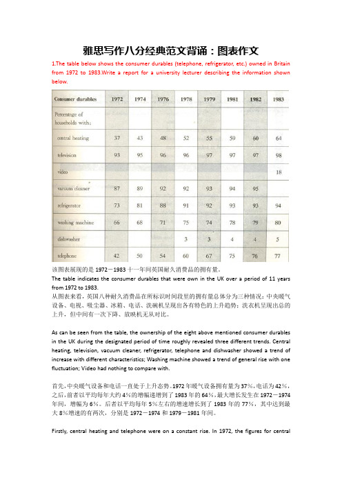
雅思写作八分经典范文背诵:图表作文1.The table below shows the consumer durables (telephone, refrigerator, etc.) owned in Britain from 1972 to 1983.Write a report for a university lecturer describing the information shown below.该图表展现的是1972-1983十一年间英国耐久消费品的拥有量。
The table indicates the consumer durables that were own in the UK over a period of 11 years from 1972 to 1983.从图表来看,英国八种耐久消费品在所标识时间段里的拥有量总体分为三种情况:中央暖气设备、电视、吸尘器、冰箱、电话、洗碗机呈现出各有特色的上升趋势;洗衣机呈现出总的上升,但中间有一次下降、放映机无从对比。
As can be seen from the table, the ownership of the eight above mentioned consumer durables in the UK during the designated period of time roughly revealed three different trends. Central heating, television, vacuum cleaner, refrigerator, telephone and dishwasher showed a trend of increase with different characteristics; Washing machine showed a trend of general rise with one fluctuation; Video had nothing to compare with.首先,中央暖气设备和电话一直处于上升态势。
雅思小作文范文表题(必备14篇)
雅思小作文范文表题(必备14篇)(经典版)编制人:__________________审核人:__________________审批人:__________________编制单位:__________________编制时间:____年____月____日序言下载提示:该文档是本店铺精心编制而成的,希望大家下载后,能够帮助大家解决实际问题。
文档下载后可定制修改,请根据实际需要进行调整和使用,谢谢!并且,本店铺为大家提供各种类型的经典范文,如工作总结、工作计划、合同协议、条据文书、策划方案、句子大全、作文大全、诗词歌赋、教案资料、其他范文等等,想了解不同范文格式和写法,敬请关注!Download tips: This document is carefully compiled by this editor. I hope that after you download it, it can help you solve practical problems. The document can be customized and modified after downloading, please adjust and use it according to actual needs, thank you!Moreover, our store provides various types of classic sample essays for everyone, such as work summaries, work plans, contract agreements, doctrinal documents, planning plans, complete sentences, complete compositions, poems, songs, teaching materials, and other sample essays. If you want to learn about different sample formats and writing methods, please stay tuned!雅思小作文范文表题(必备14篇)雅思小作文范文表题第1篇The graph below shows the amounts of waste produced by three companies over a period of 15 years.雅思小作文范文The line graph compares three companies in terms of their waste output between the years 2000 and 20XX.It is clear that there were significant changes in the amounts of waste produced by all three companies shown on the graph.While companies A and B saw waste output fall over the 15-year period, the amount of waste produced by company C increased considerably.In 2000, company A produced 12 tonnes of waste, while companies B and C produced around 8 tonnes and 4 tonnes of waste material respectively.Over the following 5 years, the waste output of companies B and C rose by around 2 tonnes, but the figure for company A fell by approXimately 1 tonne.From 2005 to 20XX, company A cut waste production by roughly 3 tonnes, and company B reduced its waste by around 7 tonnes.By contrast, company C saw an increase in waste production of approXimately 4 tonnes over the same 10-year period.By 20XX, company C’s waste output had risen to 10 tonnes,while the respective amounts of waste from companies A and B had dropped to 8 tonnes and only 3 tonnes.(192 words, band (9)雅思图表作文真题:混合图:温度与降水The climograph below shows average monthly temperatures and rainfall in the city of Kolkata.雅思小作文范文The chart compares average figures for temperature and precipitation over the course of a calendar year in Kolkata.It is noticeable that monthly figures for precipitation in Kolkata vary considerably,whereas monthly temperatures remain relatively stable.Rainfall is highest from July to August, while temperatures are highest in April and May.Between the months of January and May,average temperatures in Kolkata rise from their lowest point at around 20°C to a peak of just over 30°C.Average rainfall in the city also rises over the same period, from approXimately 20mm of rain in January to 100mm in May.While temperatures stay roughly the same for the neXt four months, the amount of rainfall more than doubles between May and June.Figures for precipitation remain above 250mm from June to September, peaking at around 330mm in July.The final threemonths of the year see a dramatic fall in precipitation, to a low of about 10mm in December,and a steady drop in temperatures back to the January average.(173 words, band (9)雅思图表作文真题:混合图:独居人口The bar chart below shows the proportions of English men and women of different ages who were living alone in 20XX.The pie chart compares the numbers of bedrooms in these one-person households.Living alone in England by age and gender, of bedrooms in one-person households (England, 20XX)雅思小作文范文The two charts give information about single-occupant households in England in the year 20XX.The bar chart compares figures for occupants age and gender, and the pie chart shows data about the number of bedrooms in these homes.Overall, females made up a higher proportion of people living alone than males, and this difference is particularly noticeable in the older age categories.We can also see that the most common number of bedrooms in a single-occupant home was two.A significant majority of the people aged 65 or over whowere living alone in England in 20XX were female.Women made up around 72% of single occupants aged 75 to 84, and 76% of those aged 85 or over.By contrast, among younger adults the figures for males were higher.For eXample, in the 35-49 age category,men accounted for nearly 65% of people living alone.In the same year, of one-person households in England had two bedrooms,while one-bedroom and three-bedroom homes accounted for 28% and of the total.Under 7% of single-occupant homes had four or more bedrooms.(189 words, band(9)以上就是雅思图表作文真题及高分范文汇总的全部内容,更多雅思小作文及图表作文真题范文,请关注小站雅思频道。
6篇雅思Writing Task 2得分9分的佳作
Writing Task 2 :Band 9Using a computer every day can have more negative than positive effects on children.Do you agree or disagree?Give reasons for your answer and include any relevant examples from your own knowledge or experience.Write at least 250 wordsWriting:In today's modern world, computers are an essential part of everyday life. Around the globe, children often use computers from a very young age. Although it is important for children to participate in various well-balanced activities, in my opinion, children who use the computer daily are actually developing a critical skill for future success. The bases for my views are personal, academic, and professional.From a personal point of view, computers are an invaluable resource to help young people explore the world around them. For example, children who use Internet to satisfy their curiosity about diverse topics are already becoming independent learners. No child with a computer is ever bored! By starting early in their lives, children feel totally at ease around computers; they are also able to take advantage of the wide range of services computers provide.From an academic viewpoint, children have no choice but to master this technological invention. For instance, when I was in university, students brought their laptops to class to take notes, do research and exchange information. They wrote assignments, created presentations and developed databases. Children who build early confidence and experience in these abilities are at a distinct advantage over those who have not.From a professional perspective, the computer has found a permanent place in the workplace. Today, employers still pay to provide computer training to their employees. Tomorrow, corporations will expect prospective job applicants to already possess these critical job skills. Consequently, parents who encourage their child to use the computer for a reasonable period of time daily are in fact investing in the child's future career.In conclusion, there is no doubt that the computer as a technological tool is hereto stay. The sooner children become computer-literate, the better for many aspects of their future lives.Some people advocate death penalty for those who committed violent crimes. Others say that capital punishment is unacceptable in contemporary society.Describe advantages and disadvantages of death penalty and give your opinion.Write at least 250 wordsWriting:Many people believe that death penalty is necessary to keep security system efficient in the society. While there are some negative aspects of capital punishment, I agree with the view that without it we will become more vulnerable to violence.Death penalty can be considered unsuitable punishment for several reasons. The strongest argument is that we have no rights to kill other humans. Right to live is the basic right of any human being, and no one can infringe this right, irrespective of the person’s deeds. Moreover, innocent people can face wrongful execution. Such unfair sentences take away lives of innocent people and make other citizens lose faith in law and justice. And besides, sometimes criminals repent of their acts. In this case they should be given a second chance to improve themselves.However, I believe that capital punishment is necessary in the society. Firstly, it is an effective deterrent of major crimes. The best method to prevent a person from committing crime is to show the consequences of his or her actions. For example, the government of Pakistan has controlled the rate of terrorism by enforcing death penalties for the members of terrorist organisations. Secondly, the governments spend large sums of national budget on maintenance of prisoners. Instead, this money can be used for the development of the society and welfare of the people.To sum up, although capital punishment has some disadvantages, I think that it proves to be the best way of controlling criminals, lessening governmental expenses and preventing other people from doing crimes.Influence of human beings on the world's ecosystem is leading to the extinction of species and loss of bio-diversity.What are the primary causes of loss of bio-diversity?What solutions can you suggest?Write at least 250 wordsWriting:Despite knowing about biodiversity’s importance for a long time, human activity has been causing massive extinctions of different species.This essay will examine the main causes of loss of biodiversity and possible solutions of this problem.The two main causes of species extinction are change of their habitats and overexploitation of natural resources.When humans artificially transform the environment, they destroy vegetation and animals’ natural habitat.For instance, to build new roads people are cutting down the trees and cementing the soil, altering the environment. Because of that, a lot of species are dying out. Also, when the activities connected with capturing and harvesting a natural resource are too intense in a particular area, the resource becomes exhausted.For example, too frequent fishing doesn’t leave enough time for fish to reproduce and makes them disappear.In other words, human activities often deplete local flora and fauna and cause loss of bio-diversity.Some possible solutions to this problem are protecting natural areas and promoting awareness among people. By protecting areas where human activity is limited and avoiding overexploitation of its resources, we can save the untouched environment and prevent species from dying out.Moreover, the next step in fighting bio-diversity loss is informing the general population about the dangers of this problem.This way, people will be more conscious of the environment and won’t overuse or destroy its resources.To conclude, people’s activities that change the environment have negative impact on the world's ecosystem. However, we can significantly lessen the extinction of species by protecting natural areas and enlightening people as to this problem.Despite a large number of gyms, a sedentary lifestyle is gaining popularity in the contemporary world.What problems are associated with this?What solutions can you suggest?Write at least 250 wordsWriting:These days a sedentary lifestyle is becoming more and more popular despite a big number of sport facilities. This essay will discuss the main problems associated with this epidemic and propose some possible solutions to avoid them.The main problems caused by inactive lifestyle are obesity and various spine disorders. A growing number of body research shows that long periods of physical inactivity raise a risk of becoming overweight. This is because people burn fewer calories and easily gain weight. What’s more, a lot of studies show that so-called ‘sitting disease’ often results in posture and backbone problems. Due to constant sitting, person loses muscle tissue and curves spine, developing numerous spinal diseases. For example, it has been proven that about 80% of people experience backache at least once a week.In my opinion, the best solution to these problems is promoting active lifestyle. Firstly, millions of people stay less active because they use cars instead of walking. Therefore, an effective way to make people more active is to advertise walking and cycling as safe and attractive alternatives to motorized transport. Moreover, inactive lifestyle is gaining popularity because nowadays a lot of people prefer passive rest to workouts in the gym. And the best way to avoid the hazards of unhealthy living is to obtain a regular dose of physical activity. Thus, promoting gyms and regular exercising would increase the level of activity.In conclusion, leading a sedentary lifestyle causes a lot of health problems, including obesity and spinal diseases. The most effective solution is to increase the level of fitness among the society by advertising physical activity.Big salary is much more important than job satisfaction.Do you agree or disagree?Provide relevant examples if necessary.Write at least 250 words.Writing:It is often argued that it is more advantageous to choose a job with high wage, even if it doesn't appeal to you at all.I completely disagree with this opinion and think that job satisfaction is much more important than salary.First of all, I believe that job satisfaction gives people a sense of fulfillment that no money can guarantee. Even if someone is earning a high salary, but feels tensed and compromises with his conscience, this person won’t enjoy his life. While pursuing one’s interests will always bring pleasure and feeling of satisfaction. For example, a lot of famous researchers made their career choices not because of appealing wages, but because they were passionate about science.That’s why it’s more important to choose the kind of work that makes you happy than to look only at a high salary.Secondly, doing what you like keeps you motivated and therefore leads to a career growth. In other words, there is a strong relation between job satisfaction and productivity. People who love their jobs can easily excel in their fields of work and achieve better results than those, who put salary on the first place.For instance, Henry Miller decided to leave his everyday job despite a good wage and ventured to become a writer.And after enduring years of ups and downs he became one of the most famous and well-paid authors of the twentieth century.Thus, advantages of jobs that keep you satisfied outweigh the drawback of a low salary in a long-term perspective.To conclude, I strongly believe that job satisfaction is more beneficial than high salary because it makes people happy and motivated.。
雅思写作小作文范文 雅思写作折线图(线状图) 伦敦地铁乘客.doc
雅思写作小作文范文雅思写作折线图(线状图)伦敦地铁乘客今天我们雅思写作小作文范文的文章来研究下折线图(线状图)。
该图表展示了一天之中每个时间点使用伦敦地铁服务的乘客数量。
其中给出的数字很多,并且有明显的起伏变化。
比较考验我们选取数字进行比较的能力。
一般而言,需要说明的点有极值、变化趋势、以及最高和最低的比较等。
小编搜集了一篇相关的高分范文,以供大家参考。
雅思写作小作文题目The graph shows the Underground Station passenger numbers in London.Summarise the information by selecting and reporting the main features, and make comparisons where relevant.雅思写作小作文范文The provided line graph shows information about the numbers of people who use the underground station in London around the clock of a typical day. As is observed from the graph, the busiest times at the underground station are 8:00 am and 6:00 pm.上面提供的折线图按照时间展示了一天之中使用伦敦地铁服务的乘客数量。
可以从上述图标中看到,地铁站最忙的时间段为早上8点和下午6点。
The highest numbers of people use the station in the morning and more specifically at around 8:00 in the morning. A rapid growth can be observed between 6:00 am and 8:00 am in the morning when around 400 people use the station at around 7:30 am. This number then quickly drops to below 200 at around 10:00 am. This translation is from Laokaoya website. Again this number rises between 11:00 and 3:00 pm when around 300 people use the underground station with some fluctuations.早上的时候,使用地铁车站的人数量最多,更准确的硕士早上8点左右的时候。
(完整版)雅思经典图表作文范文
#45.The charts below show the percentage of their food budget the average family spent on restaurant meals in different years.The graph shows the number of meals eaten in fast food restaurants and sit-down restaurants.You should write at least 150 words.Give reasons for your answer and include any relevant examples from your own knowledge or experience.Over the past30years,the average family has dramatically increased the number of meals that they eat at restaurants.The percentage of the family's food budget spent on restaurant meals steadily climbed.Just10percent of the food budget was spent on restaurant meals in1970,and15percent in1980.That percentage more than doubled in1990,to35percent,and rose again in2000to50percent. Where families eat their restaurant meals also changed during that30-year period. In1970,families ate the same number of meals at fast food and sit-down restaurants.In1980,fam¬ilies ate slightly more frequently at sit-down restaurants. However,since1990,fast food restaurants serve more meals to the families than do the sit-down restaurants.Most of the restaurant meals from2000were eaten at fast food restaurants.If this pattern continues,eventually the number of meals that families eat at fast food restaurants could double the number of meals they eat at sit-down restaurants.(164words)#44. You should spend about 20 minutes on this task.The map below is of the town of Garlsdon.A new supermarket(S)is planned for the town.The map shows two possible sites for the supermarket.Summarise the information by selecting and reporting the main features,and make comparisons where relevant.You should write at least 150 wordsmodel answer:The first potential location(S1)is outside the town itself,and is sited just off the main road to the town of Hindon,lying12kms to the north-west.This site is in the countryside and so would be able to accommodate a lot of car parking.This would make it accessable to shoppers from both Hindon and Garlsdon who could travel by car.As it is also close to the railway line linking the who towns to Cransdon(25km to the south-east),a potentially large number of shoppers would also be able to travel by train.In contrast,the suggested location,S2,is right in the town centre,which would begood for local residents.Theorically the store could be accessed by road or rail from the surrounding towns,including Bransdon,but as the central area is a no-traffic zone,cars would be unable to park and access would be difficult.Overall,neither site is appropriate for all the towns,but for customers in Cransdon,Hindon and Garlsdon,the out-of-town site(S1)would probably offer more advantages.(179words)#43. You should spend about 20 minutes on this task.The table below shows CO2emissions for different forms of transport in the European Union.The Pie Chart shows the percentage of European Union funds being spent on different forms of transport.You should write at least 150 words.model answer:The chart shows CO2emissions per passenger kilometre for variuos methods of transport in the European Union while the pie chart shows European Union spending on transport.Flying by air produces by far the greatest CO2emissions, approximately three times as much as passenger cars which are the next largest producers.Very little is spent by the EU on air travel while roads make up more than half of the EU transport budget.Trains produce about three times less CO2emissions per passenger kilometre than passenger cars and eight times less than air travel.Nearly a third of EU transport funds are spent on railways.Ships are a clean form of transport and produce about the same amount of CO2 per passenger kilometre as trains do.However,only2percent of EU funds are spent on ports.A further one percent is spent on inland waterways.Coaches are the cleanest form of transport.Emissions of CO2per passenger kilometre from coaches are half those of buses.Buses emit less than half as much CO2per passenger kilometre as cars.The European Union spends10 percent of its transport budget on public transport,such as buses and coaches. (197words)The table below shows the sales at a small restaurant in a downtown business district.Summarize the information by selecting and reporting the main features,and make comparisons where relevant.You should write at least 150 words.Give reasons for your answer and include any relevant examples from your own knowledge or experience.Sales:week of October7-13Mon.Tues.Wed.Thurs.Fri.Sat.Sun. Lunch $2,400 $2,450 $2,595 $2,375 $2,500 $1,950 $1,550 Dinner $3,623 $3,850 $3,445 $3,800 $4,350 $2,900 $2,450model answer:The sales at this small restaurant during the week of October7to13th followed a fairly set pattern from Monday to Friday,and then showed notable shift on the weekend.The lunch and dinner sales during the week peaked on Friday and then dipper down as the weekend set in.During the week of October7-14th,the lunch sales averaged at approximately $2,400.The highest lunch sales occurred on Friday,and the lowest occurred on Sunday.Sunday's lunch sales were approximately$1,000less than the average lunch sales during the rest of the week.Dinner sales,which generated at least$1,000to$1,500more a day than lunch sales,also remained steady during the week.Just like the lunch sales,the dinner sales peak on Friday and dipped down for the weekend.Excluding Wednesday and Thursday,the lunch and dinner sales from October7-11rose gradually until the end of the business week.Midweek,on Wednesday and Thursday,the sales were slightly lower than they were on Tuesday.According to the sales report,this restaurant has a steady lunch and dinner crowd. The most profitable day during the second week of October was Friday.Sunday, was the least prof¬itable day,with the full day's sales totaling/totalling less than the Friday dinner sales.These numbers are reflective of a restaurant that is located in a business/financial district where business hours are Monday through Friday.In June1996,an experimental flu vaccine was trialled in a large country town on females only.Summarise the information by selecting and reporting the main features,and make comparisons where relevant.You should write at least 150 words.Give reasons for your answer and include any relevant examples from your own knowledge or experience.model answer:The diagrams show data for a flu epidemic which hit a large country town in1996. Figure1gives the number of persons who died;Figure2shows the percentage breakdown of females who received a new flu vaccine;and Figure3gives the number of cases of flu before and during the epidemic.In Figure1it can be seen that the flu was responsible for the deaths of2females but no males in the period from March to May.However,from June to August, there were4female deaths and1male death.According to the pie chart in Figure2,only those females most at risk were given the new flu vaccine;28%did not take part in the trial.Of those females who took part,35%were aged(over65years old);24%were babies or children;and13% were either hospitalised or receiving other medical attention.From Figure3it is clear that the new vaccine had a positive effect on the number of new cases of flu reported in females.There were just over1000cases reported in March,climbing rapidly to a peak of3500in June.Thereafter,the number of cases dropped slowly to about2800in August,before levelling off at2500for the rest of the year.For males,the figures were lower but showed a similar trend throughout the epidemic.(232words)#39. You should spend about 20 minutes on this task.The chart below shows estimated world literacy rates by region and by gender for the year2000.Write a report for a university lecturer describing the information below.You should write at least 150 words.model answer:In this report I will describe a bar chart that shows the estimated world illiteracy rates by gender and region for the year2000.First I will look at male illiteracy for the6areas shown.The lowest rates were in Developed Countries,Latin America/Caribbean and East Asia/Oceania with rates of1%(approximately),10%and8%(approximately)respectively.The rates for the next three areas were much higher and quite similar to each other.Sub-Saharan Africa,the Arab States and South Asia had rates of approximately31%,29%and 34%.Female illiteracy was much higher relatively in each area except LatinAmerica/Caribbean where it was only slightly higher.The lowest rates for female illiteracy were again Developed Countries,Latin America/Caribbean and East Asia/Oceania with rates of approximately2%,12%and20%.Again the rates for the next three areas were much higher and quite similar to each other.Sub-Saharan Africa,the Arab States and South Asia had rates of approximately48%, 52%and56%.This ends my report.#38. You should spend about 20 minutes on this task.The chart shows the number of mobile phones and landlines per100people in selected countries.Write a report for a university lecturer describing the information given.You should write at least 150 words.model answer:The graph shows the number of mobile phones and landlines per100users,for selected countries.Overall,most of the countries included in the graph have more mobile phones subscribers than landlines.Most European countries have high mobile phone use.The biggest users of mobile phones are the Italians,with88cell phones per100people.For example, Italy has twice as many mobile phones as landlines,with88mobiles per hundred people compared to45for landlines.Mobile phone use is low in Canada,with fewer than40phones per100people.Denmark is also unusual because it has slightly more landlines than mobile phones.However,in some countries,the number of landlines is higher than the number of mobile phones.One example is the USA,where the number of mobiles,at50per 100people,is much lower than the number of landlines,at almost70per hundred.A similar pattern can be seen in Canada.The highest number of landlines in the graph is in Denmark,with about90per100people.In contrast,the lowest figures for fixed lines are in Italy and the UK.In conclusion, it seems that mobile phone use is higher in Europe than in North America.#37. You should spend about 20 minutes on this task.The graphs show enrolment in different colleges in the Higher Colleges of Technology in1999.Write a total of150-200words about the information in the three graphs. Write a report for a university lecturer describing the information given. You should write at least 150 wordsmodel answer:The charts shows student enrolment by gender and level in different colleges of the Higher Colleges of Technology colleges in the UAE.There are clear differences in male and female enrolment.Females outnumber men in all the colleges,with almost25%more students in Dubai Women's college than in Dubai Men's.Ras Al-Khaimah Women's College has almost180students, compared to only100in the Men's college.Females also outnumber males by level,with almost double the number of men at Higher Diploma level(330compared to181).Only at Diploma level does the number of men slightly exceed that of women.Over half the students are in Certificate level,with less than a quarter at Higher Diploma or Bachelor level.In conclusion,most students in the Higher Colleges are enrolled at Diploma level or below,and the majority of students are women.(143words)# 36. You should spend about 20 minutes on this task.The line graph below shows the number of annual visits to Australia by overseas residents.The table below gives information on the country of origin where the visitors came from.Write a report for a university lecturer describing the information given.You should write at least 150 words.NUMBER OF VISITORS (million)SOUTH KOREAJAPANCHINAUSABRITAINEUROPETotal20059.112.00.81.12.94.530.4 19752.93.20.30.40.91.18.8model answer:The given line graph illustrates information on the number of overseas visitors traveling to Australia in millions of people.Overall,one notable trend seems to be that Australia has steadily become more popular as a destination spot.For example,there were20million more visitors to Australia in2005than in1975. That's a jump from10million to30million in20years.The second table gives statistics showing the countries whose residents went to Australia between1975and2005.In both years,the largest number of visitors came from Japan,followed by South Korea and Europe.Britain,the United States and China also had many people traveling to Australia in these years.In fact,the number of people visiting Australia grew in every one of these countries.For example,in2005,12million people went there from Japan compared with only3.2 million in1975.(147words)#35. You should spend about 20 minutes on this task.The table below shows the consumer durables (telephone, refrigerator, etc.) owned in Britain from 1972 to 1983.Write a report for a university lecturer describing the information shown below. You should write at least 150 words.model answer:The chart shows that the percentage of British households with a range of consumer durables steadily increased between 1972 and 1983. The greatest increase was in telephone ownership, rising from 42% in 1972 to 77% in 1983. Next came centralheating ownership, rising from 37% of households in 1972 to 64% in 1983. The percentage of households with a refrigerator rose 2 1% over the same period and of those with a washing machine by 14%. Households with vacuum-cleaners. televisions and dishwashers increased by 8%, 5% and 2% respectively. In 1983. the year of their introduction, 18% of households had a video recorder.The significant social changes reflected in the statistics are that over the period the proportion of British houses with central heating rose from one to two thuds, and of those with a phone from under a half to over three-quarters. Together with the big increases in the ownership of washing machines and refrigerators, they are evidence of both rising living standards and the trend to lifestyles based on comfort and convenience.Consumer durables Percentage of households with: central heating television videovacuum cleaner refrigerator washing machine dishwasher telephone198260 9795 93 79 4 76197852 9692 91 75 3 60197239 9387 73 6642197443 9589 81 6850197648 9692 88 7154197955 9793 92 74 3 67198159 9794 93 78 4 75198364 98 1894 80 5 77#34. You should spend about 20 minutes on this task.The table below shows the figures for imprisonment in five countries between 1930and1980.Write a report for a university,lecturer describing the information shown below. You should write at least 150 wordsmodel answer:The table shows that the figures for imprisonment in the five countries mentioned indicate no overall pattern of increase or decrease.In fact there is considerable fluctuation from country to country.In Great Britain the numbers in prison have increased steadily from30000in1930 to80,000in1980.On the other hand in Australia,and particularly in New Zealand the numbers fell markedly from1930to1940.Since then they have increased gradually,apart from in1980when the numbers in prison in New Zealand fell by about30,000from the1970total.Canada is the only country in which the numbers in prison have decreased over the period1930to1980,although there have been fluctuations in this trend.The figures for the United States indicate the greatest number of prisoners compared to the other four countries but population size needs to be taken into account in this analysis.The prison population in the United States increased rapidly from1970to1980and this must be a worrying trend.。
- 1、下载文档前请自行甄别文档内容的完整性,平台不提供额外的编辑、内容补充、找答案等附加服务。
- 2、"仅部分预览"的文档,不可在线预览部分如存在完整性等问题,可反馈申请退款(可完整预览的文档不适用该条件!)。
- 3、如文档侵犯您的权益,请联系客服反馈,我们会尽快为您处理(人工客服工作时间:9:00-18:30)。
趋势图写作范文二
The line chart describes how the popularity of cinemas and televisions
changes between 1957 and 1974. Their popularity shows different
pictures.
According to the graph, over the period from 1957 to 1974 the trend
was towards a decrease in the popularity of the cinema. There was a
dramatic fall in the number of cinema admissions from 1957, when
about 900 million people went to cinema, to 1960, when the
attendance figure was roughly 500 million. From 1960 to 1963 the
rate of decline slowed down, the figure for the latter year being about
400 million. From this year on, there was a more gradual reduction in
the popularity of the cinema, reaching a figure of about 90 million in
1974.
On the contrary, there was an upward rend in the number of TV
licenses issued in this period. In 1957 about 390 million licenses were
issued, and this figure rose steadily, reaching 700 million in 1966, to
a peak of 950 million in 1974.