英语作文:饼状图作文
饼图英语作文3例
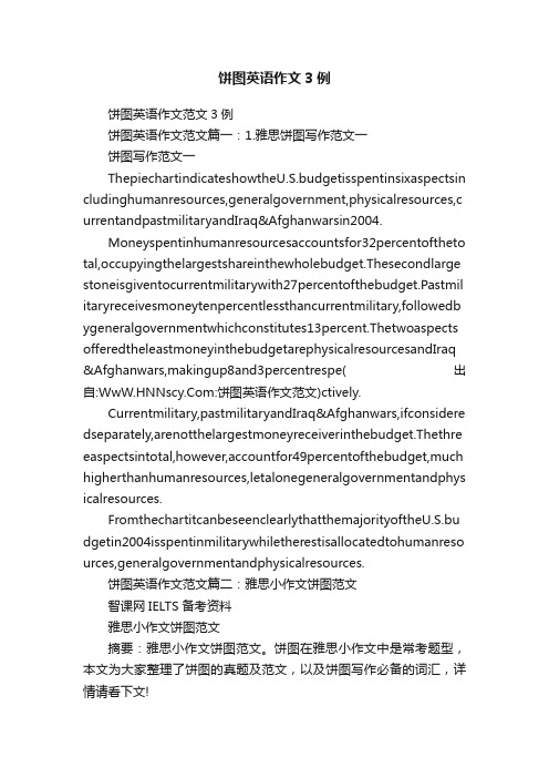
饼图英语作文3例饼图英语作文范文3例饼图英语作文范文篇一:1.雅思饼图写作范文一饼图写作范文一ThepiechartindicateshowtheU.S.budgetisspentinsixaspectsin cludinghumanresources,generalgovernment,physicalresources,c urrentandpastmilitaryandIraq&Afghanwarsin2004.Moneyspentinhumanresourcesaccountsfor32percentoftheto tal,occupyingthelargestshareinthewholebudget.Thesecondlarge stoneisgiventocurrentmilitarywith27percentofthebudget.Pastmil itaryreceivesmoneytenpercentlessthancurrentmilitary,followedb ygeneralgovernmentwhichconstitutes13percent.Thetwoaspects offeredtheleastmoneyinthebudgetarephysicalresourcesandIraq &Afghanwars,makingup8and3percentrespe(出自::饼图英语作文范文)ctively.Currentmilitary,pastmilitaryandIraq&Afghanwars,ifconsidere dseparately,arenotthelargestmoneyreceiverinthebudget.Thethre easpectsintotal,however,accountfor49percentofthebudget,much higherthanhumanresources,letalonegeneralgovernmentandphys icalresources.FromthechartitcanbeseenclearlythatthemajorityoftheU.S.bu dgetin2004isspentinmilitarywhiletherestisallocatedtohumanreso urces,generalgovernmentandphysicalresources.饼图英语作文范文篇二:雅思小作文饼图范文智课网IELTS备考资料雅思小作文饼图范文摘要:雅思小作文饼图范文。
饼形图英语作文

饼形图英语作文饼形状的图文作文,要想用英语描述出来,需要怎么做呢?下面是店铺给大家整理了饼形图英语写作范文,供大家参阅!饼形图英语作文篇1You should spend about 20 minutes on this task.Write a report for a university lecturer describing the information shown below.You should write at least 150 words.model answer:In this analysis we will examine three pie charts. The first one is headed 'World Spending.' Thesecond is 'World Population' and the third is 'Consumption of Resources.'In the first chart we can see that people spend most of their income (24%) on food. In somecountries this percentage would obviously be much higher. Transport and then housing are thenext major expenses at 18% and 12% respectively. Only 6% of income is spent on clothing.In the second chart entitled 'World Population', it is not surprising to find that 57% of peoplelive in Asia. In fact China and India are two of the most populated countries in the world andthey are both situated on this continent. Europe and the Americans account for nearly 30% ofthe total, whilst 10% of people live in Africa.Finally, the third chart reveals that the USA and Europe consume a huge 60% of the world'sresource.To sum up, the major expenditure is on food, the population figures are the highest for Asiaand the major consumers are the USA and Europe.(182 words)雅思小作文的要点就是理解图或者表想要表达的东西,然后用文字正确的阐述出来即可。
饼状图百分比英语作文
饼状图百分比英语作文Pie Chart Percentages.Pie charts are a type of circular graph that visually represents data in a proportional manner. Each sector of the pie represents a percentage of the whole, with the sum of all sectors equalling 100%. Pie charts are commonly used in various fields, including business, marketing, and statistics, to present complex data in a simple and easy-to-understand format.Calculating Percentages.Determining the percentage represented by each sector of a pie chart involves dividing the value of that sector by the total value of all sectors and multiplying theresult by 100. Here's the formula:Percentage = (Value of Sector / Total Value) x 100。
Example 1。
Suppose we have a pie chart with four sectors representing the market share of different companies in an industry. The values of each sector are as follows:Company A: $20,000。
饼状图的英文作文

饼状图的英文作文英文:Pie chart is a type of graph that is commonly used to represent data in a circular format. It is divided into slices, where each slice represents a proportion of the whole. Pie charts are useful in displaying data that can be broken down into categories or percentages.One advantage of using a pie chart is that it is easy to interpret. The slices of the pie represent a clearvisual representation of the data. It is also easy to compare the sizes of the slices, which can help to identify patterns or trends in the data.However, there are also some disadvantages to using a pie chart. One of the main criticisms is that it can be difficult to accurately compare the sizes of the slices, especially if there are a large number of slices. Another disadvantage is that it can be difficult to accuratelyrepresent small percentages, as the slices can become too small to be easily visible.In my personal experience, I have used pie charts to represent survey data. For example, I conducted a survey on favorite types of pizza toppings, and used a pie chart to show the percentage of respondents who preferred each topping. The pie chart made it easy to see that pepperoni was the most popular topping, followed by mushrooms and onions.Overall, pie charts can be a useful tool for representing data, but it is important to consider their limitations and use them appropriately.中文:饼状图是一种常用的图表类型,用于以圆形格式表示数据。
雅思写作小作文范文雅思写作饼状图piechart健康饮食.doc
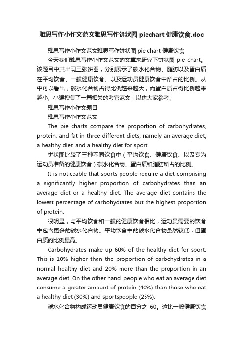
雅思写作小作文范文雅思写作饼状图piechart健康饮食.doc雅思写作小作文范文雅思写作饼状图pie chart 健康饮食今天我们雅思写作小作文范文的文章来研究下饼状图pie chart。
该题目中共出现三张饼图,分别展示了碳水化合物、脂肪以及蛋白质在平均饮食、一般健康饮食、以及运动员健康饮食中所占的比例。
从中可以看出,碳水化合物占得比例越来越大,而蛋白质占得比例越来越小。
小编搜集了一篇相关的考官范文,以供大家参考。
雅思写作小作文题目雅思写作小作文范文The pie charts compare the proportion of carbohydrates, protein, and fat in three different diets, namely an average diet, a healthy diet, and a healthy diet for sport.饼状图比较了三种不同饮食中(平均饮食、健康饮食、以及专为运动员准备的健康饮食)碳水化合物、蛋白质和脂肪所占的比例。
It is noticeable that sports people require a diet comprising a significantly higher proportion of carbohydrates than an average diet or a healthy diet. The average diet contains the lowest percentage of carbohydrates but the highest proportion of protein.很明显,与平均饮食和一般的健康饮食相比,运动员需要的饮食中包含更多的碳水化合物。
平均饮食中的碳水化合物虽然较低,但蛋白质的比例最高。
Carbohydrates make up 60% of the healthy diet for sport. This is 10% higher than the proportion of carbohydrates in a normal healthy diet and 20% more than the proportion in an average diet. On the other hand, people who eat an average diet consume a greater amount of protein (40%) than those who eat a healthy diet (30%) and sportspeople (25%).碳水化合物构成运动员健康饮食的百分之60。
作文范文之英语饼状图作文

英语饼状图作文【篇一:英语写作—饼状图】the meal sold in a supermarket this is a pie chart that shows the proportion of the meal sold in a supermarket.the total meat sold in the supermarket is classified into six types as follows: chicken, pork, beef, lamb, fish and others.overall, chicken has the largest proportion, which accounts for 40%, while others has the smallest percentage, at 2%.as can be seen in the pie chart, chicken, which makes up 40%, is the most popular among the total meat sold, then next is pork with 20%, followed by beef, constituting 18%; and finally come lamb, fish and others at 15%, 5% and 2% respectively, it should be noted that the sale of pork is half as much as that of chicken. and it is also interesting to note that the sale of chicken is 20 timesas much as that of others.it can be concluded from the pie chart that chicken is most commonly boughtmeat while others is the least commonly bought meat.【篇二:雅思小作文饼图范文】智课网ielts备考资料雅思小作文饼图范文摘要:雅思小作文饼图范文。
饼状图作文英语作文范文
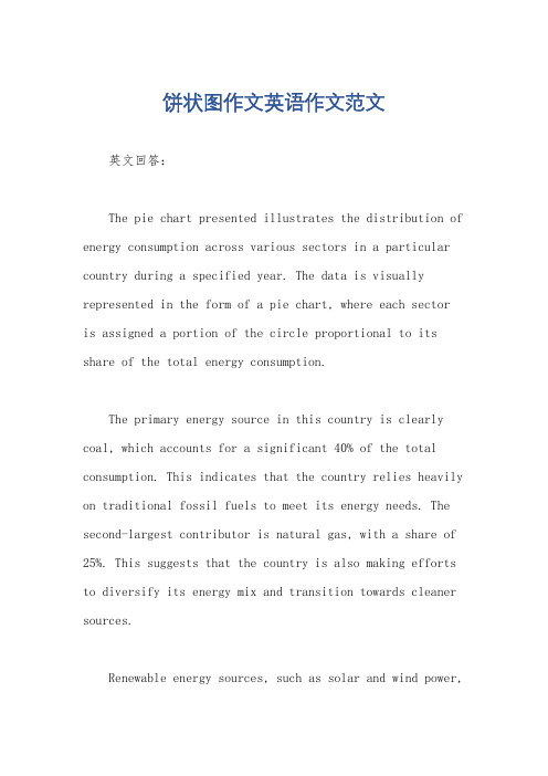
饼状图作文英语作文范文英文回答:The pie chart presented illustrates the distribution of energy consumption across various sectors in a particular country during a specified year. The data is visually represented in the form of a pie chart, where each sectoris assigned a portion of the circle proportional to its share of the total energy consumption.The primary energy source in this country is clearly coal, which accounts for a significant 40% of the total consumption. This indicates that the country relies heavily on traditional fossil fuels to meet its energy needs. The second-largest contributor is natural gas, with a share of 25%. This suggests that the country is also making efforts to diversify its energy mix and transition towards cleaner sources.Renewable energy sources, such as solar and wind power,play a relatively minor role, collectively accounting for only 15% of the total energy consumption. This highlightsthe need for the country to invest more in renewable energy technologies and reduce its dependence on fossil fuels.The transportation sector is the largest consumer of energy, accounting for 30% of the total. This is primarily due to the extensive use of gasoline and diesel-powered vehicles in the country. The industrial sector, which includes manufacturing and construction, accounts for the second-largest share (25%) of energy consumption. This indicates that the country has a strong industrial base and requires significant energy to power its industries.The residential and commercial sectors collectively account for 20% of the total energy consumption. This suggests that households and businesses are alsosignificant contributors to the country's energy demand. It is important to note that these sectors often rely on electricity for various purposes, such as lighting, heating, and cooling.The pie chart provides a clear and concise overview of the energy consumption patterns in the specified country. It highlights the dominance of traditional fossil fuels, the growing importance of natural gas, and the need for further investments in renewable energy sources. The data can serve as a valuable foundation for policymakers and energy planners to develop strategies for addressing the country's energy needs while promoting sustainability.中文回答:饼状图作文范文。
英语饼状图作文范文

英语饼状图作文范文In today's rapidly evolving world, education is constantly adapting to new trends and challenges. To gain a deeper understanding of the current state of education, it is instructive to analyze the distribution of various educational modes. This pie chart illustrates the percentage of students enrolled in traditional classrooms, online courses, and hybrid learning models.The pie chart is divided into three sections, each representing a different mode of education. The largest section, accounting for 45% of the total, is labeled "Traditional Classroom." This section represents students who attend physical schools and are taught by teachers in a face-to-face environment.The second section, labeled "Online Courses," comprises 30% of the chart. This segment represents students who opt for online education, either through platforms like Coursera, edX, or through their university's virtual learning management system.The smallest section, labeled "Hybrid Learning," makes up the remaining 25%. Hybrid learning combines traditional classroom learning with online resources and activities, offering a blend of both worlds.The distribution of these sections provides valuable insights into the current trends in education. Firstly, it is evident that traditional classroom learning still holds a significant position, indicating that many students and parents prefer the traditional model of education. However, the growing popularity of online courses is also apparent, indicating a shift towards more flexible and accessible forms of education.The emergence of hybrid learning models is particularly noteworthy. This mode of education combines the best of both worlds, offering the structure and interactivity of a traditional classroom along with the flexibility and convenience of online learning. Hybrid models are likely to gain further popularity as they cater to the diverse needs of modern students.Furthermore, this pie chart analysis reveals that the education landscape is becoming increasingly diverse. Whiletraditional classroom learning remains dominant, the increasing presence of online and hybrid models indicates that education is evolving to meet the needs of a more connected and technology-driven world.The implications of this trend are profound. Firstly, it highlights the need for teachers and educators to adapt to new teaching methods and technologies to engage and educate modern students. Secondly, it underscores the importance of providing students with a variety of learning options to cater to their unique needs and preferences. Finally, it emphasizes the need for continuous innovation in education to prepare students for the challenges and opportunities of the future.In conclusion, the pie chart analysis of educational modes reveals a dynamic and evolving landscape. The traditional classroom model remains strong, but online and hybrid models are gaining popularity, indicating a shift towards more flexible and diverse forms of education. This trend underscores the need for continuous innovation and adaptation in the field of education to meet the needs of modern students and prepare them for the future.**教育面貌的变迁:饼状图分析**在当今快速发展的世界中,教育正在不断适应新的趋势和挑战。
- 1、下载文档前请自行甄别文档内容的完整性,平台不提供额外的编辑、内容补充、找答案等附加服务。
- 2、"仅部分预览"的文档,不可在线预览部分如存在完整性等问题,可反馈申请退款(可完整预览的文档不适用该条件!)。
- 3、如文档侵犯您的权益,请联系客服反馈,我们会尽快为您处理(人工客服工作时间:9:00-18:30)。
placement appears in the programs naturally. And 15% of them consider it necessary for CCTV to make money from product placement, which is of great benefit to the development of CCTV itself. However, among the people surveyed, more than one third of them complain that the product placement has nothing to do with the programs. 25% of them even feel hurt seeing so much of it. Furthermore, the rest 10% hold the view that great harm has been done to the image of CCTV.
As far as I am concerned, as a saying goes, every coin has two sides, this practice has both advantages and disadvantages. On the one hand, it can make some products famous and bring considerable profits. On the other hand, it may have a negative effect on people’s interest, so more attention should be paid to the product placement.
conclusion that different people have / hold different opinions towards the product placement. According to / From the pie chart, we can draw a conclusion that most people are against this practice.
佳作:
The 2010 Spring Festival Gala has set records for TV commercial rates, which accordingly has caused heated discussion due to product placement in the programs.
百分数所表达的意义及正确的表达法 15% of the people have the view that this action can cater to the need of the development of CCTV, but 10% of the people think quite differently that the product placement can do harm to the image of CCTV . Besides, 25% of the people think there are too many advertisements placed during the performances and they have nothing to do with/ have no relation to the programs, which makes audience feel annoyed. On the contrary, 20% of the people conveyed think it is natural to place advertisements. 描述不错,但思路混乱。
As is shown in the pie chart, different people hold different opinions towards the practice. Some people are in favor of this kind of practice. About 15% people hold the opinion that it is needed for the development of Gala. Another 20% think it natural to place advertisements in the programs, which does not affect people’s interest in the performance to a degree.
However, others hold the opposite opinion. 10% people think this kind of phenomenon does do great harm to the image of CCTV. Besides, 15% of the conveyed complain there are too many advertisements, which will make the Spring Festival Gala boring. The other 30 percent of the people consider that the advertisements are not related to the programs .
个人观点: 1. As far as I am concerned, the disadvantages of
the product placement outweigh the advantages of it. There is no doubt that the commercial advertisements will bring great profits to CCTV. But no one can deny the fact that it will change the meaning of the Spring Festival Gala. Meanwhile, it can ruin the image of CCTV. 2. As far as I am concerned, the product placement shouldn’t appear in the programs. Although CCTV can make plenty of money through the practice, they shouldn’t ignore the negative effects due to the product placement. CCTV represents China so they must know that a good image is more important than profit in a long run.
饼状图作文
I.饼状图作文写作注意的要点:
百分数所表达的意义及正确的表达法:如“20%的人认为 广告植入可以接受。”的英语表达法为:20% people (20% of the people ) think / hold the opinion that the product placement is acceptable .
2. 饼状图往往是对一种社会现象的看法,所以往往用现 在时来描述。而许多学生用错了时态
例文(苏州二检卷:春晚广告范文)
The 2010 Spring Festival Gala has set records for TV commercial rates, which accordingly has caused heated discussion due to product placement in the programs.
From the chart we can draw a conclusion that most of the people surveyed are against product placement in the programs. In my opinion, product placement nowadays is almost unavoidable, but it should not damage the art of the show and should take the audience’s feelings into account .
II.学生佳句、佳作:
导入话题: As the pie chart shows, different people have / hold
different opinions towards the product placement. By analyzing the pie chart, we can come to a
20% people think that it is natural to play advertisements during the performances, which will not do harm to the performances. 15% people hold the opinion that it can satisfy the needs of the development of CCTV. However, every coin has two sides. 30% people think that the advertisements have no connection with the performances and 25% of the people point out that too many advertisements make the performances boring, which will make the audience lose interest in it .In addition , 10% people think this practice does damage to the image of CCTV.