雅思小作文剑桥真题饼图归纳
雅思小作文饼图常用词汇、万能句型、范文整理
雅思小作文饼图常用词汇、万能句型、范文整理一、饼图常用词汇1.占比词汇-account for:占据-constitute:构成-make up:组成-represent:代表-comprise:包括-occupy:占有-consist of:由……组成2.描述数据词汇-significant:显著的-considerable:相当大的-minor:较小的-negligible:可以忽略的-substantial:大量的-slight:轻微的-moderate:适度的3.比较词汇-similar:相似的-different:不同的-compare with:与……相比1-in contrast to:与……形成对比-while:然而-whereas:然而-on the other hand:另一方面4.其他常用词汇-proportion:比例-segment:部分-percentage:百分比-distribution:分布-category:类别-sector:扇形二、饼图万能句型1.开头句型-The pie chart illustrates the proportion of categories in a specific field.-The pie chart provides information about the distribution of various segments.-The pie chart depicts the percentage of different categories in a given context.2.数据描述句型-Category A accounts for a significant proportion of the total, reaching XX%.-XX%of the total is occupied by CategoryB.emiring it the largest segment.2-Category C constitutes a considerable part, comprising XX%of the pie chart.-The proportion of Category D is relatively minor, only accounting for XX%.3.比较句型-In comparison with Category A, Category B has a higher percentage of XX%.-While Category A occupies XX%,Category B represents a larger proportion of XX%.-The distribution of Category C is similar to that of Category D, both comprising XX%.-In contrast to Category A, the percentage of Category B is significantly lower, at XX%.4.总结句型-Overall, the pie chart reveals a clear distribution of categories in the given field.-In summary, the majority of the pie chart is occupied by Category A, followed by Category B.-It can be concluded that Category C and Category D play minor roles in the overall distribution.三、实战演练题目:The pie chart below shows the main reasons for traffic accidents in a particular area. Summarise the3information by selecting and reporting the main features, and make comparisons where relevant.答案:The pie chart illustrates the main reasons for traffic accidents in a specific area. Upon analysis, several key points can be identified.First and foremost, the largest proportion of traffic accidents is caused by driver error, accounting for 45%of the total. This is followed by poor weather conditions, which constitute 25%of the accidents. Vehicle defects and road conditions each occupy 10%of the pie chart, while the remaining 10%is attributed to other factors.In comparison, driver error is the most significant factor, nearly doubling the percentage of poor weather conditions. Meanwhile, vehicle defects and road conditions share the same proportion, both comprising a minor part of the total.Overall, the pie chart reveals that driver error is the primary cause of traffic accidents in the given area, with poor weather conditions being the second most common factor. Other factors, such as vehicle defects and road conditions, play relatively minor roles in the overall distribution.4。
雅思图表写作:饼图(复习)

W Skills
riting
表达-5:
B公司的销售收入 排行第一,约7000 万美元。
B Company tops the list, with a sales figure about $70 million.
统计数据句型
W Skills
riting
表达-6:
中国有13亿人口, 占世界总人口的 五分之一。
China has 1.3 billion people, accounting for one fifth of the world’s population.
统计数据句型
W Skills
riting
表达-7:
十二人有硕士学 位,占职工总数 的四分之一。
There are 12 staff members with master’s degree, making up nearly a quarter of the workforce.
W Skills
实战练习
RITING
饼图写作练手
教材 P217 现在做!(只描述饼图。) Now, work!( 10 minutes )
P217饼图主体段写作示范1
As can be seen from the pie chart, it is thought that the costs of adult education should be shared by three sections: taxpayer, individual and employer. (第一句话综括组成部分,下面细说。) To be more specific, individual (对象-1) should pay (主要趋势) the largest portion, making up (极 值趋势) 40% (极值-最大) of the whole costs. Compared with individual, the proportion of taxpayer (对象-2) is less, (极值-最小) accounting for (极值趋势) 25% (数值). Then, the percentage of employer (对象-3) stands at (主要趋势) the middle of the list, which constitutes (极值-中) 35% (数值).
雅思小作文各种图题、表格题技巧总结
雅思小作文各种图题、表格题技巧总结雅思作文Task 1受图表内容的限制,遣词造句的要求非常有限,只需针对考试,把核心表达用准用熟即可,所谓博大不如精深。
下面是威学教育雅思教研组总结的雅思小作文线图题、柱形图题、饼图题、表格题以及流程图等的写作总结!线图、柱状图、饼图,表格题介绍段introduction介绍段内容几乎完全不用创新,就是对题目文字部分的第二段做改写,paraphrase the rubric.所谓改写,要么换词,要么换句式。
例如:(I4-100)The charts below give information about travel to and from the UK and most popular countries for UK residents to visit.换词(1) 图 The charts图:chart, graph(雅思写作中完全等价,无差别)线:line / curve chart柱图:bar / column graph饼:pie chart表:table / statistics / figures(2) 动词“表明”give information about介绍段是客观描述,用一般现在时态,give information about 虽然在这篇作文中最好不再用,但是informal learning,随手学到的东东,留作其它文章再用。
替换的词语和结构很多,比如我常用的show /illustrate / demonstrate/compare,大家也可以选几个自己喜欢并且拼写准确的形成风格。
第二段其余部分的替换因题而异,比如travel换成visitthe UK换成Britain(注意不是England,英格兰只是Britain的一部分)popular换成fashionablecountry换成nationUK residents to visit换成UK tourists不过随着练习作文数量的增加,你会惊喜的发现,雅思图表作文,连描述的对象都是类似的。
解析雅思小作文中线图+饼图的写作构思及例题示范
解析雅思小作文中线图+饼图的写作构思及例题示范雅思小作文多图写作是一个大的趋势,越来越多的组合图出现更加证明了这一点。
在此,我们先来介绍最常见的一种组合图,线图+饼图的写作构思及例题示范,帮助大家顺利攻克雅思小作文。
看到题目是由线图和饼图组成的多图组合,我们可以按以下3个思路构思:1. 饼图和曲线图各自展示了什么数据在哪个时间点或段的变化特征?2. 在饼图中,数据总值为多少?它由几部分组成?每一部分各代表什么?各自所占百分比又是多少?百分比从大到小如何排列的?谁最大?谁最小?3. 曲线图有何特征?根据特征,曲线可以分成几段来描述?起点值、终点值、峰值、谷值多少?各自对应的时间点又是什么?现在,我们再来看一道例题:WRITING TASK 1:You should spend about 20 minutes on this task.* The chart and graph below give information about sales and share prices for Coca-Cola.* Summarise the information by selecting and reporting the main features, and make comparisons where relevant.You should write at least 150 words.范文:The pie chart shows the worldwide distribution of sales of Coca-Cola in the year 2000 and the graph shows the change in share prices between 1996 and 2001.In the year 2000, Coca-Cola sold a total of 17.1 billion cases of their fizzy drink product worldwide. The largest consumer was North America, where 30.4 per cent of the total volume was purchased. The second largest consumer was Latin America. Europe and Asia purchased 20.5 and 16.4 per cent of the total volume respectively, while Africa and the Middle East remained fairly small consumers at 7 per cent of the total volume of sales.ince 1996, share prices for Coca-Cola have fluctuated. In that year, shares were valued at approximately $35. Between 1996 and 1997, however, prices rose significantly to $70 per share. They dipped a little in mid-1997 and then peaked at $80 per share in mid-98. From then until 2000 their value fell consistently but there was a slight rise in mid-2000.。
雅思小作文题型整理
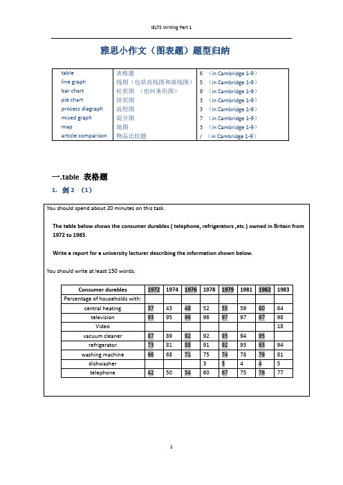
雅思小作文(图表题)题型归纳一.t able 表格题1.剑2 (1)4.剑5(4)6.剑7(1)二.Line graph线图(含直线和曲线图)1.剑3(4)You should spend about 20 minutes on this task.The graph below shows the unemployment rates in the US and Japanbetween March 1993 and March 1999.Write a report for a university lecturer describing the information shownbelow.You should write at least 150 words.You should spend about 20 minutes on this task.The graph below shows the proportion of the population aged 65 and overbetween 1940 and 2040 in three different countries.Summarize the information by selecting and reporting the main features,and make comparisons where relevant.Write at least 150 words.You should spend about 20 minutes on this task.The graph below shows the consumption of fish and some different kinds of meatin a European country between 1979-2004.Summarize the information by selecting and reporting the main features, andmake comparisons where relevant.Write at least 150 words.You should spend about 20 minutes on this task.The graph below shows the quantities of goods transported in the UK between 1974 and 2002 by four different modes of transport.Summarize the information by selecting and reporting the main features, and make comparisons where relevant.Write at least 150 words.5.剑9(4)三.Bar chart 柱状图You should spend about 20 minutes on this task.The chart below shows the amount of leisure time enjoyed by men and women of different employment status.Write a report for a university lecturer describing the information shown below.Write at least 150 words.Leisure time in a typical week: by sex and employment status,1998-99You should spend about 20 minutes on this task.The table below shows the figures for imprisonment in five countries between 1930 and 1980.Write a report for a university lecturer describing the information shown below.You should write at least 150 words.You should spend about 20 minutes on this task.The chart below shows the amount spent on six consumer goods in fourEuropean countries.Write a report for a university lecturer describing the information shown below. You should write at least 150 words.You should spend about 20 minutes on this task.The charts below show the level of participation in education and sciencein developing and industrialized countries in 1980 and 1990Write a report for a university lecturer describing the information shown below. You should write at least 150 words.5.剑4(3)You should spend about 20 minutes on this task.The chart below shows the different levels of post-school qualifications inAustralia and the proportion of men and women who held them in 1999.Summarize the information by selecting and reporting the main features,and make comparisons where relevant.You should write at least 150 words.You should spend about 20 minutes on this task.The charts below show the main reasons for study among students ofdifferent age groups and the amount of support they received from employers.Summarize the information by selecting and reporting the main features,and make comparisons where relevant.You should write at least 150 words.You should spend about 20 minutes on this task.The charts below give information about USA marriages and divorce ratesbetween 1970 and 2000, and the marital status of adult Americans in twoof the years.Summarize the information by selecting and reporting the main features,and make comparisons where relevant.You should write at least 150 words.You should spend about 20 minutes on this task.The chart below shows information about changes in average house prices in fivedifferent cities between 1990 and 2002 compared with the average house prices in 1989.Summarize the information by selecting and reporting the main features, and makecomparisons where relevant.You should write at least 150 words.四.Pie chart饼图1.剑7(4)2.剑8(2)3.剑9(3)五.流程图1.剑1(2)You should spend about 20 minutes on this task.The diagrams below show the life cycle of the silkworm and the stages inthe production of silk cloth.Summarize the information by selecting and reporting the main features,and make comparisons where relevant.Write at least 150 words.六.混合图。
雅思小作文饼状图与描写比例
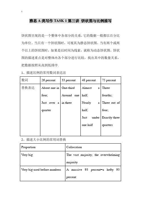
雅思A类写作TASK 1第三讲饼状图与比例描写饼状图呈现的是一个整体中各部分的关系,它的数据一般都以百分比为单位。
当只有一个饼状图时,可视其为静态饼状图。
当有两个或两个以上的饼状图时,如果是以时间为线索,就称为动态饼状图。
饼状图的描述重点是对整体内各个部分进行比较,找出其中的数量关系,把数据按照从高到低排序.1、描述比例的常用数词表达法2、描述大小比例的常用词替换3. 描写倍数关系的表达法及例子3、描写比例的词汇及句型范例4、相同与相异的表达方法Sample1The pie charts below illustrate the number of journal articles read per week by all students, PHD students, and junior lecturers at an Australian university.A thatB respectivelyC for exampleD howE butF whichG meanwhileH whereasI andJ who1.The three charts illustrate ______many articles from academic journals are read weekly by PHD students _______junior lecturers compared to other students at an Australian university.2._________the overwhelming majority of those studying doctorates read at least twelve articles per week in comparison with the average student.3.The figures were 80 percent and twelve percent________.4.Furthermore, only five percent of PHD level students read between one and five articles,__________the average for all students in this category is a hefty 67%.5.______, for junior lecturers the pattern appears to be slightly different.6.Most read six or more articles per week (99%), ______out of this total 24 percent read twelve or more, ______is almost a third of the corresponding figure for PHD level students.7.It is clear ______those students _____are researching for a PHD read more articles than tither junior lecturers or other students.Sample 2:A stood atB a rise ofC lost ground toD made byE respectivelyF at the expense ofG that ofH on whetherI as opposed to J captured K exceededThe pie charts show the market share of washing machines_____four companies over the period 1990 to 2000 and the results of asurvey______customers would consider buying the new Sanyo washing machines over the same period.During the first year of sales of the new Sanyo machine in 1990, its market share______two percent_______60 percent for the Panasonic product,m 20 percent for the Haier washing machines and 18 for _______Samsung. In 1995, however, Panasonic Ltd.______its three other competitors. While Haier Ltd and Samsung Ltd both increased their market share by one percentage point each in 1995, Sanyo Ltd______8% of the market ,______300%.In 2000, Sanyo’s market share had increased to 31%______its three main competitors with Panasonic Ltd, Samsung and Haier Ltd falling to 39 percent, 17 percent and 12 percent _______. The bar chart shows that Sanyo machine________its popularity rating in each year, rising from 5 in 1990 to 40 in the year 2000.It is clear from the data that sales of the Sanyo washing machine were on the increase over the period.Sample 3:This pie chart shows the distribution of the world population in 2000.1.in 2000, the percentage of people in Asia ________(stand at) 52%.2. The ______(high) proportion went to_______(Asian) with 52% of the world total population.3.Next ______(come) Africa at 11%. had nearly _______(fourth) times more population than Europe.5.The population of Asia was_______(large) than the _____(combine) population of all the other regions.6. The proportion of Asia was more than ______(fourth) times greater than that of Europe.7. The population of Europe was less than _______(a five) of that of Asia.8. The percentages of Europe and Middle East were____the (same)9. The population percentage of Europe was almost_______(identically)to that of Africa.10. There was a significant ______(differ) in population percentages between Asia and the other regions.Task 1Task 2You should spend about 20 minutes on this task.The two graphs show the main sources of energy in the USA in the 1980s and the 1990s.Write a report for a university lecturer describing the changes which occurred.Write at least 150 words.Task 3You should spend about 20 minutes on this task.Write a report for a university lecturer describing the information shown below.You should write at least 150 words.Task 4These pie charts show Japan’s population distribution by age in the three years of 2000, 2005 and 2010.Task 1The charts compare the sources of electricity in Australia and France in the years 1980 and 2000. Between these years, electricity production almost doubled, rising from 100 units to 170 in Australia, and from 90 to180 units in France.In 1980 Australia used coal as the main electricity source (50 units) and the remainder was produced from natural gas, hydro power (each producing 20 units) and oil (which produced only 10 units). By 2000, coal had become the fuel for more than 75% of electricity produced and only hydro continued to be another significant source supplying approximately 20%.In contrast, France used coal as a source for only 25 units of electricity in 1980, which was matched by natural gas. The remaining 40 units were produced largely from oil and nuclear power, with hydro contributing only 5 units. But by 2000, nuclear power, which was not used at all in Australia, had developed into the main source, producing almost 75% of electricity, at 126 units, while coal and oil together produced only 50 units. Other sources were no longer significant.Overall, it is clear that by 2000 these two countries relied on different principal fuel sources: Australia relied on coal and France on nuclear power.Task 2The two graphs show that oil was the major energy source in the USA in both 1980 and 1990 and that coal, natural gas and hydroelectric power remained in much the same proportions. On the other hand, there was adramatic rise in nuclear power, which doubled its percentage over the ten years.Oil supplied the largest percentage of energy, although the percentage decreased from 42% in 1980 to 33% in 1990. Coal in 1990 was the second largest source of energy, increasing its proportion to 27% from 22% in the previous decade. Natural gas, the second largest source in 1980 at 26%, decreased its share very slightly to provide 25% of America's energy ten years later. There was no change in the percentage supplied by hydroelectric power which remained at 5% of the total energy used. Nuclear power the greatest change: in 1990 it was 10%, twice that of the 1980s.Task 3In this analysis we will examine three pie charts. The first one is headed 'World Spending.' The second is 'World Population' and the third is 'Consumption of Resources.'In the first chart we can see that people spend most of their income (24%) on food. In some countries this percentage would obviously be much higher. Transport and then housing are the next major expenses at 18% and 12% respectively. Only 6% of income is spent on clothing.In the second chart entitled 'World Population', it is not surprising to find that 57% of people live in Asia. In fact China and India are two of the most populated countries in the world and they are both situated on thiscontinent. Europe and the Americans account for nearly 30% of the total, whilst 10% of people live in Africa.Finally, the third chart reveals that the USA and Europe consume a huge 60% of the world's resource.To sum up, the major expenditure is on food, the population figures are the highest for Asia and the major consumers are the USA and Europe. Task 4These pie charts given concern how Japan’s population was distributed by age in three separate years: 2000, 2005 and 2010.It is apparent from the information supplied that in spite of a continuous decrease, Japanese aged 15-64 occupied the highest proportion in the three years. The number of the elderly above 64 was on the rise ; by contrast, young children under 15 was on the decline.In 2000, people aged 15-64 occupied the highest percentage among the three age groups and the highest in the three years as well. People older than 64 represented 17% of the total population and young people aged 0-14 stood at 15%.In 2005, both groups of people under 15 and 15-64 experienced a slight decrease of 1% and 2% respectively, in spite of a 3% increase in aged people.In 2010, there was a further drop of 1% and 2% in the percentages ofpeople younger than 15 and 15-63 but a continual climb of 3% in aged people.Clearly, as time goes by, Japan is becoming an aging population.。
雅思作文写作Task 1第二课时—柱状图和饼状图
图表作文讲解2:柱状图和饼状图学生面授老师时间本次课时雅思写作第二课时教学思路1.作文简介、写作技巧2.实例讲解3.分析总结4.课后作业教学目标柱状图、饼状图知识点讲解基本特征和写作方法实例分析讲解重点写作技巧讲解范文学习柱状图和饼状图写作方法备考资料剑桥IELTS4-8教学详细内容:一、写作技巧详解1.柱状图特点➢柱状图是动态图表,切入点是描述趋势。
➢柱状图写作注重“比较”(找出similarity)和“对比”(找出difference),也就是说需要横向总结所有柱状图表的共性特征,也要分别描写各个柱子的个性特征。
➢两种写作方式:其一是对不同时间段内的数据进行比较,适合于数据代表的物体较少且时间界限明确的情况。
另外是对单独数据的全程描述,适合于描述数据对象很多且时间划定不清晰的情况。
2.饼状图特点饼形图与柱形图或者线形图所截然不同的是它没有了横轴与纵轴,而以饼形的分割来表示百分比,可以依照三步审题分析法来进行观察:➢观察共有几张饼状图,以及它们之间的关系是什么(一般说来,雅思图表题中极少见到单饼图);➢观察每张饼状图中有哪几个区域,以及各个区域分别代表什么;➢观察单个饼状图中各区域间的百分比差异,以及相同区域在各个饼状图间的百分比的比较或发展。
饼状图是所有图表题中最好写的一种,唯一值得注意的地方在于如何丰富百分比的表达和“占”的表达,要采取多样性的表达,如25%=a quarter of, 50%=half of, >50%=a/the majority of.描写饼状图中的比例构成就是饼状图图表作文的重点,但也应注意,这种描述并不是对图形的简单重复,对各项数据比例的描述应建立在归纳整理的基础上有条理地进行。
学生不仅要善于找数据,更重要的是要善于从数据或比例中升华出来,找到规律和本质。
常用词汇、句型及模板1.柱状图1)倍数的表达今年的产量是去年产量的两倍➢The output this year is two times(twice) more than last year’s.➢As much as 不可数名词 as many as 可数The books of this semester are two times as many as that of last semester. ➢ A is two times the amount of B不可数➢ A is two times the number of B可数2) 常用套句➢There was …in the number of A from …to … (over next years), which was followed by … and then… until…when there was … for the next … years.➢From…onwards, there was … in the number of A which then increased / decreased …at …% in …➢In …, the number reached (was) …%, but (30) years later there was …➢The number of A increased rapidly from … to … during the (five-year) period. ➢In the (three years) from … through…, the percentage of A was slightly larger / smaller than that of B.➢The graphs show a threefold increase in the number of A.➢Here is an upward trend in the number of A.➢… (year) witnessed / saw a sharp rise in A.2.饼状图1)常用词:percentage, proportion, make up, constitute, account for, take up, ..isdivided into…parts, consume the largest/smallest portion.2)例句:➢The graph, presented in a pie chart, shows the general trend in…..➢The percentage of A in … is more than twice tha n that of B.➢The biggest loss was to A area.➢There is not a great deal of difference between A and B.➢In general positions, females outnumber males.➢ A much greater percentage of men than women are found in managerial positions. ➢The profit of company A doubled from May to September.3)模板:➢The two pie charts describe ………………………➢The first point to note is …………………………➢Comparing the graphs, …………………………….➢The graphs also suggest that ………………………➢In conclusion, it can be seen from the data that …………………..4)饼状图作文模型The two pie charts illustrate the significant changes in people’s ways of communication from 1970 to 1995.The first graph shows that in 1975, the most popular way to communicate was letter writing, with the percentage of 50%. Others ___________________________, the figures are 32% and 18% respectively.It can be seen from the second graph that ways of communication changed a lot in two decades. By 1995, ______________________________. By contrast, ________________________________.Comparing the two pie charts, we can see that the use of the phones and computers during the same period had both risen considerably. However, letter writing became less popular among the people.In general, people inclined to use more modernized mediums to communicate with others, while the traditional way became less employed.The pie chart depicts the proportion of ___________________________. It consists of six segments, the largest one representing _________, which account for 26% of the total. _____________ takes up 21%, becoming the second largest.__________________________________. The rest proportions, 15% of all, constituting 5% and 10% respectively.From the chart it can be seen clearly that ________________________.二、实例分析分析思路:1.第一幅柱状图的描述单位是百万,即人数;第二幅则是百分比。
剑桥雅思真题小作文题目分类总结
题型1——Table〔表格〕Cambridge IELTS 4TEST 1:The table below shows the proportion of different categories of families living in poverty in Australia in 1999.Summarise the information by selecting and reporting the main features,and make parisons where relevant.Cambridge IELTS 5TEST 4:The table below gives information about the underground railway systems in si* cities.Summarise the information by selecting and reporting the main features,and make parisons where relevant.Cambridge IELTS 6TEST 2:Thetable below gives information about changes in modes of travel in England between 1985 and 2000.Summarise the information by selecting and reporting the main features,and make parisons where relevant.Cambridge IELTS 7TEST 1:The table below gives information on consumer spending on different items in five different countries in 2002.Summarise the information by selecting and reporting the main features,and make parisons where relevant.题型2——Line Graph〔线性图〕Cambridge IELTS 5TEST 1:The graph blew shows the proportion of the population aged 65 and over between 1940 and 2040 in three different countries.Summaries the information by selecting and reporting the main features,and make parisons where relevant.Cambridge IELTS 7TEST 2:The pargh below shows the consumption of fish and some different kinds of meat in European country between 1979 and 2004.Summarise the information by selecting and reporting the main features,and make parisons where relevant.Cambridge IELTS 8TEST 4:The graph below shows the quantities of goods transport in the UK between 1974 and 2002 by four different modes of transport.Summarise the information by selecting and reporting the main features and make parisons where relevant.题型3——Bar Chart〔条形图/柱状图〕Cambridge IELTS 4TEST 3:The chart below shows the different levels of post-school qualifications in Australia and the proportion of men and women who held them in 1999. Summaries the information by selecting and reporting the main features, and make parisons where relevant.Cambridge IELTS 5TEST 2:The charts below show the main reasons for study among students of different age groups and amount of support they received from employers.Summarise the information by selecting and reporting the main features,and make parisons where relevant.Cambridge IELTS 6TEST 4:The charts below give information about USA marriage and divorce rates between 1970 and 2000, and the marital status of adult America in two of the years. Summarise the information by selecting and reporting the main features,and makeparisons where relevant.Cambridge IELTS 7TEST 3:The chart below shows information about changes in average house prices in five different cities between 1990 and 2002 pared with average house prices in 1989. Summaries the information by selecting and reporting the main features, and make parisons where relevant.题型4——Pie Chart〔饼图〕Cambridge IELTS 7TEST 4:The pie charts below show units of electricity production by fuel source in Australia and France in 1980 and 2000.Summarise the information by selecting and reporting the main features, and make parisons where relevant.Cambridge IELTS 8TEST 2:The three pie charts below show the changes in annual spending by a particular UK school in 1981,1991,and 2001.Summarise the information by selecting and reporting the main features, and make parisons where relevant.题型5——混合图Cambridge IELTS 4TEST 2:The graph blew shows the demand electricity in Engliand during typical days in winter and summer.The pie chart shows how electricity is used in an average English home.Summarise the information by selecting and reporting the main features and make parisions where ralevant.Cambridge IELTS 4TEST 4:The charts below give information about travel to and from the UK, and about the most popular countries from UK residents to visit.Summarise the information by selecting and reporting the main features, and make parisons where relevant.Cambridge IELTS 6TEST 1:The graph and table below give information about water use worldwide and water consumption in two different countries.Summarise the information by selecting and reporting the main features,and make parisons where relevant.Cambridge IELTS 8TEST 1:The pie chart below shows the main reasons why agricultural land bees less productive. The table shows how these causes affected three regions of the world during the 1990s. Summarise the information by selecting and reporting the main features, and make parisons where relevant题型6——Process Diagram〔流程图〕Cambridge IELTS 6TEST 3:The diagrams below show the life cycle of the silkworm and the stages in the production of silk cloth.Summarise the information by selecting and reporting the main features,and make parisons where relevant.Cambridge IELTS 8TEST 3:The diagrams below show the stages and equipment used in the cement-making process, and how cement is used to produce concrete for building purpose.Summaries the information by selecting and reporting the main features, and make parisons where relevant.题型7——Map〔地图题〕Cambridge IELTS 5TEST 3:The map below is of the town of Garlsdon. A new supermarket(s) is planned for the town. The map shows two possible sites for the supermarket.Summarise the information by selecting and reporting the main features,and make parisons where relevant.。
雅思小作文---TASK1图表题
雅思小作文 T A S K 1 图表题规律注意事项:1 . Task1 是客观写作,要求客观真实。
2 . 客观性:不应该有任何图里没有而靠自己主观想象加入的成分。
结尾段针对图形做出的总结性结论也应该是根据图表的实际内容做出的符合逻辑的总结。
准确性:图表里面的数据介绍要力求精确,不能抄错数字。
但当一个特征点没有落在一个准确的坐标值上时,允许进行合理的目测或估计一个大概数值。
详尽性:要有层次感,并不需要把所有的数字都推到文章里。
3 . 类型Table 表格题Line Graph 线图Bar Chart 柱状图Pie Chart 饼状图Process Chart 流程图4 . 看图要注意单位,标题和图例。
5 . 对于多数小作文题,题中给出了几个图就对应的写出几个主体段。
题目里只给出一个图,根据图中包含几类图形元素写几个主体段。
图中只给了一个图,但图中所含图形元素很多,则分类。
题目中出现多线多柱多饼,用“对应提取法“,把每组里的对应元素提出来组织主体段。
6 . 时态和发生时间意义对应。
陈述永恒事实的句型,其主句的谓语动词必定用一般现在时。
若题目里没有出现时间,则全文都使用一般现在时。
7 . 结构开头段(1~2句)改写原题主体段1 总体概括具体介绍数字主体段N 总体概括具体介绍数字结尾段(1~2句)介绍总数(若图里并没有明确的给出总数,则省略)结论(根据图里的数据得出有一定合理性的结论)8 . 开头段的改写题目中ShowProportion InformationThe number/amount of FamilyMalesFemaleInfluence改写成illustrate /compare percentagedatathe figure for householdmenwomenaffect/effectCategories kinds/typesSubway system Storeunderground railway/train system shop9 . 介绍数据或描述变化趋势的常用词。
雅思写作小作文范文 雅思写作饼状图pie chart 学校花费.doc
雅思写作小作文范文雅思写作饼状图pie chart 学校花费今天我们雅思写作小作文范文的文章来研究下饼状图pie chart。
跟以前咱们见过的题目不同,这次有三个图形。
如此一来,数据就显得非常多和杂乱,十分考验大家挑选关键信息并进行比较的能力。
小编搜集了一篇相应的考官范文,以供大家参考。
雅思写作小作文题目The three pie charts below show the changes in annual spending by a particular UK school in 1981, 1991 and 2001.Summarise the information by selecting and reporting the main features, and make comparisons where relevant.雅思写作小作文范文The pie charts compare the expenditure of a school in the UK in three different years over a 20-year period.饼状图比较了一所英国学校在20年的时间跨度中三年的花费。
It is clear that teachers’ salaries made up the largest proportion of the school’s spending in all three years (1981, 1991 and 2001). By contrast, insurance was the smallest cost each year.很明显,教师的工资在所有三个年份(1981年,1991年和2001年)中占据学校花费的最大部分。
相比之下,保险在每一年里都是最小的花费。
In 1981, 40% of the school’s budget went on teachers’ salaries. This figure rose to 50% in 1991, but fell again by 5% in 2001. The proportion of spending on other workers’ wages fell steadily over the 20-year period, from 28% of the budget in 1981 to only 15% in 2001.1981年,学校预算的百分之四十用于教师的薪酬纸上。