【徐州朗阁雅思英语】雅思写作图表作文之曲线图写作攻略
雅思小作文曲线图写作步骤及常用表达

智 课 网 雅 思 备 考 资 料雅思小作文曲线图写作步骤及常用表达曲线图是雅思小作文图表类型题中常见的一个,下文小编为大家分享雅思小作文曲线图写作步骤,以及可能用到的一些表达方式,希望对大家的雅思写作有帮助!曲线图是雅思小作文图表类型题中常见的一个,下文小编为大家分享雅思小作文曲线图写作步骤,以及可能用到的一些表达方式,希望对大家的雅思写作有帮助!雅思小作文曲线图写作步骤:· 先根据横轴分析变化,然后再进行比较。
· 第一段介绍核心信息(e.g.时间地点研究对象);一句话即可。
· 第二三段先分析第一个时间点,再分析后一个时间点。
雅思小作文曲线图常用句型&短语:Excel in something = have advantage in something图表描述::The graph shows/illustrates/displays …· 表程度:Felldramatically/significantly/astonishingly/considerably/steadily to approximately 100 and 200 respectively; noticeable decrease.· Slightly/marginally more women than men …· 表上升 The graph showed an upward trend/ something soars to…; Increase/ rise/ grow/ go up/ improve/ climb/ boom/ leap· 表下降:decrease/fall/drop/dip/go down/decline/reduce· Exceed/overtake/outnumber – e.g. Men with postgraduate diplomas clearly outnumbered their female counterparts.· 数值相同:Coal as a source for only 25 units of electricity in 1980, which was matched by natural gas.· 数值不方便时可用括号表述。
【2019最新】雅思小作文攻略+范文:曲线图-word范文模板 (1页)

【2019最新】雅思小作文攻略+范文:曲线图-word范文模板本文部分内容来自网络整理,本司不为其真实性负责,如有异议或侵权请及时联系,本司将立即删除!== 本文为word格式,下载后可方便编辑和修改! ==雅思小作文攻略+范文:曲线图下面雅思为大家整理了雅思小作文攻略+范文:曲线图,供考生们参考,以下是详细内容。
曲线图范文 1:【第一句】 The curve illustrates the number of cases of A - type crimes committed in the UK between the years 1990 and 201X.【第二句】It can be seen that A - type crimes decreased dramatically to 200 cases around the middle of the 1990 s and then increased to 201X before the year 201X.范文 2:From the graph , we can see clearly that in the early morning ,at 6 a . m ., few people watch TV . However , from this time onwards , the number of TV audience is on the rise . At noon , the people watching TV account for about 8% of the total population . In the period between 12:00 and 2:00 p . m ., the TV audience experiences a sharp increase from 8% to approximately 18%.From 2:00 p . m . to 4:00 p . m ., the figure remains constantat about 18%, then balloons to the peak of the day , reaching approximately 50%. The number of TV audiences drops dramatically from 10 p . m . till it reaches its bottom at 3 p . m .On the other hand , there is a sharp increase in radio audience from 6. a . m to 9 a . m ., peaking at about 28% at 8:30 a . m . However , from this point onwards , it declines gradually for therest of the day , bottoming out at 4:00 a . m . the next day .In brief , the number of TV and radio audiences varies according to different phases of time probably due to the different features of these two media .。
(完整word版)雅思作文写作Task 1第一课时—曲线图、表格图

IELTS图表作文讲解:曲线图表格图范文分析:开头段(首段改写)The graph ①illustrates changes in the amounts of② beef, lamb, chicken and fish③consumed in a particular European country④ between 1979 and 2004。
①改写题目中的shows⑧下降表达,类似的有decrease, go down , decline, fall down ,drop ,sink。
这句话描写相反的趋势。
⑨交叉点⑩时间+上升表达⑪⑩最大值结尾段Overall,the graph shows how the consumption of ①chicken increased dramatically while the popularity of ②these other foods decreased over the period.①上升②下降,结尾段一般总结图中最主要的信息或最终要的趋势.❖TABLE③ 低于平均值的家庭类型情况④ 高于平均值的情况⑤ 倍数表达,清晰的对比⑥ 尾段对表中的主要类型的总趋势进行了重述Besides,此文章中作者用括号表达数据,很有新意,清晰三、结构及句型总结首段常用句型:1。
The table /graph shows (that)...2. The figures/statistics show (that)。
3. The diagram shows/ describes/ illustrates how。
.4。
According to/As (is) shown in the/As can be seen from the table/chart, diagram, graph, figures5. It can be seen/obse rved from the/ we can see from the…6. It is clear/ apparent from the table/chart/diagram/graph/figures (that)。
雅思写作Task1曲线图考官范文(6)
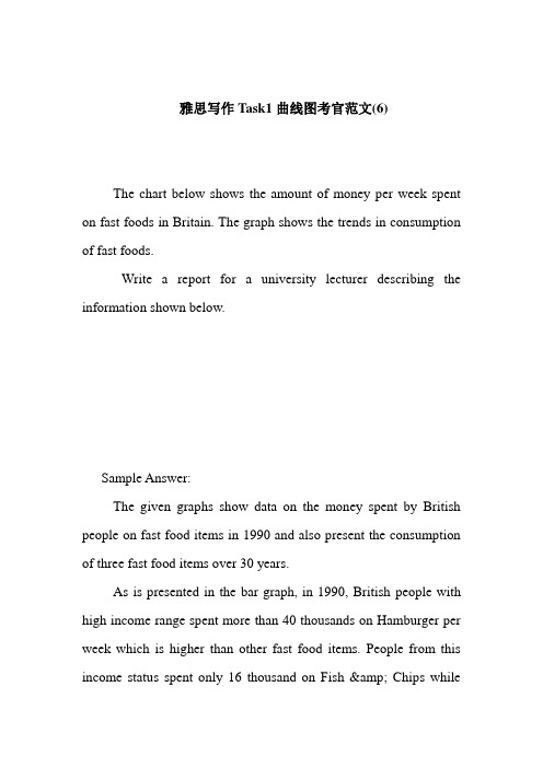
雅思写作Task1曲线图考官范文(6)The chart below shows the amount of money per week spent on fast foods in Britain. The graph shows the trends in consumption of fast foods.Write a report for a university lecturer describing the information shown below.Sample Answer:The given graphs show data on the money spent by British people on fast food items in 1990 and also present the consumption of three fast food items over 30 years.As is presented in the bar graph, in 1990, British people with high income range spent more than 40 thousands on Hamburger per week which is higher than other fast food items. People from this income status spent only 16 thousand on Fish & Chips whilethey spent around 18 thousand on Pizza in a week. Again Hamburger was the most popular fast food item in the medium income earning people also. They spent over 30 thousand dollar on this food item while they spent only 25 thousand on Fish & Pizza and 11 thousand on Pizza. Finally among the low income group, the fish & chips was the most popular fast food item as they spend most on this item (17 thousand per week). Their expenditure of pizza was only 6 thousand per week while they spent 14 thousand per week on hamburger.According to the line graph, people consume pizza more than any other fast food items in 1970. In this year UK citizens consumed more than 300 tons of pizza while the consumed only 100 tons of hamburger and fish & chips. The percentage of pizza consumption started declining and reached to only 200 tons on 1990. On the contrary, the popularity of the fish and chips reached to 500 tons in 1990 from the initial consumption volume of 80 tons. Finally the consumption of hamburger also increased over the year and reached to around 300 tons in 1990 from the initial amount of 20 tons.(Approximately 280 words)。
雅思写作之图表题答题技巧

雅思写作之图表题答题技巧
1.仔细审题
在开始写作之前,要认真阅读题目要求,明确图表的主题和要求,确保理解图表中的数据和信息。
2.确定图表类型
根据题目要求,确定图表类型,如柱状图、折线图、饼图等。
不同类型的图表有不同的写作要点和技巧,要熟悉每种类型的图表特点和写作方法。
3.概括图表主要特征
在描述图表之前,要概括图表的主要特征,如总体趋势、重要数据点等。
这有助于把握图表的整体情况,为后续的写作提供思路和方向。
4.描述图表细节
在描述图表时,要注意细节的描述,如数据的最大值、最小值、数据的波动情况等。
这些细节有助于让读者更好地理解图表中的数据和信息。
1
5.使用适当的图表语言
在描述图表时,要使用适当的图表语言,如“随着时间的推移”、“比例”、“增加”、“减少”等。
这些语言可以帮助读者更好地理解图表中的数据和趋势。
6.注意比较和对比
在描述图表时,要注意比较和对比不同数据点之间的关系和差异,这有助于突出数据的重点和特点。
7.总结和展望
在描述完图表后,可以总结图表中的信息和重点,并展望未来的趋势和发展。
这有助于让读者更好地理解图表的意义和价值。
以上是雅思写作图表题的答题技巧,考生可以在备考过程中多做练习,提高自己的图表分析和写作能力。
同时,也要注意积累词汇和表达方式,以便更好地应对不同类型的图表题目。
2。
雅思写作task 1 曲线图

• 引言: • 1.直接开门见山,给曲线下定义,即日期,地点,曲 线讲述了什么内容。(第一句,注意时态用一般现 在时) • The graph shows....... • (chart,table,diagram)(indicates,illustrates,describes,gi ves,presents,reveals) • eg:The graph shows the number of cases of X disease in Someland between the years 1960 and 1995 • 2.第二句,第三句要总结出曲线的总体趋势(要注 意使用的时态) • eg:It can be clearly seen that X disease increased rapidly to 500 cases around the 1980s and then dropped to zero before 1999,while Y disease fell consistently from a high point of nearly 600 case in1960 to less that 100 cases in 1996
• 避免重复: • 如果是准确使用了各种结构和大量的词 汇,得分就会很高。
两条曲线
•
You should spend about 20 minutes on this task.Write a report for a university lecturer describing the information in the graph below.You should write at least 150 words.
• • •
考生答卷一: The graph shows the rate of smoking in Someland. In1960,600 men in every 1000 was smoking.This number decreased gradually to 500 by 1974 and continued to decrease but more steeply to 300 in 1996.In contrast the rate of women smokers in1960 was very low at onlt 80 in every1000.This number incresed to 170 by 1968 and increased again but more steeply to 320 in 1977.The rate of female smokers then remained stable at 320 until 1984 at which point the figures began to decline and had dropped to 250 by 1995. 考生答卷二 The graph compares the rate of smoking in men and women in Someland between the years1960 and 2000.It can be clearly seen that the rate of smoking for both men and women iacurrently declining and that fewer women have smoked throughout the period. In 1960,600men in ever 1000 was smoking.This number decreased gradually to 500 by 1974 and continued to decrese but more steeply to 250 in 2000.In contract,the rate of smoking in women in1960 was very low at only 80 in ever 1000.By 1968 this increased to 170,and increased again but more steeply to 320 in 1977.The rate of female smokers then remained stable at 320 until 1984 at which point the figures began to decline and had dropped to 200 by 2000. In conclusion ,we can see that the rate of smoking in men dropped throughout the whole period but was always at a higher level than the female figures, The rate of smoking inwomen increased until 1977 but then decreased for the rest the period.
雅思作文之曲线图——词汇、句型及案例分析
雅思作文之曲线图——词汇、句型及案例分析曲线图1 解题关键 (1)2曲线图举例 (2)3曲线图常用词汇 (4)4曲线图常用表达 (8)5曲线图模板 (10)1 解题关键1曲线图和柱状图都是动态图,解题的切入点在于描述趋势。
2在第二段的开头部分对整个曲线进行一个阶段式的总分类,使写作层次清晰,同时也方便考官阅卷。
接下来再分类描述每个阶段的specific trend,同时导入数据作为分类的依据。
3趋势说明。
即,对曲线的连续变化进行说明,如上升、下降、波动、持平。
以时间为比较基础的应抓住“变化”:上升、下降、或是波动。
题中对两个或两个以上的变量进行描述时应在此基础上进行比较,如变量多于两个应进行分类或有侧重的比较。
4极点说明。
即对图表中最高的、最低的点单独进行说明。
不以时间为比较基础的应注意对极点的描述。
5交点说明。
即对图表当中多根曲线的交点进行对比说明。
6不要不做任何说明就机械地导入数据,这不符合雅思的考试目的。
P1 This line graph illustrates the fluctuation of....rate or this line graph shows/indicate/discuss....In general, the figures reveal that 是什么内容,总体趋势要交代(如果有的话)P2 主体:少于三根分别描述the figure f123....the figure f123...多于三根归类描述。
On the contrary.....P3 结尾From these figures, we can see that......(开头描述趋势,结尾不写;开头没,结尾就要写)remain at; jump sharply from; reach the peak of; take up; fluctuate around; increase suddenly to; fall rapidly between 时间;come steep decrease; bottom out to百分比;increase sharply; fall to 百分比;exceed; there is a steady decline to百分比;remain stable at; drop to百分比;drop gradually to百分比;rise slightly to 百分比;significantly exceed2曲线图举例先请大家看曲线图,并思考以下问题:* 曲线有何规律特征?* 根据曲线特征,其大致可以分成几大段以便写作描述?* 峰值、谷值各自多少?对应的月份又是什么?* 曲线变动过程中有无出现平稳?图一:Dubai Gold Sales 2002(Estimates)graph showing gold sales in Dubai图二:Jan Feb Mar Apr May Jun Jul Aug Sep Oct Nov Dec 200 220 350 240 200 160 120 210 120 180 180 190结合刚刚的看图思考,请各位“雅友”鉴赏以下对应的写作经典范例,并特别注意蓝色粗体字部分的语言学习,同时也期待大家能在今后的line chart 写作中学以致用!Dubai Gold SalesThe line graph shows estimated sales of gold in Dubai for 12 months in 2002 in millions of dirhams. There were two main seasons for gold sales.The main season for sales is in the December to May period. Sales were consistently above 200 million dirhams per month, rising sharply to a peak of 350 million dirhams in March. However, for the next four months, sales declined steadily, reaching an annual low of 120 million dirhams in July.In August, there was a sudden increase. Sales almost doubled, rising from 120 million dirhams in July to 210 million dirhams in August. This was followed by a drop in September, back to the July figure.From September to October, sales recovered, from 120 to 180 million. In October and November, sales remained steady, and there was a small increase in December to 190 million dirhams.In conclusion, the main sales period is in the early part of the year, slumping in the summer, except for a sudden increase in August.3曲线图常用词汇动词—九大运动趋势一:表示向上:increase,rise,improve,grow,ascend,mount,aggrandize,go up,climb,take off,jump,shoot up暴涨,soar,rocket,skyrocket举例:人口上升:the number of population increased/ascended/mounted等等。
【雅思小作文】组合图(曲线图+饼图)写作范例
组合图是雅思小作文里常考的题型之一,其写作非常值得我们深入研究。
现专供一组合图(组合图+饼图或pie chart + line chart)写作范例和各位“雅友”一起分享,期望对大家的组合图写作带去一些启发和帮助。
不过,在鉴赏前还是请各位先看图表,并思考以下问题:* 饼图和曲线图各自展示了什么数据在哪个时间点或段的变化特征?* 在饼图中,数据总值为多少?它由几部分组成?每一部分各代表什么?各自所占百分比又是多少?百分比从大到小如何排列的?谁最大?谁最小?* 曲线图有何特征?根据特征,曲线可以分成几段来描述?起点值、终点值、峰值、谷值多少?各自对应的时间点又是什么?WRITING TASK 1:雅思口语考试最新评分标准雅思考试小作文—图表作文逻辑分析雅思流程图作文—你不知道的秘密雅思写作流程图的注意事项如何在20分钟内写出不低于6分的雅思小作文雅思流程图作文的注意事项雅思零基础三个月创6分奇迹You should spend about 20 minutes on this task.* The chart and graph below give information about sales and share prices for Coca-Cola.* Summarise the information by selecting and reporting the main features, and make parisons where relevant.You should write at least 150 words.写作范文:The pie chart shows the worldwide distribution of sales of Coca-Cola in the year 2000 and the graph shows the change in share prices between 1996 and 2001.In the year 2000, Coca-Cola sold a total of 17.1 billion cases of their fizzy drink product worldwide. The largest consumer was North America, where 30.4 per cent of the total volume was purchased. The second largest consumer was Latin America. Europe and Asia purchased 20.5 and 真的不掉线吗??、????????????16.4 per cent of the total volume respectively, while Africa and the Middle East remained fairly small consumers at 7 per cent of the total volume of sales.Since 1996, share prices for Coca-Cola have fluctuated. In that year, shares were valued at approximately $35. Between 1996 and 1997, however, prices rose significantly to $70 per share. They dipped a little in mid-1997 and then peaked at $80 per share in mid-98. From then until 2000 their value fell consistently but there was a slight rise in mid-2000.真的不掉线吗??、????????????文言文临场翻译的技巧及七大误区临场翻译的技巧古文翻译是对古汉语知识的综合能力的训练。
- 1、下载文档前请自行甄别文档内容的完整性,平台不提供额外的编辑、内容补充、找答案等附加服务。
- 2、"仅部分预览"的文档,不可在线预览部分如存在完整性等问题,可反馈申请退款(可完整预览的文档不适用该条件!)。
- 3、如文档侵犯您的权益,请联系客服反馈,我们会尽快为您处理(人工客服工作时间:9:00-18:30)。
出国留学考雅思、新托福、备考大学四六级,就来徐州朗阁 雅思写作图表作文之曲线图写作攻略
朗阁海外考试研究中心吴玉
雅思写作包含图表作文以及议论文,也就是我们常说的小作文和大作文。
评分上前者占1/3,后者占2/3。
很多考生根据评分上的比重,错误地认为小作文没有议论文重要,殊不知,虽然只占1/3,但图表作文的技巧性比较强,短期内强化训练更能有较大提高。
若考生的写作总分要求达到6分,那图表作文至少要达到7分,这样才更为保险。
以下是朗阁海外考试研究中心的专家通过总结,对数据类图表中的曲线图做出的分类写作攻略。
曲线图是所有数据类动态图表的基础,掌握了曲线图的写法,其他图表就很容易下手了。
曲线图一般分为三种情况,单曲线,双曲线和多根曲线。
单曲线
单曲线最简单,没有纵向的对比,只需要横向比较,从起点至终点按照时间段把趋势提出来即可。
需要注意的是不仅要列趋势,还要作对比。
双曲线
双曲线即图表里出现了两根曲线,而且大部分情况下这两根曲线的趋势是不同的。
也就是说,当Line 1的趋势是上升的,Line 2基本是下降的,这种情况一般推荐一根一根分段描写,具体的描写方法按照上文所提到的单曲线写法进行。
需要注意的是,两段之间必须加上表示转折关系的连接词,如On the contrary, In contrast, Conversely, whereas, whilst等。
另外,在整篇文章的结尾段,需要进行时间段上两根曲线纵向的对比,如从整体上来看,前半年看电视的人数大大超过听收音机的,然而后半年情况完全相反。
出国留学考雅思、新托福、备考大学四六级,就来徐州朗阁
第二种双曲线的情况是图中的两根曲线前面一阶段时间内趋势相同,然后从某个时间点开始两根线开始走不同的趋势。
这种也没有什么难度,朗阁海外考试研究中心的专家推荐的写法是按照时间段描写。
Body 1写相同趋势的部分,Body 2写趋势不同的部分。
具体来讲,Body 1也有两种写法,可以把两根曲线放在一起写,如A and B both experienced a gentle growth from … and … to … and … respectively;或者可以分开写,如A declined substantially during the initial decade from … to … . Similarly / Likewise / Also, B ... . 至于Body 2,开始部分需要告知读者从哪个时间点开始两者不一样了,如However, from 1970 onwards, two different trends can be witnessed. 接下来,一根一根按照单曲线写法分开描述。
多曲线
多曲线现在出现地概率越来越高,一般来说推荐两种写法。
第一种,当这几根曲线的趋势差异较大时,按趋势分类分段描写,具体的写法和上文提到的类似;第二种,当几根曲线的趋势差异不大时,可以观察一下纵向对比情况,数据比较高的放一段描写,相对较低的几根曲线放另一段描写。
词句要求
曲线图必须掌握多变的趋势词表达方式以及程度词表达方式,配合多变的句式结构呈现给考官。
考生可对范文中比较好的词汇表达进行整理、记忆,并有意识地应用到文章中。
另外,很多考生问怎样才能使自己的图表作文句型变化,朗阁海外考试研究中心的专家给出的建议是,想要改变句式,首先要去改句子的主语,主语变了,后面跟的成分一定会随之改变。
信息选择
出国留学考雅思、新托福、备考大学四六级,就来徐州朗阁 很多考生问不知道哪些数据要写哪些数据可以忽略,笔者建议在曲线图中以下几个数据一定要提,包括起点、终点、突然变化的时间点对应的数据、最高点、最低点。
同时在下笔之前要思考一下,这个图的信息量大不大,如果信息量较大,那么在写的时候就要注意适当地忽略一些无关紧要的数据,即不要每个时间点都去描写;如果本图的信息量不那么大,则要有意识地在时间点上多做描写,做更多的对比。
时态选择
最后需要注意的是图表作文的时态,大部分情况下在题目中出现的时间是过去时间,那么文章就要全部用过去时。
但现在题目中出现将来时间的情况越来越多,并且考生可以看到范文中很少用will, be going to …等,这是因为图表中出现的将来信息一定是预测出来的,所以考生需要牢记be forecast to, be estimated to, be predicted to等表示推测、估计的短语。
以下给出一篇剑桥真题(剑5 / Test 1 / Task 1)的范文,供考生参考。
The line graph shows the proportion of people in Japan, Sweden, and the USA aged 65⁺from 1940 and the expected proportions up to 2040.
From 1940 to 1990, the proportions of people aged 65⁺ in the USA and Sweden are similar and follow the same trend. In 1940 the figures were 9% and 7% respectively, rising to 15% and 14% respectively in 1980, before dipping to 14% and 13% respectively in 1990. Thereafter, America’s proportion of people aged 65⁺ leveled out and is forecast to remain at 14% until 2020, after which it is expected to increase to 23% in 2040. However, Sweden’s proportion of people aged 65+ began to rise after 1990. The increase is forecast to
出国留学考雅思、新托福、备考大学四六级,就来徐州朗阁 continue until 2010, when the proportion is estimated to be 20%. Then, there is expected to be a slight drop to 18% in 2030, followed by a steep climb to 25% in 2040.
The situation in Japan differs considerably, with a fall in the percentage of people aged 65⁺ between 1940 (5%) and 1960 (3%). The percentage remained steady until 1985, whereupon it began to climb. This rise is projected to continue until around 2030, when the proportion of Japanese aged 65⁺is expected to reach 10%. Thereafter, within just a few years, the proportion is forecast to rise dramatically to 25%, with a less dramatic rise to 27% in 2040.。