雅思写作A类图表作文讲义Academic Task 1
雅思图表作文TASK1精讲精练
雅思图表作文TASK1精讲精练A理论部分:雅思小作文概论1、文章结构:主要分三部分:i。
introductory sentence;ii。
body paragraph;iii.Concluding sentence具体讲:第一段introductory sentence只要写一句话,交待图形(如the line graph, pie chart等等),描述对象(如图表描述的是the number of tourists visiting England),地点(如the US, the UK等)以及时间(如between 1988 and 1997等等);另外要注意的就是第一段不能和图表上方已给的句子太过相似!否则,会失分的!第二部分一般写1~3段,这要视情况而定。
这部分主要就是对比不同的数据,如相似或相同的数据;某个数据是另一个数据的2倍;某个数据所占比例最大或最小等等。
最后一段concluding sentence也只要写一句话,主要是总结图表的整个趋势。
2。
文章的效果。
很多学生会发现小作文的例文特别简单(尤其是剑桥书里提供的)。
原因很简单,这个report 的目的就是要让university lecturer了解某个事物的发展趋势,所以写出来的文章必须结构清晰、易懂,绝对不能太复杂,也不要把每个数据都描写出来,只要描写有代表性的,重要的数据即可.以下为雅思小作文的四个基本步骤第一步:改写题目通过同义词转换在短短的1分钟内就写好作文的第一段。
举例:The graph below shows the percentage of people unable to find work in three major countries from 1983 to 1992.题目中划线的单词都可以进行同义转换:graph—figure, show—illustrate, percentage-proportion, major-key, from…to…—between…and…,第二步:分析时态1. 图表小作文大部分时候使用过去时态,因为出现的数据一般都是以往的统计数据,过去的情形和现在的情形很有可能完全不一样,因此用过去时态比较恰当。
雅思英语图表作文范文

雅思英语图表作文范文The IELTS Academic Writing Task 1 requires candidates to describe a graph, chart, table, or diagram in a clear and concise manner. Here is a sample essay that demonstrates how to tackle this task effectively:The provided graph illustrates the significant increase in the number of students enrolled in higher education from 2000 to 2010 in a specific country. The data is presented in two categories: males and females.In 2000, there were approximately 20,000 male students and 15,000 female students enrolled in universities. Over the next decade, both figures saw a substantial rise. By 2010, the number of male students had more than doubled, reaching a total of 50,000. Similarly, the number of female students also saw a remarkable increase, surpassing the male enrollment with a total of 55,000 students.The graph clearly shows a trend of growth in university enrollment across the entire period. The increase was steady and consistent for both genders, with a slightly higher rate for female students. By the end of the decade, the gap between male and female enrollment widened, indicating a higher preference or accessibility for higher education amongfemales.Several factors could be contributing to this trend. Economic growth and increased awareness of the importance of education might have played a role in encouraging more students to pursue higher education. Additionally, government policies and initiatives promoting gender equality in education could have influenced the higher enrollment rate among female students.In conclusion, the graph provides a clear picture of the growth in higher education enrollment between 2000 and 2010, with a notable increase in female students. This data not only reflects the changing educational landscape but also the evolving societal values and policies that support education for all.Remember, when writing your own IELTS Academic Task 1 essay, it's crucial to:1. Introduce the graph/chart briefly without repeating the title.2. Describe the overall trend first, then go into specific details.3. Use a range of vocabulary to describe changes (e.g., increase, rise, drop, decline).4. Be objective and stick to the data presented.5. Conclude by summarizing the main points without adding personal opinions or additional analysis.Practice writing essays using various types of charts and graphs to familiarize yourself with different data presentations and ensure you're prepared for the IELTS exam.。
雅思写作task1
3. 写作 写好引言段(introduction) 引言段开头必须是主题句。包括图表的类型, 内容指的是什么等。命题中已有主题句的情况, 转写题目。 描写图表(body) 注意使用衔接词和转承短语,使文章紧凑,逻 辑性强。 结尾段(ending) 不需要加一段“单独”的结论,不需要发表个 人观点。
波动 Fluctuate There were strong/slight fluctuations… 峰值 …reached its peak/ plateau/ bottom/ lowest point …peaked at 1000 比例 A constitute/ accounts for/ makes up/ takes up nearly 10% of B B is composed of 50%..,40%.., and 10%..
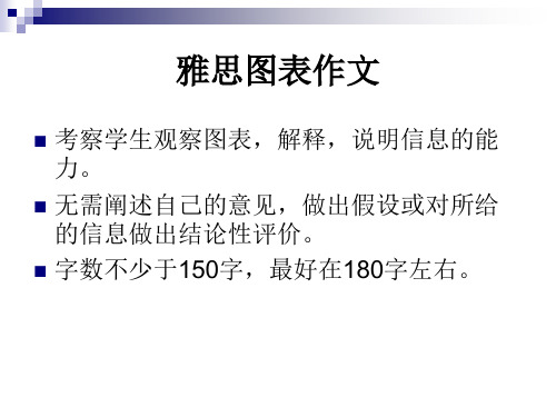
雅思图表作文
考察学生观察图表,解释,说明信息的能 力。 无需阐述自己的意见,做出假设或对所给 的信息做出结论性评价。 字数不少于150字,最好在180字左右。
写作内容
既有宏观overview又有微观details 语言简练明确,逻辑性强 相关处进行关系描述和对比
写作时态
一般用过去时描述已经发生的客观信息。 没有时间信息的客观描述用一般现在时。 预测数据使用表将来的结构。 Be projected/ expected/ predicted/ forecasted to
如何写overview (线、柱、饼、表) As an overall trend,… (流程) This process diagram covers/includes … stages/phrases.
如何表方向 1. 上升 Increase/rise/grow/boom/top/climb/go up/an upward trend …in 2003 were 23% up of those of 2001 Roughly doubled/ tripled/ quadrupled 2. 下降 decrease/ descend/ dive/ plunge/ decline/ drop/ reduction …experienced/saw/witnessed a 7% drop…
雅思英语图表作文范文(必备3篇)

雅思英语图表作文范文第1篇A类雅思各类图表作文要点及范文一.曲线图解题关键1曲线图和柱状图都是动态图,解题的切入点在于描述趋势。
2在第二段的开头部分对整个曲线进行一个阶段式的总分类,使写作层次清晰,同时也方便考官阅卷。
接下来再分类描述每个阶段的specifictrend,同时导入数据作为分类的依据。
3趋势说明。
即,对曲线的连续变化进行说明,如上升、下降、波动、持平。
以时间为比较基础的应抓住“变化”:上升、下降、或是波动。
题中对两个或两个以上的变量进行描述时应在此基础上进行比较,如变量多于两个应进行分类或有侧重的比较。
4极点说明。
即对图表中最高的、最低的点单独进行说明。
不以时间为比较基础的应注意对极点的描述。
5交点说明。
即对图表当中多根曲线的交点进行对比说明。
6不要不做任何说明就机械地导入数据,这不符合雅思的考试目的。
曲线图常用词汇动词—九大运动趋势一:表示向上:increase,rise,improve,grow,ascend,mount,aggrandize,goup,climb, take off, jump,shoot up暴涨,soar,rocket, skyrocket雅思英语图表作文范文第2篇It is said that countries are becoming similar to each other because of the global spread of the same products, which are now available for purchase almost anywhere. I strongly believe that this modern development is largely detrimental to culture and traditions worldwide.A country’s history, language and ethos are all inextricably bound up in its manufactured artefacts. If the relentless advance of international brands into every corner of the world continues, these bland packages might one day completely oust the traditional objects of a nation, which would be a loss of richness and diversity in the world, as well as the sad disappearance of t he manifestations of a place’s character. What would a Japanese tea ceremony be without its specially crafted teapot, or a Fijian kava ritual without its bowl made from a certain type of tree bark?Let us not forget either that traditional products, whether these be medicines, cosmetics, toy, clothes, utensils or food, provide employment for local people. The spread of multinational products can often bring in its wake a loss of jobs, as people urn to buying the new brand,perhaps thinking it more glamorous than the one they are used to. This eventually puts old-school craftspeople out of work.Finally, tourism numbers may also be affected, as travelers become disillusioned with finding every place just the same as the one they visited previously. To see the same products in shops the world over is boring, and does not impel visitors to open their wallets in the same way that trinkets or souvenirs unique to the particular area too.Some may argue that all people are entitled to have access to the same products, but I say that local objects suit local conditions best, and that faceless uniformity worldwide is an unwelcome and dreary prospect.Heres my full answer:The line graphs show the average monthly amount that parents in Britain spent on their children’s s porting activities and the number of British children who took part in three different sports from 2008 to is clear that parents spent more money each year on their children’s participation in sports over the six-year period. In terms of the number of children taking part, football was significantly more popular than athletics and 2008, British parents spent an average of around £20 per month on their children’s sporting activities. Parents’ spending on children’s sports increased gradually over the followi ng six years, and by 2014 the average monthly amount had risen to just over £ at participation numbers, in 2008 approximately 8 million British children played football, while only 2 million children were enrolled in swimming clubs and less than 1 million practised athletics. The figures for football participation remained relatively stable over the following 6 years. By contrast, participation in swimming almost doubled, to nearly 4 million children, and there was a near fivefold increase in the number of children doing athletics.剑桥雅思6test1大作文范文,剑桥雅思6test1大作文task2高分范文+真题答案实感。
雅思写作Task 1 曲线图 Line Chart

You should write at least 150 words.
综合图:
综合图:model answer
• The graphs give information about global birth rates and population size. They predict that the global population growth rate will begin to decrease towards the middle of this century and will eventually stabilize at approximately 11 billion.
饼型图题:
You should spend about 20 minutes on this task.
The two pie charts below show the percentage of the Earth’s surface area and the percentage of the two world’s population for the seven continents.
You should write at least 150 words.answer
1
This line graph shows the birth and death rates per thousand population from 1900 to 1980. Before 1920 the birth rate remained level at around 40 per thousand. Then from 1920 it fell until it reached 30 per thousand in 1930. From 1930to 1945 it rose slowly(increased steadily) to 50 per thousand. Since 1945 it had decreased/fallen steadily. It got to 20 per thousand in 1980. The birth control measures were becoming effective and the birth rate was falling/decreasing at the moment and would continue to fall.
【写作】雅思写作第一节课课堂讲义

【关键字】写作Unit 1 雅思IELTS 考试写作简介雅思考试写作部分在听力和阅读后进行,由两部分组成,TASK1和TASK2。
要求考生在60分钟内完成两篇文章的写作。
普通培训类和学术类考生在写作的考试内容上有一些区别。
两类写作TASK2题目类型基本相同,考试的结构和要求也大体相同,要求在40分钟完成250字左右的议论文。
类似英美国家学校里任课教师布置的课堂讨论作文。
一般要求考生根据自己的知识和经验就一个现象阐明自己的态度和见解,或就一个观点发表自己赞同或反对的观点。
学术类写作TASK 1(ACADEMIC TRAINING MODULE)要求考生对题目中给出的各类图表加以观察和分析,并根据已知的图表和资料写一篇很多于150字的小短文。
考得较多的有曲线图、柱状图、饼状图、表格、饼图等。
也有可能考到两种不同种类的图。
另外,流程图和示意图也偶尔考到。
时间20分钟。
普通培训类写作TASK1(GENERAL TRAINING MODULE)则要求考生就某个假设的场景写一封信. 到目前为止,出现较多的书信种类有投诉信、请求信、建议信、寻找失物信、邀请信等。
20分钟内完成150个字的文章。
总之,就题目的难度而言,GENERAL TRAINING MODULE 普通类写作比ACADEMIC TRAINING MODULE学术类写作稍微简单一些。
评分标准The examiner reads your answer and awards band score of between 1(did not answer the question) and 9 (native speaker-like ) according to these criteria:• 1.Task Response (i.e. how fully and appropriately the candidate has answered all parts of the task; the extent to which the candidate's ideas are relevant, developed andsupported; the extent to which the candidate's position is clear and effective) • 2.Coherence and Cohesion (i.e. how well the information and ideas are organized and presented i.e. paragraphing; how well the information is linked)• 3.Lexical Resource (i.e. the range of vocabulary used, how accurately it is used and how appropriate it is for the task)• 4.Grammatical Range and Accuracy (i.e. the range of structures used, how accurately they are used and how appropriate they are for the task)The band scores are then added together divided by 3 and rounded to determine your band score for this task.Writing Overall Band = 1 / 3* Task1 + 2 / 3*Task2For example: Task1 =6Task2 =7Overall Band = 1 / 3* 6 + 2 / 3*7= 6.5Unit 2 曲线图1.描述上升的单词increase rise grow go up词汇升级:creep up ≤10 edge up 10 ease up 20boom 30 surge 45 soar 60 swell 70 escalate 80 rocket 902.描述下降的单词decrease drop decline fall go down词汇升级:creep down ≤10 edge down 10 ease down 20ebb 30 subside 45 slump 60 collapse 70 plunge 80 plummet 903.描述波动的单词fluctuate --- fluctuation go up and down rise and fall例:Sales of Computers 1995There was a slight growth in the sales of computers from Jan to Feb. However, they increased dramatically to a peak in the next month. After that, there was a downward trend in sales between Mar and Aug, which leveled off by the end of Dec.Task 1每部分的结构:例题分析example 1WRITING TASK 1You should spend about 20 minutes on this taskThe graph below shows the number of passengers in a London underground station at different times of the day.Summarize the information by selecting and reporting the main features and make comparisons where relevant.You should write at least 150 words.Number of passengers at a London underground stationThe line graph illustrates the fluctuation in the number of people at a London underground station over the course of a day.开头段三种万能方法:①改单词②换句型③加信息The busiest time of the day is in the morning. There is a sharp increase between 06:00 and 08:00, with 400 people using the station at 8 o'clock. After this the numbers drop quickly to less than 200 at 10 o'clock. Between 11 am and 2 pm the number rises, with a plateau of just under 300 people using the station.In the afternoon, numbers decline, with less than 100 using the station at 4 pm. There is then a rapid rise to a peak of 380 at 6 pm.After 7 pm, numbers fall significantly, with only a slight increase again at 8pm, tailing off after 9 pm.Overall, the graph shows that the station is most crowded in the early morning (around 08:00) and early evening (around 18:00) periods.例题分析2:Sample 2WRITING TASK 1---“例2”You should spend about 20 minutes on this taskThe graph below shows the annual amount of fish caught in North America from 1972 to 2000. Summarize the information by selecting and reporting the main features and make comparisons where relevant.You should write at least 150 words.line graph with two linesThe graph reveals changes in fish catches for the US and Canada over the last 30 years. Between 1975 and 1981, US fish catches averaged between 2.5 and 2.75 million tons per year, while Canadian landings fluctuatedbetwee n 600,000 and 900,000 tons. …In 1981, however, there was a significant increase in fish caught in the US, and this rise continued and peaked at 5.6 million tons in 1991. During the same period, Canada's catch went up from 1 million tons to 1.6 million tons, a growth of over 50%.From 1991 onwards, a sudden decline in fish catching was reported in both countries. US figures plummeted to 4 million tons in 2001, a drop of 28%, and Canadian catches plunged to 0.5 million tons, a decrease of 66%. In the following four years, US catches remained stable at 4 million tons, while Canadian catches rose and fell around the 0.5 million tons mark.In general, fish catches have declined drastically in both the US and Canada since the early 1990s. Although Canadian production was much lower, it echoed US figures, declining or increasing at the same rate.习题③You should spend about 20 minutes on this taskThe graph below shows the consumption of fish and some different kinds of meat in a European country between 1979 and 2004.Summarize the information by selecting and reporting the main features and make comparisons where relevant.You should write at least 150 words.The line chart illustrates changes in the amounts of beef, lamb, chicken and fish consumed in a particular European country between 1979 and 2004.In 1979 beef was by far the most popular of these foods, with about 225 grams consumed per person per week. Lamb and chicken were eaten in similar quantities (around 150 grams), while much less fish was consumed (just over 50 grams)However, during this 25-year period the consumption of beef and lamb fell dramatically to approximately 100 grams and 55 grams respectively. The consumption of fish also declined, but much less significantly to just below 50 grams, so although it remained the least popular food, consumption levels were the most stable.The consumption of chicken, on the other hand, showed an upward trend, overtaking that of lamb in 1980 and that of beef in 1989. By 2004 it had soared to almost 250 grams per person per week. Overall, the graph shows how the consumption of chicken increased dramatically while the popularity of these other foods decreased over the period.此文档是由网络收集并进行重新排版整理.word可编辑版本!。
雅思作文写作Task 1第二课时—柱状图和饼状图
图表作文讲解2:柱状图和饼状图学生面授老师时间本次课时雅思写作第二课时教学思路1.作文简介、写作技巧2.实例讲解3.分析总结4.课后作业教学目标柱状图、饼状图知识点讲解基本特征和写作方法实例分析讲解重点写作技巧讲解范文学习柱状图和饼状图写作方法备考资料剑桥IELTS4-8教学详细内容:一、写作技巧详解1.柱状图特点➢柱状图是动态图表,切入点是描述趋势。
➢柱状图写作注重“比较”(找出similarity)和“对比”(找出difference),也就是说需要横向总结所有柱状图表的共性特征,也要分别描写各个柱子的个性特征。
➢两种写作方式:其一是对不同时间段内的数据进行比较,适合于数据代表的物体较少且时间界限明确的情况。
另外是对单独数据的全程描述,适合于描述数据对象很多且时间划定不清晰的情况。
2.饼状图特点饼形图与柱形图或者线形图所截然不同的是它没有了横轴与纵轴,而以饼形的分割来表示百分比,可以依照三步审题分析法来进行观察:➢观察共有几张饼状图,以及它们之间的关系是什么(一般说来,雅思图表题中极少见到单饼图);➢观察每张饼状图中有哪几个区域,以及各个区域分别代表什么;➢观察单个饼状图中各区域间的百分比差异,以及相同区域在各个饼状图间的百分比的比较或发展。
饼状图是所有图表题中最好写的一种,唯一值得注意的地方在于如何丰富百分比的表达和“占”的表达,要采取多样性的表达,如25%=a quarter of, 50%=half of, >50%=a/the majority of.描写饼状图中的比例构成就是饼状图图表作文的重点,但也应注意,这种描述并不是对图形的简单重复,对各项数据比例的描述应建立在归纳整理的基础上有条理地进行。
学生不仅要善于找数据,更重要的是要善于从数据或比例中升华出来,找到规律和本质。
常用词汇、句型及模板1.柱状图1)倍数的表达今年的产量是去年产量的两倍➢The output this year is two times(twice) more than last year’s.➢As much as 不可数名词 as many as 可数The books of this semester are two times as many as that of last semester. ➢ A is two times the amount of B不可数➢ A is two times the number of B可数2) 常用套句➢There was …in the number of A from …to … (over next years), which was followed by … and then… until…when there was … for the next … years.➢From…onwards, there was … in the number of A which then increased / decreased …at …% in …➢In …, the number reached (was) …%, but (30) years later there was …➢The number of A increased rapidly from … to … during the (five-year) period. ➢In the (three years) from … through…, the percentage of A was slightly larger / smaller than that of B.➢The graphs show a threefold increase in the number of A.➢Here is an upward trend in the number of A.➢… (year) witnessed / saw a sharp rise in A.2.饼状图1)常用词:percentage, proportion, make up, constitute, account for, take up, ..isdivided into…parts, consume the largest/smallest portion.2)例句:➢The graph, presented in a pie chart, shows the general trend in…..➢The percentage of A in … is more than twice tha n that of B.➢The biggest loss was to A area.➢There is not a great deal of difference between A and B.➢In general positions, females outnumber males.➢ A much greater percentage of men than women are found in managerial positions. ➢The profit of company A doubled from May to September.3)模板:➢The two pie charts describe ………………………➢The first point to note is …………………………➢Comparing the graphs, …………………………….➢The graphs also suggest that ………………………➢In conclusion, it can be seen from the data that …………………..4)饼状图作文模型The two pie charts illustrate the significant changes in people’s ways of communication from 1970 to 1995.The first graph shows that in 1975, the most popular way to communicate was letter writing, with the percentage of 50%. Others ___________________________, the figures are 32% and 18% respectively.It can be seen from the second graph that ways of communication changed a lot in two decades. By 1995, ______________________________. By contrast, ________________________________.Comparing the two pie charts, we can see that the use of the phones and computers during the same period had both risen considerably. However, letter writing became less popular among the people.In general, people inclined to use more modernized mediums to communicate with others, while the traditional way became less employed.The pie chart depicts the proportion of ___________________________. It consists of six segments, the largest one representing _________, which account for 26% of the total. _____________ takes up 21%, becoming the second largest.__________________________________. The rest proportions, 15% of all, constituting 5% and 10% respectively.From the chart it can be seen clearly that ________________________.二、实例分析分析思路:1.第一幅柱状图的描述单位是百万,即人数;第二幅则是百分比。
【7A文】雅思写作小作文TASK1
第一章图表作文概述图表分成Linechart,table,piechart,barchart,flowchart(3次)一、审题ThegraphbelowshowsradioandtelevisionaudiencesthrougWriteareportforauniversitylecturerdescribingtheinformatiYoushouldwriteatleast150words.0.00%10.00%20.00%30.00%40.00%50.00%6:8:1:12:2:4:6:8:1:12:2:4:6:RadioTelevisionThediagrambelowshowstheaveragehoursofunpaidworkpe rweekdonebypeopleindifferentcategories.(Unpaidworkreferst osuchcategoriesaschildcareinthehome,houseworkandgardenichildren children chldrenThetablebelowshowsinformationonincomes,taGesandpricesinfivecitiesaroundtheworld.Writeareportforauniversitylecturerdescribingtheinformations hownbelow.Youshouldwriteatleast150words.0102030405060708090审题:1、审题目:(题目相关的内容和时间)2、审文字:图标文字信息,比如坐标轴数据代表的信息,度量单位(图三)3、审数字:注意:有时不止一个图表,先判断图标之间是否有联系,若有,就一起描述,若无则分开描述;若我们无法看出其中联系,最好分开描述。
(图五)1)不描述所有数据。
2)遵循时间、最高原则。
雅思A类写作-图表写作模板
雅思A类写作-图表写作模板⼀.图表写作常⽤模板Para1. This is a table / chart / (line线状bar柱状pie饼状)graph which demonstrate / illustrate / reveal /depict /privide information about.............Para2. (1)Obvious /Apparent from the graph is that ...rank thefirst/highest,while/whereas ....turn out to be the lowest(2)It is exhibited/shown in the table that.....(3)It can be seen from the table that.....Para3.(1)饼.柱图A,which accounts for...%,ranks the first;then next is B with...%;followed by C,constituting...%;finally it comes D.E.F at...%...%and...%respectively(2)特殊变化(不变,增长或下降多的)①It is worth mentioning that....②It must be pointed out that....③More striking/surprising is that....Para4.To conclude /In conclusion/overall雅思写作图表作⽂标准化结构样本仅供参考Para 1, 两句话:第⼀句:This is a _____chart, which demonstrates the number of_____ from ____ to ____. 如果两个图,则:There are two charts below. The _____ chart describes the number of _____, and the _____ chart illustrates the figure of ____. 第⼆句:(所有题⽬适⽤),From the chart we can see that the number of ______ varies constantly/greatly in _____.Para 2, As we can see from the chart,/or It is clear from the chart that ____.如果有两个图:则:The _____ chart shows that ______./or As we can see from the first chart, _______Para 3, (如果两个图的话,) It is clear from the second chart that …Para 4 结尾:From the figures/statistics above, we can see/conclude/draw a conclusion that …⼆.应注意事项DON'T copy any part of the question in your answer. This is not your own work and therefore will be disregarded by the examiner and deducted from the word count. You can use individual words but be careful of using long "chunks" of the question text.Don't repeat yourself or the same ideas. This gives a bad impression and the examiner realises that it isn't adding to the content of your report.If you are weak at English grammar, try to use short sentences. This allows you to control the grammar and the meaning of your writing much more easily and contributes to a better cohesion and coherence mark. It's much easier to make things clear in a foreign language if you keep your sentences short!Think about the tenses of your verbs. If you're writing about something that happened in the past, your verbs will need to be in the past tenses. If you're describing the future, you will need to use the future tenses. If it's a habitual action, you'll need the present simple tense and so on. If you have time, a quick check of your verbs at the end of the exam can help you find errors. For describing graphs you will probably need past tenses whereas, for describing a process, you will probably need the present simple. Think about the verbs while practising and then it will become easier when you do the exam.As I just said, if you have finished the exam with time to spare, DON'T just sit there!! Check what you have done. If you have time after the check, check again. And so on……Don't be irrelevant. Although you can use your imagination to expand on your answer, if any part of your report is totally unrelated to the question and put in to just put up the word count, then the examiner will not take it into account and deduct it from the word count.If you want to improve, there's no secret. Practice. Practice. Practice. You won't get better sitting and doing nothing. Even good English users need practice for the IELTS exam. It could make all the difference between your getting the band that you need, and getting half a band less than you need and having to wait 3 months to do the exam again.三.写作范⽂雅思TASK1图表写作套句精选50句1.the table shows the changes in the number of...over the period from...to...该表格描述了在...年之...年间...数量的变化。
雅思小作文---TASK1图表题
雅思小作文 T A S K 1 图表题规律注意事项:1 . Task1 是客观写作,要求客观真实。
2 . 客观性:不应该有任何图里没有而靠自己主观想象加入的成分。
结尾段针对图形做出的总结性结论也应该是根据图表的实际内容做出的符合逻辑的总结。
准确性:图表里面的数据介绍要力求精确,不能抄错数字。
但当一个特征点没有落在一个准确的坐标值上时,允许进行合理的目测或估计一个大概数值。
详尽性:要有层次感,并不需要把所有的数字都推到文章里。
3 . 类型Table 表格题Line Graph 线图Bar Chart 柱状图Pie Chart 饼状图Process Chart 流程图4 . 看图要注意单位,标题和图例。
5 . 对于多数小作文题,题中给出了几个图就对应的写出几个主体段。
题目里只给出一个图,根据图中包含几类图形元素写几个主体段。
图中只给了一个图,但图中所含图形元素很多,则分类。
题目中出现多线多柱多饼,用“对应提取法“,把每组里的对应元素提出来组织主体段。
6 . 时态和发生时间意义对应。
陈述永恒事实的句型,其主句的谓语动词必定用一般现在时。
若题目里没有出现时间,则全文都使用一般现在时。
7 . 结构开头段(1~2句)改写原题主体段1 总体概括具体介绍数字主体段N 总体概括具体介绍数字结尾段(1~2句)介绍总数(若图里并没有明确的给出总数,则省略)结论(根据图里的数据得出有一定合理性的结论)8 . 开头段的改写题目中ShowProportion InformationThe number/amount of FamilyMalesFemaleInfluence改写成illustrate /compare percentagedatathe figure for householdmenwomenaffect/effectCategories kinds/typesSubway system Storeunderground railway/train system shop9 . 介绍数据或描述变化趋势的常用词。
- 1、下载文档前请自行甄别文档内容的完整性,平台不提供额外的编辑、内容补充、找答案等附加服务。
- 2、"仅部分预览"的文档,不可在线预览部分如存在完整性等问题,可反馈申请退款(可完整预览的文档不适用该条件!)。
- 3、如文档侵犯您的权益,请联系客服反馈,我们会尽快为您处理(人工客服工作时间:9:00-18:30)。
•
table = figures = statistics Save „below‟
•
Word
•
give information about
• • •
reveal indicate demonstrate Simple Present Tense
•
Word
•
the UK • Britain most popular • favorite / fashionable / stylish country • nation
Academic Writing Task 1
宁柏宇 北京新东方学校 国外考试部英联邦项目
IELTS Writing
• •
Saturday / Thursday Morning 3rd paper Test
2
Question Booklet
•
Task 1
• •
Report (Academic) / Letter (General) 150w, 20m
•
about / around / roughly / more or less from about 12 to 53 million
•
(5) Time
• •
from 1979 to 1999 between 1979 and 1999
• •
during the 20 years / two decades starting from 1979
• •
9
Registration
•
Self-Analysis
• • • • •
NCEE NCEE CET-4 CET-6
100 130 600 600
or or or
CET-4 CET-6 NETEM
425 425 70
4.5 5.0 5.5 6.0
>4hrs / day, 1 point / per 2 months
(2) Verbs
• •
•
• •
increase : decrease / rise : fall go up : come down climb : slide ascend : decline rocket : collapse
(2) Verbs
•
Tense
• • •
increased increase is expected / predicted to increase
(1) Subjects
•
Legend
•
visits abroad by UK residents
•
Paragraph 2
•
travel from the UK
•
Synonyms
•
UK visitors / travelers / tourists
(1) Subjects
•
it / they
•
The visits increased from 1979 to 1999. In particular, they increased most quickly from 1985 to 1988.
27
Introduction
•
• •
Paragraph 2
Copied phrases will not be counted Paraphrase the rubric
Word (B - 78)
•
chart = graph = diagram
• •
•
line, curve bar, column pie
•
Between paragraphs (B - 78)
•
According to the chart,
• • • • line chart upper / lower chart chart 1 chart of visits to and from the UK
Between Features (B - 51)
•
Introduction
•
The line chart reveals visits to and from Britain and UK travelers‟ top 5 favorite nations in 1999 are indicated in the bar graph.
Linking Devices
10
Considerate IELTS
• •
•
Test as often as possible Reschedule ( + 500 RMB) Refund ( - 750 RMB)
11
Teaching Material
• •
•
<Cambridge IELTS 4> <Cambridge IELTS 5> 《雅思写作胜经》、群言出版社
•
also / besides / on the other hand
•
but / however / conversely
while / in particular
•
Basic Structure 1
The visits increased greatly (1) (2) (3) from about 12 to 57 million (4) from 1979 to 1999. (5)
12
Task 1 - Question Grouping
•
Figure (75% 2008Q1)
•
Multiple / Single
•
Non-Figure (25% hart / Map
13
Writing Procedure
• •
•
Read + Plan (3 mins) Write (16 mins) Check (1 mins)
(3) Adverbs
• •
•
•
sharply / rapidly / swiftly slowly / gradually / tardily greatly / vastly / considerably slightly / marginally / minutely
(3) Adverbs & (4) Numbers
Chart 1 (Band 6.5)
•
According to the line chart, visits abroad by UK residents increased from about 12 to 57 million from 1979 to 1999. While, overseas travelers to Britain went up from about 10 to 27 million. It is obvious that UK tourists were more and climbed faster than overseas ones during the period.
21
Thinking Style
22
Paragraphs
•
Multiple Charts
• • • • •
Introduction Chart 1 Chart 2 … Comparison
•
Single Chart
• • • • •
Introduction Feature 1 Feature 2 … Conclusion (if needed)
There is a boy asks you out. Band 9 : 20+ Band 7 : 15 A new challenger comes here. Here comes a new challenger.
26
Sentence Length
• •
•
Structure Variety
• •
• • •
thousands of millions of billions of
Scoring Criterion
• •
TA : Content CC : Structure LR : Words GRA : Sentences
•
•
17
Marking Criterion
• •
•
• • •
UNDERLENGTH NO OF WORDS PENALTY OFF - TOPIC MEMORISED ILLEGIBLE
•
Task 2
• •
Essay 250w, 40m
3
Writing Booklet
•
Writing Booklet
•
ningboyu_nos@
• Password: ieltswriting
•
Pencil and Eraser
4
Scoring
•
Examiner
•
Task 1 and 2 : 0 - 9
5.5 6 6.5
+ 0.5 + 0.5
6
7
8
Registration
•
Objective
•
An acceptable score within the shortest time The earlier, the more choices ! No deadline, no completion !
(do) (be done)
•
The line chart reveals visits to and from the UK.
Visits to and from the UK are revealed in the line chart.