图表型作文
作文万能模板--图表作文
高考英语作文高三英语复习时要覆盖各类作文题材,以便在考场上看到任何类型的题目都能轻松搞定。
以下为大家整理了图表分析类作文题目及范文,供同学们参阅。
图表作文是高中英语作文中较常见的类型,要求学生通过图中数据和提示内容写一短文,属于比较、对照类。
也可根据提示写为议论文。
通常我们采取三段式写法:第一段:描述图表,得出结论。
第二段:紧扣主题,根据图表比较分析原因,论证结论。
第三段:发表议论,提出自己的看法。
常用句式:1. As can be seen from the chart,...As is shown in the chart,...2. The chart shows that about 60 percent of students want to go to college...3. From the graph/data/results/information above,it can be seen/concluded/show/estimated...4.The graph shows the changes in the number of...over the period from...to...pared with...,the number of the students of...高中英语作文图表作文万能模板:As is shown by the figure/percentage in the table /picture,____ has been on rise/ decrease,significantly/dramatically rising/decreasing from ____ in _____ to _____ in _____. From the sharp rise/decline in the chart,it goes without saying that _____.There are at least two good reasons accounting for _____. In one hand,____.In the other hand,_____ is due to the fact that ______.In addition,______ is responsible for _____. Maybe there are some other reasons to show ______.But it is generally believed that the above mentioned reasons are commonly convincing.As far as I am concerned,I hold the point of view that _______. I am sure my opinion is both sound and well-grounded.DIY:高考英语图表分析类作文题目1最近,你参加了高三年级组织的“你最重视哪科作业”的调查,结果见下面的饼状图。
雅思作文图表题范文(热门3篇)

雅思作文图表题范文第1篇It is said that countries are becoming similar to each other because of the global spread of the same products, which are now available for purchase almost anywhere. I strongly believe that this modern development is largely detrimental to culture and traditions worldwide.A country’s history, language and ethos are all inextricably bound up in its manufactured artefacts. If the relentless advance of international brands into every corner of the world continues, these bland packages might one day completely oust the traditional objects of a nation, which would be a loss of richness and diversity in the world, as well as the sad disappearance of the manifestations of a place’s character. What would a Japanese tea ceremony be without its specially crafted teapot, or a Fijian kava ritual without its bowl made from a certain type of tree bark?Let us not forget either that traditional products, whether these be medicines, cosmetics, toy, clothes, utensils or food, provide employment for local people. The spread of multinational products can often bring in its wake a loss of jobs, as people urn to buying the new brand, perhaps thinking it more glamorous than the one they are used to. This eventually puts old-school craftspeople out of work.Finally, tourism numbers may also be affected, as travelers become disillusioned with finding every place just the same as the one they visited previously. To see the same products in shops the world over is boring, and does not impel visitors to open their wallets in the same way that trinkets or souvenirs unique to the particular area too.Some may argue that all people are entitled to have access to the same products, but I say that local objects suit local conditions best, and that faceless uniformity worldwide is an unwelcome and dreary prospect.Heres my full answer:The line graphs show the average monthly amount that parents in Britain spent on their children’s sporting activities and the number of British children who took part in three different sports from 2008 to is clear that parents spent more money each year on their children’s participation in sports over the six-year period. In terms of the number of children taking part, football was significantly more popular than athletics and 2008, British parents spent an average of around £20 per month on their children’s sporting activities. Parents’ spending on children’s sports increased gradually over the following six years, and by 2014 the average monthly amount had risen to just over £ at participation numbers, in 2008 approximately 8 million British children played football, while only 2 million children were enrolled in swimming clubs and less than 1 million practised athletics. The figures for football participation remained relatively stable over the following 6 years. By contrast, participation in swimming almost doubled, to nearly 4 million children, and there was a near fivefold increase in the number of children doing athletics.剑桥雅思6test1大作文范文,剑桥雅思6test1大作文task2高分范文+真题答案实感。
(完整版)图表作文范文汇总.docx
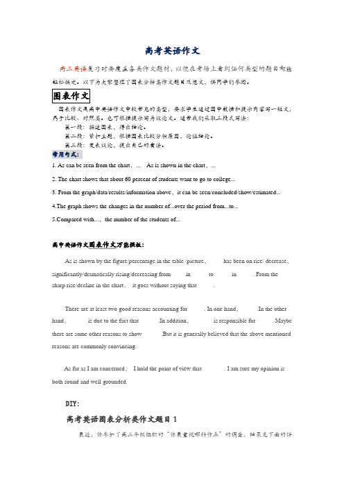
表作文范文假如你是Li Hua,是一名国学校的学生。
你最近200 名同学(男女各半)的理想做了一次,并根据果(如所示)你的看法。
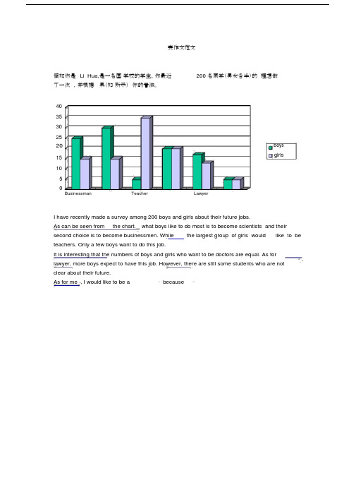
4035302520boysgirls15105Businessman Teacher LawyerI have recently made a survey among 200 boys and girls about their future jobs.As can be seen from the chart, what boys like to do most is to become scientists and their second choice is to become businessmen. While the largest group of girls would like to be teachers. Only a few boys want to do this job.It is interesting that the numbers of boys and girls who want to be doctors are equal. As for lawyer, more boys expect to have this job. However, there are still some students who are notclear about their future.As for me , I would like to be a⋯because⋯7崇文一模某英文报纸正在开展题为“中学生课堂注意力”的专栏讨论,你校准备参加,并请你代表学校写一篇文章给该英文报纸投稿。
下面的图表为你校的调查结果,请你根据所提供的信息做简要说明,并根据提示给出改善的建议。
注意:图中数据为学生人数百分比。
中学生课堂注意力集中的情况中学生课堂注意力不能集中的原因40%30%70%60%能够集中注意力不能集中注意力课堂干扰睡眠不足与疲劳改善注意力的建议:教室课堂课间通风、明亮积极参与课堂活动适量活动或适当休息注意: 1.词数:不少于60。
英语图表作文精选10篇

英语图表作文精选10篇四级英语作文图表类篇一图片模板:It seems to me that the cartoon / drawing issending a message about ____________(图画内容),which reveals ____________(稍作评价).In myperspective of view, ____________ (表明个人观点)。
Apparently, ____________(将个人观点和图片内容相结合,得出观点。
)For one thing, ____________(从社会角度论证).For another thing, ____________(从个人角度说明).For example, ____________(自己、朋友或他人,只要自己知道或听过的例子).Last but not least, ____________(从反面角度谈论).Asa result, the drawer of the illustration is urging us to _____________(建议或措施).Only inthis way can we ____________(展望结果).In conclusion / To my understanding, ____________(再次表明观点或态度).We should____________(进一步说明个人的观点).图表模板:According to the bar chart / pie chart / line graph displays the changes in the numberof____________(图表整体趋势).There was an increase in ____________(图表细节).At the point of ____________, ____________reaches its peak value of ____________(数据或变化).What has caused these changes? There are mainly three reasons.Firstly, ____________ (原因一).Secondly, ____________(原因二).The number of ____________ increased overthe period.____________ rose by _________ from ________ to ________________.Andthere were____________.Finally, ____________(最后一个原因).In conclusion / We can safely draw the conclusion that ____________(结论).Therefore, ____________(进一步谈论更多个人想法).英语四级图表类作文篇二In the morning, the clear sky, father-in-law of the sun was inlaid with a golden halo. A group of happy little magpies chirped in the branches, as if holding a singing contest, very lively!Noon is the hottest time of the day. The sun gave out a blazing light, as if to roast the earth. There was no one in the street. Everyone hid in the house to blow the air conditioner, for fear that they would be cooked outside. At this time, the little magpie on the tree also became quiet, they all hide in the deep leaves of the nap. Only the indefatigable cicada was still shouting “hot, hot.。
英语作文图表作文(五篇范文)
英语作文图表作文(五篇范文)第一篇:英语作文图表作文图表分析作文1As is clearly shown in the table/ figure/ graph / chart, 图表总体描述 between 年代 and 年代.Especially, 突出的数据变化.There are three reasons for 具体表示急剧上升、下降或特殊现象的词.To begin with, 原因一.In addition / Moreover, 原因二.For example, 具体例证.Last but no least, 原因三.In short,总结上文.As far as I am concerned, / For my part, / As for me,作者自己的观点.On the one hand, 理由一.On the other hand, 理由二.In brief,总结上文.图表分析作文2The table / figure / graph / chart shows that 图表总述from 年代to年代.It is self-evident that突出的数据变化.Three possible reasons contribute to 具体表示急剧上升、下降或特殊现象的词或代词代替上文内容.One reason is that原因一.Another reason is that 原因二.For instance,举例证.What’s more原因三.As a result, 重述上文之趋势.However, in my opinion 作者观点.For one thing,理由一.For another, 理由二.T o sum up,总结上文.图表分析作文3It can be seen from the table / figure / graph / chart that图表总述between年代and年代.Especially,突出的数据变化.Why are there such great changes during 图表涉及的年头数years? There are mainly two reasons explaining具体表示急剧上升、下降或特殊现象的词或代词代替上文内容.First,原因一.In the old days,比较法说明过去的情况.But now,说明现在的情况.Second,原因二.As a result,总结上文.In my viewpoint,作者自己的观点.On the one hand,论点一.On the other hand,论点二.图表分析作文4As the table / figure / graph / chart shows,图表总述in the past years年代.Obviously,突出的数据变化.Why are there suchsharp contrasts during 图表涉及的年头 years?Two main factors contribute to具体表示急剧上升、下降或特殊现象的词或代词代替上文内容.First of all,原因一.In the past,比较法说明过去的情况.But now 说明现在的情况.Moreover,原因二.Therefore,总结上文.As I see it,作者自己的观点.For one thing,论点一.For another,论点二.图表作文补充句型• As is shown in the graph…如图所示…•The graph shows that…图表显示…•As can be seen from the table,…从表格中可以看出…•From the chart, we know that…从这张表中,我们可知…• All these data clearly prove the fact that… 所有这些数据明显证明这一事实,即…• The increase of ….In the ci ty has reached to 20%.….在这个城市的增长已达到20%.• In 1985, the number remained the same.1985年,这个数字保持不变.• There was a gradual decline in 1989.1989年,出现了逐渐下降的情况.第二篇:英语图表作文图表描述专题训练(一)这类作文时,注意以下几点:第一,审题时,除了要把握好图表的表层信息外,还要分析图标的深层含义,如原因、根源、可能的发展趋势等。
英语图表作文模板及精选4篇

英语图表作文模板及精选4篇(经典版)编制人:__________________审核人:__________________审批人:__________________编制单位:__________________编制时间:____年____月____日序言下载提示:该文档是本店铺精心编制而成的,希望大家下载后,能够帮助大家解决实际问题。
文档下载后可定制修改,请根据实际需要进行调整和使用,谢谢!并且,本店铺为大家提供各种类型的经典范文,如总结报告、合同协议、规章制度、条据文书、策划方案、心得体会、演讲致辞、教学资料、作文大全、其他范文等等,想了解不同范文格式和写法,敬请关注!Download tips: This document is carefully compiled by this editor. I hope that after you download it, it can help you solve practical problems. The document can be customized and modified after downloading, please adjust and use it according to actual needs, thank you!Moreover, our store provides various types of classic sample essays, such as summary reports, contract agreements, rules and regulations, doctrinal documents, planning plans, insights, speeches, teaching materials, complete essays, and other sample essays. If you want to learn about different sample formats and writing methods, please pay attention!英语图表作文模板及精选4篇学而不思则罔,思而不学则殆,以下是本店铺给大伙儿收集整理的英语图表作文模板及精选4篇,欢迎参考。
英语图表作文模板及范文(通用12篇)
英语图表作文模板及范文(通用12篇)(经典版)编制人:__________________审核人:__________________审批人:__________________编制单位:__________________编制时间:____年____月____日序言下载提示:该文档是本店铺精心编制而成的,希望大家下载后,能够帮助大家解决实际问题。
文档下载后可定制修改,请根据实际需要进行调整和使用,谢谢!并且,本店铺为大家提供各种类型的经典范文,如工作总结、工作计划、合同协议、条据文书、策划方案、句子大全、作文大全、诗词歌赋、教案资料、其他范文等等,想了解不同范文格式和写法,敬请关注!Download tips: This document is carefully compiled by this editor. I hope that after you download it, it can help you solve practical problems. The document can be customized and modified after downloading, please adjust and use it according to actual needs, thank you!Moreover, our store provides various types of classic sample essays for everyone, such as work summaries, work plans, contract agreements, doctrinal documents, planning plans, complete sentences, complete compositions, poems, songs, teaching materials, and other sample essays. If you want to learn about different sample formats and writing methods, please stay tuned!英语图表作文模板及范文(通用12篇)英语图表作文模板及范文第1篇The table/chart diagram/graph shows (that)According to the table/chart diagram/graphAs (is)shown in the table/chart diagram/graphAs can be seen from the table/chart/diagram/graph/figures,figures/statistics shows (that)……It can be seen from the figures/statisticsWe can see from the figures/statisticsIt is clear from the figures/statisticsIt is apparent from the figures/statisticstable/chart/diagram/graph figures (that)……table/chart/diagram/graph shows/describes/illustrates图表类英语作文范文The past years have witnessed a mounting number of Chinese scholars returning from overseas.As is lively illustrated by the column chart, the number of returnees climbed from a mere thousand in 20XX to over thousand in 20XX, at an annual increase rate of around 50%.A multitude of factors may have led to the tendency revealed by the chart, but the following are the critical ones from my perspective.First and foremost, along with the development ofChinese economy and society, the number of Chinese studying abroad has been soaring in the past years, which has provided an eXpanding base for the number of returnees.In the second place, the government has enacted a series of preferential policies to attract overseas Chinese scholars back st but not least, the booming economy, science and technology in this country have generated more attative job opportunites for scholars returning from overseas.The waves of returnees will definitely contribute to this nation’s development, since they have brought back not only advanced science and technology but also pioneering concepts of education and management.With more scholars coming back from overseas, and with the concerted efforts of the whole nation,we have reasons to eXpect a faster rejuvenation of this country.更多培训课程:苏州个人提升英语更多学校信息:苏州虎丘区朗阁教育机构咨询电话:英语图表作文模板及范文第2篇Students tend to use computers more and more frequently nowadays.Reading this chart, we can find that the average number of hours a student spends on the computer per week has increased sharply.In 1990, it was less than 2 hours; and in 1995, it increased to almost 4 hours, and in 2000, the numbersoared to 20 hours.Obviously computers are becoming increasingly popular.There are several reasons for this change.First,computers facilitate us in more aspects of life.Also, the fast development of the Internet enlarges our demands for using computers.We can easily contact with friends in remote places through the Internet.Besides, the prices of computers are getting lower and lower,which enables more students to purchase them.However, there still eXist some problems, such as poor quality, out-of-date designs and so on.And how to balance the time between using computers and studying is also a serious problem.Anyhow, we will benefit a lot from computers as long as we use them properly.英语图表作文模板及范文第3篇As can be clearly seen from the graph/table/chart (As is shown in the table/figure), great changed have taken place in_______,The_________have/has skyrocketed/jumped from _____to _____.When it comes to the reasons for the changes,different people give different eXplanations.Here I shall just give a begin with, ______What’s more,___________, Last but not least, ________.While it is desirable that ___________,there are still some problems and difficulties for __________Firstly, __________,In addition, __________,In a word, __________.以上就是为大家整理的英语专四图表作文范文模板,希望能够对大家有所帮助。
雅思图表作文真题范文
雅思图表作文真题:柱状图:奥运奖牌The chart below shows the total number of Olympic medals won by twelve different countries.雅思小作文范文:The bar chart compares twelve countries in terms of the overall number of medals that they have won at the Olympic Games.It is clear that the USA is by far the most successful Olympic medal winning nation. It is also noticeable that the figures for gold, silver and bronze medals won by any particular country tend to be fairly similar.The USA has won a total of around 2,300 Olympic medals, including approximately 900 gold medals, 750 silver and 650 bronze. In second place on the all-time medals chart is the Soviet Union, with just over 1,000 medals. Again, the number of gold medals won by this country is slightly higher than the number of silver or bronze medals.Only four other countries - the UK, France, Germany and Italy - have won more than 500 Olympic medals, all with similar proportions of each medal colour. Apart from the USA and the Soviet Union, China is the only other country with a noticeably higher proportion of gold medals (about 200) compared to silver and bronze (about 100 each).(178 words, band 9)雅思图表作文真题:柱状图:学习动机The charts below show the main reasons for study among students of different groups and the amount of support they received from employers.参考雅思小作文范文The bar charts compare students of different ages in terms of why they are studying and whether they are supported by an employer.It is clear that the proportion of students who study for career purposes is far higher among the younger age groups, while the oldest students are more likely to study for interest. Employer support is more commonly given to younger students.Around 80% of students aged under 26 study to further their careers, whereas only 10% study purely out of interest. The gap between these two proportions narrows as students get older, and the figures for those in their forties are the same, at about 40%. Students aged over 49 overwhelmingly study for interest (70%) rather than for professional reasons (less than 20%).Just over 60% of students aged under 26 are supported by their employers. By contrast, the 30-39 age group is the most self-sufficient, with only 30% being given time off and help with fees. The figures rise slightly for students in their forties and for those aged 50 or more.(178 words, band 9)雅思图表作文真题:柱状图:The chart below shows numbers of incidents and injuries per 100 million passenger miles travelled (PMT) by transportation type in 2002.雅思小作文范文The bar chart compares the number of incidents and injuries for every 100 million passenger miles travelled on five different types of public transport in 2002.It is clear that the most incidents and injuries took place on demand-response vehicles. By contrast, commuter rail services recorded by far the lowest figures.A total of 225 incidents and 173 injuries, per 100 million passenger miles travelled, took place on demand-response transport services. These figures were nearly three times as high as those for the second highest category, bus services. There were 76 incidents and 66 people were injured on buses.Rail services experienced fewer problems. The number of incidents on light rail trains equalled the figure recorded for buses, but there were significantly fewer injuries, at only 39. Heavy rail services saw lower numbers of such events than light rail services, but commuter rail passengers were even less likely to experience problems. In fact, only 20 incidents and 17 injuries occurred on commuter trains.(165 words, band 9)雅思图表作文真题:柱状图:各地房价The chart below shows information about changes in average house prices in five different cities between 1990 and 2002 compared with the average house prices in 1989.雅思小作文范文:The bar chart compares the cost of an average house in five major cities over a period of 13 years from 1989.We can see that house prices fell overall between 1990 and 1995, but most of the cities saw rising prices between 1996 and 2002. London experienced by far the greatest changes in house prices over the 13-year period.Over the 5 years after 1989, the cost of average homes in Tokyo and London dropped by around 7%, while New York house prices went down by 5%. By contrast, prices rose by approximately 2% in both Madrid and Frankfurt.Between 1996 and 2002, London house prices jumped to around 12% above the 1989 average. Homebuyers in New York also had to pay significantly more, with prices rising to 5% above the 1989 average, but homes in Tokyo remained cheaper than they were in 1989. The cost of an average home in Madrid rose by a further 2%, while prices in Frankfurt remained stable. (165 words)雅思图表作文真题:饼状图:垃圾处理The pie charts below show how dangerous waste products are dealt with in three countries.雅思小作文范文:The charts compare Korea, Sweden and the UK in terms of the methods used in each country to dispose of harmful waste.It is clear that in both the UK and Sweden, the majority of dangerous waste products are buried underground. By contrast, most hazardous materials in the Republic of Korea are recycled.Looking at the information in more detail, we can see that 82% of the UK’s dangerous waste is put into landfill sites. This disposal technique is used for 55% of the harmful waste in Sweden and only 22% of similar waste in Korea. The latter country recycles 69% of hazardous materials, which is far more than the other two nations.While 25% of Sweden's dangerous waste is recycled, the UK does not recycle at all. Instead, it dumps waste at sea or treats it chemically. These two methods are not employed in Korea or Sweden, which favour incineration for 9% and 20% of dangerous waste respectively.(159)。
雅思写作八分经典范文背诵:图表作文(5)
The table below shows the consumer durables (telephone, refrigerator, etc.) owned in Britain from 1972 to 1983.Write a report for a university lecturer describing the information shown below.该图表展现的是1972-1983十一年间英国耐久消费品的拥有量。
The table indicates the consumer durables that were own in the UK over a period of 11 years from 1972 to 1983.从图表来看,英国八种耐久消费品在所标识时间段里的拥有量总体分为三种情况:中央暖气设备、电视、吸尘器、冰箱、电话、洗碗机呈现出各有特色的上升趋势;洗衣机呈现出总的上升,但中间有一次下降、放映机无从对比。
As can be seen from the table, the ownership of the eight above mentioned consumer durables in the UK during the designated period of time roughly revealed three different trends. Central heating, television, vacuum cleaner, refrigerator, telephone and dishwasher showed a trend of increase with different characteristics; Washing machine showed a trend of general rise with one fluctuation; Video had nothing to compare with.首先,中央暖气设备和电话一直处于上升态势。
图表作文20篇
图表作文范文20篇Model writing 1Directions: Write a composition of no less than 150 words entitled “Leading Causes of Road Accidents in China”. The composition should be based on the following graph.Motor Vehicles Bicycles Pedestrians OthersOutline:Your composition should be in three paragraphs:1. introduce the causes;2. report the information given in the graph;3. conclude the composition by giving some suggestions.Sample:With the development of the cities, the road accident is becoming a more and more serious problem in China. The information represented in the graph, which depicts the leading causes of road accidents in China, indicates that most accidents are caused by motor vehicles, bicycles,and pedestrians.In the graph we can clearly see that motor vehicles are responsible for the largest part of road accidents, namely about 50% of them. Bicycles account for 35% of the accidents and pedestrians caused nearly 10%. These statistics indicate that motor vehicles have to some extent become a threat to the security of whole society, which endangers people’s lives.Since we know that motor vehicles are the leading cause of road accidents in China, we should take some measures to improve the situation. First, we should make a law to punish any violators of traffic regulations. Then, cyclists should use hand signals to warn other road users of their intentions. Last but not least, the department concerned should educate ordinary people to walk on a zebra crossing or overpass when they cross a street. All in all, it’s time for us to attach great importance to this problem.Model writing 2Directions: Take a look at the table below. It shows the number of road accidents in Britain in different places as well as the ages of theSampleThe chart above organizes data about road accidents involving children in Britain by when and where the accidents occurred. It can be seen that the incidence of accidents decreases as the children’s age increases and that age correlates with the circumstances surrounding the accident.For all ages, the most common situation leading to accident is playing in the street but young children were particularly affected. Children between the ages of 5-7 seemed to get into accidents while engaged in activities appropriate to their age, such as shopping for their parents orgoing home from school. In fact, this age group accounted for the most road accidents of all. Children between 8 and age 11 had the most accidents cycling in the street. After age 11, the number of accidents dropped considerably in all situations.From the chart, we get to know that playing in the street is the most common and universal site of accidents of all ages, but the risks that other sites and situations present vary with the children’s ages.Model writing 3Directions: Write a composition entitled “Changes in US Spending Patterns”. The composition should be based on the following pie charts.Sample:The pie charts show changes in American spending patterns between 1966 and 1996.Food and cars made up the two biggest items of expenditure in both years. Together they comprised over half of household spending. Food accounted for 44% of spending in 1966, but this dropped by two thirds to 14% in 1996. However, the outlay on cars doubled, rising from 23% in 1966 to 45% in 1996.Other areas changed significantly. Spending on eating out doubled, climbing from 7% to 14%. The proportion of salary spent on computers increased dramatically, up from 1% in 1996 to 10% in 1996. However, as computer expenditure rose, the percentage of outlay on books plunged from 6% to 1%.Some areas remained relatively unchanged. Americans spent approximately the same amount of salary on petrol and furniture in both years.In conclusion, increased amounts spent on cars, computers, and eating out were made up for by drops in expenditure on food and books. Model writing 4Directions: For this part, you are allowed 30 minutes to write a composition of no less than 150 words on Changes in People’s Diet. Study the following table carefully and your composition must be based on the information given in the table. You should quote as few figures as possible.Outline:Write three paragraphs to:1. State the changes in people’s diet in the past five years2. Give possible reasons for the changes3. Draw your own conclusionSample:As can be seen in the table, there have been great changes in people’s diet in the past five years. During the five years, the consumption ofgrain decreased by 4%, while that of meat and milk increased by 4% and 3% respectively. From the figures we can draw the conclusion that grain, as the staple food in China, is playing a less important role in people’s diet, while the consumption of high-energy food, such as meat and milk, has increased steadily.What caused these changes? I think the reasons are as follows: First, the open policy brings the people opportunities to earn a lot of money. Second, people nowadays pay more attention to the structure of their diet. They are seeking the most reasonable diet structure, which will do good to their health.From the above, we can see that, with the development of the country, people’s living standard has greatly improved in the five years. We can also expect better living standard and more reasonable diet structure in the future.Model writing 5Directions: For this part, you are allowed 30 minutes to write a composition on the topic Health Gains in Developing Countries. Your composition should be no less than 120 words.Outline:You must base your composition on the following instruction given in Chinese:1. 以下图为依据描述发展中国家的期望寿命(life expectancy)和婴儿死亡率(infant mortality)的变化情况。
- 1、下载文档前请自行甄别文档内容的完整性,平台不提供额外的编辑、内容补充、找答案等附加服务。
- 2、"仅部分预览"的文档,不可在线预览部分如存在完整性等问题,可反馈申请退款(可完整预览的文档不适用该条件!)。
- 3、如文档侵犯您的权益,请联系客服反馈,我们会尽快为您处理(人工客服工作时间:9:00-18:30)。
描述图表常用句型
主谓宾结构 1. The line graph shows the number of road accidents in Britain
over a period of six years. 2. The chart reflects an increase in the consumption of fast food
population share in Asia,
60%
Europe and North America in 1998. Asia accounted
50%
for a lion’s share of 60%, 40%
while the proportion of
Europeans was 15% and
gradually from 85,000 to
50
about 12,000, while TV-goers
40
increased steadily from 5,000
to more than 100,000, with
30
both enjoying an equal
20
amount of audience of 55,000 10
描述图表常用句型
“there be”句型 1. There is a decline in female smokers in
the past four years. 2. There is a significant difference
between youngsters’ and adults’ habit of learning. 3. There was a minor fluctuation of milk consumption from May to December.
in shanghai over a 10-year period between 1993 and 2003. 3. In the table, the indicators of economic conditions display the
differences that exist between developed and developing countries. 4. The consumption of grain accounts for / takes up / makes up about 66%. 5. China experienced a steady increase in life expectancy in the past decade. 6. Beijing saw a constant decline in traffic accident from 2001 to 2003. 7. Bicycles enjoy a minor popularity in Scotland.
0
the year of 1995.
1965 1975 1985 1995
The Changing Demand (unit) for Energy in China Energy units: 1 unit = 100 billion mega joules兆焦)
Line chart
• The line chart shows the
描述图表常用句型
With引导的独立主格结构 1. The indicators reflect that
gers are the most popular fast food, with pizza following closely / coming a close second.
100
dramatic changes of
audiences’ choices between
90
film and TV over the 10-year
80
period from 1975 until 1985.
70
during this period, the
number of film-goers dropped 60
8
in China from 1965 to 1995.
7
The demand for energy
dropped steadily between
6
1965 and 1975 from 5 units of energy to approximately 2
5
units in China. From 1975 until 4
1985, energy demand
appeared to level off and
3
remained constant at about 2 units of energy. From that
2
time onwards, energy demand 1
climbed dramatically from 2 units of energy in 1985 to 7 in
2000 1800 1600 1400 1200 1000
800 600
1991
1995
1999
2003
Average Income (RMB) of the Chinese Farmer
Line chart
• The line chart reflects the fluctuation of energy demand
描述图表常用句型
被动句式
1. From the figures shown, it can be seen obviously that housing accounts for more that half of Chinese family’s monthly expenditure.
2. Seen from the bar chart, it could be safely concluded that the number of women being employed in this field rose substantially to 9,000,000.
70% 60% 50% 40% 30% 20% 10%
0% 1980 1990 2000
Asia
Europe
North America
Population (percentage) differs In Three Continents
Pie Chart
• The pie chart shows the monthly expenditure per •fTahmeiplyieinchCahrtinsah,owwisththtehe mfa3pmfnhacr0ooeoomca%nueuopiitrn,sudolhynirmsflpnttyiaingriiifonnkeo,Ctngecxpthhlpoforsuisefonaurd,nraptnmisd.insatpooiHpgpthennoupoe,tnfrrurhtnoleostaleoxiyaornpdaitgngemri,e,rolabsynttaesalyincd ecxopmenmsuen, iwchaitcihonsseeamnsdto be thhoeuhseeahvoieldstgbouorddsenanodn msoedrevricneCsh. iAnessea fcaomnitlyr.ast, consumer luxuries and other items only take up a very small percentage.
in 1981.
0
1 1 1 1 1 1 1 1 1 1 1
97 97 97 97 97 98 98 98 98 98 98
5 6 7 8 9 0 1 2 3 4 5
Film-goer2 TV-goers
Line chart
• The bar chart displays a
70%
sharp contrast of
Food
Housing
Transportation & Communications Household goods &services Consumer luxuries
Other items
Monthly Expense Per Family in China
Table
GDP per head(1990: US dollars) Life Expectancy (years)
图表型作文
常见图表类型
Line chart
• The line char displays the changes of Chinese farmers’ average income from 1991 t 2003. It is obviously seen that their average income has been increasing constantly over the 12-year period.
Bangladesh
150
41
Egypt
710
57
Indonesia
595
50
USA
14200
75
Quality of Life in Four Countries • The table above reveals the living standard of four
different countries in 1990 by comparing two key economic indicators. There is little difference between the economic indicators of Egypt and Indonesia. It goes without saying that USA enjoyed the highest quality of living, achieving the highest GNP of 14,200 dollars per head and the longest life expectancy of 75. comparatively speaking, Bangladesh and the lowest quality of life, with its life expectancy less than half of that of USA and its GNP the lowest among the four countries.