图表作文大学英语
关于大学生消费观的英语作文图表

文章标题**College Students' Consumption Habits: A VisualInsight**In today's world, the consumption patterns of college students have become increasingly diverse and complex. A recent survey, presented through a comprehensive chart, reveals intriguing insights into the evolving consumption habits of this demographic. The chart, a mix of bar graphs and pie charts, offers a snapshot of the spending behaviors, preferences, and attitudes towards consumption amongcollege students.At a glance, the chart highlights the significant roleof technology and digital media in shaping student consumption. The bar graph depicting the breakdown of monthly expenses shows a significant portion dedicated to digital purchases, such as streaming services, apps, and games. This trend reflects the widespread use of smartphones and the internet among college students, whoare increasingly spending on digital entertainment and information.The pie chart, on the other hand, illustrates thevariety of non-digital expenses. Food and accommodation, naturally, occupy a significant chunk of the pie,reflecting the basic needs of students. However, the slice dedicated to fashion and personal care is noteworthy, indicating a focus on personal appearance and self-expression. This is likely influenced by social media and peer pressure, which often promote certain fashion trends and beauty standards.Interestingly, the chart also reveals a growing trendof sustainability-conscious consumption. A notable percentage of students are choosing to spend on eco-friendly products and services, indicating a growing awareness of environmental issues and a desire to make responsible consumption choices.Moreover, the survey data suggests that many college students are budget-conscious and prioritize their expenses. While there is a willingness to splurge on certain items, students are generally mindful of their financiallimitations and seek value for money. This is evident inthe choice of affordable yet trendy fashion items and the preference for discounted digital subscriptions.However, it's worth noting that the consumption habits of college students are not without challenges. The ease of online shopping and the allure of instant gratification can lead to impulsive spending and financial mismanagement. Therefore, it's crucial for students to develop healthy consumption habits and financial literacy skills to ensure sustainable and responsible spending.In conclusion, the chart provides a revealing glimpse into the consumption habits of college students. It highlights the influence of technology, the variety of expenses, and the emerging trend of sustainability-conscious consumption. As college students continue to shape the future of consumption, it's important to understand their spending behaviors and attitudes to better cater to their needs and promote responsible consumption practices.**大学生消费观:一图洞察**在当今世界,大学生的消费模式日益多样化和复杂化。
图表作文大学英语
Job Problems for College Students
The job market for college students is getting tighter and tighter. According to a survey, only 88 percent of college graduates of the Class of 2001 found jobs the year they graduated, compared with 96 percent in 1999. Why do college graduates find it increasingly difficult to get a job?
Nevertheless, no matter what job you choose, it could be a challenge. As for me, I like science and technology. With the economic growth and social progress, professionals of science and technology will become more and more important. Therefore I will choose doing scientific research as my career.
Job Problems for College Students
Nowadays, college students’ employment has become a hot point. According to the statistical chart, about 12 percent of college graduates can’t find the proper job in 2001 compared with only 4 percent in 1999.
图表类作文大学英语

图表类作文大学英语English:In this chart, we can see the percentage of people who prefer different modes of transportation for commuting. The most popular mode of transportation among respondents is car, with 40% of people choosing to drive to work. This is followed by public transport, with 35% of respondents indicating that they prefer taking the bus or train. Walking is the third most popular choice, with 15% of people opting to walk to their workplace. Cycling is the least favored mode of transportation, with only 10% of respondents indicating that they choose to ride a bike to commute. These results show that cars are still the preferred mode of transportation for the majority of people, while public transport is also a popular choice. It is interesting to note that walking is preferred more than cycling, which could be attributed to factors such as better pedestrian infrastructure and convenience. This data provides valuable insights into the transportation choices of people and can be useful for urban planners and policymakers in designing transportation systems that cater to the needs of the public.中文翻译:在这个图表中,我们可以看到人们在通勤时喜欢不同交通方式的百分比。
大学英语四级图表作文
大学英语四级图表作文In the first chart, we can see the percentage of students participating in different extracurricular activities. It's interesting to note that the most popular activity is sports, with over 60% of students taking part. This is followed by music and art, which are also quite popular among students. On the other hand, only a small percentage of students are involved in volunteer work or academic clubs.Moving on to the second chart, we can see the average number of hours students spend on various activities each week. Unsurprisingly, the chart shows that students spendthe most time studying, with an average of 25 hours per week. This is followed by sports and part-time work, bothof which take up around 10-15 hours per week. Interestingly, students spend very little time on volunteer work, with an average of only 2 hours per week.In the third chart, we can see the reasons why studentschoose to participate in extracurricular activities. The most common reason is to make friends and socialize, with over 40% of students citing this as their motivation. This is followed by personal interest and enjoyment, which is the main reason for around 30% of students. Surprisingly, very few students participate in activities for the purpose of building their resume or college applications.In conclusion, these charts provide a fascinating insight into the extracurricular activities of college students. It's clear that students are most interested in activities that allow them to socialize and have fun, rather than those that are purely academic or career-oriented.。
大学英语图表作文范文

大学英语图表作文范文1. The bar chart shows the percentage of students participating in extracurricular activities in a university. It's interesting to see the variation in participationrates among different activities.2. The pie chart illustrates the distribution of majors among undergraduate students. It's clear that the majorityof students are enrolled in the business and engineering programs.3. The line graph depicts the trend of international student enrollment over the past five years. It's evident that there has been a steady increase in the number of international students studying at the university.4. The scatter plot displays the correlation between GPA and hours spent studying per week. It's apparent that students who study more hours tend to have higher GPAs, but there are also outliers that defy this trend.5. The table presents the average class sizes in various departments. It's notable that classes in the humanities department tend to be smaller compared to those in the science and technology departments.6. The heatmap indicates the peak times of library usage throughout the day. It's clear that the library is most crowded during the late afternoon and evening hours.7. The radar chart showcases the skills and competencies developed by students through internships.It's impressive to see the diverse range of skills that students have acquired in areas such as communication, problem-solving, and teamwork.8. The histogram displays the distribution of student grades in a particular course. It's evident that the majority of students fall within the average grade range, with a smaller number of students achieving high or low grades.9. The box plot illustrates the variability in student performance on a standardized test. It's interesting to see the range of scores, as well as any outliers that may indicate exceptional performance or areas for improvement.10. The area chart shows the allocation of university funding across different departments. It's clear that a significant portion of the budget is allocated to research and development, reflecting the university's commitment to academic excellence.。
英语图表作文精选10篇

英语图表作文精选10篇四级英语作文图表类篇一图片模板:It seems to me that the cartoon / drawing issending a message about ____________(图画内容),which reveals ____________(稍作评价).In myperspective of view, ____________ (表明个人观点)。
Apparently, ____________(将个人观点和图片内容相结合,得出观点。
)For one thing, ____________(从社会角度论证).For another thing, ____________(从个人角度说明).For example, ____________(自己、朋友或他人,只要自己知道或听过的例子).Last but not least, ____________(从反面角度谈论).Asa result, the drawer of the illustration is urging us to _____________(建议或措施).Only inthis way can we ____________(展望结果).In conclusion / To my understanding, ____________(再次表明观点或态度).We should____________(进一步说明个人的观点).图表模板:According to the bar chart / pie chart / line graph displays the changes in the numberof____________(图表整体趋势).There was an increase in ____________(图表细节).At the point of ____________, ____________reaches its peak value of ____________(数据或变化).What has caused these changes? There are mainly three reasons.Firstly, ____________ (原因一).Secondly, ____________(原因二).The number of ____________ increased overthe period.____________ rose by _________ from ________ to ________________.Andthere were____________.Finally, ____________(最后一个原因).In conclusion / We can safely draw the conclusion that ____________(结论).Therefore, ____________(进一步谈论更多个人想法).英语四级图表类作文篇二In the morning, the clear sky, father-in-law of the sun was inlaid with a golden halo. A group of happy little magpies chirped in the branches, as if holding a singing contest, very lively!Noon is the hottest time of the day. The sun gave out a blazing light, as if to roast the earth. There was no one in the street. Everyone hid in the house to blow the air conditioner, for fear that they would be cooked outside. At this time, the little magpie on the tree also became quiet, they all hide in the deep leaves of the nap. Only the indefatigable cicada was still shouting “hot, hot.。
英语作文图表作文(五篇范文)
英语作文图表作文(五篇范文)第一篇:英语作文图表作文图表分析作文1As is clearly shown in the table/ figure/ graph / chart, 图表总体描述 between 年代 and 年代.Especially, 突出的数据变化.There are three reasons for 具体表示急剧上升、下降或特殊现象的词.To begin with, 原因一.In addition / Moreover, 原因二.For example, 具体例证.Last but no least, 原因三.In short,总结上文.As far as I am concerned, / For my part, / As for me,作者自己的观点.On the one hand, 理由一.On the other hand, 理由二.In brief,总结上文.图表分析作文2The table / figure / graph / chart shows that 图表总述from 年代to年代.It is self-evident that突出的数据变化.Three possible reasons contribute to 具体表示急剧上升、下降或特殊现象的词或代词代替上文内容.One reason is that原因一.Another reason is that 原因二.For instance,举例证.What’s more原因三.As a result, 重述上文之趋势.However, in my opinion 作者观点.For one thing,理由一.For another, 理由二.T o sum up,总结上文.图表分析作文3It can be seen from the table / figure / graph / chart that图表总述between年代and年代.Especially,突出的数据变化.Why are there such great changes during 图表涉及的年头数years? There are mainly two reasons explaining具体表示急剧上升、下降或特殊现象的词或代词代替上文内容.First,原因一.In the old days,比较法说明过去的情况.But now,说明现在的情况.Second,原因二.As a result,总结上文.In my viewpoint,作者自己的观点.On the one hand,论点一.On the other hand,论点二.图表分析作文4As the table / figure / graph / chart shows,图表总述in the past years年代.Obviously,突出的数据变化.Why are there suchsharp contrasts during 图表涉及的年头 years?Two main factors contribute to具体表示急剧上升、下降或特殊现象的词或代词代替上文内容.First of all,原因一.In the past,比较法说明过去的情况.But now 说明现在的情况.Moreover,原因二.Therefore,总结上文.As I see it,作者自己的观点.For one thing,论点一.For another,论点二.图表作文补充句型• As is shown in the graph…如图所示…•The graph shows that…图表显示…•As can be seen from the table,…从表格中可以看出…•From the chart, we know that…从这张表中,我们可知…• All these data clearly prove the fact that… 所有这些数据明显证明这一事实,即…• The increase of ….In the ci ty has reached to 20%.….在这个城市的增长已达到20%.• In 1985, the number remained the same.1985年,这个数字保持不变.• There was a gradual decline in 1989.1989年,出现了逐渐下降的情况.第二篇:英语图表作文图表描述专题训练(一)这类作文时,注意以下几点:第一,审题时,除了要把握好图表的表层信息外,还要分析图标的深层含义,如原因、根源、可能的发展趋势等。
英语图表作文模板及精选4篇
英语图表作文模板及精选4篇(经典版)编制人:__________________审核人:__________________审批人:__________________编制单位:__________________编制时间:____年____月____日序言下载提示:该文档是本店铺精心编制而成的,希望大家下载后,能够帮助大家解决实际问题。
文档下载后可定制修改,请根据实际需要进行调整和使用,谢谢!并且,本店铺为大家提供各种类型的经典范文,如总结报告、合同协议、规章制度、条据文书、策划方案、心得体会、演讲致辞、教学资料、作文大全、其他范文等等,想了解不同范文格式和写法,敬请关注!Download tips: This document is carefully compiled by this editor. I hope that after you download it, it can help you solve practical problems. The document can be customized and modified after downloading, please adjust and use it according to actual needs, thank you!Moreover, our store provides various types of classic sample essays, such as summary reports, contract agreements, rules and regulations, doctrinal documents, planning plans, insights, speeches, teaching materials, complete essays, and other sample essays. If you want to learn about different sample formats and writing methods, please pay attention!英语图表作文模板及精选4篇学而不思则罔,思而不学则殆,以下是本店铺给大伙儿收集整理的英语图表作文模板及精选4篇,欢迎参考。
新大学英语四级作文专题(图表作文和应用文)(含答案)
图表作文图表作文提示部分包括图表和文字要点提示两部分。
图表的类型主要有:圆形(饼型)图(pie chart)、柱形图(直型图)(graph)、曲线图(chart)和数据统计表(表格)(table)。
图表作文的写作容包括综合理解、客观详述和主观表达。
模板一①总的趋势②图表具体描述③剖析图表所揭示的含义④理由一⑤理由二⑥理由三⑦理由四⑧总结⑨前景预测As can be seen from the table, the past decade has witnessed dramatic changes in ①______. While②_______. It is obvious from the table that③_________.What contributed to these changes?I think the reasons are as follows.To start with,④______. Secondly,⑤______ . What’s more,⑥ _______. Last but not least,⑦________.In conclusion,⑧_________. Moreover,⑨ ________.文: How People Spent Their HolidaysYear 1990 1995 2000Traveling 37% 51% 76%Staying at home 63% 49% 24%1.上图所示为1990、1995、2000年某城市人们度假方式的情况,请描述其变化:2.请说明发生这些变化的原因。
3.得出结论。
How People Spent Their HolidaysAs can be seen from the table,the past decade have witnessed dramatic changes in the way people spent their holiday between 1990 and 2000.In 1990, 63% of people spent their holidays at home,while the figure dropped considerably to24%in2000.It is obvious from the table that people tended to be more and more mobile,and they wanted to get entertainment in the outside world.What contributed to these changes?I think the reasons are as follows.To start with,with the rapid development of economy,people earn by far more money than they used to.Thus,people are able to afford traveling expenses.Secondly,people thinkit important to get well-informed about the outside world in this new era when everything is on the move.Traveling,of course,is a sure way to achieve this goal. What's more, in this competitive society, people are usually under great stress. However,it is not difficult to find traveling an effective way to relieve people's stress and get st but not least,by traveling outside,people are closeto nature, which is not only beneficial to both their health and peace of mind.In conclusion, people prefer to go traveling rather than stay at home during holidays for a combination of reasons.Moreover,it seems that this trend will lastin the foreseeable future.模板二①描述图表②分三方面解释原因③下结论1)During the period from_______to_______,________rose from________to_______,while _______ decreased from _______ to _______.2)We believe that three reasons can account for this phenomenon.First,____.Second,____. Third, _____.3) ___.We are happy to see that things are becoming better and better nowadays. We can imagine that ___.文: Health Gains in Developing Countries1.以下图为依据描述发展中国家的期望寿命(1ife expectancy)和婴儿死亡率(infant mortality)的变化情况2.说明引起变化的各种原因Health Gains in Developing CountriesDuring the period from1960to1990,the life expectancy of developing countries rose from 40 years to nearly 60 years, while infant mortality decreased from 200 deaths per 1000 births to around 100.We believe that three reasons can account for this phenomenon. First, economy develops quickly in developing countries during this period, and living quality improves significantly as a result.Second,people's health conditions also become better and better with the development of national health care systems. When they become richer and richer, they care more about personal health conditions. Third, medical sciences also develop at a fantastic speed,and it is much safer for mothersto give birth.We are happy to see that things are becoming better and better nowadays.We can imagine that people will live longer and the infant mortality will again fall. [1996.6. CET-6]模板三①描述图表②解释图表③补充解释1)During the period between_______and________,________declined abruptly from_______ to ________, while ________ increased sharply from ________ to _______. 2)Several reasons can account for this pared with_________is much cheaper and more convenient__________ . Apart from that, _________.3) However, there are still a number of people who _________, generally for two reasons. On one hand,________. On the other hand, ________.文: Film Is Giving Way to TV1.电影观众越来越少2.电视观众越来越多,因为……3.然而,还是有人喜欢看电影,因为……Film Is Giving Way to TVDuring the period between1975and1985,film-goers declined abruptly from85,000to about12,000,while TV-watchers increased sharply from5,000to more than100,000.Several reasons can account for this phenomenon. Compared with a film, TV is much cheaper and more convenient--you don't have to leave your house at all.Apart from that, you have many choices while watching TV, but a film concentrates on a certain topic.However, there are still a number of people who enjoy going to the cinema,generally for two reasons. On the one hand, the audio-visual effect of a cinema is much better. On the other hand, in a quiet and comfortable place such as a cinema,you can concentrate on what you are watching and get the most of the film.作业:2002年06月英语四级写作试题Directions: For this part, you are allowed thirty minutes to write a composition on the topic Student Use of Computers.You should write at least 120words,and base your composition on the chart and the outline given below:181614121086420三维柱形图 11990199520001.上图所示为1990年、1995年、2002年某校大学生使用计算机的情况,请描述其变化;2.请说明发生这些变化的原因(可从计算机的用途、价格或社会发展等方面加以说明);3.你认为目前大学生在计算机使用中有什么困难或问题。
大英赛图表类的作文
大英赛图表类的作文英文回答:The given prompt asks for a comparison of two piecharts showing the distribution of leisure activities among different age groups in the UK. In the first chart, we can see that the younger age group (16-24) spends the majorityof their leisure time on social media, with 35% of their time devoted to this activity. This is followed bylistening to music and watching TV, which account for 20% and 15% of their leisure time respectively. On the other hand, the older age group (55 and above) spends the most time on gardening and DIY activities, with 30% of their leisure time dedicated to these pursuits. This is followed by reading, which accounts for 20% of their time, and watching TV, which takes up 15% of their leisure time.In the second chart, we can see the changes in leisure activities among different age groups over a 10-year period. For the younger age group, social media usage has increasedsignificantly from 30% to 35%, while listening to music has remained relatively stable at 20%. However, there has beena decrease in the time spent watching TV, from 20% to 15%. On the other hand, for the older age group, gardening and DIY activities have seen a slight decrease from 35% to 30%, while reading has remained stable at 20%. There has also been a decrease in the time spent watching TV, from 20% to 15%.中文回答:给定的提示要求比较两个饼图,显示英国不同年龄组之间的休闲活动分布。
- 1、下载文档前请自行甄别文档内容的完整性,平台不提供额外的编辑、内容补充、找答案等附加服务。
- 2、"仅部分预览"的文档,不可在线预览部分如存在完整性等问题,可反馈申请退款(可完整预览的文档不适用该条件!)。
- 3、如文档侵犯您的权益,请联系客服反馈,我们会尽快为您处理(人工客服工作时间:9:00-18:30)。
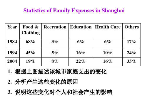
Statistics of Family Expenses in
Shanghai
As is shown in the table above, dramatic changes have taken place in family expenses in the City of Shanghai within two decades (from 1984 to 2004). The most obvious change is in expense on food and clothing, which has dropped by 48%; while those on recreation, education and health care have increased respectively by 5%, 16% and 10%. Expenses on other things keep rising from 17% to 35%.
The statistics of rise and fall seem to exist in isolation but are in fact closely related to one another. The most likely factors accounting for these changes are as follows:
Development in economy is the fundamental one. The increased income results in the lowering percentage of
food and clothing. That is to say, a small percentage of the total income is enough to cover food and clothing expenses.
Another factor lies in the development of people’s concept. When people are well fed and well dressed, they begin to interest themselves in recreation and education. As for the more expenses on health care, I figure there are two main reasons: the cancellation of free medical care and people’s awareness of the importance of health.
The changes reflect the development of the city and indicate that people are enjoying more.
As can be seen from the cartoon/picture,
table/graph/chart, ...
As is clearly shown by the …,
From …we can see…The…of …added up to…in…while…in…Therefore, it can be predicated that…is to…
There are chiefly…reasons for the …Firstly, …in ever-increasing number, owing to th e …, have realized the …Secondly, …Apart from the above reasons, …
In spite of what is mentioned above, there are…indicates…Hence, the situation is still serious and…is still a challenging task.
From the table, we can see the decrease of the population growth rate. It added up to 1.6% in 1994, while it decreased to 1.54% in 1995 and 1.52% in 1996 respectively. Therefore, it can
be predicated that the growth rate is to be on the decrease in the century. There are chiefly two reasons for the decline. Firstly, couples in ever-increasing number, owing to the development of society, have realized the harm of bringing up too many children. Secondly, all the countries of the world, especially, the developing countries have taken united action to deal with the population explosion. One of the most important measures is the birth control. Since 1980’s, China has conducted the family planning program to control the balance of the death rate and the birth rate and has achieved great success.
In spite of what is mentioned above, there are still many people who don’t understand the significance of population control. The table indicates the number of population was 5.777
billion in the world in 1996. If the 1996 growth rate continued, the world’s population would double in the next 45 years. Hence, the situation is still serious and how to control the growth rate is still a challenging task.。