MACDK线分析方法(精)
史上最牛MACD30分钟K线买卖法,准到令人无法相信

史上最牛MACD30分钟K线买卖法,准到令人无法相信史上最牛MACD30分钟K线买卖法,准到令人无法相信K线王者 06-03 12:32 大对于短线操作者来说,仅仅使用日K线图还是不够的,还要看更短周期的K线图,我们经常使用30分钟K线图。
在短线K线图中间,我们可以发现,1分钟K线和5分钟K线是最敏感的,由于它们太敏感了,敏感性太好了,稳定性就差得多,而60分钟和日K线虽然比较稳定,但敏感性又差了些。
因此,我们取1分钟K线图、5分钟K线图以及60分钟K、日K线中间,正好是30分钟K线图。
事实证明,在具体的短线炒作中,30分钟兼顾了灵敏度和稳定度,有比较好的操盘效果。
【30分钟K线图分析方法】1、【DIF上穿零轴线】。
就在这个位置上做多,这在30分钟K 线图中显得特别重要。
我们标为a点,我们只有把握住了这个点,才能使我们在大部分的下跌时段内保持空仓。
由于它在零下,在绿色的海洋中间(见图中方框),我们说它在这个区间是水下操作,很难抓着机会,而在a点以后,它进入了零轴线以上,走势就稳定得多,机会也会较多。
在这一点(a点)出现以后,我的体会是买那些好的、强势股票操作,就是当时盘中成交量相对大的、涨势相对快的、形态相对好的股票。
2、【三金叉见底】技术。
比如说,这儿有一个MACD金叉,这个地方有一个均价线金叉,这个地方放量形成均量线金叉。
在这个跨度区间内,我们都把它叫短线底部,可以在这个区间买一些强势个股。
这样,我们从a点这一个可买进的点,变成一个可买进的区间了,现在这个时间扩大,b点到c点就是三金叉见底完成,这个过程有好几个点可以考虑买入。
3、【冲过60生命线】,过了60生命线就可以买入。
图d点是短线炒作的最后一个切入点,在d点应该完成短线建仓了。
4、【三死叉见顶及时卖出】。
在30分钟K线图上同样会有死亡交叉,而且这个死亡交叉是一个很明确的短线卖出点。
图f区间就是三死叉形成的区间,这个区间也有两三个小时可以考虑卖出,这些都是常用操作手法。
macd高级战法使用技巧
macd高级战法使用技巧
MACD(Moving Average Convergence Divergence)是一种常用的技术指标,用于分析股票、期货和其他金融市场的趋势和动能。
下面是一些MACD高级战法的使用技巧:
1. 金叉和死叉:MACD由快线(DIF)和慢线(DEA)组成。
当快线上穿慢线时,形成金叉,表示买入信号;当快线下穿慢线时,形成死叉,表示卖出信号。
这是最基本的MACD信号,可以帮助判断趋势的转折点。
2. 背离:观察价格走势和MACD指标之间的背离情况。
如果价格创新高而MACD指标没有创新高,或者价格创新低而MACD指标没有创新低,就可能出现背离,表明趋势可能要反转。
3. MACD柱状图:MACD柱状图是DIF和DEA之间的差异,它显示了价格动能的变化。
当MACD柱状图从负值转为正值时,表示买入信号;当MACD柱状图从正值转为负值时,表示卖出信号。
4. 趋势线:在MACD指标上绘制趋势线,以帮助识别价格趋势的转折点。
当趋势线被突破时,可能发生买入或卖出信号。
5. 配合其他指标:MACD可以与其他技术指标结合使用,例如移动平均线、相对强弱指标(RSI)和布林带等。
通过多个指标的确认,可以提高买卖信号的准确性。
精准MACD主图及使用方法
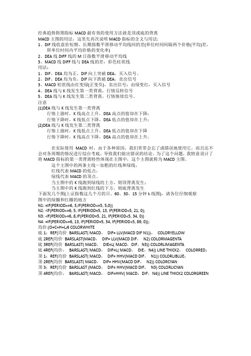
经典趋势附图指标MACD最有效的使用方法就是顶或底的背离MACD主图的用法,这里先再次说明MACD指标的含义与用法:1、DIF线收盘价短期、长期指数平滑移动平均线间的差(单位时间间隔两个价格(平均)差,即单位时间内平均价格的变化率)2、DEA线DIFF线的M日指数平滑移动平均线3、MACD线DIFF线与DEA线的差,彩色柱状线用法:1、DIF、DEA均为正,DIF向上突破DEA,买入信号。
2、DIF、DEA均为负,DIF向下跌破DEA,卖出信号3、MACD柱状线由红变绿(正变负),卖出信号;由绿变红,买入信号4、DEA线与K线发生第一类背离,行情反转信号5、DEA线与K线发生第二类背离,行情继续信号。
注意(1)DEA线与K线发生第一类背离行情上涨时,K线高点上升,DEA高点的值却在下降;行情下降时,K线低点下降,DEA低点的值却在上升;(2)DEA线与K线发生第二类背离行情上涨时,K线低点上升,DEA低点的值却在下降行情下降时,K线高点下降,DEA高点的值却在上升。
在实际使用MACD时,由于各种原因,我们常常会忘了或错误地使用它,而且还不会对各周期的情况进行综台考底,导致我们做出错误的结论。
为了这个问题,我特意设计了将MACD指标的第一类背离特性体现在主图中,这个主图就称为MACD主图。
这个主图中的两条主线—加粗的红线和绿线,红线代表MACD的低点,绿线代表MACD的顶点。
当主图中的K线跑到绿线的上方,则顶背离发生;当主图中的K线跑到红线的下方,则底背离发生下面发几个图(上证指数这几个月的日、60、30、15分钟k线图),请各位仔细观察图中的绿圈和红圈的地方N1: =IF(PERIOD>=6, 3,IF(PERIOD<=5, 5,0))N2: -IF(PERIOD>=6, 5, IF(PERIOD=5, 13, IF(PERIOD<5, 21, 0);N3: -IF(PERIOD>=6, 8,IF(PERIOD=5, 21, IF(PERIOD<5, 34, 0))N4: =IF(PERIOD>=6, 13, IF(PERIOD=5, 34, IF(PERIOD<5, 89, 0));均价:(O+C+H+L/4 COLORWHITE底1:REF(均价BARSLAST( MACD,DIF= LLV(MACD DIF N1)),COLORYELLOW底2REF(均价BARSLAST(MACD,DIF= LLV(MACD DIF,N2) COLORMAGENTA底3REF(均价BARSLAST( MACD,DIE=L( MACD,DIF,N3)) COLORLIMAGENTA底4REF(均价,BARSLAST( MACD,DIF=L( MACD,DIE,N4)) LINE THICK2,COLORRED;顶1:REF(均价BARSLAST( MACD,DIF= HHV(MACD DIF,N1)) COLORLIBLUE;顶2REF(均价BARSLAST( MACD,DIF= HHV(MACD DIF,N2)) COLORCYAN顶3:REF(均价BARSLAST (MACD,DIF= HHV(MACD DIF,N3) COLORLICYAN顶4REF(均价,BARSLAST( MACD,DIF=HHV( MACD,DIF,N4)) LINE THICK2 COLORGREEN。
MACD指标精讲

MACD指标精讲一、什么是MACD线?MACD线。
称为信号线。
MACD线和信号线之间的变化可以提供趋势变化的信号。
为了更直观地判别价格信号,可以将MACD线与信号线之间的差额以直方图的形式显示出来,于是得到移动平均线趋同趋异指数森林图。
当MACD线高于信号线时,相应地MACD森林图位于零线下方。
MACD线是基于移动平均线的分析方法,其原理在于快速移动平均线和慢速移动平均线在不同价格走势情况下相互间的关系会发生变化。
因此它的适用范围比前几种摆动指标更为广泛,既能为盘整状况下的价格走势提供信号,也能对具有明显趋势的市场变化进行分析。
MACD线从双移动平均线发展而来的,由快的移动平均线减去慢的移动平均线,应用范围现货、期货、股票、基金、其他衍生金融产品。
是以快速及慢速移动平均线的交叉换位、合并分离的特性,来分析、研究股市中、长趋势的指标,从而决定股票买卖的时机。
二、M ACD怎样看?MACD指标是根据均线的构造原理,对股票价格的收盘价进行平滑处理,求出算术平均值以后再进行计算,是一种趋向类指标。
MACD指标是运用快速(短期)和慢速(长期)移动平均线及其聚合与分离的征兆,加以双重平滑运算。
而根据移动平均线原理发展出来的MACD,一则去除了移动平均线频繁发出假信号的缺陷,二则保留了移动平均线的效果至于MACD线在股市K线图中怎样看?MACD快速线下穿慢速线形成死叉,后市看空;MACD快速线上穿慢速线形成金叉,后市看多;在同一时间,价格创新高,MACD未创新高,形成顶背离,后市看空;在同一时间,价格创新低,MACD未创新低,形成底背离,后市看多。
三、M ACD的运用法则:1、DIF向上交叉MACD视为买进信号;2、DIF向下交叉MACD视为卖出信号;3、短期内DIF从低档二次向上交叉MACD,视为强烈买进信号;4、短期内DIF从高档二次向下交叉MACD,视为强烈卖出信号;5、当股价的高点比前一波的高点高,而MACD的高点却比前一波的高点低时称为“牛背离”,暗示股价很快会反转下跌;6、当股价的低点比前一波的低点低,而MACD的低点却比前一波的低点高时称为“熊背离”,暗示股价很快会反转上涨。
60分钟k线macd指标的参数设置

60分钟k线macd指标的参数设置MACD指标是一种技术分析指标,是由移动平均线的差离而计算出来的,指标的值由两条线组成,分别是快线DIF和慢线MACD,另外还有一条红色的信号线,主要是用来辅助MACD的买入和卖出点的。
在60分钟K线上进行MACD指标设置,对于投资者在判断价格走势的趋势方向上非常有帮助。
下面我们将会从参数、计算过程以及如何使用等方面对60分钟K线MACD指标进行详细介绍。
一、参数设置MACD指标的参数包括快线、慢线和信号线。
常用的参数设置为DIF=12, DEA=26, MACD=9。
具体解释如下:1.快线(DIF):是指短期的指数平滑移动平均线。
3.信号线(MACD):信号线是由慢线DEA的9日移动平均线计算得出的。
二、计算过程1. DIF的计算: DIF=12日EMA-26日EMA。
参数设置为DIF=12,DEA=26,MACD=9的计算过程就是把每根60分钟的K线上的收盘价分别带入公式进行计算即可,计算出来的结果就是每根K线上的DIF、DEA和MACD的值。
三、如何使用1.判断价格走势的趋势方向:使用60分钟K线上的MACD指标可以有效的辅助投资者判断价格走势的趋势方向。
当DIF向上穿过DEA时,意味着价格走势可能会向上,投资者可以考虑买入;当DIF向下穿过DEA时,意味着价格走势可能会向下,投资者可以考虑卖出。
2.确认买卖点:使用60分钟K线上的MACD指标可以有效的确认买卖点。
在MACD指标中,当DIF向上突破DEA时,产生了金叉信号,通常是买入信号;当DIF向下突破DEA时,产生了死叉信号,通常是卖出信号。
需要注意的是,金叉和死叉信号一般都需要结合股票的基本面和市场情况来进行分析和判断。
综上所述,60分钟K线上的MACD指标参数设置为DIF=12, DEA=26, MACD=9,通过计算60分钟K线上的收盘价来得到DIF、DEA、MACD这三个指标值,可以帮助投资者判断价格走势的趋势方向,确认买卖点,对于投资者进行投资决策非常有帮助。
MACD指标实战技巧总结

MACD指标实战技巧总结1.识别顶底背离MACD指标可以用来识别价格的顶底背离,即价格与MACD指标的走势相背离。
当价格创新高而MACD指标没有跟随创新高时,这可能意味着价格不会持续上涨,投资者可以考虑卖出股票。
同样,当价格创新低而MACD指标没有跟随创新低时,这可能意味着价格不会持续下跌,投资者可以考虑买入股票。
2.交叉信号当MACD指标线上穿信号线时,被称为金叉,这是一个买入信号。
相反,当MACD指标线下穿信号线时,被称为死叉,这是一个卖出信号。
交叉信号能够帮助投资者确认价格趋势的转折点,但需要结合其他技术指标和基本面因素进行确认。
3.观察MACD柱状图MACD柱状图是由MACD指标线和信号线之间的差异形成的,柱状图的变化可以反映价格趋势的力度。
当柱状图缩小甚至消失时,可能意味着价格趋势即将反转;当柱状图放大时,可能意味着价格趋势正在加速。
投资者可以根据柱状图的变化来判断价格的长短期趋势。
4.结合其他指标使用MACD指标可以与其他技术指标结合使用,以增强分析的准确性。
例如,可以结合移动平均线使用,当价格上穿短期移动平均线而MACD指标线上穿信号线时,这是一个买入信号。
另外,也可以结合相对强弱指标(RSI)使用,当价格创新高而MACD指标线下穿信号线,且RSI指标处于超买区域时,这可能是一个卖出信号。
5.适当调整参数MACD指标的默认参数为12、26、9,投资者可以根据不同的交易品种和周期进行适当调整。
短期参数可以增加敏感性,长期参数可以增加稳定性。
需要注意的是,调整参数时要避免过度拟合,尽量选择符合交易策略的参数值。
6.注意市场环境MACD指标在不同市场环境下的表现可能会有所不同,投资者需要根据市场环境进行判断和调整。
例如,在震荡市中,MACD指标的信号可能会更加频繁且不稳定,此时可以结合其他指标使用进行确认;而在趋势市中,MACD指标的信号更具可信度,可以用于判断趋势的延续或反转。
总而言之,MACD指标是一种常用的技术分析指标,可以帮助投资者识别顶底背离、交叉信号和价格趋势的力度。
MACD几种位置的金叉和死叉详解
MACD几种位置的金叉和死叉详解MACD的定义:它是从双指数移动平均线发展来的,由快的指数移动平均线减去慢的指数移动平均线,MACD的意义和双移动平均线基本相同。
当MACD上穿零轴,是买入的信号,当MACD下穿零轴时,则是卖出的信号。
MACD的常见形态和操作方法1、金叉MACD金叉是指MACD的快线DIF线自下而上穿越DEA慢线,MACD则由绿柱转为红柱,代表了股价由下跌开始转为抬升,意味着多头市场的开始,按照金叉位置与零轴线关系的不同,可以分为零上金叉和零下金叉。
零上金叉:通常就意味着新一波涨势的开始,并且上升幅度比较大。
(1)、MACD零轴附近金叉的买点(2)、MACD低位金叉的买点(3)、MACD在零轴上方金叉买入法(4)MACD二次金叉MACD在低位发生第一次金叉时,股价在较多情况下涨幅有限,或小涨后出现较大的回调,造成买进的投资者出现套牢亏损情况。
但是当MACD在低位第二次金叉出现后,股价上涨的概率和幅度会更大一些。
因为在指标经过第一次金叉之后发生小幅回调,并形成一次死叉,此时空方好象又一次的占据了主动,但其实已是强弩之末,这样在指标第二次金叉时,必然造成多方力量的发力上攻。
2、死叉按照死叉位置与零轴线关系的不同,可以分为零上死叉和零下死叉。
(1)零上死叉:零上死叉是指DIF快线和DEA慢线同在零轴上方所形成的死叉。
(2)零下死叉:在零轴下方DIFF线死叉DEA线—死叉日卖出3、顶背离:顶背离就是K线图上的股票走势一峰比一峰高,股价一直在向上涨,构成的图形的走势是一峰比一峰低,当股价的高点比前一次的高点高、而MACD指标的高点比指标的前一次高点低,这叫顶背离。
顶背离现象一般是股价在高位即将反转转势的信号,表明股价短期内即将下跌,是卖出股票的信号。
以上所说的MACD背离是股价与MACD 指标中的MACD比,而我平时是使用股价与MACD指标的DIFF比,下图详解:4、底背离:底背离一般出现在股价的低位区。
精通MACD战法,告别低卖高买,赚钱不愁
精通MACD战法,告别低卖高买,赚钱不愁
MACD七大经典战法:
1、MACD运行在0轴上方
日线图显示MACD黄线、白线均运行在0轴之上,表明行情处在可操作阶段、选股时,对于黄白线均运行在0轴之下的个股要及时规避:
2、MACD黄白线0轴长飘
MACD黄白线持续贴近0轴运行,当两线发散上行之际,则表明股价有望爆发上涨:
3、MACD空中加油
股价上行阶段,MACD出现大片大红柱,当股价开始调整时,MACD红柱相应减少,但股价随后收出一根放量阳线,当MACD红柱再次放大时,出现标准的“MACD空中加油”形态,股价看涨:
4、MACD三点绿
股价持续上涨后进入调整阶段,但MACD绿柱出现不超过3根,随后股价进入放量上攻阶段,表明股价又继续上涨潜力:
5、MACD鳄鱼嘴
MACD黄白两线在0轴附近出现“鳄鱼嘴”形态,股价后市看涨:
6、MACD黄白线0轴上方第一次金叉
MACD黄白两线在0轴上方首次形成金叉,则买点出现:
7、MACD黄白线0轴下方第一次死叉
MACD黄白两线在0轴下方首次形成死叉,则卖点出现:。
MACD十大形态技战法
MACD十大形态技战法MACD指标是最著名的趋势性指标,其主要特点是稳健性,这种指标不过度灵敏的特性对短线而言固然有过于缓慢的缺点,但正如此也决定其能在周期较长、数据数目较多行情中给出相对稳妥的趋势指向。
若以此类推,将MACD在周相对较长的分时图如15分钟以上中尤其是在交易日午市运用,则可化长为短,成为几个交易内做短线的极佳工具。
值得注意的是,在现在的股票交易系统里,快速参数多取12日,慢速参数多取26日,这是因为中国股市在早期是一周6个交易日、一月平均26个交易日而如此沿袭下来,投资者可改为10和22。
但基本差别不大,所以,之后也没引起重视而一直沿袭至今。
指标背离原则是整个MACD运用的精髓所在,也是这个指标准确性较高的地方。
其中细分为顶背弛和底背弛。
其基础要点如下:1、背弛形成原理:往往是在市场多空中一方运行出现较长时期后出现的(图象上即为DIF和DEA 交叉开口后呈近平行同向运行一段时间),因为这代表一方的力量较强,在此情况下往往容易走过了头,这种股价和指标的不对称就形成了背弛!如大盘在去年11月份到年初双头过程中就出现了明显的顶背弛。
2、背弛原点取值十分重要,强调要具有明显的高(低)点性!注意要在同一上升(下降)趋势里中取值,且在最高(低)点之后运行一段(一般在下跌末段、股价与指标出现第三浪低点)后才出现原点;3、连续性原则.注意:1、必须在复权价位下运用指标;2、停牌阶段指标运动失效;3、涨跌停板指标失效.背弛是一种能量积累过程,只有震荡交易才能利于能量的积累与转换!故此,停牌期间MACD指标容易失灵!就形成方式看,只有以股价震荡盘升(跌)方式形成的背弛具有较高的判顶(底)信号,那种指标暴涨(跌)后形成的背弛往往是反弹(回调)行情。
因为只有逐步震荡的方式才能是能量完全释放完毕而确立顶(底)部,但暴动的方式却使市场一方扩大了发挥的范围,其之后至少还会出现多次背弛才能真正反转。
MACD底背弛三大常性一、事不过三。
MACD指标七种使用技巧
MACD指标七种使用技巧
一、MACD指标概述
MACD指标(Moving Average Convergence Divergence),由英国的技术分析家Gerald Appel发明。
MACD指标是基于均线发展而来的一种趋向指标,它利用两条平均滑动线的移动正负差离绘制出股价的变动趋势,即股价的变化以及变化的方向及强弱。
二、使用MACD指标的七种技巧
1、买卖信号点分析:
MACD曲线的正负交叉,由正变负叫做买进信号,此时多头动能极强,可以买入;由负变正叫做卖出信号,反映出空头动能极强,可以卖出。
2、平衡点的判断:
根据MACD曲线随价格波动的规律,不断的浪潮,有上涨的浪头和下跌的浪头,我们可以根据MACD曲线,在第一波浪跌的尾部和第二波浪上涨开始的前部,定下一个预期的平衡点。
3、量能时期的把握:
可以通过MACD指标横坐标下方的量能曲线把握股票时期的走势以及量能的变化。
4、下跌趋势的判断:
可以从MACD相对平稳的状态,突然出现了一次大幅变化,熊市需求量极强,从而产生下跌趋势的判断。
5、上涌趋势的判断:
可以根据MACD的正负变化情况,随着股价的上涨,股流量的明显加强,从而产生上涌趋势的判断。
6、MACD金叉死叉的判断:
可以根据MACD的正负变化情况,股价发生较快变化时,可以采用金叉死叉进行买卖判断,比如MACD金叉出现后,股价进一步上涨,此时可以进行买入。
7、MACD零轴的判断:
采用MACD的双线形态,可以根据双线的穿插情况,进行买卖判断。
比如当MACD的红色线跨过绿色线时,表明股价发生了变化,可以进行买卖判断。
- 1、下载文档前请自行甄别文档内容的完整性,平台不提供额外的编辑、内容补充、找答案等附加服务。
- 2、"仅部分预览"的文档,不可在线预览部分如存在完整性等问题,可反馈申请退款(可完整预览的文档不适用该条件!)。
- 3、如文档侵犯您的权益,请联系客服反馈,我们会尽快为您处理(人工客服工作时间:9:00-18:30)。
Moving Average Convergence Divergence (MACDby Ty YoungHi, this is Ty Young with and today we will be discussing the Moving Average Convergence/Divergence (MACD.Originally, Gerald Appel’s MACD was composed of a default setting (12,26,9 which displayed two lines. One line, the MACD, is the difference between the 26-period EMA and the12-period EMA. When an additional EMA (signal line, also known as the trigger line such as the 9-period EMA is added to the mix, we have an indicator that reveals over bought (OB and over sold (OS conditions as well as providing us withbuy/sell signals. This is accomplished through divergences or crossovers.The general rule of thumb is, when the MACD rises above the signal line the bulls are in control. And conversely, when the MACD drops below the signal line, we look for an opportunity to sell. Greater credibility is given to the bulls/bears when the two lines cross above/below the zero line – conservatively speaking.I say this because often times at OB levels, depending on support and resistance (S/R, Bollinger Band Reversal signals, Fibonacci, etc., the MACD can make a bearish cross (or in the case of the MACD Histogram – a bearish drop giving great shorting opportunities despite the fact the MACD is way into bullish territory – the opposite being true for OS levels.Knowing that lagging indicators can remain in OB/OS conditions for extended periods of time it is important to take note that these crossings provide us with potentialentry signals; higher probability opportunities dictate that we look to other means for confirmation.An added bonus is provided to us through the MACD Histogram, which gives us a visual perspective of the difference between the MACD (the difference of two EMAs and the third EMA (signal line.As with any oscillator, the MACD or MACD Histogram can provide us with possible retracement or reversal opportunities when divergence is visible.ChartsIn trading the Forex and currency markets, if you are more of a position trader, in order to limit whipsawing you will find it advantageous to use the standard MACD setting of 12,26,9 or longer. As an intra-day trader, I have deviated from the default settings by shortening the moving averages (10,22,5 in order to provide a more responsive indicator.On the 4-hr. chart below, as the market began to drop we can see with Crossover (A, the MACD (blue line moved below the signal line (red. In Crossover (B, as the price began to rise, the MACD moved above the red line. As the trend began to strengthen (bullish or bearish, the MACD pair crossed the centerline.Also, take notice of the widening of the two lines. As with the Bollinger Bands, when the two MACD lines begin to widen or spread apart, this shows greater control of the dominant team (bulls/bears.In the next chart, we have the MACD Histogram, which is contrastingly portrayed as bars. Similar to the MACD above, however, we see below that the bars of the Histogram cross the centerline as domination of one group weakens while the other group strengthens. In contrast to the MACD lines crossing, however, as the trend strengthens/weakens the bars increase/diminish in size.In other words, as the bulls’ position weakened the bars not only diminished in size, they crossed below the centerline. Having crossed the centerline into bearish territory, as the bears take greater control of the market, the bars once again began to increase in size – which is nothingmore than the equivalence of the MACD lines widening.Now, when we put the two indicators together (below, we can easily see the relationship between the MACD lines and the MACD Histogram. The Histogram is on the bullish side of the zero line when the MACD (blue is above the signal line (red - and on the bearish side of thezero line when the MACD is below the trigger line.Now, some charting services do not permit you to display the MACD as two distinct lines. As with the chart below, the MACD is displayed as a histogram (not to be confused with the MACD Histogram and a signal line. Plainly stated, the two MACD lines have been substituted with histogram bars.Instead of two lines (the MACD and signal line crossing each other, the signal line crosses the histogram. So, we have three ways to determine dominance:•Th e crossing of the histogram and the signal line (or, if you prefer, the crossing of the MACD and the signal line•The size (or length of the bars (or, the widening of the red and blue lines•Above or below the zero-line.Basically, we have the same information provided with each – just a little different perception. So, if you have a choice, what it really amounts to is (from your perspective which picture clearly depicts what is happening with the price action - which version of the MACD speaks the loudest to you.We have now seen that the MACD is “merely” a combination of several EMAs either converging with each other or moving away divergently from each other at some point –thus the description, “Convergence/Divergence” - which raises the question, “Why not just place a 12 EMA and a 26 EMA (standard settings on the price chart?” If you want to experiment a little, you will notice that the MACD doesn’t lag anywhere near as much as an EMA crossover – the MACD moves faster. And in our business a faster indicator is always a plus. This is precisely why I DO NOT use EMA crossovers to enter or exit the market; if you haven’t figured it out by now, you will see in time thatMAs are best used for support and resistance.Click To Play The VideoClick To Play The VideoSo, what do you say boys and girls - let’s trade.Trade ExampleIn this 4-hr. chart bellow, as usual, the BBs provide us with the initial signal. What do we see?1 In the boxed-in area (A, we have an opportunity to short the market with our classic BBreversal signal; demonstrated by a close above the upper band, subsequently followed by multiple closes within the bands.2 The MACD is beginning a bearish cross.3 And it is positioned in overbought territory. Shorting this market looks good doesn’t it? Is this a “high-probability” trade?Are we able to make a determination by this chart?Remember, in order to get a clearer perspective, what is our first move? If this is, in-fact, a shorting opportunity –don’t we need confirmation of the trend? A nd we do this how? Or better asked, “Where?” Let’s go one time frame higher to the Daily chart.What do we see?1 We have a bullish trend2 We have consolidation (market is ready for a breakout3 MACD has made a bullish cross4 MACD has broken above the zero line into bullish territorySo, let’s expand the Daily chart in order to get an even greater perspective.Now, what do we see?1 Consolidation is obvious.2 We have two closes above the upper band3 And MACD indicates that the bulls dominateAre we still looking for an opportunity to short this market?NOT……………We are looking for an opportunity to enter in a bullish direction. This would be a high probability trade.Remember, we buy the dips and sell the rallies. So, if we are looking to go long, we are lookingfor what, specifically? A retracement. So, let’s go back to the 4-hr. chart and wait for a pullback.1 The market has pulled back to the 20 SMA2 MACD has crossed but remains in bullish territoryThis is a good place to start. We will now drop down to a 60-min. chart to find our entry.In the chart above, we see that we have a reversal signal; so, let’s pinpoint the entry.In the chart above, we have an aggressive entry at the BB Reversal signal or we can enter more conservatively a few pts. above candle (C – placing our protective stop, immediately below candle (D or below the lower Bollinger Band.As the price began to move in our favor (below, a trailing stop would move upward just below the lower BB….just as long as the MACD remain ed in bullish territory.A Classic BB Reversal signal confirmed with a crossing of the MACD (below brings my stop higher – or conservatively, I could exit at this point.The next two hours prove, once again, the importance of protective stops (below. If you had not followed the market with a trailing stop, you would have exited at your original stop –with a loss…. a minor loss, non-the-less, a loss. As it is, sound-trading tactics provided us with aprofitable day.Now, when it comes to trading divergence, my personal preference is the MACD Histogram. The chart below is where we originally entered the market – except I have exchanged the MACD indicator for the MACD Histogram. As you may be able to see, in addition to the BB Reversalsignal, we have great bullish divergence.With , this is Ty Young, reminding you to “Read the Charts”. ☺。