中原工学院信息商务学院外文翻译格式
任务书 样表(本科)
主要参考
文献资料
[1]Catford, J. C. A. (1995). Linguistic Theory of Translation.EnglandOxfordPress.
[2]冯庆华,2007,《实用翻译教程》,上海外国语教育出版社。
[3]金惠康,2002,《跨文化交际与翻译》,中国对外翻译出版公司。
时
间
进
度
1.第7学期第13周
选定论文题目
2.第7学期第14-18周
查阅相关文献资料
3.寒假期间
完成《毕业论文任务书》、《文献综述》、《开题报告》
4.第8学期第1--7周
撰写论文初稿
5.第8学期第8--10周
撰写论文二稿
6.第8学期第11-12周
撰写论文三稿/定稿
7.第8学期第13周
答辩
8.第8学期第14周
[4]柳琼颖,2002,《广告人的目标在英文广告中的体现》,对外经济贸易大学出版社。
[5]李秀平,2006,“英语广告翻译常见问题分析及对策思考”,《中国翻译》第一期。
[6]黄乃圣,2003,《英汉广告的文化语境与翻译》,江西社会科学出版社。
[7]王金,2001,“广告标语口号的套译”,《山东外语教学》第一期。
中原工学院信息商务学院
毕业论文(设计)任务书
中文题目
中文宋体五号加黑居中
英文题目
英文Times New Roman字体五号加黑居中
姓名
张三
系别
外语系
专业
班级
ZB英语121
学号
2010XXXX
设
计
任
务
随着现代全球商业的高速发展,广告翻译也逐步成为翻译学的重要研究领域,广告也日益具有国际性,从一种语言到另一种语言,广告的翻译既要保留原文的精华,又要符合消费者的心理。论文主要根据现代广告的重要作用,对英文广告的翻译特点和翻译策略做了深入的研究和简要的阐述。论文的主体从英语广告的基本常识、英语广告的特点就和英语广告的翻译策略三个方面入手,全面分析了英语广告的修辞和语法等特征以及英语广告的直译、意译、套译等方法,达到了论文的预期目的。
毕业论文外文翻译格式【范本模板】
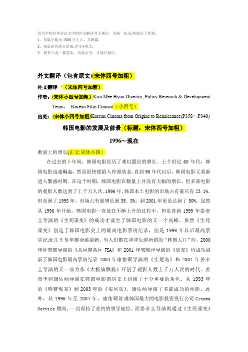
因为学校对毕业论文中的外文翻译并无规定,为统一起见,特做以下要求:1、每篇字数为1500字左右,共两篇;2、每篇由两部分组成:译文+原文.3 附件中是一篇范本,具体字号、字体已标注。
外文翻译(包含原文)(宋体四号加粗)外文翻译一(宋体四号加粗)作者:(宋体小四号加粗)Kim Mee Hyun Director, Policy Research & Development Team,Korean Film Council(小四号)出处:(宋体小四号加粗)Korean Cinema from Origins to Renaissance(P358~P340) 韩国电影的发展及前景(标题:宋体四号加粗)1996~现在数量上的增长(正文:宋体小四)在过去的十年间,韩国电影经历了难以置信的增长。
上个世纪60年代,韩国电影迅速崛起,然而很快便陷入停滞状态,直到90年代以后,韩国电影又重新进入繁盛时期。
在这个时期,韩国电影在数量上并没有大幅的增长,但多部电影的观影人数达到了上千万人次。
1996年,韩国本土电影的市场占有量只有23.1%。
但是到了1998年,市场占有量增长到35。
8%,到2001年更是达到了50%。
虽然从1996年开始,韩国电影一直处在不断上升的过程中,但是直到1999年姜帝圭导演的《生死谍变》的成功才诞生了韩国电影的又一个高峰。
虽然《生死谍变》创造了韩国电影史上的最高电影票房纪录,但是1999年以后最高票房纪录几乎每年都会被刷新。
当人们都在津津乐道所谓的“韩国大片”时,2000年朴赞郁导演的《共同警备区JSA》和2001年郭暻泽导演的《朋友》均成功刷新了韩国电影最高票房纪录.2003年康佑硕导演的《实尾岛》和2004年姜帝圭导演的又一部力作《太极旗飘扬》开创了观影人数上千万人次的时代。
姜帝圭和康佑硕导演在韩国电影票房史上扮演了十分重要的角色。
从1993年的《特警冤家》到2003年的《实尾岛》,康佑硕导演了多部成功的电影。
毕业设计(论文)外文文献译文格式及装订要求
“毕业设计(论文)外文文献译文”格式及装订要求
全校所有专业的学生在完成毕业设计(论文)的同时,必须完成一篇专业外文文献翻译工作(将外文文献翻译成中文),要求译出3000汉字以上的有关技术资料或专业外文文献,内容要与毕业设计(论文)内容相关。
书写时具体格式要求参考“毕业论文(设计说明书)缩写稿格式、版面要求”,装订时按以下顺序独立装订:1、封面;2、外文文献译文;3、外文文献原文。
附件:毕业设计(论文)外文文献译文封面
毕业设计(论文)
外文文献译文及原文
学生:
学号:
院(系):
专业:
指导教师:
20 年月日。
毕业设计(论文)外文资料和译文格式要求(模板)
成都东软学院外文资料和译文格式要求一、译文必须采用计算机输入、打印,幅面A4。
外文资料原文(复印或打印)在前,译文在后,于左侧装订。
二、具体要求1、至少翻译一篇内容与所选课题相关的外文文献。
2、译文汉字字数不少于4000字。
3、正文格式要求:宋体五号字。
译文格式参见《译文格式要求》,宋体五号字,单倍行距。
纸张纸张为A4纸,页边距上2.54cm、下2.54cm、左3.17cm、右3.17cm。
装订外文资料原文(复印或打印)在前,译文在后封面封面的专业、班级、姓名、学号等信息要全部填写正确。
封面指导教师必须为讲师以上职称,若助教则需要配备一名讲师协助指导。
讲师在前,助教在后。
指导教师姓名后面空一个中文空格,加职称。
页眉页眉说明宋体小五,左端“XX学院毕业设计(论文)”,右端“译文”。
页眉中的学院名称要与封面学院名称一致。
字数本科4000字。
附:外文资料和译文封面、空白页成都东软学院外文资料和译文专业:软件工程移动互联网应用开发班级:2班姓名:罗荣昆学号:12310420216指导教师:2015年 12月 8日Android page layoutUsing XML-Based LayoutsW hile it is technically possible to create and attach widgets to our activity purely through Java code, the way we did in Chapter 4, the more common approach is to use an XML-based layout file. Dynamic instantiation of widgets is reserved for more complicated scenarios, where the widgets are not known at compile-time (e g., populating a column of radio buttons based on data retrieved off the Internet).With that in mind, it’s time to break out the XML and learn how to lay out Android activities that way.What Is an XML-Based Layout?As the name suggests, an XML-based layout is a specification of widgets’ relationships to each other—and to their containers (more on this in Chapter 7)—encoded in XML format. Specifi cally, Android considers XML-based layouts to be resources, and as such layout files are stored in the res/layout directory inside your Android project.Each XML file contains a tree of elements specifying a layout of widgets and their containers that make up one view hierarchy. The attributes of the XML elements are properties, describing how a widget should look or how a container should behave. For example, if a Button element has an attribute value of android:textStyle = "bold", that means that the text appearing on the face of the button should be rendered in a boldface font style.Android’s SDK ships with a tool (aapt) which uses the layouts. This tool should be automatically invoked by your Android tool chain (e.g., Eclipse, Ant’s build.xml). Of particular importance to you as a developer is that aapt generates the R.java source file within your project, allowing you to access layouts and widgets within those layouts directly from your Java code. Why Use XML-Based Layouts?Most everything you do using XML layout files can be achieved through Java code. For example, you could use setTypeface() to have a button render its textin bold, instead of using a property in an XML layout. Since XML layouts are yet another file for you to keep track of, we need good reasons for using such files.Perhaps the biggest reason is to assist in the creation of tools for view definition, such as a GUI builder in an IDE like Eclipse or a dedicated Android GUI designer like DroidDraw1. Such GUI builders could, in principle, generate Java code instead of XML. The challenge is re-reading the UI definition to support edits—that is far simpler if the data is in a structured format like XML than in a programming language. Moreover, keeping generated XML definitions separated from hand-written Java code makes it less likely that somebody’s custom-crafted source will get clobbered by accident when the generated bits get re-generated. XML forms a nice middle ground between something that is easy for tool-writers to use and easy for programmers to work with by hand as needed.Also, XML as a GUI definition format is becoming more commonplace. Microsoft’s XAML2, Adobe’s Flex3, and Mozilla’s XUL4 all take a similar approach to that of Android: put layout details in an XML file and put programming smarts in source files (e.g., JavaScript for XUL). Many less-well-known GUI frameworks, such as ZK5, also use XML for view definition. While “following the herd” is not necessarily the best policy, it does have the advantage of helping to ease the transition into Android from any other XML-centered view description language. OK, So What Does It Look Like?Here is the Button from the previous chapter’s sample application, converted into an XMLlayout file, found in the Layouts/NowRedux sample project. This code sample along with all others in this chapter can be found in the Source Code area of .<?xml version="1.0" encoding="utf-8"?><Button xmlns:android="/apk/res/android"android:id="@+id/button"android:text=""android:layout_width="fill_parent"android:layout_height="fill_parent"/>The class name of the widget—Button—forms the name of the XML element. Since Button is an Android-supplied widget, we can just use the bare class name. If you create your own widgets as subclasses of android.view.View, you would need to provide a full package declara tion as well.The root element needs to declare the Android XML namespace:xmlns:android="/apk/res/android"All other elements will be children of the root and will inherit that namespace declaration.Because we want to reference this button from our Java code, we need to give it an identifier via the android:id attribute. We will cover this concept in greater detail later in this chapter.The remaining attributes are properties of this Button instance:• android:text indicates the initial text to be displayed on the button face (in this case, an empty string)• android:layout_width and android:layout_height tell Android to have the button’swidth and height fill the “parent”, in this case the entire screen—these attributes will be covered in greater detail in Chapter 7.Since this single widget is the only content in our activity, we only need this single element. Complex UIs will require a whole tree of elements, representing the widgets and containers that control their positioning. All the remaining chapters of this book will use the XML layout form whenever practical, so there are dozens of other examples of more complex layouts for you to peruse from Chapter 7 onward.What’s with the @ Signs?Many widgets and containers only need to appear in the XML layout file and do not need to be referenced in your Java code. For example, a static label (TextView) frequently only needs to be in the layout file to indicate where it should appear. These sorts of elements in the XML file do not need to have the android:id attribute to give them a name.Anything you do want to use in your Java source, though, needs an android:id.The convention is to use @+id/... as the id value, where the ... represents your locally unique name for the widget in question. In the XML layout example in the preceding section, @+id/button is the identifier for the Button widget.Android provides a few special android:id values, of the form @android:id/.... We will see some of these in various chapters of this book, such as Chapters 8 and 10.We Attach These to the Java How?Given that you have painstakingly set up the widgets and containers in an XML layout filenamed main.xml stored in res/layout, all you need is one statement in your activity’s onCreate() callback to use that layout:setContentView(yout.main);This is the same setContentView() we used earlier, passing it an instance of a View subclass (in that case, a Button). The Android-built view, constructed from our layout, is accessed from that code-generated R class. All of the layouts are accessible under yout, keyed by the base name of the layout file—main.xml results in yout.main.To access our identified widgets, use findViewById(), passing in the numeric identifier of the widget in question. That numeric identifier was generated by Android in the R class asR.id.something (where something is the specific widget you are seeking). Those widgets are simply subclasses of View, just like the Button instance we created in Chapter 4.The Rest of the StoryIn the original Now demo, the button’s face would show the current time, which would reflect when the button was last pushed (or when the activity was first shown, if the button had not yet been pushed).Most of that logic still works, even in this revised demo (NowRedux). However,rather than instantiating the Button in our activity’s onCreate() callback, we can reference the one from the XML layout:package youts;import android.app.Activity;import android.os.Bundle;import android.view.View;import android.widget.Button; import java.util.Date;public class NowRedux extends Activity implements View.OnClickListener { Button btn;@Overridepublic void onCreate(Bundle icicle) { super.onCreate(icicle);setContentView(yout.main);btn=(Button)findViewById(R.id.button);btn.setOnClickListener(this);upd ateTime();}public void onClick(View view) { updateTime();}private void updateTime() {btn.setText(new Date().toString()); }}The first difference is that rather than setting the content view to be a view we created in Java code, we set it to reference the XML layout (setContentView(yout.main)). The R.java source file will be updated when we rebuild this project to include a reference to our layout file (stored as main.xml in our project’s res/l ayout directory).The other difference is that we need to get our hands on our Button instance, for which we use the findViewById() call. Since we identified our button as @+id/button, we can reference the button’s identifier as R.id.button. Now, with the Button instance in hand, we can set the callback and set the label as needed.As you can see in Figure 5-1, the results look the same as with the originalNow demo.Figure 5-1. The NowRedux sample activity Employing Basic WidgetsE very GUI toolkit has some basic widgets: fields, labels, buttons, etc. Android’s toolkit is no different in scope, and the basic widgets will provide a good introduction as to how widgets work in Android activities.Assigning LabelsThe simplest widget is the label, referred to in Android as a TextView. Like in most GUI toolkits, labels are bits of text not editable directly by users. Typically, they are used to identify adjacent widgets (e.g., a “Name:” label before a field where one fills in a name).In Java, you can create a label by creating a TextView instance. More commonly, though, you will create labels in XML layout files by adding a TextView element to the layout, with an android:text property to set the value of the label itself. If you need to swap labels based on certain criteria, such as internationalization, you may wish to use a resource reference in the XML instead, as will be described in Chapter 9. TextView has numerous other properties of relevance for labels, such as:• android:typeface to set the typeface to use for the label (e.g., monospace) • android:textStyle to indicate that the typeface should be made bold (bold), italic (italic),or bold and italic (bold_italic)• android:textColor to set the color of the label’s text, in RGB hex format (e.g., #FF0000 for red)For example, in the Basic/Label project, you will find the following layout file:<?xml version="1.0" encoding="utf-8"?><TextView xmlns:android=/apk/res/androidandroid:layout_width="fill_parent"android:layout_height="wrap_content"android:text="You were expecting something profound?" />As you can see in Figure 6-1, just that layout alone, with the stub Java source provided by Android’s p roject builder (e.g., activityCreator), gives you the application.Figure 6-1. The LabelDemo sample applicationButton, Button, Who’s Got the Button?We’ve already seen the use of the Button widget in Chapters 4 and 5. As it turns out, Button is a subclass of TextView, so everything discussed in the preceding section in terms of formatting the face of the button still holds. Fleeting ImagesAndroid has two widgets to help you embed images in your activities: ImageView and ImageButton. As the names suggest, they are image-based analogues to TextView and Button, respectively.Each widget takes an android:src attribute (in an XML layout) to specify what picture to use. These usually reference a drawable resource, described in greater detail in the chapter on resources. You can also set the image content based on a Uri from a content provider via setImageURI().ImageButton, a subclass of ImageView, mixes in the standard Button behaviors, for responding to clicks and whatnot.For example, take a peek at the main.xml layout from the Basic/ImageView sample project which is found along with all other code samples at : <?xml version="1.0" encoding="utf-8"?><ImageView xmlns:android=/apk/res/androidandroid:id="@+id/icon"android:layout_width="fill_parent"android:layout_height="fill_parent"android:adjustViewBounds="true"android:src="@drawable/molecule" />The result, just using the code-generated activity, is shown in Figure 6-2.Figure 6-2. The ImageViewDemo sample applicationFields of Green. Or Other Colors.Along with buttons and labels, fields are the third “anchor” of most GUI toolkits. In Android, they are implemented via the EditText widget, which is a subclass of the TextView used for labels.Along with the standard TextView properties (e.g., android:textStyle), EditText has many others that will be useful for you in constructing fields, including:• android:autoText, to control if the fie ld should provide automatic spelling assistance• android:capitalize, to control if the field should automatically capitalize the first letter of entered text (e.g., first name, city) • android:digits, to configure the field to accept only certain digi ts • android:singleLine, to control if the field is for single-line input or multiple-line input (e.g., does <Enter> move you to the next widget or add a newline?)Beyond those, you can configure fields to use specialized input methods, such asandroid:numeric for numeric-only input, android:password for shrouded password input,and android:phoneNumber for entering in phone numbers. If you want to create your own input method scheme (e.g., postal codes, Social Security numbers), you need to create your own implementation of the InputMethod interface, then configure the field to use it via android: inputMethod.For example, from the Basic/Field project, here is an XML layout file showing an EditText:<?xml version="1.0" encoding="utf-8"?><EditTextxmlns:android=/apk/res/androidandroid:id="@+id/field"android:layout_width="fill_parent"android:layout_height="fill_parent"android:singleLine="false" />Note that android:singleLine is false, so users will be able to enter in several lines of text. For this project, the FieldDemo.java file populates the input field with some prose:package monsware.android.basic;import android.app.Activity;import android.os.Bundle;import android.widget.EditText;public class FieldDemo extends Activity { @Overridepublic void onCreate(Bundle icicle) { super.onCreate(icicle);setContentView(yout.main);EditText fld=(EditText)findViewById(R.id.field);fld.setText("Licensed under the Apache License, Version 2.0 " + "(the \"License\"); you may not use this file " + "except in compliance with the License. You may " + "obtain a copy of the License at " +"/licenses/LICENSE-2.0");}}The result, once built and installed into the emulator, is shown in Figure 6-3.Figure 6-3. The FieldDemo sample applicationNote Android’s emulator only allows one application in the launcher per unique Java package. Since all the demos in this chapter share the monsware.android.basic package, you will only see one of these demos in your emulator’s launcher at any one time.Another flavor of field is one that offers auto-completion, to help users supply a value without typing in the whole text. That is provided in Android as the AutoCompleteTextView widget and is discussed in Chapter 8.Just Another Box to CheckThe classic checkbox has two states: checked and unchecked. Clicking the checkbox toggles between those states to indicate a choice (e.g., “Ad d rush delivery to my order”). In Android, there is a CheckBox widget to meet this need. It has TextView as an ancestor, so you can use TextView properties likeandroid:textColor to format the widget. Within Java, you can invoke: • isChecked() to determi ne if the checkbox has been checked• setChecked() to force the checkbox into a checked or unchecked state • toggle() to toggle the checkbox as if the user checked itAlso, you can register a listener object (in this case, an instance of OnCheckedChangeListener) to be notified when the state of the checkbox changes.For example, from the Basic/CheckBox project, here is a simple checkbox layout:<?xml version="1.0" encoding="utf-8"?><CheckBox xmlns:android="/apk/res/android"android:id="@+id/check"android:layout_width="wrap_content"android:layout_height="wrap_content"android:text="This checkbox is: unchecked" />The corresponding CheckBoxDemo.java retrieves and configures the behavior of the checkbox:public class CheckBoxDemo extends Activityimplements CompoundButton.OnCheckedChangeListener { CheckBox cb;@Overridepublic void onCreate(Bundle icicle) { super.onCreate(icicle);setContentView(yout.main);cb=(CheckBox)findViewById(R.id.check);cb.setOnCheckedChangeListener(this);}public void onCheckedChanged(CompoundButton buttonView,boolean isChecked) {if (isChecked) {cb.setText("This checkbox is: checked");}else {cb.setText("This checkbox is: unchecked");}}}Note that the activity serves as its own listener for checkbox state changes since it imple ments the OnCheckedChangeListener interface (via cb.setOnCheckedChangeListener(this)). The callback for the listener is onCheckedChanged(), which receives the checkbox whose state has changed and what the new state is. In this case, we update the text of the checkbox to reflect what the actual box contains.The result? Clicking the checkbox immediately updates its text, as you can see in Figures 6-4 and 6-5.Figure 6-4. The CheckBoxDemo sample application, with the checkbox uncheckedFigure 6-5. The same application, now with the checkbox checkedTurn the Radio UpAs with other implementations of radio buttons in other toolkits, Android’s radio buttons are two-state, like checkboxes, but can be grouped such that only one radio button in the group can be checked at any time.Like CheckBox, RadioButton inherits from CompoundButton, which in turn inherits fromTextView. Hence, all the standard TextView properties for font face, style, color, etc., are available for controlling the look of radio buttons. Similarly, you can call isChecked() on a RadioButton to see if it is selected, toggle() to select it, and so on, like you can with a CheckBox.Most times, you will want to put your RadioButton widgets inside of aRadioGroup. The RadioGroup indicates a set of radio buttons whose state is tied, meaning only one button out of the group can be selected at any time. If you assign an android:id to your RadioGroup in your XML layout, you can access the group from your Java code and invoke:• check() to check a specific radio button via its ID (e.g., group.check(R.id.radio1))• clearCheck() to clear all radio buttons, so none in the group are checked• getCheckedRadioButtonId() to get the ID of the currently-checked radio button (or -1 if none are checked)For example, from the Basic/RadioButton sample application, here is an XML layout showing a RadioGroup wrapping a set of RadioButton widgets: <?xml version="1.0" encoding="utf-8"?> <RadioGroupxmlns:android=/apk/res/androidandroid:orientation="vertical"android:layout_width="fill_parent"android:layout_height="fill_parent" ><RadioButton android:id="@+id/radio1"android:layout_width="wrap_content"android:layout_height="wrap_content"android:text="Rock" /><RadioButton android:id="@+id/radio2"android:layout_width="wrap_content"android:layout_height="wrap_content"android:text="Scissors" /><RadioButton android:id="@+id/radio3"android:layout_width="wrap_content"android:layout_height="wrap_content"android:text="Paper" /></RadioGroup>Figure 6-6 shows the result using the stock Android-generated Java forthe project and this layout.Figure 6-6. The RadioButtonDemo sample application Note that the radio button group is initially set to be completely unchecked at the outset. To pre-set one of the radio buttons to be checked, use either setChecked() on the RadioButton or check() on the RadioGroup from within your onCreate() callback in your activity.It’s Quite a ViewAll widgets, including the ones previously shown, extend View, and as such give all widgets an array of useful properties and methods beyond those already described.Useful PropertiesSome of the properties on View most likely to be used include:• Controls the focus sequence:• android:nextFocusDown• android:nextFocusLeft• android:nextFocusRight• android:nextFocusUp• android:visibility, which controls wheth er the widget is initially visible• android:background, which typically provides an RGB color value (e.g., #00FF00 for green) to serve as the background for the widgetUseful MethodsYou can toggle whether or not a widget is enabled via setEnabled() and see if it is enabled via isEnabled(). One common use pattern for this is to disable some widgets based on a CheckBox or RadioButton selection.You can give a widget focus via requestFocus() and see if it is focused via isFocused(). You might use this in concert with disabling widgets as previously mentioned, to ensure the proper widget has the focus once your disabling operation is complete.To help navigate the tree of widgets and containers that make up an activity’s overall view, you can use:• get Parent() to find the parent widget or container• findViewById() to find a child widget with a certain ID• getRootView() to get the root of the tree (e.g., what you provided to the activity via setContentView())Android 页面布局使用XML进行布局虽然纯粹通过Java代码在activity上创建和添加部件,在技术上是可行的,我们在第4章中做的一样,更常见的方法是使用一种基于XML的布局文件。
外文文献翻译格式要求
外文文献翻译格式要求:,行间距设( 1)摘要,关键词:宋体五号(其中“摘要”和“关键词”为宋体五号加粗)置为 18 磅,段前段后间距设置为 0.5 行,对齐方式选择“两端对齐”方式;各个关键词之间以分号(;)或者(,)隔开,最后一个关键词后不加标点;( 2)正文一级标题:采用黑体小三号加粗,行间距设置为20 磅,段前段后间距设置为0.5行,一般采用“ 1 引言”样式,其中 1 和“引言”之间用一个空格分开;正文二级标题:采用黑体小三号,行间距设置为20 磅,段前段后间距设置为0.5 行,一般采用“ 2.1 系统原理”样式,其中 1 和“系统原理”之间用一个空格分开;;一级标题和二级标题采用“左对齐”方式;( 3)正文内容:采用宋体小四号,行间距设置为 20 磅,段前段后间距设置为 0 行,首行缩进 2 字符,正文对齐方式在段落格式设置中选择“两端对齐”,遇正文中有公式的,设置该行(段)行间距为“单倍行距”( 4)插图:请设置图片版式为“浮于文字上方”,并勾选“居中”,图片大小根据版面,按比例适当进行缩放,图示说明采用“图 1 主控制器的结构图”样式置于图下,图序与说明以一个空格字符间隔,图示说明采用宋体五号,居中对齐,行间距设置为“单倍行距”,段前段后距设置为 0.5 行;( 5)表格:在表格属性中选择“居中”对齐方式,表格说明采用“表 1 两种方法试验数据比较”样式置于表格上方,表序与说明以一个空格字符间隔,表格说明采用宋体五号,居中对齐,行间距设置为“单倍行距”,段前段后距设置为 0.5 行;(6)参考文献:“参考文献”格式同一级标题格式,参考文献内容采用宋体五号,行间距设置为 18 磅,段前段后间距设置为 0 行,对齐方式选择“左对齐”方式,其中出现的标点一律采用英文标点;Times 以上摘要,关键词,正文,标题及参考文献中出现的英文字符和数字,一律设置为“ New Roman ”字体。
另外:外文文献翻译附于开题报告之后:第一部分为译文,第二部分为外文文献原文,译文与原文均需单独编制页码(底端居中)并注明出处。
外文翻译 -面对绿色贸易壁垒升级

毕业论文(设计)外文翻译题目:面对绿色贸易壁垒升级系部名称:经济管理系专业班级:国贸08 学生姓名:潘学号:200880514指导教师:教师职称:副教授2011年12月30日面对绿色贸壁垒升级萨金特摘要:今年五月,欧盟在签发符合RoHS,WEEE,EUP的法令,REACH法规和规章和绿色贸易措施,提出并实施了DMF的顺序法令;DMF的命令禁止有“二甲酯”产品的流向和销售导欧盟市场,然而,3个月后执行的命令,让不少企业都受到影响,特别是金融危机的背景下的中国出口产业。
一些专家指出,绿色贸易壁垒成为继汇率影响外贸的又一个关键因素。
关键词:欧盟、绿色贸易壁垒、中国一、不可避免的“绿色贸易壁垒”近年来,由于欧洲和美洲国家绿色贸易壁垒不断升级;跨越关税壁垒后,另一种非关税的绿色贸易壁垒等待像中国这样的发展中国家。
从2009年2月至4月,欧盟非食品类产品快速预警系统(RAPEX)发布了30条关于对中国鞋和玩具产品的信息,德国、西班牙和法国召回,因为含有DMF。
2009年3月28日,山西检验检疫局工作组从企业收到一份报告,说是遏制拖拉机备用零件出口到意大利,由于使用木质包装已没有“自由DMF”的证明号码。
从2009年7月开始,广州芳村的包装材料制造商受到的退货和返工,因为在其产品中二甲基甲酰胺。
近年来,为什么绿色贸易壁垒在广泛领域的频率使用,它背后有一个深层次的原因。
例如,全球环境恶化,如:臭氧损耗,全球变暖,生物多样性丧失和其他问题,直接影响到人们的消费观念和价值观念,特别是在欧洲和美国等发达国家,消费者的'绿色价值观已经形成,并显示他们对绿色产品的需求和喜好,这也提供了绿色贸易壁垒的形成条件和机会。
此外,传统的非关税越来越多地被谴责,在这种情况下,出于自身利益的欧洲,美国和其他国家开始寻求新的贸易保护措施。
此外,在国家环保标准的差异,以及当前的国际贸易规则和协议是不完整的provids绿色贸易壁垒的借口。
外文翻译及外文原文(参考格式)
外文翻译要求:1、外文资料与毕业设计(论文)选题密切相关,译文准确、质量好。
2、阅读2篇幅以上(10000字符左右)的外文资料,完成2篇不同文章的共2000汉字以上的英译汉翻译3、外文资料可以由指导教师提供,外文资料原则上应是外国作者。
严禁采用专业外语教材文章。
4、排序:“一篇中文译文、一篇外文原文、一篇中文译文、一篇外文原文”。
插图内文字及图名也译成中文。
5、标题与译文格式(字体、字号、行距、页边距等)与论文格式要求相同。
下页附:外文翻译与原文参考格式2英文翻译 (黑体、四号、顶格)外文原文出处:(译文前列出外文原文出处、作者、国籍,译文后附上外文原文)《ASHRAE Handbook —Refrigeration 》.CHAPTER3 .SYSTEM Practices for ammonia 3.1 System Selection 3.2 Equipment3.10 Reciprocating Compressors第3章 氨制冷系统的实施3.1 系统选择在选择一个氨制冷系统设计时,须要考虑一些设计决策要素,包括是否采用(1)单级压缩(2)带经济器的压缩(3)多级压缩(4)直接蒸发(5)满液式(6)液体再循环(7)载冷剂。
单级压缩系统基本的单级压缩系统由蒸发器、压缩机、冷凝器、储液器(假如用的话)和制冷剂控制装置(膨胀阀、浮球阀等)。
1997 ASHRAE 手册——“原理篇”中的第一章讨论了压缩制冷循环。
图1.壳管式经济器的布置外文翻译的标题与译文中的字体、字号、行距、页边距等与论文格式相同。
英文原文(黑体、四号、顶格)英文翻译2(黑体,四号,顶格)外文原文出处:(黑体,四号,顶格)P. Fanning. Nonlinear Models of Reinforced and Post-tensioned Concrete Beams. Lecturer, Department of Civil Engineering, University College Dublin. Received 16 Jul 2001.非线形模型钢筋和后张法预应力混凝土梁摘要:商业有限元软件一般包括混凝土在荷载做用下非线性反应的专用数值模型。
中原工学院简介

封面中原工学院信息商务学院(中英文字体按提供的字体)College of Information & Business,Zhongyuan University of Technology新生入学手册2006年7月阅读指南请新生和家长阅读《新生报到手册》全文并请仔细阅读《中原工学院信息商务学院2006年本科新生入学须知》及《新生交费办法》目录1.中原工学院信息商务学院致新同学的一封信2.中原工学院信息商务学院2006年本科新生入学须知3.新生交费办法4.新生入校生活服务指南致新同学的一封信亲爱的新同学:您好!祝贺您成为一名光荣的大学生!在老师的辛勤培养以及家长和社会各界的关心与支持下,您经过多年的努力终于实现了自己的夙愿,成为中原工学院信息商务学院的一名新同学。
我们全体教职员工对您的到来表示最真诚的欢迎,并向关心您成长的老师、家长及社会各界表示衷心的感谢!中原工学院信息商务学院是教育部首批确认和批准的具有普通全日制本科学历教育招生资格的独立学院,是培养本科层次高级应用型人才的本科院校。
目前,学院在校生2400余人,实行两区办学(中原工学院北校区和西校区)。
学院实行校董事会领导下的院长负责制的管理模式。
独立学院是专指由普通本科高校与企业或社会团体或事业单位按新机制、新模式合作举办的本科层次的二级学院。
独立学院是我国高等学校的重要组成部分,是新形势下我国高等教育办学机制与模式的一项探索和创新,是更好更快扩大高等教育资源的一种有效途径,对我国高等教育的持续、健康发展具有重大意义。
目前,教育部确认批准的独立学院全国共有292所。
中原工学院信息商务学院依托中原工学院办学,中原工学院对其教学质量负责。
中原工学院是中央与河南省共建的具有学士、硕士学位授予权的多科性高等学校,学科门类齐全,拥有2个省级重点学科,办学特色鲜明,适应社会需要,毕业生深受社会欢迎,尤其在浙江、广东一带已经形成品牌效应。
我院将充分利用中原工学院50年的办学经验、雄厚的师资和学科基础、丰富的藏书和数字化校园、同时聘请国内外相关专业的知名学者教授等优质教育资源,以立足河南,面向全国,服务社会与地方经济为宗旨,以社会和经济发展对人才的需要为导向,以培养实用化和个性化相结合、人文素养和专业技能兼备的高级应用型人才为目标, 以实践能力和创新能力为重点,以较强的外语、计算机应用能力为特色,以灵活的学分制、导师制为手段,全面构建本科生人才培养体系,不断优化人才培养方案,形成了我院独特的人才培养模式。
- 1、下载文档前请自行甄别文档内容的完整性,平台不提供额外的编辑、内容补充、找答案等附加服务。
- 2、"仅部分预览"的文档,不可在线预览部分如存在完整性等问题,可反馈申请退款(可完整预览的文档不适用该条件!)。
- 3、如文档侵犯您的权益,请联系客服反馈,我们会尽快为您处理(人工客服工作时间:9:00-18:30)。
毕业论文(设计)
外文翻译
外文题目:
(翻译文献的中文题目)
翻译文献的中文题目
一级标题
一级标题:四号(宋体、新罗马),加粗,行距1.5倍,段前、段后各0.5行正文
二级标题
二级标题:小四号(宋体、新罗马),加粗,行距1.5倍,段前、段后各0.5行正文
正文要求:小四号(宋体、新罗马),行距1.5倍
本文摘译自:
写明出处:作者.题目.刊物名,时间
外文翻译写作要求:
1、中英文内容必须一致,不得出现此多彼少现象。
2、英文必须有出处,在中文的结尾处注上英文出处,标注“本文摘译自……”。
3、字数要求:汉字3000字左右。
4、排版要求:见上页
5、其他:
汉语翻译在前,英文原文附在汉语翻译之后(如英文文献来源为书籍类印刷品,需用A4纸复印)。