雅思写作小作文范文 雅思写作折线图(线状图) 美国肉类消耗量.doc
雅思小作文模板肉类消耗

雅思小作文模板肉类消耗英文回答:Meat Consumption Essay。
Meat consumption has been a topic of much debate in recent years, with both proponents and opponents citing a variety of arguments to support their respective stances. On the one hand, meat provides essential nutrients such as protein, iron, and vitamin B12, and it can be a valuable part of a healthy diet. On the other hand, meat production has been linked to environmental damage, animal welfare concerns, and health risks for humans.Environmental Impact。
One of the most significant concerns associated with meat consumption is its environmental impact. The raising of livestock for food requires vast amounts of land, water, and feed, all of which can contribute to environmentaldegradation. In particular, the clearing of forests for grazing land has been a major driver of deforestation, particularly in the Amazon rainforest. Additionally, the production of meat generates significant amounts of greenhouse gases, including methane and nitrous oxide, which contribute to climate change.Animal Welfare。
剑7test2小作文 雅思 知乎
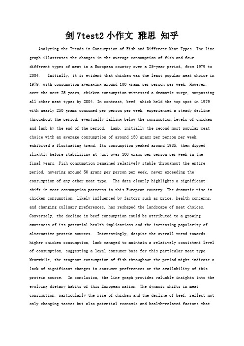
剑7test2小作文雅思知乎Analyzing the Trends in Consumption of Fish and Different Meat Types The line graph illustrates the changes in the average consumption of fish and fourdifferent types of meat in a European country over a 25-year period, from 1979 to 2004. Initially, it is evident that chicken was the least popular meat choice in 1979, with consumption averaging around 100 grams per person per week. However, over the next 25 years, chicken consumption witnessed a dramatic surge, surpassing all other meat types by 2004. In contrast, beef, which held the top spot in 1979 with nearly 250 grams consumed per person per week, experienced a steady decline throughout the period, eventually falling below the consumption levels of chicken and lamb by the end of the period. Lamb, initially the second most popular meat choice with an average consumption of around 150 grams per person per week, exhibited a fluctuating trend. Its consumption peaked around 1985, then dipped slightly before stabilizing at just over 100 grams per person per week in thefinal years. Fish consumption remained relatively stable throughout the entire period, hovering around 50 grams per person per week, never exceeding the consumption of any other meat type. The data clearly highlights a significant shift in meat consumption patterns in this European country. The dramatic rise in chicken consumption, likely influenced by factors such as price, health concerns, and changing culinary preferences, has reshaped the landscape of meat choices. Conversely, the decline in beef consumption could be attributed to a growing awareness of its potential health implications and the increasing popularity of alternative protein sources. Interestingly, despite the overall trend towards higher chicken consumption, lamb managed to maintain a relatively consistent level of consumption, suggesting a loyal consumer base for this particular meat type. Meanwhile, the stagnant consumption of fish throughout the period might indicate a lack of significant changes in consumer preferences or the availability of this protein source. In conclusion, the line graph provides valuable insights into the evolving dietary habits of this European nation. The dynamic shifts in meat consumption, particularly the rise of chicken and the decline of beef, reflect not only changing tastes but also potential economic and health-related factors thatinfluence consumer choices. Further research into these underlying factors could provide a more comprehensive understanding of the observed trends.。
雅思A类小作文范文 Consumption of meat 线图类
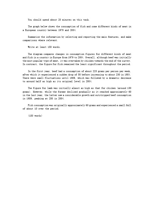
You should spend about 20 minutes on this task.The graph below shows the consumption of fish and some different kinds of meat in a European country between 1979 and 2004.Summarise the information by selecting and reporting the main features, and make comparisons where relevant.Write at least 150 words.The diagram compares changes in consumption figures for different kinds of meat and fish in a country in Europe from 1979 to 2004. Overall, although beef was initially the most popular type of meat, it was overtaken by chicken towards the end of the survey. In contrast, the figure for fish remained the least significant throughout the period.In the first year, beef had a consumption of about 225 grams per person per week, after which it experienced a sudden drop of 50 before increasing to about 230 in 1984. There were small fluctuations until 1989, which was followed by a dramatic decrease to around half as high as its original level in 2004.The figure for lamb was initially almost as high as that for chicken (around 150 grams). However, while the former declined gradually as it reached approximately 60 in the last year, the latter saw a considerable growth and outstripped beef consumption in 1989, peaking at 250 in 2004.Fish consumption was originally approximately 60 grams and experienced a small fall of about 10 over the period.(180 words)。
雅思写作Task1小作文饼状图范文:美国消费模式的
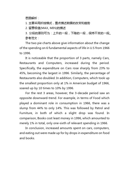
思路解析:1. 主要采用折线模式,重点描述数据的改变和趋势2. 留意极值(MAX, MIN)的描述3. 分段的原则可为:上升的一段,下降的一段,保持不变的一段。
参考范文:The two pie charts above give information about the change of the spending on 6 fundamental aspects of life in U.S from 1966 to 1996.It is noticeable that the proportion of 3 parts, namely Cars, Restaurants and Computers, increased during the period. Specifically, the expenditure on Cars rose sharply from 23% to 45%, becoming the largest in 1996. Similarly, the percentage of Restaurants also doubled. In addition, Computers, which took up the smallest proportion only at 1% in American budget of 1966, soared up by 10 times to 10% by 1996.For the rest 3 areas, however, the 3-decade period saw an opposite downward-trend. For example, in terms of Food which played a dominant role in consumption in 1966, there was a slump from 44% to only 14%. This was followed by Patrol and Furniture, in both of which a slight drop was found. In comparison, Books cost least money in 1996, which amounted to merely 1% in total, only one-sixth of relevant spending in 1966.In conclusion, increased amounts spent on cars, computers, and eating out were made up for by drops in expenditure on food and books.。
雅思写作Task1曲线图考官范文(6)
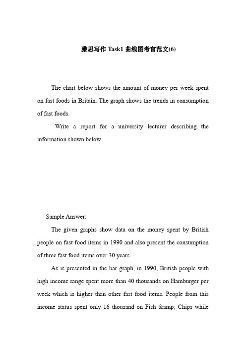
雅思写作Task1曲线图考官范文(6)The chart below shows the amount of money per week spent on fast foods in Britain. The graph shows the trends in consumption of fast foods.Write a report for a university lecturer describing the information shown below.Sample Answer:The given graphs show data on the money spent by British people on fast food items in 1990 and also present the consumption of three fast food items over 30 years.As is presented in the bar graph, in 1990, British people with high income range spent more than 40 thousands on Hamburger per week which is higher than other fast food items. People from this income status spent only 16 thousand on Fish & Chips whilethey spent around 18 thousand on Pizza in a week. Again Hamburger was the most popular fast food item in the medium income earning people also. They spent over 30 thousand dollar on this food item while they spent only 25 thousand on Fish & Pizza and 11 thousand on Pizza. Finally among the low income group, the fish & chips was the most popular fast food item as they spend most on this item (17 thousand per week). Their expenditure of pizza was only 6 thousand per week while they spent 14 thousand per week on hamburger.According to the line graph, people consume pizza more than any other fast food items in 1970. In this year UK citizens consumed more than 300 tons of pizza while the consumed only 100 tons of hamburger and fish & chips. The percentage of pizza consumption started declining and reached to only 200 tons on 1990. On the contrary, the popularity of the fish and chips reached to 500 tons in 1990 from the initial consumption volume of 80 tons. Finally the consumption of hamburger also increased over the year and reached to around 300 tons in 1990 from the initial amount of 20 tons.(Approximately 280 words)。
(完整版)雅思写作-小作文范文-柱状图
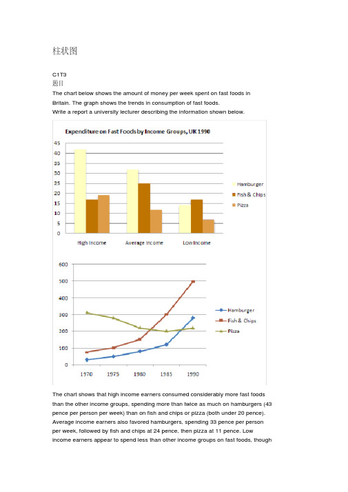
柱状图C1T3题目The chart below shows the amount of money per week spent on fast foods in Britain. The graph shows the trends in consumption of fast foods.Write a report a university lecturer describing the information shown below.The chart shows that high income earners consumed considerably more fast foods than the other income groups, spending more than twice as much on hamburgers (43 pence per person per week) than on fish and chips or pizza (both under 20 pence). Average income earners also favored hamburgers, spending 33 pence per person per week, followed by fish and chips at 24 pence, then pizza at 11 pence. Low income earners appear to spend less than other income groups on fast foods, thoughfish and chip remains their most popular fast food, followed by hamburgers and then pizza.From the graph we can see that in 1970, fish and chips were twice as popular asburgers, pizza being at that time the least popular fast food. The consumption of hamburgers and pizza has risen steadily over the 20 year period to 1990 while the consumption of fish and chips has been in decline over that same period with a slight increase in popularity since 1985.分析:题目The chart below shows the amount of money per week spent on fast foods inBritain. The graph shows the trends in consumption of fast foods.两句话,两个图第一段The chart shows that high income earners consumed considerably more fastfoods than the other income groups, spending more than twice as much onhamburgers (43 pence per person per week) than on fish and chips or pizza(both under 20 pence).说明了高收入人群的两个特点,第一是消耗快餐最多,第二是人群中hamburger, fish and chips, pizza的特点spending more than twice as much on hamburgers than on fish and chip and chips or pizza 这是一句令人费解的句子,含义应为“消耗的汉堡是薯片或匹萨的比如两倍多”,应用的句型应当为典型的表示倍数关系的句型“n times as…as”,? This airplane flies two times as fast as that one. 这家飞机的飞行速度是那架的两倍。
关于世界食物消费的饼状图的英语作文模板
关于世界食物消费的饼状图的英语作文模板Introduction:The pie chart below illustrates the global food consumption patterns in different regions of the world. It provides a comprehensive overview of the types of food consumed and the proportion of each category in the total food consumption.Overview of the pie chart:The pie chart is divided into several segments, each representing a different region of the world. The size of each segment corresponds to the proportion of food consumed by that region. The chart includes categories such as grains, fruits and vegetables, meat, dairy products, and others.Analysis of the data:- Grains: The chart shows that grains are a staple food in many regions of the world, accounting for a significant portion of the total food consumption. This is particularly true in regions like Asia and Africa, where rice, wheat, and other grains are the main sources of calories.- Fruits and vegetables: The data reveals that fruits and vegetables are an essential part of the diet in most regions,contributing to overall health and nutrition. Consumption of these foods is highest in regions like Europe and North America, where fresh produce is readily available.- Meat: The chart indicates that meat consumption varies significantly among different regions, with higher consumption rates in North America and Europe compared to Asia and Africa. This reflects differences in dietary preferences, cultural practices, and economic factors.- Dairy products: The data shows that dairy products are a significant source of nutrients in many regions, particularly in Europe and North America. However, consumption levels are lower in regions like Asia and Africa, where dairy products are less commonly consumed.Conclusion:Overall, the pie chart provides valuable insights into global food consumption patterns and highlights the importance of a diverse and balanced diet for human health and well-being. The data can inform policymakers, researchers, and individuals about the need for sustainable food production systems, dietary diversity, and nutrition education programs to address food insecurity, malnutrition, and other food-related challenges worldwide.。
雅思写作小作文范文 雅思写作柱状图bar chart 日常花费.doc

雅思写作小作文范文雅思写作柱状图bar chart 日常花费今天我们雅思写作小作文范文的文章来研究下柱状图bar chart。
该图表共显示了4个国家,分别为德国、意大利、法国和英国,以及这些国家的民众在音响、网球拍、香水、CD、玩具和电影方面的花费。
因为图中数据较多(共有24个),如果每条数据都详细描述的话,无论是时间和篇幅都不够用。
因此小编搜集了一篇相应的考官范文,以供大家参考。
雅思写作小作文题目雅思写作小作文范文The bar chart compares consumer spending on six different items in Germany, Italy, France and Britain.柱状图比较了德国、意大利、法国和英国的消费者在六种不同物品上的花费。
It is clear that British people spent significantly more money than people in the other three countries on all six goods. Of the six items, consumers spent the most money on photographic film.很明显,英国民众在所有六种物品上都明显花费比其他三个国家民众更多的金钱。
在六种物品中,消费者在电影上花费的金钱最多。
People in Britain spent just over £170,000 on photographic film, which is the highest figure shown on the chart. By contrast, Germans were the lowest overall spenders, with roughly the same figures (just under £150,000) for each of the six products.英国民众在电影上的花费超过170000英镑。
- 1、下载文档前请自行甄别文档内容的完整性,平台不提供额外的编辑、内容补充、找答案等附加服务。
- 2、"仅部分预览"的文档,不可在线预览部分如存在完整性等问题,可反馈申请退款(可完整预览的文档不适用该条件!)。
- 3、如文档侵犯您的权益,请联系客服反馈,我们会尽快为您处理(人工客服工作时间:9:00-18:30)。
雅思写作小作文范文雅思写作折线图(线状图)美国肉类消耗量
今天我们雅思写作小作文范文的文章来研究下折线图(线状图)。
该图表来自于华盛顿邮报的网站,数据相对于真正的雅思考试而言要更多一些。
因此如何挑选数据和进行对比就显得尤为重要。
小编搜集了一篇考官写的范文,以供大家参考。
雅思写作小作文题目
雅思写作小作文范文
The line graph shows changes in the per capita consumption of beef, pork, broilers, and turkey in the United States between 1955 and 2012.
该折线图展示了1955年到2012年期间美国每人牛肉、猪肉、鸡肉和火鸡肉的消耗量。
It is noticeable that beef was by far the most popular of the four types of meat for the majority of the 57-year period. However, a considerable rise can be seen in the consumption of broilers, with figures eventually surpassing those for beef.
很显然,牛肉在57年中的大多数时间都是四种肉类中最受欢迎的类型。
然而,鸡肉的消费量可以看到明显上升,并最终超过了牛肉的数量。
Between 1955 and 1976, US beef consumption rose from around 60 to a peak of 90 pounds per person per year. During the same period, consumption of broilers also rose, to nearly 30 pounds per person, while the figures for pork fluctuated between 50 and 40 pounds per person. Turkey was by far the least popular meat, with figures below 10 pounds per capita each year.
在1955年到1976年期间,美国牛肉的消耗量从每人每年60磅,上涨到最高点每人每年90磅。
在同样的时间段里,鸡肉的消费量也在上升,到达将近每人30磅。
而猪肉的消费量则在每人50磅到40磅之间徘徊。
火鸡肉到目前为止是最不受欢迎的肉类,每年每人的消耗量低于10磅。
By 2012, the amount of beef consumed by the average American had plummeted to around 50 pounds, but the consumption of broilers had doubled since the 1970s, to approximately 55 pounds per capita. By contrast, there were no significant changes in the trends for pork and turkey consumption over the period as a whole.
到2012年,平均每位美国人牛肉的消耗量跌落到大约50磅,但是鸡肉的消费量上涨到了20世纪70年代的两倍,到达大约每人55磅。
相比之下,猪肉和火鸡肉的消费类在整个时间段内没有太大的变化趋势。
雅思写作小作文高分范文,快速提升写作成绩。