雅思写作预备1——单线图
雅思写作Task 1 曲线图 Line Chart

You should write at least 150 words.
综合图:
综合图:model answer
• The graphs give information about global birth rates and population size. They predict that the global population growth rate will begin to decrease towards the middle of this century and will eventually stabilize at approximately 11 billion.
饼型图题:
You should spend about 20 minutes on this task.
The two pie charts below show the percentage of the Earth’s surface area and the percentage of the two world’s population for the seven continents.
You should write at least 150 words.answer
1
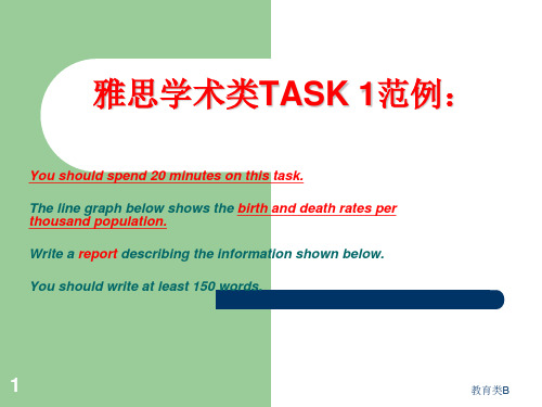
This line graph shows the birth and death rates per thousand population from 1900 to 1980. Before 1920 the birth rate remained level at around 40 per thousand. Then from 1920 it fell until it reached 30 per thousand in 1930. From 1930to 1945 it rose slowly(increased steadily) to 50 per thousand. Since 1945 it had decreased/fallen steadily. It got to 20 per thousand in 1980. The birth control measures were becoming effective and the birth rate was falling/decreasing at the moment and would continue to fall.
雅思图表写作范例(中小学校)

4
教育类B
TASK 2饼型图题:
You should spend about 20 minutes on this task.
The two pie charts below show the percentage of the Earth’s surface area and the percentage of the two world’s population for the seven continents.
Write a report describing the information shown below.
about the graph. Overall, the number of (mobile phone) owners has risen considerably since 1995. In some countries the figure has more than doubled over the five years.
7
教育类B
饼型图:model answer
Asia also has the largest population with a half of the world’s people living there. In contrast, Antarctica has no permanent inhabitants. Europe has a population next to that of Asia in size, and an area slightly bigger than that of Oceania, becoming the most densely populated region on the earth. Here the striking fact about the distribution of the world’s
雅思写作task曲线图.pptx

内容
分析
The graph shows the number of cases of
X disease in Someland between the years 1960 and 1995.As an overall trend概括。
第6页/共12页
• 避免重复:
•
如果是准确使用了各种结构和大量的词汇,得分就会很高。
第7页/共12页
两条曲线
•
You should spend about 20 minutes on this task.Write a report
for a university lecturer describing the information in the graph
单条曲线(single line graph)
• You should spend about 20 minutes on this task.Write a report for a university lecturer describing the information in the graph below.You should write at least 150 words.
below.You should write at least 150 words.
第8页/共12页
• 考生答卷一:
• The graph shows the rate of smoking in Someland.
• In1960,600 men in every 1000 was smoking.This number decreased gradually to 500 by 1974 and continued to decrease but more steeply to 300 in 1996.In contrast the rate of women smokers in1960 was very low at onlt 80 in every1000.This number incresed to 170 by 1968 and increased again but more steeply to 320 in 1977.The rate of female smokers then remained stable at 320 until 1984 at which point the figures began to decline and had dropped to 250 by 1995.
雅思图表写作范例课件

TASK 1 线型图范例:
雅思TASK 1图表作文
线型图:model answer
1
This line graph shows the birth and death rates per thousand population from 1900 to 1980.
Before 1920 the birth rate remained level at around 40 per thousand. Then from 1920 it fell until it reached 30 per thousand in 1930. From 1930to 1945 it rose slowly (increased steadily) to 50 per thousand. Since 1945 it had decreased/fallen steadily. It got to 20 per thousand in 1980. The birth control measures were becoming effective and the birth rate was falling/decreasing at the moment and would continue to fall.
population is its unevenness.
雅思学术类TASK 1范例:
You should spend 20 minutes on this task. The line graph below shows the birth and death rates per thousand population. Write a report describing the information shown below. You should write at least 150 words.
雅思写作-小作文范文-线图

线图C5T1原题The graph below shows the proportion of the population aged 65 and over between 1940 and 2040 in three different countries.Summarize the information by selecting and reporting the main features, and make comparisons where relevant.The graph shows the increase in the ageing population in Japan, Sweden and the USA. It indicates that the percentage of elderly people in all three countries is expected to increase to almost 25% of the respective populations by the year 2040. In 1940 the proportion of people aged 65 or more stood at only 5% in Japan, approximately 7% in Sweden and 9% in the US. However, while the figures for the Western countries grew to about 15% in around 1990, the figure for Japan dipped to only 2.5% for much of this period, before rising to almost 5% again at the present time.In spite of some fluctuation in the expected percentages, the proportion of older people will probably continue to increase in the next two decades in the three countries. A more dramatic rise is predicted between 2030 and 2040 in Japan, by which time it is thought that the proportion of elderly people will be similar in the three countries.分析:题目The graph below shows the proportion of the population aged 65 and over between 1940 and 2040 in three different countries.第一段The graph shows the increase in the ageing population in Japan, Sweden and the USA.•作者没有一上来提示图表内容,而是直接奔向中心思想,也就是文章的主旨句。
雅思写作—第4课(流程图+地图题)

丝
It is noticeable that the cocoon stage of the silkworm can
绸
be used to produce silk cloth through a very simple
的
process.
制
造
步
骤
雅思写作 — TASK 1
流程图
蚕 的 生 命 周 期
The cocoons are the raw material used for the production of silk cloth.
Once selected, they are boiled in water and the threads can be separated in the unwinding stage.
流程图
蚕 的 生 命 周 期
丝 绸 的 制 造 步 骤
The diagrams below show the life cycle of the silkworm and the stages in the production of silk cloth.
主体段
小结
充分利用图中信息 不要漏掉重要阶段 学会同义替换 灵活使用连接词
雅思写作 — TASK 1
流程图
流程图的常用表达
1. 表示过程,步骤,环节 process,procedure,step,stage,phase
2. 表示循环周期
circle,circulation,reuse.
3. 表示顺序衔接
(1) 首先
the process starts from.. the beginning of the whole cycle is marked by... ...is the first step in...
雅思写作单项
极点说明 趋势/幅度说明 交点说明
线型作文三要素
趋势 v+adv/adj+n 数据 时间 tense
线图写作“三要”“两不要”:
(1)要描写主要特征 (2)要总结趋势 (3)要比较 (4)不要只罗列数据 (5)不要妄自揣测推论数据背后的原因
双曲线
写法: 首段 —改写原题+总体趋势 中间段落 — 分别描写两条曲线 末段 — 写两条曲线的共同点和不同
剑7P101
四饼图 预测值比较
The charts below give information on the ages of the populations of Yemen and Italy in 2000 and projections for 2050.
剑9T3
柱状图 Bar Chart
(C6T4)
动态柱图
The chart below shows the total number of minutes (in billion) of telephone calls in the UK, divided into three categories, from 1995-2002. (C9T2)
点
The graph below shows radio and television audiences in UK throughout the day in 1992.
雅思图表线性图写作范文
WRITING TASK 1You should spend about 20 minutes on this task.The graph below gives information about cinema attendancein Australia between 1990 and the present, with projections to 2010.Summarise the information by selecting and reporting the main features, and make comparisons where relevant.Write at least 150 words.The graph shows percentages of cinema attendance at least once a year in Australia between 1990 to 2010 with projections for the future. The graph is described by 4 groups of different ages which are 14 to 24, 25 to 34, 35 to 49 and over 50 year olds.The youngest age group people have been going to cinema more than any other age groups and the percentage has been keeping very high at approximately90% since 1990. It is predicted to keep the high and to increase more from 2006.The middle age groups people have enjoyed going cinema between 60% to 80%. The percentage of age 25 to 34 group has been higher than the one of age 35 to 49 group but from 2006 the percentage of 25 to 34 year olds people will decrease while the one of35 to 49 year olds people will increase and get higher than the other one.The oldest people seem to go cinema less than the other groups but the percentageof the attendance has slightly going up by 15% from 40% to 55% between 1990 to 2004 and it will keep increasing to 60% by 2010.Overall, it seems the younger age people, the more going to cinema.(210 words)【考官评语】Band 6This response addresses the requirements of the task and selects relevant material to describe. Key features and an overview are presented, although clearer highlighting, more support and a more comprehensive overview would be needed to reach a higher band. Information is well-organised and there is a clear overall progression in the response. There is some effective use of cohesive devices, but only limited use of reference and substitution. The range of vocabulary is not wide, but it is adequate for the task. Control of word form and spelling is consistentlygood, although there are some clumsy noun phrases that indicatelimited flexibility. The candidate attempts to use a mix of simple and complex sentences, but control is variable and grammatical errors or omissionsare quite intrusive at times. Figures are poorly integrated into sentences and indicate evident limitations.。
雅思写作 小作文 流程图 Flow Charts
IELTS Writing: Task 1
Process Diagram
Lecturer: Lilian
PART ONE
流程图
Process
Diagram
Process diagrams can show steps and stages in a process
C ycle natural cycles: water cycle, life cycle of a butterfly eg: how glass is made, how a type of food is produced
The first flow diagram illustrates the process of glass container production, and the second digram shows steps in the process of recycling used glass.
passive verbs
At the first stage in the process The process begins with Secondly, Finally The second step involves Next, then, after that At the following stage
4 steps 5 steps
We can see that glass is made using three main raw materials, and the manufacturing process consists of four distinct stages.
It requires five steps to turn used glass into new glass products.
