图表作文总结
图表类作文
图表类作文图表作文在1991年6月,1996年6月,2002年6月,2012年12月四级考试中出现。
图表作文分为表作文和图作文两类。
表作文是指以表格(Table)形式命题的作文。
表格可以使大量数据系统化,便于阅读和比较。
阅读表格时要注意找出表格中各个项目的相互关系和变化规律。
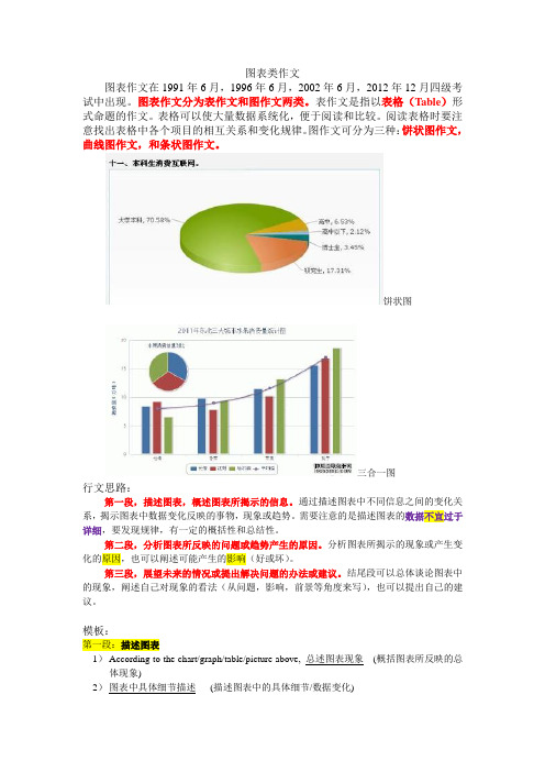
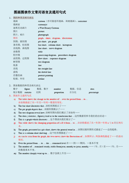
图作文可分为三种:饼状图作文,曲线图作文,和条状图作文。
饼状图三合一图行文思路:第一段,描述图表,概述图表所揭示的信息。
通过描述图表中不同信息之间的变化关系,揭示图表中数据变化反映的事物,现象或趋势。
需要注意的是描述图表的数据不宜过于详细,要发现规律,有一定的概括性和总结性。
第二段,分析图表所反映的问题或趋势产生的原因。
分析图表所揭示的现象或产生变化的原因,也可以阐述可能产生的影响(好或坏)。
第三段,展望未来的情况或提出解决问题的办法或建议。
结尾段可以总体谈论图表中的现象,阐述自己对现象的看法(从问题,影响,前景等角度来写),也可以提出自己的建议。
模板:第一段:描述图表1)According to the chart/graph/table/picture above, 总述图表现象(概括图表所反映的总体现象)2)图表中具体细节描述(描述图表中的具体细节/数据变化)3)Obviously/Consequently, this chart/graph//table/picture has forcefully proved that 图表呈/现象趋势)4)Many reasons account for 图表反映的问题(过渡句,过渡到分析问题产生的原因) Consequently, many problems related to 图表涉及的主体emerge. /图表涉及的主体或呈现的结果can do lots of harm/benefits. (过渡到分析问题所造成的好/坏影响)5)Firstly/First of all, 原因一/影响一(分析第一个原因或影响)6)进一步说明原因/影响一(第一个原因或影响的进一步阐述)7)Furthermore/Secondly, 原因二/影响二8)Thirdly/Besides, 原因三/影响三(As a result, 以上原因导致的结果)第三段:阐述观点段/说明影响段/说明问题段9)As for me/As far as I am concerned, 我的态度/相关情况或是现象将来的趋势、可能带来的(好或坏的)影响或存在的问题10)For one thing, 理由一/影响一/问题一11)For another/In addition/Besides, 理由二/影响二/问题二12)In brief/To conclude, 总结全文(总结全文,重申观点,提出建议或作出展望)实用句型一、描述图表二、原因三、收尾———补充:●表示增长、上升的词汇●动词:increase, rise, climb, go up, soar, skyrocket,副词:sharply, remarkably, obviously,significantly, gradually, slowly●表示下降、减少的词汇decrease, drop, fall, go down, decline●表示持续不变的词汇level off; remain steady/unchanged●表示倍数的词汇double; triple the number of/the percentage of; four/five times四、模板示例例:2012.12月真题●全文3段为:1. 描述图表2. 分析原因3. 结论或建议从文章内容上,第1段总体描述1句,加细节描述1-2句;第2段分析原因,解释为什么教育程度越高,失业率越低?内容仁者见仁,只要没跑题就行。
图表类小作文必备句型

图表类小作文必备句型
段落一,数据展示与对比。
看这儿,图表上明明白白地写着呢!去年第四季度销售额嗖嗖地涨了15%,这都是因为咱们推出了新产品,还调整了营销策略。
而那竞争对手,市场份额就像泄了气的皮球,咱们的市场地位就更加明显了。
段落二,趋势分析与预测。
瞅瞅过去五年的销售数据,咱们的产品在市场上稳扎稳打,就像爬山一样一步步往上走。
照这个势头下去,未来几年咱们市场份额肯定还能涨,盈利也能跟着水涨船高。
段落三,数据解读与结论。
图表上那些数字可是个好兆头!客户对咱们产品的满意度越来越高,这都得归功于产品质量和售后服务的提升。
这么一来,客户们更信任咱们了,公司的长期发展也更有保障了。
段落四,数据背后的故事。
这些数据可不是天上掉下来的,背后都是咱们团队的辛勤付出。
从市场调研到产品研发,再到市场推广,每个环节都少不了团队成
员的智慧和努力。
这些成绩,都是大家用汗水和智慧换来的。
段落五,数据的启发与启示。
看着这些数据,我心里就有数了。
想要在竞争激烈的市场中站
稳脚跟,就得不断创新,满足客户需求。
这些数据不仅仅是数字,
更是咱们未来发展的指南针。
图表作文

TASK1图表作文9 分图形分类bar 柱状图line 折线图table 表格pie 饼状图80%map 地图diagram流程图20%数据类图表不是流水账数据的主要特点共性和差异静态数据图数据大小(只有一个年份或者没有年份)动态数据图数据变化(有两个或者两个以上年份)图表作文基础知识1.介词:“by” 表示“按照…统计”“in”表示“以…为单位”“per” 表示“每…”2.时态:依据标注的年份;参考题目中动词的时态(show\give information about除外);没有任何提示时,使用一般现在时3.文章结构:第一段(改写题目);主体段(详细比较数据);结尾段(总结比较结果)改写题目的方法:换词换句型1.定语从句:The …shows\ illustrates the percentage \ number \ amountof …which\who…The line graph shows the number of people who visited the UK from 2000 to 2010.The pie chart shows the percentage of expenditure which students spent on different items in 2000.The table shows the amount of water which was used for different purposes in 2000.The line graph shows\illustrates the amount of fish and meat which were consumed in a European country from 1979 to 2004.2.宾语从句:The …shows\illustrates how much\ how many \ how \ why …1981, 1991 and 2001.The line graph illustrates how my weight changed from 2000 to 2010.The line graph shows how my spending on clothing changed from 2000 to 2010. The line graph shows how the global water use changed from 1900 to 2000.静态数据图的写作方法1.按照由大到小的顺序描写数据;2.可以选择主要数据,也可以组合数据;3.使用“最高级、比较级和衔接词”凸显数据特点In 1999, France, which attracted 11 million UK residents, was the most popular country. The second most popular country was Spain, which hosted about 9 million UK visitors. However,the USA, Greece and Turkey were much less preferred by UK visitors (4 million, 3 million and 2 million respectively 分别地). 在静态数据图中最高级的使用方法Football was the most popular sport, which attracted 70% of students.Football attracted the highest percentage of students (70%).The percentage of students who took part in football was the highest (70%).第一种最高级: 形容词London has the oldest underground railway, which opened in 1863.The London underground railway, which opened in 1863, has the longest history. Tokyo has the busiest underground railway, which transports 1927 million passengers per year.第二种最高级:…the highest\lowest percentage of \\ …the largest\smallest number of … \\ …the largest \ smallest amount of …Students spent 60% of expenditure (开支) on clothing.⇨Students spent the highest percentage of expenditure on clothing (60%).60%of students’ expenditure was spent on clothing.⇨The highest percentage of students’ expenditure was spent on clothing (60%).52.5% of electricity is used for heating rooms and water.=> The highest percentage of electricity is used for heating rooms and water(52.5%).The Tokyo underground railway transports 1927 million passengers per year.⇨The Tokyo underground railway transports the largest number of passengersper year (1927 million).3000 km3 of water was used for agriculture.In 2000, the largest amount of water was used for agriculture (3000 km3).第三种最高级:The percentage\ number\ amount of …is the largest\smallest.The amount of water which was used for agriculture was the largest (3000 km3).The number of passengers who the Tokyo underground railway transports is the largest (1927 million).The percentage of electricity which is used for heating water and rooms is the highest (52.5%).比较级的使用方法:第一种方式:形容词The USA, Greece and Turkey were less popular(4 million, 3 million and 2 million respectively).Washington, Kyoto and Los Angeles have younger underground railways, which opened in 1976, 1981 and 2001 respectively.The underground railways in Washington, Kyoto and Los Angeles, which opened in 1976, 1981 and 2001 respectively, have shorter histories.第二种方式:…smaller numbers of … …smaller amounts of … …smaller proportions (比例) of …A, B and C have smaller numbers of friends.The underground railways in Kyoto and Los Angeles transport smaller numbers of passengers per year (45 million and 50 million respectively).A andB drank smaller amounts of water.Buses and cars produced smaller amounts of CO2 (500 grams and 400 grams).Riding bicycle and Swimming attracted smaller proportions of students (10% and 8% respectively).Consumers in Italy, Spain and Sweden spent smaller proportions of expenditure on food, drinks and tobacco (16%, 17% and 19% respectively).成对静态图文章结构1. 改写题目2. 男士数据偏高的项目3. 女士数据偏高的项目4. 总结比较结果常用句型:1.衔接词:…, while … \\ While…, …Women spend 74 minutes per day on kitchen tasks, while men spend only 30 minutes.60% of these people who held a Master’s degree were male, while40% of these people were female.2.短语:…, compared with …Women spend 74 minutes on kitchen tasks per day, compared with30 minutes for men.60% of these people who held a Master’s degree were men, compared with 40% for women.3.比较级:…more…than…Women spend more time than men on kitchen tasks per day (74 minutes and 30 minutely).More men than women held a Master’s degree (60% and 40% respectively).Men occupied a higher percentage of Master’s graduates than women (60% and 40% respectively).4.动词:outnumber (在数量上) 超过Girls outnumbered boys.Men with a Master’s degree outnumbered their female counterparts (60% and 40% respectively).5.倍数:…twice \ three timesWomen spend twice as much time as men on kitchen tasks per day (74 minutes and 30 minutes respectively).动态图写作基础词汇和句型描写趋势的词汇:上升:increase, rise (rose), grow (grew), climb, soar (飞升)下降:decrease, drop (dropped), fall (fell), decline, dip (微降)保持平稳:…keep stable at 30% …remain stable at 20%达到顶峰:…peak at 20% …reach a peak of 20%跌倒谷底:…bottom at 10% …reach a bottom of 10%描述幅度的词汇:大幅度:sharp ly; significant ly 显著地;dramatic ally 戏剧化地;rapid ly迅速地小幅度:slight ly, slow ly平稳地:steadily (steady)动态图中常见主语:T he percentage of old people in Japan …The quantity of goods transported by road…The number of people who visited the UK …常用句型:1.动词+副词:…increase sharply from…to… \\ …decrease slightly from…to…Between 1979 and 2004, the consumption of chicken increased sharply from 150 grams to 250 grams.2.形容词+名词:…see\experience a sharp rise from…to… \\ …see\ experience a slight fallfrom…to…Between 1979 and 2004, the consumption of chicken saw a sharp rise from 150 grams to 250 grams.3.“trend”的句型:…show an upward trend, rising sharply from…to… ; …show a downwardtrend, dropping slightly from…to…From 1974 to 2002, the consumption of chicken showed an upward trend, rising sharply from 150 grams to 250 grams.4.“there be”句型:There is a sharp increase in…, rising from…to… \\ There is a slightdecrease in…, dropping from…to…From 1974 to 2002, there was a sharp increase in the consumption of chicken, rising from 150 grams to 250 grams.5. “差数”的句型:…increase by 10% \\ …decrease by 5%; …see a 10% increase \\ …see a 5%decreaseFrom 1974 to 2002, the consumption of chicken increased by 10%.5.“倍数”的句型: …increase twofold\ threefold from…to… \\ …see a twofold\threefoldincrease from…to… \\ …double\ triple from…to…From 1974 to 2002, the consumption of chicken doubled (=increased twofold) from 100 grams to 200 grams.动态数据图的写作方法:按趋势分段(剑桥雅思6第52页)1. 改写题目; 2 上升组数据 3 下降组数据 4 总结总体趋势The table shows how the modes of travel changed in England between 1985 and 2000. During the 15-year period, the distance transported by all modes of travel increased sharply from 4740 miles to 6475 miles.It is obvious that the distance traveled by car remained the longest and this rose significantly from 3199 miles to 4806 miles. There was also a dramatic increase in the distance traveled by train, growing from 289 miles to 366 miles. Taxi and long distance bus were much less widely used, though the figure for taxi grew from 13 miles to 42 miles while the figure for long distance bus soared from 54 miles to 124 miles.By contrast, the distance traveled by local bus showed a downward trend, dropping dramatically from 429 miles to 274 miles. The distance traveled by walking also declined, but it declined less sharply from 255 miles to 237 miles. Similarly, the figure for bicycle experienced a slight fall from 51 miles to 41 miles.Overall, it can be seen that the distance traveled by walking, bicycle and local bus decreased, while the popularity of these other modes of travel increased over these years.动态图的写作要点:1.分析数据时,从“趋势、幅度和数值”入手;2.比较数据时,使用“最高级、比较级和衔接词”;3.总结数据时,侧重于概括数据的总体趋势。
四级图表作文

Direction: For this part,you are allowed 30 minutes to a short essay entitled education pays based on the statistics provided in the chart below(unemployment rate in 2010).please give a brief description of the chart first and then make comments on it. you should write at least 120 words but no more than 180 words.第一段:描述图表总结趋势A trend, as is illustrated in the bar-chart, is that a higher level of education is followed by lower chance of unemployment.Specifically, the rate touches almost 15% among those under high school level, but no more than 2% among those with doctoral degrees. The conclusion is education pays.第二段:联系现实论证主题Some reasons must be lying behind this correlations. For one thing,the degree of education is commonly viewed as value of the diploma-owner. Therefore, those with descent diploma are always cherished by employers. For another, years of education indeed endows them with the capacity in their professions, which increases their job performance and decreases their chance of unemployment.第三段:重申主题提出建议Obviously, a diploma is not necessarily a guarantee against unemployment, but at least a proof of lower chance of being laid out. Therefore, it is a safe bet to go on further education.第一段:A trend, as is exhibited in the pie-chart, is that only few college students have adequate physical exercise every week, while the vast majority are under exercised. Specifically, the percentage of those who work out over three hours per week stays merely 2.42%, but 61% of youngsters who do exercise less than an hour weekly.第二段:Some reasons must be lying behind this situation. For one thing, must of them are busy taking part-time jobs or tests, sparing no time to exercise for physical health, For another, some of them are lazy to spend even a minute on the playground. Rather, they are willing to sit in front a screen for hours.Something must be done to deal with such “business”and “laziness”.第三段:We should bear in mind that physical health is not necessarily a guarantee to a glorious life, but at least a proof against weakness and sickness. Therefore,i t is a safe bet to invest health by having physical training regularly.。
表格图表作文

taxes and prices in five cities around the world
City Average hourly wage £ 4 Tax as % Monthly rent of wage for 4bedroom flat 18.9% £ 700
Athens
Geneva
Hong kong
Organising the report
The best way to organise this report is to work down the list of countries visited and look at the total numbers of visitors and the numbers from the UK and the USA. Before doing that, check to see if there are any similarities between any of the countries.
Writing a paragraph
•
You can deal with the countries in any order, but let’s follow the organization model we prepared above. For the paragraph on Canada and Mexico, we need to include the following information: 1. the three figures (in millions of people). 2. the fact that Americans make up about 80% of the visitors to these countries. 3. the fact that British people make up a small proportion of the visitors to these two countries.
图画图表作文常用语言及通用句式【已总结】
图画图表作文常用语言及通用句式1、图的种类及相关表达漫画cartoon(亦可做连环漫画,讽刺漫画),caricature漫画家cartoonist迪斯尼动画片 a Walt Disney Cartoon图片picture照片、相片photograph图形graph,chart,diagram,illustration饼图,圆形图pie chart,pie graph条形图,柱状图bar chart,column chart,histogram直线图,曲线图line chart,curve diagram表格图table程序图processing diagram,procedures diagram流程图,过程图flow chart,sequence diagram树型图tree diagram线条line直线the straight line虚线the dotted line肖像绘画portrait painting轮廓,外形outline2、图表数据的种类及相关表达数字figure 数量,数字number 数据,信息data统计数据statistic 比例proportion 百分比percentage3、图表作文通用句式a)The table shows the change in the number of …over the period from …to…该表格描述了从…年至…年间…数量的变化。
b)The bar chart illustrates that ..该柱状图展示了……c)The pie graph depicts that…该圆形图揭示了……d)The tree diagram reveal how..该树形图向我们揭示了该如何……e)The data ( statistics , figures) lead us to the conclusion that …这些数据资料令我们的出结论…f)This is a graph which illustrates …这个图表向我们展示了…g)This table shows the changing proportion of a & b from… to …该表格描述了从…年到…年间a与b的比例关系。
图表作文模板2

⑤There are many reasons responsible for this phenomenon/case, instance and the following are the typical ones.⑥The first reason is that理由一.⑦The second reason is that理由二.⑧The third reason is that/A case in point is that/The typical example is that理由三.
⑨As far as i am concerned/In my opinion, the proper attitude towards/suggestion for主题is that我的观点/态度/建议.⑩We should take the following effective measures..For one thing, we should方法一.For another, we should方法二.
图表作文模板2
①From the picture (graph, chart, table, pie, bar), we know that图表内容总概括.②On the one hand, the left/first picture tells us that情况一,图/表一的内容。On the other hand, (the right/second) picture informs us that
⑨Considering all these reasons/this situation/Confronted with such a problem, i think we need to take some positive measures.⑩On the one hand,方法/建议一.On the other hand,方法/建议二.Thus/Only in this way, can段落总结句.
最新图表作文模板

图表作文模板 精品好文档,推荐学习交流 仅供学习与交流,如有侵权请联系网站删除 谢谢16 图表作文(一) 图表作文常用的句型 (1)常用的开篇句型(即概述图表内容时常用的表达法) ① According to the table/pie chart/line graph/bar graph, we can see/conclude that … 根据该表/图,我们可知 …… ② The table/graph reveals (shows/indicates/illustrates/ represents/points out) that … 该表/图表明…… ③ As we can see from the table … As can be seen from the line/bar graph … As is shown (illustrated/indicated) in the pie chart … 如表/图所示,…… (2) 描述增减变化常用的句型 ① Compared with … is still increased by … ② The number of … grew/rose from … to … ③ An increase is shown in …; then came a sharp increase of … ④ In … the number remains the same/drops to … ⑤ There was a very slight (small/slow/gradual) rise/increase in 1990. ⑥There was a very steady (marked/sharp/rapid/sudden/ dramatic) drop (decrease/ decline/ fall/ reduction) in 1998/ compared with that of last year). 精品好文档,推荐学习交流 仅供学习与交流,如有侵权请联系网站删除 谢谢16 下面是根据例2的题目要求写的范文。 ⑴From the graph, we can see that the number of car accidents in Walton city fluctuated during the year of 1990. ⑵The first two months of 1990 showed an increasing trend. ⑶The rate rose to 32 in March but fell to 26 in June. ⑷From June on, the rate was rising again and reached the peak point 39 in August. ⑸After August the rate began to decline remarkably, and eventually dropped to the lowest point 16 at the end of the year. ⑹Therefore, it’s obvious that car accident in Walton city declined in 1990.⑴主题句/概述表格反映的内容⑵—(5)反映交通事故的变化情况(6)小结:总结表格数据反映的总趋势 ⑺There are several reasons for the decline. ⑻First, a new traffic law was made and came into force. ⑼It provided that in summer every car must be air-conditioned. ⑽As a result, the highest rate in August, when humidity and high temperature make drivers impatient and easily lead to car accidents, dropped steadily. ⑾Second, new roads were built and some narrow streets were widened, which quickened the flow of traffic. ⑿Finally, the city administration made great efforts to heighten people’s awareness of observing traffic 精品好文档,推荐学习交流 仅供学习与交流,如有侵权请联系网站删除 谢谢16 rules.⑺主题句⑻原因/措施一⑼解释措施一/次要辅助⑽采取措施一后的结果⑾原因/措施二⑿原因/措施三 ⒀With all these new measures, I’m sure the rate of car accidents in Walton city will go on falling this year.⒀总结:展望未来的情况 中间段
- 1、下载文档前请自行甄别文档内容的完整性,平台不提供额外的编辑、内容补充、找答案等附加服务。
- 2、"仅部分预览"的文档,不可在线预览部分如存在完整性等问题,可反馈申请退款(可完整预览的文档不适用该条件!)。
- 3、如文档侵犯您的权益,请联系客服反馈,我们会尽快为您处理(人工客服工作时间:9:00-18:30)。
图表作文汇总时态如果图表中没有具体标明时间,描述时可采用一般现在时,但如果图表中给出了具体时间参照,则应对时态进行相应的调整。
一、图表作文经典句型分类:(一)常用的开篇句型(即概述图表内容时常用的表达法)1. According to the table/pie chart/line graph/bar graph, we can see/conclude that … 根据该表/图,我们可知……2. The table/graph reveals (shows/indicates/illustrates/ demonstrates/suggests) that … 该表/图表明……3. As we can see from the table …As can be seen from the line/bar graph …As is shown (illustrated/indicated) in the pie chart …如表/图所示,……It is clear/appar ent from the figure/statistics,…From the statistics given in the table, we estimate/conclude that, ….From the information given in the graph, we can see that,…(二)表数据变化的句式:a. 表示增加, 减少和波动的结构1. The number of…climbed/jumped/rose suddenly/ went sharply up/ soared to…in…2. There was an evident/ apparent/obvious increase in…from…to…3. The number of…increased/rose steadily/gradually from…to…4. There was a steady/gradual increase/rise in the number of…from…to…5. There was a slight/slow increase/rise in the number of…from…to6. The number of…increased/rose slightly/slowly from…to…7. The number of…decreased/ fell/ dropped suddenly / rapidly /dramatically /substantially /sharply/steeply from…to…8. There was a sudden/ rapid/ dramatic/ substantial/ sharp/ steep decrease/ drop/ reduction/ decline in the number of…from…to…9. There was an evident/ apparent/obvious reduction/decline in…from…to…10. The number of…dropped sharply/went sharply down to…in…11. The number of…increased/rose by…%from…to…12. There was a slight fluctuation in the number of…from…to…b. 表示变化不大或没有变化的结构1. The number of…remained steady/stable/constant between…and…2. The number of…stayed the same between…and…3. There was little/hardly any change in the number of…between…and…4. The number of…remained level between…and…5. The number of…remained steady at approximately…between…and…6. The number of…appeared to level off.c. 表示最高点或最低点的结构1. The situation/figures reached a peak/a high at…%in…2. The situation/figures bottomed out at…%in…3. The situation/figures peaked at…%in…4. The sit uation/figures hit a trough at…%in…5. The number soared to a record high ofd. 表示最高点或最低点的结构1. A is twice/three times/four times what it was in…2. A is twice/three times/four times the amount in…3. A is twice/three times/four times as much/many as…in…4. A is twice/three times/four times more than…in…5. From…to…, A increased/dropped more than sixfold.6. The output of steel in 1990 was 400%up compared with in 1980.7. The figure was roughly doubled/tripled/quintupled between…and…(三)表数据的句式:1. had the largest percentage/proportion of2. account for/take up 20%3. Compared with A, B has a higher percentage.4. On the top of the list is…, which accounts for 50%.5. At the bottom is…, which takes up 20%.6. A is second to B.7. A is ranked/rated first, followed by B at 45%and C at 30%例句1. As is shown by the graph/in the table…(概述图表)正如曲线所示,最近54年来该国人口飞速增长。
As is shown by the graph, there has been a rapid increase in the population of the country in the past five years.2. It can be seen from the ta ble that … (得出结论)A. 从表中所给的统计数字可以看出,从1985年到1990年中国的人均收入迅速提高。
From the statistics given in the table it can be seen that the average personal income of the Chinese people increased (grew 、rose) rapidly from 1985 to 1990.B. 从曲线图可以得出结论,最近5年来中国人口的出生率已经大大下降。
It can be concluded from the graph that there has been a great decline in birth rates in China in the past five years.3. … amount to … (数量总计)add up tocome tosum up to全部费用合计200美元。
All the expenses (costs) amount to (= add up to) $ 200.4. … increase from … to … (数量增减)decreaserisefalldropA. 这个工厂生产的彩电已由1986年的5000台增加到1990年的21000台。
The number of colour TV sets produced by the factory increased (rose , grew , climbed) from 5000 in 1986 to 21000 in 1990.B.参加者的人数增加到30万。
The number of paticipants grew up to 300000 persons = increased , reaching 300000 persons).C. 这个学校的教职工人数已减少到700人。
The number of teaching staff members in this school has decreased to 700 persons.5.(be)three times as + 形容词+ as 总产量total output现在我们地区的粮食产量相当于1970年的3倍。
The grain production (= output)in our area now is three times as great as that of 1970.pared with … , …与去年相比,今年13项主要产品的产量都有大幅度增长。
The factory has an output of 9 million cigarettes daily.Compared with that of last year,the output of 13 main products (= items) this year has increased to a great extent.7.There is (was) a rapid/sudden/steady/gradual/slow/slight rise (increase) in …最近几年来这个地区的棉花产量有了迅速增长。
The cotton output in this area has increased rapidly in the past few years.二、图表作文常用词汇1、表示程度的副词:程度较大:considerablydramaticallygreatlymarkedlyobviouslyquicklyrapidlysharplysignificantlysuddenly程度较小:slightlygraduallyslowlysteadily2、时间的嵌入嵌入时间时所使用的介词和介词词组:infrom……to……between…….and……during……and……at the start of ……by the end of ……over ……at the end of ……throughout ……Sample 1The pie chart shows the worldwide distribution of sales of Coca-Cola in the year 2000 and the graph shows the change in share prices between 1996 and 2001.In the year 2000, Coca-Cola sold a total of 17.1 billion cases of their fizzy drink product worldwide. The largest consumer was North America, where 30.4 per cent of the total volume was purchased. The secon d larges t consumer was Latin America. Europe and Asia purchased 20.5 and 16.4 per cent ofthe total volume respectively, while Africa and the Middle East remained fairly small consumers at 7 per cent of the total volume of sales.Sample 2The table demonstrates(展示) how different modes of travel changed in England in 15 years spanning(贯穿)from 1985 to 2000. In general, the modes are classified into two kinds in terms of average miles travelled per person per year: one enjoyed rising popularity while the other decreasing.The travel modes which gained popularity in the period included cars, long distance buses, trains, taxis and others. Cars remained top among the modes in the 15 years, with its average miles increasing considerably from 3,199 in 1985 to 4,806 in 2000.Long distance buses and taxis seemed to be warmly welcomed by travelers, so average miles travelled in the two modes almost tripled(增为原来的三倍).Travels by walking, bicycles and local buses lost travelers’ favor in the one and a half decade. Average travelling distance by local buses suffered the biggest decrease, dropping from 429 to 274, whilst(尽管;当…时) the number of miles by walking and bikes fell mildly from 255 to 237 and from 51 to 41 respectively(分别). Despite the decreases, however, the total miles travelled grew from 4,740 to 6,475.In brief, the total travelling distance in the country grew in 15 years when cars, long distance buses, trains, taxis and other modes of travel were more popular and walking, bicycling and local transportation less popular.Sample 3The following table gives statistics showing the aspects ofquality of life in five countries.The figures reveal(显示)the quality of life in five countries in 1982, namely Bangladesh, Bolivia, Egypt, Indonesia and the U.S.A.It is clear from the table that Americans’ GNP was considerably higher than that of others, achieving at 13160 do llars; its daily calorie supply for each person was also the highest at 3652. Meanwhile, Americans enjoyed the longest life expectancy at 74 years, while their infant mortality rate(死亡率) was the lowest at only 1.2%.In contrast, the people in Bangladesh lived the poorest lives of all. This was most evident in its GNP at 140dollars, being only one tenth of American, as well as the lowest of five countries. Besides, its life expectancy were also the least at 1877 each person and 40 years respectively, while its infant mortality rate was the highest at 13.2% being ten times of American.The other three countries maintain middle positions. The GNP of them, in decreasing order, were Egypt ($690), Indonesia ($580) and Bolivia ($570). The similar patterns can be seen in the other three columns.Specifically, life expectancy in Indonesia was 1 year less than Bolivian, whereas its infant mortality rate was 10% less, compared with Egyptian.Overall, we can see that there are significant differences in every aspect of quality of life in five countries.Sample 4Dubai Gold Sales 2002(estimates)图二:Dubai Gold SalesThe line graph shows estimated sales of gold in Dubai for 12 months in 2002 in millions of dirhams. There were two main seasons for gold sales.The main season for sales is in the December to May period. Sales were consistently above 200 million dirhams per month, rising sharply to a peak of 350 million dirhams in March. However, for the next four months, sales declined steadily, reaching an annual low of 120 million dirhams in July.In August, there was a sudden increase. Sales almost doubled, rising from 120 million dirhams in July to 210 million dirhams in August. This was followed by a drop in September, back to the July figure.From September to October, sales recovered, from 120 to 180 million. In October and November, sales remained steady, and there was a small increase in December to 190 million dirhams. In conclusion, the main sales period is in the early part of the year, slumping(暴跌) in the summer, except for a sudden increase in August.Sample 5This is a pie chart that shows the proportion of the meal sold in a supermarket. The total meat sold in the supermarket is classified into six types as follows: chicken, pork, beef, lamb, fish and others.Overall, chicken has the largest proportion, which accounts for 40%; while others has the smallest percentage, at 2%.As can be seen in the pie chart, chicken, which makes up 40%, is the most popular among the total meat sold, then next is pork with 20%, followed by beef, constituting 18%; and finally come lamb, fish and others at 15%, 5% and 2% respectively, Itshould be noted that the sale of pork is half as much as that of chicken. And it is also interesting to note that the sale of chicken is 20 times as much as that of others.It can be concluded from the pie chart that chicken is most commonly bought meat while others is the least commonly bought meat.。