雅思写作-小作文范文-条图
雅思小作文流程图类题目范文及解析

雅思小作文流程图类题目范文及解析雅思小作文流程图类题目范文及解析,一起来学习一下吧,下面我就和大家共享,来观赏一下吧。
雅思小作文流程图类题目范文及解析雅思小作文流程图类题目范文及解析为大家带来雅思小作文当中一类较有难度的图表——流程图类的小作文的范文以及解析。
流程图顾名思义就是对某一有时间和步骤先后挨次的行为进行步骤的拆解,并配上相应的文字和解说而生成的图表。
我们在处理流程图类图表作文是应当怎么写,请看下文。
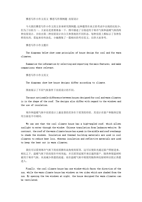
上图来自网络主题:家居设计题型:流程图The diagrams below show some principles of house design for cool and for warm climates.满分范文:The diagrams show how house designs differ according to climate.这些图表显示房子的设计因气候而不同。
The most noticeable difference between houses designed for cool and warm climates is in the shape of the roof. The designs also differ with regard to the windows and the use of insulation.为凉快和暖和气候设计的房子之间最明显的区分是屋顶的外形。
在窗户和保温材料的使用方面,设计也有所不同。
We can see that the cool climate house has a high-angled roof, which allows sunlight to enter through the window. By contrast, the roof of the warm climate house has a peak in the middle and roof overhangs to shade the windows. Insulation and thermal building materials are used in cool climates to reduce heat loss, whereas insulation and reflective materials are used to keep the heat out in warm climates.我们可以看到凉快的气候房子有一个高角度的屋顶,它允许阳光通过窗户进入。
雅思经典图表作文范文

#45. The charts below show the percentage of their food budget the average family spent on restaurant meals in different years. The graph shows the number of meals eaten in fast food restaurants and sit-down restaurants.You should write at least 150 words.Give reasons for your answer and include any relevant examples from your own knowledge or experience.Over the past 30 years, the average family has dramatically increased the number of meals that they eat at restaurants. The percentage of the family's food budget spent on restaurant meals steadily climbed. Just 10 percent of the food budget was spent on restaurant meals in 1970, and 15 percent in 1980. That percentage more than doubled in 1990, to 35 percent, and rose again in 2000 to 50 percent. Where families eat their restaurant meals also changed during that 30-year period. In 1970, families ate the same number of meals at fast food and sit-down restaurants. In 1980, fam¬ilies ate slightly more frequently at sit-down restaurants. However, since 1990, fast food restaurants serve more meals to the families than do the sit-down restaurants. Most of the restaurant meals from 2000 were eaten at fast food restaurants. If this pattern continues, eventually the number of meals that families eat at fast food restaurants could double the number of meals they eat at sit-down restaurants.(164 words)#44. You should spend about 20 minutes on this task.The map below is of the town of Garlsdon. A new supermarket (S) is planned for the town. The map shows two possible sites for the supermarket.Summarise the information by selecting and reporting the main features, and make comparisons where relevant.You should write at least 150 wordsmodel answer:The first potential location (S1) is outside the town itself, and is sited just off the main road to the town of Hindon, lying 12 kms to the north-west. This site is in the countryside and so would be able to accommodate a lot of car parking. This would make it accessable to shoppers from both Hindon and Garlsdon who could travel by car. As it is also close to the railway line linking the who towns to Cransdon (25 km to the south-east), a potentially large number of shoppers would also be able to travel by train.In contrast, the suggested location, S2, is right in the town centre, which would begood for local residents. Theorically the store could be accessed by road or rail from the surrounding towns, including Bransdon, but as the central area is a no-traffic zone, cars would be unable to park and access would be difficult. Overall, neither site is appropriate for all the towns, but for customers in Cransdon, Hindon and Garlsdon, the out-of-town site (S1) would probably offer more advantages.(179 words)# 43. You should spend about 20 minutes on this task.The table below shows CO2 emissions for different forms of transport in the European Union.The Pie Chart shows the percentage of European Union funds being spent on different forms of transport.You should write at least 150 words.model answer:The chart shows CO2 emissions per passenger kilometre for variuos methods of transport in the European Union while the pie chart shows European Union spending on transport. Flying by air produces by far the greatest CO2 emissions, approximately three times as much as passenger cars which are the next largest producers. Very little is spent by the EU on air travel while roads make up more than half of the EU transport budget.Trains produce about three times less CO2 emissions per passenger kilometre than passenger cars and eight times less than air travel. Nearly a third of EU transport funds are spent on railways.Ships are a clean form of transport and produce about the same amount of CO2 per passenger kilometre as trains do. However, only 2 percent of EU funds are spent on ports. A further one percent is spent on inland waterways.Coaches are the cleanest form of transport. Emissions of CO2 per passenger kilometre from coaches are half those of buses. Buses emit less than half as much CO2 per passenger kilometre as cars. The European Union spends 10 percent of its transport budget on public transport, such as buses and coaches. (197 words)The table below shows the sales at a small restaurant in a downtown business district.Summarize the information by selecting and reporting the main features, and make comparisons where relevant.You should write at least 150 words.Give reasons for your answer and include any relevant examples from your own knowledge or experience.model answer:The sales at this small restaurant during the week of October 7 to 13th followed a fairly set pattern from Monday to Friday, and then showed notable shift on the weekend. The lunch and dinner sales during the week peaked on Friday and then dipper down as the weekend set in.During the week of October 7-14th, the lunch sales averaged at approximately $2,400. The highest lunch sales occurred on Friday, and the lowest occurred on Sunday. Sunday's lunch sales were approximately $1,000 less than the average lunch sales during the rest of the week.Dinner sales, which generated at least $1,000 to $1,500 more a day than lunch sales, also remained steady during the week. Just like the lunch sales, the dinner sales peak on Friday and dipped down for the weekend.Excluding Wednesday and Thursday, the lunch and dinner sales from October 7-11 rose gradually until the end of the business week. Midweek, on Wednesday and Thursday, the sales were slightly lower than they were on Tuesday.According to the sales report, this restaurant has a steady lunch and dinner crowd. The most profitable day during the second week of October was Friday. Sunday, was the least prof¬itable day, with the full day's sales totaling/totalling less than the Friday dinner sales. These numbers are reflective of a restaurant that is located in a business/financial district where business hours are Monday through Friday.In June 1996, an experimental flu vaccine was trialled in a large country town on females only.Summarise the information by selecting and reporting the main features, and make comparisons where relevant.You should write at least 150 words.Give reasons for your answer and include any relevant examples from your own knowledge or experience.model answer:The diagrams show data for a flu epidemic which hit a large country town in 1996. Figure 1 gives the number of persons who died; Figure 2 shows the percentage breakdown of females who received a new flu vaccine; and Figure 3 gives the number of cases of flu before and during the epidemic.In Figure 1 it can be seen that the flu was responsible for the deaths of 2 females but no males in the period from March to May. However, from June to August, there were 4 female deaths and 1 male death.According to the pie chart in Figure 2, only those females most at risk were given the new flu vaccine; 28% did not take part in the trial. Of those females who took part, 35% were aged (over 65 years old); 24% were babies or children; and 13% were either hospitalised or receiving other medical attention.From Figure 3 it is clear that the new vaccine had a positive effect on the number of new cases of flu reported in females. There were just over 1000 cases reported in March, climbing rapidly to a peak of 3500 in June. Thereafter, the number of cases dropped slowly to about 2800 in August, before levelling off at 2500 for the rest of the year. For males, the figures were lower but showed a similar trend throughout the epidemic.(232 words)#39. You should spend about 20 minutes on this task.The chart below shows estimated world literacy rates by region and by gender for the year 2000.Write a report for a university lecturer describing the information below.You should write at least 150 words.model answer:In this report I will describe a bar chart that shows the estimated world illiteracy rates by gender and region for the year 2000.First I will look at male illiteracy for the 6 areas shown. The lowest rates were in Developed Countries, Latin America/Caribbean and East Asia/Oceania with rates of 1% (approximately), 10% and 8% (approximately) respectively. The rates for the next three areas were much higher and quite similar to each other. Sub-Saharan Africa, the Arab States and South Asia had rates of approximately 31%, 29% and 34%.Female illiteracy was much higher relatively in each area except LatinAmerica/Caribbean where it was only slightly higher. The lowest rates for female illiteracy were again Developed Countries, Latin America/Caribbean and East Asia/Oceania with rates of approximately 2%, 12% and 20%. Again the rates for the next three areas were much higher and quite similar to each other. Sub-Saharan Africa, the Arab States and South Asia had rates of approximately 48%, 52% and 56%.This ends my report.# 38. You should spend about 20 minutes on this task.The chart shows the number of mobile phones and landlines per 100 people in selected countries.Write a report for a university lecturer describing the information given.You should write at least 150 words.model answer:The graph shows the number of mobile phones and landlines per 100 users, for selected countries. Overall, most of the countries included in the graph have more mobile phones subscribers than landlines.Most European countries have high mobile phone use. The biggest users of mobile phones are the Italians, with 88 cell phones per 100 people. For example, Italy has twice as many mobile phones as landlines, with 88 mobiles per hundred people compared to 45 for landlines. Mobile phone use is low in Canada, with fewer than 40 phones per 100 people. Denmark is also unusual because it has slightly more landlines than mobile phones.However, in some countries, the number of landlines is higher than the number of mobile phones. One example is the USA, where the number of mobiles, at 50 per 100 people, is much lower than the number of landlines, at almost 70 per hundred.A similar pattern can be seen in Canada. The highest number of landlines in the graph is in Denmark, with about 90 per 100 people. In contrast, the lowest figures for fixed lines are in Italy and the UK.In conclusion, it seems that mobile phone use is higher in Europe than in North America.# 37. You should spend about 20 minutes on this task.The graphs show enrolment in different colleges in the Higher Colleges of Technology in 1999.Write a total of 150 - 200 words about the information in the three graphs. Write a report for a university lecturer describing the information given. You should write at least 150 wordsmodel answer:The charts shows student enrolment by gender and level in different colleges of the Higher Colleges of Technology colleges in the UAE.There are clear differences in male and female enrolment. Females outnumber men in all the colleges, with almost 25% more students in Dubai Women's college than in Dubai Men's. Ras Al-Khaimah Women's College has almost 180 students, compared to only 100 in the Men's college.Females also outnumber males by level, with almost double the number of men at Higher Diploma level (330 compared to 181). Only at Diploma level does the number of men slightly exceed that of women.Over half the students are in Certificate level, with less than a quarter at Higher Diploma or Bachelor level.In conclusion, most students in the Higher Colleges are enrolled at Diploma level or below, and the majority of students are women.(143 words)# 36. You should spend about 20 minutes on this task.The line graph below shows the number of annual visits to Australia by overseas residents. The table below gives information on the country of origin where the visitors came from. Write a report for a university lecturer describing the information given.You should write at least 150 words.NUMBER OF VISITORS (million)1975 2005SOUTH KOREAJAPANCHINAUSABRITAINEUROPE 2.93.20.30.40.91.19.112.00.81.12.94.5Total 8.8 30.4model answer:The given line graph illustrates information on the number of overseas visitors traveling to Australia in millions of people. Overall, one notable trend seems to be that Australia has steadily become more popular as a destination spot. For example, there were 20 million more visitors to Australia in 2005 than in 1975. That's a jump from 10 million to 30 million in 20 years.The second table gives statistics showing the countries whose residents went to Australia between 1975 and 2005. In both years, the largest number of visitors came from Japan, followed by South Korea and Europe. Britain, the United States and China also had many people traveling to Australia in these years. In fact, the number of people visiting Australia grew in every one of these countries. For example, in 2005, 12 million people went there from Japan compared with only 3.2 million in 1975.(147 words)#35. You should spend about 20 minutes on this task.The table below shows the consumer durables (telephone, refrigerator, etc.) owned in Britain from 1972 to 1983.Write a report for a university lecturer describing the information shown below. You should write at least 150 words.Consumer1972 1974 1976 1978 1979 1981 1982 1983 durablesPercentage ofhouseholds with:central heating 39 43 48 52 55 59 60 64television 93 95 96 96 97 97 97 98video 18vacuum cleaner 87 89 92 92 93 94 95refrigerator 73 81 88 91 92 93 93 94washing66 68 71 75 74 78 79 80 machinedishwasher 3 3 4 4 5telephone 42 50 54 60 67 75 76 77 model answer:The chart shows that the percentage of British households with a range of consumer durables steadily increased between 1972 and 1983. The greatest increase was in telephone ownership, rising from 42% in 1972 to 77% in 1983. Next came centralheating ownership, rising from 37% of households in 1972 to 64% in 1983. The percentage of households with a refrigerator rose 2 1% over the same period and of those with a washing machine by 14%. Households with vacuum-cleaners. televisions and dishwashers increased by 8%, 5% and 2% respectively. In 1983. the year of their introduction, 18% of households had a video recorder.The significant social changes reflected in the statistics are that over the period the proportion of British houses with central heating rose from one to two thuds, and of those with a phone from under a half to over three-quarters. Together with the big increases in the ownership of washing machines and refrigerators, they are evidence of both rising living standards and the trend to lifestyles based on comfort and convenience.#34. You should spend about 20 minutes on this task.The table below shows the figures for imprisonment in five countries between 1930 and 1980.Write a report for a university, lecturer describing the information shown below. You should write at least 150 wordsmodel answer:The table shows that the figures for imprisonment in the five countries mentioned indicate no overall pattern of increase or decrease. In fact there is considerable fluctuation from country to country.In Great Britain the numbers in prison have increased steadily from 30 000 in 1930 to 80,000 in 1980. On the other hand in Australia, and particularly in New Zealand the numbers fell markedly from 1930 to 1940. Since then they have increased gradually, apart from in 1980 when the numbers in prison in New Zealand fell by about 30,000 from the 1970 total. Canada is the only country in which the numbers in prison have decreased over the period 1930 to 1980, although there have been fluctuations in this trend. The figures for the United States indicate the greatest number of prisoners compared to the other four countries but population size needs to be taken into account in this analysis. The prison population in the United States increased rapidly from 1970 to 1980 and this must be a worrying trend.。
雅思写作小作文范文 雅思写作图例题 房屋设计.doc
雅思写作小作文范文雅思写作图例题房屋设计今天我们雅思写作小作文的文章来研究图例题。
这种题型在真正的考试中出现的比较少,但为了以防万一,大家还是需要准备一下。
图中描述了分别适用于寒冷气候和温暖气候的两种房屋设计,并给出第二种房屋设计在白天和黑夜的不同形态。
每种房屋上都标示了各种各样的东西,看起来有些杂乱。
小编搜集了一篇相应的考官范文,以供大家参考。
雅思写作小作文题目The diagrams below show some principles of house design for cool and for warm climates.Summarise the information by selecting and reporting the main features, and make comparisons where relevant.雅思写作小作文范文The diagrams show how house designs differ according to climate.图表展示了不同气候条件下房屋设计的不同。
The most noticeable difference between houses designed for cool and warm climates is in the shape of the roof. The designs also differ with regard to the windows and the use of insulation.寒冷和温暖气候中房屋设计上最显著的差异在于屋顶的形状。
其设计在窗户和隔热层使用方面也不尽相同。
We can see that the cool climate house has a high-angled roof, which allows sunlight to enter through the window. Chinese translation from laokaoya website. By contrast, the roof of the warm climate house has a peak in the middle and roof overhangs to shade the windows. Insulation and thermal building materials are used in cool climates to reduce heat loss, whereas insulation and reflective materials are used to keep the heat out in warm climates.我们可以看到寒冷气候下的房屋拥有高角度的屋顶。
雅思英语图表作文范文(必备3篇)

雅思英语图表作文范文第1篇A类雅思各类图表作文要点及范文一.曲线图解题关键1曲线图和柱状图都是动态图,解题的切入点在于描述趋势。
2在第二段的开头部分对整个曲线进行一个阶段式的总分类,使写作层次清晰,同时也方便考官阅卷。
接下来再分类描述每个阶段的specifictrend,同时导入数据作为分类的依据。
3趋势说明。
即,对曲线的连续变化进行说明,如上升、下降、波动、持平。
以时间为比较基础的应抓住“变化”:上升、下降、或是波动。
题中对两个或两个以上的变量进行描述时应在此基础上进行比较,如变量多于两个应进行分类或有侧重的比较。
4极点说明。
即对图表中最高的、最低的点单独进行说明。
不以时间为比较基础的应注意对极点的描述。
5交点说明。
即对图表当中多根曲线的交点进行对比说明。
6不要不做任何说明就机械地导入数据,这不符合雅思的考试目的。
曲线图常用词汇动词—九大运动趋势一:表示向上:increase,rise,improve,grow,ascend,mount,aggrandize,goup,climb, take off, jump,shoot up暴涨,soar,rocket, skyrocket雅思英语图表作文范文第2篇It is said that countries are becoming similar to each other because of the global spread of the same products, which are now available for purchase almost anywhere. I strongly believe that this modern development is largely detrimental to culture and traditions worldwide.A country’s history, language and ethos are all inextricably bound up in its manufactured artefacts. If the relentless advance of international brands into every corner of the world continues, these bland packages might one day completely oust the traditional objects of a nation, which would be a loss of richness and diversity in the world, as well as the sad disappearance of t he manifestations of a place’s character. What would a Japanese tea ceremony be without its specially crafted teapot, or a Fijian kava ritual without its bowl made from a certain type of tree bark?Let us not forget either that traditional products, whether these be medicines, cosmetics, toy, clothes, utensils or food, provide employment for local people. The spread of multinational products can often bring in its wake a loss of jobs, as people urn to buying the new brand,perhaps thinking it more glamorous than the one they are used to. This eventually puts old-school craftspeople out of work.Finally, tourism numbers may also be affected, as travelers become disillusioned with finding every place just the same as the one they visited previously. To see the same products in shops the world over is boring, and does not impel visitors to open their wallets in the same way that trinkets or souvenirs unique to the particular area too.Some may argue that all people are entitled to have access to the same products, but I say that local objects suit local conditions best, and that faceless uniformity worldwide is an unwelcome and dreary prospect.Heres my full answer:The line graphs show the average monthly amount that parents in Britain spent on their children’s s porting activities and the number of British children who took part in three different sports from 2008 to is clear that parents spent more money each year on their children’s participation in sports over the six-year period. In terms of the number of children taking part, football was significantly more popular than athletics and 2008, British parents spent an average of around £20 per month on their children’s sporting activities. Parents’ spending on children’s sports increased gradually over the followi ng six years, and by 2014 the average monthly amount had risen to just over £ at participation numbers, in 2008 approximately 8 million British children played football, while only 2 million children were enrolled in swimming clubs and less than 1 million practised athletics. The figures for football participation remained relatively stable over the following 6 years. By contrast, participation in swimming almost doubled, to nearly 4 million children, and there was a near fivefold increase in the number of children doing athletics.剑桥雅思6test1大作文范文,剑桥雅思6test1大作文task2高分范文+真题答案实感。
雅思小作文线图满分范文汇总
雅思⼩作⽂线图满分范⽂汇总雅思⼩作⽂线图满分范⽂汇总雅思⼩作⽂中的线图,作为动态图的代表,在很⼤程度上来说是属于⽐较困难的考题类型。
但是⼀篇好的范⽂,从很⼤程度上就可以帮助雅思考⽣解决这些难题,但是整个⽹上关于雅思线图的范⽂很少,⽽图⽚的质量也乏善可陈。
针对这个问题,超级学长的⽼师精挑细选了5篇雅思⼩作⽂中的线图满分范⽂给雅思考⽣作为参考。
这5篇范⽂都属于过往的真题,从质量上,典型性上都⾮常具有研究,学习,模仿的价值。
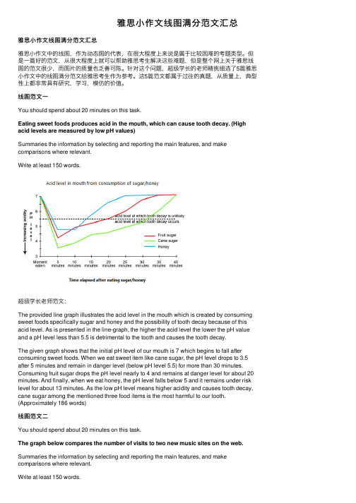
线图范⽂⼀You should spend about 20 minutes on this task.Eating sweet foods produces acid in the mouth, which can cause tooth decay. (High acid levels are measured by low pH values)Summaries the information by selecting and reporting the main features, and make comparisons where relevant.Write at least 150 words.超级学长⽼师范⽂:The provided line graph illustrates the acid level in the mouth which is created by consuming sweet foods specifically sugar and honey and the possibility of tooth decay because of this acid level. As is presented in the line-graph, the higher the acid level the lower the pH value and a pH level less than 5.5 is detrimental to the tooth and causes the tooth decay.The given graph shows that the initial pH level of our mouth is 7 which begins to fall after consuming sweet foods. When we eat sweet item like cane sugar, the pH level drops to 3.5 after 5 minutes and remain in danger level (below pH level 5.5) for more than 30 minutes. Consuming fruit sugar drops the pH level nearly to 4 and remains at danger level for about 20 minutes. And finally, when we eat honey, the pH level falls below 5 and it remains under risk level for about 13 minutes. As the low pH level means higher acidity and causes tooth decay, cane sugar among the mentioned three food items is the most harmful to our tooth. (Approximately 186 words)线图范⽂⼆You should spend about 20 minutes on this task.The graph below compares the number of visits to two new music sites on the web. Summaries the information by selecting and reporting the main features, and make comparisons where relevant.Write at least 150 words.超级学长⽼师范⽂:The graph exhibits the public interest of using two new music websites named Music Choice and Pop Parade in the period of 15 days’ time. According to the graph, the trends were totally unstable and have swung extremely.The statistics of Pop Parade shows the starting point of 120000 visitors on the first day and decreased during the following 7days with the minimum number of visitors of 40000 on the 7th day. The fluctuation of Music Choice website wasn’t as extreme as the Pop Parade in the first week. The Music Choice started with 40000 visitors in the 1st day and the same number of visitors on the 7th day with small amount of changes during this week. In the 2nd week, both of the websites had the increasing interest of visitors i.e. Pop Parade reached to 140000 visitors on the 11th day and Music Choice reached to 120000 on the 12th day, and after some oscillations, the websites ended the 15 day period with 180000 and 80000 respectively. According to the chart, the rate of 180000 was the maximum of viewers that belongs to Pop Parade and Pop Parade has More public interest for the viewers altogether than the Music Choice within these two weeks.( Approximately 204 words )线图范⽂三You should spend about 20 minutes on this task.The line graph below gives information on cinema attendance in the UK.Summaries the information by selecting and reporting the main features, and make comparisons where relevant.Write at least 150 words.超级学长⽼师范⽂:The given line graph shows the number of cinema-going UK people and classifies theseviewers in four age groups. As is observed from the graph, people over 40 years old went to movies more than the younger people of the UK.As is observed from the line graph, the people of 44 to 54 years-old attended cinema more than the people of other age groups who are less than 44 years old. Only 15% of the UK citizens who were between 14 to 24 years old attended in cinema in 1990 while this percentage increased with the increase of age group. In this same year, more than 35% people over 40 years attended the cinema. It is clear from the data that, the people in UK trend to attend cinema more with the increase of their age. The cinema goer’s number increased gradually from 1990 to 2010 except for 1995 to 2000. In 2010, the number of cinema attendees was also dominated by the age group of 44 to 54 and the percentage of cinema attendees from all age groups increased by 5% on an average than the percentages were in 2005.线图范⽂四You should spend about 20 minutes on this task.The graph below shows the differences in wheat exports over three different areas. Summaries the information by selecting and reporting the main features, and make comparisons where relevant.Write at least 150 words.超级学长⽼师范⽂:The given line graph compares the wheat exports over three different parts of the world namely Australia, Canada and the European Community from 1985 to 1990. As is presented in the graph, the wheat export in Australia decreased over time while the export in Canada and European countries increased with some fluctuations.According to the graph, around 15 to 20 million tons of wheat was exported to Australia, Canada and the European community. This amount decreased slightly in 1986 reaching around 15 million tons and from that point, the export quantity in Australia kept on decreasing and reached just over 10 million tons in 1990. In the meantime, the amount increased sharply in Canada until 1988 and then there was a quick decline and finally, it reached around 19 million tons in 1990. Finally, the wheat export in the European Community increased gradually over the years and reached over 20 million tons in 1990.线图范⽂五You should spend about 20 minutes on this task.The chart below shows the changes that took place in three different areas of crime in New Port city center from 2003-2012.Summaries the information by selecting and reporting the main features, and make comparisons where relevant.Write at least 150 words.超级学长⽼师范⽂:The graph represents the variation in levels in the three main areas of crime in the centre of Newport city in the time period from 2003 to 2012.To start with, it was 3400 incidences of burglary in 2003 and 3750 in 2004. Fortunately, in the next 4 years it fell down dramatically and reached the absolute minimum in 2008 (1100 incidences), however, it then grew by 300 accidents and remained fairly constant by 2012.Car theft was a steady level of crime from 2003 to 2004 and got reduced in next 5 years from 2700 up to 2250. The number then increased to 2700 in 2012.Robbery reached its peak in 2005, which was 900 cases and decreased back to 500 in 2008. In the following two years, the number of incidences rose to 700 and continued to stay at this level in 2012.In conclusion, in the Newport city centre, the rate of burglary fell significantly, the level of robbery remained fairly constant, whereas car theft raised and had the biggest number of incidences in 2012.。
雅思图表作文万能模板
雅思图表作文万能模板英文回答:Introduction。
The bar chart illustrates the percentage of people in three age groups who engage in three different activities: reading books, watching TV, and using the internet. The data was collected from a survey conducted in a particular region, and the results provide insights into the leisure activities of different age groups.Overall Observation。
In general, the chart reveals that the youngest age group (aged 18-24) has the highest engagement in all three activities compared to the middle-aged (aged 35-44) and elderly (aged 65+) groups.Reading Books。
The youngest age group (aged 18-24) exhibits the highest percentage of readers, with 75% engaging in this activity. In contrast, the middle-aged group has a significantly lower percentage of readers (50%), and the elderly group has the lowest percentage (30%).Watching TV。
雅思写作小作文线图高分范文解析!
线图雅思小作文范文解析线图雅思小作文范文解析!动态线图,这已成为近两年来雅思考试的主流,下面三立在线小编就为大家分享一篇雅思写作小范文之线图九分范文。
希望同学们可以从中学习雅思线图写作技巧The line graph compares average yearly spending by Americans on mobile andlandline phone services from 2001 to 2010.概括线图内容It is clear that spending on landline phones fell steadily over the 10-yearperiod, while mobile phone expenditure rose quickly. The year 2006 marks thepoint at which expenditure on mobile services overtook that for residentialphone services.总述一条线总体趋势,和另一条行程对比In 2001, US consumers spent an average of nearly $700 on residential phoneservices, compared to only around $200 on cell phone services. Over thefollowing five years, average yearly spending on landlines dropped by nearly$200. By contrast, expenditure on mobiles rose by approximately $300.自2001年开始,描述cell phone每一段的变化趋势。
In the year 2006, the average American paid out the same amount of money onboth types of phone service, spending just over $500 on each. By 2010,expenditure on mobile phones had reached around $750, while the figure forspending on residential services had fallen to just over half this amount.对比手机服务,写出手机服务的特征。
雅思写作 小作文
是否会确定主体段应该写几段 1.
对于多数的小作文题来说,图中给出了几个 图我们就对应写几个主体段 2. 还有一种题目只给出了一个图,那我们就要 看一个图里面包含几类图形元素(如线图里有 几根线,柱图里有几根柱),然后对应对每类 图形元素写一个主体段
是否会确定主体段应该写几段 3.
增加单词,删除单词和替换单词 规律1: 当一道题包含2个或以上的国家,或者 两种或以上同类型的事物时,那么在开头段转 述这个图的信息时就可以用compare代替show
规律2:
原题里的below一词在转述中必须删掉 (因为当你写作文时,是在画有横线的答题纸 上写的,图形不在答题纸上,也就谈不上 below或者above的问题了)
首段介绍图表总体内容用一般现在时。接下来
对以前的统计数字描述用一般过去时,对将来 的趋势预测描述用一般将来时
展示,提供(首句谓语动词) Vt. Show,
describe, indicate, illustrate, provide
占百分之多少 Vt. Account
3.
一定要保证客观 对于含有多个图的题,最好能在图之间适当解 释一下联系,但是如果实在看不出任何联系, 那么就把各图再分别简单概括一下也是剑桥官 方范文里常用的结论方式
不管是从雅思考试目的还是将来出国留学的实
用目的,各类图表作文都是必须要掌握的 写作技能:图表作文的写作技能是有限的,同 时也是经典的。又因为它不要求主观思想的表 达,只是客观规律的描述,所以,学会使用这 些有限的写作技能后,小作文可以轻取高分。
客观性 2. 准确性 3. 详尽性
客观性 不应该有任何图里并没有而靠自己主观想象加
入的成分 即使是结尾段针对图形做出的总结性结论,应 该根据图表的实际内容做出符合逻辑的总结归 纳
2020雅思小作文考官范文(线形图题型)
2020雅思小作文考官范文(线形图题型)主题:老年人口题型:线图The graph below shows the proportion of the population aged 65 and over between 1940 and 2040 in three different countries满分范文:The line graph compares the percentage of people aged 65 or more in three countries over a period of 100 years.It is clear that the proportion of elderly people increases in each country between 1940 and 2040. Japan is expected to see the most dramatic changes in its elderly population.In 1940, around 9% of Americans were aged 65 or over, compared to about 7% of Swedish people and 5% of Japanese people. The proportions of elderly people in the USA and Sweden rose gradually over the next 50 years, reaching just under 15% in 1990. By contrast, the figures for Japan remained below 5% until the early 2000s.Looking into the future, a sudden increase in the percentage of elderly people is predicted for Japan, with a jump of over 15% in just 10 years from 2030 to 2040. By 2040, it is thought that around 27% of the Japanese population will be 65 years old or more, while the figures for Sweden and the USA will be slightly lower, at about 25% and 23% respectively.主题:手机变迁题型:线图The line graph shows the average annual expenditures on cell phone and residential phone services between 2001 and 2010.范文:The line graph compares average yearly spending by Americans on mobile and landline phone services from 2001 to 2010.It is clear that spending on landline phones fell steadily over the 10-year period, while mobile phone expenditure rose quickly. The year 2006 marks the point at which expenditure on mobile services overtook that for residential phone services.In 2001, US consumers spent an average of nearly $700 on residential phone services, compared to only around $200 on cell phone services. Over the following five years, average yearly spending on landlines dropped by nearly $200. By contrast, expenditure on mobiles rose by approximately $300.In the year 2006, the average American paid out the same amount of money on both types of phone service, spending just over $500 on each. By 2010, expenditure on mobile phones had reached around $750, while the figure for spending on residential services had fallen to just over half this amount.主题:网络使用题型:线图The line graph below shows internet usage in different countries.范文:The line graph compares the percentage of people in three countries who used the Internet between 1999 and 2009.It is clear that the proportion of the population who used the Internet increased in each country over the period shown. Overall, a much larger percentage of Canadians and Americans had access to the Internet in comparison with Mexicans, and Canada experienced the fastest growth in Internet usage.In 1999, the proportion of people using the Internet in the USA was about 20%. The figures for Canada and Mexico were lower, at about 10% and 5% respectively. In 2005, Internet usage in both the USA and Canada rose to around 70% of the population, while the figure for Mexico reached just over 25%.By 2009, the percentage of Internet users was highest in Canada. Almost 100% of Canadians used the Internet, compared to about 80% of Americans and only 40% of Mexicans.。
雅思写作流程图满分写法(参考模板)
雅思写作流程图满分写法朗阁海外考试研究中心丁仡然很多同学常常对雅思小作文流程图的写法感到困扰,虽然市场上有很多关于雅思流程图指导的书,但是笔者想要强调的是我们还是要用好剑桥1-10这十本最官方的书,仔细研究其中的考官范文就不难发现,其实流程图只是一只纸老虎,没有同学们想象的那么可怕。
本文中,朗阁海外考试研究中心的专家就为各位考生分析一篇剑桥10考官所写的最新流程图满分范文,希望借这篇文章对大家的雅思小作文有一定的帮助和提升!我们来看一下小作文题目(剑桥雅思10, Test 4, P101)The diagrams below show the life cycle of a species of large fish called the salmon.该图表描述了某一种大型鱼(三文鱼)的生命循环过程。
解题步骤:在写流程图的时候,大家首先要把题干看三遍,然后一定要花时间分析一下这幅图,一定要把图中每个步骤都看懂,然后深入理解每一步骤要表现的内容是什么。
注意:1. 图中所有的信息点都要讲到,不然会被重点扣分;2. 图中的信息千万不能写偏,不能写出和图中描述不符合的信息;3. 不要在小作文里面写自己的观点,这是很大的忌讳之处;4. 流程图也要写overview, 这点非常重要!这篇文章总体分为三段:第一段写了最上面的那个图:也就是三文鱼在上游时候最初的形态。
第二段写了中间和下面那个图:也就是三文鱼在下游和游到大海里,以及最后游回到出生地的过程。
第三段:整篇文章总体的overview和三幅图之间的比较和差异。
考官范文分析:在第一段里面考官在一开始就写到:salmon begin life as eggs on a pebbly riverbed, hidden among reeds in the slow-moving upper reaches of a river. 大家注意考官写的这句话是一种9分的流程图表达方式:就是用一句话把图中的好几个信息点都串进去,我们可以看到,这句话里面:图中有的salmon eggs, small stones, upper river slow moving都写进去了,所以从这句话中考生们可以学习一种技能,就是尽量一句话中多串几个图中的信息点。
- 1、下载文档前请自行甄别文档内容的完整性,平台不提供额外的编辑、内容补充、找答案等附加服务。
- 2、"仅部分预览"的文档,不可在线预览部分如存在完整性等问题,可反馈申请退款(可完整预览的文档不适用该条件!)。
- 3、如文档侵犯您的权益,请联系客服反馈,我们会尽快为您处理(人工客服工作时间:9:00-18:30)。
条图C3T2原题The chart below shows the amount spent on six consumer goods in for European countries.Write a report for a university lecture describing the information shown below.The chart shows that Britain, among the four European countries listed, has spent most heavily on the range of consumer goods included. In every case, British spending is considerably higher than that of other countries; only in the case of tennis racquets does another country, Italy, come close.In contrast, Germany is generally the lowest spender. This is most evident in photographic film, where Germany spends much less than Britain. Germany only spends more than another country, France, in two cases: tennis racquets and perfumes.Meanwhile, France and Italy generally maintain middle positions, averaging approximately similar spending overall. Specifically, France spends more on CDs and photographic film but less on tennis racquets than Italy does. Italy’s spending on personal stereos is only marginally greater than that of France, while spending on toys is equal between the two.It is clear from the data given that there are some significant differences in spending habits within Europe.分析:题目The chart below shows the amount spent on six consumer goods in four European countries.•一般题目都会将图形的X1, X2, Y轴的几个变量表示出来,如此处X1轴six consumer goods; X2轴European countries; Y轴the amount第一段The chart shows that Britain, among the four European countries listed, has spent most heavily on the range of consumer goods included.•点明了英国消费冠军的地位•the range of consumer goods 其中的the range of 表示“一系列的”,由于雅思小作文经常出现多个物品或人群的比较,所以这个表达很有用•the four countries listed; consumer goods included其中的listed, included为过去分词作后置定语,但是这两个词是充数的,没有也无妨,不过这两个词雅思图表经常用到In every case, British spending is considerably higher than that of other countries; only in the case of tennis racquets does another country, Italy, come close.•具体到6种消费品,只是这个地方的描述和图形不太精确,仔细看看,应当是stereos 和法国与德国齐平,tennis racquets越高于意大利,当然用come close 是正确的。
•In every case; in the case of tennis racquets其中的case [c] 代指物品,与item 类似•Only in the case of tennis request does another country come close. 这句由于有only居于句首,倒装第二段In contrast, Germany is generally the lowest spender.•In contrast引出了消费乌龟德国,特别注意,谈英国的时候spend用的是谓语动词形式,have spent on sth, 谈德国时spend为名词形式spender 消费者,可见同一意思不同词性的变化会使句型多样化,这个技巧一定要掌握This is most evident in photographic film, where Germany spends much less than Britain.•具体说明the lowest spender, This is most evident 这是个表示进一步说明的句型Germany only spends more than another country, France, in two cases: tennisracquets and perfumes.•此处表示比较A spend more than B, 还可以用compared to表达,Germany spends more on tennis racquets and perfumes, compared to France.第三段Meanwhile, France and Italy generally maintain middle positions, averaging approximately similar spending overall.•meanwhile引出了消费居中派意大利和法国,(France and Italy are)averaging similar spending 指出了各项的消费比较均衡,average [vt] 均摊Specifically, France spends more on CDs and photographic film but less on tennis racquets than Italy does. Italy’s spending on personal stereos is only marginally greater than that of France, while spending on toys is equal between the two.•这两句是对意大利和法国各项的比较,意大利超过法国的项目有stereos, tennis, perfume; 意大利与法国齐平的项目有toys;意大利低于法国的项目有film, CDs. •注意一下表示消费的两种句型✓France spends more on… than Italy does. spend为谓语动词✓Italy’s spending on… is greater than that of France. spending为名词作主语第四段It is clear from the data given that there are some significant differences in spending habits within Europe.•总结一句,some significant differences老一套了,图表表现的含义很多都是difference.词汇句型积累任何一个作文(包括雅思大小作文)其中的都有一个核心的词,这个核心的词肯定将在文中反复出现,如文章中的spendspend [vt] 用作谓语动词•Britain has spent most heavily on sthspent 过去分词作定语•The chart below shows the amount spent on six consumer goods in four European countries.spender [c] 消费者•Germany is the lowest spenderspending [u] 消耗量•Italy’s spending on personal stereos is only marginally greater than that of FranceC4T3原题The chart below shows the different levels of post-school qualification in Australia and the proportion of men and women who held them in 1999. Summarize the information by selecting and reporting the main features, and makes comparison where relevant.The chart gives information about post-school qualifications in terms of the different levels of further education reached by men and women in Australia in 1999.We can see immediately that there were substantial differences in the proportion of men and women at different levels. The biggest gender difference is at the lowest post-school level, where 90% of those who held a skilled vocational diploma were men, compared with only 10% of women. By contrast, more women held undergraduate diplomas (70%) and marginally more women reached degree level (55%).At the higher levels of education, men with postgraduate diplomas clearly outnumbered their female counterparts (70% and 30%, respectively), and also constituted 60% of Master’s graduates.Thus we can see that more men than women hold qualifications at the lower and higher levels of education, while more women reach undergraduate diploma level than men. The gender difference is smallest at the level of Bachelor’s degree, however.分析:题目The chart below shows the different levels of post-school qualification in Australia and the proportion of men and women who held them in 1999.这个题目不同于以往的表述方法,因为作者将一个图表的一个内容拆成两个名词短语来表示,其实也是包含有三个要素:the different levels of post-schoolqualification, men and women, proportion, 因此如果改写成一句话为The chart below shows the proportion of men and women in each level of qualification in Australia in 1999.开头段The chart gives information about post-school qualifications in terms of the different levels of further education reached by men and women in Australia in 1999.•对题目的改写,果然是变成了一句话,也必定包括的三个要素,这里当然我们还可以改写成将名词短语改写成句子,如此处The chart indicates that how many men and women hold the each post-school qualification in Australia in 1999.主体一段We can see immediately that there were substantial differences in the proportion of men and women at different levels.•substantial differences这基本上是对图形特征的一个固定特征,没有difference 还要你谈干什么?The biggest gender difference is at the lowest post-school level, where 90% of those who held a skilled vocational diploma were men, compared with only 10% of women.•就skilled vocational diploma进行说明,就两点进行了说明,第一点,和所有其他学历比起来,性别差异最大;第二点,男女各占比值,男女比值相加为100%,这是指标为相对变量的特征。