Bootstrap实战教程
bootstrap基础教程案例代码
一、概述Bootstrap是一个用于快速开发响应式网页的前端框架,其具有易用性和功能丰富的特点,广泛应用于各种网页开发中。
本文将介绍Bootstrap的基础教程以及相关案例代码,帮助读者快速掌握Bootstrap的使用方法。
二、Bootstrap基础教程1. 栅格系统Bootstrap基于12列的栅格系统,可以轻松实现页面布局。
以下是一个简单的例子:```html<div class="cont本人ner"><div class="row"><div class="col-md-4">.col-md-4</div><div class="col-md-4">.col-md-4</div><div class="col-md-4">.col-md-4</div></div></div>```在这个例子中,页面被分成了三列,每一列占据了页面宽度的1/3。
2. 响应式工具类Bootstrap提供了一系列的响应式工具类,可以根据不同的屏幕尺寸来显示或隐藏元素。
要在小屏幕设备上隐藏一个元素,可以使用`d-none d-sm-block`类:```html<div class="d-none d-sm-block">在小屏幕设备上隐藏该元素</div>```3. 按钮Bootstrap提供了丰富的按钮样式,可以轻松地创建不同风格的按钮。
以下是一个简单的例子:```html<button type="button" class="btn btn-primary">Primary按钮</button><button type="button" class="btn btn-secondary">Secondary按钮</button>```4. 表格使用Bootstrap可以轻松创建各种样式的表格。
BootStrap入门教程(一)之可视化布局

BootStrap⼊门教程(⼀)之可视化布局HTML模板:<!DOCTYPE html><html><head><title>Bootstrap 模板</title><meta name="viewport" content="width=device-width, initial-scale=1.0"><!-- 引⼊ Bootstrap --><link href="/libs/bootstrap/3.3.7/css/bootstrap.min.css" rel="stylesheet"><!-- HTML5 Shim 和 Respond.js ⽤于让 IE8 ⽀持 HTML5元素和媒体查询 --><!-- 注意:如果通过 file:// 引⼊ Respond.js ⽂件,则该⽂件⽆法起效果 --><!--[if lt IE 9]><script src="https:///libs/html5shiv/3.7.0/html5shiv.js"></script><script src="https:///libs/respond.js/1.3.0/respond.min.js"></script><![endif]--></head><body><h1>Hello, world!</h1><!-- jQuery (Bootstrap 的 JavaScript 插件需要引⼊ jQuery) --><script src="https:///jquery.js"></script><!-- 包括所有已编译的插件 --><script src="js/bootstrap.min.js"></script></body></html> 在这⾥,您可以看到包含了 jquery.js、bootstrap.min.js 和 bootstrap.min.css ⽂件,⽤于让⼀个常规的 HTML ⽂件变为使⽤了 Bootstrap 的模板。
Bootstrap入门与布局教程课件
通过定义容器的大小,平分为12份 调整内外边距 结合媒体查询
9/44
栅格系统工作原理
一行数据(row)必须包含在 .container中浏可,览视以器区域便为
其赋予合容适器 c的ont对aine齐r 方式和内列与边列距间距 30px 使用行在水平方向列创colu建mn一组列
列右间 距
4/44
新手入门 开发环境(webstorm) 引入Bootstrap框架文件
压缩处理文件bootstrap.min.css,bootstrap.min.js 使用 Bootstrap 中文网提供的免费 CDN 加速服务
5/44
基本模板
<html>
<head lang="en">
示例
<meta name="viewport" content="width=device-width, user-scalable=no,
initial-scale=1.0/>
<link href="css/bootstrap.css" rel="stylesheet">
</head>
<body>
<h1>这是一个Bootstrap框架的最基本HTML模板</h1>
<script src="js/jquery-1.12.4.js"></script>
</div>
演示示例3:Bootstrap列偏移
13/44
列嵌套
使用列组合的方式如何布局?
示例
bootstrap响应式网站开发实例教程课件第3章第1节

<div class="row"> <div class="col-md-8">占8列</div> <div class="col-md-4">占4列</div>
</div>
<div class="row"> <div class="col-md-6">占6列一半</div> <div class="col-md-6">占6列一半</div>
中型设备台式电脑(≥992px)
以折叠开始,断点以上是水平的
970px
.col-md12
~78px 30px 列的两侧分别 15px Yes Yes Yes
大型设备台式电脑 (≥1200px)
以折叠开始,断点以上是水平 的
1170px
.col-lg12
~95px 30px 列的两侧分别 15px Yes Yes Yes
B o o t s t r a p 栅 格 系 统 - - Bootstrap栅格系统的原理
运行“实例1”的页面效果,拖动浏览器 改变浏览器的宽度,可以看到不同的效果。 当屏幕<992px后,所有的列变成从上到下 依 次 排 列 , 在 浏 览 器 的 宽 度 为 800px 和 600px呈现的效果是一样的,如图3-4所示。
a)
图3-4 应用栅格系统布局网站的效果 b)
a) 宽度为800px时的页面效果 b)宽度为600px时的页面效果
B o o t s t r a p 栅 格 系 统 - - Bootstrap栅格系统的原理
BOOTSTRAP教程
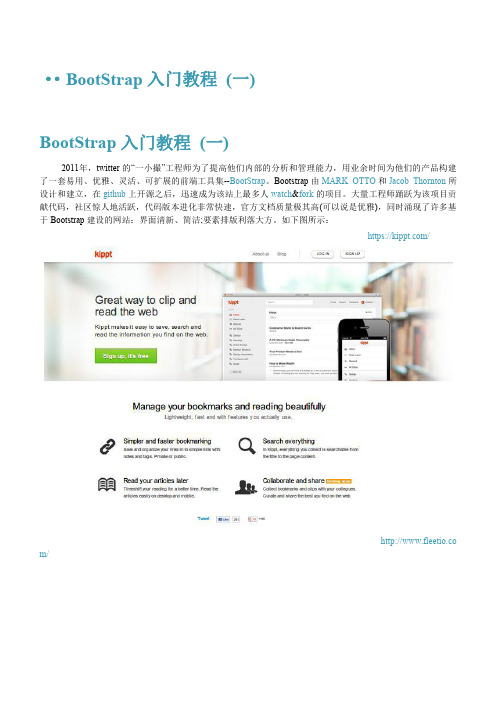
图2-2 引用(Blockquotes) 代码片段如下所示:
<divclass="row"> <divclass="span6 "> <blockquoteclass="pull-right"> <p>凌冬将至. 我是黑暗中的利剑,长城上的守卫,抵御寒冷的烈焰,破晓时分的光线,唤醒眠者的号角,守护王国的坚盾。 </p> </blockquote> </div> <divclass="span6 "> <blockquote> <p>凌冬将至. 我是黑暗中的利剑,长城上的守卫,抵御寒冷的烈焰,破晓时分的光线,唤醒眠者的号角,守护王国的坚盾。</p> 守夜人军 守夜人军团总司令.<small>蒙奇.D.<citetitle="">路飞</cite></small>
图1-1 默认格网系统(Default G rid System) 以下简单的代 码则是实现图1-1中,第三列的宽度为4和宽度为8的两个 div.
<divclass="row"> <divclass="span4">...</div> <divclass="span8">...</div> </div>
嵌套的 div 长度之和不能大于它的父 div,否则会溢出叠加。各位可以试试将第一层的 div 长度改为其他值,看 看效果。 流式格网系统(Fluid grid system).它使用%, 而不是固定的 px,来确定页面要素的宽度.只需要简单的将. row 改成.row-fluid ,就可以将 fixed 行改为 fluid.如图1-4所示:
个人学习总结-BootStrap入门教程
说明:
1)<meta name="viewport" content="width=device-width,initial-scale=1.0">
使用来修复网页在移动设备上显示的问题
2)<!--[if lt IE 9]>
<script src="/svn/trunk/html5.js"></script>
<![endif]-->
这是对ie9之前等版本不支持HTML5的浏览器进行特殊的处理
4)在head中的bootstrap-responsive.css是非必须文件,可以不引入,这个文件的主要作用是做一个响应式的网页。
5)在网页中bootstrap.css是bootstrap中的样式文件,bootstrap.js是脚本文件,两个文件相互对应,引入的顺序和位置一般是:CSS文件在head标签中引入,js文件在body标签里引入。其中jquery文件要在bootstrap脚本文件之前引入。
<li>adsf</li>
<li>asdf</li>
</ol>
<h2>描述列表</h2>
<dl class="dl-horizontal">
<dt>adf</dt>
<dd>dasfdafadsf</dd>
<dt>adf</dt>
<dd>adfadsf</dd>
<dt> adsf</dt>
bootstrap响应式网站开发实例教程课件第5章

在页面关联了Bootstrap的CSS文件后,除了在<table> 标签中添加class .table之外继续添加.table-striped类后, 即<table class= "tab图le5-t5a条bl纹e-状st表ri格ped" >,就会得到一 个具有条纹效果的表格。
bootstrap教程ppt
CSS全局样式——排版
• 改变大小写 – class =“text-lowercase” 转成小写 – class = “text-uppercase”转成大写 – class = “text-capitalize”首字母大写
• 无序列表——顺序无关紧要的一组元素 • 有序列表——顺序至关重要的一组元素 • 无样式列表
Bootstrap基本模板
• Bootstrap模板注意事项 – Bootstrap模板必须是基于HTML5文件的。因此DTD类型定义必须是HTML5 的。 – Bootstrap文件当字符集设置,也要遵循HTML5的规范。 – 设置IE浏览器兼容模式(X-UA-Compatible)。 – 设置模板,适用于所有平台(viewport )。 – 引入bootstrap的CSS主文件(bootstrap.min.css)。 – 引入jQuery插件的主文件(jQuery) – 引入bootstrap的JS主文件(bootstrap.min.js)
BootStrap入门学习 Part 1
Bootstrap简介
• 什么是 Bootstrap? – Bootstrap 是由 Twitter 的 Mark Otto 和 Jacob Thornton 两位设计师开发的。 Bootstrap 是 2011 年八月在 GitHub 上发布的开源产品。 – Bootstrap 是一个用于快速开发 Web 应用程序和网站的前端框架。 – Bootstrap 是基于 HTML、CSS、JAVASCRIPT 的。 – Bootstrap简洁灵活,使得 Web 开发更加快捷。 – Bootstrap可以构建出非常优雅的前端界面,而且占用资源非常小。
- 1、下载文档前请自行甄别文档内容的完整性,平台不提供额外的编辑、内容补充、找答案等附加服务。
- 2、"仅部分预览"的文档,不可在线预览部分如存在完整性等问题,可反馈申请退款(可完整预览的文档不适用该条件!)。
- 3、如文档侵犯您的权益,请联系客服反馈,我们会尽快为您处理(人工客服工作时间:9:00-18:30)。
<!DOCTYPE html> <html> <head> <title>Bootstrap in practice: the grid system</title> <meta name="viewport" content="width=device-width, initial-scale=1.0" /> <meta charset="utf-8" /> <!-- Bootstrap CSS --> <link href="///bootstrap/3.0.0/css/bootstrap.min.css" rel="stylesheet" /> </head> <body> <h1>Hello, world!</h1> <p>Asymmetrical YOLO banjo lomo fanny pack, shoreditch flexitarian dreamcatcher ethnic kitsch sriracha nisi sustainable swag. Cliche 90's farm-to-table master cleanse Pinterest jean shorts. Cillum raw denim aesthetic sunt.</p> <p>Aliqua photo booth literally veniam minim leggings, est craft beer banjo intelligentsia Truffaut officia. Irony minim 3 wolf moon meggings, viral hella hoodie selvage flexitarian small batch pariatur.</p> <p>Consectetur art party Tonx culpa semiotics. Pinterest assumenda minim organic quis.</p> <p>Wayfarers selvage YOLO, commodo assumenda eu est bespoke mlkshk. Helvetica reprehenderit iPhone, aesthetic 90's literally chambray bicycle rights viral blog voluptate. Occupy bespoke stumptown duis keytar vero.</p> </body> </html>
• •
HTML5: achieved declaring a <!DOCTYPE html> Bootstrap CSS: gently hosted by NetDNA
Take a look at the page in a browser, and you'll see a lonely – but stylish – Hello, world!.
BABY STEPS
21
Section 2
ADDING SOME BEEF
You are going to see the grid system in action very soon, but first you need to beef up your page with some random content. I'll take mine from hipsteripsum.me, but the classic or any editor plugin will be fine as well.
2. YOUR FIRST PAGE
BOOTSTRAP IN PRn 1
BABY STEPS
It's super easy to put together a basic page with Bootstrap. Just fire up your editor and type in this markup:
2. YOUR FIRST PAGE
22
Section 3
HERE COMES THE GRID
Let's start with a very simple layout: two columns, two paragraphs per column.
2. YOUR FIRST PAGE
23
<!DOCTYPE html> <html> <head> <title>Bootstrap in practice: the grid system</title> <meta name="viewport" content="width=device-width, initial-scale=1.0" /> <meta charset="utf-8" /> <!-- Bootstrap CSS --> <link href="///bootstrap/3.0.0/css/bootstrap.min.css" rel="stylesheet" /> <!-- To better visualize the columns --> <style> .row > div { background-color: #dedef8; box-shadow: inset 1px -1px 1px #444, inset -1px 1px 1px #444; } </style> </head> <body> <div class="container"> <h1>Hello, world!</h1> <div class="row"> <div class="col-md-6"> <p>Asymmetrical YOLO banjo lomo fanny pack, shoreditch flexitarian dreamcatcher ethnic kitsch sriracha nisi sustainable swag. Cliche 90's farm-to-table master cleanse Pinterest jean shorts. Cillum raw denim aesthetic sunt.</p> <p>Aliqua photo booth literally veniam minim leggings, est craft beer banjo intelligentsia Truffaut officia. Irony minim 3 wolf moon meggings, viral hella hoodie selvage flexitarian small batch pariatur.</p> </div> <div class="col-md-6"> <p>Consectetur art party Tonx culpa semiotics. Pinterest assumenda minim organic quis.</p> <p>Wayfarers selvage YOLO, commodo assumenda eu est bespoke mlkshk. Helvetica reprehenderit iPhone, aesthetic 90's literally chambray bicycle rights viral blog voluptate. Occupy bespoke stumptown duis keytar vero.</p> </div> </div> </div> </body> </html>
Heads up!
You'd better serve these pages locally. If you have Ruby, your best bet is to gem install serve and then launch serve . from the directory where your HTML file resides. Then point your browser to http://localhost:4000/ and you are golden. If you can't or don't want to serve your pages locally, then please change every protocol relative URL in the sources to its more classic variant, or your browser may not be able to find those resources. Example: change ///bootstrap/3.0.0/