arcgis工具使用方法
arcgis识别工具的用法

arcgis识别工具的用法
arcgis识别工具是一种功能强大的工具,用于在地图中识别和定位各种要素和属性。
它可以帮助用户快速准确地定位目标地物,从而更好地分析和处理数据。
下面是arcgis识别工具的用法:
1.选择地图图层:在arcgis中打开要使用的地图,并选择要素图层。
2.启动识别工具:点击工具栏上的“识别”按钮,或者使用快捷键“Ctrl+I”启动识别工具。
3.识别要素:在地图中单击要素,识别工具将显示该要素的属性信息。
4.查看属性信息:通过识别工具,用户可以查看要素的所有属性信息,包括名称、类型、大小、颜色等等。
5.查询要素:通过识别工具,用户可以查询地图中的要素,以便更好地分析和处理数据。
6.编辑要素:如果需要编辑地图中的要素,可以在识别工具中进行编辑操作,包括添加、删除、修改等。
总之,arcgis识别工具是一种非常实用的工具,可以帮助用户快速准确地定位目标要素并查看属性信息,从而更好地分析和处理数据。
- 1 -。
arcgis软件操作

33
工具的位置:Data mangement tools下 projections and transformations-feature- project
Project可以用于数据换带
34
注意:
定义坐标系统和坐标转换区别:
◆坐标转换是真正改变坐标(xy)值; 投影变换是研究从一种地图投影点的坐标变换为 另一种地图投影点的坐标的理论和方法。 ◆在平面坐标下,在arcmap可以查看经纬度,反过 来是经纬度坐标系统,无法看xy,因为中央经线 不一样,xy就不一样
45
面拓扑
must not overlap:要素相互不能重叠(含部分)
must not have gaps:单要素类,连续连接的面 中间不能有空白区(非数据区)或者缝隙
46
其他拓扑
point must be covered by line:点都在线上
boundary must be covered by:多边形层的边界 与线层重叠
31
2、ArcToolbox Data Management Tools-> projections and transformation->Define Projection
32
2.2坐标变换
基于同一基准面,如西安80,地理坐标和平面坐标 ,可以有固定公式转换,ArcGIS可以直接转换,误差 可以达到0.1mm,即 实现北京54经纬度,和北京54平面(xy)之间转换 实现西安80经纬度,和西安80平面(xy)之间转换
◆ 投影变换:当系统所使用的数据是来自不同地图投
影的图幅时,需要将一种投影的地理数据转换成 另一种投影的地理数据,这就需要进行地图投影 变换。
arcgis基础操作步骤
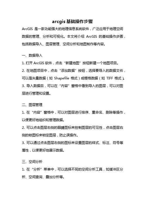
arcgis基础操作步骤ArcGIS是一款功能强大的地理信息系统软件,广泛应用于地理空间数据的管理、分析和可视化。
本文将介绍ArcGIS的基础操作步骤,包括数据导入、图层管理、空间分析和地图制作等内容。
一、数据导入1. 打开ArcGIS软件,点击“新建地图”按钮新建一个地图项目。
2. 在地图项目中,点击“添加数据”按钮,选择要导入的数据文件,可以是矢量数据(如Shapefile格式)或栅格数据(如TIFF格式)。
3. 导入数据后,可以在“内容”窗格中看到导入的图层,可以对图层进行管理和设置。
二、图层管理1. 在“内容”窗格中,可以对图层进行排序、重命名、删除等操作,以便更好地组织和管理数据。
2. 可以点击图层右侧的眼睛图标来控制图层的可见性,点击图层右侧的锁图标来锁定图层,防止误操作。
3. 可以通过点击图层右侧的图标来设置图层的样式、标注、符号等属性,以便更好地展示数据。
三、空间分析1. 在“分析”菜单中,可以选择不同的空间分析工具,如缓冲区分析、空间查询、叠加分析等。
2. 在使用空间分析工具前,需要选择要分析的图层和设置分析参数,然后点击“运行”按钮执行分析。
3. 分析结果将以新的图层形式显示在“内容”窗格中,可以对其进行管理和进一步的分析。
四、地图制作1. 在地图项目中,可以调整地图的范围和比例尺,以便更好地展示地理空间数据。
2. 可以选择不同的底图样式,如街道地图、卫星影像、地形图等,以便更好地呈现地图内容。
3. 可以添加标注、图例、比例尺等元素,以及设置符号、颜色、透明度等样式,以便更好地制作地图。
总结:ArcGIS是一款功能强大的地理信息系统软件,通过数据导入、图层管理、空间分析和地图制作等基础操作步骤,可以对地理空间数据进行管理、分析和可视化。
掌握这些基础操作步骤,有助于更好地利用ArcGIS进行地理信息工作。
希望本文的介绍对读者有所帮助。
arcgis mean center使用
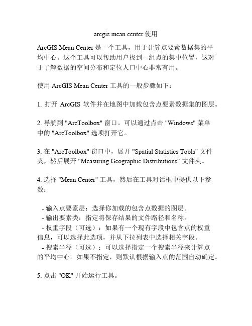
arcgis mean center使用ArcGIS Mean Center 是一个工具,用于计算点要素数据集的平均中心。
这个工具可以帮助用户找到一组点的集中位置,这对于了解数据的空间分布和定位人口中心非常有用。
使用 ArcGIS Mean Center 工具的一般步骤如下:1. 打开ArcGIS 软件并在地图中加载包含点要素数据集的图层。
2. 导航到 "ArcToolbox" 窗口。
可以通过点击 "Windows" 菜单中的 "ArcToolbox" 选项打开它。
3. 在 "ArcToolbox" 窗口中,展开 "Spatial Statistics Tools" 文件夹,然后展开 "Measuring Geographic Distributions" 文件夹。
4. 选择 "Mean Center" 工具,然后在工具对话框中提供以下参数:- 输入点要素层:选择你加载的包含点数据的图层。
- 输出要素类:指定将保存结果的文件路径和名称。
- 权重字段(可选):如果有一个现有字段中包含点的权重信息,可以选择此选项,并从下拉列表中选择相关字段。
- 搜索半径(可选):可以选择指定一个搜索半径来计算点的平均中心。
如果不指定,则默认根据输入点的范围自动确定。
5. 点击 "OK" 开始运行工具。
6. 一旦工具运行完成,结果将在地图中显示,并保存在指定的输出要素类中。
使用 ArcGIS Mean Center 工具可以帮助用户快速计算一组点的平均中心,从而更好地理解数据的空间分布和趋势。
ArcGIS Pro 3D分析工具使用指南说明书

Apply 3D Analysis Tools in ArcGIS Pro380 New York StreetRedlands, California 92373 – 8100 USACopyright © 2019 EsriAll rights reserved.Printed in the United States of America.The information contained in this document is the exclusive property of Esri. This work is protected under United States copyright law and other international copyright treaties and conventions. No part of this work may be reproduced or transmitted in any form or by any means, electronic or mechanical, including photocopying and recording, or by any information storage or retrieval system, except as expressly permitted in writing by Esri. All requests should be sent to Attention: Contracts and Legal Services Manager, Esri, 380 New York Street, Redlands, CA 92373-8100 USA.The information contained in this document is subject to change without notice.Using 3D thematic symbology to display features in a sceneTime: 40 minutesOverviewThe ArcGIS 3D Analyst extension contains a powerful set of tools for understanding how the local terrain and other 3D features can obstruct the line of sight, or viewshed, between an observer and a target. However, sometimes you wish to quickly explore visibility scenarios in 3D without a lot of data preparation.The content used in this lesson contains a mix of small-, medium-, and large-scale urban environments. All the analysis tasks in this lesson are done interactively and incorporate the currently visible layers in the scene–if you turn a layer on or off, your analysis changes in real time. These tools can be useful for a quick visual check or exploration of a scenario before conducting more rigorous visibility studies.If you have some time left after using the Exploratory Analysis tools, you can spend a few minutes reviewing the exploratory tools–the Range and Time sliders in ArcGIS Pro–to discover meaningful patterns within a 3D space time cube.In this lesson, you will learn to do the following:•Use the 3D Exploratory Analysis tools in ArcGIS Pro•Use the line of sight and viewshed tools to observe the effects of objects and terrain•Explore spatiotemporal patterns in complex datasets using a 3D space time cubeGetting startedThe analysis scenarios in this lesson are contained in an ArcGIS Pro Project package (.ppkx).1.Download the DisplayAnalytics.zip compressed folder.2.Locate the downloaded file on your computer and extract it to a location you can easily find, suchas your Documents folder.3.From the extract location, double-click the DisplayAnalytics.ppkx project package to launch ArcGISPro and display the package contents.When the project opens, you will find three scenes–two global scenes for Exploratory Analysis and one local scene for Exploring a Space Time Cube. Using the Exploratory Analysis scenes, you will review and use exploratory analysis tools with data for San Francisco and the Esri campus in Redlands, California. In the space time cube scene, you will use a space time cube to explore patterns in water usage in Merced, California.The San Francisco building data used in the lesson is sourced from a scene layer, published on . The original building data used to create the published scene is used with permission from PLW Modelworks (Copyright © 2010-2011 PLW Modelworks, LLC)4.Review the 3D Exploratory Analysis tools used in this lesson. The tools are located on the ribbon, onthe Analysis tab in the 3D Exploratory Analysis group.5.Click the Interactive Analysis drop-down menu and review the available tools.There are four exploratory tools:•Line of Sight, which creates sight lines to determine if one or more targets are visible from a given observer location.•View Dome, which determines the parts of a sphere that are visible from an observer located at the center.•Viewshed, which determines the visible surface area from a given observer location through a defined viewing angle.•Slice, which visually cuts through the view's display to reveal hidden content.6.In the 3D Exploratory Analysis group, make sure to click Clear All before continuing to the nextstep.7.Close the Exploratory Analysis ESRI and Space Time Cube scenes.Building a view domeView domes are spherical “bubbles” of visibility that extend out from an observer location, showing what can and cannot be seen. In this step, you will use a view dome to better understand how “urban canyons” caused by tall buildings in San Francisco can limit your ability to view the sky or other features.1.Reposition the Exploratory Analysis SFC scene within the ArcGIS Pro application. By clicking theyellow square, your scene will expand to fill the view.Your Contents pane may not be visible.2.If necessary, on the ribbon, click the View tab, Windows group, then click Contents to display theContents pane.3.On the ribbon, click the Map tab, Navigate group, Bookmarks, then choose SFC Financial-District.The scene updates to the extent of the San Francisco Financial District.4.On the ribbon, click the Map tab, Navigate group, then click Explore.ing the navigation tools, zoom into and explore the Financial District in San Francisco tofamiliarize yourself with the area.6.When you are done, locate and focus on the area northwest of Market Street.If you are having trouble locating Market Street, use the Market Street bookmark to center yourself in the correct location.7.Continue zooming in to get to a top-down view, closer to street level8.On the ribbon, click the Analysis tab, in the 3D Exploratory Analysis Group, then click the drop-down menu for Interactive Analysis and choose View Dome.The Exploratory Analysis pane appears.9.Select the Interactive Size option.10.Next, click in the middle of an intersection surrounded by buildings. This will start generating the view dome.Now, you will make a second click, away from your first click, to set the radius of your view dome.11.About one city block away from your first click, move your pointer and click.NOTE: If you want to recreate your view dome, you can right-click the center of your first click and click Delete. You can also use your Explore tool to pan your scene to the middle of your screen.In the view dome, obstructed areas are shown in pink, while the uncolored area indicates a clear view of the sky. You can see how the visible areas of the view dome tend to be aligned with the street orientation.12.Next, you’ll change the view dome symbology. In the Exploratory Analysis pane, click Properties.13.Expand the Global Properties group.14.Update the color used for Visible and Not Visible areas to light green and red. In addition, modifythe Wireframe color to dark green.The scene updates and the view dome symbology is easier to interpret.insight into what may be observed and what may be obscured from the origin point of the dome.16.If necessary, click the center of your view dome to activate its handles.e the four handles around the edge of the dome to change its size and see how buildingsintersect.NOTE: You can also move the dome around on the ground by grabbing the blue disc around the observer and dragging it to a new location.The 3D Exploratory Analysis tools work not only with local multipatch and terrain data, but also with hosted scene layers, such as the textured San Francisco buildings, and with 3D symbols.18.When you are done, save the project.19.Close the Exploratory Analysis SFC scene.SliceThe Slice tool allows you to interactively place a clipping surface in a scene that slices through one or more layers. It is useful for exploratory tasks in which you have nested layers that you want to investigate–like cutting into a 3D geologic model to understand how the different strata are organized or internally cut by faults.In this step, you will use a simple 3D map of the Esri headquarters in Redlands, California, to slice different layers and create ad hoc exploratory views of the campus and buildings.1.Click the View tab. In the Windows group, click Catalog Pane.2.From the Catalog pane, expand Maps, and open the Exploratory Analysis ESRI scene.The scene opens to display the buildings and landscape of the Esri campus.3.Navigate to the front of Building Q, the distinctive wood and glass structure at the end of the street.You may need to clear your settings.4.On the ribbon, click the Analysis tab, in the 3D Exploratory Analysis group, then click Clear All toremove all previous analysis settings.5.Click the Interactive Analysis drop-down menu and choose Slice.The Exploratory Analysis pane updates.6.In the Exploratory Analysis pane, choose the Interactive Plane, Vertical.7.In the Exploratory Analysis pane, click Properties.8.Expand the Global Properties pane and update the Wireframe color to green and the Cut Outlinecolor to red.9.In the Exploratory Analysis pane, click Create. Your cursor becomes a crosshair as you hover overthe scene.10.Zoom in to the left front corner of the building.11.Click the ground near the left bottom corner of Building Q, then click another point that’s parallel tothe front facade orientation to set the plane.After the second click, the front of the facade will be removed, showing the interior of the building.ing the light blue anchor points, extend the vertical slice plane to slice through the front of thebuilding.The slice navigator center point, turns into a four-headed arrow when you point to it. Dragging the white arrows within the slice’s center point allows you to move the slice backward or forward.e the move handles to push it back into the building.directions.You can create some interesting interior views with the exterior walls “peeled away”–experiment with different plane orientations and angles.Next, include the ground surface in the slice.15.In the Exploratory Analysis pane, click Properties.16. Expand the Affected Layers group, and check Ground.Now you can see underground, which is useful for subsurface data visualization.Isometric cutaways are a common method for viewing architectural models or drawings.17.In the View tab, in the Scene group, try changing the Drawing Mode from Perspective to Parallel,to see how that alters the scene.18.Change the Drawing Mode back to Perspective when you are ready to continue.19.In the Exploratory Analysis pane, click the red X to close the Slice tool.20.Save the project.ViewshedViewsheds are used to visualize which parts of the environment can be seen from a given observer location. Unlike a view dome, which is a spherical surface of a set size, a viewshed renders on the surface of the terrain and any 3D objects what is visible and what is not visible within a given distance.In this step, you will again use the Exploratory Analysis ESRI scene.1.If necessary, navigate back to the area in front of Building Q.2.In the Contents pane, check all scene layers except the Tree layer.3.In the Contents pane, right-click the Esri CCTV Camera Locations layer and choose Attribute Table.4.Review the Esri CCTV Camera Locations attribute table and note the attribute fields populated withcamera properties such as direction, camera angle, and viewing distances.The viewshed tool can use these parameters to calculate what may or may not be visible based on the horizontal and vertical viewing angle and the minimum and maximum viewing distance of the camera.5.On the Analysis tab, in the 3D Exploratory Analysis group, click the Clear All button to clear anyactive analysis layers, then use the Interactive Analysis drop-down menu to select Viewshed.6.In the Exploratory Analysis pane, select the From Layer creation method.7.For Point layer, choose Esri CCTV Camera Locations.The Initial Viewpoint values for Heading and Tilt are automatically populated with values from the Esri CCTV Camera Locations layer attributes.8.Update the values for Viewshed Angles and Viewshed Distance as follows:•For Viewshed Angles:o For Horizontal, choose Angle_Horizontalo For Vertical, choose Angle_Vertical•For Viewshed Distance:o For Minimum, choose ViewDistance_Maxo For Maximum, choose ViewDistance_Min9.When finished, click Apply to add a viewshed to the scene.ing the 3D navigator, zoom out to visualize what the camera can observe based on its currentparameters.With the camera facing north, all locations visible to it are rendered in green, while locations not visible to the camera are rendered in pink.11.Tilt the scene to see how the 3D building objects and the placement of the camera impact thecalculated viewshed.Many of the buildings obscure the visibility of the camera, and it appears to be most effective at observing the street and parking spaces in front of the camera. However, we have the trees layer turned off and the viewshed is currently not including trees in its computation of visibility.12.In the Contents pane, check the Tree layer.With the Tree layer turned on, the viewshed is recalculated and the impact of the trees is notable, as trees certainly impact visibility.ing the 3D navigator, place yourself in the same northerly direction that the camera is facing.Notice how visibility is now largely confined to the street corridor and a few smaller paths between the tree canopy.14.Zoom in and notice how the south-facing parts of trees are also visible to the camera.Trees have a big impact on viewsheds–without vegetation, about half of the campus was visible. With trees added, the viewshed was reduced to a narrow strip along New York Street. The exploratory analysis tools in ArcGIS Pro allow you to quickly understand and test a variety of visibility scenarios.15.On the Analysis tab, in the 3D Exploratory Analysis group, click the Clear All button to clear anyactive analysis layers16.Close the Exploratory Analysis ESRI scene.In the next step, you will explore complex spatiotemporal data using the space time cube.Space Time CubeThe space time cube is a data visualization approach that analyzes large spatiotemporal datasets by aggregating them into bins across space and time. Within each bin, points are counted, and specific attributes are aggregated. Bins covering the same x,y area share the same location ID. Bins encompassing the same duration share the same time-step ID:In this example, you will use a space time cube to explore patterns in water consumption over a 12-year period in central California.1.In the Catalog pane, expand Maps and 0pen the Space Time Cube scene.The scene opens to display a space time cube using 1-mile x 1-mile bins to highlight areas of high water consumption from August 2002 to August 2013.In this scene, the Range slider and Time slider are both enabled for the visible layers to allow for the filtering of visible attributes and time slides.Let’s explore the Time slider setup.2.On the ribbon, under the Map tab, click the Time tab.3.In the Full Extent group, note the Start date set to 8/31/2002 12:00:01 AM and the End dateset to 8/31/2013 12:00:01 AM.These dates represent the 12-year period of water consumption visualized in this Space Time Cube.Note that the Step Interval is set to 1 Year, meaning that the Start and End time will be offset by one year.4.In the initial scene, the Time slider control is hidden; hover over the control to activate.5.On the Time slider control, click the auto-play button in the middle, or you can use the single-step button to the right to initiate stepping through the time range in one-year increments.As you interact with the Time slider, it will filter the 2D and 3D data to display the current active time range.6.On your own, step through the time series a couple of times–do you see a visual change inwater consumption in certain years over other years?Before proceeding, disable the Time slider to display the full data range.7.On the Time slider control, click the globe symbol to disable the control.Next, you’ll investigate the Range slider on the right edge of the scene. It is configured to display a subset of the total z-score range of each cube bin.(Image rotated -90)In this example, the z-score is a standard deviation measure of water consumption.If a bin has a z-score of 2.5, you would say that the result represents 2.5 standard deviations. A bin with a very high or very low (negative) z-score indicates that it is highly unlikely that the observed spatial pattern reflects a theoretically random pattern.8.On the ribbon, click the Map tab, then click the Range tab.9.In the Full Extent group, note the Max and Min range.Notice that the z-score ranges from a Max of 9.9 to a Min of -8.3.10.In the scene, drag the active range span down to show the negative z-score values. The cubesymbology will change from orange/red (positive) to a blue (negative) color gradient.11.On the Range tab, in the Current range group, update the upper end of visible range span bysetting the maximum (negative) z-score incrementally to -1.65, -1.96, and -2.58.These values represent 90 percent, 95 percent, and 99 percent confidence levels, respectively.You can also make these settings manually on the Range slider control if you choose.12.On the Range slider control, drag the range slider back up to show positive z-values above 1.65,1.96, and2.58, and look at bins that represent 90 percent, 95 percent, and 99 percentconfidence levels, respectively.13.Save the project.For more information on how to create your own space time cube, refer to the ArcGIS Pro online documentation.SummaryIn this lesson, you used the 3D Exploratory Analysis tools to conduct real-time visibility studies at the city and campus scale–employing the view dome, slice, and viewshed tools. Using these tools, you learned how to conduct line-of-sight studies by placing observer locations interactively in the scene, and by loading observer locations from a predefined layer’s attributes. Finally, you learned how to interact with the space time cube to filter out and discover statistically significant patterns of water usage with the Range slider and Time slider functionality in ArcGIS Pro.。
arcgis使用教程

arcgis使用教程ArcGIS 是一款地理信息系统(GIS)软件,用于收集、存储、管理、分析和显示地理数据。
本教程将介绍如何使用ArcGIS进行地图数据的分析和可视化。
1. 安装ArcGIS软件首先,下载并安装ArcGIS软件。
可以从ESRI官方网站下载最新版本的ArcGIS软件。
按照安装程序的提示进行安装,完成后会在计算机上创建ArcGIS的快捷方式。
2. 基本界面介绍打开ArcGIS软件后,会看到一个主界面。
主界面包含了各种工具和菜单,用于操作和管理地理数据。
左侧是图层列表,可以在这里查看和管理已加载的地理数据。
右侧是地图视图,用于显示地理数据。
3. 数据导入在ArcGIS中,可以导入各种地理数据,包括shapefile文件、栅格数据、GPS数据等。
导入数据的方法包括拖拽文件到图层列表、从菜单中选择导入选项,或者使用导入工具进行导入。
导入后,可以在图层列表中看到导入的数据。
4. 数据显示和样式设置在图层列表中选择要显示的图层,然后在地图视图中可以看到该图层的数据。
可以通过调整图层的透明度、颜色、符号等样式设置来美化数据的显示效果。
5. 数据查询和筛选ArcGIS提供了各种数据查询和筛选工具,可以根据属性值的条件查询和筛选地理数据。
选择要查询或筛选的图层,然后使用查询和筛选工具进行操作。
6. 地理处理和分析ArcGIS提供了地理处理和分析工具,可以进行空间分析、缓冲区分析、叠加分析等操作。
选择要进行处理或分析的图层,然后使用相应的工具进行操作。
7. 地图设计和制图通过调整图层的显示样式、添加标注、设置图例和比例尺等操作,可以设计和制作出美观的地图。
在地图视图中进行相关的操作,然后保存地图以供后续使用。
8. 数据输出和分享完成地图的设计和制作后,可以将地图输出为不同的格式,包括图片、PDF、动画等。
同时,也可以将地图分享至ArcGIS Online等平台,与他人共享地理数据和地图项目。
注意:本教程只是ArcGIS的基本使用介绍,还有更多高级的功能和工具可以进一步探索和学习。
ArcGIS工具箱功能实现由Excel坐标表自动生成点、线、面图层的方法
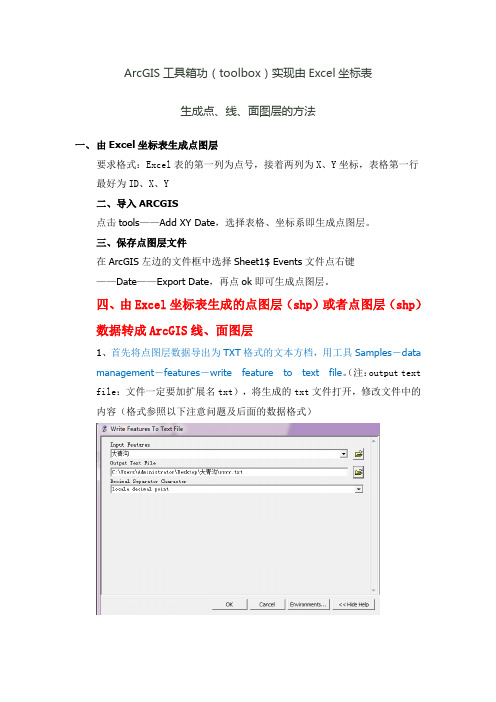
ArcGIS工具箱功(toolbox)实现由Excel坐标表生成点、线、面图层的方法一、由Excel坐标表生成点图层要求格式:Excel表的第一列为点号,接着两列为X、Y坐标,表格第一行最好为ID、X、Y二、导入ARCGIS点击tools——Add XY Date,选择表格、坐标系即生成点图层。
三、保存点图层文件在ArcGIS左边的文件框中选择Sheet1$ Events文件点右键——Date——Export Date,再点ok即可生成点图层。
四、由Excel坐标表生成的点图层(shp)或者点图层(shp)数据转成ArcGIS线、面图层1、首先将点图层数据导出为TXT格式的文本方档,用工具Samples-datamanagement-features-write feature to text file。
(注:output text file:文件一定要加扩展名txt),将生成的txt文件打开,修改文件中的内容(格式参照以下注意问题及后面的数据格式)2、打开ARCGIS,点击ARCGIS工具箱,找到Samples-data management -features-creat feature from text file,各参数设置参照注意问题及数据格式。
ARCGIS中用数据生成线及面要注意的问题:Samples-data management-features-creat feature from text file Input decimal separator中在英文状态下输入12345678.12345或者11111111.11111也可以是其他,但不能使用空格。
数据格式:1、Polyline后面不能有空格;(如果要生成面,将Polyline改成Polygon)2、数据间的空格间隔只能是一个字符;3、生成线的每一点要按顺序排列,按不同顺序排列会生成不同的图像;4、第一个点的序号从0开始编号;5、若要生成多条线,对每条线要编号;且要符合上述的要求,每条线的点重新从0开始编号;6、最后一行要加上END;7、将数据从EXCEL表中导出成TXT格式后,按上述要求调整好数据格式,新建一个TXT文档,将数据复制到新建的文档当中。
2024新版arcgis基本操作学习教程

01
展示模型构建器的基本界面和常用功能,如添加工具、设置参
数、连接工具等。
构建简单模型
02
演示如何构建一个简单的空间分析模型,如缓冲区分析、叠加
分析等。
模型验证与调试
03
介绍如何验证模型的正确性和调试模型中的错误,确保模型的
准确性和可靠性。
复杂空间分析案例剖析
案例一
城市交通可达性分析:演示如何 使用arcgis进行城市交通可达性分 析,包括道路网络建模、交通流 量模拟、可达性结果可视化等步 骤。
导入方法
通过"添加数据"按钮或拖拽方式将数 据导入到ArcGIS中。
数据编辑工具介绍及使用技巧
01
编辑工具介绍:ArcGIS提供了丰富的编辑工具,如选择 、移动、旋转、缩放、裁剪等,方便用户对数据进行编辑 和处理。
02
使用技巧
03
在编辑前,建议先备份原始数据以防万一。
04
使用选择工具时,可以通过按住Shift键选择多个要素。
2024新版arcgis基本 操作学习教程
目 录
• ArcGIS软件概述 • 软件安装与配置 • 数据导入与编辑 • 地图制作与可视化表达 • 空间分析与建模 • 数据输出与共享 • 总结回顾与拓展资源推荐
01
ArcGIS软件概述
软件背景及发展历程
早期GIS发展
自20世纪60年代起,地理信息系统(GIS)开始萌芽,主要用于土 地管理和规划。
3. 软件运行缓慢
如果ArcGIS运行缓慢,请尝试增加计算机的内存、优化硬 盘空间或更新显卡驱动程序。此外,关闭不必要的后台程 序也可以提高软件性能。
03
数据导入与编辑
支持的数据格式及导入方法
- 1、下载文档前请自行甄别文档内容的完整性,平台不提供额外的编辑、内容补充、找答案等附加服务。
- 2、"仅部分预览"的文档,不可在线预览部分如存在完整性等问题,可反馈申请退款(可完整预览的文档不适用该条件!)。
- 3、如文档侵犯您的权益,请联系客服反馈,我们会尽快为您处理(人工客服工作时间:9:00-18:30)。
Arcgis中一些工具的区别在矢量叠加,即将同一区域、同一比例尺的两组或两组以上的多边形要素的数据文件进行叠加产生一个新的数据层,其结果综合了原来图层所具有的属性。
矢量叠加操作分为:
交集(Intersect)、擦除(Erase)、标识叠加(又称交补集,Identify)、裁减(Clip)、更新叠加(Update)、对称差(Symmetrical Difference)、分割(Split)、合并叠加(Union)、添加(Append)、合并(Merge)以及融合(Dissolve)等类型。
这里首先提醒一下:编辑里边的merge是将同一要素类里边的要素合并生成新的要素,并将原要素删除,其属性按指定的要素修改。
编辑里边的union可将同一要素类或不同要素类的要素合并生成新的要素,不删除原要素,新要素的属性为系统默认值(空格或0等,根据字段属性而定)。
编辑里的merge和union是对选中的要素进行操作,而arctoolbox里的是对要素类进行操作。
◆交集(Intersect),计算两个图层几何对象相交的部分。
对于ArcToolBox中的Intersect工具来说,可以选择保留所有的属性字段或是只有FID或是除了FID所有的字段。
而相应的Editor Tool中也有一个类似于Intersect的工具,对于这个工
具来说,与我们ArcToolBox中Intersect不同的是,它所产生的最后结果是没有属性的,是需要人工输入属性值的。
此工具要求input features是简单要素类,如point、line、polygon,不能是复杂要素类,如annotation、network等。
当input features是不同的要素类型时(如point和polygon、line和polygon),输出的结果默认是维数较低的类型,如line和polygon的默认结果是line,point与line的默认结果是point。
结果类型可以降低维数,比如polygon和polygon的默认结果是polygon,但可指定为line或point。
结果可能有多部件要素(multipart features),可用multipart to singlepart工具打散。
◆擦除叠加(Erase),目标特征与要擦除区域多边形进行叠加,只有落在要擦除区域外的特征方可能保留下来,并拷贝到输出特征集中。
使用中需注意,用于擦除的区域必须是多边形,不能是点线。
erase后的结果可能有多部件要素(multipart features),可用multipart to singlepart工具打散。
◆标识叠加(Identify),这个工具最让人迷惑了,说实话,当时我就没记得还有这样一种工具,呵呵。
现在看起来,这个工具还是挺有用的嘛,至少从ArcGIS的帮助文档看来。
该工具只能在拥有ArcInfo许可的时候才能使用。
它的功能是,将输入特征与标识叠加对象进行Intersect操作,输入对象中与标识对象
叠加的部分也获得了标识叠加对象的属性信息,其他部分保持不变。
此工具要求input features是简单要素类,identity features 必须是polygon要素类。
结果可能有多部件要素(multipart features),可用multipart to singlepart工具打散。
当选中keep_relationships选项时,结果的属性表中将会增加input features和identity features空间相关的字段。
当input features是line时,结果的属性表将会增加两个字段left_poly 和right_poly,分别存放左边和右边identity features的fid 值。
◆裁减(Clip),这个工具最能让人与Erase工具弄混了,与Erase功能相反,它保留了输入特征与裁减特征相重的部分。
Clip工具可以裁减特征集、栅格数据与coverages(裁减Coverages需要有ArcInfo级的许可)。
需要注意的是在Editor Tool中也有Clip这样的一个工具,其功能与矢量叠加中的Clip 功能并不相同,它既可以保留相重部分,也可以减去相重的部分。
当然,Editor Tool中的Clip就不属于我们这里讨论的矢量叠加的范围之中了。
◆更新叠加(Update),两者相交的部分属性信息为更新特征所有的属性信息,其他不相交的部分保持不变。
update features全部写入输出结果中。
结果可能有多部件要素(multipart features),可用multipart to singlepart工具
打散。
此工具要求input features和update features必须是polygon类型的,且属性表结构要一致,否则将丢失属性。
当borders选项选中时,update features中的每个要素的外轮廓都将保留在结果中,即保持update features原来的形状,这是默认选项。
当borders选项未选中时,update features的所有要素及与之相交的input features的要素会融合在一起,形成重叠的几个要素,重叠要素的个数和update features的要素的个数形同,这几个要素分别赋予update features的每个要素的属性。
◆对称差(Symmetrical Difference),即计算输入特征与更新特征不相交的部分形成新的文件。
结果文件的属性表根据joinattributes选项的不同而不同。
当选项为no_fid时,将input features和update features的属性表中除fid外的所有字段传递到结果的属性表中;当选项为only_fid时,只将input features和update features的属性表中的fid传递到结果的属性表中;当选项为all时,将input features和update features的属性表中的所有字段传递到结果的属性表中;
从属性表中可区分各个要素原属于input features还是update features中。
例如某个要素的fid_fa为-1时表示此要素原来不在input features中而是位于update features中。
此工具要求input features和update features均为polygon要素类。
◆分割(Split),即将一个特征对象分割成多个对象。
这个比较好理解,可能是用以分割特征对象的那个分割文件中的任何一个多边形的边界都会起到分割的作用。
◆合并叠加(Union),平行输入一组特征对象,所有对象的所有属性信息都将被写入到输出文件当中去。
与Update的区别在于Union保留了所有的信息而update则没有,update在输入特征与更新特征相交的部分只保留了更新特征的属性信息。
图形:union只能合并polygon类型的要素类。
两个要素类合并时会处理相交部分,使之单独形成多部件要素,并且有选项选择允许缝隙(gaps)或不允许缝隙。
如果过选择不允许缝隙,两个要素类合并后的缝隙将生成要素。
属性表:union合并属性表的选项有三个:all、no_fid和only_fid。
all将两个要素类的属性表字段按顺序全部放在输出要素类的属性表中,包括fid。
同名的字段(除fid外)在字段名后加数字以示区别(fid后加要素类名称)。
no_fid将两个要素类的属性表中除fid外的字段按顺序全部放在输出要素类的属性表中。
only_fid只将两个要素类的属性表中的fid放到输出要素类的属性表中,在fid后加要素类名称
◆添加(Append),合并输入要素类、表、栅格影像及栅格目录到一个已有的要素类、表、栅格影像及栅格目录中。
感觉上是将几个图层合并成一个图层,可以把相互重合的部分融合起来。
当schema type选项为test时,输入输出的要素类属性表
结构必须一致,既字段名、类型、排列顺序必须完全相同,当schema type选项为no_test时可以不同。
图形:append可以合并点、线、多边形等要素类和表、栅格影像及栅格目录,但必须是相同类型的。
append不处理要素,只简单地把要素放到一个要素类里,因此输出的要素类可能会有重叠或缝隙。
属性表:同输出要素类的属性表。
输入要素类属性表中的字段如果在输出要素类属性表中没有将会被丢弃,但可做字段映射,将输入要素类的某个字段映射到输出要素类的某个字段。
◆合并(Merge),合并输入要素类、表到新的要素类、表中。
就是应该是Split的反操作,把有公共边的相邻的对象连接起来。
与Append有些差别,可能,据我理解,Append容许操作的数据有相重叠的部分,而Merge一般只操作相邻的对象。
图形:merge可以合并点、线、多边形等要素类和表,但必须是相同类型的。
merge不处理要素,只简单地把要素放到一个要素类里,因此输出的要素类可能会有重叠或缝隙。
属性表:merge处理属性表时会把相同名字的字段合成一个,不同名字的字段按原名字、顺序全部加入输出要素类属性表中,原fid将会丢弃。
merge可以进行字段映射。
◆融合(Dissolve),将数据按属性信息进行整合,将具有相同指定属性信息的对象融合成一个对象。
这个比较简单,一般会用于大量细块操作后的整合,可以减少数据量吧。