WPF4DataGrid控件(自定义样式篇)(20190215102544)
WPF动态生成DataGrid及动态绑定解决方案

WPF动态⽣成DataGrid及动态绑定解决⽅案⼀、场景有过WPF项⽬经验的朋友可能都知道,如果⼀个DataGrid要绑定静态的数据是⾮常的简单的(所谓静态是指绑定的数据源的类型是静态的),如下图所⽰,想要显⽰产品数据,只需绑定到⼀个产品列表即可,这个⼤家都清楚,所以这个要讲的肯定不是这个。
但是现在有⼀个新的需求,根据所选择产品的不同,要动态⽣成第⼆个表格中的不同数据,以便进⾏编辑,如下图1、2所⽰,当选择的产品不同时,第⼆个表格显⽰的内容是完全不⼀样的。
这样就会产⽣⼀个问题,⽆法直接对第⼆个表格进⾏绑定,因为它的数据源类型都是不⼀样的,⽆法按照传统⽅法进⾏绑定。
如何解决,先⾃⼰思考⼀下,也许会有更好的解决⽅案。
⼆、思路1、定义Domain既然⽆法知道要绑定的数据类型是什么,因为它是动态的,⽆法事先预知的,根据所选择的产品(因为产品数据都存储于DB中,所以将类型定义于Domain项⽬中)不同⽽变化的。
那么可以在 Product 中定义 SKUFields 属性⽤于代表产品可显⽰的字段。
产品定义如下所⽰。
///<summary>///产品///</summary>[Table("Product")]public class Product{public int ProductId { get; set; }public string ProductDesc { get; set; }public bool IsRFID { get; set; }public bool IsTID { get; set; }public string CustomerItemCode { get; set; }public string ProductCode { get; set; }public string SuggestedPrinter { get; set; }///<summary>///产品对应的⽂件名称///</summary>public string ProfileName { get; set; }///<summary>///产品对应的SKU字段列表///</summary>public ICollection<SKUField> SKUFields { get; set; }}///<summary>/// SKU 字段///</summary>public class SKUField{///<summary>///产品ID///</summary>public int ProductId { get; set; }///<summary>///字段ID///</summary>public int SKUFieldId { get; set; }///<summary>///字段名称///</summary>public string FieldName { get; set; }///<summary>///字段标题,⽤于显⽰///</summary>public string FieldTitle { get; set; }///<summary>///字段是否可编辑///</summary>public bool IsEditable { get; set; }///<summary>///字段的值///</summary>public object DefaultValue { get; set; }///<summary>///字段值是否可选///</summary>public bool IsValueSelectable { get; set; }///<summary>///字段的类型,如int、string或其他///</summary>public Type FieldType { get; set; }///<summary>///如果IsValueSelectable = True,那么SKUFieldValues代表可选择的值列表///</summary>public ICollection<SKUFieldValue> SKUFieldValues { get; set; }}///<summary>///⽤于定义SKU字段的取值///</summary>public class SKUFieldValue{public int SKUFieldId { get; set; }public int SKUFieldValueId { get; set; }public string FieldValue { get; set; }}然后在项⽬中定义 IProductRepository 接⼝,⽤于定义获取产品的⽅法。
WPF自定义ItemsControl控件

该控件叫 Sum m ar y, 主要是一些汇总信息的显示,有几个地方用,之前都是分散到各个XA ML 文件里,不统一。
本人WPF新手,对XAML了解不多,做这个软件基本上都是用CM,界面布局用Avalon Dock。
由于缺乏相关经验,又没有一个能问得上的人指导,写这个控件费了我很长时间(啥时有空啥时动动)。
之前主要做一些功能方面的,没有心思美化界面,现在虽然还有很多功能没写,但是基本上够自己用了,放下心思来做一些界面上的东西,要不然何苦选择WPF?先看一下图:该Custo m Cont rol 由4部分组成:大标题,小标题,值及Detail。
虽然细分这么多,但实质上还是一个列表类的控件,所以选择继承自 Item sC ontro l.做这个控件的时候,遇到了一些详细的问题不知道怎么解决,Google/Bing 都没有找到我要了解的,Baidu更不用提了,漫天的转载,Copy.1, 类似 Com boB ox 的 Displa yMemb erPat h 如何弄?既然都自定控件了,当然是想让它适用不同场景,不能局限于某一个实体类,最好是能像Displa yMemb erPat h ValueM em ber Path这样的属性。
这里,我定义了:Item Ti tlePa thPro perty及 Item Va luePa thPro perty来处理。
2,有了上面两个依赖属性,但是还不足以处理更多的场景,最好是能有不同的 Tem pla te 。
这里我定义了:TitleT em pla te / ValueT em pla te及De tailT em pla te.第一个问题,只需定义一个简单的 DataTe m plat e ,然后用 Tem pla teBin ding即可做到。
WPFDataGrid自定义样式

WPFDataGrid⾃定义样式微软的WPF DataGrid中有很多的属性和样式,你可以调整,以寻找合适的(如果你是⼀名设计师)。
下⾯,找到我的⼩抄造型的⽹格。
它不是100%全⾯,但它可以让你⾛得很远,有⼀些⾮常有⽤的技巧和陷阱。
在DataGrid中的最⾼⽔平,你可以改变的外观和感觉,通过设置⼀些:Property Type Values DefaultAlternatingRowBackgroundBrush Any Brush NullBackground Brush Any Brush Theme defaultColumnHeaderHeight Double0 to any positive double NaNColumnHeaderStyle Style Any Style NullColumnWidth DataGridLength0 to any positive double, Auto, *, SizeToCells, SizeToHeader SizeToHeaderHeadersVisibility DataGridHeadersVisibility All, Row, Column, None AllMaxColumnWidth Double0 to any positive double Positive InfinityMaxRowHeight Double0 to any positive double Positive InfinityMinColumnWidth Double0 to any positive double20MinRowHeight Double0 to any positive double0RowBackground Brush Any Brush Theme defaultRowDetailsVisibilityMode DataGridRowDetailsVisibilityModeVisible, VisibleWhenSelected, Collapsed VisibleWhenSelectedRowHeadersWidth Double0 to any positive double NaNRowHeight Double0 to any positive double NaNAlternationCount int2+coerced to 2GridLinesVisibility DataGridGridLinesVisibility All, Horizontal, Vertical, None AllHorizontalGridLinesBrush Brush Any Brush Black(via metadata)VerticalGridLinesBrush Brush Any Brush Black(via metadata)ItemTemplate DataTemplate Any DataTemplate NullRowDetailsTemplate DataTemplate Any DataTemplate NullCellStyle Style Any Style NullItemContainerStyle Style Any Style NullRowHeaderStyle Style Any Style NullRowStyle Style Any Style NullStyle Style Any Style NullTemplate ControlTemplate ControlTemplate TargetType=Datagrid Null在这⾥,你可以看到的⼀些属性(在视觉上是不是全部)的可视化表⽰,这将让你知道这是什么⽂章将涵盖。
一个Winform下DataGridView控件外观的自定义类
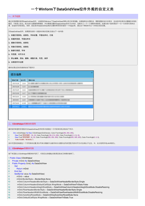
⼀个Winform下DataGridView控件外观的⾃定义类⼀、关于起因最近⾮常频繁的使⽤DataGridView控件,VS提供的Winform下DataGridView的默认样式⾮常难看。
如果做美化处理的话,需要调整的地⽅⾮常多,且该控件的很多设置属性⾮常的晦涩,不是很⼈性化。
每次进⾏设置都煞费脑筋,并且需要设置的DataGridView控件⼜⽐较多,如果⼿⼯⼀个⼀个调整⾮常⿇烦。
如果在每个窗体⾥逐个⼀⾏⼀⾏的⽤代码来设置,会造成代码很凌乱、琐碎,因此我对DataGridView格式设置的常⽤项封装到⼀个Helper类,通过这个帮助类可以⼀步到位完成设置。
对DataGridView控件,我需要完成的⼀些基本的格式控制,包括以下⼀些内容:1、标题⾏背景⾊、前景⾊、字体设置、平⾯化样式、⾏⾼2、标题列宽度,平⾯化样式3、偶数⾏背景⾊、前景⾊4、奇数⾏背景⾊、前景⾊5、数据⾏⾼度、字体6、列宽度,对齐⽅式7、禁⽌编辑、添加、删除、调整⾏⾼、列宽、排序8、去除控件外边框最终处理过后的风格类似如下图所⽰⼆、CGridHelper类模块的调⽤最终我所希望的实现格式化DataGridView控件的形式是通过⼀⾏代码来实现,类似如下所⽰:1Dim mGridHelper As New CGridHelper(GridVersion, Color.FromArgb(250, 250, 250),2New Font("微软雅⿊", 10), 30, Color.FromArgb(159, 210, 235), Color.FromArgb(0, 0, 0), 24,3New Font("微软雅⿊", 9), 30, Color.FromArgb(250, 250, 250), Color.FromArgb(225, 225, 225), Color.FromArgb(0, 0, 0),4"0;80;70;595", "M;M;M;L")其中列宽的控制通过⼀个字符串来设置,⽤分号来分隔数字,各数字依次设置对应列的宽度;列的对齐⽅式也类似,不过左、中、右分别⽤字母L/M/R表⽰。
wpf自定义窗体样式
wpf 自定义窗体样式<Window.Style><Style TargetType="{x:Type Window}"><Setter Property="WindowStyle" Value="None"/><Setter Property="ResizeMode" Value="NoResize"/><Setter Property="Background"><Setter.Value><LinearGradientBrush EndPoint="0.5,1" StartPoint="0.5,0"><GradientStop Color="#2866b2" Offset="0" /><GradientStop Color="#194477" Offset="1" /></LinearGradientBrush></Setter.Value></Setter><Setter Property="Template"><Setter.Value><ControlTemplate TargetType="{x:Type Window}"><Grid x:Name="Root"><Grid.Resources><Style x:Key="ButtonStyle" TargetType="{x:Type Button}"><Setter Property="Background" Value="#FF1F3B53"/><Setter Property="Foreground" Value="#FF000000"/><Setter Property="Padding" Value="3"/><Setter Property="Focusable" Value="false"/><Setter Property="BorderThickness" Value="1"/><Setter Property="BorderBrush"><Setter.Value><LinearGradientBrush EndPoint="0.5,1" StartPoint="0.5,0"><GradientStop Color="#FFA3AEB9" Offset="0"/><GradientStop Color="#FF8399A9" Offset="0.375"/><GradientStop Color="#FF718597" Offset="0.375"/><GradientStop Color="#FF617584" Offset="1"/></LinearGradientBrush></Setter.Value></Setter><Setter Property="Template"><Setter.Value><ControlTemplate TargetType="{x:Type Button}"><Grid x:Name="grid" Background="#02FFFFFF" HorizontalAlignment="Center" Height="17" VerticalAlignment="Center" Width="48" Margin="0,-2,5,0"><VisualStateManager.VisualStateGroups><VisualStateGroup x:Name="CommonStates"><VisualState x:Name="Normal"/><VisualState x:Name="MouseOver"><Storyboard><DoubleAnimation Duration="0" To="0.95" Storyboard.TargetProperty="Opacity" Storyboard.TargetName="X"/><DoubleAnimationUsingKeyFrames Storyboard.TargetProperty="(UIElement.Opacity)" Storyboard.TargetName="X_Fuzz2"><EasingDoubleKeyFrame KeyTime="0" Value="1"/></DoubleAnimationUsingKeyFrames><DoubleAnimationUsingKeyFrames Storyboard.TargetProperty="(UIElement.Opacity)" Storyboard.TargetName="X_Fuzz1"><EasingDoubleKeyFrame KeyTime="0" Value="1"/></DoubleAnimationUsingKeyFrames><DoubleAnimationUsingKeyFrames Storyboard.TargetProperty="(UIElement.Opacity)" Storyboard.TargetName="X_Fuzz0"><EasingDoubleKeyFrame KeyTime="0" Value="1"/></DoubleAnimationUsingKeyFrames><ColorAnimationUsingKeyFramesStoryboard.TargetProperty="(Panel.Background).(GradientBrush.GradientStops)[0]. (GradientStop.Color)" Storyboard.TargetName="Border"><EasingColorKeyFrame KeyTime="0" Value="#a6b2be" /></ColorAnimationUsingKeyFrames><ColorAnimationUsingKeyFramesStoryboard.TargetProperty="(Panel.Background).(GradientBrush.GradientStops)[1]. (GradientStop.Color)" Storyboard.TargetName="Border"><EasingColorKeyFrame KeyTime="0" Value="#c8cfd6" /></ColorAnimationUsingKeyFrames></Storyboard></VisualState><VisualState x:Name="Pressed"><Storyboard><DoubleAnimation Duration="0" To="0.85" Storyboard.TargetProperty="Opacity" Storyboard.TargetName="X"/><DoubleAnimationUsingKeyFrames Storyboard.TargetProperty="(UIElement.Opacity)" Storyboard.TargetName="X_Fuzz2"><EasingDoubleKeyFrame KeyTime="0" Value="1"/></DoubleAnimationUsingKeyFrames><DoubleAnimationUsingKeyFrames Storyboard.TargetProperty="(UIElement.Opacity)" Storyboard.TargetName="X_Fuzz1"><EasingDoubleKeyFrame KeyTime="0" Value="1"/></DoubleAnimationUsingKeyFrames><DoubleAnimationUsingKeyFrames Storyboard.TargetProperty="(UIElement.Opacity)" Storyboard.TargetName="X_Fuzz0"><EasingDoubleKeyFrame KeyTime="0" Value="1"/></DoubleAnimationUsingKeyFrames><ColorAnimationUsingKeyFramesStoryboard.TargetProperty="(Panel.Background).(GradientBrush.GradientStops)[0].(GradientStop.Color)" Storyboard.TargetName="Border"><EasingColorKeyFrame KeyTime="0" Value="#627384" /></ColorAnimationUsingKeyFrames><ColorAnimationUsingKeyFramesStoryboard.TargetProperty="(Panel.Background).(GradientBrush.GradientStops)[1]. (GradientStop.Color)" Storyboard.TargetName="Border"><EasingColorKeyFrame KeyTime="0" Value="#2b333a" /></ColorAnimationUsingKeyFrames></Storyboard></VisualState><VisualState x:Name="Disabled"><Storyboard><DoubleAnimation Duration="0" To="0.5" Storyboard.TargetProperty="Opacity" Storyboard.TargetName="X"/></Storyboard></VisualState></VisualStateGroup></VisualStateManager.VisualStateGroups><Border x:Name="Border" CornerRadius="0,0,3,3" BorderThickness="1"><Border.BorderBrush><LinearGradientBrush EndPoint="0.5,1" StartPoint="0.5,0"><GradientStop Color="#cfd5db" Offset="0"/><GradientStop Color="#9ca9b3" Offset="1"/></LinearGradientBrush></Border.BorderBrush><Border.Background><LinearGradientBrush EndPoint="0.5,1" StartPoint="0.5,0"><GradientStop Color="#99a7b4" Offset="0.5"/><GradientStop Color="#667a8a" Offset="1"/></LinearGradientBrush></Border.Background></Border><Path x:Name="X_Fuzz2"Data="F1 M 6.742676,3.852539 L 9.110840,1.559570 L 8.910645,0.500000 L 6.838379,0.500000 L 4.902832,2.435547 L 2.967285,0.500000 L 0.895020,0.500000 L 0.694824,1.559570 L 3.062988,3.852539 L 0.527832,6.351563 L 0.689941,7.600586 L 2.967285,7.600586 L 4.897949,5.575195 L 6.854004,7.600586 L 9.115723,7.600586 L 9.277832,6.351563 L 6.742676,3.852539 Z" Fill="#14C51900" HorizontalAlignment="Center" Height="10" Margin="0,-1,0,0" Opacity="0"RenderTransformOrigin="0.5,0.5" Stretch="Fill" Stroke="#14C51900" VerticalAlignment="Center" Width="11"><Path.RenderTransform><TransformGroup><ScaleTransform ScaleY="1.3" ScaleX="1.3"/></TransformGroup></Path.RenderTransform></Path><Path x:Name="X_Fuzz1"Data="F1 M 6.742676,3.852539 L 9.110840,1.559570 L 8.910645,0.500000 L 6.838379,0.500000 L 4.902832,2.435547 L 2.967285,0.500000 L 0.895020,0.500000 L 0.694824,1.559570 L 3.062988,3.852539 L 0.527832,6.351563 L 0.689941,7.600586 L 2.967285,7.600586 L 4.897949,5.575195 L6.854004,7.600586 L 9.115723,7.600586 L 9.277832,6.351563 L 6.742676,3.852539 Z"Fill="#1EC51900" HorizontalAlignment="Center" Height="10" Margin="0,-1,0,0" Opacity="0"RenderTransformOrigin="0.5,0.5" Stretch="Fill" Stroke="#1EC51900" VerticalAlignment="Center" Width="11"><Path.RenderTransform><TransformGroup><ScaleTransform ScaleY="1.1" ScaleX="1.1"/></TransformGroup></Path.RenderTransform></Path><Path x:Name="X_Fuzz0"Data="F1 M 6.742676,3.852539 L 9.110840,1.559570 L 8.910645,0.500000 L 6.838379,0.500000 L 4.902832,2.435547 L 2.967285,0.500000 L 0.895020,0.500000 L 0.694824,1.559570 L 3.062988,3.852539 L 0.527832,6.351563 L 0.689941,7.600586 L 2.967285,7.600586 L 4.897949,5.575195 L6.854004,7.600586 L 9.115723,7.600586 L 9.277832,6.351563 L 6.742676,3.852539 Z"Fill="#FFC51900" HorizontalAlignment="Center" Height="10" Margin="0,-1,0,0"Opacity="0" Stretch="Fill" Stroke="#FFC51900" VerticalAlignment="Center" Width="11"/><Path x:Name="X"Data="F1 M 6.742676,3.852539 L 9.110840,1.559570 L 8.910645,0.500000 L 6.838379,0.500000 L 4.902832,2.435547 L 2.967285,0.500000 L 0.895020,0.500000 L 0.694824,1.559570 L 3.062988,3.852539 L 0.527832,6.351563 L 0.689941,7.600586 L 2.967285,7.600586 L 4.897949,5.575195 L6.854004,7.600586 L 9.115723,7.600586 L 9.277832,6.351563 L 6.742676,3.852539 Z"Fill="#FFFFFFFF" HorizontalAlignment="Center" Height="10" Margin="0,-1,0,0"Opacity="0.7" Stretch="Fill" VerticalAlignment="Center" Width="11"><Path.Stroke><LinearGradientBrush EndPoint="0.5,1" StartPoint="0.5,0"><GradientStop Color="#FF313131" Offset="1"/><GradientStop Color="#FF8E9092" Offset="0"/></LinearGradientBrush></Path.Stroke></Path></Grid></ControlTemplate></Setter.Value></Setter></Style></Grid.Resources><Grid x:Name="Overlay" Background="White" Margin="0" Opacity="0" /><Grid x:Name="ContentRoot" HorizontalAlignment="Center" Height="{TemplateBinding Height}" RenderTransformOrigin="0.5,0.5" VerticalAlignment="Center" Width="{TemplateBinding Width}"><Grid.RenderTransform><TransformGroup><ScaleTransform/><SkewTransform/><RotateTransform/><TranslateTransform/></TransformGroup></Grid.RenderTransform></Grid><Border BorderBrush="#14000000" BorderThickness="1" Background="#14000000" CornerRadius="2" HorizontalAlignment="Stretch" Margin="-1" VerticalAlignment="Stretch"/><Border BorderBrush="#0F000000" BorderThickness="1" Background="#0F000000" CornerRadius="2.25" HorizontalAlignment="Stretch" Margin="-2" VerticalAlignment="Stretch"/><Border BorderBrush="#0C000000" BorderThickness="1" Background="#0C000000" CornerRadius="2.5" HorizontalAlignment="Stretch" Margin="-3" VerticalAlignment="Stretch"/><Border BorderBrush="#0A000000" BorderThickness="1" Background="#0A000000" CornerRadius="2.75" HorizontalAlignment="Stretch" Margin="-4"VerticalAlignment="Stretch"/><Border BorderBrush="{TemplateBinding BorderBrush}" BorderThickness="{TemplateBinding BorderThickness}" Background="#FFFFFFFF" CornerRadius="2"><Border CornerRadius="1.5" Margin="1"><Border.Background><LinearGradientBrush EndPoint="0.5,1" StartPoint="0.5,0"><GradientStop Color="#FFE5E8EB" Offset="1"/><GradientStop Color="#FFF6F8F9" Offset="0"/></LinearGradientBrush></Border.Background><Grid><Grid.RowDefinitions><RowDefinition Height="Auto"/><RowDefinition/></Grid.RowDefinitions><!--窗口标题栏,后台需要增加拖动方法--><Border x:Name="Chrome" BorderBrush="#FFFFFFFF" BorderThickness="0,0,0,1" Width="Auto" MouseLeftButtonDown="WindowHeader_MouseLeftButtonDown"><Border.Background><LinearGradientBrush EndPoint="0.5,0.528" StartPoint="0.5,0"><GradientStop Color="#FFE5E8EB" Offset="1"/><GradientStop Color="#FFFEFEFE" Offset="0"/></LinearGradientBrush></Border.Background><Grid Height="20" Width="Auto"><Grid.ColumnDefinitions><ColumnDefinition/><ColumnDefinition Width="72"/></Grid.ColumnDefinitions><ContentControl Content="{TemplateBinding Title}" HorizontalAlignment="Stretch" Margin="6,0,6,0" VerticalAlignment="Center"/><!--标题栏中的关闭按钮,后台需要增加关闭事件--><Button Click="PART_CloseButton_Click" x:Name="PART_CloseButton" Grid.Column="1" HorizontalAlignment="Right" IsTabStop="False" Style="{StaticResource ButtonStyle}" VerticalAlignment="Top" /></Grid></Border><Border Background="{TemplateBinding Background}" Margin="6" Grid.Row="1"><AdornerDecorator><ContentPresenter /></AdornerDecorator></Border></Grid></Border></Border></Grid><ControlTemplate.Triggers><Trigger Property="Visibility" Value="Visible"><Trigger.EnterActions><BeginStoryboard><Storyboard><DoubleAnimationUsingKeyFrames BeginTime="0" Storyboard.TargetProperty="Opacity" Storyboard.TargetName="Overlay"><EasingDoubleKeyFrame KeyTime="0" Value="0"/><EasingDoubleKeyFrame KeyTime="00:00:00.3" Value="1"/></DoubleAnimationUsingKeyFrames><DoubleAnimationUsingKeyFrames BeginTime="0" Storyboard.TargetProperty="(RenderTransform).(Children)[0].ScaleX"Storyboard.TargetName="ContentRoot"><SplineDoubleKeyFrame KeyTime="0" Value="0"/><SplineDoubleKeyFrame KeyTime="00:00:00.25" Value="0"/><SplineDoubleKeyFrame KeyTime="00:00:00.4" Value="1"/><SplineDoubleKeyFrame KeySpline="0,0,0.5,1" KeyTime="00:00:00.45" Value="1.05"/><SplineDoubleKeyFrame KeyTime="00:00:00.55" Value="1"/></DoubleAnimationUsingKeyFrames><DoubleAnimationUsingKeyFrames BeginTime="0" Storyboard.TargetProperty="(RenderTransform).(Children)[0].ScaleY"Storyboard.TargetName="ContentRoot"><SplineDoubleKeyFrame KeyTime="0" Value="0"/><SplineDoubleKeyFrame KeyTime="00:00:00.25" Value="0"/><SplineDoubleKeyFrame KeyTime="00:00:00.4" Value="1"/><SplineDoubleKeyFrame KeySpline="0,0,0.5,1" KeyTime="00:00:00.45" Value="1.05"/><SplineDoubleKeyFrame KeyTime="00:00:00.55" Value="1"/></DoubleAnimationUsingKeyFrames></Storyboard></BeginStoryboard></Trigger.EnterActions></Trigger></ControlTemplate.Triggers></ControlTemplate></Setter.Value></Setter></Style></Window.Style>。
WPF自定义CheckBox样式

WPF⾃定义CheckBox样式⼀、Checkbox基本样式下⾯的样式包含了CheckBox三种状态的显⽰,这⾥CheckBox的三种状态是使⽤图⽚代替的。
当然你也可以使⽤字体图标或者Path绘制。
先看效果:代码如下:<Style x:Key="chkBase" TargetType="CheckBox"><Setter Property="IsChecked" Value="False"/><Setter Property="Background" Value="Transparent"/><Setter Property="Foreground" Value="#999"/><Setter Property="Template"><Setter.Value><ControlTemplate TargetType="CheckBox"><DockPanel Background="{TemplateBinding Background}" ToolTip="{TemplateBinding Content}" LastChildFill="False" Width="{TemplateBinding Width}"><Image Margin="2 0 0 0" DockPanel.Dock="Left" x:Name="_img" Stretch="None" Source="/Images/chk_no.png"/><TextBlock DockPanel.Dock="Left" Foreground="{TemplateBinding Foreground}" Margin="2 0 0 0" VerticalAlignment="Center" Text="{Binding Content,RelativeSource={RelativeSource TemplatedParen </DockPanel><ControlTemplate.Triggers><Trigger Property="IsChecked" Value="true"><Setter TargetName="_img" Property="Source" Value="/Images/chk_yes.png"/></Trigger><Trigger Property="IsChecked" Value="{x:Null}"><Setter TargetName="_img" Property="Source" Value="/Images/chk_null.png"/></Trigger></ControlTemplate.Triggers></ControlTemplate></Setter.Value></Setter></Style>图⽚素材:⼆、CheckBox其它形式下⾯这种样式的CheckBox⼀般作为开关按钮。
DataGridView自定义行样式和行标题

DataGridView⾃定义⾏样式和⾏标题定义两个样式对象://定义两种⾏样式private DataGridViewCellStyle m_RowStyleNormal;private DataGridViewCellStyle m_RowStyleAlternate;在窗体加载的时候对样式进⾏设置:///<summary>///设置⾏样式///</summary>private void SetRowStyle(){//可根据需要设置更多样式属性,如字体、对齐、前景⾊、背景⾊等this.m_RowStyleNormal = new DataGridViewCellStyle();this.m_RowStyleNormal.BackColor = Color.LightBlue;this.m_RowStyleNormal.SelectionBackColor = Color.LightSteelBlue;this.m_RowStyleAlternate = new DataGridViewCellStyle();this.m_RowStyleAlternate.BackColor = Color.LightGray;this.m_RowStyleAlternate.SelectionBackColor = Color.LightSlateGray;}定义演⽰数据:///<summary>///绑定数据///</summary>private void BindData(){//建⽴⼀个DataTable并填充数据,然后绑定到DataGridView控件上m_GradeTable = new DataTable();m_GradeTable.Columns.Add("Class", typeof(string));m_GradeTable.Columns.Add("Name", typeof(string));m_GradeTable.Columns.Add("Grade", typeof(int));m_GradeTable.Rows.Add(new string[] { "Class1", "Jim", "89" });m_GradeTable.Rows.Add(new string[] { "Class1", "Jack", "77" });m_GradeTable.Rows.Add(new string[] { "Class1", "Bill", "91" });m_GradeTable.Rows.Add(new string[] { "Class2", "Tom", "58" });m_GradeTable.Rows.Add(new string[] { "Class2", "Rose", "95" });m_GradeTable.Rows.Add(new string[] { "Class3", "Peter", "64" });m_GradeTable.Rows.Add(new string[] { "Class3", "David", "82" });m_GradeTable.Rows.Add(new string[] { "Class3", "Eric", "68" });m_GradeTable.Rows.Add(new string[] { "Class3", "Lily", "79" });this.bdsGrade.DataSource = m_GradeTable;}在DataGridView控件的CellFormatting事件中实现设置⾏样式、单元格样式和⾏号:private void dgvDataTable_CellFormatting(object sender, DataGridViewCellFormattingEventArgs e){//在此对⾏样式进⾏设置if (e.ColumnIndex == this.dgvGrade.Columns["ColumnClass"].Index)//根据班级设置⾏样式{DataGridViewRow CurrentRow = this.dgvGrade.Rows[e.RowIndex];CurrentRow.HeaderCell.Value = Convert.ToString(e.RowIndex + 1);//显⽰⾏号,也可以设置成显⽰其他信息//CurrentRow.HeaderCell.ToolTipText = "当前第" + Convert.ToString(e.RowIndex + 1) + "⾏";//设置ToolTip信息//以下为根据上⼀⾏内容判断所属组的效果if (e.RowIndex == 0)//⾸⾏必须特殊处理,将其设置为常规样式{CurrentRow.DefaultCellStyle = this.m_RowStyleNormal;}else{//判断和上⼀⾏是否属于同⼀个班级,如果是则设置相同样式,否则设置另⼀种样式//需要定义两个DataGridViewCellStyle,⽤于交替显⽰,也可以根据需要隐藏⼀些和上⼀⾏重复的信息//这⾥当两⾏是同⼀个班级时,将下⼀⾏的班级信息隐藏掉,选中时则显⽰班级信息if (CurrentRow.Cells[e.ColumnIndex].Value != DBNull.Value && CurrentRow.Cells[e.ColumnIndex].Value != null&& CurrentRow.Cells[e.ColumnIndex].Value.ToString() == this.dgvGrade.Rows[e.RowIndex - 1].Cells[e.ColumnIndex].Value.ToString()){CurrentRow.DefaultCellStyle = this.dgvGrade.Rows[e.RowIndex - 1].DefaultCellStyle;//设置和上⼀⾏的样式相同CurrentRow.Cells[e.ColumnIndex].Style.ForeColor = CurrentRow.DefaultCellStyle.BackColor;//⽤前景⾊隐藏信息//如果需要选中时显⽰完整信息则注释该下⾯⼀⾏//CurrentRow.Cells[e.ColumnIndex].Style.SelectionForeColor = CurrentRow.DefaultCellStyle.SelectionBackColor;//选中时也使前景⾊等于背景⾊,将⽂字隐藏掉 }else//当前⾏和上⼀⾏不属于同⼀个班级时{if (this.dgvGrade.Rows[e.RowIndex - 1].DefaultCellStyle == this.m_RowStyleNormal)//根据上⼀⾏的样式设置当前⾏的样式CurrentRow.DefaultCellStyle = this.m_RowStyleAlternate;elseCurrentRow.DefaultCellStyle = this.m_RowStyleNormal;}}//if(e.RowIndex == 0)}else if (e.ColumnIndex == this.dgvGrade.Columns["ColumnGrade"].Index)//根据成绩设置单元格样式{if (this.dgvGrade.Rows[e.RowIndex].Cells[e.ColumnIndex].Value != DBNull.Value&& Convert.ToInt32(this.dgvGrade.Rows[e.RowIndex].Cells[e.ColumnIndex].Value) < 60)//对不及格的成绩设置特殊样式{this.dgvGrade.Rows[e.RowIndex].Cells[e.ColumnIndex].Style.ForeColor = Color.Red;//设置⼩于60的数字显⽰为红⾊this.dgvGrade.Rows[e.RowIndex].Cells[e.ColumnIndex].Style.SelectionForeColor = Color.Red;this.dgvGrade.Rows[e.RowIndex].Cells[e.ColumnIndex].Style.Alignment = DataGridViewContentAlignment.MiddleRight;}}}在DataGridView控件的RowPostPaint事件中实现⾏标题图标绘制和提⽰信息设置://根据内容设置⾏标头private void dgvDataTable_RowPostPaint(object sender, DataGridViewRowPostPaintEventArgs e){if (this.dgvGrade.Rows[e.RowIndex].Cells["ColumnGrade"].Value == DBNull.Value)return;int intGrade = Convert.ToInt32(this.dgvGrade.Rows[e.RowIndex].Cells["ColumnGrade"].Value);//获取成绩Image RowIcon;//标头图标string strToolTip;//提⽰信息if (intGrade >= 90){RowIcon = TestDataGridViewRowStyle.Properties.Resources.GradeA;//从资源⽂件中获取图⽚strToolTip = "Grade A";}else if (intGrade >= 80){RowIcon = TestDataGridViewRowStyle.Properties.Resources.GradeB;strToolTip = "Grade B";}else if (intGrade >= 70){RowIcon = TestDataGridViewRowStyle.Properties.Resources.GradeC;strToolTip = "Grade C";}else if (intGrade >= 60){RowIcon = TestDataGridViewRowStyle.Properties.Resources.GradeD;strToolTip = "Grade D";}else{RowIcon = TestDataGridViewRowStyle.Properties.Resources.GradeF;strToolTip = "Grade F";}e.Graphics.DrawImage(RowIcon, e.RowBounds.Left + this.dgvGrade.RowHeadersWidth - 20, e.RowBounds.Top + 4, 16, 16);//绘制图标this.dgvGrade.Rows[e.RowIndex].HeaderCell.ToolTipText = strToolTip;//设置提⽰信息}。
datagridtemplatecolumn自定义控件

datagridtemplatecolumn自定义控件`datagridtemplatecolumn`是GridView控件的一个属性,它允许你在GridView的列中使用自定义的控件。
这个属性是一个模板列,你可以通过它为GridView的列定义一个自定义的控件模板。
这个模板将会被用于渲染GridView中的每一行数据。
要使用`datagridtemplatecolumn`,你需要先创建一个自定义的控件,然后在GridView的列配置中设置`datagridtemplatecolumn`属性为你的自定义控件的名称。
以下是一个简单的例子,演示如何在一个GridView中使用自定义的按钮控件:1. 首先,创建一个自定义的按钮控件。
在Visual Studio中,右键点击项目,选择“添加”->“新项”,然后创建一个名为“CustomButton”的新用户控件。
2. 接下来,修改CustomButton控件的代码,为它添加一个点击事件处理器。
例如:```csharpusing System;using System.Windows.Forms;namespace WindowsFormsApp1{public partial class CustomButton : UserControl{public CustomButton(){InitializeComponent();}private void CustomButton_Click(object sender, EventArgs e){MessageBox.Show("按钮被点击了!");}}}```3. 在GridView的列配置中,将`datagridtemplatecolumn`属性设置为自定义按钮控件的名称。
例如:```csharpusing System.Windows.Forms;namespace WindowsFormsApp1{public partial class Form1 : Form{public Form1(){InitializeComponent();}private void Form1_Load(object sender, EventArgs e){dataGridView1.Columns["Column1"].DataPropertyName = "Column1";dataGridView1.Columns["Column1"].DefaultCellTemplate = new DataGridTextBoxCell();dataGridView1.Columns["Column2"].DataPropertyName = "Column2";dataGridView1.Columns["Column2"].DefaultCellTemplate = new DataGridTemplateColumn(new CustomButton(), "CustomButton");}}public class CustomButton : DataGridTemplateColumn{public CustomButton(){CellTemplate = new DataGridButtonCell();HeaderText = "按钮列";}}}```在这个例子中,我们创建了一个名为CustomButton的自定义按钮控件,并在GridView的列配置中设置了`datagridtemplatecolumn`属性。