作文范文之雅思小作文真题模拟汇总
雅思小作文

1.The charts below compare the age structure of the populations of France and India in 1984.看到这样一个图形大家会觉得这道题很难吧,Simon看到题目时这样说,“I found this one difficult, so don't worry if you did too!”。
所以大家别怕,连雅思考官都说难呢!我们先来分析一下,该图描述的是法国和印度两个国家的不同年龄的人群所占的比例。
从图中我们可以看出,印度人口显然比法国整体上要年轻,因为20岁以下印度的人口占了相当大的比例;而法国呢,则上年纪的人居多。
再说得细致点,印度小于五岁的人口占了14%从上往下随着年纪呈递增趋势;法国相对就比较分散了,0到40岁的人似乎都在7% 8%间波动。
70岁以上人口法国大概有15%而印度只有2%然后我们再来说性别,50岁以上的法国女人显著比法国男人比例高,而印度人口在男女比例上却看不出显著不同。
分析完了思路,我们马上来看一下Simon写的这篇满分作文吧!The two charts compare the populations of France and India in terms of age distribution by gender in the year 1984.(第一段不需要太长,简单明了,留下好印象,提起考官兴趣。
)It is clear that the population of India was younger than that of France in 1984, with a noticeably larger proportion of people aged under 20. France,on the other hand, had a significantly larger percentage of elderly inhabitants.(先介绍两个国家整体上最明显的对比)In India, close to 14% of people were aged 5 or under, and each five-year age bracket above this contained an increasingly smaller proportion of the population. France’s population, by contrast, was more evenly distributed across the age ranges, with similar figures (around 7% to 8% of all people) for each five-year cohort between the ages of 0 and 40. Somewhere between 10% and 15% of all French people were aged 70 or older, but the equivalent figure for India was only 2%.(详细分析两个国家差别最明显的年龄群体并以详实的数据进行描述)Looking more closely at gender, there was a noticeably higher proportion of French women than men in every cohort from age 50 upwards. For example, almost 3% of French 70- to 75-year-olds were women, while just under 2% were men. No significant gender differences can be seen on the Indian population chart.(最后不忘从性别的角度去分析人口比例的差距。
雅思小作文真题范文-:地图题范文
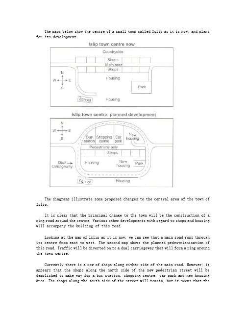
The maps below show the centre of a small town called Islip as it is now, and plans for its development.The diagrams illustrate some proposed changes to the central area of the town of Islip.It is clear that the principal change to the town will be the construction of a ring road around the centre. Various other developments with regard to shops and housing will accompany the building of this road.Looking at the map of Islip as it is now, we can see that a main road runs through its centre from east to west. The second map shows the planned pedestrianisation of this road. Traffic will be diverted on to a dual carriageway that will form a ring around the town centre.Currently there is a row of shops along either side of the main road. However, it appears that the shops along the north side of the new pedestrian street will be demolished to make way for a bus station, shopping centre, car park and new housing area. The shops along the south side of the street will remain, but it seems that thetown’s park will be reduced in size so that more new houses can be built within the ring road.(187 words, band 9)。
Simon考官A类雅思写作小作文范文-汇总

A类雅思写作小作文共计41篇,篇篇9分,完整覆盖了雅思a类小作文的pie,bar,line,table, diagram, map, combination7大题型,范文皆雅思前考官英国曼城人simon的手笔,此人行文风格推崇简洁明快,适合烤鸭研读模仿。
他的雅思小作文几乎都是4段式,字数一般在160左右。
一、柱状图(10)_________________________________________ 31. 柱状图:年龄分布 ___________________________________ 32. 柱状图:电子游戏 ___________________________________ 43. 柱状图:奥运奖牌 ___________________________________ 54. 柱状图:学习动机 ___________________________________ 55. 柱状图:交通事故 ___________________________________ 76. 柱状图:各地房价 ___________________________________ 77. 柱状图:日常消费 ___________________________________ 99. 柱状图:网聊耗时 __________________________________ 1110. 柱状图:电话耗时 _________________________________ 12二、饼图(4)___________________________________________ 131. 饼图-垃圾处理 _____________________________________ 132. 饼图:三地用水 ____________________________________ 153. 饼图:服务问卷 ____________________________________ 154. 饼图:游客分析 ____________________________________ 16三、流程图(8)_________________________________________ 171. 流程图:房屋保护 __________________________________ 172. 流程图:太阳能发电 ________________________________ 185. 流程图:房屋设计 __________________________________ 216. 流程图:水循环 ____________________________________ 237. 流程图:天气预报 __________________________________ 238. 流程图:三文鱼一生 ________________________________ 25四、表格(7)___________________________________________ 261. 表格:垃圾制造 ____________________________________ 262. 表格:骑车上班 ____________________________________ 273. 表格:消费开支 ____________________________________ 274. 表格:贫困家庭 ____________________________________ 285. 表格:地下铁 ______________________________________ 296. 表格:手机用途 ____________________________________ 30五、地图(3)___________________________________________ 331. 地图:村庄变迁 ____________________________________ 332. 地图:超市变迁 ____________________________________ 343. 地图:学校变迁 ____________________________________ 35六、线图(5)___________________________________________ 361. 线图:手机变迁 ____________________________________ 362. 线图:老龄人口 ____________________________________ 373. 线图:价格变动 ____________________________________ 384. 线图:企业垃圾 ____________________________________ 395. 线图:网络人口 ____________________________________ 40七、混合图(5)_________________________________________ 411. 混合图:温度与降水 ________________________________ 412. 混合图:英国移民 __________________________________ 423. 混合图:水消耗 ____________________________________ 434. 混合图:运动开支 __________________________________ 445. 混合图:独居人口 __________________________________ 45一、柱状图(10)1. 柱状图:年龄分布The charts below compare the age structure of the populations of France and India in 1984.The two charts compare the populations of France and India in terms of age distribution by gender in the year 1984.It is clear that the population of India was younger than that of France in 1984, with a noticeably larger proportion of people aged under 20. France, on the other hand, had a significantly larger percentage of elderly inhabitants.In India, close to 14% of people were aged 5 or under, and each five-year age bracket above this contained an increasingly smaller proportion of the population. France’s population, by contrast, was more evenly distributed across the age ranges, with similar figures (around 7% to 8% of all people) for each five-year cohort between the ages of 0 and 40. Somewhere between 10% and 15% of all French people were aged 70 or older, but the equivalent figure for India was only 2%.Looking more closely at gender, there was a noticeably higher proportion of French women than men in every cohort from age 50 upwards. For example, almost 3% of French 70- to 75-year-olds were women, while just under 2% were men. No significant gender differences can be seen on the Indian population chart.(199 words, band 9)2. 柱状图:电子游戏The bar graph shows the global sales (in billions of dollars) of different types of digital games between 2000 and 2006.The bar chart compares the turnover in dollars from sales of video games for four different platforms, namely mobile phones, online, consoles and handheld devices, from 2000 to 2006.It is clear that sales of games for three out of the four platforms rose each year, leading to a significant rise in total global turnover over the 7-year period. Sales figures for handheld games were at least twice as high as those for any other platform in almost every year.In 2000, worldwide sales of handheld games stood at around $11 billion, while console games earned just under $6 billion. No figures are given for mobile or online games in that year. Over the next 3 years, sales of handheld video games rose by about $4 billion, but the figure for consoles decreased by $2 billion. Mobile phone and online games started to become popular, with sales reaching around $3 billion in 2003.In 2006, sales of handheld, online and mobile games reached peaks of 17, 9 and 7 billion dollars respectively. By contrast, turnover from console games dropped to its lowest point, at around $2.5 billion.(187)3. 柱状图:奥运奖牌The chart below shows the total number of Olympic medals won by twelve different countries.范文:The bar chart compares twelve countries in terms of the overall number of medals that they have won at the Olympic Games.It is clear that the USA is by far the most successful Olympic medal winning nation. It is also noticeable that the figures for gold, silver and bronze medals won by any particular country tend to be fairly similar.The USA has won a total of around 2,300 Olympic medals, including approximately 900 gold medals, 750 silver and 650 bronze. In second place on the all-time medals chart is the Soviet Union, with just over 1,000 medals. Again, the number of gold medals won by this country is slightly higher than the number of silver or bronze medals.Only four other countries - the UK, France, Germany and Italy - have won more than 500 Olympic medals, all with similar proportions of each medal colour. Apart from the USA and the Soviet Union, China is the only other country with a noticeably higher proportion of gold medals (about 200) compared to silver and bronze (about 100 each).(178 words, band 9)4. 柱状图:学习动机The charts below show the main reasons for study among students of different groups and the amount of support they received from employers.参考范文The bar charts compare students of different ages in terms of why they are studying and whether they are supported by an employer.It is clear that the proportion of students who study for career purposes is far higher among the younger age groups, while the oldest students are more likely to study for interest. Employer support is more commonly given to younger students.Around 80% of students aged under 26 study to further their careers, whereas only 10% study purely out of interest. The gap between these two proportions narrows as students get older, and the figures for those in their forties are the same, at about 40%. Students aged over 49 overwhelmingly study for interest (70%) rather than for professional reasons (less than 20%).Just over 60% of students aged under 26 are supported by their employers. By contrast, the 30-39 age group is the most self-sufficient, with only 30% being given time off and help with fees. The figures rise slightly for students in their forties and for those aged 50 or more.(178 words, band 9)5. 柱状图:交通事故The chart below shows numbers of incidents and injuries per 100 million passenger miles travelled (PMT) by transportation type in 2002.范文The bar chart compares the number of incidents and injuries for every 100 million passenger miles travelled on five different types of public transport in 2002.It is clear that the most incidents and injuries took place on demand-response vehicles. By contrast, commuter rail services recorded by far the lowest figures.A total of 225 incidents and 173 injuries, per 100 million passenger miles travelled, took place on demand-response transport services. These figures were nearly three times as high as those for the second highest category, bus services. There were 76 incidents and 66 people were injured on buses.Rail services experienced fewer problems. The number of incidents on light rail trains equalled the figure recorded for buses, but there were significantly fewer injuries, at only 39. Heavy rail services saw lower numbers of such events than light rail services, but commuter rail passengers were even less likely to experience problems. In fact, only 20 incidents and 17 injuries occurred on commuter trains.(165 words, band 9)6. 柱状图:各地房价The chart below shows information about changes in average house prices in five different cities between 1990 and 2002 compared with the average house prices in 1989.范文:The bar chart compares the cost of an average house in five major cities over a period of 13 years from 1989.We can see that house prices fell overall between 1990 and 1995, but most of the cities saw rising prices between 1996 and 2002. London experienced by far the greatest changes in house prices over the 13-year period.Over the 5 years after 1989, the cost of average homes in Tokyo and London dropped by around 7%, while New York house prices went down by 5%. By contrast, prices rose by approximately 2% in both Madrid and Frankfurt.Between 1996 and 2002, London house prices jumped to around 12% above the 1989 average. Homebuyers in New York also had to pay significantly more, with prices rising to 5% above the 1989 average, but homes in Tokyo remained cheaper than they were in 1989. The cost of an average home in Madrid rose by a further 2%, while prices in Frankfurt remainedstable.(165 words)7. 柱状图:日常消费The bar chart below shows money spent on consumer goods in different countries.范文:The bar chart compares consumer spending on six different items in Germany, Italy, France and Britain.It is clear that British people spent significantly more money than people in the other three countries on all six goods. Of the six items, consumers spent the most money on photographic film.People in Britain spent just over £170,000 on photographic film, which is the highest figureshown on the chart. By contrast, Germans were the lowest overall spenders, with roughly the same figures (just under £150,000) for each of the six products.The figures for spending on toys were the same in both France and Italy, at nearly £160,000. However, while French people spent more than Italians on photographic film and CDs, Italians paid out more for personal stereos, tennis racquets and perfumes. The amount spent by French people on tennis racquets, around £145,000, is the lowest figure shown on the chart.(150)8. 柱状图:教育水平The charts below show the levels of participation in education and science in developing and industrialised countries in 1980 and 1990.The three bar charts show average years of schooling, numbers of scientists and technicians, and research and development spending in developing and developed countries. Figures are given for 1980 and 1990.It is clear from the charts that the figures for developed countries are much higher than those for developing nations. Also, the charts show an overall increase in participation in education and science from 1980 to 1990.People in developing nations attended school for an average of around 3 years, with only a slight increase in years of schooling from 1980 to 1990. On the other hand, the figure for industrialised countries rose from nearly 9 years of schooling in 1980 to nearly 11 years in 1990.From 1980 to 1990, the number of scientists and technicians in industrialised countries almost doubled to about 70 per 1000 people. Spending on research and development also saw rapid growth in these countries, reaching $350 billion in 1990. By contrast, the number of science workers in developing countries remained below 20 per 1000 people, and research spending fell from about $50 billion to only $25 billion.(184 words)9. 柱状图:网聊耗时The chart below shows the amount of time that 10 to 15-year-olds spend chatting on the Internet and playing on games consoles on an average school day in the UK.IntroductionThe bar chart compares the time spent by 10 to 15-year-olds in the UK on two activities, namely chatting online and playing computer games.OverviewOverall, we can see that playing computer games is marginally more popular than chatting on the Internet. However, completely different trends can be seen if we look at the specific figures for boys and girls.Boys aged between 10 and 15 clearly favour playing on games consoles over chatting online. According to the chart, while 85% of boys play computer games every day, only 55% chat online daily. Furthermore, the majority of boys play on their consoles for more than one hour each day, and 10% do this activity for four hours or more.By contrast, girls prefer chatting online. Close to 70% of 10 to 15-year-old girls engage in online conversation each day, compared to about 50% of this cohort who play computer games. Of the girls who do play on consoles, most of them play for less than an hour, whereas most girls who chat online do so for more than one hour, and nearly 10% chat for four hours or more.(188)10. 柱状图:电话耗时The chart below shows the total number of minutes (in billions) of telephone calls in the UK, divided into three categories, from 1995-2002.提纲:Introduction: rewrite the question statement in your own words.Overview: point out which category was highest in each year, which was lowest, and which saw the biggest changes.Details: compare the 3 categories in 1995, then say what happened up until 1999.Details: notice what happened to local calls from 1999 onwards, and contrast this with the other 2 categories. Finish with a comparison of the figures in 2002.范文:The bar chart compares the amount of time spent by people in the UK on three different types of phone call between 1995 and 2002.It is clear that calls made via local, fixed lines were the most popular type, in terms of overall usage, throughout the period shown. The lowest figures on the chart are for mobile calls, but this category also saw the most dramatic increase in user minutes.In 1995, people in the UK used fixed lines for a total of just over 70 billion minutes for local calls, and about half of that amount of time for national or international calls. By contrast, mobile phones were only used for around 4 billion minutes. Over the following four years, the figures for all three types of phone call increased steadily.By 1999, the amount of time spent on local calls using landlines had reached a peak at 90 billion minutes. Subsequently, the figure for this category fell, but the rise in the other two types of phone call continued. In 2002, the number of minutes of national / international landline calls passed 60 billion, while the figure for mobiles rose to around 45 billion minutes.(197 words, band 9)二、饼图(4)1. 饼图-垃圾处理The pie charts below show how dangerous waste products are dealt with in three countries.范文:The charts compare Korea, Sweden and the UK in terms of the methods used in each country to dispose of harmful waste.It is clear that in both the UK and Sweden, the majority of dangerous waste products are buried underground. By contrast, most hazardous materials in the Republic of Korea are recycled.Looking at the information in more detail, we can see that 82% of the UK’s dangerous waste is put into landfill sites. This disposal technique is used for 55% of the harmful waste in Sweden and only 22% of similar waste in Korea. The latter country recycles 69% of hazardous materials, which is far more than the other two nations.While 25% of Sweden's dangerous waste is recycled, the UK does not recycle at all. Instead, it dumps waste at sea or treats it chemically. These two methods are not employed in Korea or Sweden, which favour incineration for 9% and 20% of dangerous waste respectively.(159)2. 饼图:三地用水The pie charts below compare water usage in San Diego, California and the rest of the world.范文The pie charts give information about the water used for residential, industrial and agricultural purposes in San Diego County, California, and the world as a whole.It is noticeable that more water is consumed by homes than by industry or agriculture in the two American regions. By contrast, agriculture accounts for the vast majority of water used worldwide.In San Diego County and California State, residential water consumption accounts for 60% and 39% of total water usage. By contrast, a mere 8% of the water used globally goes to homes. The opposite trend can be seen when we look at water consumption for agriculture. This accounts for a massive 69% of global water use, but only 17% and 28% of water usage in San Diego and California respectively.Such dramatic differences are not seen when we compare the figures for industrial water use. The same proportion of water (23%) is used by industry in San Diego and worldwide, while the figure for California is 10% higher, at 33%.(168 words, band 9)3. 饼图:服务问卷The charts below show the results of a questionnaire that asked visitors to the Parkway Hotel how they rated the hotel's customer service. The same questionnaire was given to 100 guests in the years 2005 and 2010.范文The pie charts compare visitors’ responses to a survey about customer service at the Parkway Hotel in 2005 and in 2010.It is clear that overall customer satisfaction increased considerably from 2005 to 2010. While most hotel guests rated customer service as satisfactory or poor in 2005, a clear majority described the hotel’s service as good or excellent in 2010.Looking at the positive responses first, in 2005 only 5% of the hotel’s visitors rated its customer service as excellent, but this figure rose to 28% in 2010. Furthermore, while only 14% of guests described customer service in the hotel as good in 2005, almost three times as many people gave this rating five years later.With regard to negative feedback, the proportion of guests who considered the hotel’s customer service to be poor fell from 21% in 2005 to only 12% in 2010. Similarly, the proportion of people who thought customer service was very poor dropped from 15% to only 4% over the 5-year period. Finally, a fall in the number of ‘satisfactory’ ratings in 2010 reflects the fact that more people gave positive responses to the survey in that year.(193 words, band 9)4. 饼图:游客分析The chart below shows the results of a survey of people who visited four types of tourist attraction in Britain in the year 1999.范文The pie chart compares figures for visitors to four categories of tourist attraction and to five different theme parks in Britain in 1999.It is clear that theme parks and museums / galleries were the two most popular types of tourist attraction in that year. Blackpool Pleasure Beach received by far the highest proportion of visitors in the theme park sector.Looking at the information in more detail, we can see that 38% of the surveyed visitors went to a theme park, and 37% of them went to a museum or gallery. By contrast, historic houses and monuments were visited by only 16% of the sample, while wildlife parks and zoos were the least popular of the four types of tourist attraction, with only 9% of visitors.In the theme park sector, almost half of the people surveyed (47%) had been to Blackpool Pleasure Beach. Alton Towers was the second most popular amusement park, with 17% of the sample, followed by Pleasureland in Southport, with 16%. Finally, Chessington World of Adventures and Legoland Windsor had each welcomed 10% of the surveyed visitors.(181 words, band 9)三、流程图(8)1. 流程图:房屋保护The diagrams below show how houses can be protected in areas which are prone to flooding.范文The diagrams compare two different methods of defence for homes which are at risk of being flooded.The key difference between the diagrams is that they show flood protection with and without a stopbank. In either case, the at-risk home is raised on stilts above ground level.The first diagram shows how a stopbank acts as a flood barrier to stop river water from flooding homes. The stopbank is a small mound of land next to the river that is higher than the 100-year flood level, and prevents the river from bursting its banks. Nearby houses can be built on stilts to prevent flooding from rainwater, and a floodgate beneath the stopbank can be opened to allow this ‘ponding’ to drain off into the river.When there is no stopbank, as shown in the second diagram, there will be nothing to stop the river from flooding. In this case, the solution is to put buildings on stilts. The height of the stilts is measured so that the floor of the house is 300mm above the 100-year flood level. This measurement is called the ‘freeboard’.(184)2. 流程图:太阳能发电The diagram below shows how solar panels can be used to provide electricity for domestic use.范文The picture illustrates the process of producing electricity in a home using solar panels.It is clear that there are five distinct stages in this process, beginning with the capture of energy from sunlight. The final two steps show how domestic electricity is connected to the external power supply.At the first stage in the process, solar panels on the roof of a normal house take energy from the sun and convert it into DC current. Next, this current is passed to an inverter, which changes it to AC current and regulates the supply of electricity. At stage three, electricity is supplied to the home from an electrical panel.At the fourth step shown on the diagram, a utility meter in the home is responsible for sending any extra electric power outside the house into the grid. Finally, if the solar panels do not provide enough energy for the household, electricity will flow from the utility grid into the home through the meter.(163)3. 流程图:废纸回收9. The chart below shows the process of waste paper recycling.The flow chart shows how waste paper is recycled. It is clear that there are six distinct stages in this process, from the initial collection of waste paper to the eventual production of usable paper.At the first stage in the paper recycling process, waste paper is collected either from paper banks, where members of the public leave their used paper, or directly from businesses. This paper is then sorted by hand and separated according to its grade, with any paper that is not suitable for recycling being removed. Next, the graded paper is transported to a paper mill.Stages four and five of the process both involve cleaning. The paper is cleaned and pulped, and foreign objects such as staples are taken out. Following this, all remnants of ink and glue are removed from the paper at the de-inking stage. Finally, the pulp can be processed in a paper making machine, which makes the end product: usable paper.(160 words, band 9)4. 流程图:蜜蜂一生The diagram shows the life cycle of the honey bee. Two things to consider are:范文The diagram illustrates the various stages in the life of a honey bee. We can see that the complete life cycle lasts between 34 and 36 days. It is also noticeable that there are five main stages in the development of the honey bee, from egg to mature adult insect.The life cycle of the honey bee begins when the female adult lays an egg; the female typically lays one or two eggs every 3 days. Between 9 and 10 days later, each egg hatches and the immature insect, or nymph, appears.During the third stage of the life cycle, the nymph grows in size and sheds its skin three times. This moulting first takes place 5 days after the egg hatches, then 7 days later, and again another 9 days later. After a total of 30 to 31 days from the start of the cycle, the young adult honey bee emerges from its final moulting stage, and in the space of only 4 days it reaches full maturity.(169 words, band 9)5. 流程图:房屋设计The diagrams below show some principles of house design for cool and for warm climates.范文:The diagrams show how house designs differ according to climate.The most noticeable difference between houses designed for cool and warm climates is in the shape of the roof. The designs also differ with regard to the windows and the use of insulation.We can see that the cool climate house has a high-angled roof, which allows sunlight to enter through the window. By contrast, the roof of the warm climate house has a peak in the middle and roof overhangs to shade the windows. Insulation and thermal building materials are used in cool climates to reduce heat loss, whereas insulation and reflective materials are used to keep the heat out in warm climates.Finally, the cool climate house has one window which faces the direction of the sun, while the warm climate house has windows on two sides which are shaded from the sun. By opening the two windows at night, the house designed for warm climates can be ventilated.(162 words, band 9)6. 流程图:水循环The diagram below shows the water cycle, which is the continuous movement of water on, above and below the surface of the Earth.范文The picture illustrates the way in which water passes from ocean to air to land during the natural process known as the water cycle.Three main stages are shown on the diagram. Ocean water evaporates, falls as rain, and eventually runs back into the oceans again.Beginning at the evaporation stage, we can see that 80% of water vapour in the air comes from the oceans. Heat from the sun causes water to evaporate, and water vapour condenses to form clouds. At the second stage, labelled ‘precipitation’ on the diagram, water falls as rain or snow.At the third stage in the cycle, rainwater may take various paths. Some of it may fall into lakes or return to the oceans via ‘surface runoff’. Otherwise, rainwater may filter through the ground, reaching the impervious layer of the earth. Salt water intrusion is shown to take place just before groundwater passes into the oceans to complete the cycle.(156 words, band 9)7. 流程图:天气预报The diagram shows the process of weather forecast by Australian Bureau of Meteorology范文The figure illustrates the process used by the Australian Bureau of Meteorology to forecast the weather.There are four stages in the process, beginning with the collection of information about the weather. This information is then analysed, prepared for presentation, and finally broadcast to the public.Looking at the first and second stages of the process, there are three ways of collecting weather data and three ways of analysing it. Firstly, incoming information can be received by satellite and presented for analysis as a satellite photo. The same data can also be passed to a radar station and presented on a radar screen or synoptic chart. Secondly, incoming information may be collected directly by radar and analysed on a radar screen or synoptic chart. Finally, drifting buoys also receive data which can be shown on a synoptic chart.At the third stage of the process, the weather broadcast is prepared on computers. Finally, itis delivered to the public on television, on the radio, or as a recorded telephone announcement.(170)8. 流程图:三文鱼一生The diagram below shows the life cycle of a salmon, from egg to adult fish.范文The diagram illustrates the stages in the life of the salmon, from birth to maturity.It is clear that there are six* main stages as the salmon develops from egg to mature adult. We can also see that salmon spend time in three distinct locations during the cycle, moving from river to estuary to ocean and then back upstream.Salmon begin their lives in rivers where the adult fish lay and incubate their eggs. After emerging from eggs, the young salmon spend the next stage of their lives being reared in freshwater areas. Then, at some point in their development, the fish swim downstream to river estuaries where rearing continues.。
雅思小作文范文10篇

雅思小作文范文10篇英文回答:1. Write a letter to your friend describing your new house.Dear [Friend's Name],。
I hope this letter finds you well. I'm writing to you today to tell you all about my new house! I'm so excited to finally have a place of my own, and I know you're going to love it too.The house is located in a quiet neighborhood, and it's just a short walk from the beach. It's a two-story house with three bedrooms and two bathrooms. The kitchen is spacious and has all the appliances I need. The living room is cozy and has a fireplace. The backyard is fenced in and has a patio and a fire pit.I've been living in the house for about a month now, and I'm really starting to feel at home. I love cooking in the kitchen, and I've been spending a lot of time reading in the living room. The backyard is perfect for entertaining, and I've already had a few friends over for BBQs.I know you're coming to visit next month, and I can't wait to show you my new house. I think you're going to love it as much as I do.Love,。
雅思小作文考官范文(精选6篇)
雅思小作文考官范文(精选6篇)(经典版)编制人:__________________审核人:__________________审批人:__________________编制单位:__________________编制时间:____年____月____日序言下载提示:该文档是本店铺精心编制而成的,希望大家下载后,能够帮助大家解决实际问题。
文档下载后可定制修改,请根据实际需要进行调整和使用,谢谢!并且,本店铺为大家提供各种类型的经典范文,如工作总结、工作计划、合同协议、条据文书、策划方案、句子大全、作文大全、诗词歌赋、教案资料、其他范文等等,想了解不同范文格式和写法,敬请关注!Download tips: This document is carefully compiled by this editor. I hope that after you download it, it can help you solve practical problems. The document can be customized and modified after downloading, please adjust and use it according to actual needs, thank you!Moreover, our store provides various types of classic sample essays for everyone, such as work summaries, work plans, contract agreements, doctrinal documents, planning plans, complete sentences, complete compositions, poems, songs, teaching materials, and other sample essays. If you want to learn about different sample formats and writing methods, please stay tuned!雅思小作文考官范文(精选6篇)雅思小作文考官范文第1篇第一段:复述文章主题+引出论点典型的大作文文章开篇,中规中矩,不失为实战中最好用也是最稳妥的写法。
雅思写作真题小作文范文.doc
雅思写作真题⼩作⽂范⽂.docThe diagram presents the process of producing smoked fish.The chart below shows the international applicants for a European country from 2004 to 2008.The table below shows the income and expenditure of Harckley Hall, a public place for hiring over the period of three years.The chart below shoes the reasons why people stay in UK and leave UK.The chart below shows the percentage of adults not doing physical exercise in Australia in 2005.The chart below shoes the percentage of international students in Canada and USA, also compare the three top source of countries in Canada and USA.The first chart shows the number of people per kilometer square of six countries in 2003. The second chart shows the percentage change of population in urban area of the six countries from 2003 to 2005.The diagram presents the process of producing smoked fish.The chart shows the percentage of dependents in total population in 5 countries, compared the number in 2000 and the projection in 2050.The chart shows the percentages of both males and females who ate 5 kinds of fruits and vegetables per day of 7 age groups in the UK 2006.The table below shows the employment rate and average annual salary of graduates from the Australian University.The chart below shows the percentage of people using internet for different activities in an UK city of year 2007 and 2009.This diagram shows the online activities of a particular city in Britain in the year of 2007 and 2009.The diagrams below show the changes of a town called Bridgetown in 1700 and 2000.The chart below gives information about the possession of newer technologies by different age groups in UK in 2009. Summarize important information and make comparison and contrast.The diagrams shows a museum and its surroundings in 1900 and 2010.The graph below shows the percentage of workers in 5 different European countries with a days or more illness absence from 1991 to 2001.。
作文范文之雅思小作文地图题给分
雅思小作文地图题给分【篇一:雅思小作文地图题】雅思小作文题型多样,其中就包括地图题,本文将详细讲解雅思小作文地图题写作技巧。
评分标准?ta – task achievement 任务完成情况?cc – coherence and cohesion 意合与形合?lr – lexical resource 词汇资源?gra – grammatical range and accuracy 语法广度与精确度审题the map below shows the development of the village of ryemouth between 1995 and present.文章结构第一段第二段描述1995年的地图第三段拿现在的地图和95年的做比照第四段总结全文第一段this report compares how the village of ryemouth has developed and changed since the year of 1995.题目:the map below shows the development of the village of ryemouth between 1995 and present.第二段as is clearly described in the first picture, ryemouth was a coastal city which was divided into three parts by two roads. in the southern part, there was a fishing port on the sea, with a fish market located in the north and a coffee shop in the north-east. a block of shops was situated on the opposite side of the market?第三段in the second picture, the village changed a lot. the fishing port has been removed and the fish market is replaced by apartments. several restaurants also occupy the place of the shops on the roadside. moreover, a parking lot is newly built on the east of the hotel. in addition, ?第四段overall, based on the brief description above, it is clear that the general layout of the village does not change a lot, while some newly-built facilities and housing has ornamented the small village.writing task 1you should spend about 20 minutes on this task.the diagram below shows the development of the village of kelsby between 1780 and 2000.summarise the information by selecting and reporting the main features, and make comparisons where relevant.write at least 150 words.新东方樊黎明:a类雅思地图题写作攻略首先注意两个点:1. 时态:本文的时间是明确的,是三个过去的时间,因此全文应当使用一般过去时。
雅思写作饼图小作文满分
雅思写作饼图小作文满分雅思写作饼图小作文满分范文(通用20篇)饼图写作也是雅思写作常见的作文类型之一。
下面,店铺就为大家送上两篇雅思写作饼图小作文满分范文,希望对大家有用。
雅思写作饼图小作文满分篇1The pie charts compare visitors’ responses to a survey about customer service at the Parkway Hotel in 2005 and in 2010.It is clear that overall customer satisfaction increased considerably from 2005 to 2010. While most hotel guests rated customer service as satisfactory or poor in 2005, a clear majority described the hotel’s service a s good or excellent in 2010.Looking at the positive responses first, in 2005 only 5% of the hotel’s visitors rated its customer service as excellent, but this figure rose to 28% in 2010. Furthermore, while only 14% of guests described customer service in the hotel as good in 2005, almost three times as many people gave this rating five years later.With regard to negative feedback, the proportion of guests who considered the hotel’s customer service to be poor fell from 21% in 2005 to only 12% in 2010. Similarly, the proportion of people who thought customer service was very poor dropped from 15% to only 4% over the 5-year period. Finally, a fall in the number of ‘satisfactory’ ratings in 2010 reflects the fact that more people gave positive responses to the survey in that year. 雅思写作饼图小作文满分篇2The charts compare Korea, Sweden and the UK in terms of the methods used in each country to dispose of harmful waste.It is clear that in both the UK and Sweden, the majority of dangerous waste products are buried underground. By contrast,most hazardous materials in the Republic of Korea are recycled.Looking at the information in more detail, we can see that 82% of the UK’s dangerous waste is put into landfill sites. This disposal technique is used for 55% of the harmful waste in Sweden and only 22% of similar waste in Korea. The latter country recycles 69% of hazardous materials, which is far more than the other two nations.While 25% of Sweden's dangerous waste is recycled, the UK does not recycle at all. Instead, it dumps waste at sea or treats it chemically. These two methods are not employed in Korea or Sweden, which favour incineration for 9% and 20% of dangerous waste respectively.雅思写作饼图小作文满分篇3Dear Sir or Madam,I’m writing in response to the advertisement you placed in Shanghai Daily for the position of overseas mechanical engineer on Mon. Feb.23.I would like to apply for this post. I graduated with a Master’s degree in Machine-Building and Electronics Industries in Tsinghua University in 1999 and began my career in Zhongshan ABB Company as a young mechanical engineer. In 20XX, I was promoted to be the chief engineer, taking charge of the projects in Southeast Asia. I have been seeking for chances overseas in my majored domain in the hope that I can develop my potential further.If possible, I would like to choose a mechanical company with good reputation located in Chicago. I would also prefer small private companies which allow me to enjoy a larger space of promotion.The reason I made the decision above is that my husbandhas recently been relocated to Chicago by his company and I am, therefore, seeking a position in the same area in Chicago.I have enclosed my resume that outlines in detail my qualifications and experience as well as an open letter of recommendation from my former employer.Please give me a feedback at your earliest convenience if my qualifications meet your requirements.I look forward to hearing from you soon.Yours sincerely,Lucy Liu雅思写作饼图小作文满分篇4As a result of constant media attention, sports professionals in my country have become stars and celebrities, and those at the top are paid huge salaries. Just like movie stars, they live extravagantlifestyles with huge houses and cars.Many people find their rewards unfair, especially when comparing these super salaries with those of top surgeons or research scientists, or even leading politicians who have the responsibilityof governing the country. However, sports salaries are not determined by considering the contribution to society a person makes, or the level of responsibility he or she holds. Instead, they reflect the public popularity of sport in general and the level of public support that successful stars can generate. So the notion of ‘fairness’ is not the issue.Those who feel that sp orts stars’ salaries are justified might argue that the number of professionals with real talent are very few, and the money is a recognition of the skills and dedication a person needs to be successful. Competition is constant and a player is tested every time they perform. in their relatively short career. The pressure from the media is intense and there is littleprivacy out of the spotlight. So all of thesefactors may justify the huge earnings.Personally, I think that the amount of money such sports stars make is more justified than the huge earnings of movie stars, but at the same time, it indicatesthat our society places more value on sport than on more essential professions and achievements.译文在媒体不断地推波助澜下,我国的许多职业运动员已成为了明星和名人。
雅思小作文例文3.0
雅思小作文例文题目1 :线图You should spend about 20 minutes on this task.Write at least 150 words.Model Answer :The graph shows the increase in the percentage of people aged 65 or more in Japan, Sweden and the USA.In 1940 the proportion of people over 65 years stood at only 5% in Japan, approximately 7% in Sweden and 9% in the US. However, while the figures for the Western countries grew to about 15% in around 1990, the figure for Japan dipped to only2.5% for much of his period, before rising to almost 5% again at the present time.In spite of some fluctuation in the expected percentages, the proportion ofolder The graph below shows the proportion of the population aged 65 and over between 1940 and 2040 in three different countries.Summarise the information by selecting and reporting the main features, and make comparisons where relevant.people will probably continue to increase in the next two decades in the three countries.A more dramatic rise is predicted between 2030 and 2040 in Japan, by which time it is thought that the proportion of elderly people will besimilar in the three countries.Overall, it indicates that the percentage of elderly people in all three countries is expected to increase to almost 25% of the respective populations by the year 2040.题目2: 饼图The charts below give information about the ages of the populations of Yemen and Italy in 2000 and projections for 2050.Summarise the information by selecting and reporting the main features, and make comparisons where relevant.The pie charts below show the percentages of different age groups in Italy and Yemen in 2000 and its prediction for 2050. The age groups can be divided into 0-14 years, 15-59 years and 60+years.In 2000, the population aged under 14 accounted for the largest proportion of the overall population in Yemen, at 50.1%. This figure is expected to drop to 37% in 2050. Yemen is expected to see a slight increase in the proportion of people over 60 years from 3.6% to 5.7% in 2050, despite the fact that this age group will still represent the smallest section of the population. There will also be an increase in the percentage of the 15-59 age group from 46.3% to 57.3%.In contrast, most of the population in Italy was between 15-19 in 2000, at 61.6%. This figure is expected to drop to 46.2% in 2050. Those aged under 14 are projected to dip from 14.3% to 11.5%, representing the least proportion of the total population in both years. While the percentage of people aged over 60 will almost double to 42.3% in 2050.Overall, the projection is that the populations of both countries will become older. Italy had an older population than Yemen in the year 2000, and the same is predicted in 2050.题目3 柱状图The charts below give information about the ages of the populations of Yemen and Italy in 2000 and projections for 2050.Summarise the information by selecting and reporting the main features, and make comparisons where relevant.The bar charts given show the amount of marriages and divorces every ten yearsfrom 1970 to 2000 as well as the specific information about the percentages of different marital status in the U.S. in 1970 and 2000.The first chart gives statistic information on marriages and divorces each decade between 1970 and 2000. The number of marriages remained higher than that of divorces throughout this period. There were 2.5 million marriages in both 1970 and 1980, higher than the rest two years. The figure then continued to decrease to around 2.3 million in 1990 and 2 million in 2000. In contrast, there were 1 million divorces in 1970, representing the lowest point between 1970 and 2000. The number increased to almost 1.5 million in 1980 before it dropped all the way down to 1 million in 2000.The second chart compares the proportion of adult Americans in 4 different marital status: never married, married, widowed and divorced. In 1970, the most common marital status of adult Americans was married, which took up the largest proportion at 70%. In contrast, the percentage of people in the rest three marital status remained much lower. Despite a slight decrease occurred in the percentage of the widowed, both figures for the divorced and never married saw moderate increases of less than 10 percentage point.Overall, with years, the marriage rate of adult Americans decreased while the opposite trend was apparent in the divorce rate.题目4 表格1The table below shows the changes in the average distance measured in milestravelled by different modes of transport per person per year in 1985 and 2000 in England. Overall, the distance travelled in all modes of transportation significantly increased from 4740 miles in 1985 to 6475 miles in 2000. Car travelled the longest distance for everyone in both 1985 and 2000, increasing from 3199 miles to 4899 miles. Taxi, the least popular mode of transportation in 1985, only travelled for 13 miles and this figure slightly increased to 42 in 2000. The amount of the travelling distance of long distance bus doubled from 1985 (54 miles) to 2000 (124 miles). However, the figure for local bus in 2000 was almost half of the figure for 1985. The other ways of transport including bicycle, train and walking barely changed in these two years in terms of travelling distance.In summary, the modes of transport which allow the travelling for relatively long distance such as car, long distance bus and train remained popular in both these two years.The table below gives information about changes in modes of travel in England between 1985 and 2000.Average distance in milestravelled per person peryear, by mode of travel题目5 表格2The table below gives information about the underground railway system in six cities.Summarise the information by selecting and reporting the main features and make comparisons where relevant.The table presents statistic information about six countries’ underground systems regarding the time of opening, the length of route measured in kilometres and the yearly number of passengers measured in millions.London has the oldest underground railway system among the six cities, which was opened in 1863 while the railway system in Los Angeles is the newest, opened in the year 2001. For the rest four cities, that is, Paris, Tokyo, Washington DC and Kyoto, the opening dates were all in the 20th century.Next, in terms of the length of route measured in kilometres, the underground system in London is the longest at 394, almost double the size of the second largest one located in Paris, while the figure for Kyoto is the smallest at 11, followed by Los Angeles at 28.Lastly, when it comes to the yearly amount of passengers travelled by the underground system in these six cities, Tokyo has the largest number of passengers at 1927 million followed by Paris at 1191 million. On the contrary, the numbers for Kyoto and Los Angeles are the smallest at 45 million and 50 million respectively.Overall, the underground systems in different cities vary a lot regarding the opening date, the size and the number of passengers. Tokyo and Paris use it as the main mode of transport while in Kyoto and Los Angeles the metro system was less popular.雅思小作文例文-信息图表1.流程图The diagrams below show the life cycle of the silkworm and the stages in the production of silk cloth.Summarise the information by selecting and reporting the main features, and make comparisons where relevant.The flow chart illustrates the life cycle of the silkworm and the making process of silk cloth.In the first stage, a moth lays eggs and it takes 10 days for eggs to grow into larva which feeds on mulberry leaves. This stage lasts for 4-6 weeks until the larva produces silk thread. 3-8 days later, a number of cocoons are produced. 16 days later, the adult moths emerge from these cocoons, where a new cycle begins.The cocoons are the raw material used for the production of silk cloth. Once selected, they are boiled in water and the threads can be separated in the unwinding stage. Each thread is between 300 and 900 metres long, which means they can either be twisted together, dyed and then directly used to produce cloth in the weaving stage, or the threads can first go through the steps of twisting and weaving before the dyeing procedure.Overall, the diagrams show that the cocoon stage of the silkworm can be used to produce silk cloth through a very simple process.2.地图The two maps illustrate how the island has changed before and after the construction of some tourist equipment.Looking first at the map before construction, we can see a huge island with a beach in the west. The island was almost bare despite a few trees in the western and eastern area.Looking at the maps in more detail, we can see that small huts have been built to accommodate visitors to the island. The other physical structures that have been added are a reception building, in the middle of the island, and a restaurant to the north of the reception. As well as the buildings mentioned above, the new facilities on the island include a pier, where boats can dock. There has also been a vehicle track linking the pier with the reception and restaurant, and some footpaths connecting the huts. Finally, a swimming area has been designated for tourists on the western tip of the island.Overall, the island has become more tourism focused after the construction of some tourist facilities.。
c10t4写作范文雅思c7t4小作文求范文
c10t4写作范文雅思c7t4小作文求范文The pie charts below show units of electricity production by fuel source in Australia and France in 1980 and 2000.考官范文:The charts pare the sources of electricity in Australia and France in the years 1980 and 2000. During these years electricity production almost doubled, rising from 100 units to 170 in Australia, and from 90 to 180 units in France.In 1980 Australia used coal as the main electricity source (50 units) and the remainder was produced from natural gas, hydro power (each producing 20 units) and oil (which produced only 10 units). By 2000, coal had bee the fuel for more than 75% of electricity produced and only hydro power continued to be another significant source supplying approximately 20%.In contrast, France used coal as a source for only 25 units of electricity in 1980, which was matched by natural gas. The remaining 40 units were produced largely from oil and nuclear power, with hydro power contributing only 5 units. But by 2000 nuclear power, which was not used at all in Australia, had developed into the main source, producing almost 75% of electricity, at 126 units, while coal and oil together produced only 50 units. Other sources were no longer significant.Overall, it is clear that by 2000 these two countries relied on different principal fuel sources: Australiarelied on coal and France on nuclear power.宣城属九华山余脉,古时统称陵阳山区。
- 1、下载文档前请自行甄别文档内容的完整性,平台不提供额外的编辑、内容补充、找答案等附加服务。
- 2、"仅部分预览"的文档,不可在线预览部分如存在完整性等问题,可反馈申请退款(可完整预览的文档不适用该条件!)。
- 3、如文档侵犯您的权益,请联系客服反馈,我们会尽快为您处理(人工客服工作时间:9:00-18:30)。
作文范文之雅思小作文真题汇总
雅思小作文真题汇总
【篇一:剑桥雅思4-9小作文题目分类汇总】
题型1——table(表格)
cambridge ielts 4
test 1:
the table below shows the proportion of different categories of families living in poverty in australia in 1999.
summarise the information by selecting and reporting the main features, and make
comparisons where relevant.
test 4:
the table below gives information about the underground railway systems in six cities.
summarise the information by selecting and reporting the main features, and make
comparisons where relevant.
test 2:
the table below gives information about changes in modes of travel in england between 1985 and .
summarise the information by selecting and reporting the main features, and make
comparisons where relevant.
test 1:
the table below gives information on consumer spending on different items in five different countries in .
summarise the information by selecting and reporting the main features, and make
comparisons where relevant.
题型2——line graph(线性图)
cambridge ielts 5
test 1:
the graph blew shows the proportion of the population aged 65 and over between 1940 and 2040 in three different countries.
summaries the information by selecting and reporting the main features, and make comparisons where relevant.
【篇二:雅思小作文题库练习集锦】
1.
writing task 1
you should spend about 20 minutes on this task.
the pie charts below show units of electricity production by fuel source in australia and france in 1980 and .
summa rise the information by selecting and reporting the main features, and make comparisons where relevant.
write at least 150 words.
he charts compare the sources of electricity in australia and france in the years 1980 and . between these years electricity production almost doubled,
rising
from 100 units to 1970 in australia, and from 90 to 180 units in france.
in 1980 australia used coal as the main electricity source (50 units) and the remainder was produced from natural gas, hydro power (each producing 20 units) and oil (which produced only 10 units). by , coal had become the fuel for more than 75% of electricity produced and only hydro continued to be another significant source supplying approximately 20%.
overall, it is clear that by 0 these two countries relied on different principal fuel sources: australia relied on coal and france on nuclear power.
这些图比较了1980年和澳大利亚和法国的电的来源。
在这些年间,电的产量几乎翻了一番,澳大利亚从100单位增长到170单位,而法国则从90增长到180。
在1980年,澳大利亚用煤炭作为主要的发电来源(50单位),其它的则来自于天然气、水力(分别生产20单位)和石油(只生产10单位)。
到,煤炭占到电能生产的75%以上,只有水力继续成为另一个重要的发电来源,提供约20%的电力。
与之相反,1980年在法国,作为电的来源的煤炭只产生25单位电,天然气与此相似。
剩下的40单位主要来源于石油和核能,水力只提供了5单位。
但到澳大利亚从未使用过的核能在法国成为主要来源,生产126单位,约为总电量的75%,而煤炭和石油一共才生产50单位。
其它来源不再重要。
ielts writing task 1: living alone charts
cook -01-15 18:42:13
the bar chart below shows the proportions of english men and women of different ages who were living alone in . the pie chart compares the numbers of bedrooms in these one-person households.
living alone in england by age and gender,
number of bedrooms in one-person households (england, )范文:
the two charts give information about single-occupant households in england in the year . the bar chart compares figures for occupants age and gender, and the pie chart shows data about the number of bedrooms in these homes.
overall, females made up a higher proportion of people living alone than males, and this difference is particularly noticeable in the older age categories. we can also see that the most common number of bedrooms in a single-occupant home was two.
a significant majority of the people aged 65 or over who were living
alone in england in were female. women made up around 72% of single occupants aged 75 to 84, and 76% of those aged 85 or over. by contrast, among younger adults the figures for。