罗马体英语书法PPT
新罗马字体介绍PPT课件

多元化与包容性设计
适应多种语言
01
新罗马字体将更加注重对全球多种语言的支持,满足不同国家
和地区的阅读需求。
包容性设计
02
新罗马字体将更加注重对特殊群体的支持,如色弱、色盲等视
觉障碍者,提供更好的可读性和用户体验。
文化元素的融入
03
新罗马字体将更好地融入不同国家和地区的文化元素,展现多
样性和包容性特点。
详细描述
许多知名品牌采用新罗马字体作为其品牌形 象的主要字体,通过独特的字体设计和排版 风格,塑造出独特的品牌形象。这些品牌案 例展示了新罗马字体在传达品牌价值和提升 品牌形象方面的优势,为其他品牌提供了有 益的参考和借鉴。
创新应用案例
总结词
新罗马字体在创新应用中展现出无限的可能 性,为设计领域带来了新的启示和思考。
装饰体
总结词
装饰体是新罗马字体的一种,其特点 是对字母进行各种装饰和变化,如扭 曲、变形、添加花边等。
详细描述
装饰体给人一种华丽、艺术的感觉, 常用于海报、标题等需要吸引眼球的 场合。通过装饰和变化,这种字体能 够创造出独特的视觉效果,增强文字 的表现力和吸引力。
03
新罗马字体的使用场景
印刷品设计
视觉平衡与美感
要点一
视觉平衡
字体的大小、粗细、形状应协调一致,营造平衡的视觉效 果。
要点二
美感
通过巧妙的线条和形状组合,使字体更加美观、优雅。
个性与创新
个性
新罗马字体应具有独特的个性,区别于其他字体,展现 独特魅力。
创新
结合现代设计理念和技术,突破传统字体的限制,创造 新的字体风格。
05
新罗马字体的未来发展
杂志和报纸
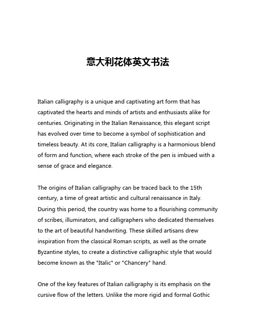
意大利花体英文书法

意大利花体英文书法Italian calligraphy is a unique and captivating art form that has captivated the hearts and minds of artists and enthusiasts alike for centuries. Originating in the Italian Renaissance, this elegant script has evolved over time to become a symbol of sophistication and timeless beauty. At its core, Italian calligraphy is a harmonious blend of form and function, where each stroke of the pen is imbued with a sense of grace and elegance.The origins of Italian calligraphy can be traced back to the 15th century, a time of great artistic and cultural renaissance in Italy. During this period, the country was home to a flourishing community of scribes, illuminators, and calligraphers who dedicated themselves to the art of beautiful handwriting. These skilled artisans drew inspiration from the classical Roman scripts, as well as the ornate Byzantine styles, to create a distinctive calligraphic style that would become known as the "Italic" or "Chancery" hand.One of the key features of Italian calligraphy is its emphasis on the cursive flow of the letters. Unlike the more rigid and formal Gothicscripts that were prevalent in Northern Europe, the Italic hand is characterized by a graceful, slanted appearance and a sense of fluidity. The letters are connected by smooth, flowing strokes, creating a seamless and harmonious overall appearance. This style of writing was not only aesthetically pleasing but also highly practical, as it allowed for faster and more efficient penmanship.Another hallmark of Italian calligraphy is its attention to detail and precision. The calligraphers of the Renaissance era were masters of their craft, and they took great pride in the execution of each individual letter. The strokes were meticulously crafted, with a consistent weight and rhythm that gave the script a sense of balance and harmony. The use of contrast between thick and thin lines, as well as the careful placement of serifs and other decorative elements, added to the overall elegance and sophistication of the Italic hand.One of the most renowned practitioners of Italian calligraphy was the legendary scribe and calligrapher Ludovico degli Arrighi, also known as "Vicentino." Born in the late 15th century, Arrighi was renowned for his exceptional skill and artistry, and his work is considered among the finest examples of the Italic script. His treatise on calligraphy, "La Operina," published in 1522, became a seminal work that influenced generations of calligraphers and scribes.Arrighi's influence can be seen in the work of many other Italiancalligraphers who followed in his footsteps. From the ornate and highly decorative scripts of the Baroque era to the more minimalist and refined styles of the neoclassical period, the Italic hand has remained a constant source of inspiration and admiration for artists and enthusiasts alike.Today, the art of Italian calligraphy continues to captivate and inspire. Modern calligraphers have embraced the timeless elegance of the Italic script, incorporating it into a wide range of applications, from fine art to commercial design. The use of Italian calligraphy in wedding invitations, greeting cards, and other stationery items has become increasingly popular, as people seek to add a touch of sophistication and timeless beauty to their personal and professional communications.Beyond its practical applications, Italian calligraphy has also found a home in the world of fine art. Calligraphers have elevated the Italic script to new heights, using it as a medium for self-expression and creative exploration. The interplay of light and shadow, the fluidity of the strokes, and the overall aesthetic appeal of the Italic hand have all contributed to its enduring popularity among artists and art enthusiasts.One of the most remarkable aspects of Italian calligraphy is its ability to transcend time and culture. While the Italic script has its rootsfirmly planted in the Italian Renaissance, it has since become a global phenomenon, with calligraphers and enthusiasts from around the world embracing its timeless elegance and beauty. From the United States to Japan, the art of Italian calligraphy continues to captivate and inspire, serving as a testament to the enduring power of the written word and the human desire for artistic expression.In conclusion, Italian calligraphy is a truly remarkable art form that has stood the test of time. From its origins in the Italian Renaissance to its continued influence in the modern world, this elegant script has captivated the hearts and minds of artists, enthusiasts, and everyday individuals alike. Whether used for practical purposes or as a medium for creative expression, the Italic hand remains a symbol of sophistication, beauty, and the enduring power of the written word.。
《英文书法介绍》课件

Paper type
Select a suitable paper type for calligraphy, considering its texture, thickness, and color. Different paper types can affect the appearance and feel of the lettering.
02
Basic Skills ofБайду номын сангаасEnglish Calligraphy
Mastery of strokes
Stroke order
The correct order of strokes is essential for creating balanced and legible letters. Practice the stroke order for each letter until it becomes automatic.
The characteristics of handwriting are: regular and rounded strokes, natural and smooth lines, and a casual and personal style. When writing, the pen pressure should be adjusted according to the thickness of the line, and the angle of the pen should be changed appropriately.
Flower body
Flower body is a more decorative style of English calligraphy, which is usually used for writing greeting cards, posters, and other occasions that need decoration. The style is exquisite, fancy, and beautiful.
英文书法介绍课件

on the font and style.
Handwriting font
Serif Fonts
Fonts with small lines attached to the ends of the strokes, often used for greater readability.
Sans Serif Fonts
Handwriting Fundamentals
01
Stroke Order
The order and direction of each letter stroke. For example, in
English, the letter "e" is written in a counterclockwise spiral.
Introduction to E of English Calligraphy • Handwritten English Calligraphy • Machine printed English calligraphy • English Calligraphy Application
Learning methods and steps
Learning letterforms
Familiarize yourself with the letterforms of each letter in the alphabet. Practice writing each letter separately before attempting to write words and sentences.
The selection of a suitable typeface should be based on the content, purpose, and audience of the document.
常用英语字体的介绍和书写PPT讲稿

再向下写出一竖,画一个扁弧回到原点, 再像b一样写出连笔。
• G在写完半圆后不是写“┐”,而是自然地
下去,和小写的g相似。
IJKL书写
• 其中小写的i,j,k,l基本无异,只是在
适当的位置加连笔。
• I在远处拉出一笔,拐弯下来挑起。 • J就像“F”的第一笔。 • K连笔之后写竖,右半部分一笔连成,中间
英语圆体字
英语圆体字
圆体字是 法国的一 种书写体, 字母的拐 角处呈弧 形。
ABCD书写
• 前四个子母中,大写的C,小写的a,c,d
与斜体基本无异,只是在连写时多一个连 笔。
• A的书写从右下起笔,一笔连成。 • B从左上起笔,一竖到底,再在右边拐出类
似“3”的一笔。
• b从右下起笔,与斜体不同,写完一竖后不
英语连体字
英语连体字
问题1:连体字是不是英国 的?
不是
• 西方人手写字的水准应该受到打字机发明
的影响。和中国年轻一代在电脑出现以后 的手书水平下降一样,可以理解为机器的 便利和高效导致对日常工作生活中手写的 频率和质量要求下降,把字写好的意愿不 高。【内因】
• 所以西方人不会练连体字
英语连体字
是向上顺时针补写半圆,而是直接从最下 方逆时针补写半圆,,收笔时甩出连写的 一撇。
• D不容易写。先写一竖,拐过弯来勾一个大
EFGH书写
• 小写的e与g基本无异。 • E像写一个倒着的“3”,收笔时画一个圈
出去。
• F先是一个顿笔,再向右写一个“~”,回
笔勾下去一竖,向左上挑出,最后加上一 横,在右边补写一小竖作为连笔。
英语连体字
因此个人认为连体字是 我们中国人的自我创新。 是一种中西方的产物。
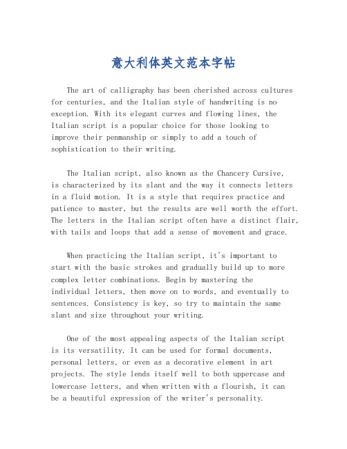
意大利体英文范本字帖

意大利体英文范本字帖The art of calligraphy has been cherished across cultures for centuries, and the Italian style of handwriting is no exception. With its elegant curves and flowing lines, the Italian script is a popular choice for those looking to improve their penmanship or simply to add a touch of sophistication to their writing.The Italian script, also known as the Chancery Cursive,is characterized by its slant and the way it connects letters in a fluid motion. It is a style that requires practice and patience to master, but the results are well worth the effort. The letters in the Italian script often have a distinct flair, with tails and loops that add a sense of movement and grace.When practicing the Italian script, it's important tostart with the basic strokes and gradually build up to more complex letter combinations. Begin by mastering theindividual letters, then move on to words, and eventually to sentences. Consistency is key, so try to maintain the same slant and size throughout your writing.One of the most appealing aspects of the Italian scriptis its versatility. It can be used for formal documents, personal letters, or even as a decorative element in art projects. The style lends itself well to both uppercase and lowercase letters, and when written with a flourish, it canbe a beautiful expression of the writer's personality.For those new to the Italian script, there are many resources available to help guide your learning process. Calligraphy books, online tutorials, and even app-based learning tools can provide step-by-step instructions and examples to follow. Practice is essential, so don't be discouraged if your writing doesn't look perfect right away.In conclusion, the Italian script is a timeless andelegant form of handwriting that can enhance any written work. With dedication and practice, anyone can learn to write inthis beautiful style and add a touch of class to their correspondence.。
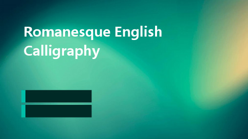
罗马体英语书法

Over time, the style evolved and because more additional, with integrated flows and more complex forms It was later influenced by the Gothic art movement, leading to the development of Gothic English Calligraphy
Logo and branding
Romanesque English Calligraphy can be used in logo design and branding to create a sense of heritage and relevance It adds a touch of elegance and distinction to any brand identity
Characteristics
This style of calligraphy is known for its monitoriality, weight, and balance It often uses a combination of majors (capital letters) and minuscules (lowercase letters) to create a harmonious visual effect
Romanesque Englishrview of Romanesque English Calligraphy
• The Basic Elements of Romanesque English Calligraphy
• Skills and Practice of Romanesque English Calligraphy
拉丁字母书写方式ppt课件

35
36
37
38
39
40
41
42
43
44
45
46
47
48
49
作 业:
1.临摹无饰线体大写和数字; 2.临摹古罗马体大写和数字。 要求: 1)在A4纸上完成,每页写6个字母
2)打1:1的正方形格,字距和行距自己控制,安排 好整版字的位置
3)用铅笔打好字的骨架 4)用黑色水笔勾勒外框。
.
1
复 习:
拉丁字母的发展: 苏美尔楔形文字→埃及圣书字→玛雅文明(消失了) 腓尼基字母22个→希腊表音字母24个→罗马字母26个→法国 卡罗林小写体
2
第三章 拉丁字母的书写
第一节 第二节 第三节 第四节
拉丁字母的分类 各种拉丁字母的特征
无饰线字体的书写方法
罗马字体的书写方法(重点)
3
第一节 拉丁字母的分类
看起来象连起来一样。
13
五、变化体 包括了许多识别性程度不同的风格各异的字体,虽然其
复杂影响了阅读而不适合于正文的印刷,但它可以加强设计 的艺术效果。
14
第三节 无饰线字体的书写方法
15
16
17
18
19
20
21
22
23
24
25
26
27
28
29
30
31
第四节 罗马字体书写方法
拉丁字母的基本结构关系
AOEpxld 上延线 顶线 X线 基线 底线
5
拉丁字母的笔画及其名称
A 细线
干线
衬线
Y臂
衬线
点
i噱 n拱
臂
衬线
F 半衬线
- 1、下载文档前请自行甄别文档内容的完整性,平台不提供额外的编辑、内容补充、找答案等附加服务。
- 2、"仅部分预览"的文档,不可在线预览部分如存在完整性等问题,可反馈申请退款(可完整预览的文档不适用该条件!)。
- 3、如文档侵犯您的权益,请联系客服反馈,我们会尽快为您处理(人工客服工作时间:9:00-18:30)。
3
字母f占上两个格,并且f上半部 分的圆弧和三条直线之间夹的 圆弧要等长和平行
字母g收笔的圆弧要和三条直 线之间夹的圆弧要等长和平行
4
字母l占下两个格,并且l下部分 的圆弧和三条直线之间夹的圆 弧要等长和平行
5
字母m/n起笔要露出一点点, 且直线要平行!
6
字母r占上两个格,并且r起笔要 露出一点点。上部分的圆弧和 三条直线之间夹的圆弧要等长 和平行
t起笔不顶格写,比d,b矮一点, 那一横,写在第二条直线以上 一点。
7
字母u和w收笔时露出一点点。
8
字母y收笔部分的圆弧和三条直 线之间夹的圆弧要等长和平行 两天直线是平行的!
9
A和B起笔的直线是平行的呦!
罗马体英语书法
1
哈尔滨剑桥学院 外国语学院 潘春英
罗马体英文字母的书写秘诀
• 26个字母大小写中最好每一个字母都是一个模子 里刻出来的;
• 每个字母的起笔、运笔和收笔要都一致; • 罗马英文字体以直线和圆弧自称 • 罗马英文字体的另外一个特点是:简洁!!!!
2
字母a的小尾巴要露出 来一点····················
10
11
竖线平行,横线平行!
12
13
14
15
M重心可以在圆心,也可以向
20
21
22
练习好之后,可以根据自己的 喜好形成自己风格的变体。
23
24
25
26
27
