高考英语作文之图表作文2
图表英语作文

图表英语作文英文回答:Chart and graphs are powerful tools for conveying information and illustrating trends, comparisons, and relationships. They provide a visual representation of data, making it easier to understand and draw meaningful conclusions. Charts and graphs can be used in various fields, including business, science, education, and healthcare.One of the most common types of charts is the bar chart. Bar charts are used to compare different values. The height or length of each bar represents the value being compared. Bar charts can be used to illustrate trends, such as sales figures over time, or to compare different categories, such as the sales of different products.Another common type of chart is the line chart. Line charts are used to show how a value changes over time. Theline on the chart connects the data points, creating avisual representation of the trend. Line charts can be used to illustrate trends in stock prices or economic indicators.Pie charts are used to show the proportion of different parts of a whole. Each slice of the pie represents adifferent part, and the size of the slice corresponds tothe proportion of the whole. Pie charts can be used to illustrate the composition of a population, such as the percentage of people in different age groups.Scatterplots are used to show the relationship between two variables. Each point on the scatterplot represents a data point, and the position of the point on the graph shows the values of the two variables. Scatterplots can be used to identify correlations between variables, such asthe relationship between height and weight.Histograms are used to show the distribution of data. Histograms divide the data into bins, and the height ofeach bin represents the number of data points that fall within that bin. Histograms can be used to illustrate thedistribution of incomes in a population or the distribution of test scores.Charts and graphs are an essential tool for communicating information. They provide a visual representation of data, making it easier to understand and draw meaningful conclusions. By understanding the different types of charts and graphs, you can effectively communicate information and make informed decisions.中文回答:图表是传达信息、展示趋势、比较和关系的有力工具。
英文图表类 作文

英文图表类作文1. The bar chart shows the percentage of people in different age groups who use social media. It's interesting to see that the highest percentage of social media users is in the 18-34 age group, with over 80% of people usingsocial media. 。
2. The line graph illustrates the change in temperature over the course of a week. As we can see, there was a sharp increase in temperature on Wednesday, followed by a gradual decrease towards the end of the week.3. The pie chart displays the distribution of household expenses. It's surprising to see that the largest portion of expenses is on entertainment, with 30% of the budget allocated to this category.4. The table compares the sales performance ofdifferent products in the past year. It's clear that Product A has consistently outperformed the other products,with the highest sales in every quarter.5. The scatter plot shows the relationship betweenhours of study and exam scores. It's evident that there isa positive correlation between the two variables, as students who study more hours tend to achieve higher scores.6. The flow chart outlines the process of applying fora visa. It's quite a complex procedure, with multiple steps and documents required at each stage.7. The diagram depicts the structure of a typical cell. It's amazing to see the intricate network of organelles and membranes that make up a single cell.。
2022年英语二图表作文

2022年英语二图表作文英文回答:In the diagram, the percentages of vehicles sold in three major categories (A, B, and C) in a particular country are depicted for the years 2018 and 2022. It is evident that while category A sales experienced a significant decline, category B and C sales witnessed a surge in their market shares.In 2018, category A vehicles held the largest market share, accounting for approximately 45%. However, by 2022, this share had plummeted to a mere 20%, indicating a notable drop of 25 percentage points. Conversely, category B witnessed a substantial increase from 30% to 45%, representing a 15 percentage point gain. Category C, which initially held the smallest market share at 25%, saw a remarkable boost to 35% in 2022, marking a 10 percentage point increase.Several factors could potentially explain these shifts in market shares. Changing consumer preferences and advancements in technology may have influenced the decline in category A sales. Meanwhile, the growing demand for eco-friendly and fuel-efficient vehicles could have contributed to the rise in popularity of category B and C vehicles. Furthermore, changing economic conditions and government incentives may also have played a role in shaping these trends.中文回答:该图表描绘了一个特定国家在 2018 年和 2022 年三个主要类别(A、B 和 C)的汽车销量百分比。
图表类英语作文范文
图表类英语作文范文图表类型的英语写作如果不擅于观察漫画的话,作文写出来可能会偏题。
下面是小编给大家带来图表类英语作文,供大家参阅!图表类英语作文范文篇1第一段:说明图表开篇句:As the bar chart shows, ____ during the years of ____to____.扩展句:1、As early as _____.2、Then _____ years later, ____.3、And arriving in the year ____, ____.第二段:解释图表变化原因主题句:Several factors contribute to _____.扩展句:1、______. (原因1)2、And ______.(原因2)3、Furthermore, ______ (原因3)4、All these result in ____.第三段:提出解决办法结尾句:However, ____ is faced with some problems.扩展句:1、With _____, ____, the effect of which is not only discouraging, but also challenging.2、So my principle is to pay due attention to ___, but notjustto____.示范第一段:说明图表开篇句:As the bar chart shows, the number of people below the poverty line decreased dramatically during the years of 1978 to1997.扩展句:1、As early as 1978, about 250 million people were under the poverty line.2、Then seven years later, the number became three fifths thatof1978.3、And arriving in the year 1997, the number was reduced to50millions.第二段:解释图表变化原因主题句:Several factors contribute to the sharp decrease of the below-poverty population.扩展句:1、The reform and opening following 1978 enabled the peasants to become much better off. (原因1)2、And with the development of Chinese economy, that policy also improved city dwellers lives greatly. (原因2)3、Furthermore, the high-tech introduced made it possible for the countrys economy as a whole to take off. (原因3)4、All these result in the great fall of theChinesepopulationbelow the poverty line.第三段:提出解决办法结尾句:However, a further decrease in the number of poverty-stricken people is faced with some problems.扩展句:1、With quite few employees being laid off, the effect of which is not only discouraging, but also challenging.2、So my principle is to pay due attention to the newcomers, but not just to care for the poor, say, in remote mountain areas.范文As the bar chart shows, the number of people below the poverty line decreased dramatically during the years of 1978 to 1997. Asearly as 1978, about 250 million people were under the poverty line.Then seven years later, the number became three fifths that of 1978.And arriving in the year 1997, the number was reduced to 50 millions.Several factors contribute to the sharp decrease of the below-poverty population. The reform and opening following 1978 enabled the peasants to become much better off. And with the development of Chinese economy, that policy also improved city dwellers lives greatly. Furthermore, the high-tech introduced made it possible for the countryseconomy as a whole to take off. All these result in the great fall of the Chinese population below the poverty line.However, a further decrease in the number of poverty-stricken people is faced with some problems. With quite few employees being laid off, the effect of which is not only discouraging, but also challenging. So my principle is to pay due attention to the newcomers, but not just to care for the poor, say, in remote mountain areas.图表类英语作文范文篇2The past years have witnessed a mounting number of Chinese scholars returning from overseas. As is lively illustrated by the column chart, the number of returnees climbed from a mere 69.3 thousand in 2008 to over 272.9 thousand in 2012, at an annual increase rate of around 50%.A multitude of factors may have led to the tendency revealed by the chart, but the following are the critical ones from my perspective. First and foremost, along with the development of Chinese economy and society, the number of Chinese studying abroad has been soaring in the past years, which has provided an expanding base for the number of returnees. In the second place, the government has enacted a series of preferential policies to attract overseas Chinesescholars back home. Last but not least, the booming economy, science and technology in this country have generated more attative job opportunites for scholars returning from overseas.The waves of returnees will definitely contribute to this nation’s development, since they have brought back not only advanced science and technology but also pioneering concepts of education and management. With more scholars coming back from overseas, and with the concerted efforts of the whole nation, we have reasons to expect a faster rejuvenation of this country.图表类英语作文范文篇3一、图表类型基本单词图表类型:table(表格)、chart(图表)、diagram(图标)、graph(多指曲线图)、column chart(柱状图)、pie graph(饼图)、tree diagram(树形图)、饼图:pie chart、直方图或柱形图:bar chart/histogram、趋势曲线图:line chart/curve diagram、表格图:table、流程图或过程图:flow chart/sequence diagram、程序图:processing/procedures diagram二、图表描述基本词语1、描述:show、describe、illustrate、can be seen from、clear、apparent、reveal、represent2、内容:figure、statistic、number、percentage、proportion三、常用的描述句型The table/chart diagram/graph shows (that)According to the table/chart diagram/graphAs (is) shown in the table/chart diagram/graphAs can be seen from the table/chart/diagram/graph/figures,figures/statistics shows (that)……It can be seen from the figures/statisticsWe can see from the figures/statisticsIt is clear from the figures/statisticsIt is apparent from the figures/statisticstable/chart/diagram/graph figures (that) ……table/chart/diagram/graph shows/describes/illustrates看过图表类英语范文的人还。
英语图表高中作文【优秀3篇】
英语图表高中作文【优秀3篇】(经典版)编制人:__________________审核人:__________________审批人:__________________编制单位:__________________编制时间:____年____月____日序言下载提示:该文档是本店铺精心编制而成的,希望大家下载后,能够帮助大家解决实际问题。
文档下载后可定制修改,请根据实际需要进行调整和使用,谢谢!并且,本店铺为大家提供各种类型的经典范文,如工作资料、求职资料、报告大全、方案大全、合同协议、条据文书、教学资料、教案设计、作文大全、其他范文等等,想了解不同范文格式和写法,敬请关注!Download tips: This document is carefully compiled by this editor.I hope that after you download it, it can help you solve practical problems. The document can be customized and modified after downloading, please adjust and use it according to actual needs, thank you!In addition, this shop provides you with various types of classic model essays, such as work materials, job search materials, report encyclopedia, scheme encyclopedia, contract agreements, documents, teaching materials, teaching plan design, composition encyclopedia, other model essays, etc. if you want to understand different model essay formats and writing methods, please pay attention!英语图表高中作文【优秀3篇】There are differences between high school in China and that in the United States。
高考英语写作之图表作文(格式与范例)
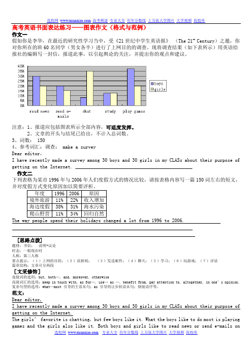
高考英语书面表达练习——图表作文(格式与范例)作文一假如你是李华,在最近的研究性学习当中,受《21世纪中学生英语报》(The 21st Century)之邀,你对你所在的班60名同学(男女各半)进行了上网目的的调查。
现将调查结果(如下表所示)用英语给报社的编辑写一封信,报道此事,以引起舆论的关注,并提出你的观点和建议。
注意:1、报道应包括图表所示全部内容,可适度发挥。
2、文章的开头与结尾已给出,不计入总词数。
3、词数: 1504、参考词汇:调查: make a surveyDear editor,I have recently made a survey among 30 boys and 30 girls in my CLASs about their purpose of getting on the Internet. ______________________________________________作文二下列表格为某市1996年与2006年人们度假方式的情况比较,请按表格内容写一篇150词左右的短文,并对度假方式变化原因加以简要评析。
年度1996 2006 原因境外旅游11% 22% 收入增加海边度假38% 31% 海水污染爬山野营11% 34% 回归自然The way people spend their holidays changed a lot from 1996 to 2006.[思路点拨]题材:书信;说明+议论时态:一般现在时人称:第三人称要点提示:(1)上网的目的;(2)读新闻;(3)发送邮件;(4)聊天;(5)学习;(6)玩游戏;(7)评语篇章结构:文章可分两段[文采修饰]连接词的选用:but, both…, and, moreover, otherwise高级词汇的选用:keep in touch with, as for…, use… as …, benefit from, pay attention to, altogether, in one’s opinion.复杂句型的选用:what…most 引导的主语从句;as 引导的让步状语从句;倒装语序等。
英语高考图表作文
英语高考图表作文In the first chart, we can see the percentage of students who choose different majors in college. It's interesting to note that the majority of students prefer to major in business, while the least popular major is engineering. This reflects the current trend of students leaning towards more practical and marketable majors.The second chart shows the average monthly income of people with different levels of education. Surprisingly, those with a high school diploma actually earn more on average than those with a bachelor's degree. This challenges the common belief that higher education always leads to higher income.Moving on to the third chart, it illustrates the distribution of household chores among family members. It's quite striking to see that women still bear the majority of the housework, despite the progress in gender equality. This indicates that traditional gender roles are stilldeeply ingrained in our society.Next, the fourth chart presents the percentage of people who are satisfied with their work-life balance. It's alarming to see that only a small fraction of people feel satisfied, while the majority feel overwhelmed by work. This highlights the pressing issue of work-related stress and the need for better work-life balance.Finally, the fifth chart depicts the usage of social media among different age groups. Unsurprisingly, the younger generations spend the most time on social media, while the older generations are less engaged. This reflects the digital divide between age groups and the increasing influence of social media on younger generations.In conclusion, these charts offer valuable insightsinto various aspects of modern society, from education and gender roles to work-life balance and technology usage.It's clear that there are still many challenges and disparities that need to be addressed in order to create a more equitable and balanced society.。
图表类的英语作文
图表类的英语作文The pie chart shows the distribution of household expenses in the United States. As we can see, the largest portion of the expenses goes to housing, accounting for 33% of the total. This is followed by transportation at 17%, food at 13%, and healthcare at 8%. Other expenses,including entertainment, clothing, and education, make up the remaining 29%.Moving on to the bar graph, it illustrates the average monthly temperature in a city over the course of a year. We can observe that the temperature starts off relatively low in January, gradually increases, and reaches its peak in July. After that, it begins to decrease again, hitting the lowest point in December. This pattern reflects the typical seasonal changes in temperature.Next, the line graph depicts the fluctuation of stock prices for a particular company over the span of one year. It shows that the stock prices experienced a sharp increasein the first quarter, followed by a slight dip in the second quarter. However, they rebounded in the third quarter and remained relatively stable in the fourth quarter. This indicates the company's performance and the market's reaction to it throughout the year.Finally, the scatter plot displays the relationship between the amount of studying and the grades achieved by a group of students. It reveals that there is a positive correlation between the two variables, as students who study more tend to achieve higher grades. However, there are also outliers, suggesting that other factors may come into play in determining academic performance.In conclusion, these various types of charts and graphs provide valuable insights into different aspects of data and can be used to better understand and analyze complex information.。
英语高考作文图表类
英语高考作文图表类In the chart, we can see that the number of people using smartphones has been increasing steadily over the past decade. This trend is not surprising, considering the convenience and versatility that smartphones offer in our daily lives.Looking at the data, it is clear that the younger generation is the most avid users of smartphones. This is understandable, as they have grown up in a digital age where smartphones are an integral part of communication and social interaction.Interestingly, the chart also shows that the use of smartphones varies among different regions. While urban areas tend to have higher smartphone usage rates, rural areas are catching up as technology becomes more accessible and affordable.One striking point to note is the impact of smartphoneusage on traditional forms of communication. With the riseof messaging apps and social media platforms, people are increasingly relying on their smartphones to stay connected, leading to a decline in face-to-face interactions and phone calls.Despite the concerns about smartphone addiction and its negative effects on mental health, it is undeniable that smartphones have revolutionized the way we communicate and access information. As technology continues to advance, it will be fascinating to see how our relationship with smartphones evolves in the future.。
高考英语图表作文
高考英语图表作文In the first chart, we can see the comparison of the average temperatures in different seasons. It's quite interesting to note that the temperature in summer is significantly higher than in the other seasons. This is probably due to the strong sunlight and longer days during the summer months.Moving on to the second chart, it shows thedistribution of rainfall throughout the year. What's striking is that there is a clear peak in rainfall during the spring season, which gradually decreases as we moveinto summer. This could be attributed to the change in weather patterns and the transition from spring to summer.Looking at the third chart, it illustrates the fluctuation of air quality index over the course of a year. It's evident that the air quality is at its worst during the winter months, possibly due to increased pollution from heating and reduced air circulation. On the other hand, theair quality improves during the summer, which could be attributed to better weather conditions and reduced pollution.Lastly, the fourth chart presents the variation in daylight hours throughout the year. It's apparent that the longest days occur in the summer, while the shortest days happen in the winter. This is a natural phenomenon caused by the tilt of the Earth's axis and its orbit around the sun.In conclusion, these charts provide valuable insights into the seasonal changes in temperature, rainfall, air quality, and daylight hours. It's fascinating to observe the different patterns and fluctuations that occur throughout the year.。