用CSS滑动门技术制作精美的按钮
实用的CSS鼠标滑过按钮特效(10种代码篇)

/*效果二*/
.button2{
-webkit-transition: all 0.5s ;
transition: all 0.5s ;
overflow:hidden;
position: relative;
}
.button2:hover{
background-color: rgba(255,255,255,0.2);
}
.button5:hover::before{
opacity:0;
-webkit-transform: scale(1.2,1.2);
transform: scale(1.2,1.2);
}
.button5::after{
content:'';
width:100%;
height:100%;
position: absolute;
height: 100%;
position: absolute;
left: -50px;
top: 0;
opacity:0;
-webkit-transition: all 0.5s ;
transition: all 0.5s ;
}
.button2:hover::after{
left:0;
opacity:1;
opacity:0;
position: absolute;
left: 0;
top:0;
background-color: rgba(255,255,255,0.5);
-webkit-transition: all 0.5s ;
transition: all 0.5s ;
}
.button4:hover::after{
CSS按钮的制作方法系列文章
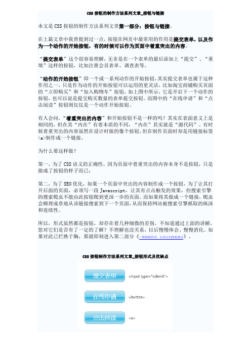
CSS按钮的制作方法系列文章_按钮与链接本文是CSS按钮的制作方法系列文章第一部分:按钮与链接。
在上篇文章中我曾提到过一点,按钮在网页中最常用的作用是提交表单,以及作为一个动作的开始按钮,有的时候可以作为页面中着重突出的内容。
“提交表单”这个很容易理解,无非是在一个表单的最后添加上“提交”、“重填”这样的按钮,比如注册会员表单、调查表等。
“动作的开始按钮”即一个或一系列动作的开始按钮,其实提交表单也属于这种作用之一,只是作为动作的开始按钮可以运用的更灵活,比如淘宝商铺购买页面的“立即购买”和“加入购物车”按钮,如上图中所示,它是开启下一个动作的按钮,也可以说是提交购买数量的表单提交按钮。
而图中的“在线申请”和“点击阅读”按钮则仅仅是一个动作开始按钮。
有人会问,“着重突出的内容”和开始按钮不是一样的吗?其实在表面意义上是相同的,但在其“内在”有着本质的不同,“内在”其实就是“源代码”。
有时候着重突出的内容虽然在设计时做的像个按钮,但在制作页面时却是用链接标签<a>制作成一个链接。
为什么要这样做?第一,为了CSS语义的正确性,因为页面中着重突出的内容本身不是按钮,只是做成了按钮的样子而已;第二,为了SEO优化,如果一个页面中突出的内容制作成一个按钮,为了让其打开后面的页面,必须写一段Javascript,让其有点击触发的效果,但搜索引擎的搜索爬虫不能由此按钮爬到更深一步的页面。
而如果将其做成一个链接,爬虫会顺理成章地从该链接搜索到下一个页面,从而保持网站被搜索引擎抓取的纵深和连续性。
所以,形式虽然都是按钮,却存在着几种细微的差别,不知道通过上面的讲解,您对它们是否有了一定的了解?不理解也没关系,以后慢慢体会、慢慢消化。
如果对此已烂熟于胸,那就即刻进入第二部分《三种按钮形式,以及它们的优缺点》。
CSS按钮制作方法系列文章_按钮形式及优缺点本文是CSS按钮的制作方法系列文章第二部分:三种按钮形式,以及它们的优缺点。
css7种漂亮的按钮hover效果

css7种漂亮的按钮hover效果没有上效果图,需要⾃⼰运⾏1、第⼀种<button>123</button><!DOCTYPE html><html><head><meta charset="utf-8" /><title></title><style>#loading-btn {display: flex;align-items: center;justify-content: center;height: 100vh;}button {background: transparent;border: 0;border-radius: 0;text-transform: uppercase;font-weight: bold;font-size: 20px;padding: 15px 50px;position: relative;}button:before {transition: all 0.8s cubic-bezier(0.7, -0.5, 0.2, 2);content: '';width: 1%;height: 100%;background: #ff5964;position: absolute;top: 0;left: 0;}button span {mix-blend-mode: darken;}button:hover:before {background: #ff5964;width: 100%;}</style></head><body><div id="loading-btn"><button><span>Hover me</span></button></div></body></html>2、第⼆种<!DOCTYPE html><html><head><meta charset="utf-8" /><title></title><style>#neon-btn {display: flex;align-items: center;justify-content: space-around;height: 100vh;background: #031628;}.btn {border: 1px solid;background-color: transparent;text-transform: uppercase;font-size: 14px;padding: 10px 20px;font-weight: 300;}.one {color: #4cc9f0;}.two {color: #f038ff;}.three {color: #b9e769;}.btn:hover {color: white;border: 0;}.one:hover {background-color: #4cc9f0;-webkit-box-shadow: 10px 10px 99px 6px rgba(76,201,240,1);-moz-box-shadow: 10px 10px 99px 6px rgba(76,201,240,1);box-shadow: 10px 10px 99px 6px rgba(76,201,240,1);}.two:hover {background-color: #f038ff;-webkit-box-shadow: 10px 10px 99px 6px rgba(240, 56, 255, 1); -moz-box-shadow: 10px 10px 99px 6px rgba(240, 56, 255, 1);box-shadow: 10px 10px 99px 6px rgba(240, 56, 255, 1);}.three:hover {background-color: #b9e769;-webkit-box-shadow: 10px 10px 99px 6px rgba(185, 231, 105, 1); -moz-box-shadow: 10px 10px 99px 6px rgba(185, 231, 105, 1); box-shadow: 10px 10px 99px 6px rgba(185, 231, 105, 1);}</style></head><body><div id="neon-btn"><button class="btn one">Hover me</button><button class="btn two">Hover me</button><button class="btn three">Hover me</button></div></body></html>3、第三种<!DOCTYPE html><html><head><meta charset="utf-8" /><title></title><style>#draw-border {display: flex;align-items: center;justify-content: center;height: 100vh;}button {border: 0;background: none;text-transform: uppercase;color: #4361ee;font-weight: bold;position: relative;outline: none;padding: 10px 20px;box-sizing: border-box;}button::before, button::after {box-sizing: inherit;position: absolute;content: '';border: 2px solid transparent;width: 0;height: 0;}button::after {bottom: 0;right: 0;}button::before {top: 0;left: 0;}button:hover::before, button:hover::after {width: 100%;height: 100%;}button:hover::before {border-top-color: #4361ee;border-right-color: #4361ee;transition: width 0.3s ease-out, height 0.3s ease-out 0.3s;}button:hover::after {border-bottom-color: #4361ee;border-left-color: #4361ee;transition: border-color 0s ease-out 0.6s, width 0.3s ease-out 0.6s, height 0.3s ease-out 1s; }</style></head><body><div id="draw-border"><button>Hover me</button></div></body></html>4、第四种<!DOCTYPE html><html><head><meta charset="utf-8" /><title></title><style>#circle-btn {display: flex;align-items: center;justify-content: center;height: 100vh;}.btn-container {position: relative;}button {border: 0;border-radius: 50px;color: white;background: #5f55af;padding: 15px 20px 16px 60px;text-transform: uppercase;background: linear-gradient(to right, #f72585 50%, #5f55af 50%);background-size: 200% 100%;background-position: right bottom;transition:all 2s ease;}svg {background: #f72585;padding: 8px;border-radius: 50%;position: absolute;left: 0;top: 0%;}button:hover {background-position: left bottom;}</style></head><body><div id="circle-btn"><div class="btn-container"><!-- // 这⾥有⼀个svg元素 --><button>Hover me</button></div></div></body></html>5、第五种<!DOCTYPE html><html><head><meta charset="utf-8" /><title></title><style>#border-btn {display: flex;align-items: center;justify-content: center;height: 100vh;}button {border: 0;border-radius: 10px;background: #2ec4b6;text-transform: uppercase;color: white;font-size: 16px;font-weight: bold;padding: 15px 30px;outline: none;position: relative;transition: border-radius 1s;-webkit-transition: border-radius 1s; }button:hover {border-bottom-right-radius: 50px; border-top-left-radius: 50px;border-bottom-left-radius: 10px; border-top-right-radius: 10px;}</style></head><body><div id="border-btn"><button>Hover me</button></div></body></html>6、第六种<!DOCTYPE html><html><head><meta charset="utf-8" /><title></title><style>#frozen-btn {display: flex;align-items: center;justify-content: center;height: 100vh;}button {border: 0;margin: 20px;text-transform: uppercase;font-size: 20px;font-weight: bold;padding: 15px 50px;border-radius: 50px;color: white;position: relative;}button:before{content: '';display: block;background: linear-gradient(to left, rgba(255, 255, 255, 0) 50%, rgba(255, 255, 255, 0.4) 50%); background-size: 210% 100%;background-position: right bottom;height: 100%;width: 100%;position: absolute;top: 0;bottom:0;right:0;left: 0;border-radius: 50px;transition: all 1s;-webkit-transition: all 1s;}.green {background-image: linear-gradient(to right, #25aae1, #40e495);box-shadow: 0 4px 15px 0 rgba(49, 196, 190, 0.75);}.purple {background-image: linear-gradient(to right, #6253e1, #852D91);box-shadow: 0 4px 15px 0 rgba(236, 116, 149, 0.75);}.purple:hover:before {background-position: left bottom;}.green:hover:before {background-position: left bottom;}</style></head><body><div id="frozen-btn"><button class="green">Hover me</button><button class="purple">Hover me</button></div></body></html>7、第七种<!DOCTYPE html><html><head><meta charset="utf-8" /><title></title><style>#shiny-shadow {display: flex;align-items: center;justify-content: center;height: 100vh;background: #1c2541;}button {border: 2px solid white;background: transparent;text-transform: uppercase;color: white;padding: 15px 50px;outline: none;overflow: hidden;position: relative;}span {z-index: 20;}button:after {content: '';display: block;position: absolute;left: -100px;background: white;width: 50px;height: 125px;opacity: 20%;transform: rotate(-45deg);}button:hover:after {left: 120%;transition: all 600ms cubic-bezier(0.3, 1, 0.2, 1);-webkit-transition: all 600ms cubic-bezier(0.3, 1, 0.2, 1); }</style></head><body><div id="shiny-shadow"><button><span>Hover me</span></button></div></body></html>。
css按钮样式

css按钮样式创建漂亮的 CSS 按钮的 10 个代码⽚段如果你正在寻找⼀些⾼质量的 CSS 按钮的⽰例,那么这篇⽂章⼀定是你的“菜”。
在本⽂中,我们从 CodePen 上收集了 10 个独特的 CSS 按钮合集,并附有它们的代码⽚段,⽅便你将它们应⽤在你的 Web 项⽬上。
⽹页设计师已经不必再依赖 Photoshop 制作酷炫的按钮了。
通过使⽤ CSS3,你可以实现背景的渐变、阴影以及光泽/闪亮的效果。
1. Plastic Buttons相当的简洁、⼲净。
由于它们拥有不同的颜⾊、尺⼨以及风格,并提供了⼩、中、⼤号按钮供你任意挑选。
所以,你可以轻松地重新调整或更换它们。
⽽利⽤纯 CSS 的实现⽅式,或许它也是⽹上最简洁、⼲净的按钮样式之⼀。
代码地址:【】2. Cool Buttons这是⼀组由 Felipe Marcos 制作的。
与上⾯的塑料按钮略有不同,但它们也易于使⽤。
虽然没有闪亮的塑料设计,但当你点击后,依然会感受到有种“推”的效果。
你可以从 6 款默认设计的颜⾊中随意挑选,或者你也可以定制⾃⼰喜欢的颜⾊、尺⼨与样式。
由于根据 CSS 类名进⾏分类,所以你可以在⼀个类上设置默认的按钮样式以及颜⾊。
代码地址:【】3. Google ButtonsGoogle 的在线⼯具(如 Blogger,云盘,Gmail 及其搜索功能)都有不同的按钮样式,⽽开发者 Tim Wagner 在中克隆了这些风格。
作者受 Google 设计的启发,利⽤纯 CSS3 实现了这些看上去很酷的按钮。
这还有个与此,它是由 Monkey Raptor 制作的扩展按钮,他为这些按钮进⾏了⼀些其他的混合。
代码地址:【】4. Bunch-o-Buttons这是由 Alan Collins 在 CodePen 上制作的基于塑料风格的按钮合集。
它拥有多种颜⾊以及不同的款式。
这个按钮集合设计的独特之处在于,它仅通过⼀个单独的 CSS 类就可以在光滑的样式与间任意切换。
纯css编写开关按钮

纯css编写开关按钮本⽂将教你怎么在不使⽤js的前提下,⽤纯css写⼀个开关按钮。
效果⼀代码如下:<!DOCTYPE html><html><head><title>纯css编写开关按钮(⼀)</title><style type="text/css">.chooseBtn {display: none;}.choose-label {box-shadow: #ccc 0px 0px 0px 1px;width: 40px;height: 20px;display: inline-block;border-radius: 20px;position: relative;background-color: #bdbdbd;overflow: hidden;}.choose-label:before {content: '';position: absolute;left: 0;width: 20px;height: 20px;display: inline-block;border-radius: 20px;background-color: #fff;z-index: 20;-webkit-transition: all 0.5s;transition: all 0.5s;}.chooseBtn:checked + label.choose-label:before {left: 20px;}.chooseBtn:checked + label.choose-label {background-color: #51ccee;}</style></head><body><input type="checkbox" name="sex" id="male" class="chooseBtn"/><label for="male" class="choose-label"></label></body></html>效果⼆ :代码如下:<!DOCTYPE html><html lang="en"><head><meta charset="UTF-8"><title>纯css编写开关按钮(⼆)</title><style type="text/css">#toggle-button{ display: none; }.button-label{position: relative;display: inline-block;width: 80px;height: 30px;background-color: #ccc;box-shadow: #ccc 0px 0px 0px 2px;border-radius: 30px;overflow: hidden;}.circle{position: absolute;top: 0;left: 0;width: 30px;height: 30px;border-radius: 50%;background-color: #fff;}.button-label .text {line-height: 30px;font-size: 18px;text-shadow: 0 0 2px #ddd;}.on { color: #fff; display: none; text-indent: 10px;}.off { color: #fff; display: inline-block; text-indent: 34px;}.button-label .circle{left: 0;transition: all 0.3s;}#toggle-button:checked + label.button-label .circle{left: 50px;}#toggle-button:checked + label.button-label .on{ display: inline-block; } #toggle-button:checked + label.button-label .off{ display: none; }#toggle-button:checked + label.button-label{background-color: #51ccee;}</style></head><body><div class="toggle-button-wrapper"><input type="checkbox" id="toggle-button" name="switch"><label for="toggle-button" class="button-label"><span class="circle"></span><span class="text on">ON</span><span class="text off">OFF</span></label></div></body></html>。
JS+CSS实现简单滑动门(滑动菜单)效果

JS+CSS实现简单滑动门(滑动菜单)效果本⽂实例讲述了JS+CSS实现简单滑动门的⽅法。
分享给⼤家供⼤家参考。
具体如下:这是⼀款超简约设计的滑动门菜单,⿏标放到主菜单上,⾥⾯的内容会跟着变化,实际上本演⽰是⼀个范例,从代码中的注释你就能感觉到,每⼀步都有注释,对学习JavaScript和CSS都有帮助,也为你以后写出⽐这更漂亮、更实⽤的滑动门做铺垫。
运⾏效果截图如下:在线演⽰地址如下:具体代码如下:<!DOCTYPE html PUBLIC "-//W3C//DTD XHTML 1.0 Transitional//EN""/TR/xhtml1/DTD/xhtml1-transitional.dtd"><html xmlns="/1999/xhtml"><head><meta http-equiv="Content-Type" content="text/html; charset=gb2312" /><title>滑动门测试</title><style>#tab_container1{width:310px;text-align:left;border:1px solid #cccccc;background:url() repeat-x top;}.cls_tab_nav{height:24px;overflow:hidden;font-size:12px;background:url() repeat-x bottom; padding-left:10px;}.cls_tab_nav ul{font-size:9pt;margin:0;padding:0;}.cls_tab_nav_li{background:url() no-repeat -70px 0;width:70px;height:24px;line-height:24px;float:left;display:inline;overflow:hidden;text-align:center;cursor:pointer;} .cls_tab_nav_li_first{font-weight:bolder;background-position:0px 0px;}.cls_tab_nav_li a{text-decoration:none;color:#000000;font-size:12px;}.cls_tab_body{border-top:none;min-height:175px;padding:10px;height:175px;}.cls_div{display:none;font-size:14px;}.cls_tab_nav_li_first a{color:#c80000;}</style></head><body><div id="tab_container1" ><div class="cls_tab_nav"><ul><li class="cls_tab_nav_li cls_tab_nav_li_first"><a href="#">百货⼤楼</a></li><li class="cls_tab_nav_li"><a href="#">⼋⽅购物</a></li><li class="cls_tab_nav_li"><a href="#">商场三</a></li></ul></div><div class="cls_tab_body"><div class="cls_div" style="display:block;">百货⼤楼</div><div class="cls_div">⼋⽅购物</div><div class="cls_div">商场三</div></div></div></body></html><script type="text/javascript">try{document.execCommand("BackgroundImageCache", false, true);}catch(e){}function $(element){if(arguments.length>1){for(var i=0,elements=[],length=arguments.length;i<length;i++)elements.push($(arguments[i]));return elements;}if(typeof element=="string")return document.getElementById(element);elsereturn element;}var Class={create:function(){return function(){this.initialize.apply(this,arguments);}}}Object.extend=function(destination,source){for(var property in source){destination[property]=source[property];}return destination;}var tabMenu=Class.create();tabMenu.prototype={initialize:function(container,selfOpt,otherOpt){this.container=$(container);var selfOptions=Object.extend({fontWeight:"bold",fontSize:"12px",color:"#FFBC44"},selfOpt||{});var otherOptions=Object.extend({fontWeight:"normal",fontSize:"12px",color:"#666"},otherOpt||{});//⽤for循环得到objs数组,主要是为了兼容⾮IE浏览器把空⽩也当作⼦对象for(var i=0,length=this.container.childNodes.length,objs=[];i<length;i++){if(this.container.childNodes[i].nodeType==1)objs.push(this.container.childNodes[i]);}var tabArray=objs[0].getElementsByTagName("li");//⽤for循环得到divArray数组,主要是为了兼容⾮IE浏览器把空⽩也当作⼦对象var divArray=new Array();for(i=0,length=objs[1].childNodes.length;i<length;i++){if(objs[1].childNodes[i].nodeType==1)divArray.push(objs[1].childNodes[i]);}for(i=0,length=tabArray.length;i<length;i++){tabArray[i].length=length;tabArray[i].index=i;tabArray[i].onmouseover=function(){//其它选项卡样式设置for(var j=0;j<this.length;j++){tabArray[j].style.backgroundPosition="-"+tabArray[j].offsetWidth+"px 0";for(var property in selfOptions){tabArray[j].firstChild.style[property]=otherOptions[property];}}//当前选项卡样式this.style.backgroundPosition="0 0";for(var property in selfOptions){this.firstChild.style[property]=selfOptions[property];}//隐藏其它选项卡for(j=0;j<this.length;j++){divArray[j].style.display="none";}//显⽰当前选项卡divArray[this.index].style["display"]="block";}}}}var tab1=new tabMenu("tab_container1",{fontSize:"12px",color:"#c80000",fontWeight:"bolder"},{fontWeight:"normal",color:"#000000"}); </script>希望本⽂所述对⼤家的JavaScript程序设计有所帮助。
用CSS创建一个美观的按钮(button)

⽤CSS创建⼀个美观的按钮(button)<button>标签默认的按钮很丑,我们要想把它变得美观,可以像这样做:⽰例代码:button.html<!DOCTYPE html><html><head><meta charset="utf-8"><title>HTML CSS Exercise CSS3 button</title><style type="text/css">button {width: 200px;padding:8px;background-color: #428bca;border-color: #357ebd;color: #fff;-moz-border-radius: 10px;-webkit-border-radius: 10px;border-radius: 10px; /* future proofing */-khtml-border-radius: 10px; /* for old Konqueror browsers */text-align: center;vertical-align: middle;border: 1px solid transparent;font-weight: 900;font-size:125%}</style></head><body><button>Subscribe Now</button></body></html>⽰例效果:怎么样?是不是好看了许多?这⾥主要应⽤了圆⾓这个概念:border-radius这⾥有许多关于圆⾓的应⽤:button{border:solid 10px #4d4e53;border-radius:10px 40px 40px 10px;} ⽰例效果:border-radius: border-top-left-radius, border-top-right-radius, border-bottom-right-radius and border-bottom-left-radius (左上,右上,右下,左下==》顺时针)button {width: 200px;padding:8px;background-color: #f7f8f9;color: #428bca;text-align: center;vertical-align: middle;font-weight: 900;font-size:125%}button{border:groove 1em red;border-radius:2em;} ==>这⾥的 border 的属性:button {padding:8px;color: #428bca;text-align: center;vertical-align: middle; font-weight: 900;font-size:125%}button{background: gold;border: ridge gold;border-radius: 13em/3em; width: 200px;height: 100px;} ==>button {padding:8px;color: #428bca;text-align: center;vertical-align: middle; font-weight: 900;font-size:125%}button{background: gold;border: none;border-radius: 40px 10px; width: 200px;height: 100px;} ==>button {padding:8px;color: #428bca;text-align: center;vertical-align: middle; font-weight: 900;font-size:125%}button{background: gold;border: none;border-radius: 50%;width: 200px;height: 100px;} ==>。
10款CSS3按钮-再也不用为按钮设计而发愁了
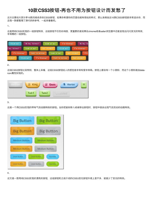
10款CSS3按钮-再也不⽤为按钮设计⽽发愁了这次主要给⼤家分享10款风格各异的CSS3按钮,如果你希望你的页⾯也能有很炫的样式,那么我相信这10款CSS3按钮就⾮常适合你,⽽且每⼀款都整理了源代码供参考,⼀起来看看吧。
1、这是⽤纯CSS3实现的⼀组按钮特效,这组按钮不仅⾊彩绚丽,更重要的是如果在chrome或者safari浏览器中还能呈现出闪闪发光的特效,⾮常酷的⼀组按钮。
2、这组CSS3按钮⽐较特别,整体上来看,这组CSS3按钮给⼈的感觉是⾮常有爱⾮常萌。
按钮上都会有⼀个⼩图标,⽽这个⼩图标是由data-icon属性实现的。
3、这是⼀个⽤CSS3实现的带有⽓泡动画特效的按钮。
当你把⿏标移⼊或者移出按钮时,按钮中就会出现⽓泡流动的动画特效。
4、这⼜是⼀款⽤纯CSS3实现的漂亮的按钮,这组按钮和之前介绍的CSS3发光按钮外观上差不多,就是少了发光的特效。
5、下⾯给⼤家分享10个简单⽽漂亮的CSS3按钮,这10个CSS3按钮拥有不同的⾊彩,你可以选择其中⼀个适合你的按钮放在⾃⼰的⽹页上。
6、下⾯给⼤家分享7个⽤CSS3实现的动画按钮特效。
这7种按钮均在⿏标滑过时产⽣不同的动画特效。
具体的动画效果可以看下⾯的在线演⽰。
7、上⼀篇向⼤家分享了,这篇再介绍2个CSS3按钮,其中⼀个按钮当⿏标划过时将会出现⼀个搜索框,这2个按钮的动画特效均使⽤纯CSS3制作完成。
8、这是⼀个⽤CSS3制作的仿Twitter Follow的⼩按钮,这个按钮⼗分简单,并没有绚丽的特效,但看起来⼗分美观⼤⽅,是⼀个⾮常不错的按钮,值得收藏。
9、对于社会化分享按钮⼤家应该都⽐较熟悉,⽐如jiathis和百度分享,他们均⽤图⽚来实现各⼤社交⽹站的分享按钮。
但是今天的这个⽹页特效将⽤CSS3来实现各⼤⽹站(facebook、g+、twitter等)的分享按钮。
10、这⾥给⼤家分享15款风格各异的CSS3按钮,除了最后三个按钮需要图⽚⽀持外,其他均可以⽤纯CSS3代码实现。
- 1、下载文档前请自行甄别文档内容的完整性,平台不提供额外的编辑、内容补充、找答案等附加服务。
- 2、"仅部分预览"的文档,不可在线预览部分如存在完整性等问题,可反馈申请退款(可完整预览的文档不适用该条件!)。
- 3、如文档侵犯您的权益,请联系客服反馈,我们会尽快为您处理(人工客服工作时间:9:00-18:30)。
162天12小时1分钟前
来源: 原创
这片文章将告诉你如何用CSS滑动门技术(Sliding Doors Techniques)去制作一些精美的button。
用这种技术比用图片好是因为,你可以同时将样式应用到所有的链接上而不用为每个链接都制作图片。
我之前发布这篇文章在Morning Break的网志上,不过由于这片文章很受欢迎,所以我决定发布在这里。
什么是滑动门技术?
这个技术非常简单。
假如我们想要一个不定宽度的按钮,我们就必须找到一种能够水平伸缩它方法。
我们将通过制作两张用作定义按钮的背景图来完成它:一个是为左边准备的,另一个是为右边的——就像下面这张图一样。
左边右边
右边比较小的图片将在左边较大的图片上滑动(这就是我们把它叫做滑动门的原因)。
右边的图片向左边滑动的越多,按钮就会越小,反之亦然。
下面的图片说明了这个原理。
为按钮加上样式
首先大致看下模拟按钮的HTML代码。
我们将<span>标签包裹在<a>标签之中。
<span>包含左边宽点的图片和文本。
文本的宽度将决定按钮的尺寸。
<a class="button" href="#"><span>Submit</span></a>
再看一看相关的CSS代码。
我们将.button类应用于<a>标签上,.button span 类应用于在<a>元素中的<span>标签里。
同时我们还要用a.button:hover span给<span>标签中的内容加上悬停时需要改变的样式.就这么多。
很简单,嗯?下面代码中的注释应该写的比较明白了。
a.button {
/* 右边滑动的图片 */
background: transparent url('button_right.png') no-repeat scroll top right;
display: block;
float: left;
height: 32px; /* 根据图片的height属性改变这个值 */
margin-right: 6px;
padding-right: 20px; /* 根据图片的width属性改变这个值 */
/* 字体属性 */
text-decoration: none;
color: #000000;
font-family: Arial, Helvetica, sans-serif;
font-size:12px;
font-weight:bold;
}
a.button span {
/* 左侧的背景图 */
background: transparent url('button_left.png') no-repeat;
display: block;
line-height: 22px; /* 根据按钮的heith属性改变这个值 */
padding: 7px 0 5px 18px;
}
a.button:hover span{
text-decoration:underline;
}
结果将跟下面的例子相似。
UPDATE更新(2008.05.41): 大家可以“动态的”调试这个按钮示例页
I've made a few more designs that you can use with the CSS code above. Each design consist of two images, like in our example. Enjoy!
我制作了一些你可能用到的图片,跟我们的例子一样每个设计都包括两张图。
希望大家喜欢!
1.
2.
3.
4.
5.
6.。