雅思写作Task1柱状图考官范文(7)
雅思写作-小作文范文-柱状图

柱状图C1T3题目The chart below shows the amount of money per week spent on fast foods in Britain. The graph shows the trends in consumption of fast foods.Write a report a university lecturer describing the information shown below.The chart shows that high income earners consumed considerably more fast foods than the other income groups, spending more than twice as much on hamburgers (43 pence per person per week) than on fish and chips or pizza (both under 20 pence). Average income earners also favored hamburgers, spending 33 pence per person per week, followed by fish and chips at 24 pence, then pizza at 11 pence. Low income earners appear to spend less than other income groups on fast foods, though fish andchip remains their most popular fast food, followed by hamburgers and then pizza. From the graph we can see that in 1970, fish and chips were twice as popular as burgers, pizza being at that time the least popular fast food. The consumption of hamburgers and pizza has risen steadily over the 20 year period to 1990 while the consumption of fish and chips has been in decline over that same period with a slight increase in popularity since 1985.分析:题目The chart below shows the amount of money per week spent on fast foods in Britain. The graph shows the trends in consumption of fast foods.两句话,两个图第一段The chart shows that high income earners consumed considerably more fast foods than the other income groups, spending more than twice as much on hamburgers (43 pence per person per week) than on fish and chips or pizza (both under 20 pence).•说明了高收入人群的两个特点,第一是消耗快餐最多,第二是人群中hamburger, fish and chips, pizza的特点•spending more than twice as much on hamburgers than on fish and chip and chips or pizza 这是一句令人费解的句子,含义应为“消耗的汉堡是薯片或匹萨的两倍多”,应用的句型应当为典型的表示倍数关系的句型“n times as…as”,比如✓This airplane flies two times as fast as that one. 这家飞机的飞行速度是那架的两倍。
雅思英语柱状图作文

雅思英语柱状图作文Title: Analyzing the Trends in [Your Topic] Through a Bar Chart.In this essay, we will delve into the intricacies of [Your Topic], examining the patterns and trends revealed through a bar chart. The chart presents valuable insights into the distribution and comparison of various categories, highlighting significant differences and similarities across the dataset.Firstly, let's take a moment to appreciate the simplicity yet effectiveness of the bar chart. It's a popular visualization tool that enables quickidentification of patterns and trends. In this case, the chart effectively illustrates the distribution of [specific data points] across [different categories or time periods]. The vertical bars represent the quantitative values, while the horizontal axis labels provide context and categorization.At first glance, the chart reveals some intriguing patterns. The tallest bar, representing [specific category or data point], stands out as the most prominent,indicating a significant concentration of [specific value or trend]. This is particularly noteworthy given the significant gap between this bar and the others, suggesting a clear leader in the dataset.Contrastingly, the shorter bars towards the left of the chart indicate lower concentrations or values in those categories. It's interesting to note that even though these categories may not be as dominant, they still play an important role in the overall distribution. They contribute to the diversity and balance of the dataset, providing valuable insights into the nuances of [Your Topic].When comparing the bars side by side, we can observe patterns and trends across categories. For instance, the steady increase in the heights of bars from left to right suggests a gradual growth or increase in [specific value or trend] over time. Conversely, a sudden dip in the barheights might indicate a sudden change or event that affected the distribution.The spacing between the bars also provides valuable insights. Wider gaps suggest larger disparities between categories, indicating that certain categories are more distinct and separate from others. Narrower gaps, on the other hand, suggest closer relationships or similarities between categories, indicating a more uniform distribution across the dataset.The color scheme chosen for the chart further enhances its readability and visual appeal. The contrasting colors make it easy to distinguish between different categories, while the neutral background does not distract from the main focus of the chart. This attention to detail ensures that the chart is both visually appealing and functionally effective.In conclusion, the bar chart presents a comprehensive overview of [Your Topic], revealing patterns and trendsthat would be difficult to discern from raw data. It allowsus to quickly identify the most prominent categories and values, while also providing insights into the relationships and similarities between different datasets. This analysis is crucial for understanding the nuances of [Your Topic] and making informed decisions based on empirical evidence.Moreover, the chart encourages further exploration and analysis. It acts as a starting point for deeper investigations into the factors that influence the distribution and trends observed. By examining the chart closely and asking pertinent questions, we can gain a deeper understanding of the underlying mechanisms and factors that shape [Your Topic].In summary, the bar chart is a powerful tool for visualizing and analyzing data. It enables us to identify patterns and trends, compare categories, and make informed decisions based on empirical evidence. By leveraging this tool effectively, we can gain a deeper understanding of [Your Topic] and use this knowledge to guide our future actions and decisions.。
雅思小作文-柱状图
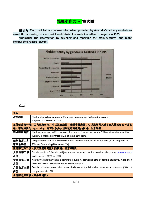
雅思小作文–柱状图题目1:The chart below contains information provided by Australia’s tertiary institutions about the percentage of male and female students enrolled in different subjects in 1995.Summarize the information by selecting and reporting the main features, and make comparisons where relevant.范文:1/ 4题目2:The chart below contains information about USA marriage and divorce rates between 1970 and 2000, and the marital status of adult Americans in two of the years.Summarize the information by selecting and reporting the main features, and make comparisons where relevant.2/ 4读图:动态图【因为有时间】,需要描述变化趋势These two graphs illustrate the change of marital status of American between 1970 and 2000.【改写题目】According to the first graph,there were 2.5m marriages in both 1970 and 1980, and then this figure decreased gradually during the next two decades, reaching to 2m in 2000. By comparison, the number of divorces first increased from 1m in 1970 to around 1.4 in 1980 and then slowly declined back to 1m in 2000.【分类描述第一幅柱状图,时态:一般过去时】As can be seen from the second bar chart,the percentage of married American adults dropped by more than 10% , from 70% in 1970 to less than 60% in 2000. Meanwhile, the percentage of adult Americans who were never married increased from about 15% in 1970 to20% in 2000, and despite still less than 10% , the proportion of divorced adults significantly went up from 1970 to 2000. Moreover, the percentages of the widowed in 1970 and 2000 accounted for less than 10% respectively, and showed a slight drop.【分类描述第二幅柱状图,时态:一般过去时】In conclusion, marital status of Americans in 2000 was not as optimistic as that of three decades ago. (1781.如果有两幅图表,则分成2段分别一一描述2.表示数值上升下降的常用句式有:•The number of …dropped from … to …•The percentage of …increased from about … to less than…•The proportion of … significantly went up from … to …3.切忌没有结论。
雅思写作小作文范文 雅思写作柱状图bar chart 影响工作表现的因素.doc
雅思写作小作文范文雅思写作柱状图bar chart 影响工作表现的因素今天我们雅思写作小作文范文的文章来研究下柱状图bar chart。
该图表展示的内容为某大型公司人力资源部门所进行的调查研究的结果,即影响工人表现的因素有哪些。
该研究的对象为两组工人,一组年龄分布在18到30岁,另一组年龄位于45到60岁之间。
小编搜集了一篇高分范文,以供大家参考。
雅思写作小作文题目The bar chart below shows the results of a survey conducted by a personnel department at a major company.Summarise the information by selecting and reporting the main features, and make comparisons where relevant.雅思写作小作文范文The bar graph shows the results of a survey which was conducted by a company and gives data on the important factors that determine the work performance of employees. As is observed, chances for personal development, relaxed working environment, opportunities for promotion and salary are the main motivating factors for young people for their work performance while comparatively aged people’s work performance is affected by the factors like money, competent boss and team spirit.该柱状图展示了某公司进行的调查研究的结果,并给出了决定员工工作表现的重要因素。
英语考试作文-8日雅思写作考试小作文范文:柱状图

英语考试作文8日雅思写作考试小作文范文:柱状图The chart below shows the heath spending among five different countries in 2002本题属于静态柱图。
柱子的数目比较多,且每个国家类别中柱子的分布特征也大同小异。
因此考生在处理数据时,务必对比分析不同国家对于同一个项目支出比例的差别。
此外还需多多观察不同项目支出之间的关系,以便突出强调图形最大的特征(数值重点)经典传送门:考官simon 9分写作大小范文共80篇大赏真题传送门:2017全年雅思写作真题范文大汇总(第一时间更新)范文:The bar chart compares the proportion for health expenditure of GDP in five nations in the year 2002.Overall, it is obvious that apart from USA, the percentage of public funding was higher than that of theprivate one among other four countries. And the distinction between these two categories in France was the biggest.Compared with people living in other nations, American themselves paid more for medical bills, reaching 12%; on the contrary, Japanese and French only had to shoulder about 2% of medical cost. As for Germany, they spent a little more than Italian.Referring to public spending, it is interesting to notice that USA also allocated the most proportion for healthcare, at approximately 10%, almost tripled that in Japan whose public spending was the least. German’s public spending ranked the second place ( 9%), which was the same as its ranking in terms of private funding.According to the data illustrated above, we can clearly see that the total spending in USA was the highest, while in Japan was the lowest. Besides, France and German stood at the same ranking.原创来自小站范钰红老师 183 words。
雅思小作文柱形图真题

雅思小作文柱形图真题英文回答:The bar chart illustrates the percentage of people in different age groups who participated in various leisure activities in a particular country. Overall, it can be observed that younger people tend to engage in more physical activities, while older individuals prefer more sedentary leisure activities.Looking at the data in more detail, it is evident that the highest percentage of individuals participating in physical activities is in the 18-24 age group, with approximately 80% of them engaging in sports. This could be attributed to the fact that younger people are generally more energetic and physically active. For instance, many young adults enjoy playing football, basketball, or going to the gym to stay fit.In contrast, the percentage of people participating inphysical activities decreases as age increases. In the 45-54 age group, only around 50% of individuals are involved in sports. This decline could be due to various factors, such as physical limitations or work commitments. For example, middle-aged adults often have demanding jobs and less free time to dedicate to sports activities.Moving on to sedentary leisure activities, the highest percentage of individuals engaged in reading can be observed in the 55-64 age group, with approximately 70% of them reading books or magazines. This could be because older individuals have more leisure time and enjoy the relaxation and mental stimulation that reading provides. For instance, many retirees find pleasure in reading novels or keeping up with current affairs through newspapers.In conclusion, the bar chart demonstrates that younger people are more likely to participate in physical activities, while older individuals prefer sedentaryleisure activities such as reading. These findings can be attributed to factors such as age-related physical limitations, work commitments, and personal preferences. Itis important to note that these trends may vary across different countries and cultures.中文回答:这个柱状图展示了不同年龄段的人参与各种休闲活动的百分比。
雅思柱状图小作文写作模板
雅思柱状图小作文写作模板雅思小作文柱状图是考试中最常见的一类图形,柱状图如何描述写成为大家棘手的问题。
下面为大家分享雅思柱状图小作文写作模板。
大家可以参考学习。
雅思柱状图写作模板1The bar chart compares the proportion of employees of both genders employed in executive positions in ACNE Oil Company within a one-year period between July 1993 and June 1994.As can be seen from the chart, the percentage of male employees generally increased with the rise of the job categories from Grade E to Grade A while the opposite was true with that of women.Grade A, which was reported as the highest position, was a male dominated one in which only one-tenth of the staff were female while male employees accounted for the rest.When it comes to Grade B and C, men also took up over half of the employees, accounting for 80% and 60%, which are 50% and 10% higher than that of women respectively.However, the situation in the other two jobs categories, which were relatively lower in rank, was totally reversed, with women taking up relatively larger proportion. Men constituted roughly 40% in Grade D, 20% less than that if women and most of the working staff in Grade E were women (over 70%) , twice the percentage of men.To sum up, on the rank ladder of ACME Oil Company, male employees took up a higher and higher proportion than the weaker sex as it gradually went up to the peak -------- Grade A.雅思柱状图写作模板2The chart below shows the amount of money per week spenton fast foods in Britain. The graph shows the trends in consumption of fast foods.Write a report for a university lecturer describing the information shown below.柱状图显示的是1970-1990二十年间英国人每周在快餐上花费了多少钱;曲线图展示的是这二十年间快餐消费的趋势。
雅思写作Task1柱状图考官范文(7)

雅思写作Task1柱状图考官范文(7)(最新版)编制人:__________________审核人:__________________审批人:__________________编制学校:__________________编制时间:____年____月____日序言作文(composition)是经过人的思想考虑和语言组织,通过文字来表达一个主题意义的记叙方法。
作文分为小学作文,中学作文,大学作文(论文)。
作文体裁包括:记叙文、说明文、应用文、议论文。
作文并不神秘,要想写好一篇文章,首先要多看,多想,勤于观察,积累素材。
只有细致的观察生活,积累素材才是写好作文的基础。
首先要明确你要写的主题,认真的审题,列出大纲,不要只注意题目中要求的字有多少,要多注意题目的本身,要多读多想,准确的用好词语和修饰语。
这是审题的关键,要确立好主题的依据,要精心的选材,布局列题,有的材料,还要分析整理。
这就要对材料进行分类,比较,概括,筛选。
我们不要象盖房子那样的把所有的材料都堆砌起来,要合理恰当的组合,具体的说开头和结尾要略写,那么经过就要仔细的推敲,修辞,润色,写好以后不要急于交稿,反复检查认真的修改。
古人说:书读百遍,其义自见。
熟读唐诗三百首,不会作诗也会吟。
这些都说明一个道理,只要你多看书,多读书对你的写作文有一定的好处。
只要你明白这样的一个道理,作文就是要你把生活中喜,怒,哀,乐用文字经过加工,修饰。
整理,也就是我们说的作文。
作文内容英语作文啦 雅思频道特为大家收集整理了雅思写作Task1柱状图考官范文(7)。
认真研读一定的雅思范文及作文模板可以帮助我们检验自己的写作水平,并能很好地吸收和应用优秀范文里的优秀内容~The chart below shows estimated world illiteracy rates by region and by gender for the year 2000.Write a report for a university lecturer describing the information below.Sample Answer:The given bar chart shows the approximate world illiteracy rates by gender and region for the year 2000. As is observed in the given column graph, in all cased, the illiteracy rate among women is higher than men. Developed countries have almost ignorable illiteracy rate and in the contrary, about half of the population in south Asia, Arab states and Africa are illiterate.The illiteracy rate in Latin America / Caribbean and East Asia / Oceania is only 1 percent (approximately), 10 percent and 14 percent (approximately) respectivelyconsidering both male and female. Sub-Saharan Africa, the Arab States and South Asia had rates of approximately 40%, 41% and 45%. Illiterate women are higher than the illiterate men in all the given countries.In the developed countries, the proportion of literacy among men and female is almost similar but the differences increased for Asia, Arab states and Africa. Among the given 6 countries, South Asian population are far more illiterate than any other country.(Approximately 163 words)(This model answer can be followed as an example of a very good answer. However, please note that this is just one example out of many possible approaches.)。
- 1、下载文档前请自行甄别文档内容的完整性,平台不提供额外的编辑、内容补充、找答案等附加服务。
- 2、"仅部分预览"的文档,不可在线预览部分如存在完整性等问题,可反馈申请退款(可完整预览的文档不适用该条件!)。
- 3、如文档侵犯您的权益,请联系客服反馈,我们会尽快为您处理(人工客服工作时间:9:00-18:30)。
雅思写作Task1柱状图考官范文(7)
英语作文啦 雅思频道特为大家收集整理了雅思写作Task1柱状图考官范文(7)。
认真研读一定的雅思范文及作文模板可以帮助我们检验自己的写作水平,并能很好地吸收和应用优秀范文里的优秀内容~
The chart below shows estimated world illiteracy rates by region and by gender for the year 2000.
Write a report for a university lecturer describing the information below.
Sample Answer:
The given bar chart shows the approximate world illiteracy rates by gender and region for the year 2000. As is observed in the given column graph, in all cased, the illiteracy rate among women is higher than men. Developed countries have almost ignorable illiteracy rate and in the contrary, about half of the population in south Asia, Arab states and Africa are illiterate.
The illiteracy rate in Latin America / Caribbean and East Asia /
Oceania is only 1 percent (approximately), 10 percent and 14 percent (approximately) respectively considering both male and female. Sub-Saharan Africa, the Arab States and South Asia had rates of approximately 40%, 41% and 45%. Illiterate women are higher than the illiterate men in all the given countries.
In the developed countries, the proportion of literacy among men and female is almost similar but the differences increased for Asia, Arab states and Africa. Among the given 6 countries, South Asian population are far more illiterate than any other country.
(Approximately 163 words)
(This model answer can be followed as an example of a very good answer. However, please note that this is just one example out of many possible approaches.)。