(完整版)雅思写作小作文饼图真题句子练习PieSentences
雅思小作文饼图范文

雅思小作文饼图范文在雅思小作文中,饼图是一种常见的数据呈现方式。
接下来我们将会给大家提供一篇关于饼图范文的示例,希望能够帮助大家更好地理解和掌握这种写作方式。
饼图范文示例:The pie chart illustrates the proportion of different types of energy production in a certain country in 2018. Overall, it can be seen that the majority of energy production comes from fossil fuels, while renewable energy sources contribute a relatively small portion.Fossil fuels, including coal, natural gas, and oil, accounted for the largest share of energy production at 65%. Among them, oil was the most dominant, making up 35% of the total energy production. Natural gas and coal followed, with 20% and 10% respectively. This indicates that traditional energy sources still play a crucial role in meeting the country's energy demands.In contrast, renewable energy sources only contributed to 20% of the total energy production. Among them, hydroelectric power was the primary source, accounting for 15%. Meanwhile, wind and solar energy made up 3% and 2% respectively. Despite the growing global emphasis on renewable energy, it is clear that in this particular country, the reliance on fossil fuels remains significantly higher.Nuclear energy, on the other hand, made up the remaining 15% of the energy production. This suggests that while it is not as dominant as fossil fuels, nuclear energy still plays a substantial role in the country's energy mix.In conclusion, the pie chart provides a clear overview of the energy production composition in the given country. It highlights the dominance of fossil fuels, the relatively small contribution of renewable energy sources, and the significant role of nuclear energy. This information is crucial for policymakers and stakeholders in making informed decisions about the country's energy future.。
雅思写作Task1小作文饼状图范文:美国消费模式的
思路解析:1. 主要采用折线模式,重点描述数据的改变和趋势2. 留意极值(MAX, MIN)的描述3. 分段的原则可为:上升的一段,下降的一段,保持不变的一段。
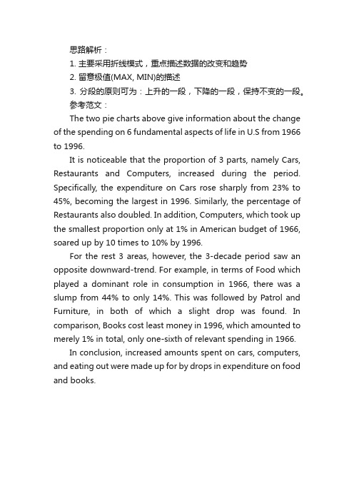
参考范文:The two pie charts above give information about the change of the spending on 6 fundamental aspects of life in U.S from 1966 to 1996.It is noticeable that the proportion of 3 parts, namely Cars, Restaurants and Computers, increased during the period. Specifically, the expenditure on Cars rose sharply from 23% to 45%, becoming the largest in 1996. Similarly, the percentage of Restaurants also doubled. In addition, Computers, which took up the smallest proportion only at 1% in American budget of 1966, soared up by 10 times to 10% by 1996.For the rest 3 areas, however, the 3-decade period saw an opposite downward-trend. For example, in terms of Food which played a dominant role in consumption in 1966, there was a slump from 44% to only 14%. This was followed by Patrol and Furniture, in both of which a slight drop was found. In comparison, Books cost least money in 1996, which amounted to merely 1% in total, only one-sixth of relevant spending in 1966.In conclusion, increased amounts spent on cars, computers, and eating out were made up for by drops in expenditure on food and books.。
两个雅思写作小作文饼图练习题
两个雅思写作小作文饼图练习题雅思小作文饼图是所有图表中出现次数最多的一个,所以需要大家更为关注。
下面为大家搜集整理了雅思写作小作文饼图的练习题,共有两个,都是比较简单的两个饼图,大家在备考的时候,注意结构和顺序的描写。
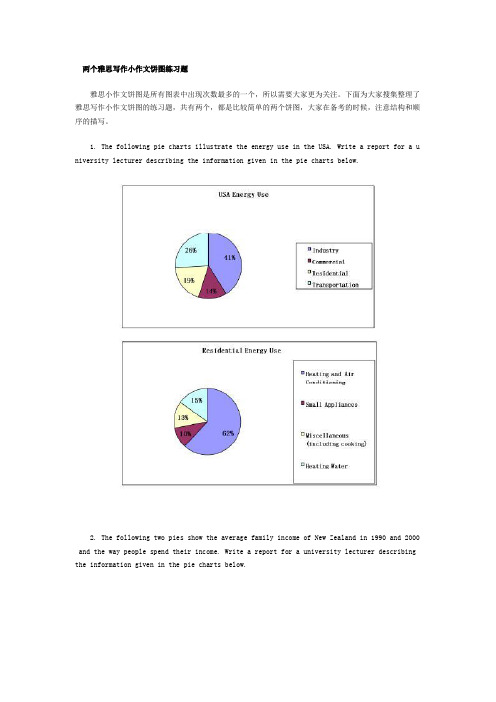
1. The following pie charts illustrate the energy use in the USA. Write a report for a u niversity lecturer describing the information given in the pie charts below.2. The following two pies show the average family income of New Zealand in 1990 and 2000 and the way people spend their income. Write a report for a university lecturer describing the information given in the pie charts below.以上就是这两个雅俗写作小作文饼图练习题的全部内容,包括了美国的能源使用和新西兰的平均家庭收入两个话题。
大家在备考雅思写作小作文饼图的时候,可以适当的练习一下上面的这两个题目。
雅思小作文图表描述方式小结雅思小作文的图表描述是有自己的方式和特点的,掌握了这个方式可以让大家的小作文备考更快也更加贴近考试的要求。
下面就为大家整理了雅思小作文图表描述的方式,供大家参考。
1. 与趋势有关的词语:上升(v.):increase, rise, climb, ascend, surge, shoot up下降(v.):decrease, decline, drop, fall, descend, plunge持平(v.):remain stable, keep constant, level off, flatten out波动(v.):fluctuate, wave, go up and down快速(adj./adv.):considerable/considerably, significant/significantly, substantial/subst antially, remarkable/remarkably, dramatic/dramatically稳步(adj./adv.):steady/steadily, stable/stably, moderate/moderately, modest/modestly缓慢(adj./adv.):slight/slightly, minimal/minimally, marginal/marginally顶点(n. /v.):peak趋势 (n.):trend/ tendency2. 与大小相关的词语:Outnumber (v.):在数量上超过The demonstrators were outnumbered by the policeExceed (v.):在数量上超过Triple (v.):变成三倍The figure has tripled.Double (v.):变成两倍The price of houses has virtually doubled over the past few years.Mount to (v.):达到Counterpart (n.):对应的另一方,比较的另一方 this product is better than its counterpart s此外,朗阁海外考试研究中心建议考生还应考虑一下题中数据和百分比有没有联系,如果有的话还应辅以一些关于比例和占据的语句。
雅思小作文饼图范文解析
我的托福雅思必过雅思小作文饼图范文解析饼图是雅思小作文的常考题型之一,其写作非常值得我们的深入研究,给大家整理了一篇关于饼图的范文,同学们可以来看看。
写作题目:WRITING TASK 1:You should spend about 20 minutes on this task.* The charts below show US spending patterns from 1966 to 1996.* Summarise the information by selecting and reporting the main features, and make comparisons where relevant.You should write at least 150 words.写作范例:The piecharts show changes in American spending patterns between 1966 and 1996.Food and cars made up the two biggest items of expenditure in both years. Together they comprised over half of household spending. Food accounted for 44% of spending in 1966, but this dropped by two thirds to 14% in 1996. However, the outlay on cars doubled, rising from 23% in 1966 to 45% in 1996.Other areas changed significantly. Spending on eating out doubled, climbing from 7% to 14%. The proportion of salary spent on computers increased dramatically, up from 1% in 1996 to 10% in 1996. However, as computer expenditure rose, the percentage of outlay on books plunged from 6% to 1%.Some areas remained relatively unchanged. Americans spent approximately the same amount of salary on petrol and furniture in both years.In conclusion, increased amounts spent on cars, computers, and eating out were made up for by drops in expenditure on food and books.以上就是关于雅思小作文饼图的具体内容,希望各位烤鸭们都能够好好看看,也希望对大家的考试有所帮助。
两个时间的饼图雅思小作文
两个时间的饼图雅思小作文英文回答:The two pie charts compare the distribution of time spent on various activities by men and women in a typical day. Overall, it is evident that both genders allocatetheir time differently.In terms of household chores, women spend asignificantly larger proportion of their day on these activities compared to men. Specifically, women spend 40%of their time on housework, while men only allocate 20% of their time for this purpose. This indicates that women are more involved in domestic responsibilities.On the other hand, men spend a larger percentage oftheir day on work-related activities, such as employmentand commuting. They dedicate 40% of their time for work, while women only spend 30% of their day on these activities. This suggests that men are more focused on their careersand professional responsibilities.Regarding leisure activities, both genders allocate a similar amount of time. Men spend 20% of their day on recreational activities, while women spend 30% of theirtime on leisure. This shows that both genders value their free time and engage in activities that bring them joy and relaxation.中文回答:这两个饼图比较了男性和女性在一天中各种活动上所花费的时间分配。
雅思小作文:饼图写作
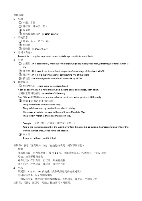
1.步骤①审题,看图②几张饼,几种类(馅)③找最值④特殊数据和比例如25%= quarter2.关键信息①最值:最大,第二,最小②相同值③特殊值如1/2, 1/3, 1/43.动词(占有)Account for; comprise; represent; make up/take up; constitute; contribute4.句型①占据型XX + account for/ make up + the largest/highest/most proportion/percentage of total, which isN%.②拥有型XX + have + the fewest/least proportion/percentage of the chart, at N%.③排序型XX + ranks the first/second, contributing N% of the chart.④被动型the majority/main part of + XXX + made up of XXX5.特殊描述①相同/相似:share equal percentage/trendIt can be seen that / it is noted that A and B share equal percentage, both at N%.比例相近的同时描写respectively/differentlyOnly 30% and 28% Chinese students choose music and art respectively/differently.②倍数5月利润是3月的三倍The profit tripled from March to May.The profit increased by twofold from March to May.There was a twofold increase in the profit from March to MayThe profit in March is tripled as much as in May.Example: 同级比较,占据型,排序型(背下)Asia is the largest continent in the world, over four times as big as Europe. Representing one fifth of the world’s surface area, Africa ranks the second.③百分比A quarter; a third; two third; half双饼图:静态(无关联);动态(有趋势的改变,例如不同年份)1.静态对比和比较(对内和对外),使用1-2次,使用倍数关系,包括相同、不同、极值写法:按图形种类分段对内比较:在段内比,自己比,用关键数据对外比较:在结尾段,彼此比,笼统结合比2.动态结尾段:N年来,XXX的变化(类似线图结尾的变化对比)中间段写法1:两个饼图分别写中间段写法2:将数据转换成线图数据,按增加项、减少向、平稳项分组三饼图:写法1 分别写写法2 按趋势写(同线图)The table compares the difference in the ratio of both males and females who received a diploma in 1993. Obviously, males and females varied considerably in level of education.In 1993, 60% of males graduated with a master’s degree in comparison with 40% of females. When it comes to the ratio of postgraduate diploma, the gap between the males and females become even more significant, the figure of males was more than twice that of females (70% and 30% respectively). In contrast, females outnumbered males in the next two categories. A slightly higher percentage of females at 53% than males at 47% was recorded in the completion of bachelor’s degree. The rise in female rate was also witnessed in the proportion of undergraduate study where females with 65% nearly doubled males with 35%.In conclusion, more males than females received higher degree.段落的描述:美国人民的消费情况In 1996, Americans spent most money on the cars consumption, which was 45%. Restaurant and food shared the same percentages (14%), following the cars. Books accounted for the least proportion of the total, only at 1%.。
雅思17t2饼图作文范文
雅思17t2饼图作文范文
雅思17T2饼图作文范文(口语化版本)。
哇,你看这个饼图,A部分真的是大头啊,占到了XX%,太牛了!这足以说明A在这个领域里可是个大佬级别的存在。
不过,B部分也不错,占了XX%,算是个中坚力量。
虽然没A那
么强势,但也不能小瞧了它,它可是给整个领域增加了不少色彩和
多样性呢。
至于C部分,虽然只占了XX%,但也不能说它不重要。
每个小
部分都是整体的一部分,没有它们,整体就不完整了。
所以,C也
是不可或缺的一份子!
话说回来,A为什么能占这么大份额呢?是不是因为它有特殊
技能或者市场需求大?这个得好好琢磨一下。
B和C虽然比例小,但说不定它们就是未来的新星呢!说不定
哪天就崛起了,所以绝对不能忽视它们!
总的来说,这个饼图就像一幅生动的画,展示了每个部分在整体中的位置和重要性。
而这些数字背后的故事,更是让人好奇和期待。
【雅思写作】小作文
Part Six 小作文饼状图:The two pie charts show the energy use in the United States and the residential energy use respectively. From the pie charts, we can have an overall understanding of the situation of energy use in the United States.From the left pie, we can see clearly that the American energy consumption is divided into four major parts, namely, residential, industry, commercial and transportation. Industry consumes the largest portion, accounting for 41%. Transportation ranks the second, making up 26%. The commercial use and residential use are 14% and 19% respectively.The pie on the right illustrates the residential use of energy. It is obvious that the heating and air conditioning are the number one consumer of energy, 62% of energy being used for them. 15% of energy is used for heating water. Small appliances account for only 10%. The remaining 13% goes to miscellaneous items such as cooking. We can say that heating and air conditioning play a very important role in American daily life.From the chart, we may have a basic understanding of the situation of energy use in the United States.The line graph compares the percentage of the UK population over the age of 4 that listened to radio and watched television throughout the day in 1992.There was a slight increase in the percentage of TV audiences from about 3% at 6 a.m. to about 7% at 8 a.m.. From 8 a.m.to 12 p.m., it remained stable. After that, the percentage of TV audiences rose sharply until 8 p.m., peaking at about 45%. However, the next 10 hours witnessed a dramatic fall in the percentage.It can be seen from the line graph that the percentage of radio audiences increased rapidly from 6 a.m.to 8 a.m.. At 8 a.m. It reached its highest point at 25%. And then, for the rest of the day, there was a gradual drop in the percentage, with a slight increase from 4 p.m. to 5 p.m. and around 11 p.m.Before around 2 p.m., the percentage of people listening to the radio was larger than that of people watching TV. However, for the rest of the day, the percentage of radio was much lower than that of TV. As a whole, throughout the whole day, for UK residents, TV was more popular than radio.范文:The charts compare the source of electricity in Australia and France in the years 1980 and 2000. Between these years electricity production almost doubled, rising from 100 units to 170 in Australia, and from 90 to 180 units in France.In 1980 Australia used coal as the main electricity source (50 units ) and the remainder was produced from natural gas, hydro power (each producing 20 units) and oil (which produced only 10 units). By 2000, coal had become the fuel for more than 75% of electricity produced and only hydro continued to be another significant source supplying approximately 20%.In contrast, France used coal as a source for only 25 units of electricity in 1980, which was matched by natural gas. The remaining 40 units were produced largely from oil and nuclear power, with hydro contributing only 5 units. But by 2000 nuclear power, which was not used at all in Australia, had developed into the main source, producing almost 75% of electricity, at 126 units, while coal and oil together produced only 50 units. Other sources were no longer significant.Overall, it is clear that by 2000 these two countries relied on different principal fuel sources: Australia relied on coal and France on nuclear power.(2)You should spend about 20 minutes on this task.The diagram below shows the method of obtaining water outdoors.You should write at least 150 words.Table one:The table below shows the proportion of different categories of families living in poverty in Australia in 1999. Summarize the information by selecting and reporting the main features, and make comparisons where relevant.Family type Proportion of people from eachhousehold type living in povertySingle aged person Aged couple Single, no children Couple, no children Sole parentCouple with children All households 4% (48, 000) 19% (359, 000) 7% (211, 000) 21% (232, 000) 12% (933, 000) 11% (1,837, 000)Table two:The table below gives information about the underground railway systems in six cities. Summarize the information by selecting and reporting the main features, and make comparisons where relevant.Underground Railway SystemsTable three:The table below gives information about changes in modes of travel in England between 1985 and 2000. Summarize the information by selecting and reporting the main features, and make comparisons where relevant.Table one :The table compares the proportion of people from each household type living in poverty in Australia in the year of 1999.What is noticeable is that in 1999, the percentage of all households living in poverty was as high as 11%, involving 1837000 people, of which sole parent families and single-without-childrenfamilies accounted for 21% and 19% respectively.Apparently, the other three types of families, namely, couples with children, couples without children and single aged people who lived in poverty took up 12%, 7% and 6% respectively, far lower than the percentages of the two above-mentioned types of families.Thus, we have learnt about some statistics about various types of families living in poverty in Australia in 1999.Table two:The table demonstrates the features of the underground railway systems in 6 cities in three different aspects.First, the subway systems in the six cities were opened in time sequence with London being the earliest (in 1863) and Los Angeles the latest (in 2001). The underground railway system had their prime time in the 20th century, which saw the construction of 4 underground railway systems respectively in Paris (1900), in Tokyo (1927), in Washington DC (1976), and in Los Angeles (1981).Second, seen from London to Los Angeles, which happened to be in chronological order of subway construction, the above-mentioned six cities roughly revealed a trend of sharp decrease in the length of the subway route. London ranked No. 1 in this respect, with a length of 394km; Paris came next with 199km; Tokyo was No. 3 with 155km; Washington DC ranked No. 4 with 126 km. Kyoto and Los Angeles were the most interesting, with merely 11km and 28km respectively, nothing comparable with the top 4 cities.Third, we see some really unexpected figures about the number of passages transported by the subway system in these six cities. Tokyo took the lead with 1.927 billion; Paris came next with 1.191 billion; London was No. 3 with 775 million; Washington DC was No. 4 with 144 million. Los Angeles and Kyoto had 50 million and 45 million respectively. Therefore, we can see the big difference as compared with other cities.Overall, the six cities revealed great differences in the history of subway construction, the length of subway lines and the yearly passenger transportation capability.Table three:Through comparison of figures of the average distance traveled per person per year in different modes of transportation, the table indicates the changes that occurred to some common ways of travel by the English people over a span of 15 years from 1985 to 2000.As is indicated in the table, three modes of travel including walking, bicycling, and taking local bus showed a trend of decline while the rest revealed a general trend of rise, though the margins of rise differed.First of all, we see that the average walking distance of people dropped from 255 miles in 1985 to 237 miles in 2000. The average distance of traveling by bike decreased by 10 miles while that by local bus saw the greatest drop by 155 miles.The use of car increased greatly from 3199 miles in 1985 to 4806 miles in 2000. Those who traveled by long distance bus also witnessed a fast increase by 70 miles. People traveling by train and taxi, on the other hand, saw an increase by 77 miles and 29 miles respectively. Meanwhile, we see that the total average distance per person in England rose by 1735 miles between 1985 and 2000.Overall, British people experienced great changes in terms of the modes of traveling and the actual distance traveled over a period of 15 years.1.《蚕丝整理》Sample:As is displayed in the first diagram, the life cycle of the silkworm can be categorized into 4 main stages. First, the life of the silkworm starts from eggs propagated by the moth, and it takes 10 days for each egg to become a silkworm larva that feeds on mulberry leaves. Silkworm larva continues to grow in 4 to 6 weeks, then wrapping itself with silk thread to construct a cocoon in the next 3 to 8 weeks. A moth can be produced from the cocoon in 16 days. The life cycle begins again from then on.Focusing on the second diagram, it illustrates the 5 main steps of the procedure of producing silk cloth. Well generated cocoons will be selected firstly. Before the silk thread can be unwound, cocoons have to be boiled in hot water. One cocoon can produce approximately 300 to 900 metres of silk thread. The unwound thread will be dyed afterwards to be weaved into silk cloth.Overall, the two diagrams reveal the stage of producing cocoons in the life cycle of the silkworm can be used to make silk cloth through 5 simple steps.Cambridge IELTS 6 Version:The first diagram shows that there are four main stages in the life of the silk worm.First of all, eggs are produced by the moth and it takes ten days for each egg to become a silkworm larva that feeds on mulberry leaves. This stage lasts for up to six weeks until the larva produces a cocoon of silk thread around itself. After a period of about three weeks, the adult moths eventually emerge from these cocoons and the life cycle begins again.The cocoons are the raw material used for the production of silk cloth. Once selected, they are boiled in water and the threads can be separated in the unwinding stage. Each thread is between 300 and 900 metres long, which means they can be twisted together, dyed and then used to produce cloth in the weaving stage.Overall, the diagrams show that the cocoon stage of the silkworm can be used to produce silk cloth through a very simple process.2. 《户外取水》The chart describes how water is obtained outdoors.According to the figure, the first step of obtaining water outdoors is to find a hole with green plants on its bottom. Next, remove the green plants in the middle and put a container there. Then, cover the hole with a plastic sheet and place two stones on both ends of it to secure its position. A third stone is laid on the middle of the plastic sheet so that the middle part is also the lowest part.When the sun shines on the green plants in the hole, water evaporates from these plants. The vapor rises up and then cools down to form water drops on the plastic sheet. When there is more and more water, it flows along the sheet to accumulate on the lowest part. Finally, water falls down into the container directly under the middle stone.Thus, water is collected successfully through evaporation from green plants.范文2:The picture describe the procedure of gaining water outdoors. The approach is quite effective in order to survive in an outdoor field situation.Before the whole procedure, several things should be prepared: a container used to hold the water, a large piece of plastic film and some stones. Also, a small ditch which is full of green plants should be found.After preparing all the stuffs, the first step is to put the plastic film to cover the valley. At the same time, some stones have to be set on the edge of the plastic film, so as to make the film become a plane and well fixed. Afterward, the next step is to lay down the last stone in the middle of the plastic film to form a lowest point. Consequently, vast sum of steam given out by the function of plants' respiration will be adhered on the plastic film and further gather to the lowest point. As a result, when the container accumulates some water, the process of collecting water outdoor is thoroughly completed.[文档可能无法思考全面,请浏览后下载,另外祝您生活愉快,工作顺利,万事如意!]。
雅思A类小作文范文 Waste Products 饼图类
You should spend about 20 minutes on this task.The pie charts below show how dangerous waste products are dealt with in three countries.Summarise the information by selecting and reporting the main features, and make comparisons where relevant.Write at least 150 words.The charts compare three countries in terms of the methods they use to treat hazardous waste products.Overall, recycling is the most widely-used approach to treating hazardous waste in Korea, in contrast to Sweden and the UK which rely mainly on landfills. Furthermore, the United Kingdom employs a more varied set of waste handling schemes.In Korea, the most significant share of dangerous waste (70%) is recycled. The second highest proportion, 22%, is buried underground while less than half this figure is incinerated.Sweden, on the other hand, favours landfills over the other two approaches since more than half of all dangerous waste is buried underground. There is little difference between the shares of recycling and burning, as the former accounts for 25% whereas the share of the latter is lower by a margin of 5%.The most popular method in the United Kingdom, like in Sweden, is burying which contributes 82%. The UK also dumps 8% of its waste at sea while treating a similar proportion with chemicals to render it harmless. Incineration is responsible for a mere 2%.(180 words)。
(完整版)piechart饼图
雅思小作文饼图解题思路饼形图与柱形图或者是线形图所截然不同的是它没有了横轴与纵轴,而以饼形的分割来表示百分比,但我们仍可以依照三步的审题分析法来进行观察:Step 1: 观察共有几张饼图,以及它们之间的关系是什么(一般说来,雅思图表题中极少见到单饼图);Step 2: 观察每张饼图中有哪几个区域,以及各个区域分别代表什么;Step 3: 观察单个饼图中各区域间的百分比差异,以及相同区域在各个饼图间的百分比的比较或发展。
现在我们就来分析一下下面的饼形图:Many women want or need to continue working even after they havechildren. The charts below show the working patterns of mothers withyoung children to care for.Write a report for a university lecturer describing the information on thecharts below.Step 1: 一共有四张饼图,它们分别按照由母亲照料的最年幼孩子的年龄大小来进行排列,从0 ~ 2岁到10岁以上;Step 2: 每张饼图中都有三种区域:白色区、深色区和浅色区。
它们分别表示母亲的工作状态:白色区为“没有工作”,深色区为“兼职工作”,浅色区为“全职工作”;Step 3: 白色区在0 ~ 2岁时处于绝对优势,占70%,而随着孩子年龄的增长,白色区渐渐地变小,在10岁以上时只有26%;深色区在孩子年幼时比例很小:0 ~ 2岁时只有19%。
随着孩子的长大,深色区急剧扩张,在5 ~ 9岁时达到顶峰,占48%,但在10岁以后却轻微下降到45%;而浅色区的变化则是在同一时期内分别占到了11%,11%,14%和29%。
当然,在开始写文章之前,我们还必须决定文章所用的时态。
- 1、下载文档前请自行甄别文档内容的完整性,平台不提供额外的编辑、内容补充、找答案等附加服务。
- 2、"仅部分预览"的文档,不可在线预览部分如存在完整性等问题,可反馈申请退款(可完整预览的文档不适用该条件!)。
- 3、如文档侵犯您的权益,请联系客服反馈,我们会尽快为您处理(人工客服工作时间:9:00-18:30)。
Pie chart
In 1980 Australia used coal as the main electricity source(50 units) and
the remainder was produced from natural gas, hydro power(each
producing 20 units) and oil,which produced only 10 units.
在1980年,澳大利亚使用煤作为主要的电力来源(50 units),剩下的电力由
天然气,氢能(两者各产生20 units)和石油,它仅仅只产生10 units。
By 2000, coal had become the fuel for more than 75% of electricity
produced and only hydro continued to be another significant source
supplying approximately 20%.
到了2000年,煤已经成为了 产生超过75%电力的 能源了,同时只有氢能继
续成为另一个重要的供应来源,大约是20%。
In contrast, France used coal as a source for only 25 units of electricity in
1980, which was matched by natural gas.
相比之下,法国在1980年用煤供电只有25 units,这和天然气相同。
The remaining 40 units were produced largely from oil and nuclear
power, with hydro contributing only 5 units.
剩下的40 units 主要都产生于石油和核能,其中氢能只贡献了5 units。
But by 2000 nuclear power, which was not used at all in Australia, had
developed into the main source, producing almost 75% of electricity, at
126 units, while coal and oil together produced only 50 units.
但是到了2000年,在澳大利亚不会使用的核能,已经发展成为了主要能源,生
产大约75%的电力,达到126 units, 相反煤和石油一共只生产 50 units。
In all three years, the greatest expenditure was on staff salaries.
在这三年中,最大的花费是在员工工资上。
But while other workers’ salaries saw a fall from 28% in 1981 to only
15% of spending in 2001,teachers’pay remained the biggest cost,
reaching 50% of total spending in 1991 and ending at 45% in 2001.
但是尽管其他工人的工资见证了一个从1981年的28%到2001年仅仅15%的
下降,老师的工资依然保持着最大的花费,在1991年达到了总共花费的50%
和2001年结束于45%。
Expenditure on resources such as books had increased to 20% by 1991
before decreasing to only 9% by the end of the period.
在这个时期末下降到只有9%之前,在资源,比如书上面的花费到1991年上涨
到了20%。
This cost decreased to only 5% of total expenditure in 1991 but rose
dramatically in 2001 when it represented 23% of the school budget.
这个花费在1991年下降到只有总体花费的5%,但是在2001年剧烈上升,那
个时候它占据了学校预算的23%。
Similarly, the cost of insurance saw a rising trend, growing from only 2%
to 8% by 2001.
相似地,保险的花费看见了一个增长趋势,从只有2%增长到2001年的8%。
Globally, 65% of degradation is caused by too much animal grazing and
tree clearance, constituting 35% and 30% respectively.
全球的,65%的土地退化是由于过度的放牧和砍伐树木,两者分别占据了35%
和30%。
A further 28% of global degradation is due to over-cultivation of crops.
另外的28%全球退化是由于过度种植。
Other causes account for only 7% collectively.
其他原因占据了整体的7%。
At 36% we can see that the travel sector accounted for the majority of
online sales in 2003, but this percentage had dropped to 29% by 2013.
我们可以看见在2003年旅游部分占据了网络销售量的大部分,占有36%,但
是这个比例到了2013年下降到了29%。
Across the same ten-year period,as an increasing number of people
chose to purchase films and music online, we can see that transactions
went from just 21% to 33%, making it the retail sector with the highest
overall share of the online market.
经历了同样的十年,因为越来越多的人选择网上购买电影和音乐,我们可以看见
交易量从仅仅的21%上升到33%,使之零售部分占有了网络市场整体最高的份
额。
In 2003, the clothing industry boasted an impressive 24% of total online
sales in New Zealand.
2003年新西兰的衣服行业占有了网络销售的24%。
However, by 2013, the figure had fallen considerably to 16%.
然而,到了2013年,这个数据显著地下降到了16%。
Interestingly, online sales of books eventually overtook sales of clothes,
although books still represented only 22% of the market.
有趣的是,书本的网上销售量最终超过了衣服的销售量,尽管书本依然只占有市
场的22%。