经典图表表达模板
外企各种模板 图表 图形展示 大全(超级实用)
Customer Profile
Data Warehousing/Integration
2020/3/27
The press Analyst Investor
CRM
Data Warehousing/Integration
e-CRM
Sales
Service Marketing
2020/3/27
투자자연동)
1단계 (솔루션 개발)
CRM
KMS GW
자료실 E-Mail 문서
ERP
EDMS E-Planning
2020/3/27
SCM
업무관리 인력관리
손익관리 자산관리 고객관리
Supporting Team
President & CEO Planning & Public
Click to add Text
2020/3/27
Integration Branding & Identity
Brand A
Brand B
Brand C
Strategy
Contents
Solution
Ebiz 기반의 웹사이트 통합 전략 제고
마케팅(홍보) 및 비지니스 채널화 장기적 안목으로 통합 시스템과 솔루션 검토
Consulting MU
• Consulting 1 team • Consulting 2 team • Consulting 3 team
R&D MU
• eBiz team • Solution team
2020/3/27
text
text
text
text
完整版树状图可视化图表集模板

此部分内容作为文字排版占位显示 (建议使用主题字体)
标题文本预设
此部分内容作为文字排版占位显示 (建议使用主题字体)
标题文本预设
此部分内容作为文字排版占位显示 (建议使用主题字体)
标题文本预设
此部分内容作为文字排版占位显示 (建议使用主题字体)
标题文本预设
此部分内容作为文字排版占位显 示 (建议使用主题字体)
04
标题文本预设
此部分内容作为文字排版占位显示 (建议使用主题字体)
06
标题文本预设
此部分内容作为文字排版占位显示 (建议使用主题字体)
标题文本预设
此部分内容作为文字排版占位显示 (建议使用主题字体)
标题文本预设
此部分内容作为文字排版占位显示 (建议使用主题字体)
标题文本预设
此部分内容作为文字排版占位显示 (建议使用主题字体)
标题文本预设
此部分内容作为文字排版占位显 示
(建议使用主题字体)
标题文本预设
此部分内容作为文字排版占位显 示
(建议使用主题字体)
标题文本预设
此部分内容作为文字排版占位显 示 (建议使用主题字体)
标题文本预设
此部分内容作为文字排版占位显 示 (建议使用主题字体)
标题文本预设
此部分内容作为文字排版占位显示 (建议使用主题字体)
标题文本预设
此部分内容作为文字排版占位显示 (建议使用主题字体)
标题文本预设
标题文本预设
此部分内容作为文字排版占位显 示 (建议使用主题字体)
标题文本预设
此部分内容作为文字排版占位显示 (建议使用主题字体)如需更改请在(设 置形状格式)菜单下(文本选项)中调整
10%
图表作文万能模板

图表作文万能模板
图表作文的句式
•1. According to the figures shown in the table/graph we can see/conclude that…
•2. We can see/We have noted/It can be seen from the table/chart/graph that…
• 5. After considering the information in the graph/table/chart, we might conclude that…
• 6.The chart/graph/table shows a minimal/slight/slow/steady/marke d/dramatic/sharp/sudden increase/rise/decline/reduction/fall /drop in…compared with those of last year/10 years ago/last century…
范文: There are differences between high school in China and that in the United States. As is shown in the chart, High school in China lasts three years, while in most US states four years. In China, students are in fixed classes and classrooms. Every day they study hard for about 10 hours and have a solid knowledge. But in the United States, students don’t have fixed classes or classrooms and they go to their teachers’ offices for classes. They spend about 8.5 hours on study a day. They are lively and good at activities organized by themselves. However, in China, the students’ extra curricular activities are mostly organized by schools and classes
图表素材大全PPT模板九 (6)
201X
Lorem ipsum dolor sit amet, consectetuer adipiscing elit, sed diam nonummy nibh
201X
Lorem ipsum dolor sit amet, consectetuer adipiscing elit, sed diam nonummy nibh
Lorem ipsum dolor sit amet, consectetur adipiscing elit, sed do
201X Join
Lorem ipsum dolor sit amet, consectetur adipiscing elit, sed do
201X Go Global
Lorem ipsum dolor sit amet, consectetur adipiscing elit, sed do
Support
Lorem ipsum dolor sit consectetuer adipiscing
201X Concept
Lorem ipsum dolor sit amet, consectetur adipiscing elit, sed do
Company Timeline
Put your Amazing Sub Title Here
Process 4
Lorem ipsum dolor sit amet, consectetur adipiscing,
Clients Testimonial
Put your Amazing Sub Title Here
MR. Joh doe
Contrary to popular belief, Lorem Ipsum is not simply random text. It has
图表作文万能模板
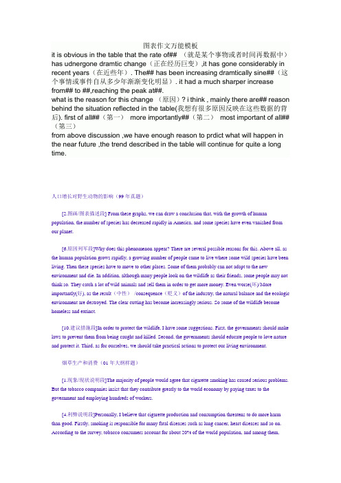
图表作文万能模板it is obvious in the table that the rate of## (就是某个事物或者时间再数据中)has udnergone dramtic change(正在经历巨变),it has gone considerably in recent years(在近些年). The## has been increasing dramtically sine##(这个事情或事件自从多少年渐渐变化明显). it had a much sharper increase from## to ##,reaching the peak at##.what is the reason for this change (原因)? i think , mainly there are## reason behind the situation reflected in the table(我想有很多原因反映在这些数据的背后). first of all##(第一)more importantly##(第二)most important of all## (第三)from above discussion ,we have enough reason to prdict what will happen in the near future ,the trend described in the table will continue for quite a long time.人口增长对野生动物的影响(99年真题)[2.图画/图表描述段] From these graphs, we can draw a conclusion that, with the growth of human population, the number of species has decreased rapidly in America, and some species have even vanished from our planet.[6.原因列军段]Why does this phenomenon appear? There are several possible reasons for this. Above all, as the human population grows rapidly, a growing number of people came to live where some wild species have been living. Then these species have to move to other places. Some of them probably can not adapt to the new environment and die. In addition, although many people look on the wildlife as their friends, some people may not think so. They catch a lot of wild animals and sell them in order to get more money. Even worse(坏)/More importantly(好), as the result(中性)/consequence(贬义)of the industry, the natural balance and the ecologic environment are destroyed. The clear cutting has become increasingly serious. So some of the wildlife become homeless and extinct.[10.建议措施段]In order to protect the wildlife, I have some suggestions. First, the governments should make laws to prevent them from being caught and killed. Second, the governments should educate people to love nature and protect it. Third, as for ourselves, we should take practical actions to protect our living environment.烟草生产和消费(01年大纲样题)[1.现象/现状说明段]The majority of people would agree that cigarette smoking has caused serious problems. But the tobacco companies insist that they contribute greatly to the world economy by paying taxes to the government and employing hundreds of workers.[4.利弊说明段]Personally, I believe that cigarette production and consumption threatens to do more harm than good. Firstly, smoking is responsible for many fatal diseases such as lung cancer, heart diseases and so on. According to the survey, tobacco consumers account for about 20% of the world population, and among them,three million people die from smoking-related diseases every year. The fact that the output of tobacco production is reduced from 143.64 billion pounds in 1994 to 142 billion pounds in 1995 also suggests that people have come to realize the negative effects of smoking. Secondly, tobacco consumption is extremely wasteful of money. As is indicated in the pictures, 200 billion US dollars is lost due to smoking each year. Obviously, the total loss of money around the globe substantially exceeds the gain in the industry.[8.归纳结论段]In conclusion, as the economic development aims at making our life better, we cannot sacrifice our health for short-term financial benefits. If we have to spend more and more money providing medical services for those who suffer from smoking-related illnesses, the notion of promoting economy via tobacco production is not justifiable. It is high time that we fought for the total tobacco ban.日用花销统计Statistics in People's Daily Expenses in Xi'anYearItem 1995 1996 1997 1998 1999Food 66% 61% 48% 41% 36%Clothing 9% 10% 12% 15% 18%Recreation 4% 5% 8% 9% 11%[2.图画/图表描述段]What is shown in the table above indicates that dramatic changes have taken place in the daily expenses in Xi' an from 1995 to 1999. The expenses on food have declined by 30% while those on clothing and recreation have increased respectively by 9% and 7%. The statistics of rise and fall seem to exist in isolation but closely related to one another.[6.原因列军段]There are two factors accounting for these changes. Development in economy is an essential one in the five years. The increased income resulting from economic growth plays an important part in the less expense on food. Hence, a small percentage of total income is enough to cover food expense. Another one is the changes in life style. When food presents no worry to the average, people begin to focus more of interest on handsome appearance and happy leisure time. As a result of such a shift, spending on clothing and recreation increased year after year.[9.趋势预测段]From the analyses made above, we may come to the conclusion that people's living standards in Xi' an have been constantly improved between 1995 and 1999. With the further growth in economy and more changes in life style, the tendency indicated in the table will continue in the table will continue in the better direction.。
高考图表作文实用模板
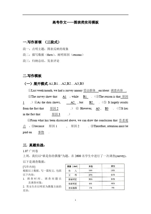
高考作文——图表类实用模板一.写作要领(三段式)段一:点明主题:图表反映的现象段二:描写数据(facts),阐明原因(reasons)段三:归纳总结,发表评论二.写作模板(一)展开模式A1,B1…A2,B2…A3,B3①Last week/month, we had a survey amony受访群体on/about 调查内容.②The survey show that ___A1__,while___B1___.(③The reason is that 原因1____.)④As the data shows, ______A2__, but____B2____.(⑤It largely results from the fact that____原因2________.)⑥However, __A3 , __B3___.(⑦It lies in the fact that____ ___原因3_____.)⑧From what has been discussed above, we can draw the conclusion that_作者观点__,⑨because___原因1______, __原因2______.⑩Therefore, attention must be paid on____事物___.三. 真题实战:1.07广州卷上周,我们以“谁是你的偶像”为题,在2600名学生中进行了一次调查(survey)。
以下是调查数据:[写作内容]根据以上数据,写一篇短文,包括以下内容:1. 调查时间、调查问题以及调查对象;2. 男女生在以明星为偶像方面的差异;3. “父母”在男女生偶像中的排序差异;4. 男女生在以伟人为偶像方面的异同;5. 你的偶像及理由。
[写作要求]1.只能使用5个句子表达全部内容;2.文中不能出现真实姓名和学校名称。
[评分标准]句子结构准确,信息内容完整,篇章结构连贯。
雅思作文模板:图表作文模板12个
雅思作文模板:图表作文模板12个雅思图表作文离不开数据的描述,所以大家如果想要在雅思图表作文当中取得好成绩,就一定要掌握一些数据描述的模板。
下面就为大家总结了12个关于数据描述的雅思图表作文模板,大家可以在备考的时候进行参考。
1.the table shows the changes in the number of...over the period from...to... 该表格描述了在...年之...年间...数量的变化。
2.the bar chart illustrates that... 该柱状图展示了...3.the graph provides some interesting data regarding... 该图为我们提供了有关...有趣数据。
4.the diagram shows (that)... 该图向我们展示了...5.the pie graph depicts (that).... 该圆形图揭示了...6.this is a cure graph which describes the trend of... 这个曲线图描述了...的趋势。
7.the figures/statistics show (that)... 数据(字)表明...8.the tree diagram reveals how... 该树型图向我们揭示了如何...9.the data/statistics show (that)... 该数据(字)可以这样理解...10.the data/statistics/figures lead us to the conclusion that... 这些数据资料令我们得出结论...11.as is shown/demonstrated/exhibited in the diagram/graph/chart/table... 如图所示...12.according to the chart/figures... 根据这些表(数字)...以上就是关于雅思图表作文数据描述的模板,大家可以看到这些雅思图表作文的模板是根据雅思图表的种类的不同而有不同的描述方法。
简洁大方漂亮的ppt模板--图表
Click to edit Master title style
Click to edit Master subtitle style
Click to edit Master title style
Click to edit Master subtitle style
Click to edit Master subtitle style
Click to edit Master title style
Click to edit Master subtitle style
Click to edit Master title style
Click to edit Master subtitle style
Click to edit Master subtitle style
Click to edit Master title style
Click to edit Master subtitle style
Click to edit Master title style
Click to edit Master subtitle style
Click to edit Master title style
Click to edit Master subtitle style
Click to edit Master title style
Click to edit Master subtitle style
Click to edit Master title style
Click to edit Master subtitle style
33张精美信息图表数据图表合集PPT模板
设计专业的请输入您需要的内容,自成立以来为各中小企业、 白领、学生、自由职业者提供PPT设计服务达千次。
10
输入标题
设计专业的请输入您需要的内容,自成立以来 为各中小企业、白领、学生、自由职业者提供 PPT设计服务达千次。
设计专业的请输入您需要的内容,自成立以来为各中小企业、 白领、学生、自由职业者提供PPT设计服务达千次。
请输入您需要的内容
设计专业的请输入您需要的内容,自成 立以来为各中小企业、白领、学生、自 由职业者提供PPT设计服务达千次。
输入标题
请输入您需要的内容
设计专业的请输入您需要的内容,自成 立以来为各中小企业、白领、学生、自 由职业者提供PPT设计服务达千次。
请输入您需要的内容
设计专业的请输入您需要的内容, 自成立以来为各中小企业、白领、 学生、自由职业者提供PPT设计服 务达千次。
设计专业的请输入您需要的内容,自成 立以来为,设计专业的PPT设计
设计专业的请输入您需要的内容,自成 立以来为,设计专业的PPT设计
设计专业的请输入您需要的内容,自成 立以来为,设计专业的PPT设计
输入标题
6
请输入您需要的内容
设计专业的请输入您需要的内容,自成 立以来为各中小企业、白领、学生、自 由职业者提供PPT设计服务达千次。
70% 50% 20% 10%
5
输入标题
设计专业的请输入您需要的内容,自成立以来为,设计专业的PPT 设计
输入标题
设计专业的请输入您需要的内容,自成立以来为,设计专业的PPT 设计
输入标题
设计专业的请输入您需要的内容,自成立以来为,设计专业的PPT 设计
输入标题
设计专业的请输入您需要的内容,自成立以来为,设计专业的PPT 设计
16张精美甘特图图表教学课件PPT模板
甘特图示范
Description
Description
Description
Description
Description
Description
For every 6 emails received, we get 3 Phone calls. Suitable for all categories business and personal presentation, Suitable for all categories business and personal presentation
3rd Week
4th Week
1
2
3
4
5
6
7
1
2
3
4
5
6
7
1
2
3
4
5
6
7
1
2
3
4
5
6
7
Description
Description
Description
Description
甘特图示范
Project step
Jan
Feb
Mar
Apr
May
June
July
Aug
Oct
Nov
Dec
Sep
Process 01
Description
For every 6 emails received, we get 3 Phone calls. Suitable for all categories business and personal presentation, Suitable for all categories business and personal presentation
- 1、下载文档前请自行甄别文档内容的完整性,平台不提供额外的编辑、内容补充、找答案等附加服务。
- 2、"仅部分预览"的文档,不可在线预览部分如存在完整性等问题,可反馈申请退款(可完整预览的文档不适用该条件!)。
- 3、如文档侵犯您的权益,请联系客服反馈,我们会尽快为您处理(人工客服工作时间:9:00-18:30)。
Dataset 1 Dataset 2
24 24
25
30
Bar graph, 12 categories
Axis title
Category A Category B Category C Category D Category E Category F Category G Category H Category I Category J Category K Category L
100% stacked bar graph
Category A
6
Category B
10
Category C
10
Category D
Do not add unit
120
symbols (e.g., $
or M) to the axis
100
labels (except for
%).
80
Set the intervals
60
to the largest
reasonable value
40
possible
20
0
All numbers in the graph (data and axis labels) should be the same size. Text labels may be smaller if necessary
Presenter/timing Presenter/timing Presenter/timing Presenter/timing Presenter/timing Presenter/timing
Create graphs using the native PowerPoint chart software, rather than pasting graphs from Excel
In general, use whole numbers unless you have a specific reason for including decimals
Axis titles are optional and should not be used if the information is given elsewhere or is self-evident
In general, include all relevant information while keeping the graph as simple as possible
Cumulative number of Rhodes Scholars, 1900-1980
Harvard vs. Yale
In general, do not use borders on bars, columns, pie pieces, et cetera
If resizing graphs in the main PowerPoint application, make sure to use only the corner object boxes (see diagram)
Bar graph, 2 data series
Axis title
Category A Category B Category C Category D Category E
0
Title, time period
Subtitle
6 6
10 10
7 7
15 15
5
10
15
20
Axis title
Source: Text is Arial, 8-point, plain; a semicolon should separate each item; the line should end in a period.
Presenter/timing Presenter/timing Presenter/timing Presenter/timing Presenter/timing Presenter/timing
Bar graph, 1 data series
Category A
Title, time period
0
Title, time period
Subtitle
6 10
7
15 13 7 8 10 4
24 22
5
10
15
20
25
Axis title
28 30
Source: Text is Arial, 8-point, plain; a semicolon should separate each item; the line should end in a period.
Title is bold, with the time period appearing after a comma. Always write out the year in full. The optional subtitle provides additional info on the data and is not bold, italics, 2 points smaller than the title. Line s
Category B
10
Axis title
Category C
7
Category D
24
Category E 0
15
5
10
15
20
25
30
Axis title
Source: Text is Arial, 8-point, plain; a semicolon should separate each item; the line should end in a period.
35
30
25
20
15
10
5
4
0 1995
7 1996
32 25 16
1997
1998E
1999E
The safest way to change the size or position of graph elements is to do so within the native graph application itself
When the data refers to projected or estimated figures, add “E” to the year label
Remember to adjust the document title tracker when you create a new document. It should match the name of the PowerPoint file
Try to use colors from the main color palette as much as possible
When choosing colors for adjacent graph elements, be sure to alternate light and dark colors (examples from the color palette shown below):
Growth in color bars, 1990-2000
Millions of Pixels
45
40
35
30
25
1
20
5
15
3
4
3
9 7
5
7
10
10
10
6
5 6
0
10
10
1990
1995
2000
If a given data element is too small to fit a data label, place the label outside in a separate text box
Yale Harvard
42 1900
78 1920
16 20
50 25
1940
1960
99 32
1980
If a legend is needed, place it to the right of the graph or within the plot area. Do not add a border and set the font to roughly the same size as the data labels
Participation in Harley Davidson conventions, 1998-2002
Thousands of people
35
When used, axis
30
tick marks should
be placed on the
25
outside of the axis
20
16
Shadow R-153 G-153 B-153
R-255 G-254 B-243
R-204 G-204 B-153
R-073 G-133 B-163
R-67 G-67 B-148
Agenda
General rules Bar and column graphs Line and combination graphs Area graphs Pie graphs Scatter plot and bubble graphs
Stacked bar graph
Title, time period
Subtitle
Category A 6 6 3 5 1 21
Category B 10