
雅思写作小作文范文 雅思写作混合图 出行原因与相关因素.doc
雅思写作小作文范文雅思写作混合图出行原因与相关因素
今天我们雅思写作小作文范文的文章来研究下混合图。
该混合图由柱状图和饼状图构成。
其中柱状图描述了2009年美国居民出行的各种原因(上下班,私人原因,购物,社交娱乐以及走亲访友),而饼状图的内容则是他们在出行过程中所关心的各种问题。
小编搜集了一篇相应的考官范文,以供大家参考。
雅思写作小作文题目
The charts below show reasons for travel and the main issues for the travelling public in the US in 2009.
Summarise the information by selecting and reporting the main features, and make comparisons where relevant.
雅思写作小作文范文
The bar chart and pie chart give information about why US residents travelled and what travel problems they experienced in the year 2009.
柱状图和饼状图所显示的信息为2009年美国居民为什么出行以及他们在出行过程中所遇到的各种问题。
It is clear that the principal reason why Americans travelled in 2009 was to commute to and from work. In the same year, the primary concern of Americans, with regard to the trips they made, was the cost of travelling.
很明显,2009年美国人民出行的主要原因是上下班。
同年中,美国人民对于他们出行最关心的问题为交通花费。
Looking more closely at the bar chart, we can see that 49% of the trips made by Americans in 2009 were for the purpose of commuting. By contrast, only 6% of trips were visits to friends or relatives, and one in ten trips were for social or recreation reasons. Translation from Laokaoya website. Shopping was cited as the reason for 16% of all travel, while unspecific ‘personal reasons’ accounted for the remaining 19%.
更加细致的看一下柱状图,我们可以看到2009年美国人民百分之四十九的旅行是为了上下班。
相比之下,只有百分之六的出行是为了拜访朋友或者亲戚,百分之十的出现是由于社交或者休闲娱乐的原因。
因为购物出行占到出行总量的百分之十六,而没有特指的私人原因占到剩下的百分之十九。
According to the pie chart, price was the key consideration for 36% of American travellers. Almost one in five people cited safety as their foremost travel concern, while aggressive driving and highway congestion were the main issues for 17% and 14%
of the travelling public. Finally, a total of 14% of those surveyed thought that access to public transport or space for pedestrians were the most important travel issues.
根据饼状图,价格是百分之三十六的美国出行者考虑的最主要原因。
几乎每五个人里就有一个认为安全是他们出行时最关心的因素。
而分别有百分之十七和百分之十四的公众认为不良驾驶和高速拥堵是他们主要关心的问题。
最终,接受调查的人群中有百分之十四认为公共交通和行人空间是出行是最主要的问题。
雅思写作小作文高分范文,快速提升写作成绩。
雅思写作小作文范文汇总 雅思写作高分范文.doc

雅思写作小作文范文汇总雅思写作高分范文相比于大作文而言,雅思写作小作文的分数要低一些,只占到整个写作的三分之一。
相应的,它的套路也更加明显,类型更加固定。
到目前为止,小作文的图表一共也就出现过柱状图bar chart,饼状图pie chart,线状图line graph,表格table,地图map,以及流程图flow chart等。
其描述方式翻来覆去也就那么几种:上升、下降、极值等。
因此,小作文更加容易得到高分,能够在一定程度上提升写作的整体成绩。
为了帮助大家备考,小编搜集了一些小作文方面的考官范文或者高分范文。
大家可以从中学习整篇文章的布局,每一段落所描述的内容,在数据较多的时候如何进行选取,如何进行分类比较,如何进行综述,描述变化或者对比都有哪些词汇,具体的句子结构又该如何变化等。
希望大家到最后都能取得理想的成绩。
点击这里查看雅思写作大作文的高分范文柱状图bar chart雅思写作小作文范文雅思写作柱状图离婚与结婚数量雅思写作小作文范文雅思写作柱状图bar chart 游戏与上网时间雅思写作小作文范文雅思写作柱状图bar chart 通话时间雅思写作小作文范文雅思写作柱状图bar chart 法国与印度年龄分布雅思写作小作文范文雅思写作柱状图bar chart 游戏销售量雅思写作小作文范文雅思写作柱状图bar chart 大胃王比赛雅思写作小作文范文雅思写作柱状图bar chart 金牌数量雅思写作小作文范文雅思写作柱状图bar chart 学习背后的原因雅思写作小作文范文雅思写作柱状图bar chart 交通事故雅思写作小作文范文雅思写作柱状图bar chart 房价变化雅思写作小作文范文雅思写作柱状图bar chart 日常花费雅思写作小作文范文雅思写作柱状图bar chart 教育与科研的参与度雅思写作小作文范文雅思写作柱状图bar chart 欧国国家垃圾处理雅思写作小作文范文雅思写作柱状图bar chart 医院急救对象雅思写作小作文范文雅思写作柱状图bar chart 快餐食用频率雅思写作小作文范文雅思写作柱状图bar chart 男女休闲时间雅思写作小作文范文雅思写作柱状图bar chart 无报酬工作时间雅思写作小作文范文雅思写作柱状图bar chart 不同国家电话数量雅思写作小作文范文雅思写作柱状图bar chart 影响工作表现的因素雅思写作小作文范文雅思写作柱状图bar chart 唱片购买人群雅思写作小作文范文雅思写作柱状图bar chart 文盲比例雅思写作小作文范文雅思写作柱状图bar chart 就业率雅思写作小作文范文雅思写作柱状图bar chart 六种商品的花费雅思写作小作文范文雅思写作柱状图bar chart 监狱关押人数雅思写作小作文范文雅思写作柱状图bar chart 上下班交通方式雅思写作小作文范文雅思写作柱状图bar chart 医疗资金与死亡数量雅思写作小作文范文雅思写作柱状图bar chart 美国心脏病患者数量雅思写作小作文范文雅思写作柱状图bar chart 阿联酋大学毕业生雅思写作小作文范文雅思写作柱状图bar chart 海湾国家女性生育率fertility rate 饼状图pie chart雅思写作小作文范文雅思写作饼状图pie chart 宾馆调查问卷雅思写作小作文范文雅思写作饼状图pie chart 城市用水雅思写作小作文范文雅思写作饼状图pie chart 学校花费雅思写作小作文范文雅思写作饼状图pie chart 健康饮食雅思写作小作文范文雅思写作饼状图pie chart 电力来源雅思写作小作文范文雅思写作饼状图pie chart 宾馆服务满意度雅思写作小作文范文雅思写作饼状图pie chart 英国景点数据统计雅思写作小作文范文雅思写作饼状图pie chart 美国居民花费表格题table雅思写作小作文范文雅思写作表格题table 六个城市的地铁信息雅思写作小作文范文雅思写作表格题table 咖啡与香蕉雅思写作小作文范文雅思写作表格题table 垃圾数量雅思写作小作文范文雅思写作表格题table 骑行上班人数雅思写作小作文范文雅思写作表格题table 手机的不同用途雅思写作小作文范文雅思写作表格题table 生活花费雅思写作小作文范文雅思写作表格题table 时间分配雅思写作小作文范文雅思写作表格题table 不同家庭类型分布雅思写作小作文范文雅思写作表格题table 城市地铁系统雅思写作小作文范文雅思写作表格题table 教育问题雅思写作小作文范文雅思写作表格题table 餐厅销量雅思写作小作文范文雅思写作表格题table 耐用消费品情况雅思写作小作文范文雅思写作表格题table 国家社会经济指数雅思写作小作文范文雅思写作表格题table 不同职业睡眠模式雅思写作小作文范文雅思写作表格题table 每年休息时间雅思写作小作文范文雅思写作表格题table 伦敦房租情况London rental charges 雅思写作小作文范文雅思写作表格题table 澳大利亚贫困家庭线状图(折线图)雅思写作小作文范文雅思写作折线图(线状图)使用互联网的人口比例雅思写作小作文范文雅思写作折线图(线状图)美国肉类消耗量雅思写作小作文范文雅思写作折线图(线状图)交通方式雅思写作小作文范文雅思写作折线图(线状图)老年人口比例雅思写作小作文范文雅思写作折线图(线状图)家庭汽车数量雅思写作小作文范文雅思写作折线图(线状图)酸雨雅思写作小作文范文雅思写作折线图(线状图)英国孩子运动雅思写作小作文范文雅思写作折线图(线状图)公司垃圾数量雅思写作小作文范文雅思写作折线图(线状图)世界食物与石油价格雅思写作小作文范文雅思写作折线图(线状图)新西兰国际游客花费雅思写作小作文范文雅思写作折线图(线状图)伦敦地铁乘客雅思写作小作文范文雅思写作折线图(线状图)迪拜黄金销量雅思写作小作文范文雅思写作折线图(线状图)音乐网站访客流程图flow chart雅思写作小作文范文雅思写作流程图flow chart 洪水与堤防雅思写作小作文范文雅思写作流程图flow chart 太阳能发电雅思写作小作文范文雅思写作流程图flow chart 纸张回收雅思写作小作文范文雅思写作流程图flow chart 蜜蜂生命周期雅思写作小作文范文雅思写作流程图flow chart 咖啡制作过程雅思写作小作文范文雅思写作流程图flow chart 水循环water cycle 雅思写作小作文范文雅思写作流程图flow chart 天气预报雅思写作小作文范文雅思写作流程图flow chart 水泥制造过程雅思写作小作文范文雅思写作流程图flow chart 消费品制造过程雅思写作小作文范文雅思写作流程图flow chart 夏威夷岛地图题map雅思写作小作文范文雅思写作地图题map 学校变化雅思写作小作文范文雅思写作地图题map 地区变化雅思写作小作文范文雅思写作地图题map 超市选址雅思写作小作文范文雅思写作地图题map 楼层改造雅思写作小作文范文雅思写作地图题map 城镇改造混合图雅思写作小作文范文雅思写作混合类可口可乐销量数据雅思写作小作文范文雅思写作混合图独居的人雅思写作小作文范文雅思写作混合图温度与降水雅思写作小作文范文雅思写作混合图各产业用水量雅思写作小作文范文雅思写作混合图国际移民雅思写作小作文范文雅思写作混合图出行原因与相关因素雅思写作小作文范文雅思写作混合图前往澳大利亚的游客雅思写作小作文范文雅思写作混合图英国居民出行的原因与目的地雅思写作小作文范文雅思写作混合图疫苗实验Flu vaccine trial以上就是雅思写作小作文范文的汇总情况,雅思会持续更新此目录汇总,方便烤鸭们查阅学习并练习,更多雅思备考资料请随时关注官网最新动态以及微信消息,祝各位烤鸭们雅思备考顺利,早日拿到理想的分数和offer!。
剑桥雅思18写作范文

剑桥雅思18写作范文本文为您提供剑桥雅思18写作范文,旨在帮助您更好地了解考试要求和提高写作水平。
第一部分:图表描述范文一:Pie ChartsThe given pie charts illustrate the reasons why people in a particular country chose to travel abroad in the year2017. The information is divided into two categories:personal and business travel.According to the charts,personal travel accounted for the majority,with73%of respondents citing this as their reason for going abroad.Within this category,the main motivation for traveling was to'relax and take a break'at 39%.Visiting family and friends,as well as exploring new cultures,were also popular reasons at22%and12% respectively.On the other hand,only27%of the respondents traveled for business purposes.In terms of business travel,'attending conferences and meetings'was the most common reason at15%,closely followed by'visiting clients and partners'at12%.'Training and professional development'and'international assignments' accounted for8%and7%respectively.Overall,the pie charts demonstrate that the majority of people traveled abroad for personal reasons,mainly to relax and explore new cultures.However,a significant portion also traveled for business purposes,attending conferences and visiting clients.第二部分:图表分析范文二:Line GraphsThe given line graphs compare the average monthly household spending on three different categories in the United Kingdom from2010to2015.The first graph shows the trends in spending on food and drink,with a slight increase from around£200in2010to approximately£250in2015.Despite minor fluctuations,the overall trend shows a steady rise during the period.The second graph displays the changes in spending on clothing and footwear.It demonstrates a more significant increase,starting at around£100in2010and rising to nearly£150in2015.Like the previous graph,it shows some fluctuations,but the overall trend is upward.Finally,the third graph presents the variations in household spending on recreation and culture.It exhibits a similar pattern to the previous graphs,with an initialfigure of approximately£100in2010,which steadily increases to reach nearly£125in2015.In conclusion,the line graphs show that household spending on food and drink,clothing and footwear,as well as recreation and culture,all experienced an upward trend from 2010to2015.This reflects an overall increase in the average monthly expenditure in these areas.第三部分:图表讨论范文三:Bar ChartsThe provided bar charts compare the age distribution of the population in two countries:Country A and Country B.The data is categorized into five different age groups:0-14,15-24,25-64,65-79,and80+.In Country A,the age group with the highest percentageis25-64,representing over50%of the population.The0-14age group comprises around25%of the population,while the remaining three age groups each account for less than10%.On the other hand,in Country B,the age groupdistribution is more evenly spread.The25-64age group still holds the majority,but it is followed closely by the0-14 age group,both at around30%.The15-24and65-79age groups both make up approximately15%of the population,while the 80+age group has the smallest percentage at around10%.Overall,the bar charts reveal that the population age distribution in Country A is more concentrated in theworking-age group(25-64),while Country B has a more balanced distribution across all age groups,particularly with a larger portion of young people(0-14).第四部分:图表总结范文四:TableThe provided table presents the percentage of households in a particular country who own different types of electronic devices in the year2018.According to the table,the highest ownership percentage is for mobile phones,with a staggering98%of households having this device.It is followed by televisions,which are present in92%of puters,both desktops and laptops,have relatively lower ownership rates at75%and68% respectively.Other devices included in the table are tablets,with55% ownership,while gaming consoles and smart speakers have the lowest ownership percentages,both at32%.In conclusion,the table demonstrates that mobile phones and televisions are the most commonly owned electronic devices in households,with computers,tablets,gamingconsoles,and smart speakers following behind in terms of ownership rates.本文为您提供的剑桥雅思18写作范文履行了任务要求,采用准确、生动、简洁的语言表达,并且没有出现与主题无关的内容。
雅思英语图表作文范文(必备3篇)

雅思英语图表作文范文第1篇A类雅思各类图表作文要点及范文一.曲线图解题关键1曲线图和柱状图都是动态图,解题的切入点在于描述趋势。
2在第二段的开头部分对整个曲线进行一个阶段式的总分类,使写作层次清晰,同时也方便考官阅卷。
接下来再分类描述每个阶段的specifictrend,同时导入数据作为分类的依据。
3趋势说明。
即,对曲线的连续变化进行说明,如上升、下降、波动、持平。
以时间为比较基础的应抓住“变化”:上升、下降、或是波动。
题中对两个或两个以上的变量进行描述时应在此基础上进行比较,如变量多于两个应进行分类或有侧重的比较。
4极点说明。
即对图表中最高的、最低的点单独进行说明。
不以时间为比较基础的应注意对极点的描述。
5交点说明。
即对图表当中多根曲线的交点进行对比说明。
6不要不做任何说明就机械地导入数据,这不符合雅思的考试目的。
曲线图常用词汇动词—九大运动趋势一:表示向上:increase,rise,improve,grow,ascend,mount,aggrandize,goup,climb, take off, jump,shoot up暴涨,soar,rocket, skyrocket雅思英语图表作文范文第2篇It is said that countries are becoming similar to each other because of the global spread of the same products, which are now available for purchase almost anywhere. I strongly believe that this modern development is largely detrimental to culture and traditions worldwide.A country’s history, language and ethos are all inextricably bound up in its manufactured artefacts. If the relentless advance of international brands into every corner of the world continues, these bland packages might one day completely oust the traditional objects of a nation, which would be a loss of richness and diversity in the world, as well as the sad disappearance of t he manifestations of a place’s character. What would a Japanese tea ceremony be without its specially crafted teapot, or a Fijian kava ritual without its bowl made from a certain type of tree bark?Let us not forget either that traditional products, whether these be medicines, cosmetics, toy, clothes, utensils or food, provide employment for local people. The spread of multinational products can often bring in its wake a loss of jobs, as people urn to buying the new brand,perhaps thinking it more glamorous than the one they are used to. This eventually puts old-school craftspeople out of work.Finally, tourism numbers may also be affected, as travelers become disillusioned with finding every place just the same as the one they visited previously. To see the same products in shops the world over is boring, and does not impel visitors to open their wallets in the same way that trinkets or souvenirs unique to the particular area too.Some may argue that all people are entitled to have access to the same products, but I say that local objects suit local conditions best, and that faceless uniformity worldwide is an unwelcome and dreary prospect.Heres my full answer:The line graphs show the average monthly amount that parents in Britain spent on their children’s s porting activities and the number of British children who took part in three different sports from 2008 to is clear that parents spent more money each year on their children’s participation in sports over the six-year period. In terms of the number of children taking part, football was significantly more popular than athletics and 2008, British parents spent an average of around £20 per month on their children’s sporting activities. Parents’ spending on children’s sports increased gradually over the followi ng six years, and by 2014 the average monthly amount had risen to just over £ at participation numbers, in 2008 approximately 8 million British children played football, while only 2 million children were enrolled in swimming clubs and less than 1 million practised athletics. The figures for football participation remained relatively stable over the following 6 years. By contrast, participation in swimming almost doubled, to nearly 4 million children, and there was a near fivefold increase in the number of children doing athletics.剑桥雅思6test1大作文范文,剑桥雅思6test1大作文task2高分范文+真题答案实感。
雅思小作文线图满分范文汇总
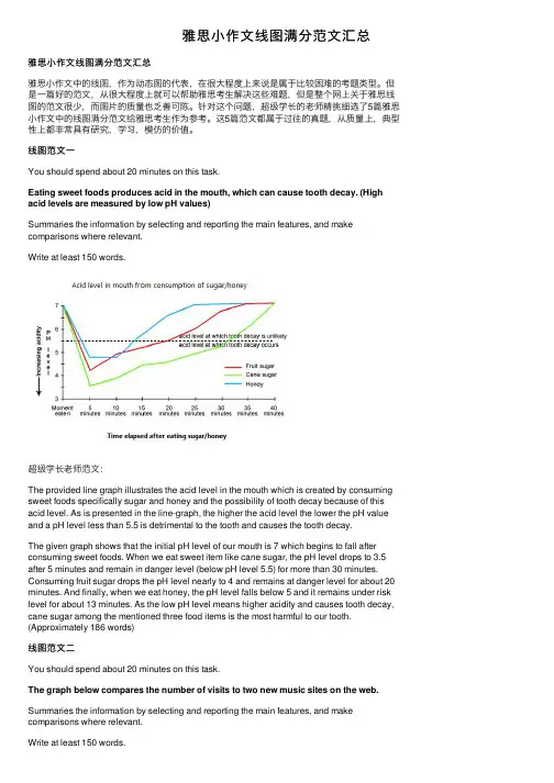
雅思⼩作⽂线图满分范⽂汇总雅思⼩作⽂线图满分范⽂汇总雅思⼩作⽂中的线图,作为动态图的代表,在很⼤程度上来说是属于⽐较困难的考题类型。
但是⼀篇好的范⽂,从很⼤程度上就可以帮助雅思考⽣解决这些难题,但是整个⽹上关于雅思线图的范⽂很少,⽽图⽚的质量也乏善可陈。
针对这个问题,超级学长的⽼师精挑细选了5篇雅思⼩作⽂中的线图满分范⽂给雅思考⽣作为参考。
这5篇范⽂都属于过往的真题,从质量上,典型性上都⾮常具有研究,学习,模仿的价值。
线图范⽂⼀You should spend about 20 minutes on this task.Eating sweet foods produces acid in the mouth, which can cause tooth decay. (High acid levels are measured by low pH values)Summaries the information by selecting and reporting the main features, and make comparisons where relevant.Write at least 150 words.超级学长⽼师范⽂:The provided line graph illustrates the acid level in the mouth which is created by consuming sweet foods specifically sugar and honey and the possibility of tooth decay because of this acid level. As is presented in the line-graph, the higher the acid level the lower the pH value and a pH level less than 5.5 is detrimental to the tooth and causes the tooth decay.The given graph shows that the initial pH level of our mouth is 7 which begins to fall after consuming sweet foods. When we eat sweet item like cane sugar, the pH level drops to 3.5 after 5 minutes and remain in danger level (below pH level 5.5) for more than 30 minutes. Consuming fruit sugar drops the pH level nearly to 4 and remains at danger level for about 20 minutes. And finally, when we eat honey, the pH level falls below 5 and it remains under risk level for about 13 minutes. As the low pH level means higher acidity and causes tooth decay, cane sugar among the mentioned three food items is the most harmful to our tooth. (Approximately 186 words)线图范⽂⼆You should spend about 20 minutes on this task.The graph below compares the number of visits to two new music sites on the web. Summaries the information by selecting and reporting the main features, and make comparisons where relevant.Write at least 150 words.超级学长⽼师范⽂:The graph exhibits the public interest of using two new music websites named Music Choice and Pop Parade in the period of 15 days’ time. According to the graph, the trends were totally unstable and have swung extremely.The statistics of Pop Parade shows the starting point of 120000 visitors on the first day and decreased during the following 7days with the minimum number of visitors of 40000 on the 7th day. The fluctuation of Music Choice website wasn’t as extreme as the Pop Parade in the first week. The Music Choice started with 40000 visitors in the 1st day and the same number of visitors on the 7th day with small amount of changes during this week. In the 2nd week, both of the websites had the increasing interest of visitors i.e. Pop Parade reached to 140000 visitors on the 11th day and Music Choice reached to 120000 on the 12th day, and after some oscillations, the websites ended the 15 day period with 180000 and 80000 respectively. According to the chart, the rate of 180000 was the maximum of viewers that belongs to Pop Parade and Pop Parade has More public interest for the viewers altogether than the Music Choice within these two weeks.( Approximately 204 words )线图范⽂三You should spend about 20 minutes on this task.The line graph below gives information on cinema attendance in the UK.Summaries the information by selecting and reporting the main features, and make comparisons where relevant.Write at least 150 words.超级学长⽼师范⽂:The given line graph shows the number of cinema-going UK people and classifies theseviewers in four age groups. As is observed from the graph, people over 40 years old went to movies more than the younger people of the UK.As is observed from the line graph, the people of 44 to 54 years-old attended cinema more than the people of other age groups who are less than 44 years old. Only 15% of the UK citizens who were between 14 to 24 years old attended in cinema in 1990 while this percentage increased with the increase of age group. In this same year, more than 35% people over 40 years attended the cinema. It is clear from the data that, the people in UK trend to attend cinema more with the increase of their age. The cinema goer’s number increased gradually from 1990 to 2010 except for 1995 to 2000. In 2010, the number of cinema attendees was also dominated by the age group of 44 to 54 and the percentage of cinema attendees from all age groups increased by 5% on an average than the percentages were in 2005.线图范⽂四You should spend about 20 minutes on this task.The graph below shows the differences in wheat exports over three different areas. Summaries the information by selecting and reporting the main features, and make comparisons where relevant.Write at least 150 words.超级学长⽼师范⽂:The given line graph compares the wheat exports over three different parts of the world namely Australia, Canada and the European Community from 1985 to 1990. As is presented in the graph, the wheat export in Australia decreased over time while the export in Canada and European countries increased with some fluctuations.According to the graph, around 15 to 20 million tons of wheat was exported to Australia, Canada and the European community. This amount decreased slightly in 1986 reaching around 15 million tons and from that point, the export quantity in Australia kept on decreasing and reached just over 10 million tons in 1990. In the meantime, the amount increased sharply in Canada until 1988 and then there was a quick decline and finally, it reached around 19 million tons in 1990. Finally, the wheat export in the European Community increased gradually over the years and reached over 20 million tons in 1990.线图范⽂五You should spend about 20 minutes on this task.The chart below shows the changes that took place in three different areas of crime in New Port city center from 2003-2012.Summaries the information by selecting and reporting the main features, and make comparisons where relevant.Write at least 150 words.超级学长⽼师范⽂:The graph represents the variation in levels in the three main areas of crime in the centre of Newport city in the time period from 2003 to 2012.To start with, it was 3400 incidences of burglary in 2003 and 3750 in 2004. Fortunately, in the next 4 years it fell down dramatically and reached the absolute minimum in 2008 (1100 incidences), however, it then grew by 300 accidents and remained fairly constant by 2012.Car theft was a steady level of crime from 2003 to 2004 and got reduced in next 5 years from 2700 up to 2250. The number then increased to 2700 in 2012.Robbery reached its peak in 2005, which was 900 cases and decreased back to 500 in 2008. In the following two years, the number of incidences rose to 700 and continued to stay at this level in 2012.In conclusion, in the Newport city centre, the rate of burglary fell significantly, the level of robbery remained fairly constant, whereas car theft raised and had the biggest number of incidences in 2012.。
雅思写作真题小作文范文.doc
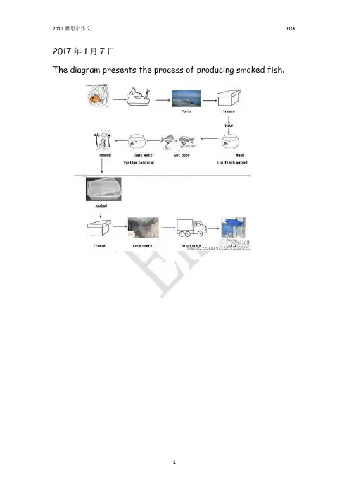
The diagram presents the process of producing smoked fish.The chart below shows the international applicants for a European country from 2004 to 2008.The table below shows the income and expenditure of Harckley Hall, a public place for hiring over the period of three years.The chart below shoes the reasons why people stay in UK and leave UK.The chart below shows the percentage of adults not doing physical exercise in Australia in 2005.The chart below shoes the percentage of international students in Canada and USA, also compare the three top source of countries in Canada and USA.The first chart shows the number of people per kilometer square of six countries in 2003. The second chart shows the percentage change of population in urban area of the six countries from 2003 to 2005.The diagram presents the process of producing smoked fish.The chart shows the percentage of dependents in total population in 5 countries, compared the number in 2000 and the projection in 2050.The chart shows the percentages of both males and females who ate 5 kinds of fruits and vegetables per day of 7 age groups in the UK 2006.The table below shows the employment rate and average annual salary of graduates from the Australian University.The chart below shows the percentage of people using internet for different activities in an UK city of year 2007 and 2009.This diagram shows the online activities of a particular city in Britain in the year of 2007 and 2009.The diagrams below show the changes of a town called Bridgetown in 1700 and 2000.The chart below gives information about the possession of newer technologies by different age groups in UK in 2009. Summarize important information and make comparison and contrast.The diagrams shows a museum and its surroundings in 1900 and 2010.The graph below shows the percentage of workers in 5 different European countries with a days or more illness absence from 1991 to 2001.The chart below shows the destinations of students graduated from physics courses and Art & Design in a European country in 2007.保护环境建议书作文600字地球,这位人类的母亲,我们生命的摇篮,曾经是那样美丽壮观,和蔼可亲!她无私的为我们提供各种资源.请大家保护好环境!争当做个好市民!以下是小编为大家搜集提供到的有关保护环境建议书作文600字范文。
雅思写作6范文

雅思写作6范文题目:在许多城市,交通拥堵是一个严重的问题。
造成这一问题的原因是什么?可以采取什么措施来解决?范文:Traffic congestion has become a real headache in many cities nowadays. Let's first dig into what's causing this mess.One of the main reasons is simply the ever increasing number of cars on the roads. As people are getting more prosperous, buying a car has become an achievable dream for a large number of folks. It seems like everyone and their grandma wants to drive their own vehicle. And with more cars squeezing onto the limited road space, it's no wonder that traffic jams are everywhere.Another factor is the poor urban planning. In some cities, the roads are like a jumbled up puzzle. There are narrow streets that were probably designed decades ago when there were far fewer cars. And new buildings keep popping up without much consideration for how they will affect the traffic flow. For example, a big shopping mall is built right next to a busy intersection, and all the cars going in and out of the mall's parking lot end up creating chaos.So, what can we do to untangle this traffic knot? Well, for starters, the government could encourage people to use public transportation more. They could make buses and subways cheaper, more convenient, and more comfortable. Imagine if taking the bus was like riding in a comfy lounge on wheels, with free Wi Fi and clean seats. People would be more willing to leave their cars at home.Also, improving urban planning is crucial. Roads need to be widened where possible, and new developments should be carefully planned to ensure they don't disrupt the traffic. Maybe there should be some kind of traffic impact assessment before any big construction project gets the green light.In addition, carpooling should be promoted. This is like a friendly car sharing club. If people who live near each other and work in the same area share a ride, there would be fewer cars on the road. Employers could also play a role here by offering incentives to employees who carpool, like special parking spots or small bonuses.All in all, traffic congestion is a tough nut to crack, but with some smart thinking and a bit of effort from everyone involved, we can at least start to make the roads a bit less clogged.题目:有些人认为保护环境是政府的责任,而其他人认为这是每个人的责任。
雅思小作文
雅思小作文雅思小作文范文在平凡的学习、工作、生活中,大家最不陌生的就是作文了吧,作文是一种言语活动,具有高度的综合性和创造性。
相信写作文是一个让许多人都头痛的问题,下面是小编精心整理的雅思小作文范文,欢迎阅读与收藏。
雅思小作文范文1题目给出的是流程图,就是以图示的方法把一个过程或流程清楚地显示了出来,现在要求考生做的是把该流程图还原成说明文。
由此可见,我们实际上要做的就是看图作文。
而大家都知道,看图作文是我们在小学最初学写作文时的入门做法。
照着图来写,省却了要自己想象和构思的过程,这自然比起写议论文的挑战度要低一些。
所以,大家应该更有信心去对付流程图作文,毕竟实际上所做的是“看图作文”。
流程图写作基本原则流程图作文是以对流程的描述为主的。
全文的安排通常分为两个主要部分:引言段和主体部分。
引言段是用来作简介的,介绍该流程图表示了一个什么什么的过程,常用的句型为主语+谓语+宾语模式。
然后视情况可以多加一句说整个过程可以分为若干个阶段。
引言段只需一段,通常就是这么一二句话。
主体部分是文章的核心部分,主要是说明该流程,所以是说明文式的行文。
主体部分可依照整个流程分成几个阶段而大体相应地分为几个自然段。
主体部分的写作原则如下:1.把图看懂这是首要前提,理解了流程图表示的是什么以及是怎样的一个过程,才谈得上用文字表达出来。
能否看得懂图取决于几方面的因素:词汇量,知识面,生活经验和常识等。
考生平时要有心地做一下这些方面的积累和准备。
一般来说,流程图是不难看懂的。
万一有些什么地方卡住了,也要大胆地合乎逻辑地去猜测,推想,判断,要灵活机敏。
2.按图示的顺序写流程图会表示一个过程的流向顺序。
因此,不难按照图示的顺序来写。
若是分成几个阶段的,就按顺序逐个阶段来描述,通常就相应地分成几个自然段落。
3.将图所提供的词扩展(或串)成句子流程图中会提供一些关键的说明性的词,比如步骤或环节的名称,怎样做,添加什么原料,去掉什么,输送到哪儿等等。
雅思写作小作文范文 雅思写作柱状图bar chart 影响工作表现的因素.doc
雅思写作小作文范文雅思写作柱状图bar chart 影响工作表现的因素今天我们雅思写作小作文范文的文章来研究下柱状图bar chart。
该图表展示的内容为某大型公司人力资源部门所进行的调查研究的结果,即影响工人表现的因素有哪些。
该研究的对象为两组工人,一组年龄分布在18到30岁,另一组年龄位于45到60岁之间。
小编搜集了一篇高分范文,以供大家参考。
雅思写作小作文题目The bar chart below shows the results of a survey conducted by a personnel department at a major company.Summarise the information by selecting and reporting the main features, and make comparisons where relevant.雅思写作小作文范文The bar graph shows the results of a survey which was conducted by a company and gives data on the important factors that determine the work performance of employees. As is observed, chances for personal development, relaxed working environment, opportunities for promotion and salary are the main motivating factors for young people for their work performance while comparatively aged people’s work performance is affected by the factors like money, competent boss and team spirit.该柱状图展示了某公司进行的调查研究的结果,并给出了决定员工工作表现的重要因素。
雅思写作A类小作文真题范文word版(汇总78页)
The figure for Germany fluctuated between 80% and 90%.The graph shows the percentage of people aged over 60 in Canada, Finland and Korea between 1950 and 2050.Summarise the information in the charts and make comparisons where appropriate.AnswerThe graph shows the percentage of people aged 60 and over in Canada, Finland and Korea between 1950 and 2050.The number of people aged above 60 in Canada and Finland follows a remarkably similar trend. In 1950 both countries had 7-9% of their population aged 60 or above and the percentage increased steadily until 2050 when both countries are expected to have around 25% of their population aged 60 or above.In contrast, Korea had only 5% of its population aged 60 or over in 1950. This number dropped slightly in the subsequent years and only recovered tothe?original level of 5% in 2000. Between 2000 and 2020 the number of people aged 60 or over in Korea increased more rapidly and is expected to reach 9% in 2020. After 2020 the aged population is expected to increase very rapidlyovertaking Canada and Finland in around 2035 and reaching 30% by 2050.The lower initial aged population of Korea can be attributed to the lower development of Korea in the early part of the 20th century, but rapid development and healthy diets in the second half of the 20th century are probably the cause of the increased longevity in Korea.You should spend about 20 minutes on this task.The diagram below shows the process by which bricks are manufactured for the building industry.Summarise the information by selecting and reporting the main features, and make comparisons where relevant.Write at least 150 words.The picture illustrates how bricks are produced.The process begins when clay is dug out through the use of a digger, which is followed by clay passing through a metal grid. Fine clay is then carried by a roller after which sand and water are added to it. In the next stage, either this mixture is pressed through a frame and cut into bricks using a wire cutter, or it is put into moulds and formed into bricks. Following that, the bricks are dried in a drying oven for one to two days. The next three stages involve two kilns connected to a cooling chamber. The dried bricks are first heated from 200 to 980 degrees centigrade, before being exposed to high temperature (870 to 1300 degrees). They are then cooled within 48 to 72 hours. Eventually, they are packed and delivered to customers by trucks.Overall, the procedure of producing bricks is comprised of ten stages which are rather simple.(161 words)You should spend about 20 minutes on this task.The diagrams below show the stages and equipment used in the cement-making process, and how cement is used to produce concrete for building purposes.Summarise the information by selecting and reporting the main features, and make comparisons where relevant.Write at least 150 words.The diagrams show how cement and concrete are produced. Overall, there are five stages in the production of cement, while the procedure for producing concrete from cement and a few other simple ingredients involves a single stage.Cement production begins when the initial raw materials, namely limestone and clay, are crushed using two rotating drums to make a fine powder which is then mixed in a cylindrical mixer. The next stage involves a tube-like rotating heater with a blowtorch mounted at its bottom opening. The mixed powder is fed from the top and simultaneously heated and blended, after which it is transferred to a grinder using a conveyor belt. There, it is milled to yield the final cement product which is eventually packed in bags.This cement is used as raw material in the production of concrete in a second process. An initial mixture comprising 15% cement, 10% water, one-quarter sand and half gravel is fed into a rotating concrete mixer wherethey are stirred until the concrete mix is ready for construction purposes.(174 words)You should spend about 20 minutes on this task.The chart below shows the amount spent on six consumer goods in four European countries.Summarise the information by selecting and reporting the main features, and make comparisons where relevant.Write at least 150 words.The diagram compares how much money was spent on six different products in Germany, Italy, France and Britain.Overall, more money was spent on toys and photographic film than on any other product. Also, the British were the biggest spenders in all six categories among the nations compared in the bar chart, while the lowest spending levels were attributed to German consumers.In Britain, the highest amount of money was spent on photographic film (more than 170 million pounds), while similar amounts were spent on personal stereos and tennis racquets which together ranked last.The French spent the second highest amount of money among the four nations on compact disks, toys and photographic film, while they ranked last in personal stereos, tennis racquets and colognes.Italian consumers spent more money on toys than on any other product (a bit less than £160 million), but they also paid a lot for photographic film.Finally, Germans spent the least overall, having similar spending figures for all 6 products compared in the chart.(170 words)You should spend about 20 minutes on this task.The graph below shows the consumption of fish and some different kinds of meat in a European country between 1979 and 2004.Summarise the information by selecting and reporting the main features,and make comparisons where relevant.Write at least 150 words.The diagram compares changes in consumption figures for different kinds of meat and fish in a country in Europe from 1979 to 2004. Overall, although beef was initially the most popular type of meat, it was overtaken by chicken towards the end of the survey. In contrast, the figure for fish remained the least significant throughout the period.In the first year, beef had a consumption of about 225 grams per person per week, after which it experienced a sudden drop of 50 before increasing to about 230 in 1984. There were small fluctuations until 1989, which was followed by a dramatic decrease to around half as high as its original level in 2004.The figure for lamb was initially almost as high as that for chicken (around 150 grams). However, while the former declined gradually as it reached approximately 60 in the last year, the latter saw a considerable growth and outstripped beef consumption in 1989, peaking at 250 in 2004.Fish consumption was originally approximately 60 grams and experienced a small fall of about 10 over the period.(180 words)You should spend about 20 minutes on this task.Chorleywood is a village near London whose population has increased steadily since the middle of the nineteenth century. The map below shows the development of the village.Summarise the information by selecting and reporting the main features, and make comparisons where relevant.Write at least 150 words.The map shows how a village called Chorleywood developed over a period of 126 years. Overall, it saw considerable growth, both in the establishment of new residential areas and transportation routes, which occurred over four phases.From 1868 to 1883 there were only two main roads in the region with Chorleywood covering a small area along one of them. Over the next 40 years, the village grew southward alongside the road and a railway was built in 1909passing through this part. Chorleywood station is also located in this area of the village.Over the period between 1922 and 1970, the railway was the line along which Chorleywood expanded, both towards the east and west. However, a motorway was constructed in 1970 parallel to one of the main roads and further development of the village occurred around its intersections with the other main road and the railway between 1970 and 1994. Furthermore, Chorleywood Park and Golf course is now located in an area enclosed by the two main roads, the railway and this motorway.(174 words)The first graph shows the reasons for studying in the UK by age, while the second graph shows the support given by employers for training by age.Summarise the information in the charts and make comparisons where appropriate.AnswerThe bar chart shows the percentage of students who choose to studybecause of their career or interest in the UK in five different age groups while the line graph shows how the level of support as a percentage from employers in terms of time-off work and help with fees changes between the age of 20 and 60.The bar shows that young people in the under-25 age group study primarily for reasons of career development (80%) but this number decreases steadily over time and falls to 67% for the 30-39 age group. By the time people reach the 50-59 age group fewer than 20% study because of their career. The opposite trend is seen with the number of students studying because of interest increasing steadily as they age with only 20% studying because of interest in the under 25?group, but this rises to nearly 70% in those in the 50-59 age group.The second chart shows that the level of support for study by employers is high in the early stages of people’s career at about 80% for people aged 20, but this decreases steadily to around 60% by age 40 before falling more steeply to 20% by age 60.The graph shows the monthly expenditure on three types of restaurant food in Australia. The plot shows the annual number of restaurant visits for the same types of food between 1965 and 2015.Summarise the information in the charts and make comparisons where appropriate.AnswerThe bar graph shows the expenditure of different income groups in Italian, Indian and Chinese restaurants in Australia, while the scatterplot shows the number of annual visits per person to the same type of restaurants between 1965 and 2015.The proportion of money spent on Chinese and Italian food is similar for high ($42 and $20), medium ($35 and $14) and low ($13 and $8) income groups. As people’s income becomes higher, the proportion of money that is spent on Indian food drops from being the most to least favoured style of food. This suggests that Indian food is preferred because it is the least expensive option.In 1970 the total number of restaurant visits per year was approximately 5 visits per person, which was made up of 3 and 2 visits per person to Chinese and Italian restaurants, respectively. The total remained low until 1985, but after that time increased steadily to around 50 visits per year by 2015. After 1985, the number of visits to Chinese restaurants increased in a continuous upward trendreaching 22 visits per person per year by 2015, while visits to Italian and Indian restaurants initially followed a similar trend but the number of visits began to level out after the year 2000 reaching 15 and 12 visits per person per year by 2015, respectively. People having higher disposable incomes and less free time are probably the causes of the dramatic change in eating habits.You should spend about 20 minutes on this task.The graph below gives information about Dubai gold sales in 2002.Summarise the information by selecting and reporting the main features, and make comparisons where relevant.Write at least 150 words.The diagram illustrates how gold sales in Dubai changed from January to December 2002.Overall, the figure fluctuated widely before returning to its original level at the end of the year. Besides, gold sales were at their highest in March, while the weakest figures could be observed in July and September.In the first month of 2002, the figure stood at 200 million dirhams and rose slightly to reach about 225 million in February. This was followed by another increase, although much steeper, in March when sales hit 350 million. However, this upward trend was suddenly broken and sales declined dramatically over the next 4 months to reach a little over 100 million in July. August sales saw a significant rise back to January levels as the figure nearly doubled, but it dropped again in September to the same level as it was in July. There was a small increase of about 100 million dirhams in October, after which the figure levelled off and remained relatively unchanged over the last two months of 2002.(174 words)You should spend about 20 minutes on this task.The two maps below show an island, before and after the construction of some tourist facilities.Summarise the information by selecting and reporting the main features, and make comparisons where relevant.Write at least 150 words.The maps illustrate how an island has changed following the development of various facilities for visitors.Overall, there have been significant constructions in the island in terms of accommodation and facilities for tourists. It is noteworthy that these developments have occurred without any noticeable damage to the trees.The length of the island is over 1200 metres while its width varies from about 200 to 500 metres in different places. Originally, there was a beach to the left of the island, and the eastern and western parts were covered with woodland, apart from which the island was completely bare.In comparison, swimming facilities have now been built in the beach. Furthermore, the western woodland is surrounded by a series of huts which are connected to each other and to the beach via footpaths. There is also a restaurant in northern part which is connected to a reception building in the middle of the island as well as a new pier to the south by means of a vehicle track. Finally, a larger set of huts have been constructed between the reception and the eastern woodland.(185 words)The pie chart shows why agricultural land in America has become less productive. The table shows how these causes affected the three regions in the Americas.Summarise the information reporting the important features and make comparisons where relevant.AnswerThe pie chart shows the causes of land degradation (deforestation, over-cultivation, over-grazing and other causes) in North, Central and South America, while the bar chart shows the percentage of land degraded in America by cause and region and the total percentage of land degraded.The pie chart shows that over-grazing makes up 35% of land degradation while deforestation and overgrazing are responsible for 32% and 27% of land degradation, respectively. Other causes of land degradation make up 8% of the total degradation.Central America has by far the highest level of land degradation at 13.8%,which is caused by deforestation (6.2%), over-cultivation (4.9%) and overgrazing (2.3%). Approximately 13% of land in South America is degraded and is caused by deforestation (6.3%) with smaller contributions from over-grazing (4.4%) and over-cultivation (2.3%). North America has by far the lowest level ofland degradation at 5.8%, which is mainly due to over-cultivation (3.7%) and overgrazing (1.8%). Deforestation made up only 0.3% of land degradation in North America.You should spend about 20 minutes on this task.The diagram below shows the life cycle of the honey bee.Summarise the information by selecting and reporting the main features, and make comparisons where relevant.Write at least 150 words.The chart illustrates the stages in the life of honey bees. It takes approximately five weeks (34 to 36 days to be exact) to complete. All in all, this life cycle is comprised of six stages from eggs to fully mature bees.The first stage is when the female bee lays up to a couple of oval eggs onceevery 72 hours. These eggs hatch between nine and ten days later, and immature bees, called nymphs, emerge which lack the typical bee stripes.Over the next 3 weeks nymphs experience three moulting stages, that is, they shed their skins to allow further growth to occur: The first moulting happening 5 days after the eggs hatch, a week after which the second one takes place. Nine days later nymphs moult for a third time and young adult honey bees emerge, identified by their horizontally striped backs. These take four more days to mature into larger adult bees whose backs are marked with bolder and darker stripes, and the cycle starts over again.(171 words)You should spend about 20 minutes on this task.The diagram gives information about the process for making pulp and paper.Summarise the information by selecting and reporting the main features, and make comparisons where relevant.Write at least 150 words.The diagram shows the process through which wood is used to manufacture pulp and paper for printing and box production purposes. Overall, it is rather sophisticated and is comprised of more than ten stages.The process begins when trees are cut down to produce logs, after which they are chipped and combined with purchased wood chips in a digester. The resulting pulp is then washed and screened to make clean pulp.This pulp can then be used to produce rough paper for making boxes. After forming the pulp in a former device, it is dried and formed into a reel. Next, it is cut into paper bales which are finally packed.Alternatively, the clean pulp may be used to make refined paper for printing purposes. Once it is cleaned in pulp cleaners, it is dried and pressed, first in pulp presses and then in paper presses. Ultimately, it goes through another drying stage in paper dryers before being rolled.(159 words)The diagram shows the process through which wood is used to manufacture pulp and paper for printing and box production purposes. Overall,it is rather sophisticated and is comprised of more than ten stages.The process begins when trees are cut down to produce logs, after which they are chipped and combined with purchased wood chips in a digester. The resulting pulp is then washed and screened to make clean pulp.What happens next depends on the type of paper that needs to be produced: if it is rough paper for packaging purposes, the pulp is formed in a former device before it is dried and formed into a reel. Next, it is cut into paper bales, which are finally packed.Alternatively, if the pulp is used to produce refined paper for printing purposes, it is cleaned further in pulp cleaners, following which it is dried and pressed, first in pulp presses and then in paper presses. Ultimately, it goes through another drying stage in paper dryers before being rolled.(170 words)The charts below describe the population in Iran and Spain in 2010 and the expected population in 2060.Summarise the information in the charts and make comparisons whereappropriate.AnswerThe two bar charts show the actual and expected percentage of the population in three age groups (0-15, 16-55 and 55+ years) in Iran and Spain in 2010 and 2060.In Iran in 2010 the number of people in the 0-15 age group was just under half (48.2%) of the total population, while the population aged 16-55 years was slightly higher (48.3%). In contrast, the number of Iranian people aged over?represented only 3.5% of the population. By 2060, it is expected that the population will have aged significantly, with the number of people aged 0-15 years expected to decrease to 43.1%, while the number of people in the 16-55 and 55+ age groups is expected to increase to 50.2% and 6.8%, respectively.In Spain in 2010 the percentage of young people was much lower (14.7%) compared to Iran, while the 16-55 and 55+ age groups made up 61.4% and 23.9% of the population, respectively. By 2060 the population of Spain is expected to age further with the number of people in the 0-15, 16-55 and 55+ age groups expected to be 11.3%, 48.5% and 40.2%, respectively.Essay NotesThis question is quite challenging as there are 2 bar charts, and data is both for the past and the future and there are relatively few data points (12 in total). The introduction is particularly difficult because of the number of different elements that need to be included.From a structural point of view the data can be readily divided logically in two ways. The first is by country and the second by year. It is best to divide the data by country as this leads to a more imple and clearer description of the data. In general, it is best not to logically divide the data into paragraphs by time. Data should be divided by time within a paragraph.The first body paragraph focuses on Iranian data because it is the first bar chart presented in the question. The data is also described in chronological (time) order. The earliest to latest year and youngest to oldest age group is the order that is adopted throughout giving the essay a clear consistent structure. There are so few data points provided in the question that each individual pointshould be described. However, it should be noted that trends are also described –notably that the population is expected to age and there are expected to be a higher proportion of older people in the future.The second body paragraph describes the data for Spain. The data is presented in the same order as for the Iranian data and the only difference is that the situation in Iran is contrasted with that in Spain. Again the small amount of data means that each individual data point can be described which means that a reader who has not seen the original question should be able to reproduce the data exactly.You should spend about 20 minutes on this task.The chart below shows the different levels of post-school qualifications in Australia and the proportion of men and women who held them in 1999.Summarise the information by selecting and reporting the main features, and make comparisons where relevant.Write at least 150 words.The bar shows the difference between the percentage of females and males in different post- school qualifications in Australia in 1999.Overall, women had the highest share in two qualifications, while menranked first in three. The highest figures for women and men were reported in undergraduate diploma and skilled vocational diploma, respectively.There was a significant difference between the proportions of males and females in skilled vocational diploma, with the former standing first with 90%.The disparity between the two figures was almost the same in undergraduate diploma and postgraduate diploma. However, while in the former women had the highest share with 70%, men accounted for the largest percentage in the latter with 70%.Women also ranked first in bachelor’s degree, whereas the share of men was lower by a narrow margin (55% and 45%, respectively). In contrast, in master’s degree, the contribution of females was 2/3 as high as that of males, as the latter was responsible for the largest share with 60%.(164 words)You should spend about 20 minutes on this task.The diagram below shows the process of using water to produce electricity.Summarise the information by selecting and reporting the main features, and make comparisons where relevant.Write at least 150 words.The diagram shows the process through which water is used to produce electrical power. Overall, hydroelectric power is generated using water from the sea through a relatively sophisticated procedure which comprises over ten stages.The process begins when seawater is heated by the sun and evaporates to form small clouds in the sky. Next, they merge into a storm cloud, which then rains over the mountain. This rainwater is gathered in the reservoir behind a dam. The following steps involve a pipe which connects the reservoir to a turbine as well as a pump, and is controlled using a valve. Once this valve is opened, water flows into the turbine and rotates it to produce electrical current, following which it is pumped back into the reservoir. After this, the electricity produced by the turbine is transferred to the transformer station through high voltage cables. The last stage is when the electrical power is delivered to domestic and industrial consumers, as well as educational and medical facilities.(169 words)You should spend about 20 minutes on this task.The diagram below shows how geothermal energy is used to produce electricity.Summarise the information by selecting and reporting the main features, and make comparisons where relevant.Write at least 150 words.The diagram shows that there are five main stages in the production of electricity through the use of geothermal energy.The process begins with cold water being pumped from the surface of the earth down into a4.5 kilometer-deep injection well. From there, it is transferred to the geothermal zone, a subterranean region composed of hot rocks, before reaching the production well, which is a vertical pipe similar to the injection well but a bit wider.In the stage that follows, the hot water is pumped up through the production well into a condenser on the surface where it is converted into steam, following which it is used to power a turbine and rotate it. This turbine is connected to an electricity generator which, when rotated by the turbine, produces electricity. The process ends when the electricity generated by the generator is transferred to the power grid for consumption by end users.(152 words)You should spend about 20 minutes on this task.The tables below give information about sales of Fairtrade*-labelled coffee and bananas in 1999 and 2004 in five European countries.Summarise the information by selecting and reporting the main features, and make comparisons where relevant.Write at least 150 words.The tables show how fairtrade coffee and banana sales changed in five countries in 2004 compared to 1999. Overall, Coffee sales rose in all countries with the highest sales observed in Switzerland. Banana sales also rose in all buttwo countries, and were highest in the UK.In 1999, the most significant coffee sales, 3 million (3m) euros were reported in Switzerland, and they doubled in 2004. The figure for the UK was originally 50% lower than that for Switzerland (1.5m) while sales in Denmark were slightly higher (1.8m). However, while the former rose dramatically to 20m, the latter remained relatively stable. There was little difference between the figures for Belgium (1m) and Sweden (0.8m), and both experienced noticeable increases to 1.7m and 1m, respectively.UK had the highest banana sales in both years, as they rose over threefold from 15 million euros to 47m. Swiss sales were originally almost twice as high as those of Denmark (1 and 0.6m, respectively), and both surged, reaching 5.5 and 4m. There was little difference between the figures for Sweden and Belgium (2 and 1.8m, respectively), and both nearly halved to reach about 1m in 2004.(193 words)You should spend about 20 minutes on this task.The diagrams below show the changes that have taken place at West Park Secondary School since its construction in 1950.Summarise the information by selecting and reporting the main features, and make comparisons where relevant.Write at least 150 words.The diagrams illustrate how West Park Secondary School has developed since 1950 when it was built. Overall, the school saw significant growth although its recreational facilities did not develop as much as its buildings and parking space.In 1950, the school was a single building located along the main road and to the right of a series of houses. There was a large playground which was located right behind the school building to the right of some farmland.Thirty years later in 1980, the houses were demolished and replaced by a car park, as well as a new science block, for the school while the old school building was changed into its main building. The farmland was also replaced by a new sports field, but the playground remained unchanged.In the last year, 2010, the car park was extended, as a result of which the land previously allocated to the sports field was added to it. However, about a。
雅思写作小作文范文 雅思写作地图题map 学校变化.doc
雅思写作小作文范文雅思写作地图题map 学校变化今天我们雅思写作小作文范文的相关文章来研究下地图题。
与听力中的地图题不同,雅思写作中的地图题往往会有两张不同时段同一地点的图片。
让大家比较其中的相同点和差别。
这种题型过去考得比较少,但近几年来有逐渐增多的趋势,甚至有时候会连着几场出现。
小编准备了一篇考官范文,以供大家参考。
雅思写作小作文题目he diagrams below show the site of a school in 2004 and the plan for changes to the school site in 2024.Summarise the information by selecting and reporting the main features, and make comparisons where relevant.雅思写作小作文范文The two pictures compare the layout of a school as it was in the year 2004 with a proposed site design for the year 2024.这两张图片比较了一个学校2004年的布局与计划在2024年实现的设计。
It is clear that the main change for 2024 involves the addition of a new school building. The school will then be able to accommodate a considerably larger number of students.很明显,2024年最主要的改变是增加了一座新的学校建筑。
学校到时候将能够容纳更多的学生。
In 2004, there were 600 pupils attending the school, and the two school buildings were separated by a path running from the main entrance to the sports field. By 2024, it is expected that there will be 1000 pupils, and a third building will have been constructed. Furthermore, the plan is to join the two original buildings together, creating a shorter path that links the buildings only.2004年,有600名学生在此上学。